
Footer Design: 15+ Examples For Your Inspiration
If your shoes are the most important component of your outfit that allows making a conclusion of your appearance, website footer design is the final element of its selling design. If you pay enough attention to this bottom element of the page, your website has a great opportunity to demonstrate the individuality of your company in all possible ways!
We are the experts, that’s why we are absolutely sure that a properly designed website’s footer with a thoughtful design, competent structure, and all necessary footer content will attract the user’s attention, make him stay longer on your website and motivate him to take further actions. That is why the effectiveness of a quality footer leaves no doubts.
Let’s consider the importance of the website’s footer, check out the best samples of footer web design and find out how to create a footer that people will talk about!
Contents
What is a footer on a website
The website footer, opposite to the header, is the part of a webpage located at the bottom of it. The correct design of this part of a webpage plays a huge role in the success of promoting the whole website and improving its usability.
Why is footer so important for your website?
The importance of the footer of the website is hard to overestimate. Chartbeat’s analysis proves this fact by monitoring 25 million visits to various sites and scrolling tracking:
- 25%r of all users do not wait for the page to load completely, rushing down to the site’s footer to find the crucial info (contact form, testimonials, sitemap).
- Most visitors spend most of their time under the fold line, rather than above it.
Benefits of a properly designed footer
- The footer may include any information that may be of visitor’s interest, from contact details to links to pages with additional services of the company. These elements provide a number of business benefits.
- Being an additional source of important information for the user, the well-optimized footer will make it easier to navigate the site and help you to achieve your business goals.
- Using the footer, you are able to tell your client some important things about the company and the direction of its business in detail, offer to subscribe to the newsletter or provide information to partners with the help of the link to the relevant pages. The footer simplifies navigation for your visitors if they need to visit any section on the site.
- The footer will tell the visitor that the website doesn’t end here. It will help to push the potential customer to further actions: to fill out a feedback form, to go to the community page on social networks, to see contact details or to register on the website. These things affect the overall conversion of the website. The correct design of the footer helps to turn your website’s visitor to a client.
Mistakes you can make in website footer optimization
The footer should complement and improve the user experience, not to become a headache for your visitors. These GetGoodRank conclusions will allow you to consider the basic mistakes in footer optimization:
-
Font.
Most often, the developers use a very small font, which merges with the background, so the visitors almost do not perceive the information. That’s why your visitors don’t want to engage with the website’s footer.
-
Lack of space.
The information is easier to perceive if there is enough empty space between the links and words. This improves the readability of the text and the visitor’s focus.
-
Lack of/no information about the company.
It is necessary to visually highlight the main links, to divide the primary and secondary information – this will make it easier to browse the page. It will be easier for the visitor to find the necessary information and highlight an important point. Thematic blocks can be highlighted with the help of graphic symbols or icons.
-
Keywords for SEO.
Users use the footer to simplify the web site’s navigation, so do not overflow it with the keywords that may negatively affect the ranking and will only use your footer’s extra space.
-
Reduplication of the main menu.
We often see that the footer simply lists items from the main menu that the visitor has already seen. In the footer. It makes sense to place the exact information here that is difficult to find at a glance!
Footer Design Examples
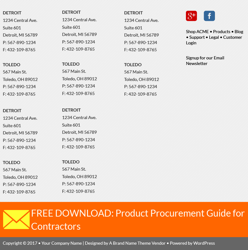
Lorem Ipsum – web site footer example
Website: https://www.lipsum.com/
Many websites use WordPress CMS. In order to make everything look perfect, you need to completely fill each box. This example clearly shows that something is missing.
It looks like it is expected that the theme is filled with three more columns and can’t be attuned to show just one of them.
And this makes us cry!
Footer menu example
Footer is often used as a secondary navigation area: it is a perfect idea to put some links like “About us”, “Contacts” and even “Help” links here.
Just look at this: maybe the idea was to create a cool fat footer, but it looks like the drawer, filled with the unnecessary papers! It is just one big mess!
If the page doesn’t fit with the rest of the website, and it seems impossible to fit it to the website’s category or navigation system, then you should ask yourself: is there a need on this page?
Crowded & busy footer example
The footer helps your visitors to easily find the crucial information they’ve missed on your website. Think about adding company info, contacts, CTAs, site map, social media buttons here. But don’t try to fit it all in a small box!
It looks just like there is a programming error with the borders and dimensions of the footer boxes. Add here a huge amount of stuff – and you will get such a result!
Zoyogurt: the best example of a beautifully-designed footer
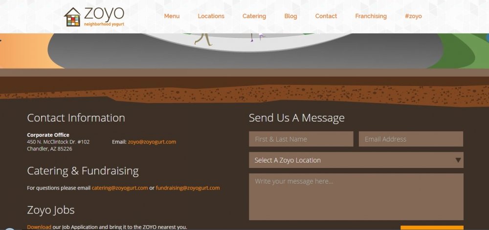
Visit the website: http://www.zoyogurt.com/
Since the footer is at the bottom of the page, you should use your chance to design a creative footer! You can place relevant illustrations here, such as the roots of trees, the ocean floor, or the surface of the planet, just as this footer was designed.
This footer design also uses links of bright color, that makes them clearly visible on the dark background, and two useful elements – a feedback form (where you are immediately proposed to choose the city and check out the physical address of the representative office) and a field for subscribing to a newsletter.
Saddlebackleather website footer example
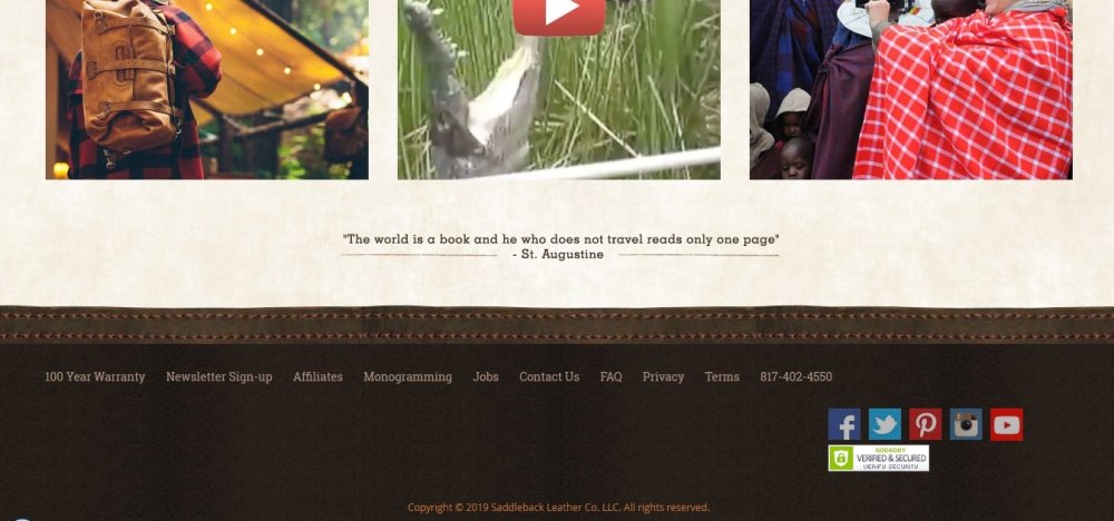
Visit the website: https://saddlebackleather.com/
This is a footer with a beautiful retro design header and footer, that really sells! 100-year warranty for the high-quality materials and finishing… terms of return are accompanied by interesting stories… It turns out to be very easy to create a perfect footer for an e-commerce website!
Railstips news footer example
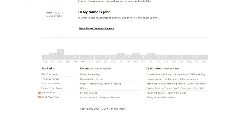
Visit the website: http://www.railstips.org/
The innovative design of a website’s footer means using not only pictures but also cute tiny animations. You can place infographics or factoids (brief statements without reference to the source). or even interestingly implemented navigation here. Take a look at this calendar footer for a blog that immediately attracts the visitor’s attention!
Informative footer example
Visit the website: http://www.nuevo-aurich.de/
Here you can find all the necessary information about the restaurant. It is a very good example of a footer because it reflects the essence of the place.
Related article: Restaurant Websites: 37+ Best Restaurant Website Design Examples
Carol Rivello – footer design example
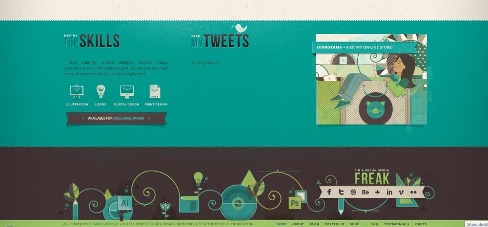
Visit the website: http://www.carolrivello.com/
Carol managed to place all the basic info and also add some examples of his work on the website’s footer.
Gisele Jaquenod: stylish footer design example
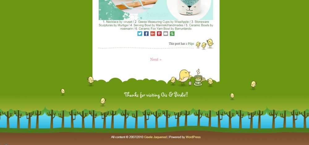
Visit the website: https://www.giselejaquenod.com.ar/blog/
Gisele’s design style can be perceived through the entire website. Here we have got nice graphics and a good idea for a footer!
Innovative footer design example
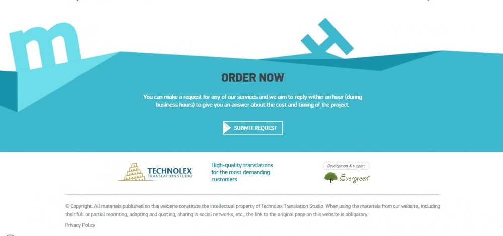
Visit the website: https://www.technolex-translations.com/
Do not be afraid to use irregular shapes!
The footer does not have to be designed as a rectangular block. The innovative design of the website’s footer may look asymmetrical and harmoniously fit into the overall look of the page. For example, here is a variant with sharp corners!
Giftrocket website footer example
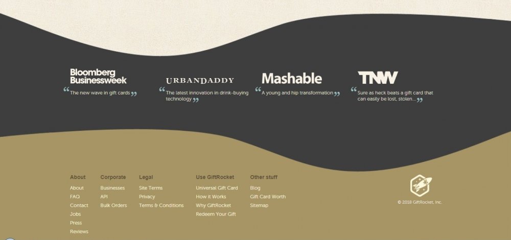
Visit the website: https://www.giftrocket.com/
Here we see the smooth lines that combine the section with reviews and the footer itself.
This design clearly divides information into sections, so that the visitors who just want to see the discount offers in other cities can easily navigate.
Stumptown coffee: the best example of a negative space usage
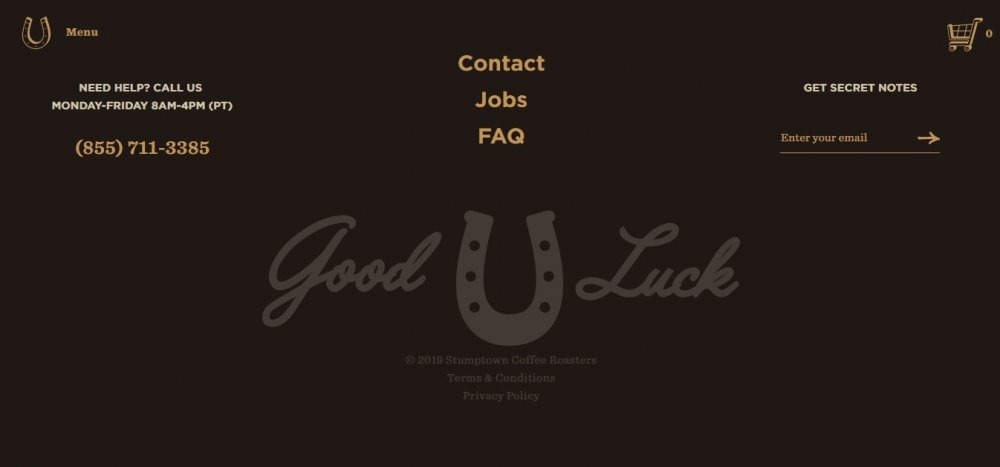
Visit the website: https://www.stumptowncoffee.com/
Consider the importance of micro-negative space in footer design: as long as you place all the necessary information, everything is legible and quickly perceived!
Spacious footer design example
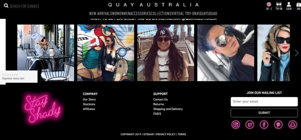
Visit the website: https://www.quayaustralia.co.uk/
Use the negative space by limiting the number of footer links: it will have a stunning effect on visual perception and improve readability. The main rule is as follows: if you consider the visual hierarchy, the visitor will notice the central elements faster.
Using a minimalistic style and a fixed drop-down menu, your online store can afford a spacious footer!
Greetabl company footer
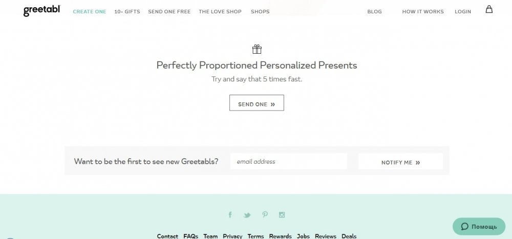
Visit the website: https://greetabl.com/
The stylish design of the footer tells a lot about the website itself. Greetabl has a modestly designed lower part of the pages, including a CTA to make the visitors to subscribe.
It is important to note that the visitor lingers here a little longer than in the rest of the page. This is a great chance to use your perfect CTA one more time! Usually, сcompanies use the subscription/mailing, but you can link your CTA with the registration form.
Minimum elements make the CTA visible, and turns into a decorative design idea, harmonizing with the turquoise background of the website.
«About Us»-focused footer example
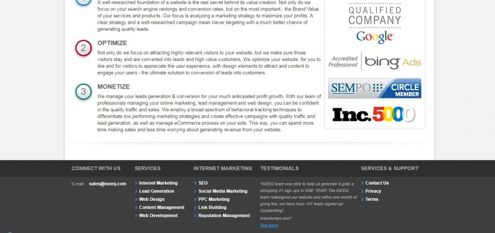
Visit the website: http://www.iseeq.com/
This website’s footer is made in a classic style and created in strict shades, contains all the necessary information about the company and its activities, the easy-to-follow links to any section of the site that may be of a visitor’s interest.
Related article: 17 Best About Me Examples for 2021: How To Write a Killer About Me Page
Sitemap- and links focused footer example
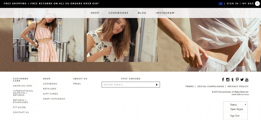
Visit the website: https://www.amusesociety.com/
Vissla design footer
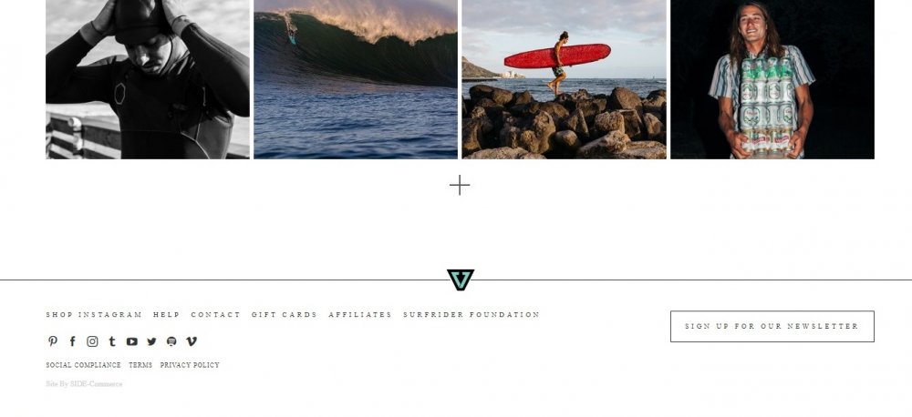
Visit the website: https://www.vissla.com/
The visual expression of the footer on the website is underlined by the logo. Links to important pages successfully fit in the minimalistic style of the footer, increasing the visitor’s focus. A number of social network icons harmoniously fit into this style, too.
Animated company team-focused footer example
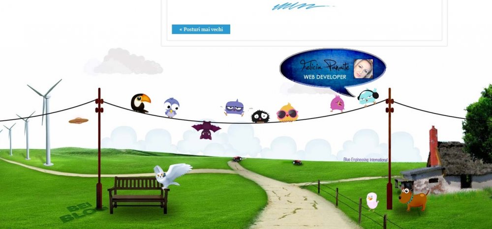
Visit the website: http://www.bei.ro/blog/
This website’s footer has no contact information or call-to-action; however, it uses another smart method of web-design that brings it a great success: when you point your mouse on the cartoon characters, you meet the company team members!
Steps to create a good footer
Website footer design tips & tricks
- Use creative solutions! In order to be eye-catching, the main background of the footer should be different from the general background of the site. But at the same time, it has to perfectly match the whole website’s style. In order to effectively highlight the footer, you can use brighter tones or even thematic images that will emphasize the company’s activity. Create a smooth transition between the second-to-last and the last block, but do not forget to put the accent on the footer.
- Use the main theme of the website design. Don’t make your footer look like something that is separated from the page itself. Colors, styles, and graphics should reflect the overall webpage style.
- Use the animation. Animated elements always attract attention. In addition, they emotionalize your footer, subconsciously calling the visitor to action.
- Use readable fonts. Avoid small fonts, even if there’s too much info in your footer. It is better to remove some unnecessary links. And be sure to choose the colors that contrast with the background so that the small size of the letters stands out well, providing convenience for reading. So, you can use any desired color palette, but with an emphasis on the font.
- Use columns, icons, indents, etc. for the better perception. This improves the мшышещкэы focus on the footer elements.
- Use more space. The more free space there is in the footer area, the higher the visitor’s concentration on the information. Organized, correct and accurate location of useful links will help you correctly transfer crucial information to your client. Thematic headlines and subtitles with logical blocks will help your visitor to improve the usability of this part of the webpage and the search for the containing information. Be sure to optimize the footer so that it looks great on any mobile device!
- Keep the footer hierarchy in mind. The hierarchy of the information is crucial for the footer, as it is important for all the other webpage sections. The most important info, like the phone number, should be in the most visible place, and the typical information, like copyright, should be displayed using the smallest font.
- Keep the design of your footer simple. The modest design is crucial when you are working with a large amount of information, which will be placed in the footer. There must be only important elements that help you to attain your goal.
- Use group links and columns. This trick helps to create a sense of correct organization of information on the site. Make each column relevant to a particular topic and link to services, social media, and the most visited pages. For each group, make a subtitle so that each element can be easily found.
- Do not use too large images: they can easily distract the visitor from what is really important.
- Think of a sub-footer for extra layering. It’s a very good idea: use the footer area to show your rewards or place CTA here.
- Sticky footer. Just as navigation elements can “stick” to the top of a webpage (regardless of scrolling), footers can always be shown at the bottom of the webpage. This is a great idea if the important links are stored in the footer. Even Conversion Sciences (USA) website uses the sticky footer!
Important things to be placed in your website’s footer
- Links to website sections with important information, including «About us» and «Contacts» in the footer. Sometimes your visitors just need to see who you are and where your office is located. People often forget the addresses, they can easily lose your business card and they will visit your website to get contact information. Place your email address, your phone number, and company location in the footer.
- Copyright notice. This short text line will tell your visitors who own the content of your site. Such information does not interfere with crucial footer info.
- Call to action. After the visitors have viewed the entire page and moved to the bottom of it, let them take a final action! Make a CTA button to subscribe to the email newsletter or offer your visitors to join you on SM.
- Graphic elements. Place a logo or other interesting graphic elements to form a visual effect. Just avoid overloading this tiny space with a huge amount of various elements.
- Site map. Many large websites use this common component in the footer. You can easily find this useful link in the footer on the websites of Intel, Apple, and other reputable companies. Ordinary visitors rarely click on it, but, just like the XML sitemap, this link can help the search engines.
- Social network buttons. An analysis of the top 50 marketing sites shows that 72% of footers contain social networking buttons. We all like to get the traffic from social networks, but we hate it when people leave us on Facebook, Twitter or YouTube. When they leave, they no longer return. That is why web designers do not place buttons in the header. A footer is an ideal place where the interests of the two parties are respected.
- Email Subscription. Studies show that 24% of websites place an email subscription button at the bottom of the webpage. That makes sense: the visitor notices the subscription button when he has read the content and found it interesting. It is a good idea to place some facts (how many satisfied subscribers are there on the website?) and to offer some benefits (what will the subscriber get if he will subscribe?).
- Authorization form. Not all visitors are just readers: company employees, partners, suppliers, and customers also visit your website. A link to the authorization form may become a necessary element in the design of the footer.
- Website search bar. If the visitors haven’t found the search bar in the header or sidebar, use it when creating a footer. Don’t forget to make your search tools clearly visible.
- Feedback from satisfied customers. Let customers tell their story – just a few gratifying words about the company: testimonials with real photos work great in the footer!
Creating a poor-quality site is probably not even as bad as spoiling a perfect site with an unsuccessful footer. Rely on professionals from Weblium AI Website Builder, creating your own website for business – and you will never have the above-mentioned problems!
And if you need support, our experts will always be there, 24/7. But be sure, that everything will be fine, because we offer to design your website, using only the best templates with a unique design from our collection!


Love these designs! Thanks for the inspiration and looking forward to more
Reading your article helped me a lot and I agree with you.
Thank you very much for sharing, I learned a lot from your article. Very cool. Thanks.