
Secrets of the Best Financial Advisor Websites in the World Revealed
Originally published by Advisor Perspectives on 6 February 2018.
The financial advisory industry is swarming with handy insights when it comes to web design. The slightest difference, even if it’s not clearly visible, can be a game changer in such a competitive industry.
We’ve decided to dig deeper into the matter and conduct our own research. The goal? Find the best practices of financial advisor websites to prove that creating a successful site is attainable if you follow certain rules. Here’s how to incorporate the greatest ideas from all over the world into your own site.
Need an effective financial advisor website? Order it on Weblium now and get a complete site in 5 days.
Contents
How we chose the financial websites to analyze (boring stuff alert)
When we decided to research the financial consulting industry, we needed to set out a plan on how to do it:
STEP 1. We determined top financial advisor websites in the world by analyzing their positions in search engine result pages, load speed and rankings of best websites (if they had been selected in any). We chose the following regions for the analysis:
- North America
- Latin America
- Europe
- Asia
- Middle East
- Eastern Europe
- Australia
- Africa (represented by South Africa, since it has the biggest interest in financial consulting, as provided by Google Trends)
STEP 2. I determined the most critical elements of financial advisor websites for comparison. These include texts, structure, news and blog, calls-to-action, and contacts
STEP 3. I made a list of recommendations that would help you create a financial advisor web site that would embody the best practices from all over the world.
Time to move on to the research itself!
Financial advisor websites. So similar, so different
The first thing I noticed is that there’s no unified approach to financial advisor websites. Since the industry evolved differently in different regions, their websites reflect that.
Regions with a long history of financial consulting (e.g. North America, Europe, Australia) have more expertise in how to present their business on the Internet. However, some newbies in consulting like South Africa seem to have already embodied the best practices.
Interesting: One of the trending subjects in financial consulting is robo-advisors, automatic financial consulting apps created by professionals. They aim to make consulting more affordable and convenient so that you can get financial advice 24/7 even on a budget. However, they won’t do for planning complex financial operations. The best thing about robo-advisor websites is the substantial use of trust factors, such as testimonials, awards, etc.
Structure and navigation
Financial websites usually have similar navigation with a menu in the header and dropdown lists helping to find necessary information.
Structurally, they consist of multiple pages, with the most significant points coming to the main page. Users can also read detailed info about each subject on a separate page.
Pages and content blocks differ a lot. The following are the most frequent for a financial website: Services, Team, News & Insights, Career, and Contacts. Surprisingly, there’s a lack of trust factors.
Content
Clearly, financial advisors have different approaches to website content, with some using so-called “walls of content” without proper visuals or icons. Fortunately, they remain in the minority, as most financial advisor websites have harnessed the power of content visualization and white space.
Images
Sad enough, visuals are still a weak point of financial advisory websites. Experts in the field use way too many generic stock images, especially at the top of the homepage. Though image subjects may differ, they still lack originality.
Calls-to-action
As for effective calls-to-action (CTA), American, European and Australian financial advisors sites take the lead. Their websites are more human, meeting real users’ needs while keeping all the information relevant to win customer trust and loyalty. Besides, CTAs are used where and when they’re needed the most.
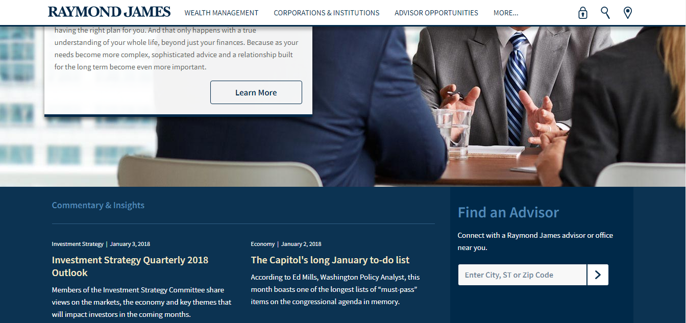
Raymond James offers to find an advisor right after the hero image at the top of the page.
Contacts
Information about office location and ways to reach out is a very important block, especially for local service providers, where clients won’t travel a thousand miles to meet their consultant.
Financial advisors in most regions usually stick to generic contact options, like address, phone numbers, and email. Use of messengers or callback forms is still rare.
If you hate long reads, get right to the summary. CAUTION! You will miss a lot of interesting insights.
North America (reputation comes first)

Overview
The region is swarming with financial consultants, advisors and investment planners of all types. Despite the competition, many sites remained in the past. The reason is that many successful financial consulting firms have gained a reputation that speaks for itself. So they don’t pay attention to their websites.
Text
Financial advisors realized that visual content should prevail over written texts. Hence, lots of illustrations instead of walls of content.
Website structure
The homepage is focused on a company’s services and what it value it offers to clients. Surprisingly, financial advisors in North America do not highlight trust factors. Instead, there a lot of banners and visual items describing their services. The creative ones often add introductory videos and real-time stock data.
A common practice is to create web pages relating to the areas of expertise, with subpages of specific services. Besides, services may be split into those for corporate and private clients and be presented separately with photos/icons and short descriptions.
TIP: Some companies add Find an Advisor page or block on their website, which is a great user experience.
News and blog
Financial advisor websites in North America have a news section filled with company news as well as handy insights from financial consulting, pieces of research, and success stories of investment and financial planning.
Calls-to-action
CTAs are not very common. They can be divided into three categories:
- Conventional (Request Information, Start the Conversation, Sign Up)
Sign-up/sign-in buttons and forms are often located right in the hero area and repeat several times throughout the page.
- Ambiguous (Take the First Step, Get Started, Explore)
- Useful (Find an advisor)
Contacts
Contact options are few usually located at the bottom of the main page or in the footer.
Latin America (visual content prevails)
Overview
Financial consulting in Latin America is not as widespread as in its Northern neighbor. Financial advisors are usually represented by branches of international corporations that have multi-language websites in Spanish, Portuguese (Brazilian) and English. Websites are usually poor in content and pay more attention to visuals.
Texts
Similar to North America, financial advisor websites in the southern region use concise texts, with the most significant information highlighted by icons and counters.
Website structure
Homepage starts with a slider of 3-4 abstract pictures of growth and development followed by business results and recent changes in financial markets. Information about the company and its services is short and may be accompanied by data and stats. It is often presented in the form of a counter.
Other pages are typical for financial advisor websites, including About, Services, Team, FAQ, Contacts. While most information is pretty concise, Services page includes a detailed description of every area of expertise in the text form.
South American advisors also often have a separate page for Cases where they share the results of their work for the clients.
News and blog
Blogging is very rare for Latin American financial advisors. Apparently, they still haven’t realized the benefits of content marketing.
Calls-to-action
CTAs are pretty generic, including Contact Us, Work with us, and Find us.
Contacts
An unusual feature of Contacts page is that it sometimes features Open Vacancies with a possibility to attach a CV. Not the most obvious place to find job opportunities, is it?
Europe (get to the crux of the matter)
Overview
The region boasts the second largest number of consulting firms after North America. The European leaders are Great Britain, Ireland, France and Italy. Financial advisor websites in the region look professional and modern, which is understandable as Europe remains one of the world leaders in the field.
Texts
Embracing the best practices of content writing, European advisors prefer brief texts focusing on their services, advantages, and achievements.
Website structure
The homepage has a slider of three to four photos. Information about the company is usually presented as one block with numbers and text content together. European financial advisors avoid dry and lengthy passages of text. The key here is to show how the company can benefit the potential client. That’s why services usually have a longer description.
Other pages also have certain peculiarities. Europeans pay a lot of attention to every consultant, describing their experience in detail on Team pages. Services may be represented either by illustrated texts or separate subpages. Similar to North America, they may be split into private and corporate sections.
News and blog
Top financial advisor websites have a Newsroom section, where experts publish company achievements and news, success stories and cases, as well as insights from the financial consulting field.
Besides, European financial advisors are good at blog content, such as articles on personal finance.
Calls-to-action
Websites are filled with various calls-to-action, ranging from usual Contact Us, Subscribe to Our Newsletter to creative Trace your pensions now, and Create a savings goal.
Contacts
The best practice in Europe is to add messenger apps to a list of more usual options like phone, email, and address as well as more sophisticated.
Asia (take the best of blogging)
Overview
Financial advisory business in Asia is represented by several regional big firms and a multitude of small ones. However, the most reputable are branches of international corporations. Financial advisor websites are generally poorly designed and, as a rule, come in two languages, one of which is English.
Text
Written content tends to take up a lot of space on Asian websites. Most texts are focused on the company, while the priority is given to the principal or CEO of the company.
Website Structure
Homepage starts either with a static photo or a slider and focuses on a company’s strategy, mission, philosophy, and history.
Other pages. Asian financial advisor websites put a focus on their team, describing each member and highlighting the management. Their Services are often listed on one page, where text information appears in popups or dropdown lists.
News and blog
Asian financial advisors understand that content is the king. Hence, a lot of news, publications, press releases, and articles in media.
Calls-to-action
CTAs range from usual Contact Us and Call us now to more sophisticated Start Investing or even strange Let’s talk business. There are also several subscription forms throughout the site.
Contacts
Apart from traditional phone numbers, emails, and addresses, top financial advisor websites often add maps, and callback options.
Middle East (dwell on details)
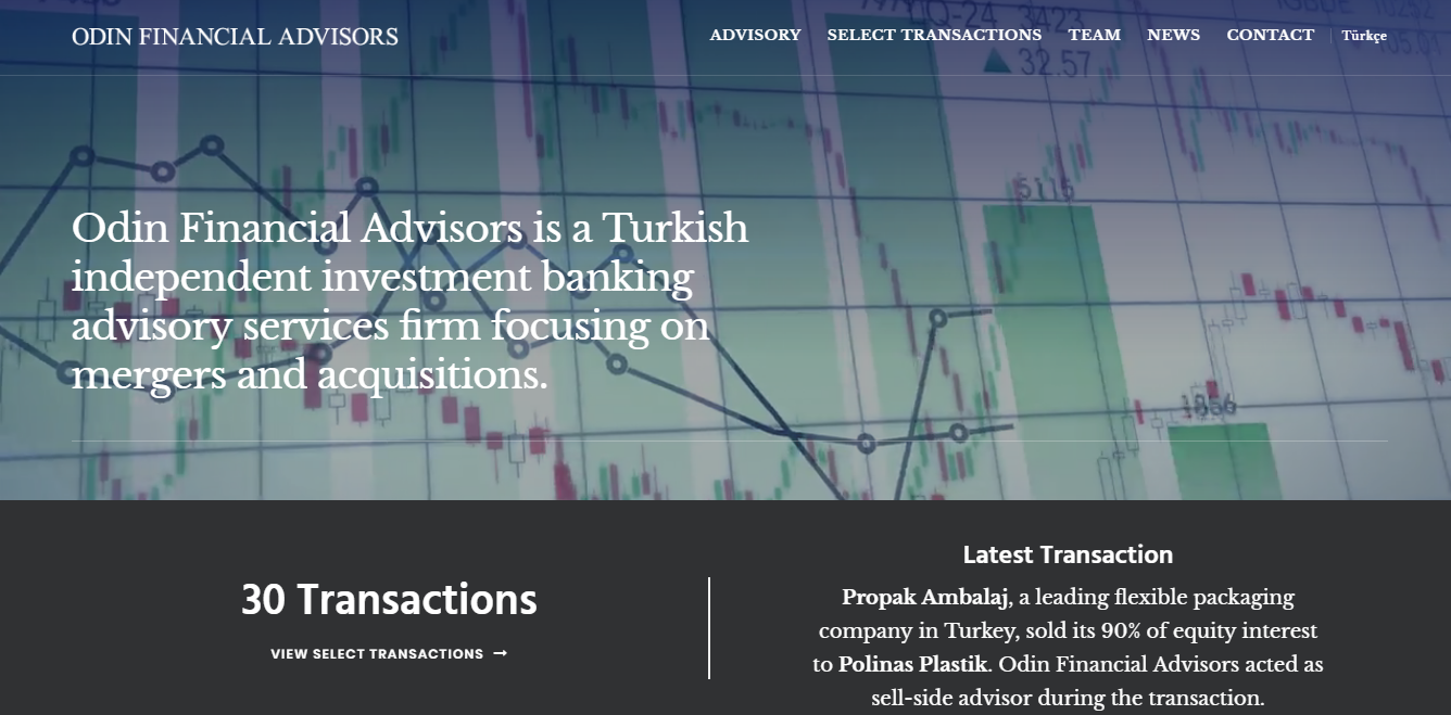
Odin Financial Advisors (http://www.odinfinancial.com/)
Overview
The consulting sector is well developed in the region, especially in Iran, Iraq, and Qatar. Financial advisor websites are well designed and generally have two versions in Arabic (or Persian) and English.
Texts
Middle Eastern financial advisors don’t follow the global trend and present most information in the form of long texts all over the site. They write mostly about the firm, its principles, and benefits.
Website structure
One of the advantages of financial advisor websites in the region is that many of them use an introductory video at the top of the homepage. They have long passages of content describing the company, while services are usually visualized by icons.
The content of the About page is practically the same as on the main page, which seems a bit odd. The Team page often includes pop-ups with a description or link to a separate page for every member.
News and Blog
The best financial advisor websites have a content section with articles or sometimes — screenshots of media publications about them. Though the latter is not a good idea, a separate block for media coverage may be an effective trust factor.
Calls-to-action
CTAs are few and far between. But even the rare ones are generic, often boiling down to boring Сontact Us and Subscribe to the Newsletter.
Contacts
Contact options are quite traditional, including email, phone and fax numbers.
Australia (keep up with the trends)
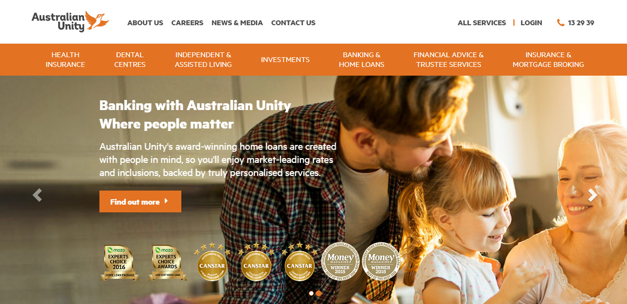
Overview
Australia has a large demand for financial services, according to Google Trends. Financial advisor websites in the region are a good example for firms around the world since they are good quality, user-friendly, and filled with relevant content.
Texts
Australian financial advisors keep their content short and to the point. You will rarely see long-winded passages focused on one subject. All information is well-structured.
Website structure
The Homepage starts either with a static image with a visible CTA or with a slider of several photos and a video. A clear benefit is that information about a company is focused on its principles and work results. Usually, it is accompanied by bullet points, icons, facts and numbers, and doesn’t exceed one paragraph. There’s also a list of services supplemented by icons to show the real benefits of working with the company. Sometimes, services are split into categories according to customer needs (grow your business, protect future, etc.)
Australian financial advisors often have separate Team pages for top management and the rest of employees, describing them in detail. Services pages describe major practice fields (e.g. Insurance, Planning) with relevant services for each one.
News and blog
Aussies pay a good deal of attention to content marketing. Thus, they tend to have separate pages for Blog and News.
A news section highlights their activities and media coverage as well as current insights from the industry.
A blog, on the contrary, is focused on their clients’ success stories and cases.
Calls-to-action
CTAs are very diverse. Australian financial consultants use them both for contact purposes (Call us) and lead generation (Book a free seminar or Subscribe to the newsletter). You can also find an advisor or get a quote for services.
Contacts
The most popular contact options include phone numbers and emails. Physical address, contact and request forms are still rare.
Eastern Europe the (good structure is everything)
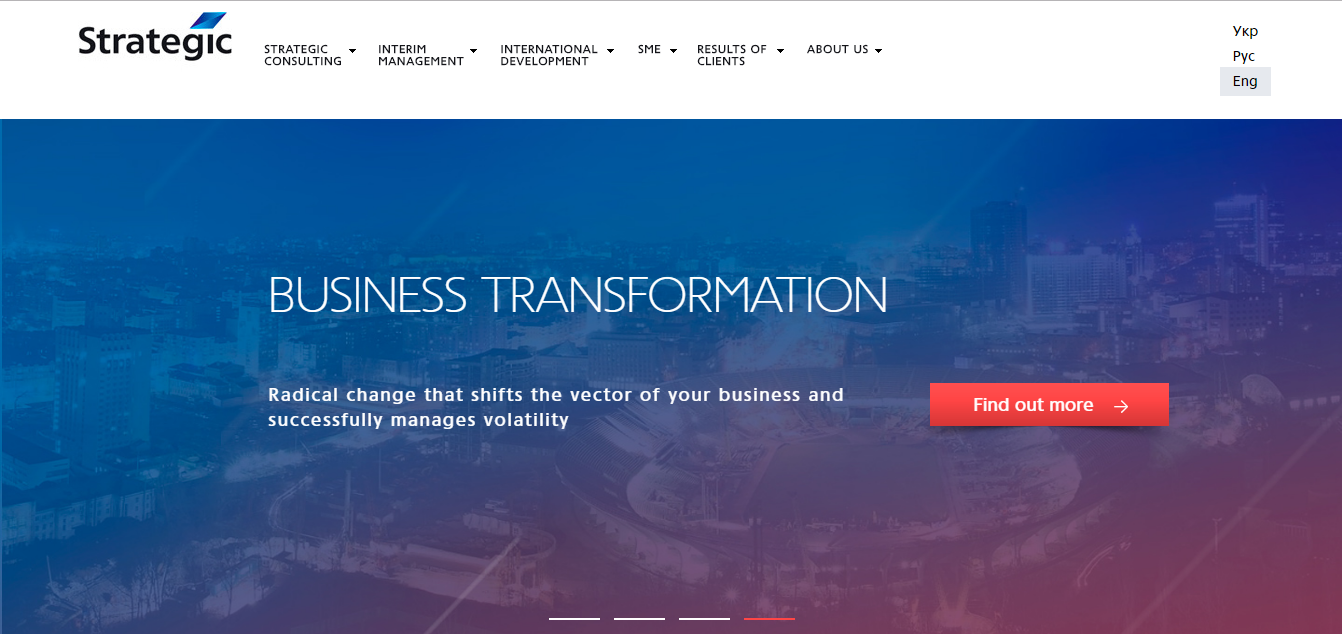
Strategic
Overview
Eastern Europe cannot boast a great selection of solely consulting firms. More often, this is one of the practice areas of multifunctional companies rendering legal and business services. However, there are also small boutique financial advisory firms and branches of international consulting firms, which are pretty well-designed.
Texts
The information is well-structured and concise. The focus is on the company and its services. But the best thing is a plethora of examples, reviews and work results.
Website structure
Homepage begins with a slider of 3-4 photos and a relevant call-to-action. Financial advisor websites in Eastern Europe use a “less text, more visuals” approach, complementing any information with icons and images. News is one of the most noticeable blocks on the homepage, which has both information about the company and industry in general.
Financial websites have pages for any purpose, which makes it easy to find details about any part of their business. The information is pretty concise though.
About Us page usually includes information about the team, mainly the top management. Separate service pages describe every service in detail. Unlike most of the world, Eastern Europeans often have pages filled with reviews and testimonials.
News and blog
Eastern European financial advisors rarely have a blog on the website. However, they often have a news section and feature the newest releases right on the homepage.
Calls-to-action
Apart from conventional Contact Us, websites may have some value-adding CTAs, like Book a free consultation.
Contacts
In addition to basic things like email, fax/phone numbers, and physical address, financial advisors often add forms to request a consultation or callback.
Africa (newbies with a potential)

Overview
We took South Africa as an example as it is the country with the largest demand for financial advisory services. The consulting industry there is swarming with firms, both large and small. Their websites are modern and neatly designed as the financial advisory industry is still on the make in the country and they do everything possible to gain trust.
Texts
The text is mostly concentrated on a company and its services. While some consulting companies still fill their websites with “walls of content”, more progressive ones follow the principle “the shorter, the better.” Yet, icons and illustrations are still hard to find.
Website structure
The top of the Homepage often has a static image or a slider of 2-4 images. Videos are less frequent. Information about a company is quite short. Sometimes, it may include the quotes of the company’s CEO and top management. One of the advantages of financial advisor websites in South Africa is the categorization of services by roles (client/consultant, private person/organization, etc.).
The Team page is usually focused on management rather than staff. Service pages are divided into broad areas of expertise (e.g. Insurance, Planning), where you can find relevant services that fall into the category. The same pages may include some info about funds and stocks.
News and blog
News is a significant page focused on the company’s activity, press coverage and insights from the industry. Blogging is still rare.
Calls-to-action
CTAs range from traditional Contact us to modern ones like Find an advisor or Request a Callback. Financial advisor websites in South Africa also stress the importance of social media, providing social buttons throughout the site and complementing them with a CTA inviting to follow them.
Contacts
Contact options can be split into 2 categories: traditional ones (maps, addresses, phones and emails) and forms (request a consultation, send a message).
What makes financial advisor websites stand out

Now that we’ve analyzed financial websites from all over the world, it’s time to move to the best part – conclusions. Apparently, websites in different regions have both strong and weak points. Follow the best practices from different regions to get an immediate competitive advantage.
Visuals
Recent studies showed that visual information is processed 60,000 times faster than text.
Facts don’t lie. Yet, it doesn’t mean that you need to fill your site with generic stock images unless you want your website to look like another financial advisor.
Hire a professional photographer instead. This will add your website a few points for originality.
An introductory video is also a good idea. Just make sure it doesn’t distract visitors from your main message.
Texts
Look up to Australian financial advisors – they have mastered it. Keeping a text short and relevant will help you guide the visitors through the website naturally. Supplementing them with icons and images will also contribute to the overall usability.
When you consider adding an extra block of text, remember that one unit of text should equal one unit of information. If it doesn’t add anything important, ditch it.
Trust factors
Stats show that 88 percent of customers trust online reviews and testimonials as much as personal recommendations.
However, this is the pain in the neck of most financial advisors around the world. They either don’t mention trust factors (awards, testimonials, partnerships, etc.) or hide them on one of the inner pages. Only robo-advisor websites have enough trust factors on their websites.
Financial consulting is the type of business where prospects may spend ages deciding what company to turn to. If you don’t have any proof of your credibility, chances are they will choose your competitor. So make sure you have a couple of trust factors right on the homepage.
Service pages
Follow the example of African financial advisors and split the services into categories for different buyer personas. This will help visitors quickly find the information they have been looking for.
Team pages
Way too often, financial advisor websites emphasize top management, forgetting about the staff. A better idea is to list the qualifications of all your employees or at least experts working with the clients.
This will both make your website more human and emphasize the professionalism of the entire team.
News and blog
By publishing news and blog posts just 1-2 times per month, you can get 70 percent more leads than companies without a blog. (MarketingProfs)
Australian financial advisor websites again take the lead here.
Use a blog to educate your visitors and share successful cases. A news section will also add to your credibility if you share insights from the consulting industry and recent publications in media.
Calls-to-action
Apart from contact purposes, calls-to-action can be used to give your visitors extra value. The Find an advisor option can help you navigate your visitors right to the specialist that can best meet their needs.
Also, use CTAs for lead generation. Offer a free seminar or ebook on personal finance in exchange for their contact information. Add a newsletter subscription that will keep your leads in the loop on all relevant news. This will also help you nurture your leads and set the precedent for more trusting conversations with clients.
Social media
30 percent of affluent people say they are more likely to turn to a financial advisor who is present on social media. (The Fidelity)
Add a couple of buttons leading to your social networks to keep in touch with your audience, share recent news and updates, as well as get unbiased feedback.
Contacts
Don’t stick to the conventional contact options. Get creative.
A map, for instance, will help visitors find your office easily in case they decide to meet you in person. This is a matter of convenience, as hardly anyone would like to travel hundreds of miles to meet you (unless you are the most reputable firm in the country, of course).
Also, add a possibility to contact you in Messengers – this is a very handy option for busy customers unable to spare their time on a phone talk. And, overall, this is the best way to show that you keep up with the times.
Special features
Think outside the box to attract the attention of your target audience. Here are a couple of unconventional ideas from around the world:
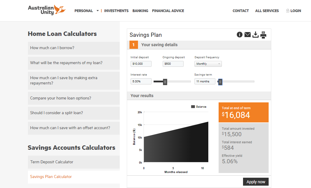
- Savings calculator. A handy built-in app that allows making rough budget estimations and plans. This rare yet handy feature is found on some Asian and Australian websites.
- FAQ. Adding a block with answers to the most popular questions you get from your customers can both act as a trust factor and relieve your employees from answering the same questions.
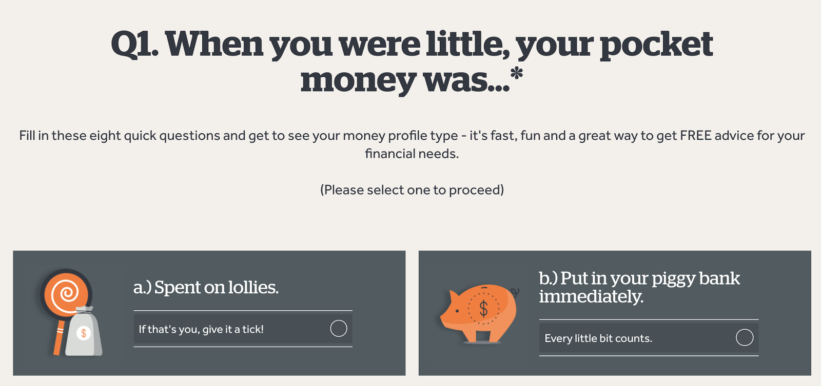
- Quiz. Found on one Australian website, this is one of the best tools to engage your audience. It adds a bit of gamification to the serious process of choosing an advisor and shows that you’re more than an organization.
Need an effective financial advisor website? Order it on Weblium now and get a complete site in 5 days.


![What Makes the Best Law Firm Websites in the World [Niche Research]](https://weblium.com/blog/wp-content/uploads/2017/08/04.jpg)
![How to Create a Website Step by Step [Guide]](https://weblium.com/blog/wp-content/uploads/2018/02/How-to-Create-a-Website-Step-by-Step-Guide.jpg)
Hi buddy! awesome sharing with full of information. I was searching for your complete guidance gave me a wonderful end up. Great going.
I haven’t tested the customer service yet but am glad that so many people have great things to say about it!