10 Best Bakery Websites to Find Inspiration
Running a business online is much more convenient for me when there’s a fully functional website behind it. At first glance, it may seem easy to create a site and start selling products or services. But when it comes to bakery websites, I’ve realized that things are a bit more complex.
A bakery website needs to show an online menu, highlight special offers and discounts, and make the ordering process as smooth and appetizing as possible. That’s why finding the right template—or at least strong inspiration—is crucial if you want your bakery website to succeed.
In this article, I want to share a selection of bakery websites that caught my attention and inspired me. They helped me spot great ideas and smart solutions that can easily be adapted for your own website.
This is not a ranking or a top list. It’s simply a collection of bakery websites that are truly worth exploring. I recommend browsing through them, noticing the details, and picking ideas that can help improve your own website concept.
Contents
Little Tart
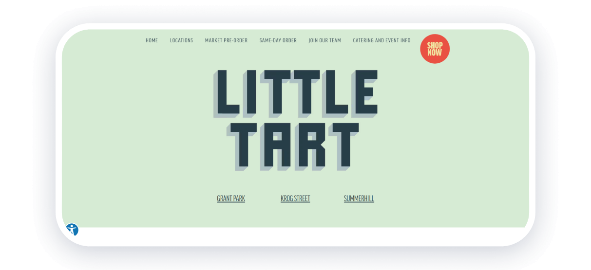
Little Tart is an American bakery website that immediately impressed me with its minimalistic, monochrome design. It creates a warm and cozy feeling and subtly encourages visitors to imagine themselves inside the bakery—and, eventually, to place an order.
On the homepage, I can easily find locations, links to merchandise, and all the essential information. At the same time, the site tells the bakery’s story and features plenty of food photos along with images of the team. This personal touch makes the brand feel friendly and trustworthy.
Strong points: convenient user journey, cozy minimalistic design, lots of photos of employees and baked goods.
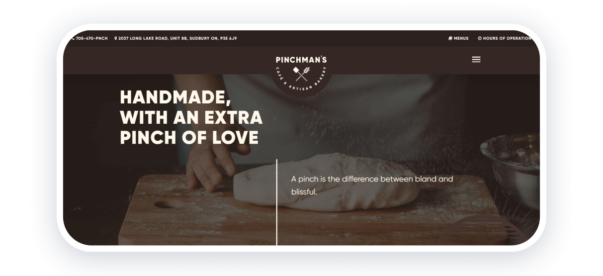
Pinchman’s is a local Canadian bakery, and what I really like about this website is how clearly it communicates its core message. From the very first screen, it feels like a family-friendly place where you can enjoy delicious pastries.
The homepage cover shows the dough-making process and highlights that every product is made with love. I also appreciate that working hours, ordering details, and product photos are visible right away—no extra clicks needed. For me, this is a perfect example of a truly user-friendly bakery website.
Strong points: fully visible key information, soft pastel colors, intuitive navigation.
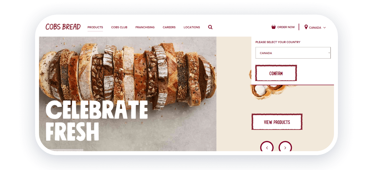
COBS Bread is a bakery chain with locations in Canada and the USA, yet the website still feels warm and local. I love how the design combines welcoming colors with expressive fonts, making the site easy and pleasant to explore.
While scrolling the homepage, a pop-up appears inviting me to learn more about their services. I find this a smart solution—it gently guides customers toward placing their first order without feeling pushy.
Strong points: simple interface, clear navigation, calm color palette, easy-to-understand messaging.
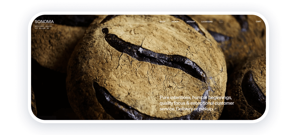
Sonoma Bakery is an Australian franchise, and the first thing that caught my eye was the mouth-watering image of freshly baked bread on the homepage. The product photos have a clever interactive feature: when I hover over an image, the cursor turns into the product name and price.
All the key information—about the bakery, the baking process, and the founders—is easy to find. I really like how transparent and open the brand feels. For inspiration, this is definitely one of the strongest bakery websites I’ve seen.
Strong points: lots of appetizing photos, detailed information about the bakery, smooth user flow.
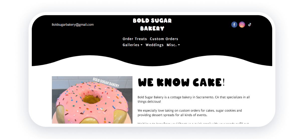
Bold Sugar Bakery is a great example of a bakery website built with Weblium, and I genuinely enjoy how well it’s thought out. The site showcases a wide variety of bakery products—from large celebration cakes to small, personalized cookies—which immediately tells customers what’s possible to order.
What stands out to me most is the personal approach. The founder’s story is right there on the homepage, helping customers connect with the person behind the brand. This kind of transparency builds trust and makes the business feel more human.
If you’re aiming to create a bakery website suitable for e-commerce, choosing the right template is essential. A good bakery template allows you to bring all your ideas together and build an inspiring, functional website. And if you plan to expand your product range or shift your focus slightly, a flexible bakery template will help you adapt and grow without rebuilding everything from scratch.
Strong points: photos of personalized products, clear user path, founder information, and customer reviews.
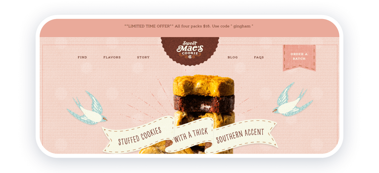
What I really love about Sweet Mae’s Cookie Company is how clearly the website communicates the core idea of the brand from the very first second. For me, this bakery feels like a loving grandma who wants to share homemade cookies with her grandchildren. That emotional message is instantly recognizable—and it works beautifully.
The design solutions here are just as impressive. On the first screen, I’m greeted by a mouth-watering pile of cookies that sets the expectations right away. As I scroll down, I see hand-drawn illustrations that reinforce the family-oriented concept and create a warm, nostalgic feeling. This kind of atmosphere really makes you want to try the cookies.
The navigation bar is simple and convenient, so I can easily reach any page without unnecessary steps. In its niche, this is one of the strongest bakery websites I’ve seen, and it definitely offers plenty of ideas worth borrowing.
Strong points: interesting design solutions, clear brand idea, convenient navigation bar, high-quality product photos.
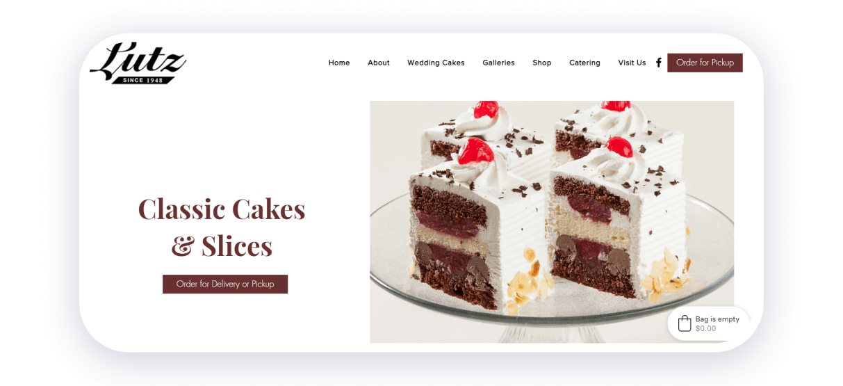
Lutz immediately stands out because of its authentic approach and clear presentation of how the bakery works. When I land on the homepage, I instantly see that this pastry business has been around since 1948—and that alone builds trust.
The background of the first screen is a video showing the baking process, ingredients, and finished pastries, which feels both honest and appetizing. I also like the floating header: it lets me scroll freely through the page while still having the option to place an order at any moment.
There’s also a pastry gallery that showcases the full product range and gives even more inspiration. If you work with restaurant or bakery templates, you can easily expand on ideas like these and adapt them to your own website.
Strong points: detailed service information, strong focus on key advantages, inspiring and appetizing pastry visuals.
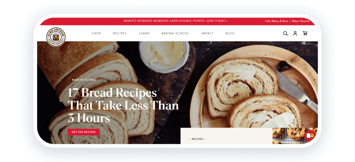
For me, King Arthur Baking is much more than a standard bakery website. It’s also an educational platform where visitors can learn how to bake, explore recipes, and improve their skills. I really like how the company uses its website to promote all of its services equally and thoughtfully.
Everything on the site is clearly categorized, which makes it easy to navigate whether you’re a beginner or a professional baker. This structure helps users quickly find exactly what they’re looking for.
Another detail I appreciate is that the website doesn’t just show finished products—it also highlights tools and ingredients you can buy to bake at home. This approach makes the website both useful and inspiring.
Strong points: detailed service descriptions, convenient category structure, memorable and clean design.
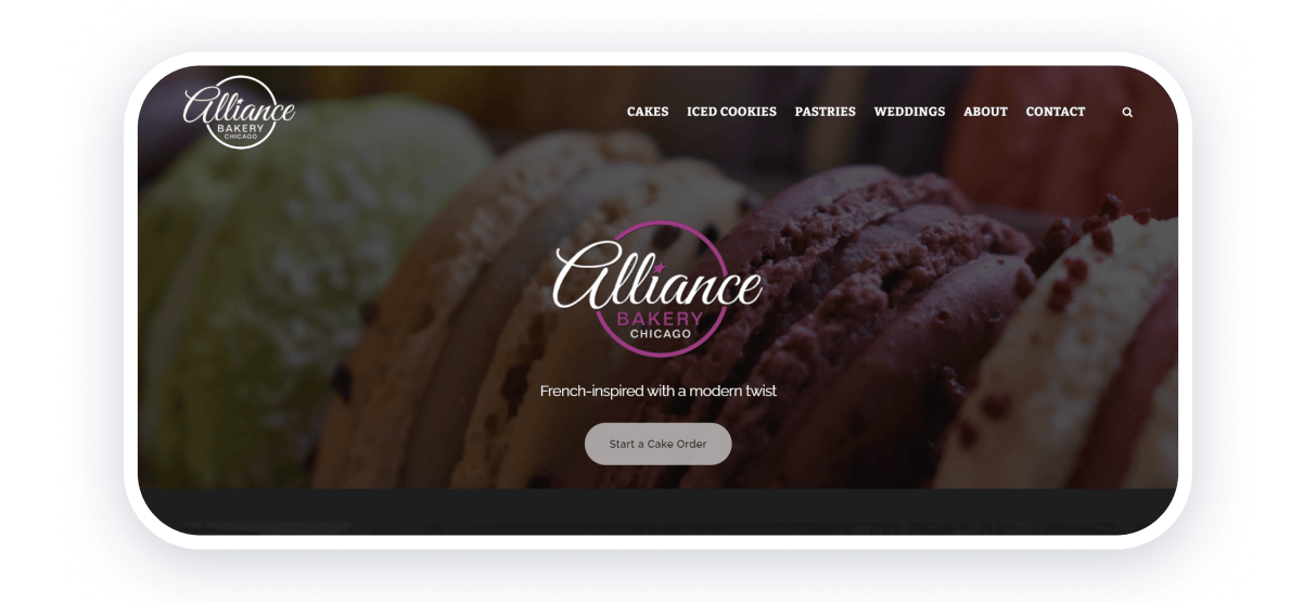
Alliance Bakery is a great example of a simple yet highly effective bakery website. Right under the navigation bar, I’m greeted by a photo of macarons—a dessert that’s notoriously difficult to make. This immediately signals the bakery’s professionalism and skill level.
As I continue exploring, I can easily find information about the bakery, its location, and operating hours. There’s also a link to Instagram, which allows me to see even more product photos, including custom cakes and cookies.
I really like how minimalistic the design is. It allows users to reach their goals—viewing products or finding contact details—in just a few clicks.
Strong points: smart focus on key menu items, intuitive navigation bar, minimalistic design that improves usability.
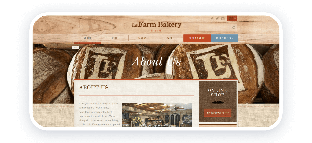
LaFarm Bakery combines thoughtful design choices to create a strong and recognizable bakery image. On one hand, I notice interface elements inspired by wood and fabric textures, which add warmth and authenticity. On the other hand, there are high-quality videos and product photos that showcase the bakery as a local, craft-focused business.
What stands out most to me is the emphasis on the chef. The website includes images and information about the person behind the baking, which builds trust and adds personality. It also brings a subtle French aesthetic that elevates the overall impression of this American bakery.
Strong points: rustic and minimalistic design, detailed information about the bakery and its chef, strong brand atmosphere.
How to Make a Bakery Website
Creating a bakery website doesn’t have to be complicated. With the right plan and tools, it’s possible to launch a professional and attractive site quickly. Here’s a step-by-step guide:
Step 1. Choose a platform and template
Start by selecting a website builder like Weblium. Look for templates specifically designed for bakeries or restaurants, as they already include key sections like menus, product galleries, and ordering buttons.
Step 2. Customize the design
Adjust the template to match your bakery’s style and branding. Add high-quality photos of pastries, cakes, and other products, along with images of the bakery or team to create a welcoming atmosphere. Choose colors, fonts, and layout elements that reflect the bakery’s personality.
Step 3. Organize the menu and products
Create a clear and easy-to-navigate menu. Include separate sections for different types of products, descriptions, and prices. Interactive elements, like hover effects or clickable images, can make browsing more engaging for visitors.
Step 4. Add ordering and contact options
Include buttons for online orders, delivery requests, or custom orders. A clear contact form or chat option helps customers get in touch without hassle.
Step 5. Highlight promotions and new items
Showcase seasonal treats, discounts, or new products directly on the homepage. This helps attract attention and encourages visitors to explore the menu.
Step 6. Make it mobile-friendly
Ensure the website looks and works perfectly on mobile devices and tablets. A responsive design guarantees a smooth experience for all users.
Step 7. Test and launch
Preview the website to check navigation, content, and functionality. Make adjustments where needed, then publish the website and share it through social media or other marketing channels.
Step 8. Update regularly
Keep the site fresh by adding new products, seasonal decorations, and customer reviews. An updated website maintains interest and encourages repeat visits.
Create Your Bakery Website With Weblium
After exploring all these inspiring bakery websites and functional ideas, I truly believe it’s the perfect moment to start creating your own bakery website. By using professional bakery and restaurant templates, you can easily organize all essential elements—menus, photos, ordering options, and contact details.
Who knows? One day, your bakery website might become an inspiration for thousands of other business owners who are just starting their online journey.

