6 Differences Between Good and Bad Web Design
How about creating your own website? Nowadays, this task is a no-brainer even for amateurs. But having a website is not enough. It should represent all of the company’s strong sides and be appealing for potential clients. This is when web design comes into play.
While design trends are changing regularly, users become more and more demanding to what they see. How to make everything right? Follow us and you won’t get lost.
Below, we’ve gathered examples of bad design and added successful cases for the contrast. You’ll easily notice the difference and will get a set of ready-made (and attractive) templates to get started.
Contents
4 reasons why good design means the world to your business
Nothing speaks louder than numbers. Here’s some convincing statistics explaining why businesses are ready to invest in a high-quality UX/UI design.
- The first impression matters. In 94% of cases, users’ first impressions are connected with website design.
- Return of users. After a single bad experience, a user is 88% less likely to return to that website.
- Loss of income. Retailers lose up to $2 billion dollars a year due to slow-loading websites.
- Experience sharing. 61% of users say they share bad experience with others, while 70% would share their positive experience. As you know, word of mouth is one of the strongest marketing instruments.
Website design may seem like a subjective matter, but there are some objective design principles influencing users’ opinions and, therefore, conversions.
The Difference Between Good and Bad Web Design
It takes about 50 milliseconds for a user to make a judgment about a website, and visual design affects the first impression.
To figure out, if it’s a good design, ask yourself:
- Is the website visually appealing?
- Does it go hand-in-hand with a company style?
- Isn’t it distracting?
Let’s move on to our list of bad websites and go through some basic rules to avoid web design mistakes.
1. Distractions
Do you remember the times when every website had flashy images, animations, and crazy color palettes? Now, we consider them a thing of the past, but these distracting effects can bother us from time to time.
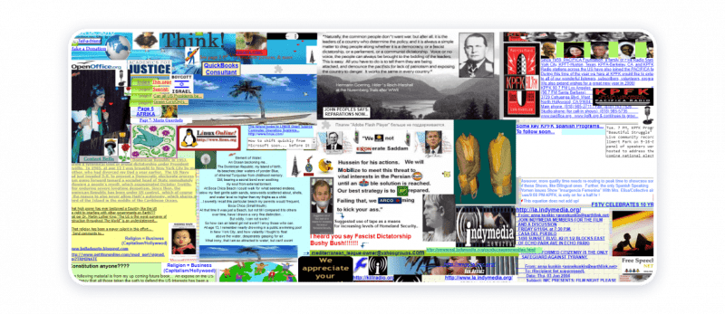
If you follow the link under the picture, you’ll notice loads of GIFs and an inconsistent color palette right on the website’s main page.
These elements make users run away from a website immediately:
- Background music;
- Overused Flash;
- Too bright colors;
- Distracting gifs;
- Annoying animations.
The Husky Kennel website template made by Weblium is bright, has some bright color inclusions, and minimalistic hover animations on the CTA buttons.
- The colors and photos broadcast the company’s style and are targeted at dog lover;
- There’s enough white space, the text is easy to read and is distributed logically;
- The sections are well-divided by design elements and pictures.
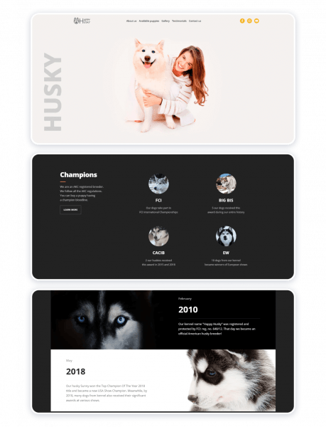
View this template in full or start editing right now.
2. Animations
If you don’t feel the need to use animations on your website, it’s better to completely avoid it.
Below, you’ll see a website with the background full of animations. It seems that the background is more important than the site’s content – it grabs all of your attention.
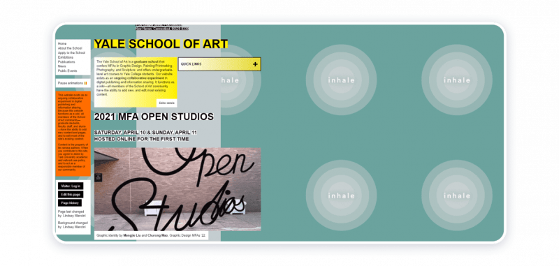
If you choose to use animation, make sure there is one bolding element on the page. You can apply animations to explain who you are in a detailed manner.
For the 3Dev website, Weblium has chosen faded images and bright animated text sharing everything you need to know about the company right away.

3. Typography and Text
Bad typography kills great content. These typography design mistakes create an impression of a sloppy website:
- Too big or too small font sizes;
- Never-ending paragraphs;
- Non-matching typefaces;
- Silly fonts like Comic Sans.
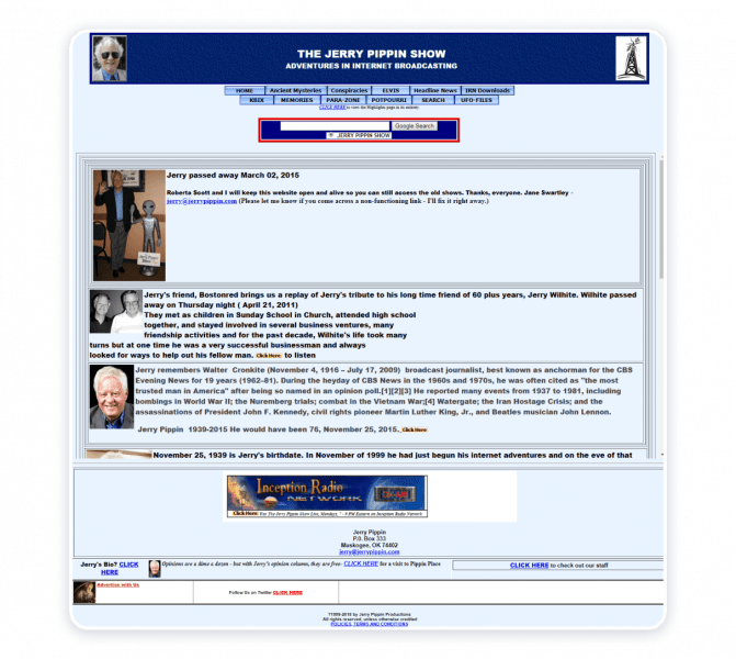
This website can boast almost every typography mistake there is.
Here’s what you should do instead.
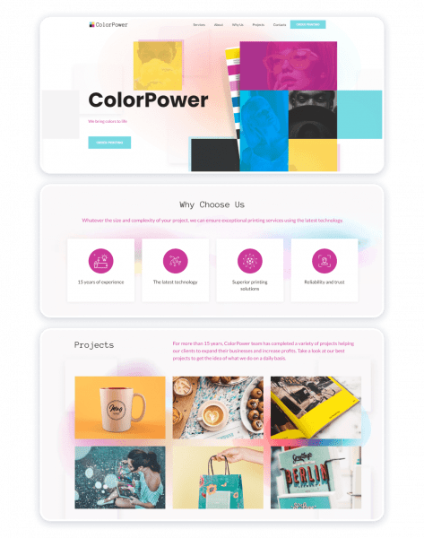
This printing services website template also consists of a big amount of pictures and text. But here’s how it’s different from the bad example:
- White space allows you to read without stressing out your eyes;
- Big chunks of text are divided into small paragraphs which makes them easy to understand;
- The “About” section is divided into several blocks of text, so it’s easier to read the page till the very end;
- The advantages listed in the “Why Us” section are presented with icons in separate blocks;
- The services are described with a couple of lines and the “Learn More” link below. It allows avoiding long descriptions under every image.
View this template in full or start editing right now.
4. Images and Illustrations
Images matter, as they can create a long-lasting impression, demonstrate products from a better angle and motivate consumers to build relationships with a brand.
Design mistakes related to images:
- Fake stock images;
- Low-resolution photos;
- Pictures not fitting the website parameters;
- Images not related to the text.
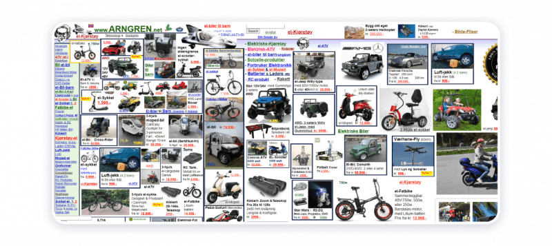
A bunch of low-quality images makes this website a wrong place to find something specific.
How to handle images?
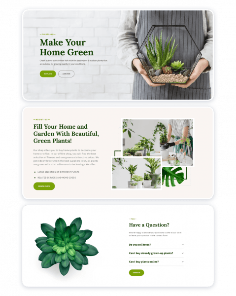
The plants shop template has lots of bright images that beautifully illustrate the main product. Even if you don’t read the text, you still understand what the company offers, and that’s a result of good design.
5. Consistency
Inconsistency is what makes a bad website.
Go through this short checklist to avoid this design mistake:
- All colors match each other and are taken from your brand book;
- All elements deliver a consistent message;
- You can form an opinion about the company by looking at the main page only.
Surprisingly, the “Hunger Games” book author had a very inconsistent website with elements scattered all over the place.
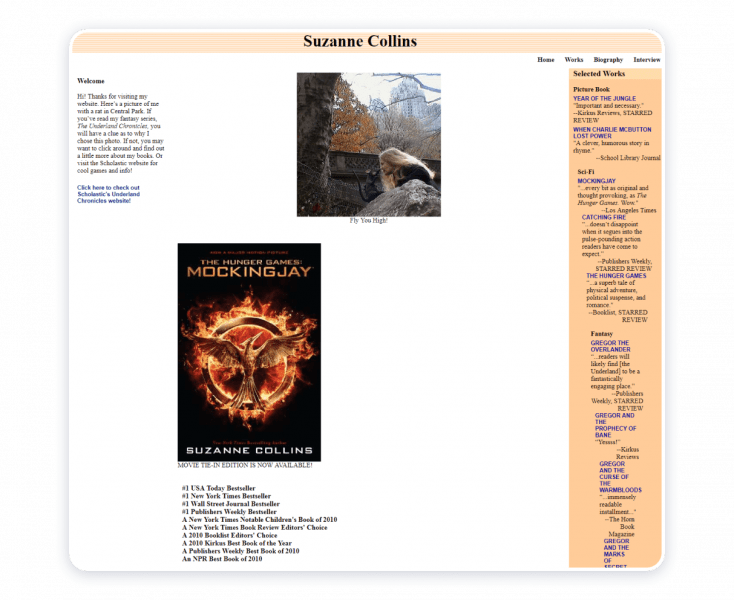
Sending a consistent message is key.
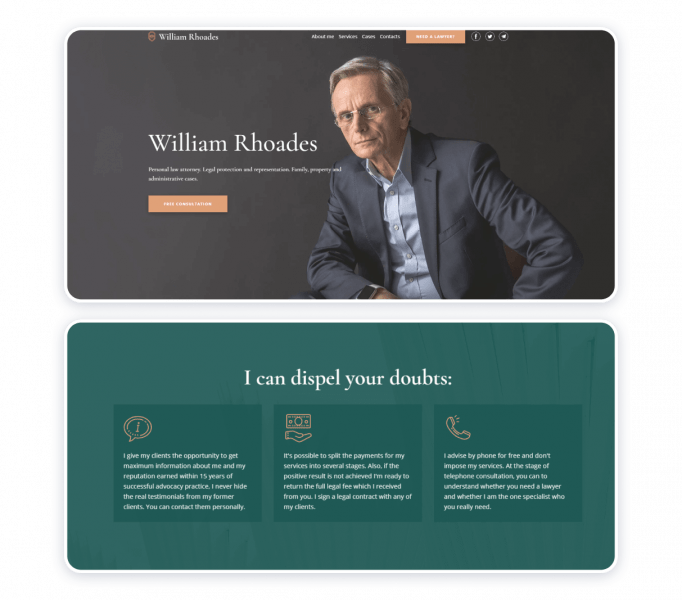
On the lawyer’s personal website template, there are no photos representing the expert’s work. We added a couple of portrait photos to add personality to the service. The results include:
- Every sentence leads to the main idea and explains what services they offer;
- Several calls-to-actions in different areas lead to the same action: request a free consultation.
6. Website Usability
To achieve a well-designed interface created with a user in mind, consider these points:
- Information hierarchy;
- Mobile-friendly design;
- Clear navigation and structure;
- Easy-to-read copywriting.
Budgets are Sexy is one more example of bad website design: it’s difficult to understand where to click and what to expect.
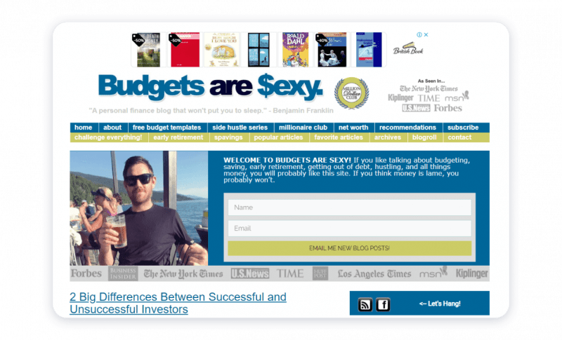
Usability first
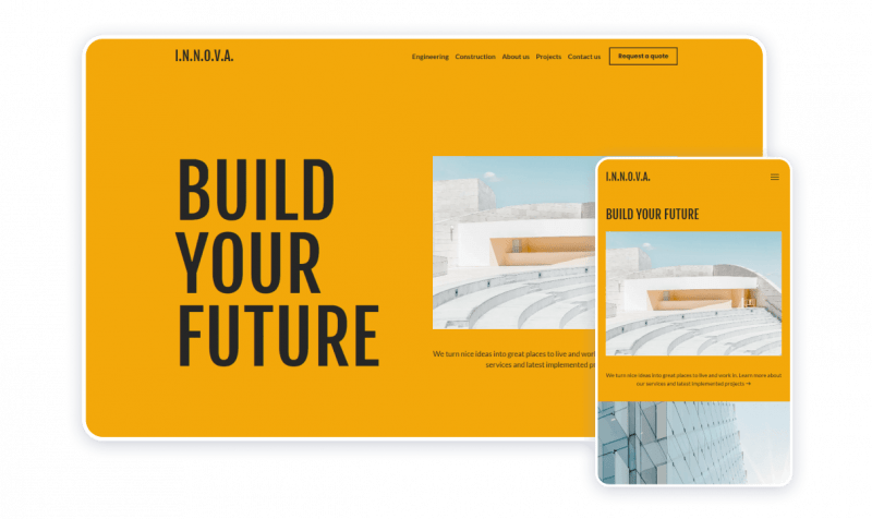
It is a construction company website template that combines vital UX design principles:
- Elements and photos match;
- Texts are easy to understand;
- Important information is illustrated;
- It’s responsive;
- Call-to-action buttons are distinctive;
- The navigation is clear.
Summary
Let’s sum it up. The core difference between good and bad websites lays in visual appeal, consistency and ability to help companies achieve business goals.
Visual appeal
A good website has a clear structure, easy-to-use navigation, and non-distracting design, while a bad website makes you feel confused or even annoyed.
Consistency
A good website matches a company’s philosophy and tone of voice and sends only one message with each element. On the contrary, bad websites give a mixed impression and look like they’ve been put together out of a few different sources.
Ability to help you achieve business goals
A good website brings leads, builds company image, raises search engine ratings, and helps companies achieve other targets. Conversely, bad websites just exist out there and don’t bring any good to the business.
How and where to create a good website?
Reaching out to the Weblium “do-it-yourself” builder, you always get a high-quality website. Our professional team has already created more than 280 ready-made templates, and our experience expands, as this number grows.
With Weblium you get:
- A quality website at the 1/10 of the average market price;
- Website creation in a matter of days;
- The ready-made website with an intuitive control panel which lets you make any changes fast and easily;
- Technical support from real experts ready to answer your questions and guide you through Weblium interface and services 24/7.


