21 Examples of Minimalist Website Design
Minimalism is an ideology and art movement that spread in the 1960s and 1970s. It has gained popularity in various fields: painting, architecture, fashion, and design. The idea of minimalism is simply described as
“Less is more.”
Adherents of the minimalist concept tend to simplify to the essence, rejecting unnecessary elements that distract attention. As a result, a person can focus on what is truly important.
Contents
Key aspects of minimalism in web design
The minimalist approach to web design has also become widespread. Minimalism is the opposite of chasing trends that change every year or even every season.
An overabundance of complex elements distracts from the essence and goals of the site and slows down the loading time. Instead, minimalist website design lets you focus on the product or service.
Simplicity and functionality are the main characteristics of minimalist websites. More specifically, the typical features of minimalism include:
- Negative space or empty space that surrounds elements on a page. The free space allows you to emphasize key elements.
- Color scheme. Aesthetic minimalist web design is based, in particular, on the theory of color. Harmony and consistency in colors and their combination with other elements determine a successful design. Minimalist websites are usually associated with black and white colors. However, any color palette is appropriate, muted tones dominate.
- Visual hierarchy is the content organization on a web page, highlighting certain essential interface elements and harmonizing them with others. In a minimalist website, visual hierarchy contributes to a positive user experience and helps to keep the site visitor’s attention.
- Typography: fonts gain more importance in the absence of excessive elements. Eye-catching font combinations make a website more aesthetically pleasing and give it a unique form and structure.
- High-quality images and videos. Since minimalism has no redundant components, images and videos occupy much space. Their quality and relevance to the brand’s messages shape the impression of the site.
Minimalist websites are broader than the characteristics described above. Let’s explore a selection of minimalist websites that might inspire your design.
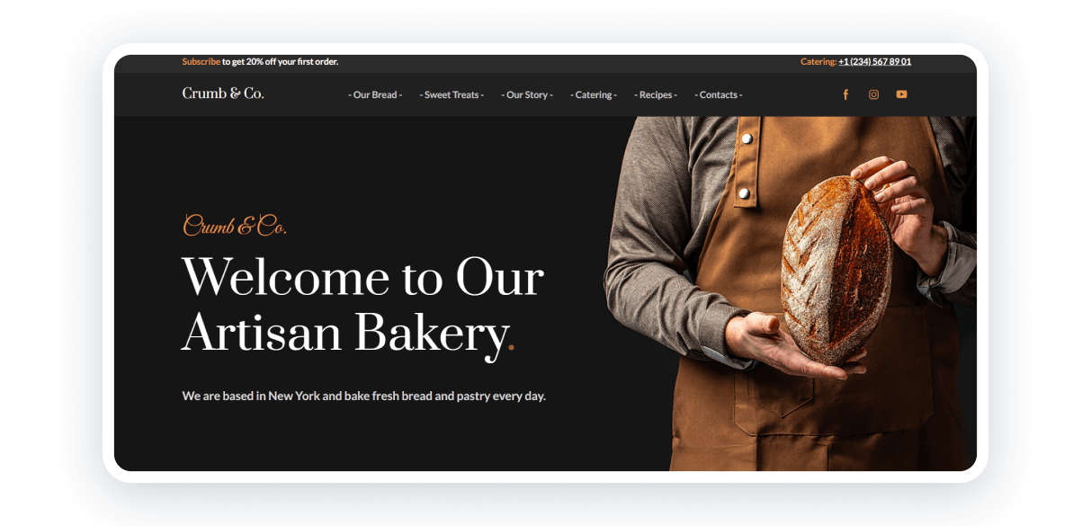
The bakery website template by Weblium exemplifies minimalistic design with its clean and straightforward layout. It features high-quality images of baked goods set against a neutral background, enhancing visual appeal. The navigation is intuitive, guiding users effortlessly to sections like menu, about, and contact. The use of a limited color palette ensures a focused and pleasant browsing experience, making it an ideal choice for those seeking a sleek and functional bakery website.
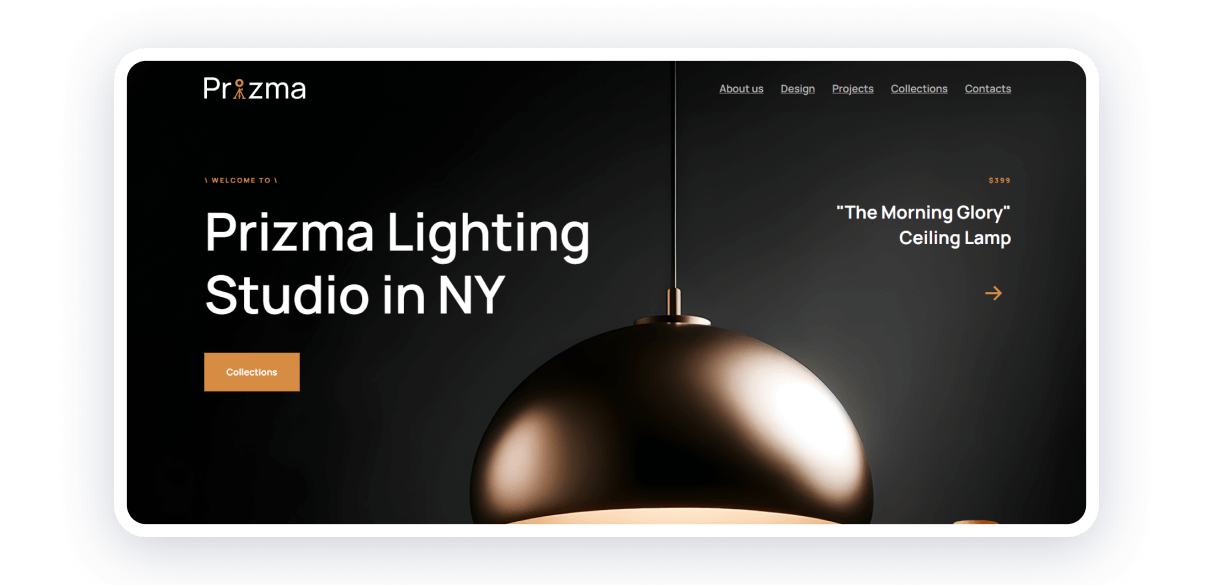
The lighting design studio website template by Weblium showcases a minimalist aesthetic with a sleek, clean design. The homepage features high-quality images of lighting designs set against a neutral background, creating a visually appealing and professional look. The intuitive navigation guides users to key sections such as projects, collections, and contact with ease. A limited color palette enhance readability and focus, ensuring a streamlined and enjoyable browsing experience. This template is ideal for showcasing sophisticated lighting design projects with elegance and simplicity.
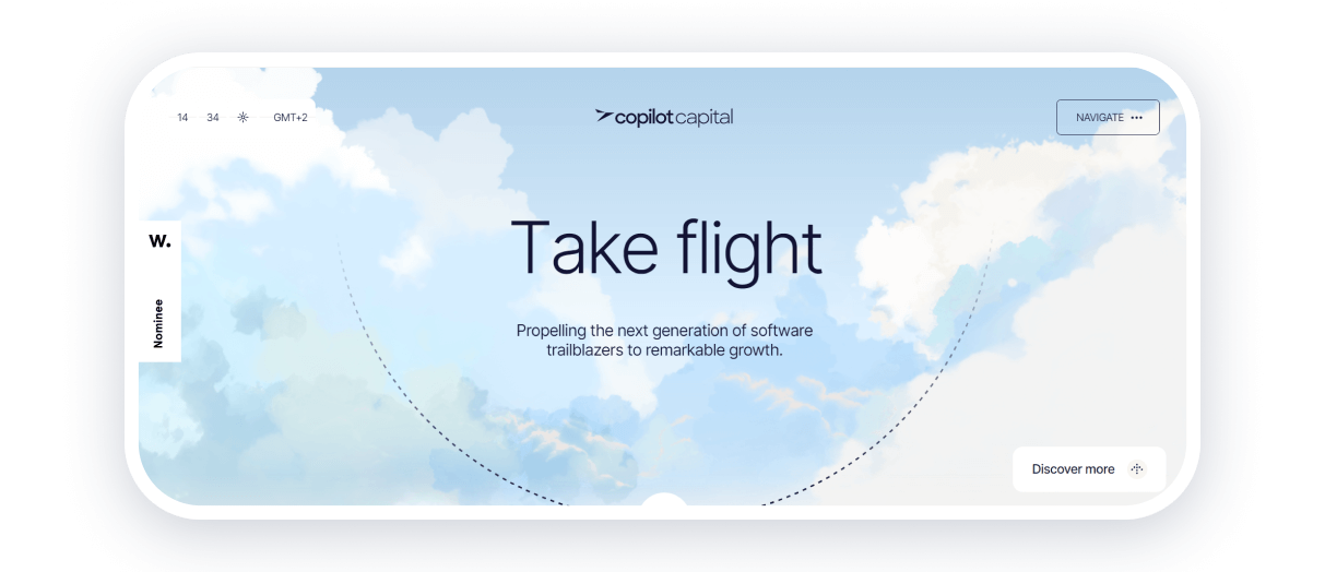
Copilot Capital is an investment company that supports software development teams in Europe. They call themselves not just investors but copilots.
This concept is very well represented on the website: elements in the form of airplane radars, airline tickets, and a navigation bar. The content complements the atmosphere, including the phrases “Why Fly With Us,” “Inflight entertainment,” etc.
Pastel colors with shades of beige and blue dominate the website. Dynamic moving arrows bring the visitor closer to the aviation theme and perfectly illustrate the movement and development offered by the company.

United Digital Technologies is a company that creates digital products: it develops custom solutions, performs security audits, expands teams, and conducts architecture assessment and modernization, UI/UX design, and QA.
The site offers a simple interface and navigation, smooth animation as elements appear, and a geometric font emphasizing the company’s technological field.
This site was created on the Weblium website builder. The platform offers templates for businesses, online stores, landing pages, etc. If you want to go beyond the templates, try the Flex block, where you can freely arrange elements. The intuitive interface and AI integrations allow you to create a website in a few hours.
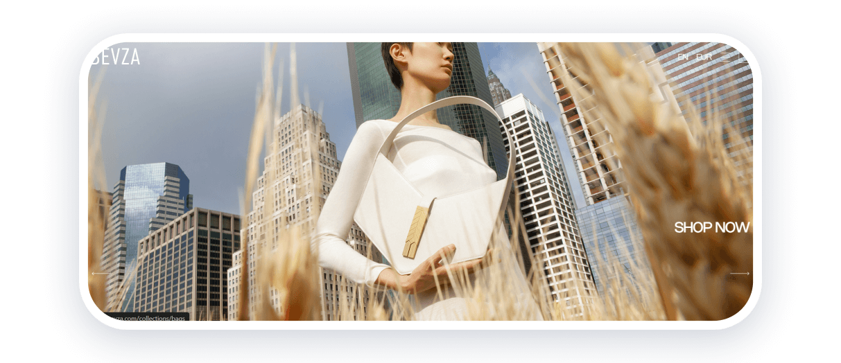
BEVZA is a Ukrainian women’s clothing brand. The central concept of the brand is sophisticated minimalism, clear silhouettes, and sensuality. These characteristics are reflected in the website design.
The home page features high-quality photos and videos of the latest collection with CTAs. Grotesque font, easy navigation through categories and collections, and information about the brand — the site is truly concise and contains only the essential details.
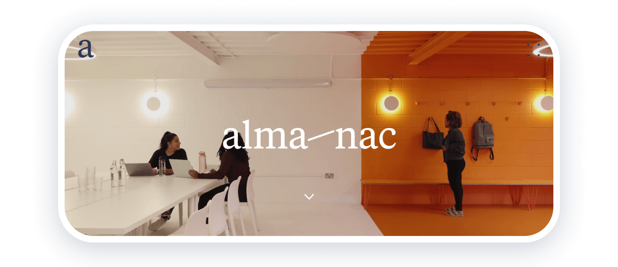
alma-nac is a London-based architecture company specializing in residential, commercial, cultural, and art projects. It has gained a reputation for its creative yet pragmatic approach.
The company’s website is a shining example of minimalism in design that doesn’t have to be monochromatic. The home page is dynamic and captures attention with video and animation. A yellow background and a smoothly moving black circle cursor convey a playful mood, one of the team’s stated values. Other pages contain information about the team, projects, and contact details.
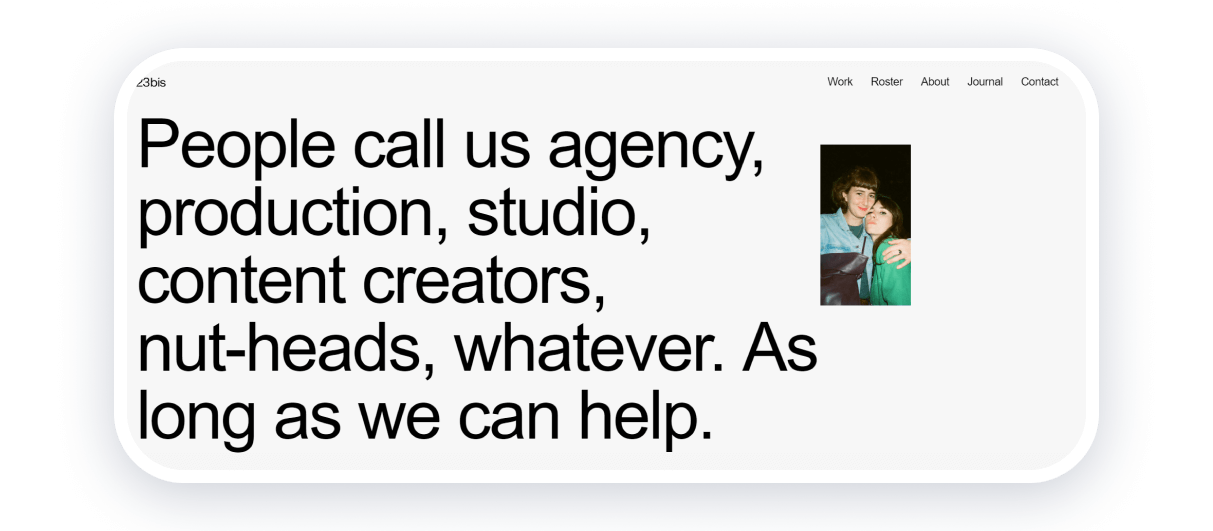
23bis is a creative agency from Switzerland. The first thing you notice when you open the site is the original solution: as you move the cursor over the first block, the team’s photos appear. The next block shows the agency’s animated portfolio and its services.
The light background is diluted with accent colors. Simple grotesque fonts and animations keep the visitor’s attention.
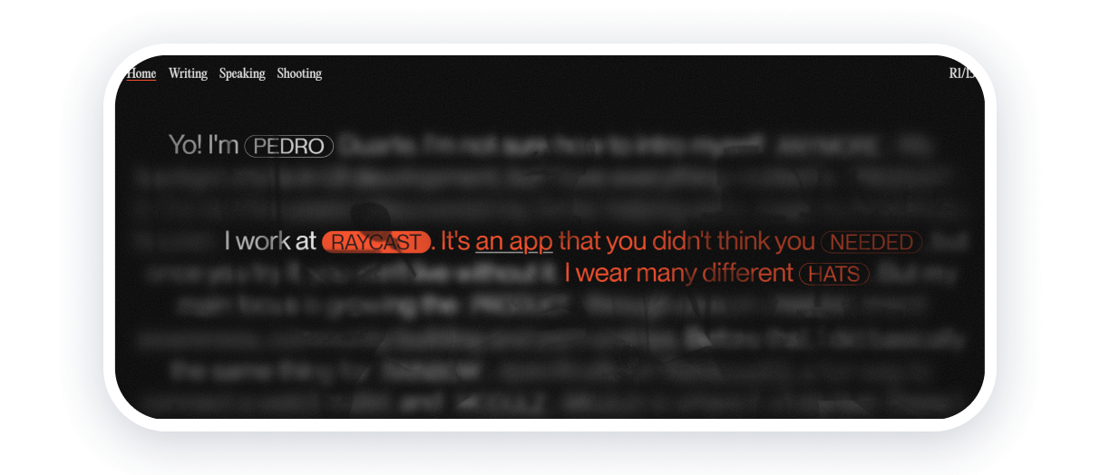
Pedro Duarte is a UI developer from Barcelona. His personal website is an excellent example of minimalist web design. The main page has several layers: a video with Pedro, blurry text, and a few clear sentences with info about him. When you click on keywords, the rest of the sentence appears in orange. The site has several more pages with writings, speeches/podcasts, and photos that Pedro took.
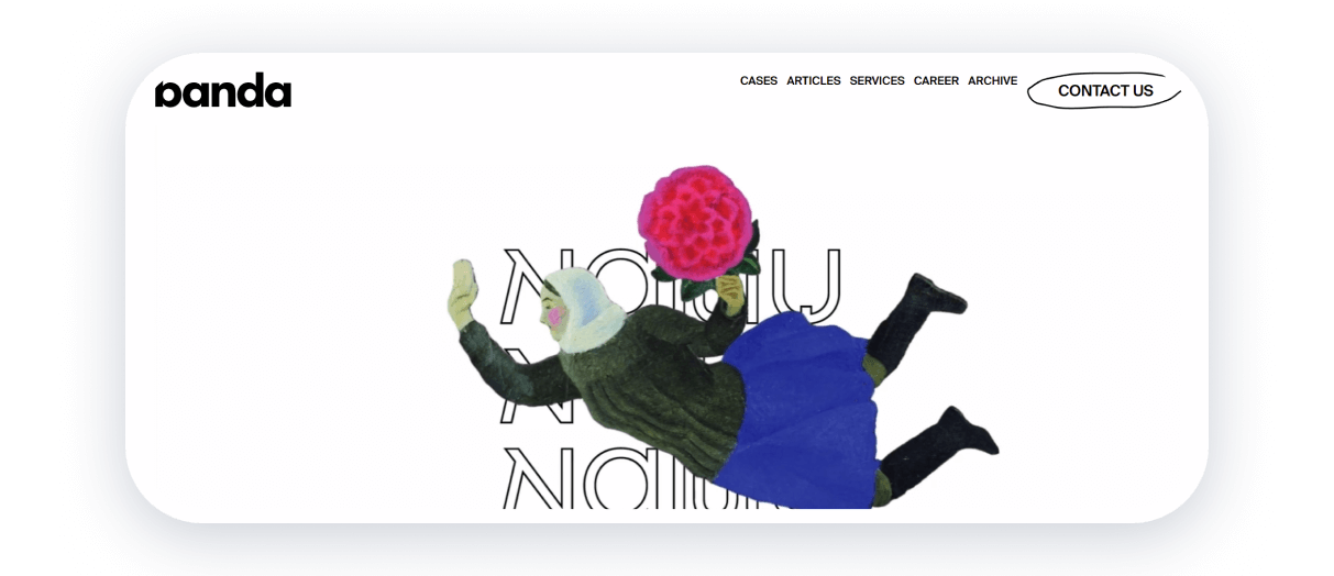
Banda Agency is a Ukrainian creative agency that develops bold advertising campaigns and branding. The page starts with a dynamic video that presents the agency’s projects. Below, the cases and services are described in more detail. The website uses a combination of classic white and black in the background and fonts with yellow, green, blue, and red accent colors.
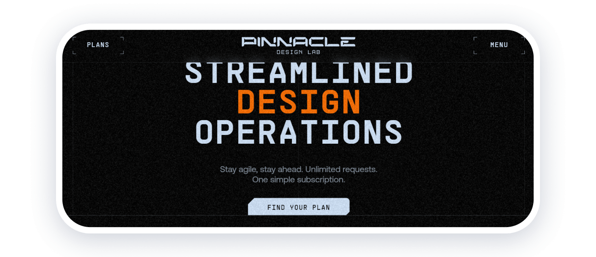
Pinaccle Design Lab is a subscription-based design studio from the US. The minimalist website design in the video game style is complemented by thoughtful details that add dynamism and evoke curiosity — you want to scroll further.
The use of negative space and simple and intuitive design are typical characteristics of minimalism embodied in this site. Animated noises in the background that create a retro effect, accent transitions, and a combination of black and orange focus attention on essential elements.
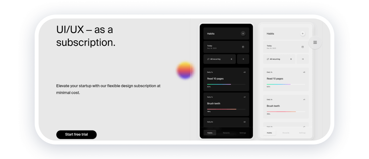
Archie Max is a Dutch company that offers UI/UX design services as a subscription. The concept of minimalism is implemented in the visual design and content: light gray background with black grotesque font, minimal animations, text, and images. Information about services and benefits, customer reviews, pricing, and contacts is clearly and accurately presented. Nothing extra — just practical information in a clear form.
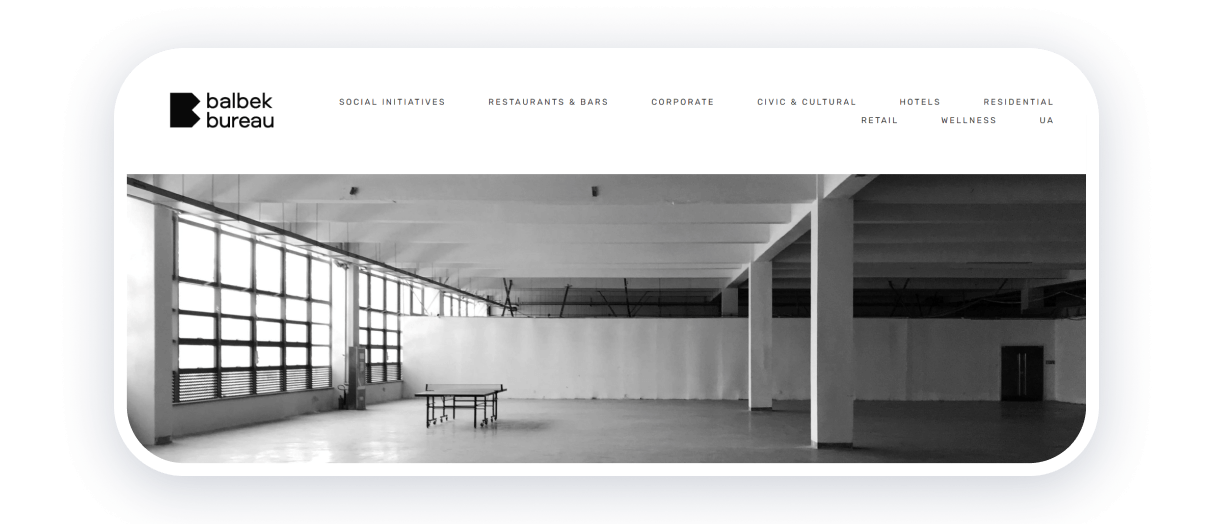
balbek bureau is an architectural bureau and interior design studio founded by Ukrainian architects Slava Balbek and Boris Dorogov. Comfort, innovation, and functionality are the driving forces behind the studio’s projects. The website is designed subtly, combining white and gray colors. Information about the team and projects is presented concisely and accompanied by vivid photos of stylish interiors.
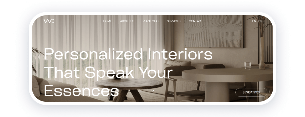
Walls Talk is another design studio with Ukrainian roots on our list. Muted beige, gray, and white tones are harmoniously combined in the website design and projects. A simple and clear structure, grotesque fonts, and stylish photos demonstrate elegance and simplicity.
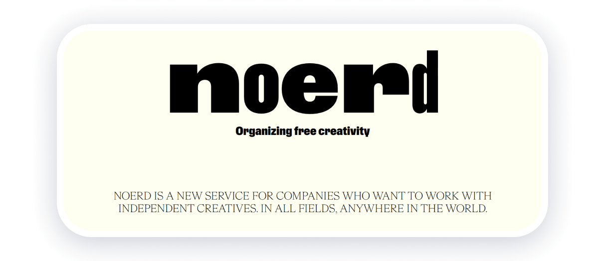
Noerd is a Stockholm-based platform that connects companies with independent creators. The site is designed in beige tones with eye-catching font combinations that give it a unique look. Asymmetrically arranged blocks, color accents, and animations keep the user’s attention. Brief descriptions of creators and projects are accompanied by high-quality storytelling, making the information easy to perceive.
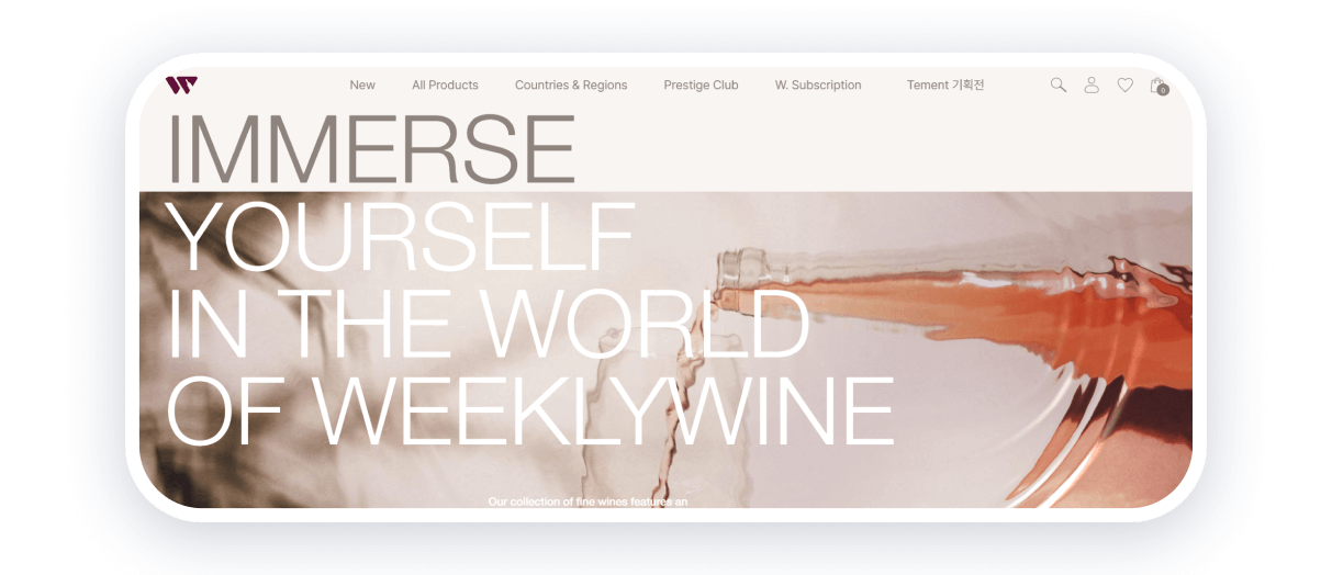
Weeklywine is a great example of minimalist e-commerce website design. The page of the Korean brand starts with an elaborate image of a glass of wine, which is complemented by a smooth animation of circles on the water. Typography defines the accents on the page: handwritten fonts are combined with grotesques. The website offers easy navigation with sorting of wine by varieties and regions.
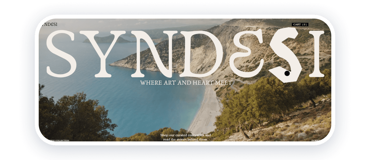
Syndesi is an e-commerce platform featuring products by Greek artisans. The homepage perfectly conveys the Greek flavor thanks to high-quality images and typography. The animation, when you hover over the brand name, looks very aesthetically pleasing. The site is designed in a discreet beige and gray color palette and offers several pages: collections, store, history, and contacts.
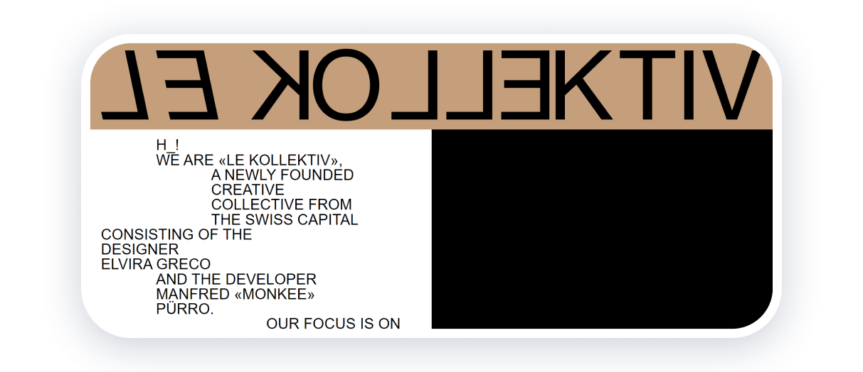
LE KOLLEKTIV is a creative duo of a designer and a developer from Switzerland. Their website is made in a laconic combination of black, white, and beige colors. Typography, including mirrored letters and animation, set catchy accents. Free space and vertical text layout attract and retain the attention of the site visitor.
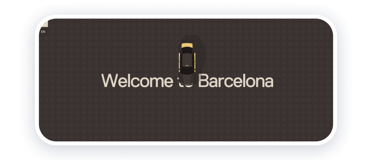
Only 8% is a website created to draw attention to the problem of gender inequality on the example of streets named after women. According to statistics, only 8% of streets in Barcelona are named after women, and the global average is only 10%.
The site’s centerpiece is a car that appears to be driving down the road as you scroll. In the center, text with key information and statistics changes. At the end of the trip, a map of Barcelona appears with street names and the ability to sort them by who or what they are named after: men, women, places, plants, animals, etc.
Only 8% is a great example of a minimalist website design with excellent storytelling focusing on social issues.
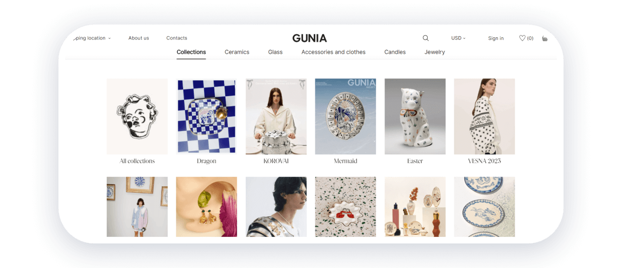
Gunia Project is a Ukrainian brand of exceptional items with ethnic motifs. Each collection is based on ethnographic research and unique design solutions. The website is divided into collections and categories. Light shades of beige and white are combined with vivid images of the products. The typography is also accentuated: antiqua font is used to highlight essential information, while the rest of the text is written in grotesques.
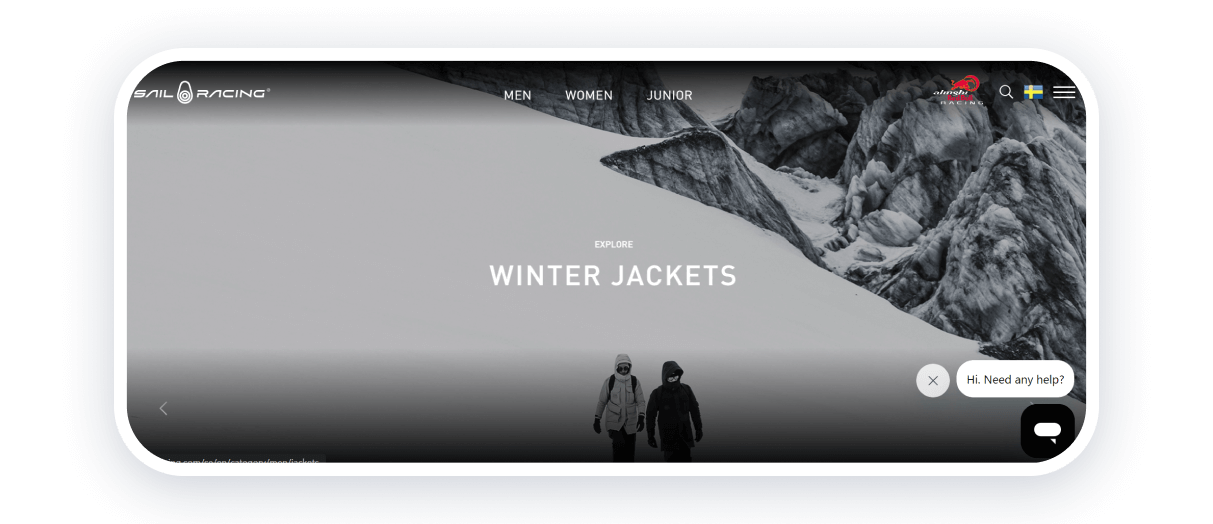
Sail Racing is a company that creates innovative technical equipment for high-speed sailing. A fascinating solution on the home page is horizontal scrolling instead of the traditional vertical one. Photos and videos demonstrate products in Arctic conditions, increasing brand credibility.
The minimalist website design is based on black and white colors. Vivid images stand out favorably against the dark background. Website navigation is simple and clear, with categories for men, women, and juniors. The clean design conveys the brand’s aesthetics and lets you focus on the crucial elements without overloading with excess.
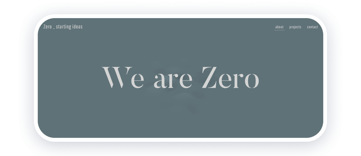
Zero_starting ideas is an Italian agency that develops strategies and communication projects. Their website is the epitome of simplicity and minimalism. The screen does not move while scrolling, and the objects on the screen change with animation. The site has only three pages: about us, projects, and contacts. Information about the projects is presented on an unusual layout with several columns, text overlays on images, and site-specific animation is used. The bright background colors change on each page, adding a playful touch to the minimalist website design.
We hope you have found some inspiration and exciting ideas for your minimalist website. Best of luck in realizing your creative projects!
