
How to Choose the Right Color Scheme for a Website
Did you know that the website color scheme can affect your revenue as much as $10 million annually? According to Harward Business Review, in 2013, Bing, a search engine by Microsoft, ran a set of experiments with the colors of their titles, links, and captions. It turned out the users who saw slightly darker blues and greens in titles and a slightly lighter black in captions were more successful in their searches and found what they wanted in significantly less time.
Read this post and dive deep into the specifics of choosing the right color scheme for a website with Crello, the online design tool for creating stunning visuals.
Contents
Why Color scheme is important for your website?
As soon as a person opens your website, the color scheme sends them a powerful first impression on the subconscious level that makes them “yay or nay” the whole experience.
According to the research, here’s what you can do by colors only:
- increase or decrease appetite
- enhance mood
- calm down customers
- reduce the perception of waiting time
Any ideas where it could help in your funnel?
For one, it turns out that you can reduce the perception of waiting time by almost 20% if you use blue color when your visitors wait for the page to upload. For websites such as bookings and file transfers, this can mean the difference between a conversion and a lost customer.
Whether you’re making a page for your established business, creating a new website from scratch, or just need to come up with a cool page for your event or product, you’ve come to the right place.
Now we will take you through the best color schemes examples by page functionality, point out the basic principles, and thumb through some trending digital palettes of 2021.
Color schemes examples by industry
Newsmakers
High-functional news websites stick to clear layouts and proven grids. The backgrounds here can be white or pastel, but the key here is that they don’t act as the actual colors. It’s just the background, while the information is the king here. Journalists all around the world stick to old good black-on-white-ish simply because it’s the most readable combination that does good for the readers’ eyes when they have to take in the big masses of text.
E-Commerce
The sellers out there are competing with each other ruthlessly. They need to place out tons and tons of pictures of goods, and this means they cannot actually control the colors on their website. This is the reason they go for very simple grids with white backgrounds that make the goods most visible. As a rule, they would usually use their brand colors in the elements of layout, in the headers and footers, and on the buttons, just to highlight the brand name.

Blogs
You’d want the readers to remember your particular page, but without letting the color scheme steal the show from your content. Consider the reader’s journey on your page. Do you want people to stay to read through your longer posts? Then making the color scheme too vibrant or popping can get them tired and overwhelmed.
If keeping the reader is your goal, go with the neutral, calm colors with the pops of lively accents.
Products
Launching a page for your product? First of all, congrats!
You’ve got to choose the color that will make your product pop, evoke the right emotion, and show your product in the best light. Of course, Apple streamlined this category with a white space approach, with few millions following this path. It’s good, but not necessary.
As long as the background is not stealing the show from your product, you’re free to experiment.
Go with the bold colors for impressive, eye-catching solutions. Think of the website as your shop window — colors do matter here.
Services
The websites for the service providers are the ones where you have to sell from the first sight. A bunch of selling text describing your services (but not too much), pictures, videos, and testimonials will come later. If you have a bright brand color in your brand book, look no further.
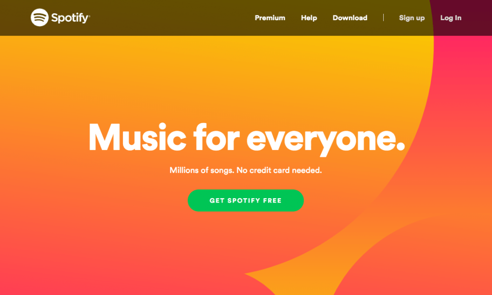
See how Spotify went all-in with the bold color to fill in the background, and then doing a great job with round shapes and simple UI? This page makes a cohesive impression of the solid product which has all its features in place.
Events
This category of pages is specific to its goals. The life span here is short, and the user journey is simple. The more you would want to give your visitors an extra experience for the money they consider to pay for a ticket to your event or happening.
This means you’d better stretch out. The people will spend just about 1 minute here before they go to payment or close the page. And, well, even in the latter case you would want them to share the page, wouldn’t you? Then bring in bold colors, radiant solutions, and surely keep the click-through button big and contrast.

All-black VR website for the web conference
Agencies
This is a big playground. Good news — you are free to use almost any color combination. As a rule, here you can show off your brand’s personality, as that’s exactly what your potential audience comes to your website for.
Basing on the specifics of your business and brand colors, all primary colors are easily applicable (and yes, CMYK is very trending).
Companies
If you’re looking to create a respectable, solid web iteration of your company, try creating the website background by combining and overlapping slightly different shades of your brand color. Orange, yellow, green, red, purple, black, grey, would all work equally well in this case, making a multidimensional space to make information about your services, case studies, and contact details jump into the customer’s eye.
The simple rule to follow is more text — fewer colors, less text — more colors.
How to choose a color scheme?
Whichever color you’re leaning to at this point, make sure it is aligned with the basic principles from this section.
Step 1. Look at your competitors
One, you don’t want to look exactly like one of them. Two, being aware of the trends in your industry can help you to avoid costly mistakes. If a color is heavily used by certain businesses, it influences customers’ perception. For example, when 95% of dentists use white, blue and green, going red or black will rather scare off your audience, than make your brand stand out.
Exceptions apply, of course.

Step 2. Follow your brand guidelines
Never go against your branding when making a color choice. And we’re not talking only about the certain hues. Saturation, intensity, and images color gamma should all go hand-in-hand if you don’t want your brand to look like a high school scrapbook class.
On the Herman Miller site, the desaturated color correction and primary brand colors are applied through all elements, staying consistent throughout the site.
Step 3. Double-check the basics
Simply put, there are colors that go well together, and the ones that don’t. The table below gives a perfect idea about text readability on various backgrounds. The higher the number, the better is readability.
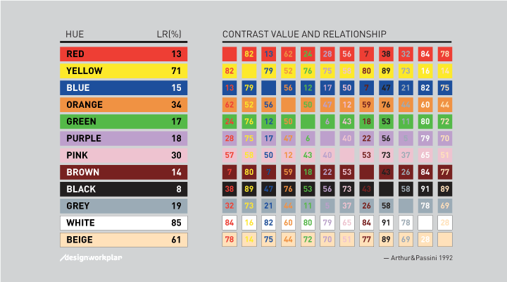
The color theory, in its turn, lets you find harmonious combinations by using any two colors opposite each other on the color wheel, any three colors spaced around it in a triangle, or any four colors forming a rectangle.
Step 4. Consider your target
Women and men like different colors. No, not pink and blue. Actually, this picture will give you a quick idea about love and hate in the world of colors.
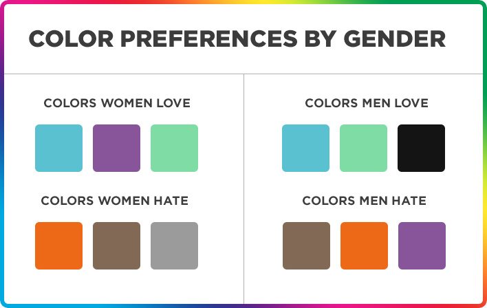
So, if your brand is one of these that target specific gender (like Dude Wipes), you might want to reinforce your selling point by using a color highly preferred by your customer segment.
Step 5. Get emotional
There are a number of articles all around the web about the colors in marketing and the emotional value that they bring to the brands, companies, and products. In a nutshell, each color has its emotion. This means you can trigger these emotions by simply adding colors in the key points of the journey.
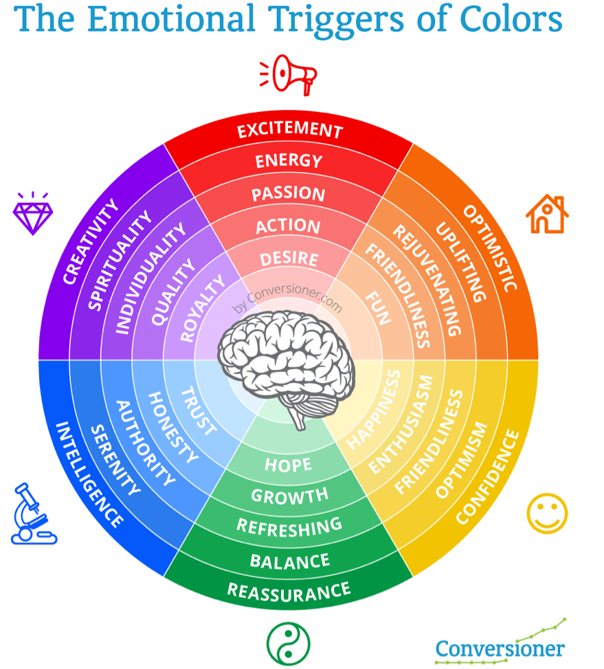
- Red — action; effective for impulse purchases.
- Orange — optimism; go-to color for conversion elements in clean, simple-looking websites.
- Yellow — happiness; this serotonin-increasing hue makes the perfect cheerful background for the website.
- Green — hope; makes an attractive CTA and buy button choice.
- Lighter blue — freedom; use when you want your customer to relax.
- Blue — reliability; a good choice for background and websites that deal with finances and precision.
- Purple — sophistication; good choice for menu items or conversion elements on sites with lots of white and black.
Add trends to the taste
Awwwwwww is the web-design awards that track the outstanding pages on the world wide web since 2006. Take a look into their website color schemes trends for 2019, or crawl all over this cool scraped infographic showing the 3-color schemes for every winning website since 2006. 
Pantone is a color authority that is impossible to ignore. In your search for trendy color solutions, make sure you check out their “Color of the year” page.
Wrap-up
When picking your website color scheme, you should think about your category, industry, business goals, your target audience, and customer journey. Stick to your brand essence, be consistent, A/B test your colors constantly, and you will drastically improve not just your customer experience, but also your personal revenue.
Thinking about a new website? Check Weblium catalog to find color-proven, effective and trending templates.