
10+ Best Financial Advisor Websites for 2026
I can find plenty of helpful ideas when it comes to website design in the financial advisor industry — some of them are already proven, while others turn out to be truly genius solutions. In such a highly competitive market, even the smallest detail in web design can become a real game-changer.
I believe a financial advisor website has to be informative, impactful, responsive, and focused on lead generation. Most importantly, it should have a clear, confident design that instantly builds trust.
I’ve collected the best examples of financial advisor websites to inspire you while creating your own perfect website.
Contents
Top financial advisor websites
I’ve selected some of the best financial advisor websites that truly stand out thanks to innovative design, user-friendly layouts, and smart strategies for building client trust and engagement.
Financial advisor website example

The PPG Financial website immediately caught my attention with its sleek, modern design and intuitive navigation. What’s even better — it’s also a website template that I can recommend using as a solid foundation for a future financial advisor website.
The homepage features a clean structure with clearly defined sections for services, client testimonials, and contact information. This visual clarity helps visitors feel secure and reinforces a strong sense of professionalism. Overall, the website is user-friendly, well-organized, and provides easy access to information about financial advisory, investment services, and wealth management. I see this template as an excellent balance of usability and aesthetics — one of the best examples of a financial consulting website.
Financial coach website example
This website is a simple-to-use tool designed for financial professionals and digital educators who wish to impart their expertise and demonstrate their tactics in an understandable, empowering manner. This template provides me with all I need to successfully market my course and services if I assist people in taking charge of their finances or teach them how to confidently create a budget.
I can easily highlight important benefits, promote 1:1 offers, and demonstrate my expertise without overwhelming visitors because of its well-organized layout and inspiring visuals. This template, which is based on the Weblium website builder, is particularly ideal for mentors and consultants who wish to gain the trust of their clients. I like that Weblium makes it simple to customize every section, adapt the content to my audience, and focus on conversions — so people don’t just browse, but feel ready to take the next step.
Wealth management website

The Bagroff Wealth Management website comes out so beautifully designed with an intentionally easy using interface and is a good universal template for your wealth management website. A landing page offers the main information: services, clients’ success stories, and staff’s proficiency.
One key distinguishing point of this financial advisor website is its use of a refined color palette that is complemented by most image items. The website is carefully structured for rapid access, so it prominently displays personal finance and investment strategy as well as wealth management services. The website is an example of a top-notch financial advisor site owing to the impeccable marriage of a beautiful facade and a timeless framework.
Money Flow – advisor website example

Website: https://moneyflow.co.uk
The website is modern, has a very responsive design, and clearly showcases the company’s services. The visitor’s attention is primarily focused on such offers as Wealth Management, Retirement Planning, Wills & Trust, as well as Investment Planning.
The imagery makes a great difference here, the website has intuitive navigation, the design is eye-catching, and quarterly branded client brochures are a great idea.
Vistica Wealth Advisors

Website: https://visticawa.com
The site showcases the things the company takes pride in, so they simply get to the heart of clients’ needs. Bold statements & icons aid to create a positive impression, you can easily understand the main processes and see the types of financial assistance that the company offers.
The “Who We Serve” section is a great idea. It breaks into the company’s clientele into 3 various segments:
- institutions;
- individuals and families;
- retirement plan sponsors.
The “Client Experience” page breaks down what clients can expect when engaging with the company for the first time. The great idea is to use graphics to show the business process.
Nelson Financial Services

The company‘s website is extremely user-friendly and just beautiful!
Website: https://dnelsonfs.com
The idea to incorporate icons and tabs to create a better understanding is great and helps to keep the visitors on the site longer.
The “Meet Our Team” section shows the headshot that you can click to get the details. Another cool website feature is the “Clients” section that has incorporated AXA Advisors, eMoney, and Riskalyze, giving you access to a few additional resources you may need.
Also, the developers have added a simple and effective form on the contact page helping to collect leads!
Braun-Bostich & Associates – Great Financial Website Design Example

Website: https://braun-bostich.com
I consider this company’s website one of the most effective examples here, largely thanks to its smart use of CTAs. The contact form is designed in a simple, clean way that naturally encourages me to learn more about the firm. I also appreciate the well-built resource center, which includes client login forms, financial calculators, and a genuinely useful blog.
Streamline Financial Services

Website: https://streamlineplanning.com
There are many reasons why this website got into our top. This is the right idea to greet the visitors with an impressive informational video on the homepage. The second thing is that the contact info is clearly visible on every website page. The third plus is the idea to use the laconic color scheme throughout the website. Also, the idea of using «Who We Are» information is very nice.
Add to this easy access to helpful client resources – newsletters, articles, and calculators working in conjunction with a strong social media presence – and you will get a perfect financial advisor firm website.
JP Maxwell Financial Advisor Website
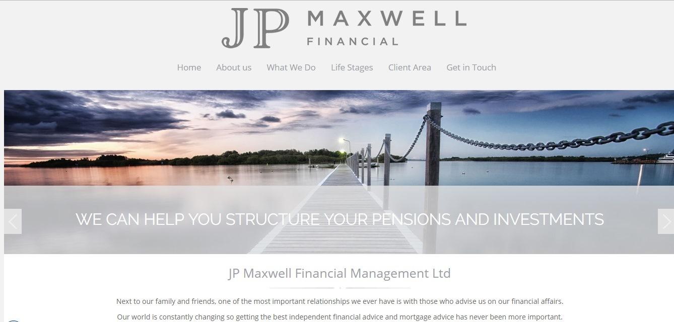
Website: https://www.jpmaxwell.co.uk
The website shows that JP Maxwell Financial company has clear goals and plans of how to assist clients’ in managing their wealth. There is much content, offering clients important info on the different financial products.
The website’s home page has a huge banner image with a simple and clear message about the holistic approach to the job. The whole website design and layout are responsive, making the website look just great on any device. The website’s color scheme is also very pleasant.
C.L. Sheldon & Company Financial Planner Website
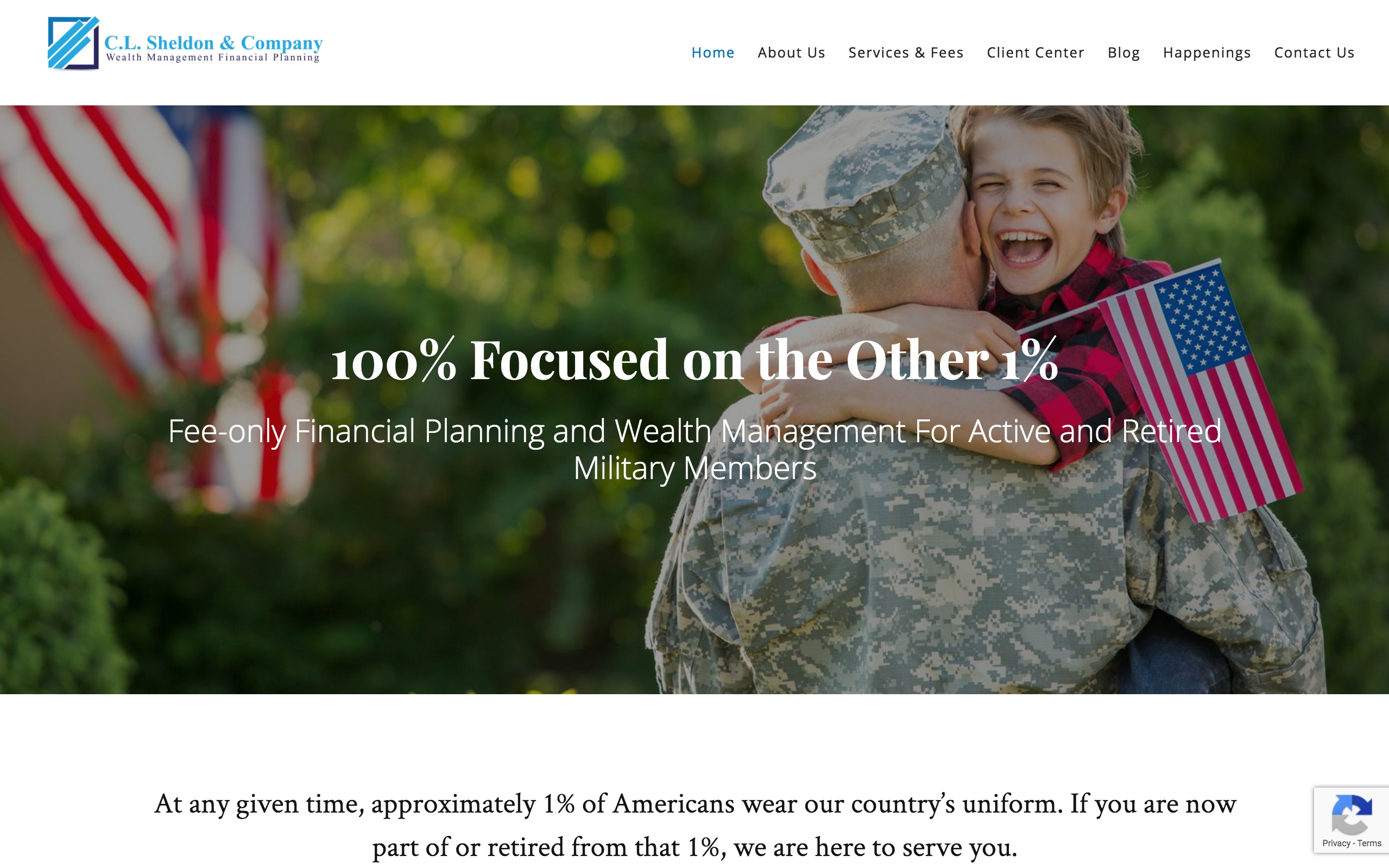
Website: https://clsheldon.com
The website is focused on serving a very specific niche of military pros and their families through wealth management and financial planning.
Many features deserve your attention here, especially the option for visitors to select their financial situation. If you have a more complex issue, the website will provide the pertinent info to help you get started with your finances.
Their blog vividly illustrates the company’s leadership while boosting ranking in search engines. The way the company has chosen to use the website to help promote a book written by the company’s president is also a wonderful idea!
IMPACTfolio Great Financial Advisor Website Example

Website: https://impactfolio.co
IMPACTfolio’s website appears to be an ideal tool to match the company’s brand. On the homepage, they greet you with the “Invest with Purpose” tagline and a CTA linked to an inspiring creative video about the company’s business.
You perceive the brand even better through the colorful icons and graphics that leave a professional impression.
Lyra Wealth Management Financial Advisor Website
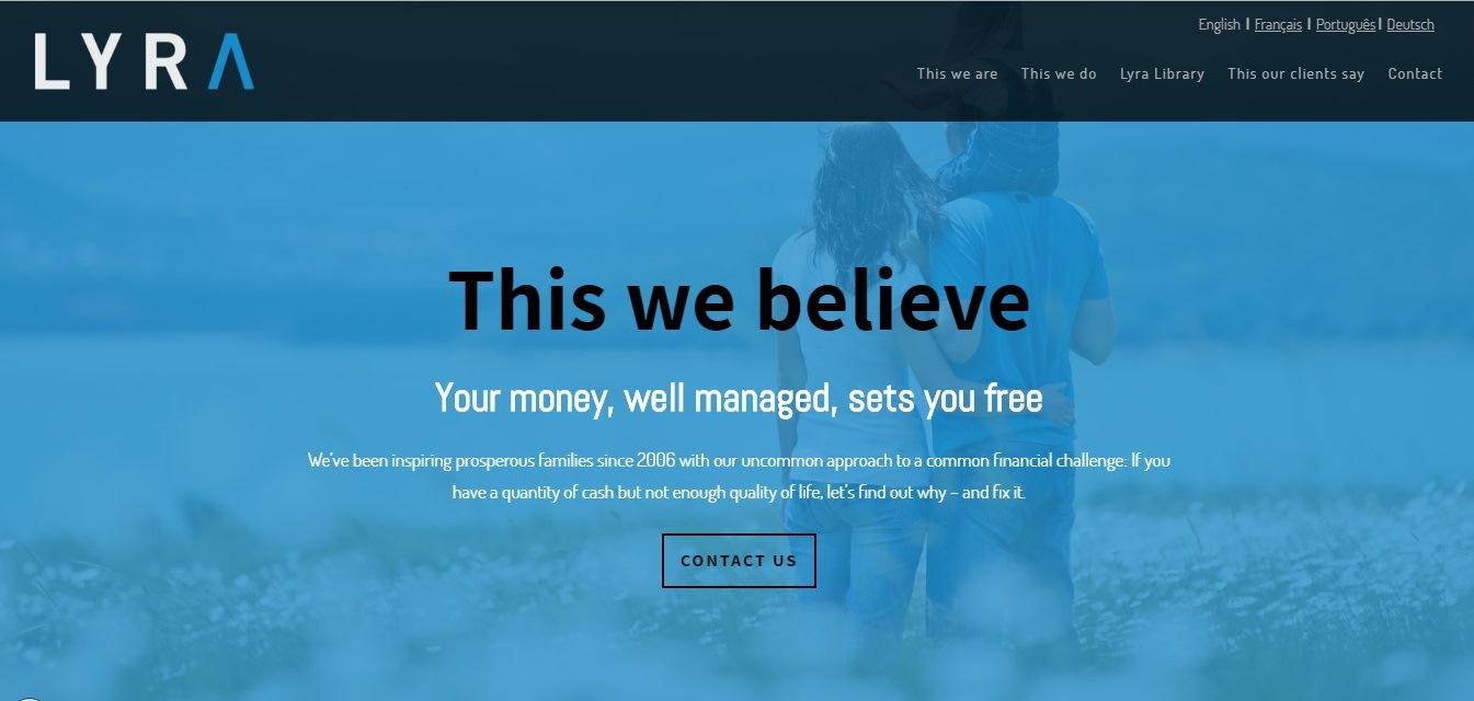
Website: http://lyrawm.com
Sherrard Financial Management (IFA Website)
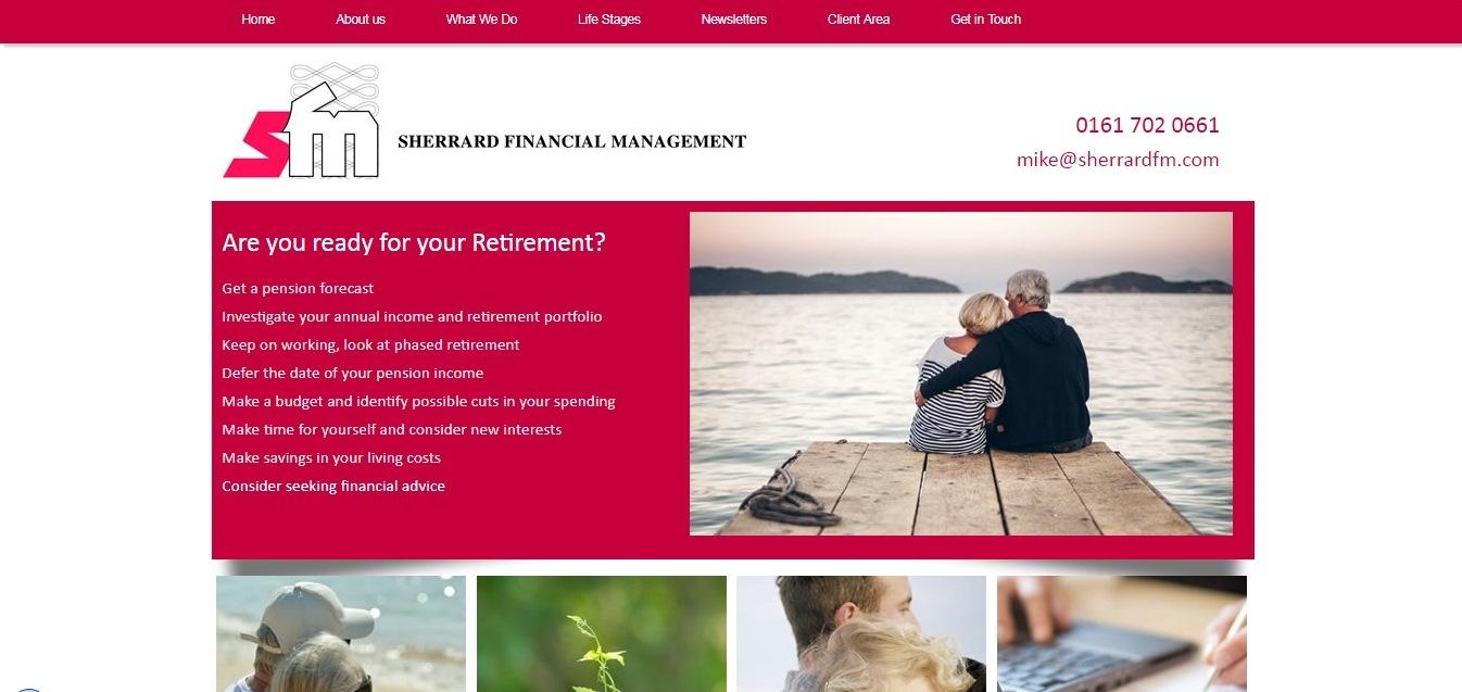
Website: https://www.sherrardfm.com
This website with a clean uncluttered look is amazing, and the red & grey color scheme builds trust at first sight. Plenty of white space adds helps you better perceive the information and focus on what really matters. The Lifestages section with the links that can be important to visitors is also a great idea. Moreover, you can find all the necessary info through the main navigation.
Conclusions
Each example shows that even small details — from intuitive navigation to compelling CTAs — can make a big difference. These financial consultant website designs and strategies can give you a clear roadmap for creating a site that looks professional, feels trustworthy, and actually drives action.
Stop wasting your time on finding the best ways to create the perfect website for your business. Use Weblium to get a fast and responsive website perfect for your niche for free!


