10 Great Pink Website Design Examples
Graphic design plays a major role in the user experience when it comes to your web design. One of the biggest impacts on the overall design of your site is the color palette. Warm tones of pink and yellows can elicit excitement and energy from your clientele. If you were using cool tones like blues and greens it will have the opposite effect and lend a calming tone to your site.
Thinking about the emotions you wanted to draw from your customers as they peruse your site a vital part of the process. If you are looking at a beauty or health site that is meant to energize your customer, you will definitely want to go with a pink website design.
There are so many hues and tones of pink that you can play with using a monochromatic layout and still get the feeling you are looking for. Or play with other color combinations and get some unique results.
In this quick article, we are going to look at some amazing examples and templates that use pink website design as their base so that you can see the effectiveness of these clean and animalistic options.
Contents
Pink Websites Examples
There are a lot of great niches that a pink website design could be used for high effectiveness. Many of these are female-oriented and here are a few examples of successful pink website design:
Beauty Salon: light pink design template
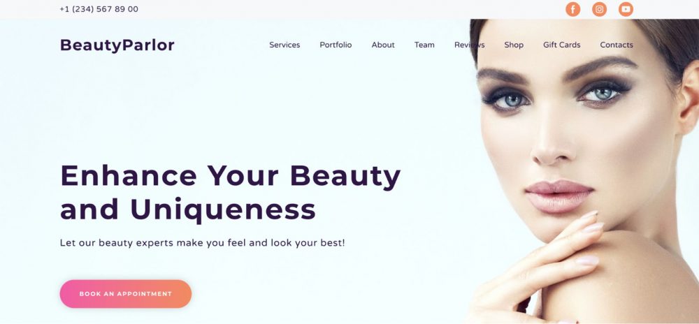
This beauty service template from Weblium, this one uses a charming blend of pinks and accents of purples to give a very feminine touch to the buttons and headers. This design creates a welcoming and elegant atmosphere, ideal for beauty salons, spas, and personal care services.
With its soothing color palette and clean layout, clients will find it easy to navigate and book appointments. Plus, the template is fully customizable, allowing you to tailor the look and feel to match your brand perfectly. Add your own images, adjust the text, and create a stunning online presence that reflects the unique style of your beauty business.
Floral Studio template: pink design
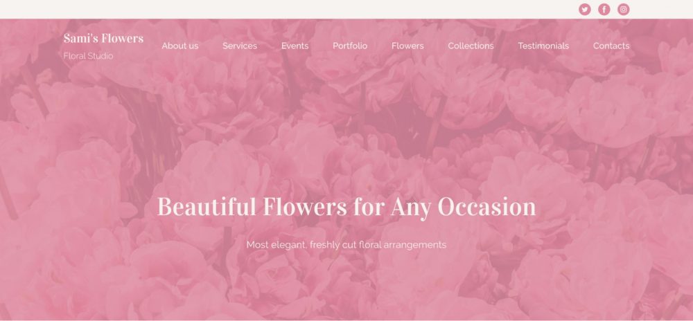
A pink monochromatic image of a flower bed serves as a simple yet striking visual centerpiece for your site. This minimalist approach, paired with a carefully chosen palette, ensures that your website conveys its message clearly and effectively with very few words.
The serene beauty of the flower bed draws visitors in, creating an inviting atmosphere that speaks volumes about your brand’s elegance and sophistication. With this design, your content remains the focal point, allowing your audience to easily understand the essence of your business at a glance.
Under Construction page: light pink background example
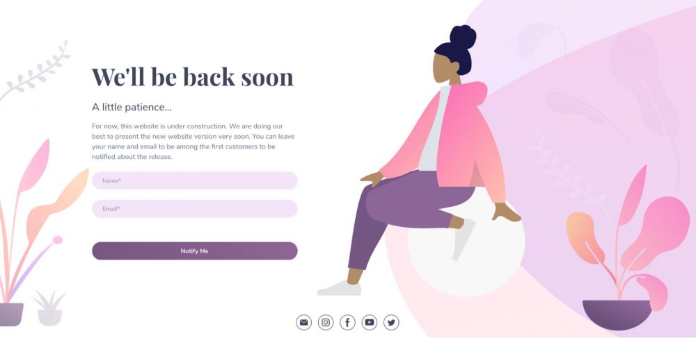
The gradient uses of pink and oranges provide a skin-like palette feel to the category buttons, adding a warm and inviting touch to the design. This thoughtful choice of colors enhances the overall aesthetic, making it clear that this template is geared toward female-oriented businesses and services.
Whether you’re in the beauty, fashion, or wellness industry, this template offers a perfect balance of sophistication and approachability. The smooth gradient transitions create a sense of harmony and elegance, ensuring that your website appeals to your target audience while maintaining a professional look.
Design Embraced website: cute pink website
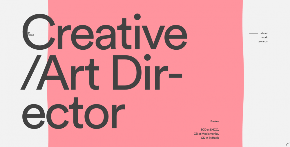
website: https://www.designembraced.com/
This is a simple and sophisticated pink website design for a freelance creative/art director. It is simple and minimalistic but laid out with care to show his design skills.
OH by Curio Wellness: pink background example
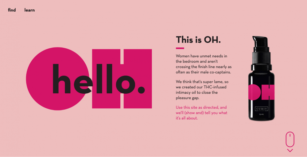
website: https://oh.curiowellness.com/
This product is geared towards women’s needs in the bedroom. This site is specific and with the palette, it is evident the minute it opens up who it is intended for. It is fun and energetic just what this product needs to entice its customers into purchasing it.
Worksmiths: pink design

website: https://worksmiths.com/
Simple and minimalistic with a clear message pink website design. This is a branding company that wants to help promote women’s businesses that are run by women themselves.
Snog: bright pink design
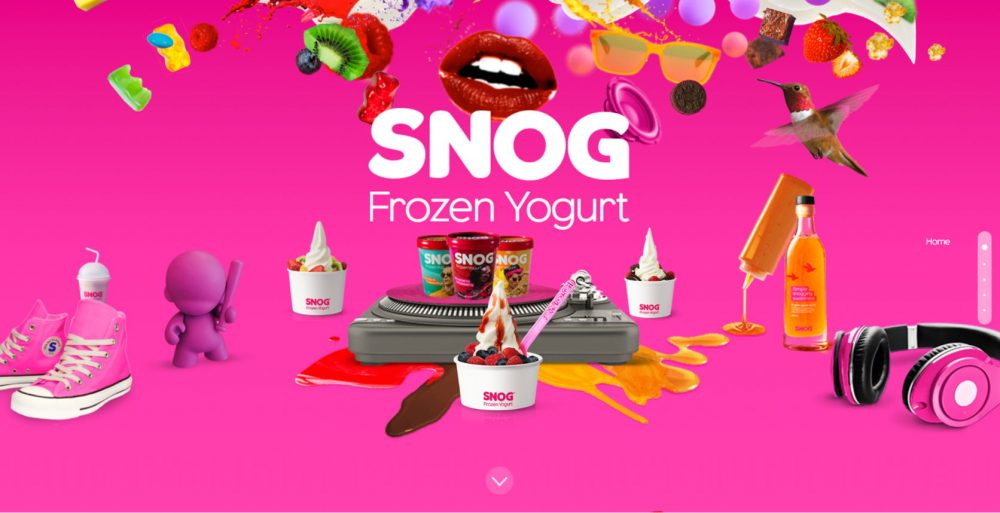
website: http://www.ifancyasnog.com/
This frozen yogurt site uses pink and red website designs to capture the fun and interesting combinations of toppings you can take advantage of with this low-fat fun desert.
Victoria Spicer website
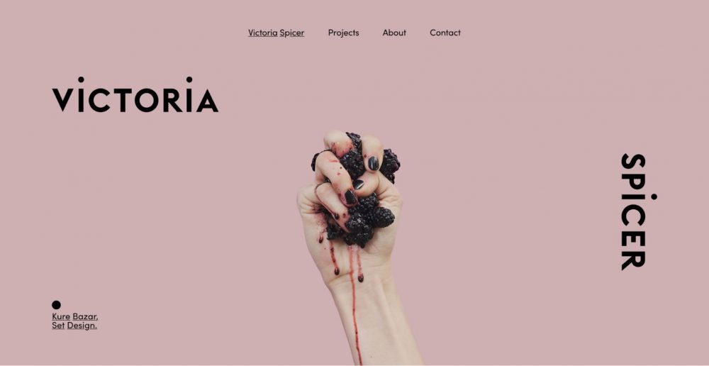
website: https://vspicer.com/about/
This well designed minimalistic laid out portfolio site says what it needs to with the first page. The simple pink website design with easy to read topography is accented with a strong mage. All these plays off the pink background.
KNC Beauty: pink light design
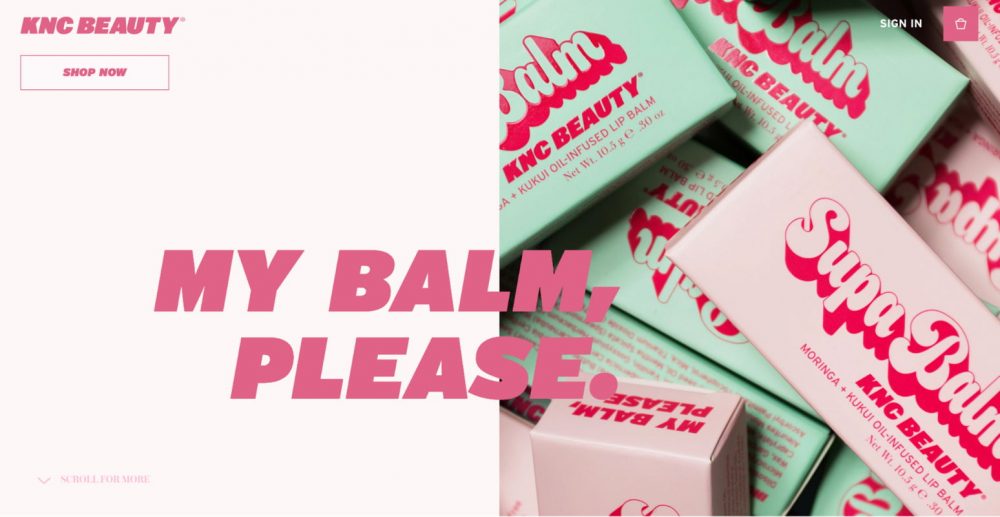
website: https://kncbeauty.com/
The use of pinks mixed with other pastel tones gives this site a fun and calming feel. The accents of green play with the herbal element of this beauty care line.
Wrap Up
There are so many great examples of pink website designs and templates out there that you will easily be able to find the right one for you and your business needs. If you are looking for a great place to find some templates definitely check out Weblium which is where you can find the templates we discussed above.


