10 Inspiring Florist Websites to Gather Ideas
Having a business is always a great responsibility. It is never simple, and you always have to consider attracting more clients to use your services. When we look at many product-focused businesses, we see that people judge their appearance and choose more appetizing food photos, modern pictures of different devices, and stylish clothes images.
However, the florist business works a little differently. Beautiful flower photos easily catch attention, but visuals alone are rarely enough to convert visitors into customers. People want to see details, understand your style, feel the mood of your brand, and instantly know why they should choose your flowers.
That’s why a florist website needs more than just pretty images. It should combine strong visuals, clear structure, and thoughtful design decisions that guide visitors toward an order. Using ready-made website templates can simplify this process and help you focus on presentation rather than technical setup.
For example, with Weblium, you can build a florist website based on professionally designed templates that are easy to customize — from layouts and typography to colors and galleries — without extra effort or coding. Still, inspiration plays a huge role in creating a memorable website.
This is not a rating or top list. All floral websites on the list are equally great and famous for using them as inspiration sources. Feel free to browse all of them to find something for your site.
Contents
Flower Station
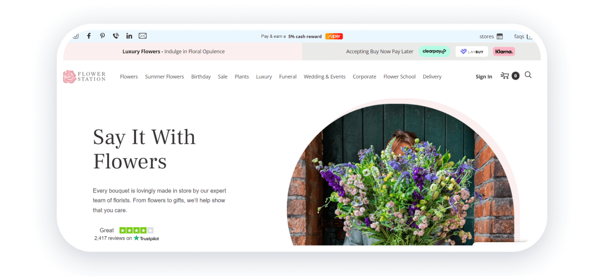
Flower Station is a British florist website that has a varying range of services. The main advantage of this site is that you can immediately see the events they are working with immediately in the header. It answers a lot of questions the customers have immediately.
Secondly, the website shows incredible photos of their beautiful flowers. They give you enough ground to believe that their services are of the highest quality since they combine product photos with images of florists working on bouquets.
After that, you can see prices on each set and learn more about their events. The website sends all the messages briefly but fully.
Strong points: good flower photos, genuine images of the working process, bright and refreshing colors, and a convenient menu.
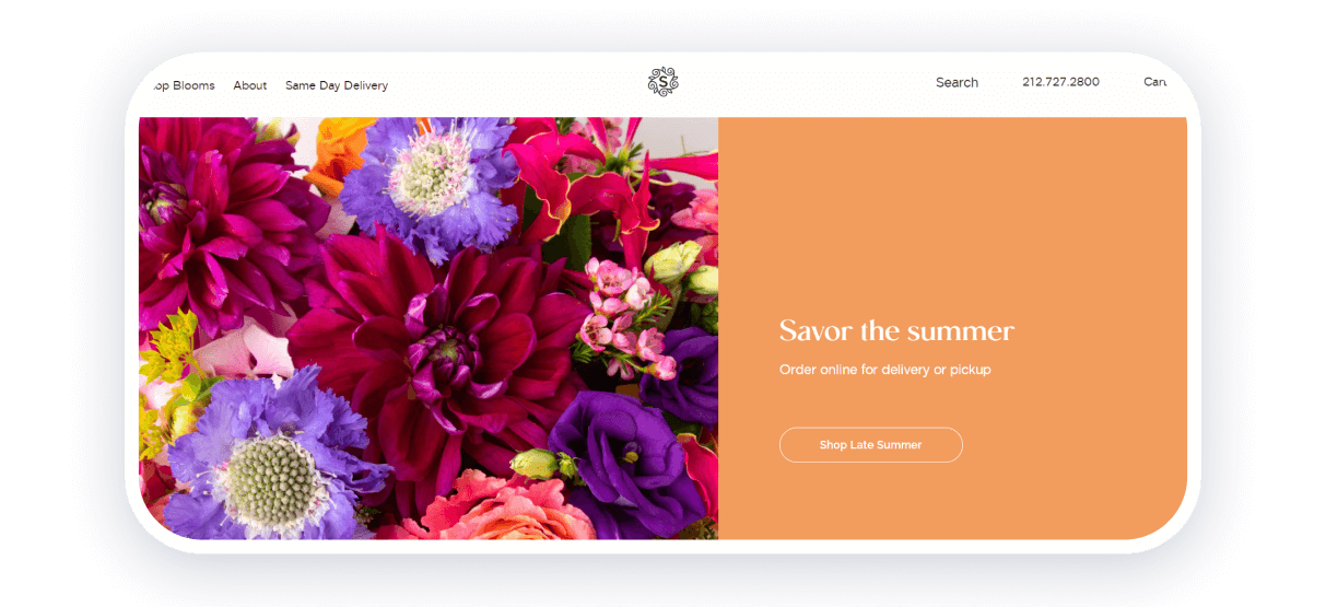
Scotts Flowers is an interesting website with a combination of yellow and white colors. This site’s design is remarkable and shows all its advantages immediately. It is unique, and you can rarely see something like this on other florist websites.
On the first screen, you can see a Summer Deal, which allows you to get a demanded bouquet with a 30% discount. After that, you can choose flowers to purchase. Qualitative and bright photos encourage users to start ordering.
Even more, one of the encouraging features is volunteering. Each potential customer knows that 10% of the profits come to the charity organization that provides food to people in need. It is a great solution to show people who browse floral websites they can help with different charities.
Strong points: minimalistic but remarkable design, focus on the main advantages of the company, great product photos, and easy to reach the store to order.
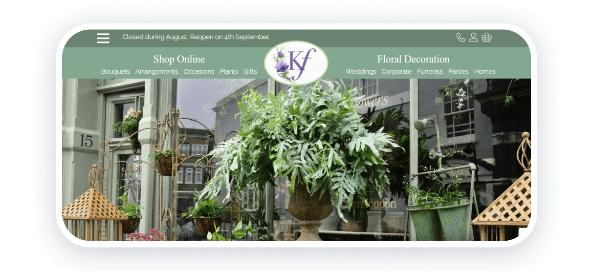
Kensington flowers immediately catch attention with the green palette. It creates a calm and refreshing feeling and gives vibes of the botanical garden.
The floating header with all the navigation is an excellent solution because potential customers can quickly inspect the information about the shop, its team, and highlighted products.
On the other hand, you can also see a lot of different services on this website for florists. You can immediately see a wide variety of flowers and services so that the customer can choose more easily.
Strong points: cozy interface, highlighting services, information about team and florist shop.
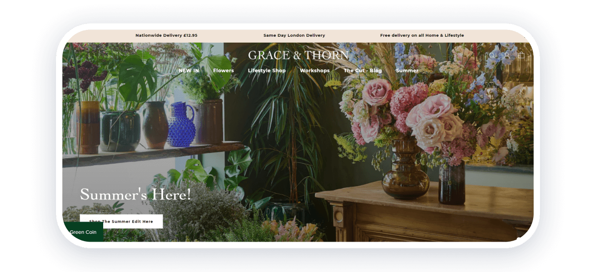
This British florist store combines unique design solutions with classical florist colors. The first thing to see on the homepage is the interior of the florist shop. It adds more trust to the business and allows it to raise expectations.
By continuing to browse the homepage, you can see the precious positions of the website. The white background of the page also contains images of hand-drawn flowers.
Moreover, reviews add even more trust to the website, so you can see why to pick this store for your needs. Great and strong solutions for all possible florist websites.
Strong points: interesting design solutions, images of the store interior, reviews from customers, and convenient navigation.
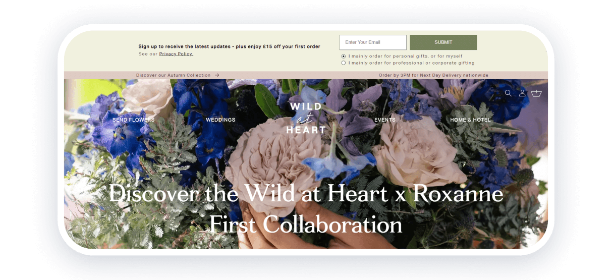
Wild at Heart is one more British flower shop that catches attention with its design. The website uses classical options to attract customers. An aesthetic photo of flowers is used as the cover image.
Even though there are a lot of different photos of flowers to order, you can see a lot of information about the founder of this florist shop. It shows who is responsible for all the deals and gives more trust.
One more advantage that the creators of the website highlight is charity. Here, you can see that this business supports animal shelters, so you can understand that you are doing useful things by buying flowers here. And claiming that flowers are luxurious brings more prestige to the business.
The charity approach isn’t new, but it always works on the best websites for florists.
Strong points: aesthetic photos, great product images, highlighting advantages, and interesting blog articles.
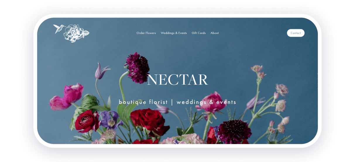
Nectar catches attention immediately with the combination of warm colors and a blue background. This American florist website is an excellent example of nicely done design.
The fonts and colors are significantly implemented into the general palette. Product photos are made as aesthetically pleasing images. Also, the website allows one to learn the story of the shop.
The catalog of cool images creates a new story that shows that the bouquet can improve any event and give some bright colors to one’s routine.
Strong points: unique design, great photos, convenient navigation, and a complete story made with pictures.
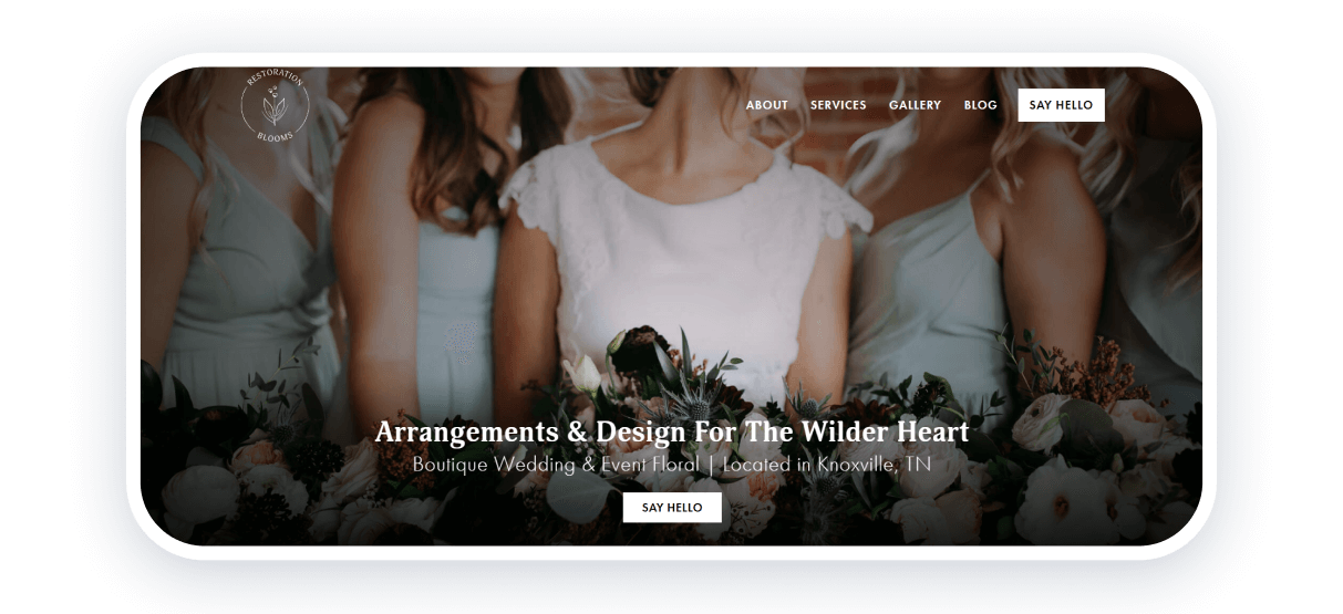
This florist website immediately shows its primary goals. From the beginning, every customer can see that the main goal is weddings. It will show that this business works in a specific niche, and customers will know what they can order here immediately.
Even more, you can see messages from the store’s owner and designer. It is a great and toughing element that creates stronger boundaries between owners and customers.
After seeing great examples of using their flowers for weddings, potential customers can also see the process of ordering, which will make it even easier to understand how this floral design website works.
Strong points: highlighting a specific niche, great photos of wedding flowers, direct approach to customers, and simple navigation.
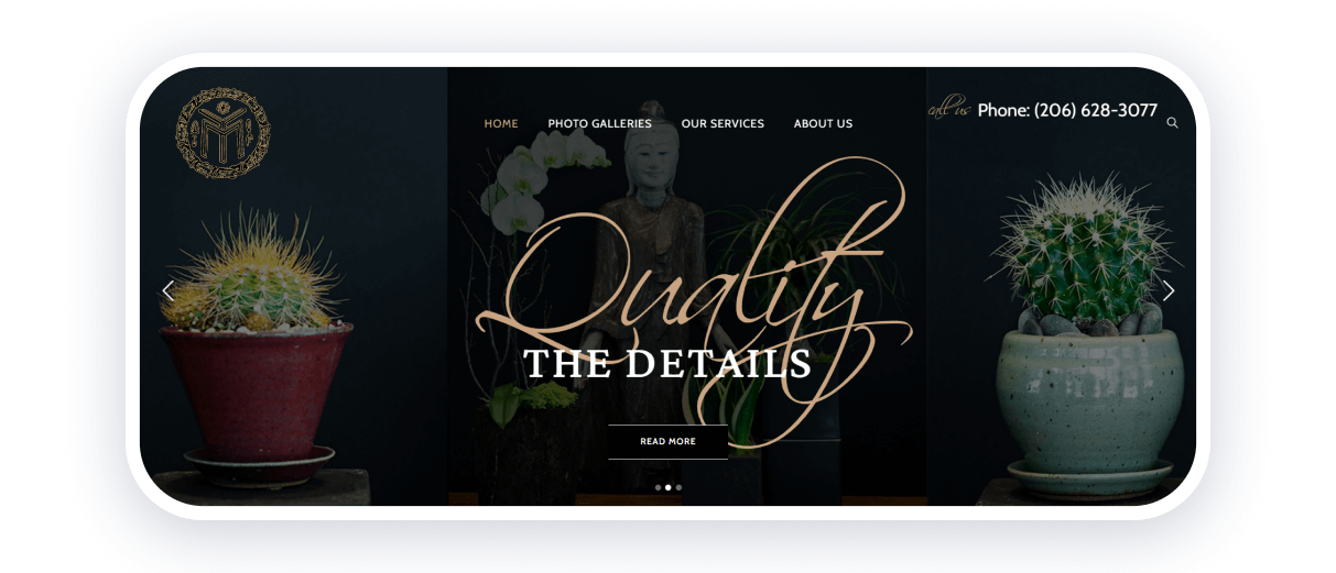
This florist website also has a lot of interesting things to show. The first thing to pay attention to is fonts. They use a great combination of regular sans serif for the main text and handwritten fonts for headings. And it will be one of the most fascinating websites for florists you will ever see.
They also provide inspiring flower galleries so customers can see how to turn purchased flowers and plants into something new. The cover image is also great and shows an implementation of flowers and plants into the interior.
Even more, you can see who is working in this shop. The team sector is not made as a separate page. You can immediately see photos of people who work on all the flowers. It is a crucial step to build trust in the company and a great way to encourage potential customers to buy your products.
Strong points: an artistic approach to the website, focus on all the services, excellent examples of customer solutions, and photos of team members.
Twig & Arrow
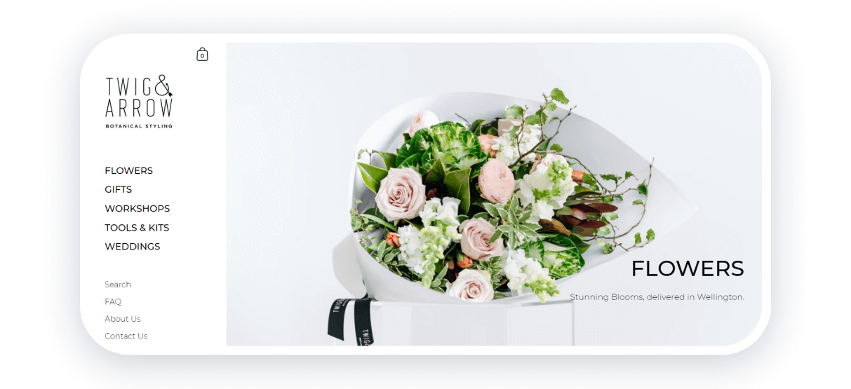
Twig & Arrow is an outstanding British florist company that encourages people to buy flowers immediately with their designs. When you first appear on the website, you can see the benefits of ordering here. Categories are located on the left, so a customer can equally pay attention to all the advantages of the website.
The color combination is also somewhat unique for florist websites. Here, you can see the mix of black and white with some dips of light pink. It is an uncommon way to express a flower shop, but it works.
One more point that makes this website significantly unique is the ordering menu. On the homepage, you can see the most valuable positions. But the main difference is that you can add them to your cart immediately. It allows customers to stop browsing and order products.
Strong points: great CTAs, unique color schemes, wedding photos with flowers, convenient navigation bar, and shop schedule.
Bouqs
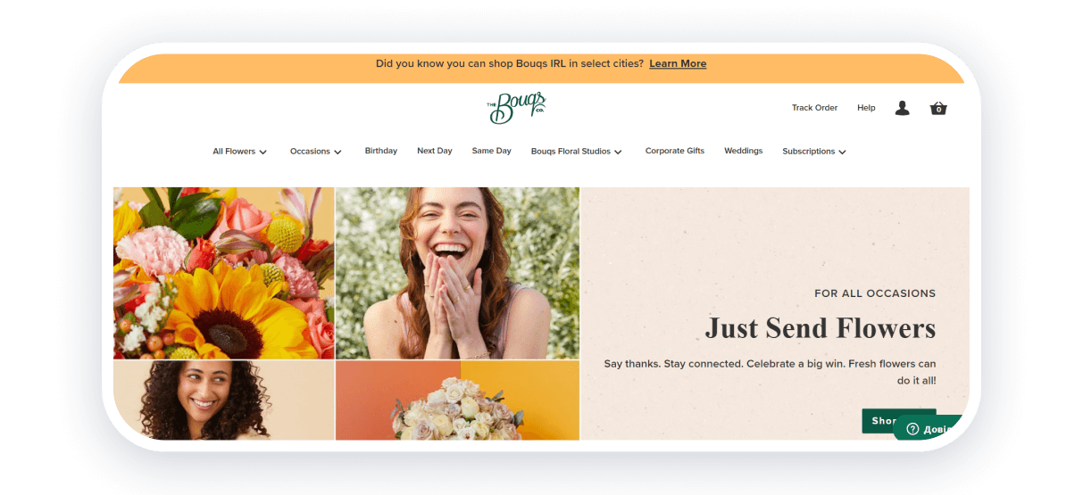
Bouqs creates a great contrast with the florist websites we described before. While others focus on a more minimalistic approach, this website explodes with various bright colors and interesting solutions.
Here, you can see white, pink, gray, yellow, beige, and green colors all implemented brilliantly. Such a combination of different shades gives enough energy to learn everything about the services.
Customers can see all the essential parts of the cooperation on the home page, which includes delivery terms, product catalog, flower subscription, and main advantages.
This website for florists is like an open book for everyone who visits it, and it is just perfect for people who lack experience in ordering flowers online.
Strong points: bright design that gives much energy, information about all types of services, and great product photos.
Create your inspiring websites with Weblium
Creating flower shop websites can be great and rewarding if you do it effortlessly. Weblium is here to help you with such a task and offers various templates for your florist company. Feel free to browse them to find the best for your niche. It is the best website builder for florist platforms where you can create either modern and innovative or vintage sites.
And if you want to create an inspiring website for any type of business, use our florist business templates. Look through them, gather ideas, and create florist websites that encourage others to build sites for their companies!


