11 Best Fitness & Sports Website Examples
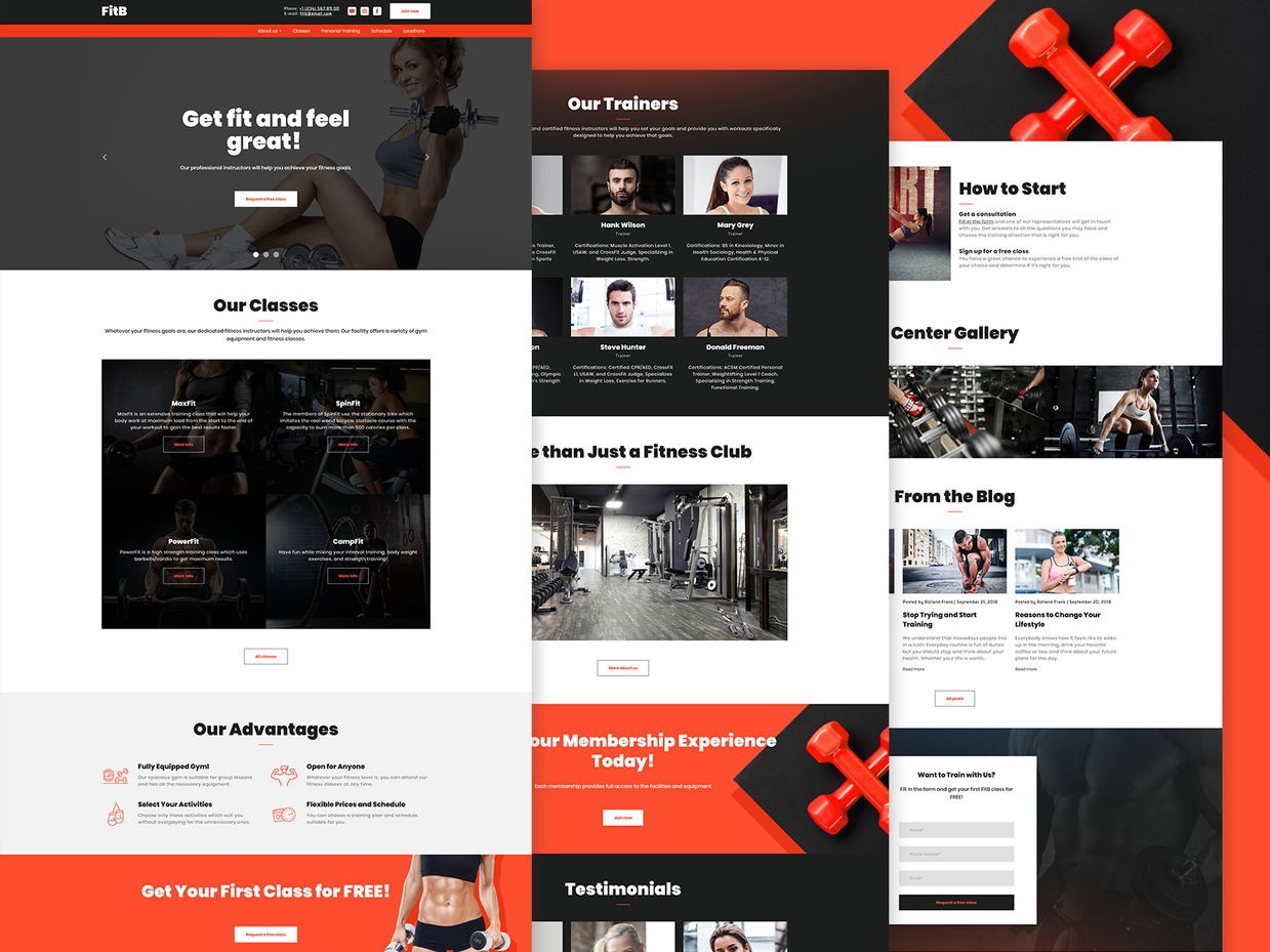
Following a good tradition of providing the latest news in the world of web design, the Weblium team has prepared the best fitness websites list for you. This selection of best sports websites and unique personal trainers sites with useful recommendations will come in handy if you have decided to create your own fitness website.
In this article, we will highlight:
- best fitness websites from all around the world,
- must-have elements of a good fitness website design.
Let’s get it started!
Fitness website templates for free
Best fitness websites
Contents
1. CrossfitWestside: Best Gym Website Design Example
Visit the website: https://www.crossfitwestside.com/
Top features: Color Scheme, Usability, «Packaging», Responsive
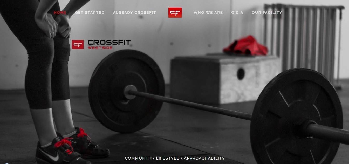
This is one of the most simple and responsive fitness website designs from our list.
Here, stylish black and white photos of the gym in Vancouver are skillfully seasoned with flashy bright red color accents that set the tone for the entire visual design of the page. It looks very impressive!
The top of the main page is taken by an automatic full-screen image slider. In the floating header at the top, there are navigation menu buttons, and at the bottom of the screen, there is an inspiring “community + lifestyle + accessibility” slogan.
The list of coaches, in addition to photos, contains the names and positions of trainers, you can find their short bios and info about their certificates.
2. Equinox: Best Personal Trainers Website Example (Webbyawards winner)
Visit the website: https://www.equinox.com/
Top features: Design, Usability, Creativity, Content, Responsive
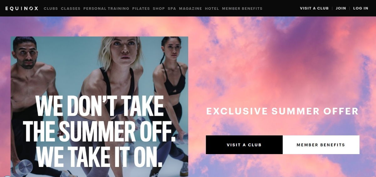
This is a landing page of one of the most expensive and prestigious fitness clubs in the world.
The fashionable design of Equinox website definitely deserves your attention. Intuitive navigation helps you to easily find any information about the services and the terms of their delivery. Главная страница уже встречает вас exclusive summer offer, а чуть ниже вы находите преимущества membership.
You can easily find the nearest Equinox fitness center by choosing your region.
3. SPIN: Best Sports Websites Example

Visit the website: https://wearespin.com/
Top features: Imagery, Forms, Responsive, CTA, Video
As soon as you enter the site, your attention is immediately attracted by the banner with a colorful video – and you already want to explore things further!
In the upper corner of the page, to the right (where the sticky menu is usually located), you will find a convenient booking form. In the middle of the page, you will see the links to the center’s inlets presented on a form of elegant square boxes with quality photos and hover-effect.
And yes, of course, you will see all calls to action, because they are made quite correctly and each of them is in its right place!
4. How to Beast: Best Health And Fitness Websites Example
Visit the website: https://www.howtobeast.com/
Top features: Design, Usability, Creativity, Content, Responsive
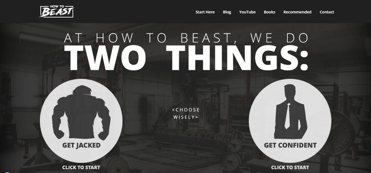
David de las Morenas website is more than just a personal trainer site! This is an online tool that bursts the level of your trust and admiration, aimed at a male audience.
On the main page, you will immediately be offered a reasonable choice: “Get jacked” or “Get confident”. What result do you strive for?
Here you will find a fascinating blog, a collection of books, written by the trainer, a compilation of useful Youtube videos, and a quiz, which will help you choose the most effective training program for yourself.
One of the most pleasant things that definitely builds trust is that David offers a two-month money-back guarantee.
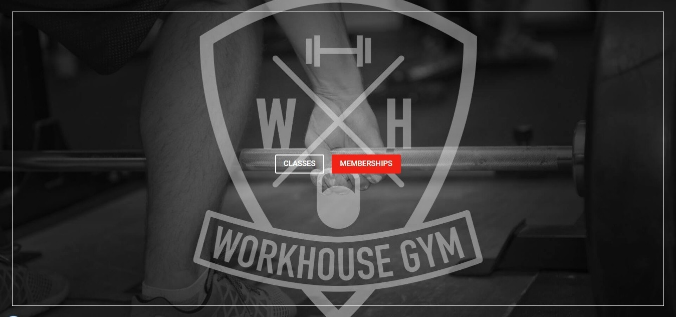
5. Workhouse: Best Gym Website Design Example (FWA winner)
Visit the website: https://www.workhousemalton.co.uk/
Top features: Design, Usability, Imagery, Fullscreen, Responsive
This one-pager is very simple, and it easily conveys its main offer to visitors.
The site has everything to attract the attention of potential clients: great imagery, energetic color palette, detailed information, contacts, and customer reviews.
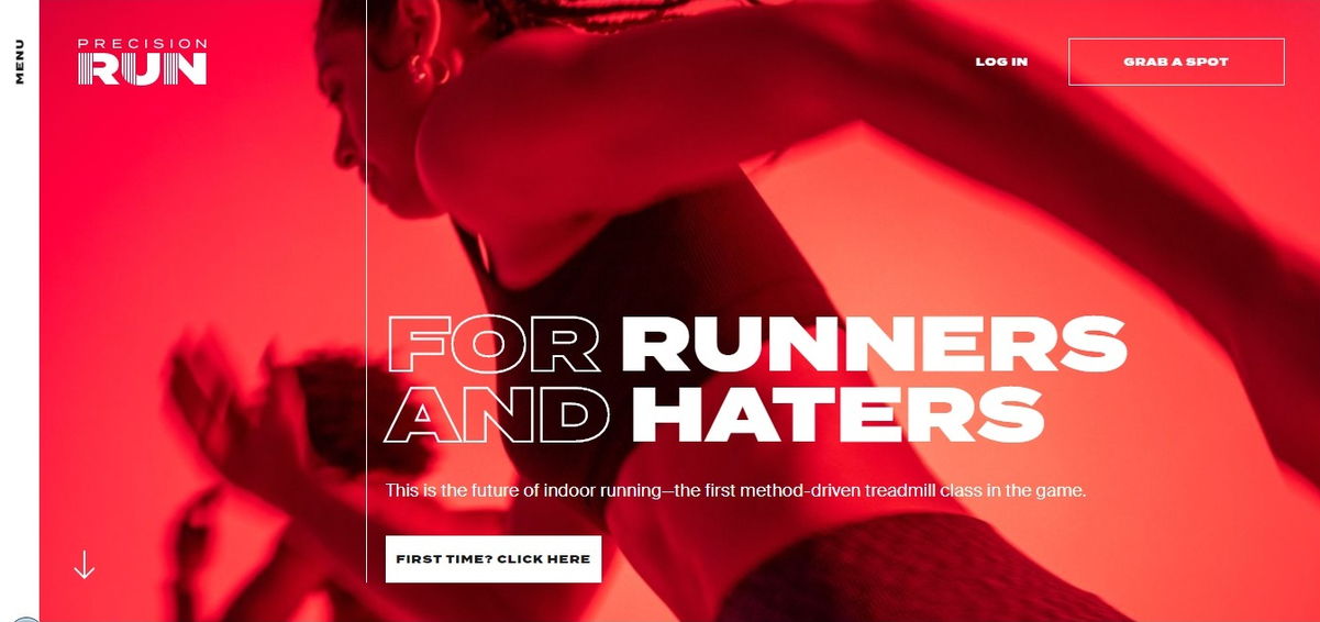
6. Precision Run: Best Sports Websites Example (CSS winner)
Visit the website: https://precisionrun.com/
Top features: Design, Photography, Fullscreen, Content, Creative, Typography, Video
The banner on the main page gets you inspired right on the spot.
Vertical site menu neatly located on the left. Even a newbie will definitely find his way through this site, since the «First time? Click here» button is here, right under the banner.
There is a separate page dedicated to coaches. The correct site footer perfectly complements the overall impression of the site.
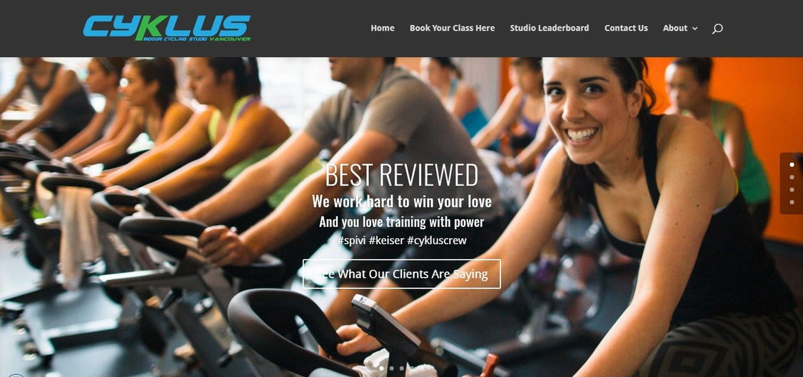
7. Cyklus Vancouver: Best Gym Website Design Example
Visit the website: https://cyklusvancouver.com/
Top features: Design, CTA, Imagery, Responsive, Content, Video
Right on the main page of the site, you are greeted by a bright banner with photos of studio interior and hot offers for the customers.
The site offers the ability to take a Google 360 tour of the studio. A separate page, which can be accessed from the main page is dedicated to trainers. Also, there are competently created CTAs wherever they are needed.
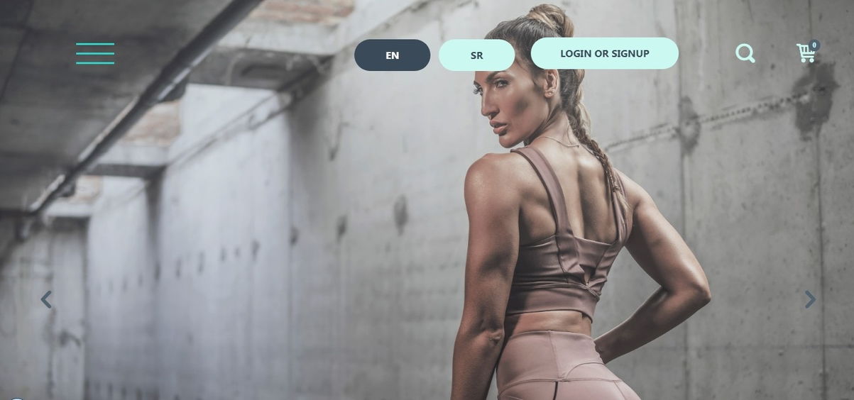
8. Fitnessbodystar: Best Health And Fitness Websites Example (D&AD Professional Awards winner)
Visit the website: https://fitnessbodystar.com
Top features: Design, Usability, Fullscreen, Creativity, Content, Responsive
The website is targeted at a female audience. Actually, it is an online store selling training manuals and nutrition programs both for novices and pros.
Cutting edge visual style, intuitive navigation, easy to read content and responsiveness make this website an exceptional one.
9. MVMNT: Best Gym Website Design Example
Visit the website: https://www.mijnpersonaltrainer.be/
Top features: Design, Fullscreen, Content, Creativity,
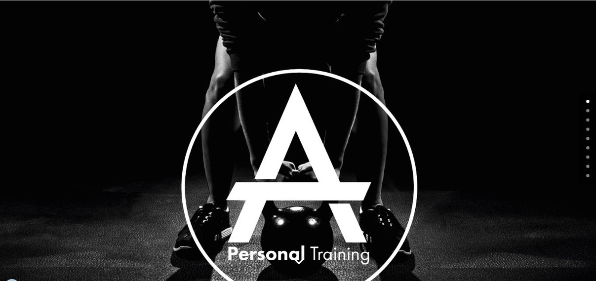
The MVMNT website greets you with an inspiring banner. Scroll a bit down, and you will see an inspiring contact form pop up.
The training programs are described very clearly. A section with customer reviews immediately draws your attention.
Multiple menus perfectly structure the body of the main page.
10. Jesse Wynyard Fitness: Personal Trainers Website Example
Visit the website: https://www.perfectfittraining.com.au/
Top features: Photography, Usability, Responsive
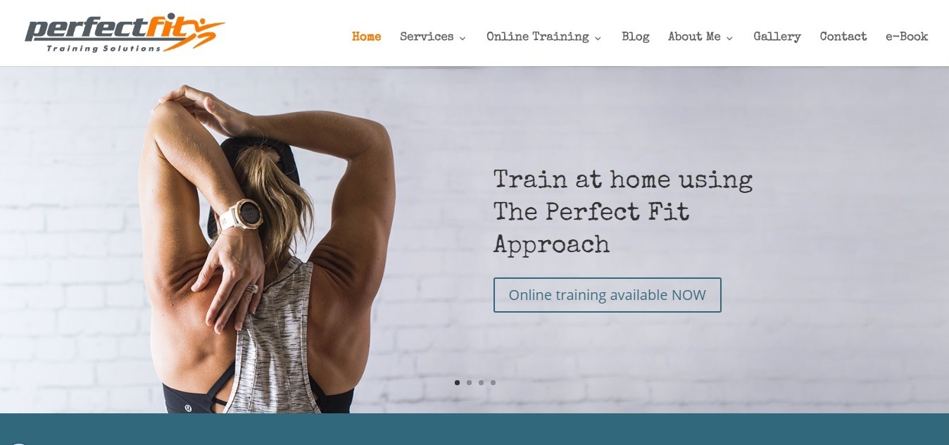
On the homepage of this personal trainers’ website, you will notice a compact but very capacious menu with drop-down windows. Basic services, online training, About me, blog, gallery – the site has everything that a good fitness website should have!
There is even a section with the e-books and a link to an app.
11. Phive: Best Health And Fitness Websites Example (CSS, Awwards winner)

Visit the website: https://phive.pt/en/
Top features: Design, Usability, Creativity, Content, Responsive, Sound, Video
When entering the website, you will get swallowed by funny animation, a unique and interactive stylish design evoking an immense motivation. These web designers definitely have a delicate sense of taste!
The website design concept is trendy, and the style flows throughout each page of a site.
Still, have no clear idea what type of website to launch? Check out these 75 extraordinary website ideas!
Best practices for fitness website design
1. The responsive design of your fitness website (or a mobile version of a site)
51% of the time spent online in the US is on mobile devices.
A website, that is optimized for mobile devices will be perfectly displayed on the smartphone or tablet screen (no matter what size of a screen it has), the website will be pleasing and easy to use, which means that visitors will be satisfied, and you will have more chances to turn them into your customers!
2. Intuitive navigation
Clear and simple site navigation is the key to successful user experience:
- make the navigation menu for the site concise (4−5 points) and stick it,
- put a link to the main page on the logo,
- add vertical indicators (points) to determine the visitor’s location on the page,
- add the “Go to the top” navigation button at the bottom of the page,
- create an attractive footer with contacts, menu, and CTA at the bottom of the page.
The first page of your site must contain links to the services that you offer.
3. High-Quality Photos Of Your Fitness Site
You are not selling people time spent in the gym, but a beautiful figure and steel muscles. Make sure that everywhere on your site there are high-quality photos that remind visitors the reason why they came here!
If the design of your fitness club has memorable elements, be sure to focus on them.
4. Eye-Catching Call To Action
The visitor can take the desired action from any place on the site. Therefore, we highly recommend you to think about your call-to-action buttons, when clicked, pop-ups for registration, or another action.
Clearness, consistency, and repetitiveness – these are the three main characteristics that your CTA should meet!
Use such common and effective calls to action as:
- Sign Up for a Free Workout;
- Join My Online Community;
- Sign Up for a Product Discount.
5. Fitness Trainers page
All successful fitness business owners know that the most important thing in fitness are people!
Show your fitness trainers as living, emotional, and enthusiastic people. Such photos draw attention. They involve!
In addition to photos and personal information, be sure to add information about the achievements of coaches, their awards and certificates – it helps to build confidence in your fitness center!
6. Pricing
It’s up to you whether to publish your prices or not. But there is one win-win solution, which is used by most large sports and fitness websites.
Highlight several club cards that are top of sales and focus on them, and attach the rest of the price list in the usual list on the corresponding page.
7. Contact Form & Clickable Phone Number on your fitness site
A quick response to a visitor’s urgent question can easily turn him into your customer. Do not miss your chance to make it as easy as possible for the visitor to connect with you!
Place al the following information on one page: address, email, a form, and clickable mobile phone numbers so mobile visitors can call you right away. This will help to make it easier to search for, share, and bookmark. Also, place the contact info in the header of each page of your website.
It is also a good idea to get a free live chat on your website so that you’ll always be there to answer the questions.
8. Gym Reviews Page
How will people understand that your fitness center is actually the best in the city? That’s right, with the help of reviews – one of the most effective tools that help to generate leads!
Add a page to your site that proudly states your fitness club’s benefits via a compilation of Facebook, Google Plus, and Yelp reviews.
This page should also give your website visitors the possibility to leave a review of your fitness center and quality of services.
9. Fitness Website Blog
All materials that you post on your fitness blog can be published on behalf of a specific trainer. This allows you to raise the level of expertise of your coaches in the eyes of potential customers.
Be sure to publish articles on various topics, such as “Nutrition”, “Health”, “Exercises”, “Motivation” and so on. This will help you to remain a leader of the niche, improve SEO, show your expertise, and increase customer confidence.
You’re just one step away from creating your perfect website: check out these best website templates!
Summary
In order to achieve success and use your personal website as an effective tool to increase your online presence, you should develop a professional and comprehensive approach to its creation. Pay attention not only to the attractiveness of the design but also to our website content.
A modern, informative website will allow you to quickly and easily stand out from the crowd thanks to all the presented benefits that your customers will easily find thanks to clear and easy navigation.
On your site, you should implement a comfortable scheduling system, provide your customers with an opportunity to get acquainted in detail with the terms of the programs, suggest creating individual programs. Do not forget about mobile-friendly design, because today, the market share of mobile devices is about 50%!
