Website Navigation Design: 12 Best Practices in 2026
Well-organized website navigation provides users with ease of maneuvering from one webpage to another. It affects conversion for business platforms and acts to increase their sales.
Improved navigation practices increase the overall webpages’ weight which is crucial for SEO. And, at the very least, people are more likely to use a website with an understandable and convenient navigation style.
The various types of navigation, such as the website’s menus, scrolls, clicks, lists, and dropdown menus that outline multiple items. Buttons and images can be used on a site for navigation as well but providing links in text form is far more easy to implement. Plus, the linked text is more useful for SEO since Google can crawl text, not graphics.
Website navigation can be one of your greatest tools for increasing website conversion if used wisely. We will tell you about the website navigation best practices that work:
- Plan and choose the menu order strategically
- Adopt the motto ‘Less is more.’
- Be specific
- Link back to the home page with your logo
- Make primary navigation stand out
- Keep header options to a minimum
- Add a search bar
- Add a fat footer
- Use responsive navigation
- Add recommended content to recirculate traffic
- Use single-page scrolling navigation
- Use familiar structure and user-friendly language
Plan and choose the menu order strategically
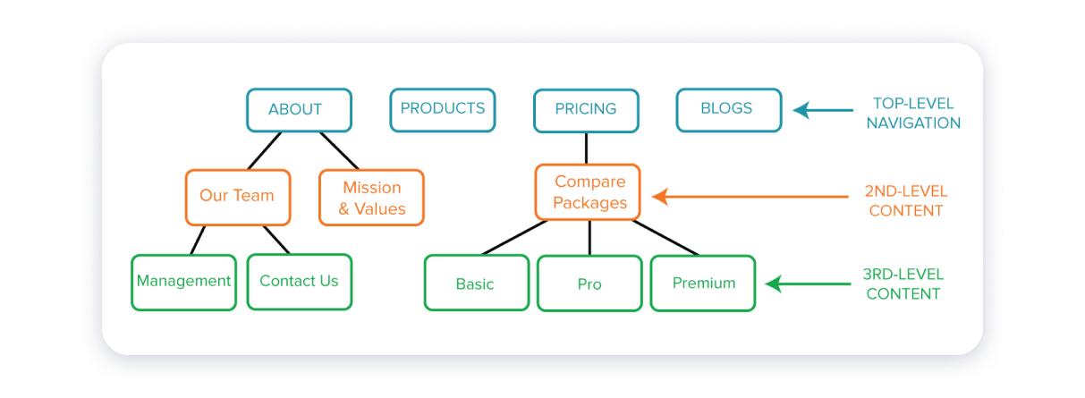
Thinking over the features that a specific site offers and also compliance with the hierarchy of information display is crucial. To make it clear and usable, it is important to create a thought-out navigation menu that would contain and display all the different levels of information. This is to be done before you even start building your website.
The serial positioning effect is good to keep in mind when planning the menu and link placement. The statistic shows that people remember the information that comes at the beginning and at the end better than all the other info. Thus, the links or menu items you consider as the most important should be placed accordingly.
Adopt the motto ‘Less is more.’
Any destination should be two clicks away. Users are more likely to linger on your website if the target is easy to reach. Keeping the drop-down menu options to a minimum is also recommended for most websites as it improves user experience. Unless you are a marketplace, with numerous categories for products, a lot of menu items will confuse the site guests.
Be specific
It is an excellent website page navigation practice if users can always know their location in a site. Having their current location highlighted will be helpful as it leaves no room for confusion.
Furthermore, context is crucial. If you have buttons, icons, images or text linking to other pages, make sure to provide their description. This ensures visitors have clues on the menus of what they expect in the various webpages.
Link back to the home page with your logo
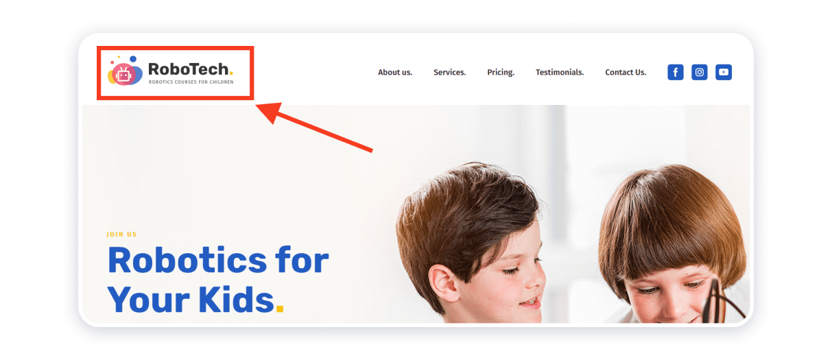
Linking your logo to your home page at the top of the page is a standard feature that allows users to always have access to their starting point. On that note, you should have a logo — it is something for the target audience to associate with you.
Make primary navigation stand out
The main menu of your website should be visible to capture the attention of visitors. Normally it is located at the top of the page or sometimes aligned to either the left or the top right corners. Having the navigation menu that contrasts against everything else would draw the users’ attention and help them understand the structure of your website
Keep header options to a minimum
It is always better to make the main menu short, up to seven items, as this is the optimal information that the human short term memory can keep at a time. Like with the drop-down menus, fewer navigation items will ensure that your visitors don’t get confused.

Add a search bar
Talking about searching for desired information on your website, a search bar can ease one’s hustle in trying to find the page they need. You can use a sticky search bar for that — it will always be visible to users.

Making anything easily accessible to users will get you more leads.
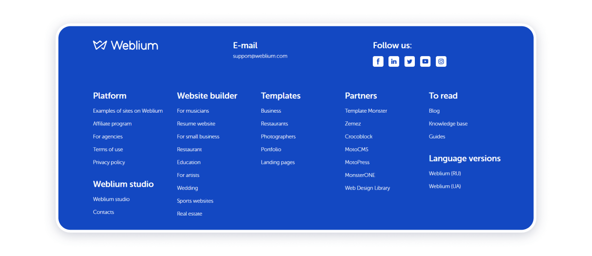
Add a fat footer
Footers are used to display legal links and contacts to the website owners. However, they also display email sign up and social links as well as address details of a company. If your website contains heavy content, it is prudent to display important links and information that may be helpful for people who may prefer bottom page navigation usually found at footers.
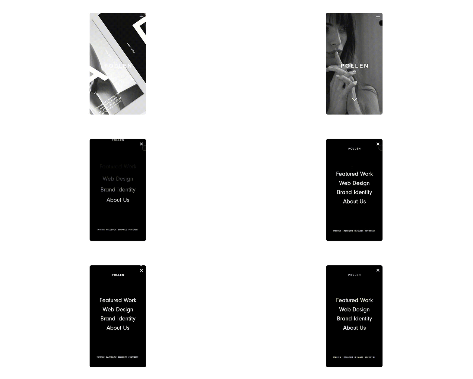
Use responsive navigation
The use of responsive web design ensures that your website will look great despite the device used to access it. The hamburger menu is useful in ensuring website responsiveness for both mobile and desktop devices. This menu has a compact size that fits well on mobile devices without causing distortions of other buttons.
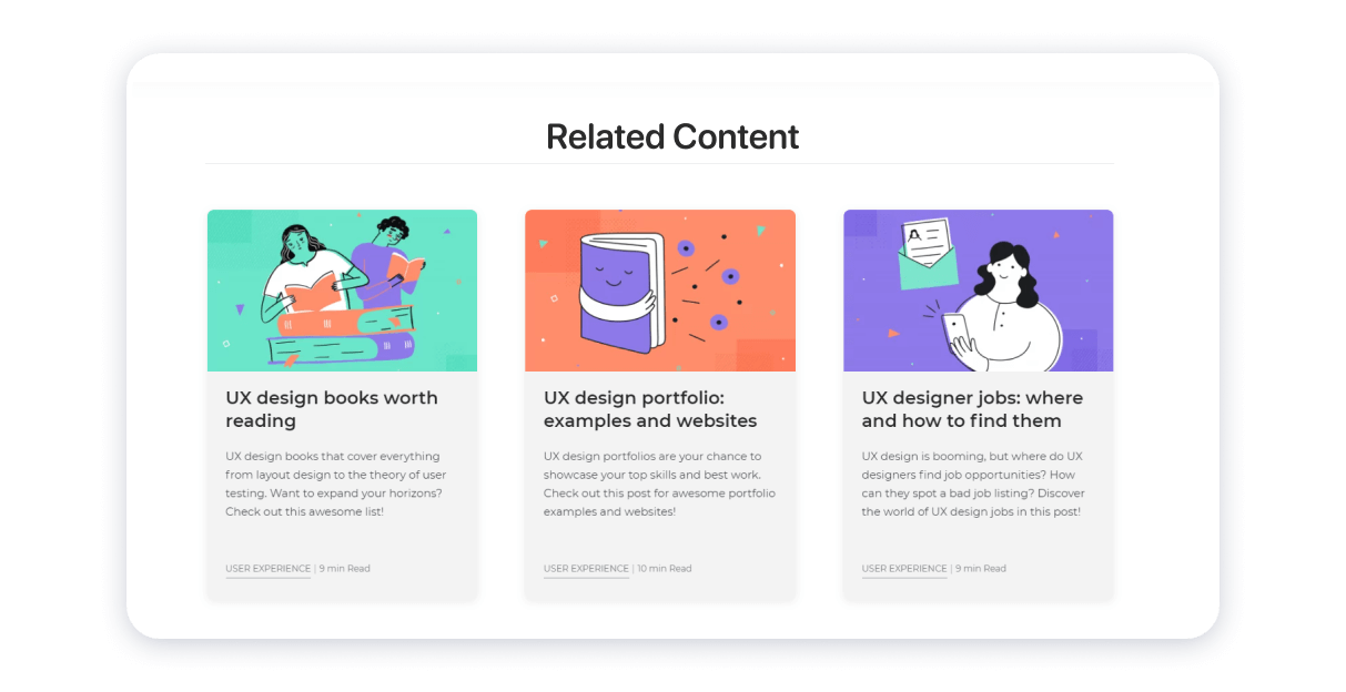
Add recommended content to recirculate traffic
This is a recommended tactic for users on a massive content website. Ensure that visitors can navigate your website based on related content. This website design technique ensures to keep users longer on a website as they encounter information that may be of interest to them.
Use single-page scrolling navigation
A single-page scrolling technique ensures that users do not get bored with tons of information — the most significant information fits the same page. It’s easy to create a single-page site in a website builder with a top menu that will take users to the section of the page that interests them the most.
Use familiar structure and user-friendly language
It’s good to structure menus in a way that is familiar to users. The same goes for the language: use vocabulary and terms that are easy to understand to your specific target audience. Trying to get creative might put off your visitors. Your site should be built in such a way that the intended users can easily understand its content. Easy to read and follow links and buttons encourage users to continue navigating through your site and vice versa.
This is easy to implement with website builders. Their templates are designed to be user-friendly and they follow the common patterns that people are used to navigating.
Conclusion
How do you ensure that your website ranks among the search engines and attracts the right kind of traffic? The answer lies in using the best methods for improving web navigation that include a navigation style that seeks to increase visitors’ conversion. Keeping menu items to a minimum and having a fat footer are among those.
Weblium is a website builder that optimizes website navigation with convenient and user-friendly templates. Our templates take into consideration all the best recommendations for navigation design and help you build a website that gets high conversion. Browse our features for more information on how to create a site.


