13 Interesting Website Background Examples
We all know that 94% of the first impression is related to design. CrazyEgg claims that 90% of information transmitted to the brain is visual, and it is processed 60,000x faster in our brain than text.
Since the background of the site occupies most of the page, this is one of the most important elements of the site, which affects the formation of the first impression of visitors. If you want to reduce your bounce rate and strengthen your brand image, pay special attention to your website background.
We did some digging and found some interesting website background examples, and now we want to share them with you!
Interesting website background examples
Contents
Lucem of hope: light blue background website example
*website created using the Weblium template
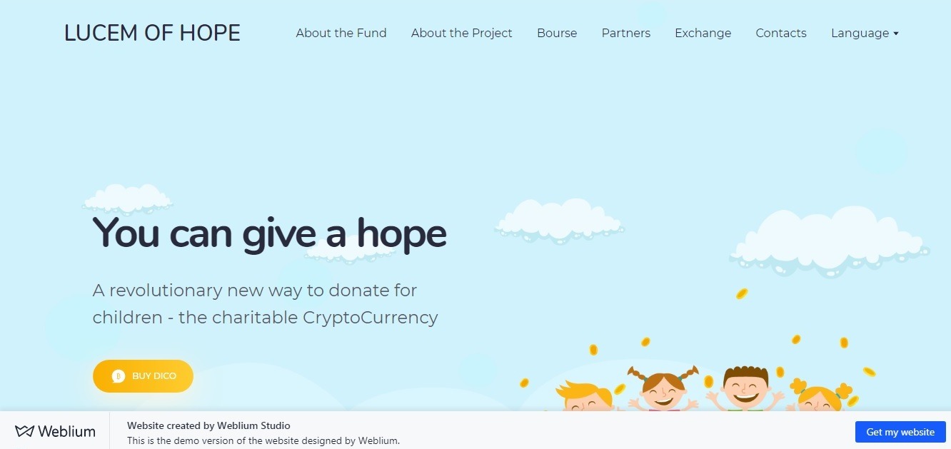
What we liked the most: light, pleasant illustrations, and clear structure.
We believe that the most important thing for the charity website (in some sense, Lucem of hope is the one that offers a modern way to donate) is an attractive design that gets the visitor in the right mood!
The Lucem of hope website has everything that this type of website needs: nice, light background, pleasant cartoonish drawings (blue cloudless sky, green grass, children holding hands).
A clear structure allows the visitor to quickly find the necessary sections with important information and the most important buttons.
Zero studios: birthday background website example
website: two.zero.nyc
*”Website of the day” by CSS design awards
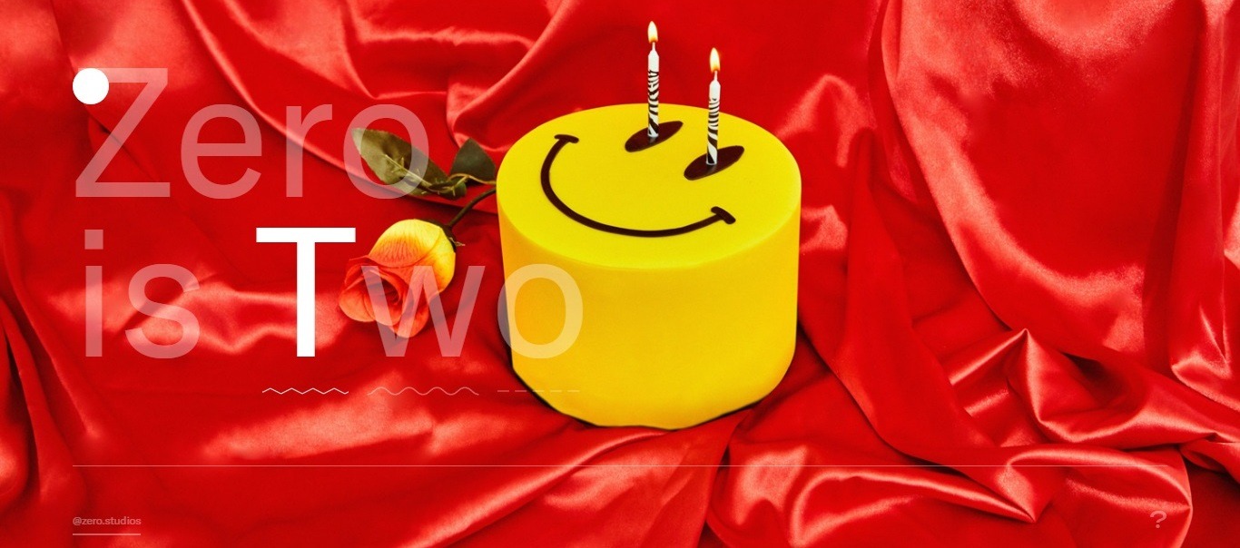
What we liked the most: great performance and intriguing effects!
Here, you will find not only colorful birthday pictures as a background of sections of the site but also cool posed photos of studio team members and brilliant fun effects.
The information is perceived so easily that you want to look further!
GMS: night background website example

*website created using the Weblium template
website: www.nfrnz.weblium.site
What we liked the most: the perfect combination of background color and shades of blocks in the foreground.
A dark background always looks modern and elegant, and, on the “Growth 18 Marketing Stage” conference website, this effect is emphasized by an animated image in a header, where geometric shapes move randomly.
On the background of the site, you can notice the related images – a world map, an image of a venue and other interesting elements.
Look more great free templates
Jarritos: white texture background website example
website: jarritos.com
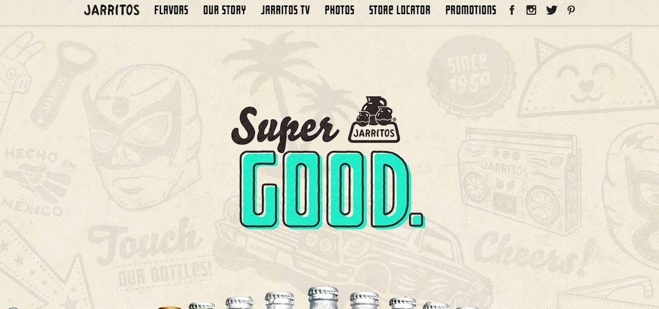
What we liked the most: cool texture background, colorful design.
Mexican-style white texture background is a perfect choice for this retro-styled website combined with modern elements!
The header immediately shows you «Super Good!» tagline, after which you can find out more about the whole choice of drinks: the bottles tinkle when you hover the mouse – and you already want to try it!
There’s also a cool video about the way these guys create their drinks – be sure to watch it!
Don Caravan: gray background website example
*website created using the Weblium template
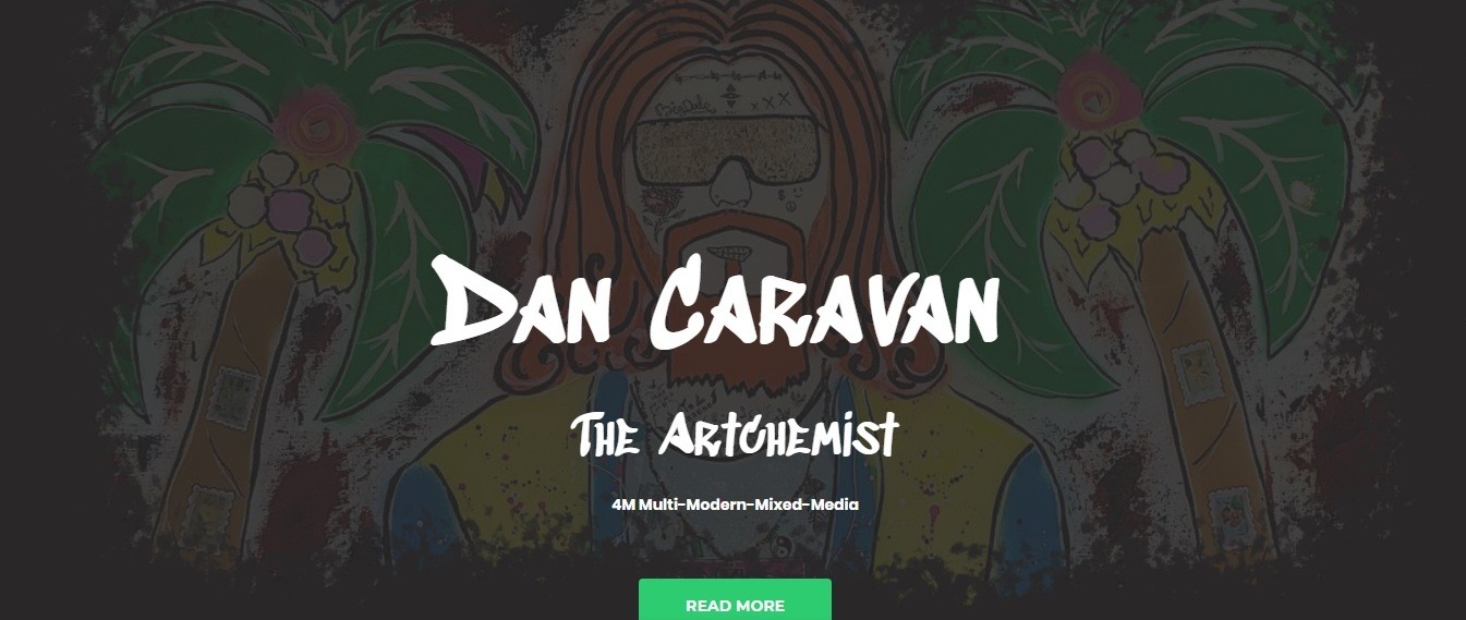
What we liked the most: the perfect combination of a gray background and colorful artist’s works.
The colorful artist’s drawing dilutes the strict gray first screen of the «Artchemist’s» website. Click «Read more» – and check out his portfolio, that will appear on the screen.
The gray background doesn’t look boring after a couple of minutes since it shows the fragments of the author’s works and photos of the showroom interiors.
Rainforest foods: summer background website example
website: rainforestfoods.com/
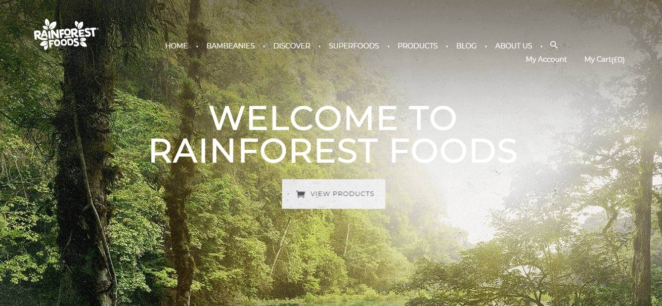
What we liked the most: colorful design, rich colors of illustrations.
We’ve decided to add this site to the «Summer background» category for a reason, as it is all filled with picturesque landscapes of the green rainforest, as well as other full-sized colorful images.
The site is well-made and gives a pleasant feeling from interacting with it. The art is in the details: light animation in the menu of the site, amazing footer, clear copy and a font that perfectly fits the design!
Webyx: modern background (in black)

website: www.webyx-dsgn.weblium.site
*website created using the Weblium template
What we liked the most: elegant dark background, video background.
Video is always good for marketing, but the full-screen video on the home page with bright text on top of it is a trend!
The developers chose black and gray colors for the website’s background; it is an elegant solution for a modern site of services in the field of branding and design!
Sweet Leaf Tea: orange background website example
website: sweetleaftea.com
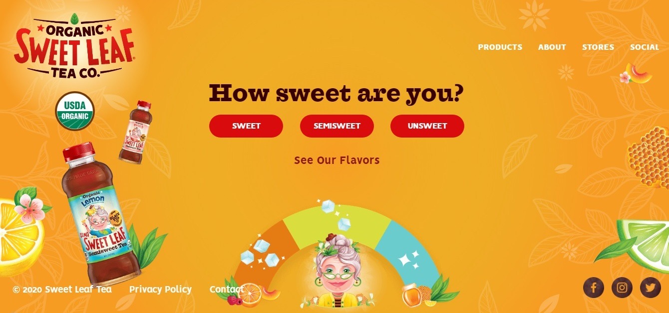
What we liked the most: the full-color palette is here on one site!
Finally, we found an orange website that looks breathtaking!
This design contains all the colors of the rainbow, and all of them are perfectly combined with a rich orange background. The illustrations and inscriptions are moving at different levels when scrolling: it creates an interesting effect and enlivens the design!
Mimi Models: beautiful website background example
*website created using the Weblium template
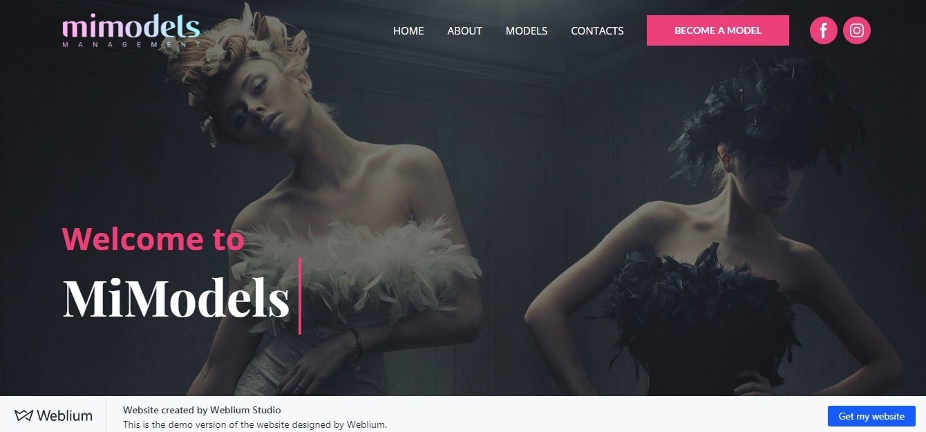
What we liked the most: the design is simple, but it looks very fresh and complete.
The laconic design of the site looks gorgeous! The background is a beautiful, professionally-made posed photo of the models (right choice for the modeling agency!).
Blocks with information and photographs of a white color perfectly contrast with the dark header.
Aurummm: beige background
website: www.aurummm.weblium.site
*website created by Weblium Studio
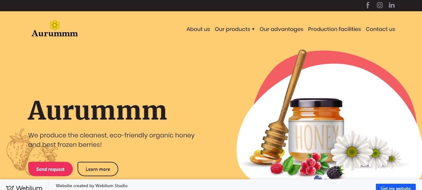
What we liked the most: simplicity and an ideal combination of background colors and website elements.
Beige is one of the shades of the sun. We think that is why the company that produces organic honey has chosen this color as the background color of the website header and individual design elements.
Choosing a honeycomb image as the background is just a great idea!
The warm colors of the site, as well as illustrations, create a warm feeling of trust and naturalness.
SmartCell: medical background website example

What we liked the most: a background that perfectly matches the specifics of the business niche, a successful combination of colors.
The website of a «SmartCell» biotechnological company uses full-size images of stem cells as the website background. In the foreground, we see the snow-white blocks with information about the services the company provides.
Premio: sports background
website: www.premio-agencia.weblium.site
*website created by Weblium Studio
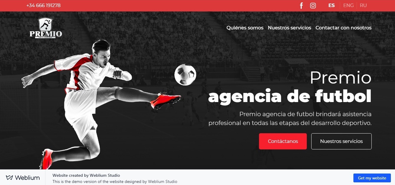
What we liked the most: an amazing color scheme!
You can see a gray background with a picture of a football stadium behind the blocks with information about the services and benefits of the Premio sports agency.
The main feature of the website design is the amazingly chosen colors: the gray background, white and red blocks, and design elements look very organic!
Ocean School: ocean background website example
website:oceanschool.nfb.ca
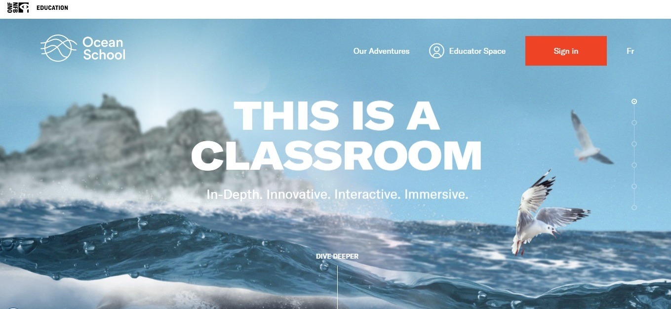
What we liked the most: high-quality background, an interesting idea of a scroll.
On the first screen, you see a full-sized, colorful image of the sea landscape in the header of the site.
As soon as you start scrolling, you start going deeper under the surface of the water, plunging into the deep sea and finding out more about the company.
Sea background, the transitions from block to block are made simply amazing, the colors are chosen perfectly, and parallax makes this stunning design look complete!
Summary
Creating the background, the web designer completes the website design concept, sets the tone for the main design elements.
Use these tips for creating the right background for the site:
- The background should correspond to the business niche and site specifics.
- The backdrop should match your website’s content, be easy to perceive.
- Contrast: the website elements should contrast with the background and not merge with it into one big spot.
- Compliance with corporate identity (this increases brand awareness and helps to build trust).
- High quality and responsiveness of the background.
- A balance between originality and usability.

