
14 Professional Consulting Website Examples
When I look at a great consulting website, I usually ask myself one question: does it make me trust this company right away? The best ones feel clear, professional, and make it easy to reach out. In my experience, even small details (the layout, messaging, or button colors) can make a big difference.
In this article, I’m sharing some modern consulting website examples that I find particularly well done. As you browse them, you’ll find ideas and approaches that help companies attract attention, build credibility, and encourage visitors to get in touch.
Contents
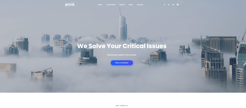
Strategic consulting

It’s among my favourite examples of consulting websites. It does a great job of presenting a business in a professional and structured way. It highlights key services, features case studies, and includes a quick way for visitors to sign up or reach out. The layout is built around spacious sections with headings, visuals, and text blocks that make the content easy to scan.
The Testimonials slider is a great addition as it keeps the page tidy while still showcasing client feedback. There’s also a blog section where to share insights and advice with the audience. You can simply try this template in the editor and add your business information to create a professional website.
Consulting company
Another good example of consulting website that has almost everything a company needs for a professional online presence. It includes blocks for presenting your key benefits, practice areas, and results in numbers, plus convenient forms for client inquiries.
I like how you can add a slider to showcase partners and dedicate a section to introducing the team. It’s also possible to embed videos and link social media accounts. The FAQ section is a nice addition too, as it can address common client questions right on the page and contribute to website search optimization as well.
Millemann

Millemann has a very minimalistic style that immediately caught my attention. If you like clean design and attention to detail, this website will probably appeal to you as much as it did to me. Even the first screen feels engaging, the image and background move slowly following your mouse cursor. The navigation is also refreshingly simple. Instead of many menu items, you only see a few key buttons: About, Contact, and Site Menu.
Instead of scrolling, the site uses arrows to guide visitors through sections called Passion, Expertise, and Quintessence. Another detail I find interesting is the floating “Discover” button that follows the cursor and leads you to these sections. It makes exploring the website feel more interactive and a bit unexpected.
Code and Theory

I really like the website of the independent consulting company Code & Theory. It immediately stands out thanks to the clever wordplay used on the homepage. Instead of the usual navigation, the first screen shows just one phrase: “How We Make The Things We Make Says A Lot About Us”. It’s a creative solution that makes the homepage feel more interactive.
Another detail I noticed is how naturally the call to action appears. Right after explaining how they help clients reach their goals, the site shows a simple “Have a project to do?” form. It feels perfectly placed.
Fresh
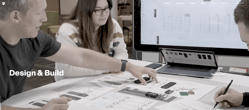
The website of Fresh Consulting feels modern and dynamic from the very first screen. The large visuals and animated transitions immediately create a sense of innovation and forward thinking.
The homepage highlights the company’s key directions (strategy, design, software, and hardware) with bold sections and interactive elements. As you scroll, the content appears gradually, which keeps the experience engaging and easy to follow. This approach works well as it guides visitors through the company’s capabilities step by step.
The Workspace Consultants
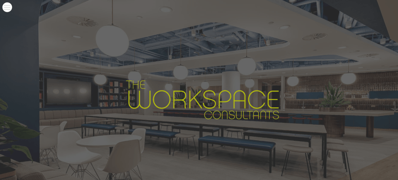
The Workspace Consultants website uses a clean and professional design that focuses mainly on content. When I explored it, I immediately saw a short introduction explaining the company’s services and how they help businesses with office relocation, design, and project management.
This design also works well for a consulting company. It doesn’t try to overwhelm visitors with visual effects. Instead, it focuses on clarity, testimonials, and real case studies to show credibility.
Implement
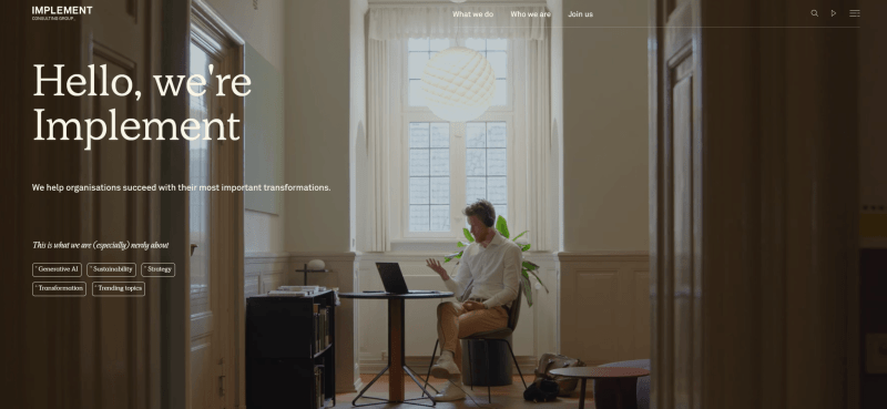
Implement is another consulting website that caught my attention with its subtle parallax effect and very clean design. The overall style is snow-white, complemented by bright, colorful photos that add contrast and keep the page visually engaging.
At the same time, nothing here feels unnecessary or overloaded. The main menu is neat and clear, and the “Start a conversation” CTA in the header is noticeable but not intrusive. As you scroll, you’ll see sections with current topics, news, “What we do”, “Careers”, a presentation video, and community information.
One detail I personally found interesting is the team section. The members are presented with many photos organized alphabetically, which makes browsing both simple and engaging.
Waters Center
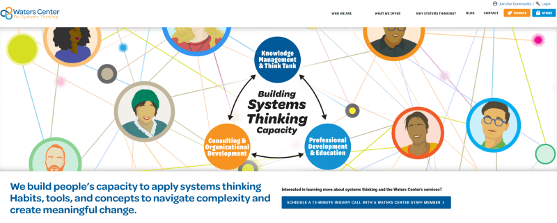
Waters Center uses bright, colorful elements and photos to present its consulting approach in a clear and engaging way. It focuses a lot on helpful materials – visitors can easily download free resources and start learning about the system.
The footer also works nicely as a final touchpoint. It includes a sign-up form and links to social media, which makes it easy for visitors to stay connected or learn more about the company.
Kearney
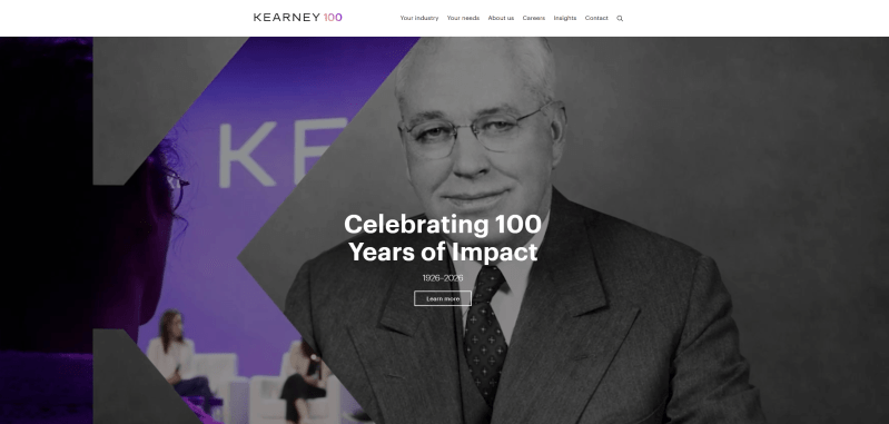
Kearney’s website has a lot of information, but I like how easy it is to navigate thanks to the clear structure. There is also a search bar, which is helpful if someone is looking for a specific topic or resource.
The color palette is simple and consistent: black and white are used for most of the text, while purple highlights buttons and links. This contrast works well because it naturally draws attention to interactive elements.
Kimmie Weeks
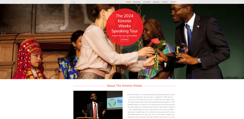
If you’re an independent consultant and want to create a personal website, I think this is among the top consulting website examples for small businesses. The site includes all the essential sections (a bio, projects, and contact information) so visitors can quickly learn about the person behind the consulting work.
The design stays consistent throughout the pages, with red used as an accent color for buttons and headings. There’s also a simple contact form, which makes it easy for potential clients or partners to send an inquiry without any extra steps.
Conjunct
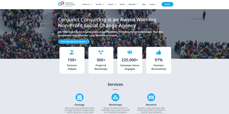
Here is another good example of consulting website with engaging blocks and interactive elements. Several visual details make the content easier to understand. For example, diagrams showing years of experience, testimonial sliders, and service cards.
The pages are quite enjoyable to navigate. As you move through the site and click different buttons, you can easily discover more information about the company and its expertise. Another useful detail is the map included on the site, helping visitors quickly find the office location.
Wedowe

Wedowe immediately caught my attention with its bold and creative design. Unusual font combinations, vibrant images, and custom icons – together, they make the site feel lively and unique.
The homepage also features an engaging gallery with real photos, a section highlighting partners, and a blog with stories from clients. These elements add personality and help visitors connect with the brand. The footer is practical and well-organized, including a newsletter subscription form and contact details.
ghSmart

ghSmart is another good consulting website example that does a great job of showcasing the company’s story, team, and expertise. When I explored it, I noticed how clearly everything is organized. Services are divided into categories, which makes it easy for visitors to find exactly what they’re looking for.
I also like the slider that features video presentations alongside quotes from the CEO, CSO, and other team members. This adds a personal touch and gives visitors a real sense of the company’s culture and experience.
L.E.K.

L.E.K.’s website immediately gives the impression of a professional and content-rich consulting firm. The homepage includes the latest news, videos, career opportunities, case studies, and more — each section has a clear button to learn more, which makes navigation straightforward.
I also like the “That’s new” section at the top. This is a small but effective detail, allowing visitors to quickly check out the latest events like webinars or industry publications without scrolling.
How to create a consulting website?
1. Clearly define your values
When I visit a consulting website, the first thing I look for is the company’s unique value. Your potential clients do the same, so make your USP the first thing they see.
Place it prominently at the top of the homepage, in the center of the screen. Share brief but clear information about what makes your product, service, or approach stand out. I also recommend adding a strong visual (an image, animation, or short presentation video) to make it more memorable.
2. Give priority to user-friendliness
Try to imagine a consulting website that isn’t visually appealing. It’s hard, right? That first impression really matters because it’s the first thing visitors notice.
In my experience, the formula for a successful website is simple: clean, pleasant, and easy to navigate. Minimalist design combined with intuitive navigation goes a long way in keeping users engaged.
Design really pays off: 73% of companies worldwide invest in web design to stand out. Adobe surveys even show that “design-driven” companies are more successful in reaching their business goals (69% versus 22% for their peers).
3. Create a clear site structure
According to Gomez’s studies, 88% of customers are less likely to return after a poor user experience. In my opinion, one of the most important factors for a positive experience is straightforward, easy-to-follow navigation.
No matter how beautiful your website looks, it won’t help if visitors can’t quickly find your portfolio, location, or contact information. Confusing navigation can make you lose potential clients. And I’ve noticed that slow-loading pages have the same effect. If it takes too long to load, you’ve almost already lost them.
4. Deliver client-focused content
The content on your site should always serve a clear purpose. In my experience, effective texts:
- provide solid arguments
- share proven advice
- include expert opinions
- clearly explain the client’s problem and show how to solve it
- and finally, motivate the visitor to take a specific action.
5. Create an inspiring «About Us» section
In my opinion, it can include some of these elements:
- a word from the director
- a brief company history
- your mission
- distinctive qualities that drive success
- ethical principles of work
- description of the company structure
- information about partners, clients, rankings, and licenses
- financial statements and customer reviews.
6. List your services
Your potential clients shouldn’t have to guess what services you offer (and they rarely will). That’s why it’s important to provide clear, client-focused information about everything you do. You can also link to your portfolio for more examples.
Describe projects in a way that’s easy to understand:
- a brief summary of the project content
- details on the qualifications of specialists involved
- the benefits clients gain from implementing the project.
7. Make a decent staff page
Depending on the size of your company, you may want to showcase different types of specialists. For a larger organization, it can include:
- the top management or management specialists
- managing partners
- consultants.
It works well to show staff photos along with a brief description of their qualifications and experience. It’s also helpful to highlight each specialist’s major projects, certifications, and awards. This makes the team feel credible and approachable.
8. Update your content regularly
Espresso.digital reports that 23% of small businesses update their websites less than once a year. And honestly, those sites often feel like they’re not updated at all.
The more frequently you refresh your content, the better it is:
- for SEO
- for social media
- for your visitors.
Here’s a rough guideline for updates:
- News blogs: daily
- Thematic informational sites: every few days up to several weeks, depending on traffic
- Corporate websites: 1-2 times a week for “Publications” and up to twice a month for “Reviews” or “Completed Projects”.
I’ve learned that you can study theory endlessly and still make mistakes. Of course, experience is priceless. But it’s much easier to gain it when you use proven solutions and guidelines.
Conclusion
An excellent consulting website is the key to attracting new clients and growing your business. With Weblium, you can easily create the online space of your dreams, regardless of your experience level.
Whether you want a simple one-page site to collect leads or a full platform with a blog to generate traffic, it’s all possible. You can choose a ready-made template or start from scratch – and in just about 30 minutes, your site can be ready to launch.
Don’t wait to take the next step. Start building your ideal consulting website with Weblium today!
FAQ about consulting websites
What is a consultant website?
It is a professional online platform that presents a consultant’s or company’s services, experience, and expertise. It acts as a digital business card that displays key information about your business, attracts potential clients, and builds trust through a detailed description of your services, successful cases, and reviews.
How do I create a consultancy website?
You should choose a convenient builder, such as Weblium, which allows you to launch a high-quality site quickly. Determine whether you need a single-page site for collecting leads or a multi-page one for an extended presentation of services. Add key blocks, fill them with texts, photos, and videos that reflect your expertise, and optimize the site for SEO so that clients can find it.
Why does an independent consultant need a website?
It is an important tool for attracting clients, demonstrating competence, and automating client interaction. It helps create a professional image, stand out from the competition, and facilitate processes such as collecting applications or conducting online consultations. In addition, a quality website with proper optimization increases its visibility in search engines, opening up access to a broader audience.
What pages does a consulting website need?
They include a home page with a brief presentation of services, an «About Us» section with a detailed description of your expertise, a «Services» section with a description of offers, customer reviews to confirm your reliability, and contacts with a feedback form. To attract additional traffic, it is worth adding a blog with valuable articles.
What content is standard for a consulting service website?
It includes a clear description of services, successful cases, client reviews, information about your experience and qualifications, and calls to action, such as «Sign up for a consultation» or «Leave a request». It is also important to add high-quality images, videos, or infographics to make the site look professional and attractive.