15 Best Real Estate Agent Websites
Searching for inspiration to build a stunning website for your business? Look no further! We’ve handpicked 15 exceptional real estate agent websites that excel in attracting clients, showcasing properties, and driving conversions.
From sleek designs to user-friendly interfaces, these websites set the standard for excellence in online property marketing. Explore our roundup to get ready to create your real estate website.
Please note that this is neither a rating nor a top list to compare. This collection aims to inspire you to create attractive, quality sites.
Contents
Best examples
Building your distinctive real estate website is more accessible and exciting than you think. Let’s discover the best real estate websites to help you find more ideas for further projects. Don’t forget that you can create your own great website using Weblium real estate website templates.
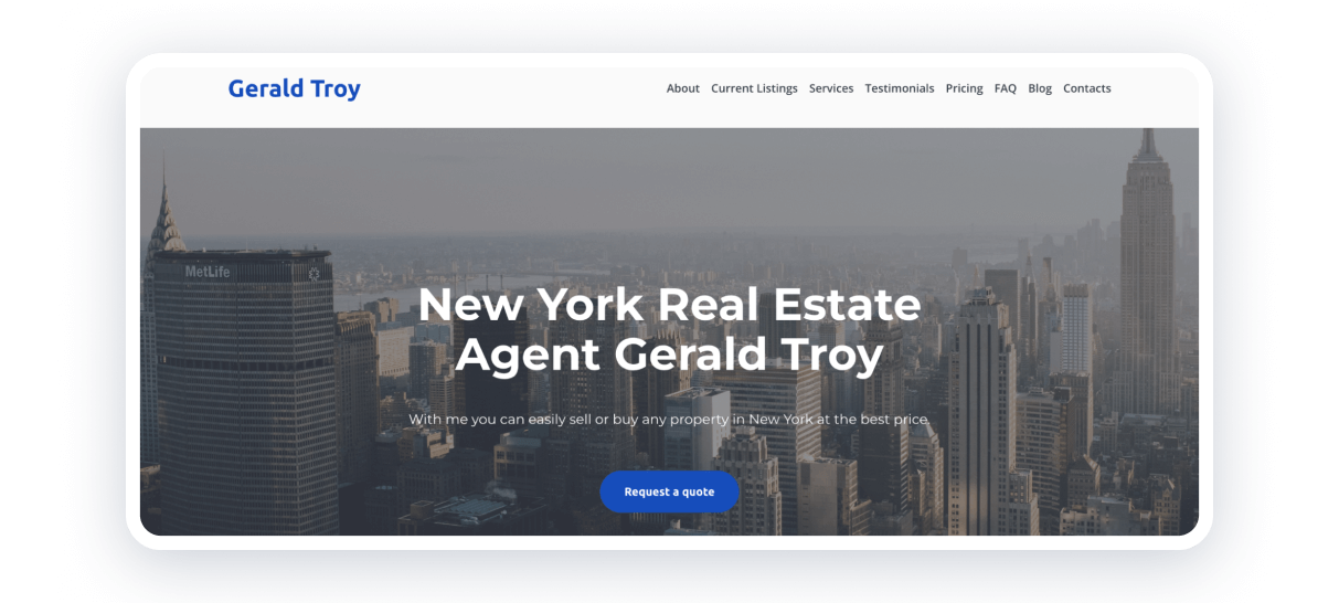
Minimalistic style and restrained colors show trust and credibility. The intuitive design allows users to find information quickly — how to contact the agent, discover pricing, or learn testimonials.
Strong points:
- logo on the left in blue color, matching with the CTA (call to action) button;
- navigation panel on the right, with necessary information about the agent;
- hero section with appropriate image, title, and apt expression — how the agent could fix the client’s problem.
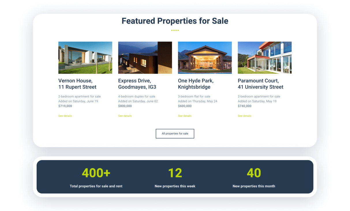
Here, you can see one of the best websites for realtors with functional design and usability. The block of properties contains only valuable information for users — the main image, key features, and price. If interested in a particular property, they will click ‘See details’ and explore more.
Strong points:
- 2 text colors per block: one for the main text and another to make an accent;
- all blocks share a largely typical style — title, list of items, and button to go further;
- achievement section with up-to-date design — no long-read paragraphs, only numbers with titles.
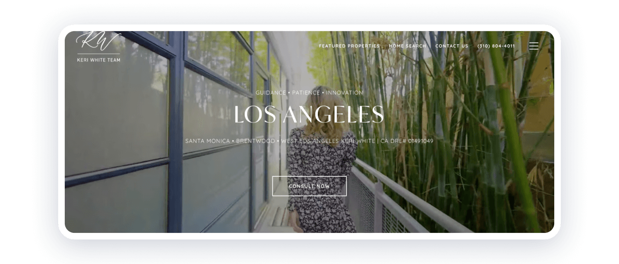
This website has many interactive elements. However, they don’t distract users from its primary purposes: showcase the property’s best features and manage communication with customers.
Strong points:
- video background in cold and soothing colors such as sky blue, light gray, or green;
- buttons to explore more arise smoothly with hovering on the element;
- the header is fixed, but it appears only when scrolling to the top.
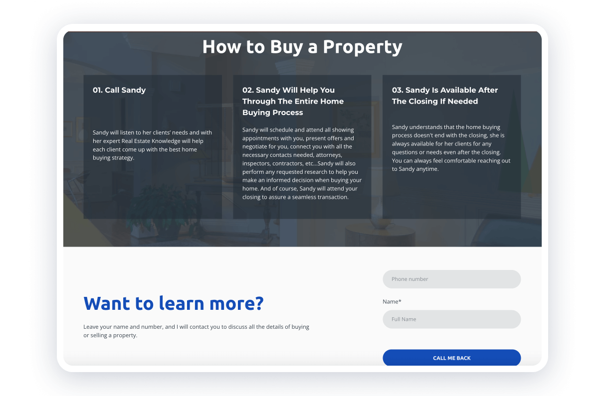
This is a superb example of proper customer communication, a crucial aspect of creating the best realtor website. It was made with Weblium, which offers a variety of features to its users.
Strong points:
- an instruction to let people know the whole process of working with you;
- a contact form to instantly react to customer’s requests;
- texts about your performance with your unique tone of voice.
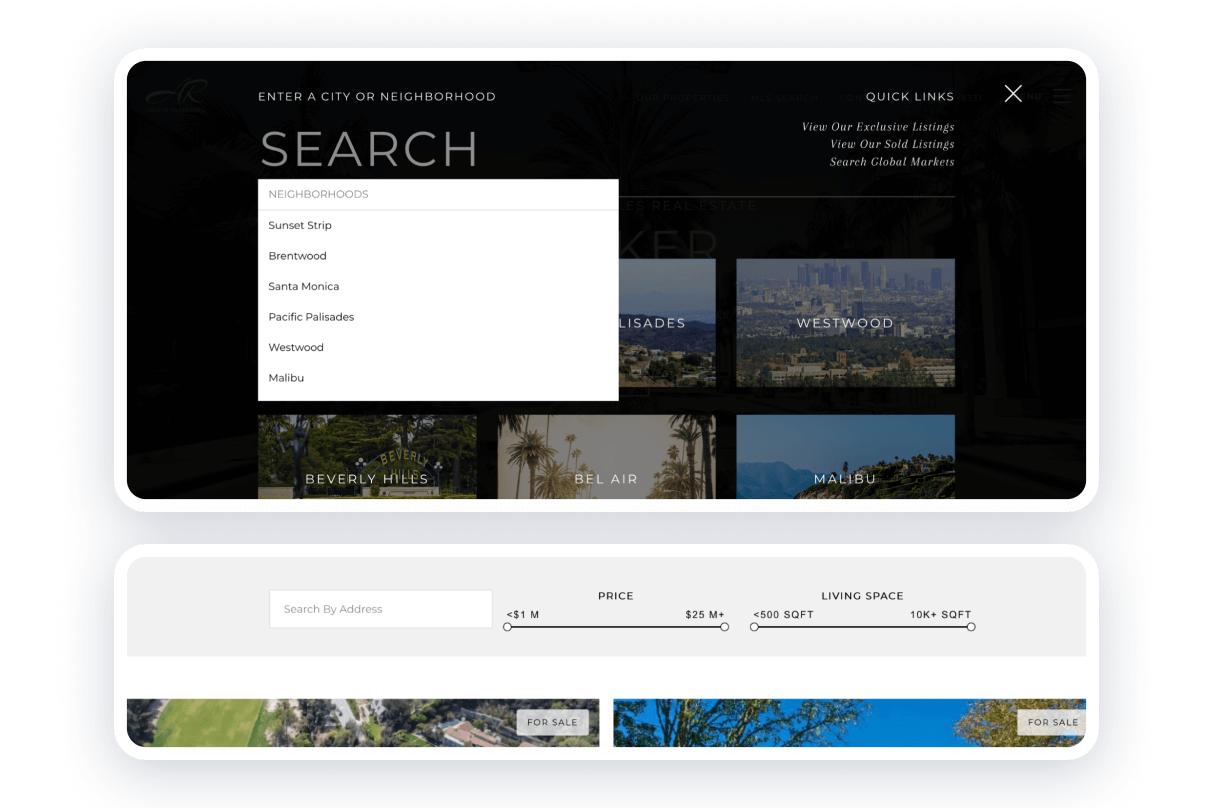
This website shows what simple yet effective methods real estate agents can use to make their sites more convenient for customers.
Strong points:
- users can choose from the list or by clicking on images;
- there are two filters: price and living space;
- ‘for sale’ icon to identify the most profitable option.
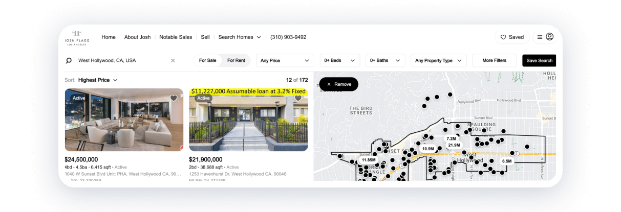
On this website, there are a couple of extraordinary features, such as the intro and horizontal swiper, but back to the essentials, there are personal brand identifiers:
- About Josh (even not us) section;
- Blog with a lot of different valuable articles.
Strong points:
- finding a place with various filters;
- signing up and saving search;
- placing manually upon a map.
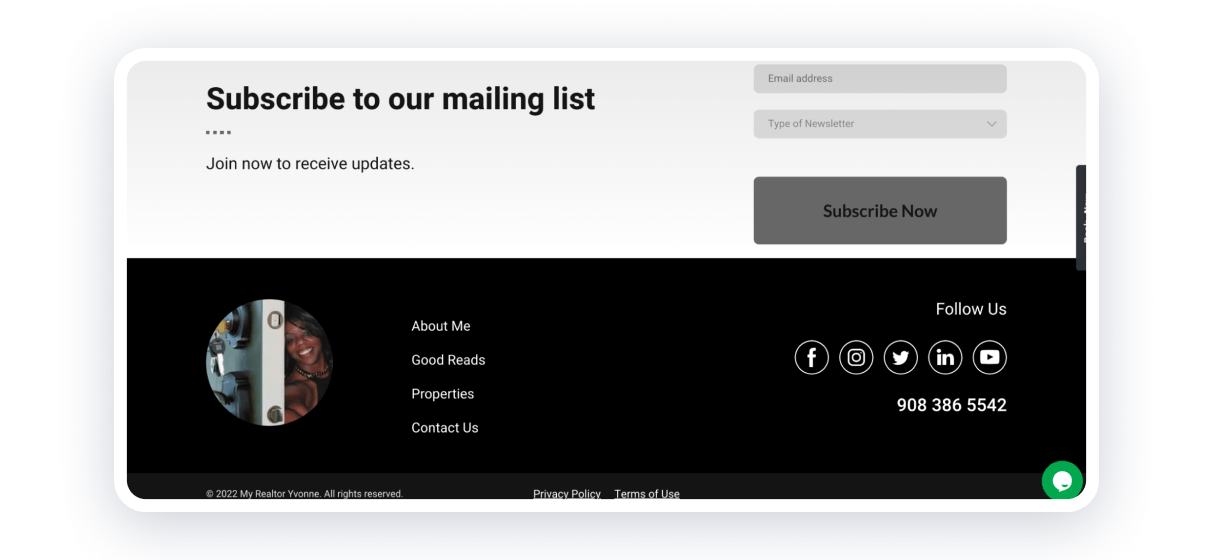
This Weblium website is a perfect example of providing various comfortable communication channels with customers, which is crucial for realtors’ websites. (Have you noticed that vertical ‘Book now’ button on the right?)
Strong points:
- an interactive calendar to book a free consultation;
- a mailing list to receive updates;
- social links to stay tuned;
- a live chat widget.
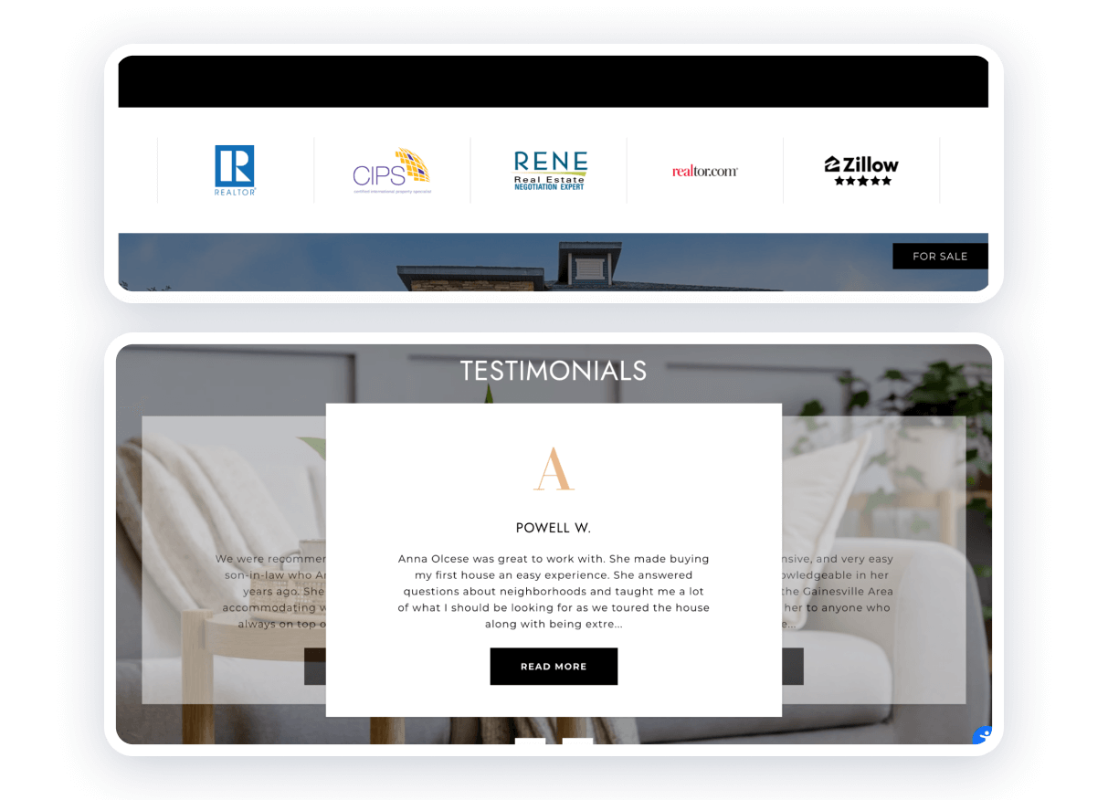
This design combines all the benefits we mentioned for real estate agent websites, the most important of which is providing critical information to the client and introducing yourself as a specialist.
Strong points:
- to name companies or brands that you’ve worked with;
- to place as many testimonials as you have and update them often;
- to show not only social media links but also other platforms that you use.
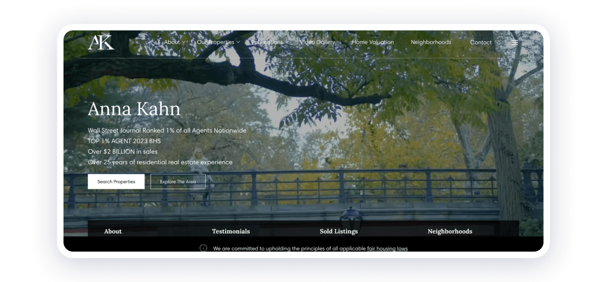
This website design is catchy, and information is easily perceived. That’s why users can discover everything without effort and feel entertained, which is good advice to keep in mind when creating the best realtor websites.
Strong points:
- logical navigation — in header, footer, and ‘burger’ menu;
- simple text colors — black and white;
- principal information on the top of the main page and easy access to CTA buttons.
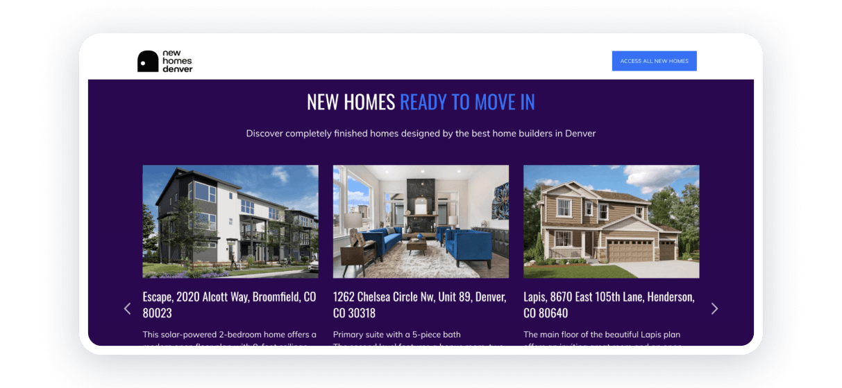
This website is another excellent example of a project created with Weblium. It combines thoroughly thought-out design with functionality that is a must-have for real estate broker websites. Its color palette catches the eye, while its layout makes it simple to navigate through the sections.
Strong points:
- the fixed header makes sure your clients don’t feel lost scrolling your site;
- the slider allows viewing all your propositions at once, not going anywhere else;
- contrast colors emphasize elements.
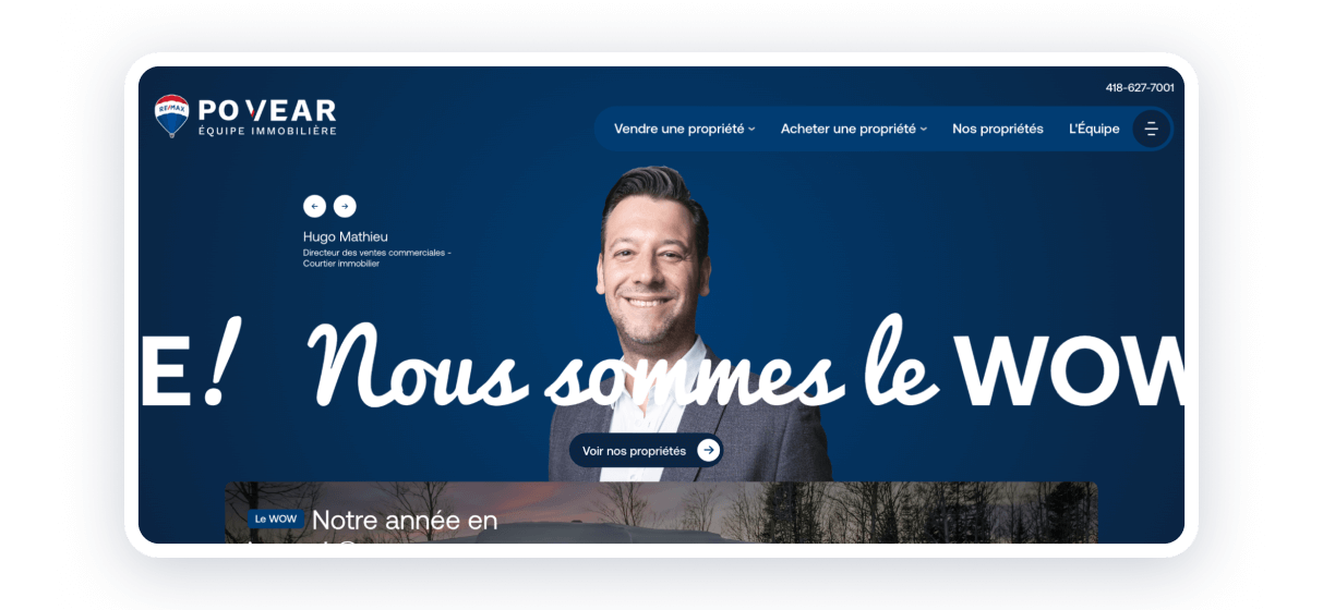
This company website shows the power of intuitive design because even if users don’t know the language, the elements can guide them through the website sections.
Strong points:
- icons everywhere: buttons, options, navigation;
- well-considered location, shape, and color of the buttons and forms;
- user experience is not only about beauty — fast loading and quality images are a must.

This design shows that it’s not required to place all information or all services you provide on the Home page (but you can, if you want — it’s up to you) when creating websites for realtors.
Strong points:
- restrained colors as well as an accent one — dark blue (many global brands choose it because blue is known for its trust and dependability);
- there are a few pages (each for one purpose), but users can easily find how to contact (the main aim of service delivery).
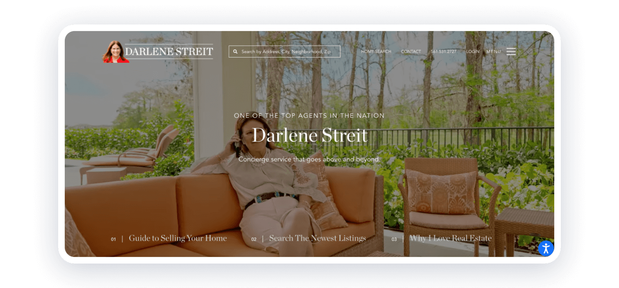
Despite the Home page being created according to ‘established standards of best realtor websites’, exploring the website, users can find helpful information and be assured that it’s the real estate agent who decides to share it.
Strong points:
- guides from the specialist about the process;
- illustrative materials — schemes, charts, pictures;
- section ‘newest listing’ to engage customers in starting to search.
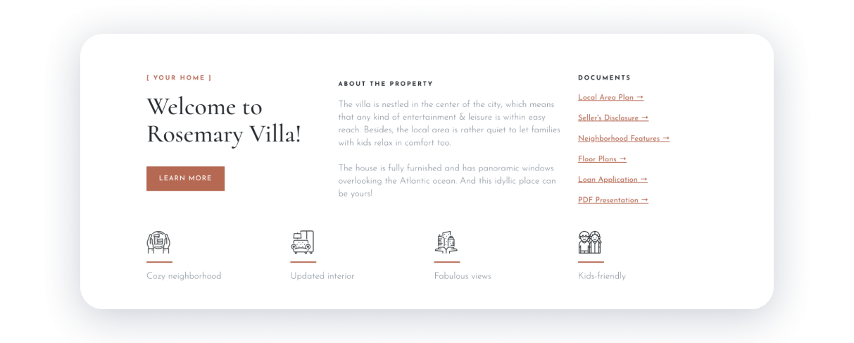
All elements and colors match perfectly. It’s an excellent example of a single-property website and a brilliant example of real estate agent websites created with Weblium.
Strong points:
- set of icons, which make design catching and stylish;
- the pair of fonts: serif for titles and sans serif for main text;
- additional elements, such as a video, a home plan, and a table of mortgage options.
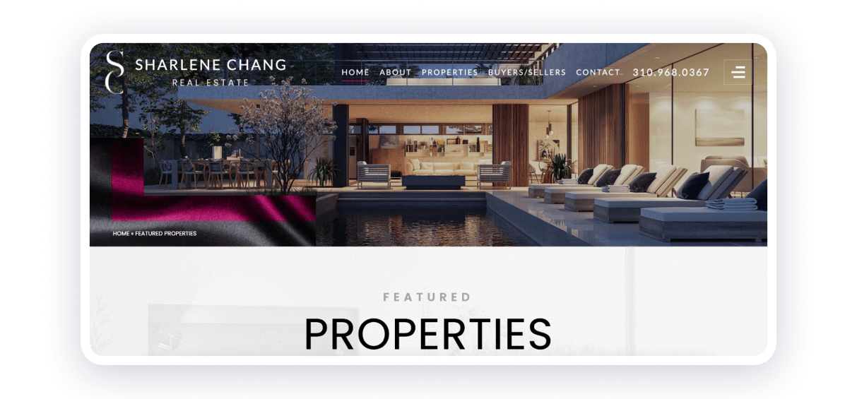
Here is a fresh vision: using colors to reflect the uniqueness of personality and some good features to boost user experience.
Strong points:
- choosing black & pink colors (even location pins on the map are pink);
- breadcrumbs — a navigational aid that allows users to keep track and maintain awareness of their locations.
How to create a real estate agent website?
Inspired by such fascinating examples, wouldn’t you like to create your own website? You could do it effortlessly. There are plenty of realtor website templates from Weblium that you could use to create good-looking and high-quality websites with no coding or design skills. However, you can do it from scratch and bring your ideas to life. How to do it step-by-step?
1. Sign up and select a template
After creating the account, you could choose any template of websites for real estate agents that suits your needs or try as much as you wish to find the most suitable. Remember our ‘Start for free’ option and 14-day trial.
2. Personalize the template
Change colors, fonts, and elements, and add your logo. Explore all our options, from block positions to animation.
3. Fill up with content
Use everything you want to describe your property — texts, images, and videos — fully. You could also customize the design by adding new pages or sections.
4. Add integrations
There are different Weblium features, such as CRM systems, contact forms, and online chats, that you could use to make your communication with customers faster and simpler. Our guide can help you discover more opportunities.
5. Preview and publish
Before presenting your website to the world, please click ‘Preview’ and check everything. The Weblium team is ready to help you 24/7.
6. Promote the website
Try using Search Engine Optimization tips to drive traffic to your site, adding a link to the website on your social networks, or sending out an email to announce the launch of your website.
The 15 best real estate agent websites highlighted here demonstrate the power of effective branding, intuitive design, and strategic content marketing. Using these tips, you can position yourself as an industry leader and build lasting client connections.

