What Is a Quiz in Targeted Ads and Why It Works So Well
In targeted ads, success depends not only on your ad setup but…
In targeted ads, success depends not only on your ad setup but…
Quizzes can be a powerful way to generate leads, but the platform…
Tree service is a practical business, but your name still matters more…
Modern users expect fast, simple experiences (not long forms or overwhelming landing…
This service is all about detail. Precision, color, finish, creativity. Good names…

The real estate industry is built on trust, credibility, and long-term relationships.…
Every boutique starts with a feeling. Maybe it is cozy and romantic,…
The ice cream business is built around emotion and atmosphere. Families look…
This industry is competitive, global, and highly experience-driven. That’s why good travel…
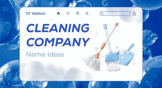
Your cleaning company name is often the first proof of professionalism clients…