
Affiliate Marketing Websites Examples
Affiliate marketing is one of the marketing tools that specialize in web promotion. It is an entire network of strategies and tricks with partnership programs, discount systems, and similar client-oriented approaches. Website design and usability are among the most important features of affiliate marketing.
Below, you will find 10 excellent examples of the web resources that prove it to be 100% true.
Contents
TopTenReviews – affiliate marketing website example
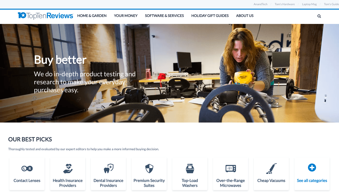
The encounter with this page starts with introducing the service – in-depth testing and research. The text is discreetly located on the left, while the emphasis is placed on a conventional representative, who is busy with checking the things. Minimalistic design features a high-res image, a convenient menu with the division into numerous categories and icons for each, and user-friendly navigation at the top of the page.
giftscoach — well-designed affiliate marketing website example

Giftscoach is a cool example of an affiliate website with gift ideas for anyone on any occasion. This webpage is devoted to gift ideas and guide for husband — a subcategory of gift ideas for him. The website owners take part in Amazon Associates program and make commission every time someone buys a gift. What makes a really appealing and user-friendly design is a sidebar slider with the top ideas. Each of them is represented as a clickable card with an affiliate link.
PC Magazine affiliate website
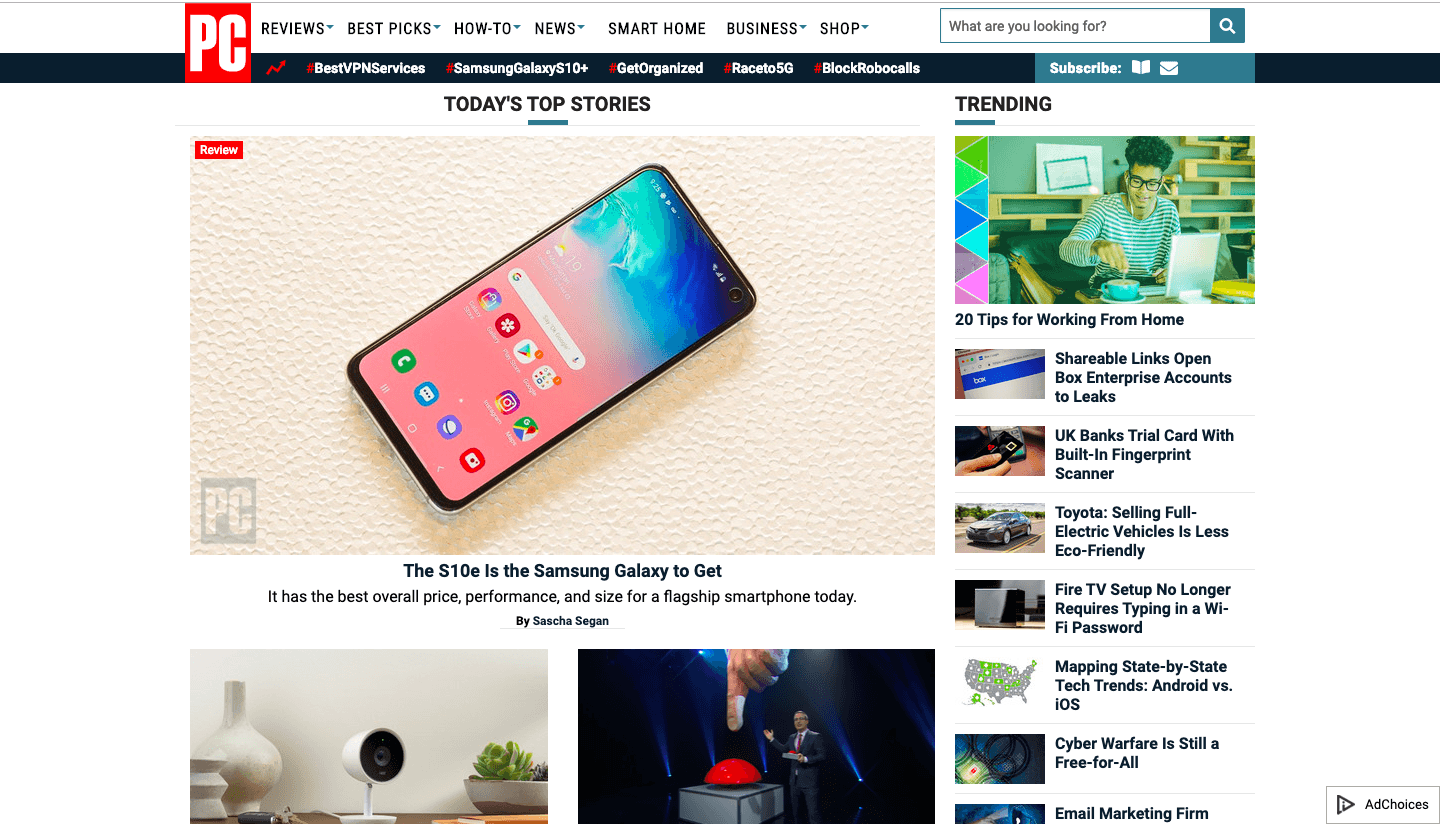
The website is full of informative articles and reviews. Nevertheless, a user doesn’t get lost after opening it. The menu at the top of the page and search row help to navigate the web resource with ease. Meanwhile, the TOP and trending stories attract attention and invite a visitor to find out more about tech products. The minimalistic logo wisely placed at the top left corner has a positive effect on brand recognition.
ThePointsGuy.com
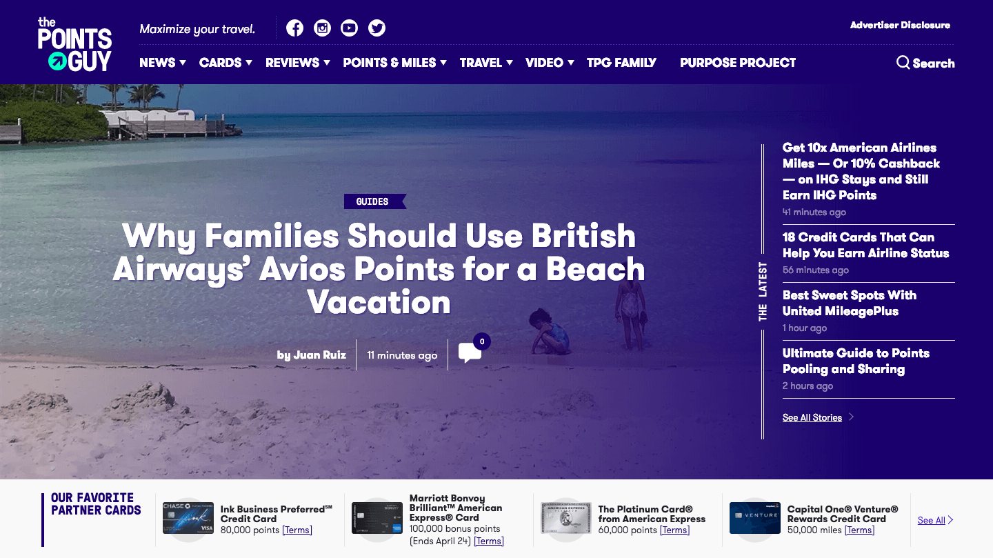
This is one more informational affiliate resource that is meant to make the lives of users easier. The best thing about this website is its minimalistic design. Despite the abundance of information, users that land there can focus on the latest articles and special offers represented by favorite partner cards. The colors are perfectly balanced. The articles organized in plates of different sizes help to keep the website neat-looking.
NerdWallet – affiliate website design example
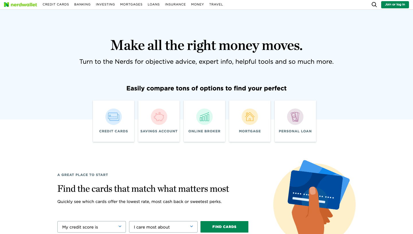
This is a good example of a strong copy. Website owners start with a slogan and explanations. The most attention is devoted to the textual part. Links to the various services on the first scroll and a user-friendly form for finding a proper card increase the involvement and user interactions. There are many CATs arranged in a unique way. The perfectly balanced color scheme and simple animations make the page very pleasant visually.
PCPartPicker
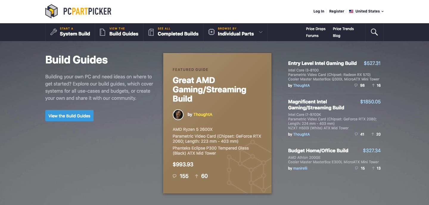
This web platform looks a bit old-school, but it perfectly meets the expectations of the target audience. Gray and brown colors don’t distract from the main message – build guides and the community that supports this activity. Interestingly, the navigation menu points unite the informative names, minimalistic graphics icons, and CATs. The blog is placed in the second scroll and features four posts in the form of a plate, which is one more interesting solution.
This is Why I’m Broke – good affiliate marketing website
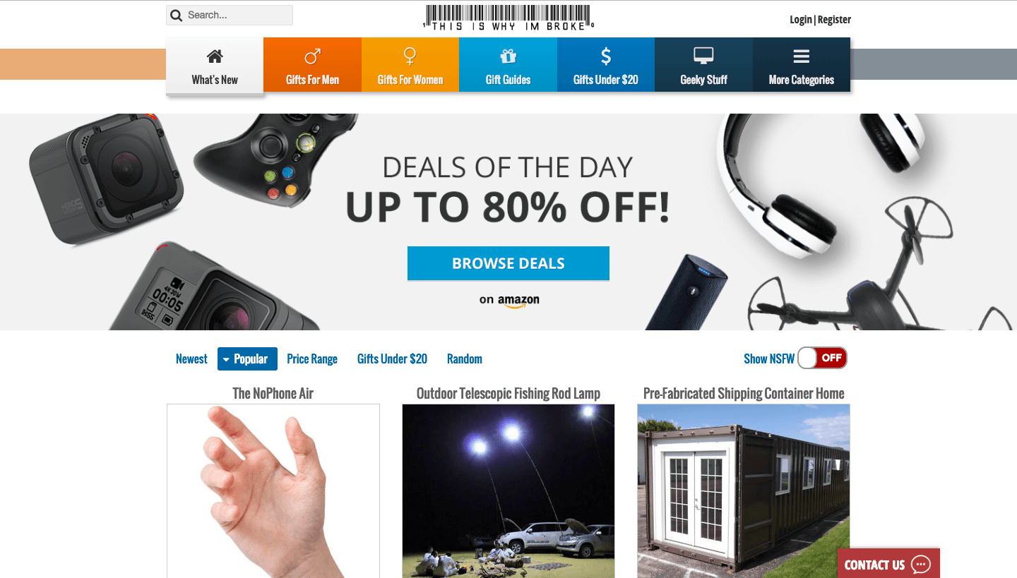
The name under the barcode is a perfect way to make a logo original and the brand more recognizable. An interesting solution for the navigation menu helps to demonstrate the most popular categories and hides the rest under the “More” button. Good marketing solutions don’t end here: there are some filters right under the banner that encourage you to start the search for gifts immediately. The latest and trending deals are neatly arranged in plates with short descriptions and big photos – just perfect for users, both loyal ones and newcomers.
Making Sense Of Cents
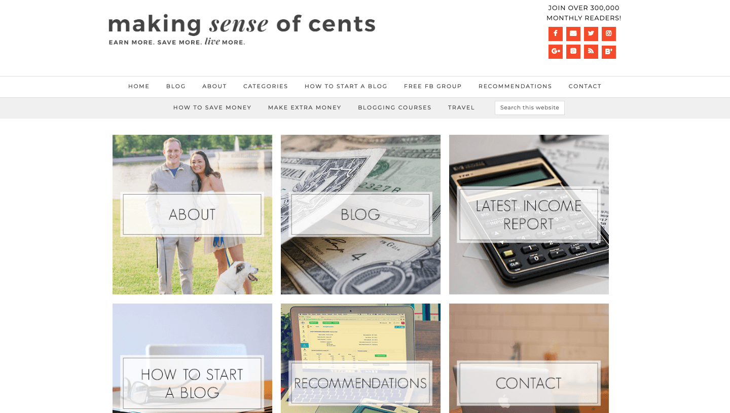
This is one more example of the excellent copy. The website meets a user with a friendly promise to explain everything about managing personal finances, which is a quite complicated thing, in simple words. The motto “Earn more. Save more. Live more” works perfectly even for the skeptics. Pastel palette calms down, while the main menu sections organized in plates help to make sense of website functionality and content. Excellent navigation is a cherry on top.
Skyscanner
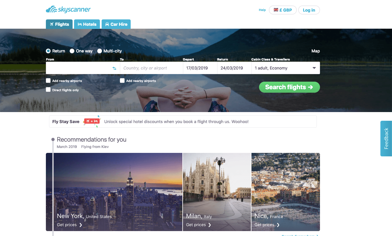
This is one of the most popular services among travelers, and certainly one of the most user-friendly. The first scroll features the search form. Flights, hotels, and car hire services are arranged in tabs, so you don’t waste time for searching them or loading new pages. The form is followed by the recommendations. The website manages to unite good photos, a map, advantages with graphic icons, and the list of top popular destinations on the homepage in a clever way.
Safewise – affiliate marketing website example

From the first look at the service, a user sees how it can solve their problems: “we do the research so you don’t have to” Safewise is an independent review platform, but unlike the majority of websites of this type, it doesn’t look messy or chaotic. The homepage features convenient navigation with a drop-down menu. Thus, everything is within easy reach but very neatly organized. As you scroll down, you discover a blog, popular safety gadgets, assistance with local services, and company info.
Gear Patrol
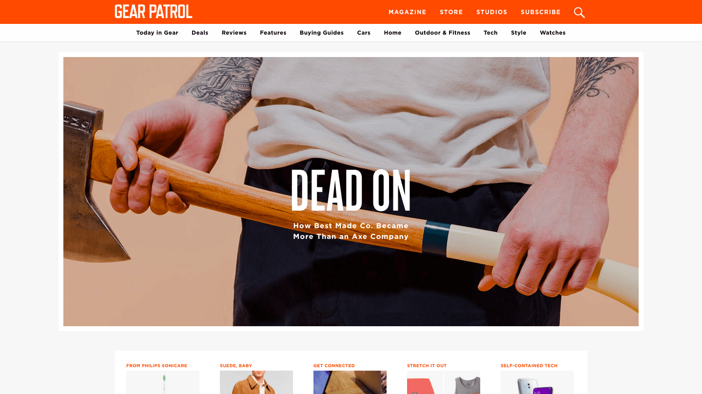
The encounter with this website starts from the catchy phrase, which makes a user curious and encourages to find out more about Gear Patrol. Navigation is simple and user-friendly. The homepage shows the latest materials and attractive deals, a subscription form, and many good reads. The combination of black, white, and orange is an interesting solution, which was implemented successfully.
Conclusion
Affiliate marketing websites work best when they focus on clarity, trust, and real value for visitors. The examples in this article show that a clear structure, easy navigation, honest content, and strong calls to action play a key role in driving conversions.
Across different niches, successful affiliate websites combine useful information with thoughtful design and fast performance. Platforms such as Weblium streamline website creation by offering ready-made templates, flexible customization, and built-in SEO and content management tools.
If you are planning to launch or improve an affiliate marketing website, use these examples as inspiration, test different content formats, and refine your site based on user behavior. A well-built website is the foundation for stable affiliate income.

