
10+ Best Actor Websites of 2026: Inspiring Examples
One important part of what I do at Weblium is researching different types of websites across specific niches. By exploring real examples, I try to broaden how people see IT—especially when it comes to building websites without any coding skills.
Actor websites, as the name suggests, are a valuable tool for anyone connected to the performing arts. In this article, I want to show you some of the best actor website examples and make the entertainment industry feel a bit less intimidating and complicated. My goal is to help you feel more confident when choosing the right website builder for actors.
I carefully select only the best website examples to inspire you, spark new ideas, and motivate you to take the next step forward.
Create your actor website for free 🎬
Contents
Actor portfolio
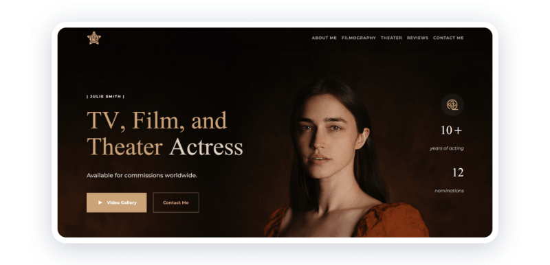
The actor portfolio website template by Weblium is designed with a minimalist and modern approach, ideal for showcasing an actor’s talents and achievements. The homepage features a clean layout with high-quality images, highlighting the actor’s headshots and performance stills. It includes sections for biography, portfolio, and contact information, ensuring easy navigation and a professional presentation.
Highlights:
- Clean, minimalist design
- High-quality images
- Intuitive navigation
The use of a limited color palette and ample whitespace keeps the focus on the content, making it an excellent choice for actors looking to create an impactful online presence. Do you want to use this template to create your own website for a theatre or movie actor?
Leonardo DiCaprio
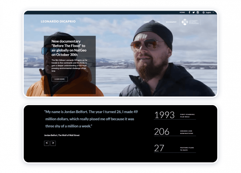
To cinema and television enthusiasts, Leonardo DiCaprio requires no presentation. The actors’ website is colorful, laconic, informative, and memorable. The resource helps to delve into the performer’s career that spans almost three decades. The website keeps the visitors informed about the life stance and social attitudes of the public figure to whom it is dedicated. The homepage features quotes from the actor’s most distinguished works, which is a truly unique and effective way to bring out some of the spectators’ most treasured memories of the actor himself.
Highlights:
- Informative
- Thought-provoking
- User-friendly
- Laconic
- Designed with a bit of a personal approach
- Non-aggressive call to action (CTA)
Challenges:
- Overflowing with information
- Positioning of the news items appears to cause some confusion
Abundant is, probably, the best word to characterize this example of an actor’s personal website. And yet, it is one of the best actor’s websites because it focuses on the things that actually matter in life, showing how the entertainment industry and performing arts can make a difference and help to advance the environmental and conservation agendas.
Sylvester Stallone
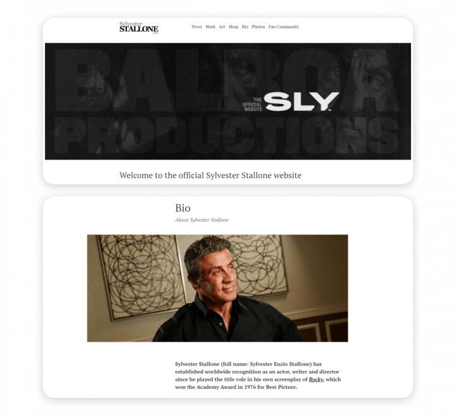
Monochromatic header, stylish and readable fonts, ample space for the visitors’ eyes to roam and pause are the most characteristic features of Sylvester Stallone’s web page. The resource features links to the actors’ social media accounts so that the followers can instantly get instant updates on the celebrity’s goings-on. The source exposes the many sides of the artist’s artistic prowess with the help of intelligible and user-friendly navigation. The website features the section specifically for the admirers of the creators’ talent.
Strong points:
- Intelligibility
- Minimalism
- Proper organization
- Stylish design
- Comprehensibility
- Tangible and smart expression of the emotive force
Flaws:
Virtually non-existent.
The source concerned is an example of a powerful and functional actor’s website that allows the artist’s work to speak for itself.
Stephen Fry
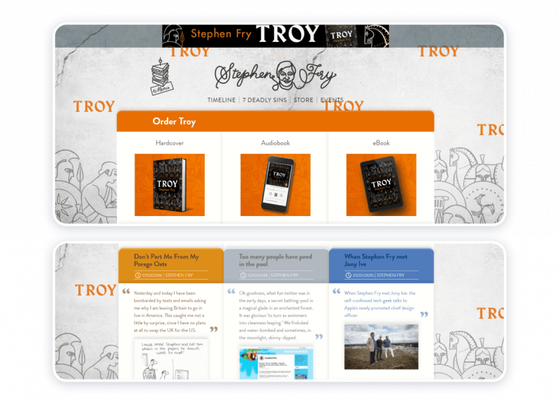
If the creators of Stephen Fry’s grandeur and avowal comply with any conventions, the one that may apply to them is that Artists never cease to amaze. Stimulating color scheme and aesthetically pleasing design as if create a beautiful frame around robust content. The web page gives a visitor to what the artist has been up to lately. The website is perfectly unique because it appears as though it has only been designed for commercial purposes, specifically the following: a) to let the interested parties keep track of Mr. Fry’s projects; b) to advertise and market the projects to which the artist has lent his talent.
Advantages:
- Whimsicality
- Informativity
- Convenience
- Thematic, visual, and textural harmony
Constraints:
- No biographical information
- No specific account of acting appearances
The analyzed example is the epitome of hard work, resilience, and respect for the private space. The strategy Mr. Fry exploits may be of use to experienced actors, already in possession of a reputation thanks to their contributions to arts and culture.
Sierra Boggess
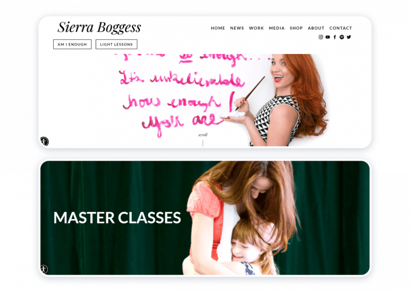
This particular example of an actress’s website conclusively proves how the website itself can encapsulate the artist’s beliefs and professional ethics. Ms. Boggess is an outstanding musical theater actress, whose most notable appearances include The Phantom of the Opera, Les Misérables, The Little Mermaid, Love Never Dies, The Secret Garden, School of Rock, and The Age of Innocence. Placidly and wisely, the page concerned encompasses the essence of being a female artist, to which most of all the chosen color scheme of white, black, and magenta alludes. Ms. Boggess’s philosophy is the idea of an intention to make a world a better place through empowerment, mindfulness, and pursuit of arts as a means to becoming more perceptive, aware of, and perceptive to the beauty of the natural world.
Benefits:
- Expressive
- Succinct
- Properly structured
- Easy to use
- Enlightening in a practical way
- Peaceable and inspirational
Shortcomings:
Practically none.
This is one of the finest samples of an actress’s personal website because it harmonizes the professional and personal qualities of the actress herself.
Helen Mirren
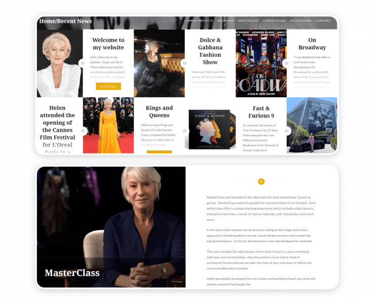
The actress’s website is the pure expression of elegance. The monochromatic background matches the smartly chosen and strategically positioned color accents in yellow, pale pink, and red. Scrolling down the page, its visitor instantly becomes knowledgeable about the artist’s dealings. The grid structure is complemented by text previews placed in the boxes to match the corresponding images. The texts are, basically, updates on the actress’s latest projects. At the bottom of the page, one may find a news archive and a search box. Copyright information contributes to the credibility of the source.
Merits:
- Regal and exquisite in its moderateness
- Trustworthy and secure
- Descriptive
- Communicative
Demerits:
Substantially zero.
Owning a portfolio website works well for even the most celebrated artists. There can be no doubt about that.
Hiro Kanagawa

This particular sample of an actor’s personal website can be deemed the best for several reasons, the key one being that it mirrors the creator’s professional essence. A highly nuanced webpage places emphasis on the artist’s skills as an actor and writer. In doing so, the owner of the website gives the potential employers all the information that they may need to discuss the terms of hypothetical collaboration. The home page brings together still (photographs), that, static images, as well as dynamic footage, namely, demo reels. Dark blue linear accents complement the monochromatic color scheme harmoniously. The choice of readable fonts contributes to a generally pleasurable experience of visiting and exploring the website.
Strong suits:
- Highly nuanced
- Focused on the essential information
- High-quality visual content
- Accessibility and convenience
Weak points:
None
Hiro Kanagawa’s is another example of an actor who has been endowed with many talents. The actor’s website teaches that all types of content require meticulous attention on the part of those who produce it.
Benedict Cumberbatch
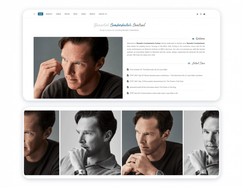
Benedict Cumberbatch central is a perfect example of followers helping those they support to sustain a constant media presence. The website is tasteful, properly structured, and thorough. Based on the official statement of the party that may have developed and continues to maintain the fansite, the webpage plays host to a photo archive containing over 150 000 images. If that does not speak tenacity, persistence, diligence, and admiration, hardly anything does.
Virtues:
- Stylishness
- Minimalism
- Informativity
- Tactfulness
- User-friendliness
Hindrances:
The choice of icons may slightly disrupt the structure of an otherwise authentic-looking and laconic website.
The unofficial fan site’s mission is to pay homage to a creator. At the same time, the resource epitomizes respect for the public figure’s privacy.
Judy Gold
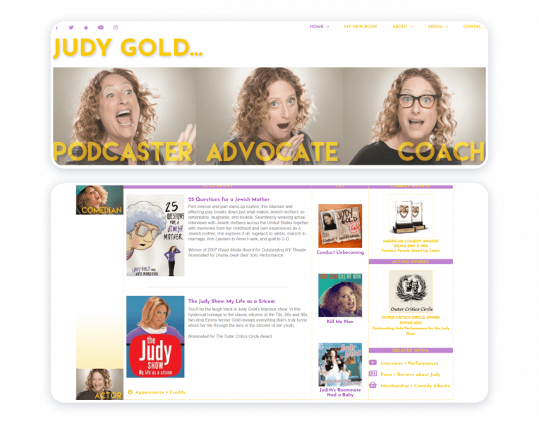
A website dedicated to Judy Gold brings together her artistic prowess and social media presence. The visual aids that appear on the website let the creator’s talent speak for itself. Aesthetically, it is a captivating source because it harmonizes colors, fonts, and textures.
Pros:
- Elaborate
- Informative
- Vibrant
- Easy to navigate
Cons:
Only the creator’s Twitter account gets special attention. In all fairness to be said, links to the artist’s other social media accounts appear on top of the homepage.
Megan Greener
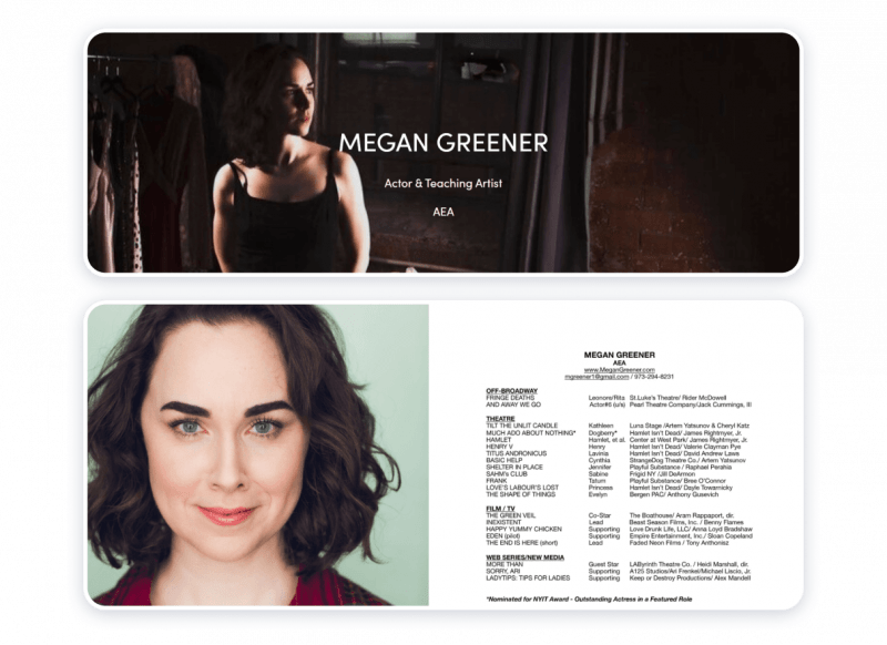
The artist makes a choice to jump right into specifying her respective field and greeting the visitors of her website with a welcome note. The strategy appears to be working because it by all means encourages the audience to explore the source. The website contains all the information professionals in the creative industry and aficionados may need to know about the actor.
Strong points:
- Majestic
- Succinct
- Properly structured
- Congruous
Weak points:
None
The website represents agreeableness and professionalism. Hence, it by all means is a good example to follow.
Woody Allen
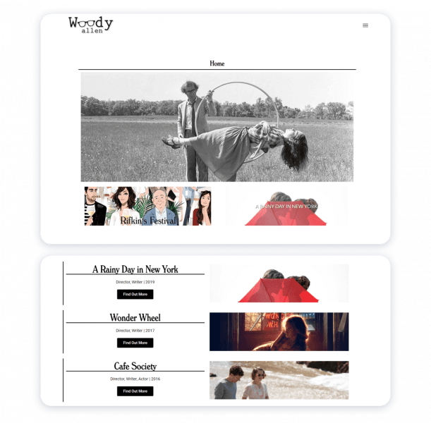
The website honors the achievements and contributions of the artist. Nothing is extra here. The director’s skill helps the creator to highlight key points wisely and efficiently with the help of simple and powerful design and structure.
Assets:
- Intelligibility
- User-friendliness
- Laconism
- Simplicity
- Clean
- Non-aggressive
Hindrances:
Virtually non-existent.
The resource gives the visitors proper tools to keep track of updates on Woody Allen’s career path. One can ask no more than that.
How to make an actor website?
Here is a brief guide on how to create a website for an actor and what tools to use. Spoiler alert: it’s very, very simple.
- Prioritize clarity over quantity. You don’t have to share your entire life story on your website as an actor. I would advise keeping things straightforward and disseminating only the most important information, such as specific roles, eye-catching images, and unambiguous contact information.
- Choose carefully what you do. Select performances that best showcase your acting abilities rather than uploading everything you’ve ever done. A well-curated, condensed portfolio is always more impressive.
- Let the content be supported by the design. A well-organized layout and well-balanced images aid in keeping visitors’ attention on your work. When the design and content complement each other, the website is easy to navigate.
- To save time, use a website builder. Without technical expertise, a professional-looking actor website can be created using website builders. Instead of concentrating on setup, you can concentrate on presentation. You can build an actor portfolio step-by-step with the help of the thoughtful layouts from Weblium.
Create your free actor website
Conclusions
Your actor website is your own virtual stage, not just a page. There, people can see your best performances, view your headshots, and learn more about you.
I know it might seem a little difficult at first, but the key is to keep it tidy, showcase your best work, and have fun. Remember that this is your place to shine around the clock, so take your time and make it your own.
Construct it, show it off, and demonstrate your abilities to the world! Use Weblium to begin building your actor website for free right now.


