![Effective Call-to-Action Buttons [Brief Guide]](https://weblium.com/blog/wp-content/uploads/2018/02/Effective-Call-to-Action-Buttons-Brief-Guide.jpg)
Effective Call-to-Action Buttons [Brief Guide]
Have you ever been in a situation where a site you’d been working on for months doesn’t convert visitors? Everything seems to be in order: well-designed layout, user-friendly navigation, highly relevant content, and even advanced SEO tunings. Frustrating, isn’t it?
The problem is very common, while the reason is simple – ineffective calls-to-action.
Contents
What is CTA?
A call-to-action is a text element on a website prompting users to take a specific action. In most cases, a call-to-action is a button with corresponding text that can be part of an image, widget, fill-out form, banner, side panel, pop-up, etc.
Very often, an ineffective CTA may undermine all the time and effort you’ve contributed to creating a beautiful website and engaging content. Yes, people will visit it, but they will never take the action your business needs.
Each call-to-action should have its goal. So if you want maximum visitors to reach it, you need to show as clearly as possible what exactly you want from them.
According to Unbounce, more than 90% of visitors who read your page headline also read your CTA copy.
Hence, your CTA should be always consistent with the page content. Otherwise, your visitors won’t find a reason to click it.
How to create a strong call-to-action
It is highly recommended to create a different call-to-action for each goal. This way, you’ll be able to reach visitors promptly.
3 key requirements for an effective call-to-action
- It must have a clear goal;
- It must be understandable;
- It must prompt visitors to perform a certain action.
Most frequent mistakes while creating a CTA
- A call-to-action has no clear purpose. In this case, marketers or web-designers are trying to get everything and nothing specific at the same time. Very often you can meet non-specific CTAs that are supposed “to attract all site visitors”.However, you’ll never be able to appeal to all visitors with one message. Thus, goal setting should come first. You need to determine the end-purpose and target audience for a particular CTA before thinking of what it should say and look like. Compare: “Click the Button” and “Sign-Up to Start Your First Website”The first CTA has no goal and is unlikely to help you reach high conversion rate.
- A call-to-action is incomprehensible to users. This mistake is usually made by inexperienced marketers trying to fill the site with beautiful phrases. Very often this intention results in the refined design and numerous marketing slogans that have no clear sense. To make it more specific, include descriptive keywords in line with the purpose of the CTA. Compare: “Discover the World of Tech” and “Find the Nearest Apple Store” The second alternative is a win-win. It is more understandable to visitors and has a positive impact on SEO.
- A call-to-action fails to encourage action. As mentioned before, a call-to-action should induce visitors to do something. Bear in mind that CTAs with a verb is way more effective than those with a noun because they impel visitors to take a particular action. A noun, on the contrary, is a mere statement that doesn’t prompt visitors to do anything. Compare: “Register for the seminar” and “Registration for the seminar”.Obviously, you’d rather click the first button. To strengthen the effect, you can add a follow-up sentence which will make it impossible for the user to reject the offer. For example: “Register for the webinar. A 100% increase in revenue guaranteed.”
Note: a call-to-action should not be aggressive. Instead, it should softly prompt the user to do what you want. So be sure to find correct words for that.
Where to place a CTA to get the most of it?
A huge factor influencing the effectiveness of a CTA is its place on the webpage. A CTA should naturally follow the content of the webpage while remaining visible and attractive.
-
- In the case of blogs, the most effective way is to place CTAs at the end of the idea, sentence, paragraph, or the entire article. This way, your call-to-action won’t affect readability and will appear exactly when users are ready to take the next step.

- In the case of blogs, the most effective way is to place CTAs at the end of the idea, sentence, paragraph, or the entire article. This way, your call-to-action won’t affect readability and will appear exactly when users are ready to take the next step.
-
- CTAs in the sidebar is used to draw more attention. To be effective, such CTAs should be quite straightforward and contain minimum fields. An email should suffice. Sidebar calls-to-action usually include general offers for the wider audience and shouldn’t necessarily be closely related to the content of the page or article.

- CTAs in the sidebar is used to draw more attention. To be effective, such CTAs should be quite straightforward and contain minimum fields. An email should suffice. Sidebar calls-to-action usually include general offers for the wider audience and shouldn’t necessarily be closely related to the content of the page or article.
-
- Header CTA. It’s a bar at the top of the page. All visitors start scrolling from the top so they’re very unlikely to miss your CTA. To increase the effect, you can even go for a persistent header CTA that won’t disappear even if a visitor scrolls the page down. Since it’s visible all the time, the users can convert whenever they’re ready.
- Header CTA. It’s a bar at the top of the page. All visitors start scrolling from the top so they’re very unlikely to miss your CTA. To increase the effect, you can even go for a persistent header CTA that won’t disappear even if a visitor scrolls the page down. Since it’s visible all the time, the users can convert whenever they’re ready.
7 main types of calls-to-action
The Internet is swarming with various CTAs. However, they can be categorized, according to their goals in marketing practice or stage in the customer journey.
There are 7 common types of call-to-action buttons:
-
-
- Lead generation
- Forms for data collection
- Learn more CTAs
- Links to a single product or service page
- Social share buttons
- Lead nurturing CTAs
- Online sales CTAs
-
Let’s sort out where and how to use them.
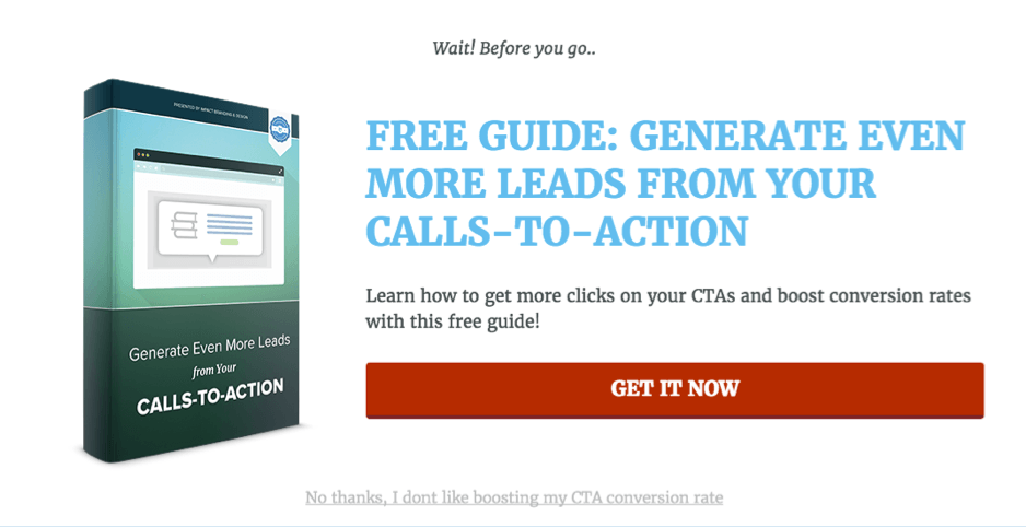
1) Effective calls-to-action for lead generation
This CTA is aimed at lead generation, or in lay terms, converting your visitors into potential customers (a.k.a. leads).
To reach success, you have to offer visitors something valuable in exchange for their personal information.
It may be something like an ultimate guide on breeding snails, a checklist on how to find a partner, or a special offer that expires in a few hours (certainly, it depends on your business industry). Just think of something your visitors cannot refuse.
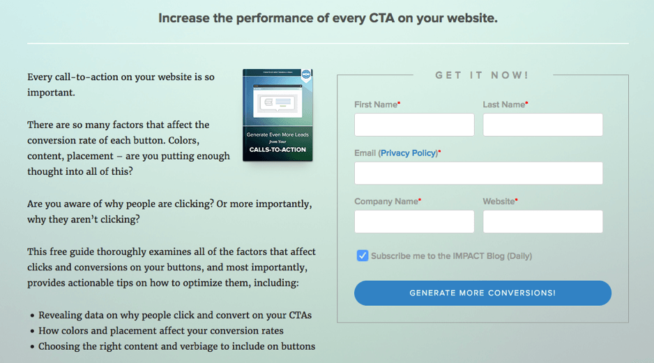
Before downloading valuable content, your visitors should complete a form. The number of fields in the form may vary to some extent, but the golden rule here is the fewer fields the better.
Why? Well, every new field decreases conversion rate, since users are unwilling to share any personal data with you.
Note: a form with multiple questions may be used only in case you provide really valuable information or want to get only the most qualified leads.
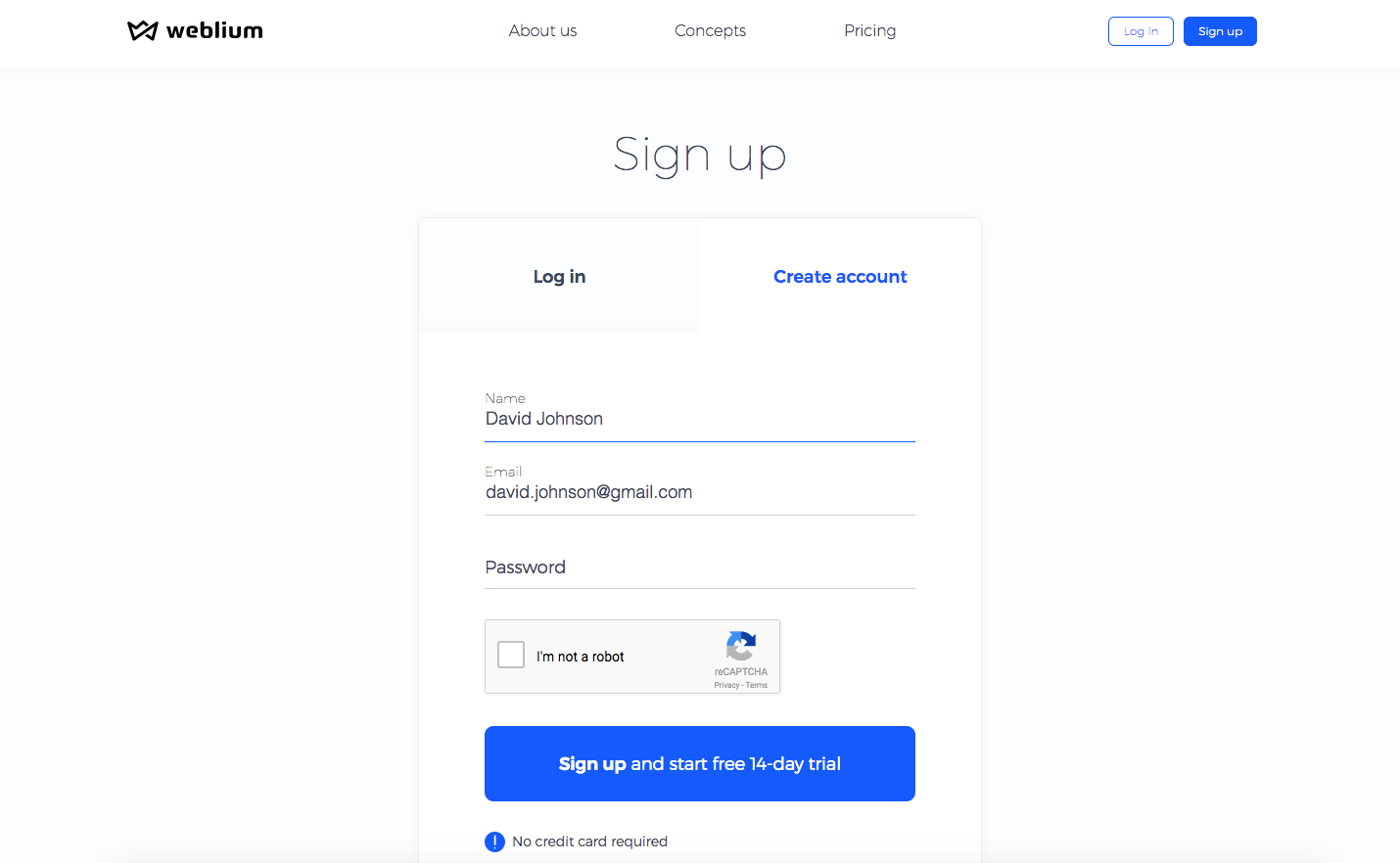
A CTA should be vivid and attractive to captivate as many visitors as possible. Lead generation CTAs should be placed where most targeted visitors land on your website.
Remember that visitors don’t know you yet, so all lead generation CTAs should demonstrate your expertise and credibility. This way, your visitors will consider you a professional in your field and, therefore, will trust you more.
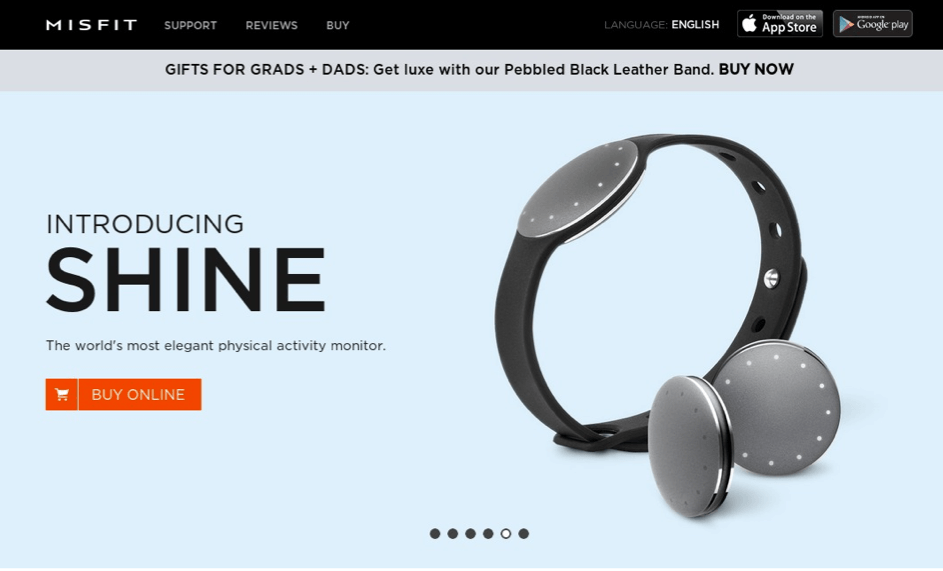
Here are good CTA examples and a follow-up submission form:
2) Data submission CTA
Data submission forms and CTAs are frequently placed across the website. They might look like a short questionnaire that a user needs to complete.
There are 2 basic types of data submission forms:
-
-
- simple forms used to subscribe to a newsletter, blog, product updates, etc.
- classic sign-up forms used to register, create an account and start using the website.
-
However interested your visitors are, long forms can wipe away all the excitement. That’s why it is advisable to leave only the most important fields in the form. In case of a simple form, a name and email address will suffice. You may add a few additional fields for a sign-up form but still try to be short.
According to Copyblogger, surrounding the form with additional content that highlights the value proposition of your product or service can lead up to a 34% increase in sign-ups.
When creating the form, you should pay special attention to a call-to-action button in it. It shouldn’t only visually stand out, but also explain to the visitors what exactly will happen when they submit the form.
As for the wording on the button, use phrases that your visitors are accustomed to (e.g. “Sign Up”, “Register”, or “Subscribe”). When everything seems familiar, users are more confident in the actions that they take.
Check out the following CTA examples:
3) CTAs that make users “learn more”
If you want your visitors to browse the pages of your site actively, be sure to add “Learn more” calls-to-action. Such CTAs motivate users to go exactly to the pages that you need.
The most effective “Learn More” CTA should contain a trigger to keep your visitors intrigued.
Example: This man ate only one product and lost 40 pounds. Learn which one here.
In some cases, the phrase “Learn More” may not be specific enough to imply what stands behind it. Therefore, to increase its effectiveness, you can choose from the following solutions:
-
-
- Use descriptive keywords that explain where the link goes (e.g. “Learn How to Use CTAs Effectively”)
- Keep to the “Learn More” format but support it with a short description (e.g. “Learn More about Our Services” or “Learn More: How CTA Work”)
- Ditch the “Learn More” and go for something creative instead (e.g. “Find More Life Hacks Here”, “Choose Your Ideal Destination”, “Read the Review”)
-
Here are some effective CTA examples:


4) How to make a user go to a specific product or service page
The next step of your customers’ journey is visiting your product or service page. Your primary goal here is to make all relevant information easily accessible.
The best idea is to place short information about you or your products/services right on the home page. And, of course, don’t forget about a CTA leading to the product or service page, where interested users will be able to read a full description and make an order.
Here are a few great CTA examples:

5) How to use social buttons as CTA
Social networks are another powerful tool that will help you reach more users. The more often your name and product/service appears there, the more users will visit your website
According to C&C Media, 70% of customers have greater chances of ordering a product or service if they see their friends share it. Don’t neglect such an opportunity!
Of course, simple social media icons are indispensable, since your users may want to get in touch with your company on a platform of their choice.
However, if you want your blog post or news to be shared actively, add a specific social share button, such as “Share” or “Like”. People who use it will automatically become your brand advocates spreading the information about you on the web.
Here are a few CTA examples:


6) How to nurture your leads with CTAs
If users have already become your leads, but are not in a hurry to make a purchase, you could stimulate them to make the next step. That’s where you need to take advantage of a call-to-action aimed at pushing a lead closer to purchase.
In comparison to the CTAs discussed earlier, this one is much more related to a product or service you are offering.
How to do it? Try to offer your leads something really valuable – a discount, a gift or a trial version of a specific product. The first two options are good at stimulating an impulse purchase, while the latter helps users to experience the product or service before ordering it.
CTAs of this type are most frequently used in emails, retargeting banners or e-books to nurture users who already know you and have a clear interest in your products or services.
Here is a good lead nurturing CTA example:
7) A call-to-action that drives online sales
The final step of a successful customer journey is closing a deal. This can be done through a CTA with a request to order a product or service. Everything is pretty straightforward: customers know you and what you offer, so you don’t want to put off a sale any longer.
These CTAs can be placed at the end of blog posts describing the features and advantages of a specific product or service or directly on the product/service page.
Here a couple of CTA examples:
Summing up
Now you see that a well-designed website filled with quality content won’t work without effective calls-to-action.
There’s no magic pill in CTA design. You need to try different options to understand what is more effective for your audience.
To achieve the best results, run A/B tests regularly. There’s no other way to see what works best for your audience. Thus, don’t be afraid to test different shapes, colors, and wordings.
This way, you will always find the right call-to-action that will help you engage your visitors. Remember that even a minimal change may result in conversion growth and, thus, improve your revenue.