How to Create a Course Website: 8 Best Tips
Education is becoming increasingly popular today, providing millions worldwide access to knowledge and training. In 2025, the global online learning market will be $325 billion. According to statistics, this area has doubled in the last 10 years alone.
When your course is ready, and it remains only to present it and recruit students, you cannot do without a website. Potential students should visit it before deciding whether to purchase your educational product. And whether the conditions, the price, and what they will receive in the end are suitable.
Therefore, we prepared this article with our user, Toma Dragunovskaya, EdTech Lead and methodologist of educational projects, so you can learn to build a website. The expert noted all the essential points when developing a course website and also gave valuable advice based on her own practical experience that will help you create the desired content for your course.

Contents
Don’t be afraid to iterate
When creating a website for your course, it is essential to remember that the first draft will not always be the final one. You often want to stop after the first version of the site because you just get used to it, and it seems that the site is cool and everything works. But there is always something to improve.
The next iterations and improvements are crucial to achieving that “wow” result. So don’t be afraid to iterate – it will help you create a site that meets your audience’s needs and enables you to achieve your goals.
Therefore, go to Weblium, test hypotheses and different messages, create site duplicates, and perform A/B tests. On Weblium, you can make an MVP (minimum viable product) and test any hypothesis.
Consider the audience
One of the most critical aspects of creating a website for your course is tailoring it to the needs of your audience. Each target group has unique needs, and understanding these needs is crucial to the success of your project.
Before you begin the course website development process, research your target audience. Understand their needs, preferences, goals, and limitations. This will help you build an online course website that meets your expectations and answers all your questions.
Blocks, design, and messages for cold and warm audiences differ. Use warm messages and a friendly context if you have a loyal audience. If the audience is cold, add more context to this topic.
Choose Weblium
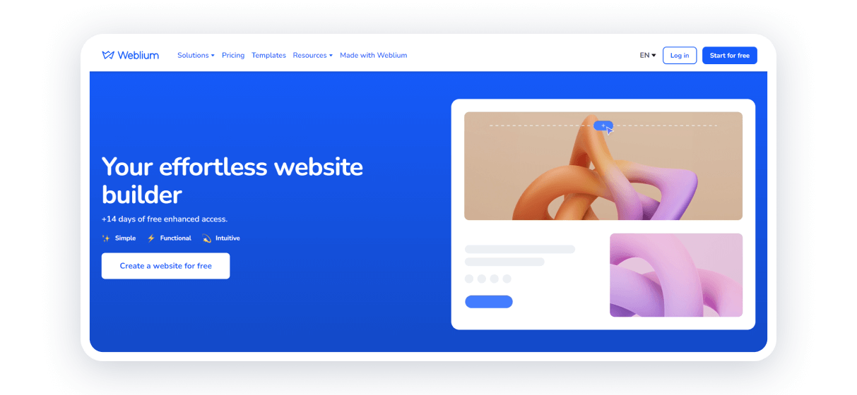
When creating a website for your course, one of the crucial steps is choosing a development platform. Weblium is an excellent solution that offers a wide range of options for creating a professional and effective website. Here are just a few advantages:
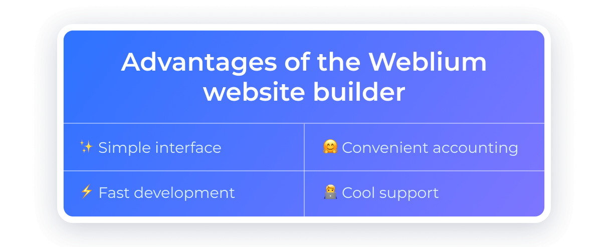
✨ Simple interface. Weblium has all the necessary blocks and tools to bring your visualization to life (even if you are not a web designer).
🤗 Convenient accounting. Here, you can keep records of sales and process applications. The whole procedure is automated: after purchasing a ticket for the course, a person receives a confirmation. This is ideal functionality for those who do not like to do things with their hands that can be automated.
⚡ Development speed. Thanks to a large selection of ready-made templates and blocks, creating a website on Weblium takes significantly less time than traditional development methods.
🧑💻 Cool support. The Weblium team provides fast and practical support to its users. In addition, the platform is constantly updated and adds new features to facilitate website creation.
We switched to Weblium after the full-scale invasion began. Like many others, we previously had a website on Tilda. Therefore, it’s cool that we could learn the Ukrainian analog quickly. I am very proud that there is such a service where the level of cooperation and feedback efficiency is even better.
Try to create a website using a template
If you are new to Weblium, one of the fastest and most effective ways to build a course website is to use a ready-made template. This way, you can save time and effort and ensure your website looks professional.
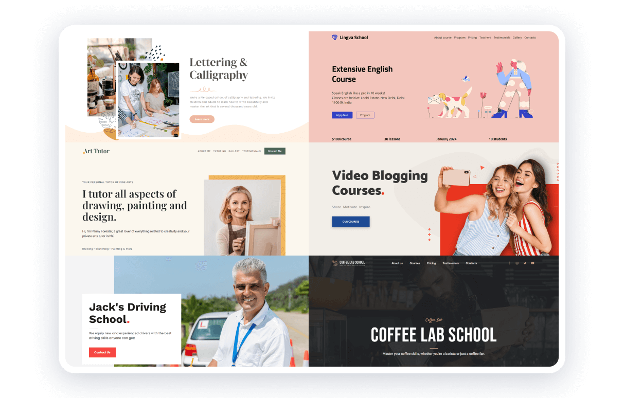
Weblium specialists have already compiled everything by topic and area. With many templates available, you will find one that suits your needs and requirements. This template can be customized with visuals and materials. That’s it: your site is ready!
Follow the “site-message” link
Creating a course website is more than just posting information online. This is an opportunity to make a space where your message can influence your target audience.
You often want to add everything about your course to your website, including all the benefits and other valuable things. However, moderation is important: add only what is needed — no more, no less.
In your messages, consider the opposite. Take the result that a person should get on the course and form blocks on the site. You need to get to point A, that is, tell what a person should understand at the finish line after reading the site.
Make the site work all the time
Your website can work all year round, recruiting people 24/7 for pre-registration or course enrollment. With Weblium, you can switch your website into 2 modes:
- first: enrollment
- second: pre-registration
To do this, you can use a cool feature: hide blocks and open them when needed. After completing enrollment in a course, you can hide blocks with the option to purchase the course and open blocks with the option of pre-registration.
This gives you complete control over how your site presents your course, regardless of stage. This approach allows you to adapt your website to the needs of your audience as much as possible and optimize all processes.
Don’t forget about the mobile version of the site
When you create a website for your course, it is essential to keep the mobile version in mind since many users view content on smartphones and tablets. Therefore, you can:
- Adapt all pictures to a square format.
- Change the distances between blocks to make everything look good.
- Work on making the questionnaire easy to open.
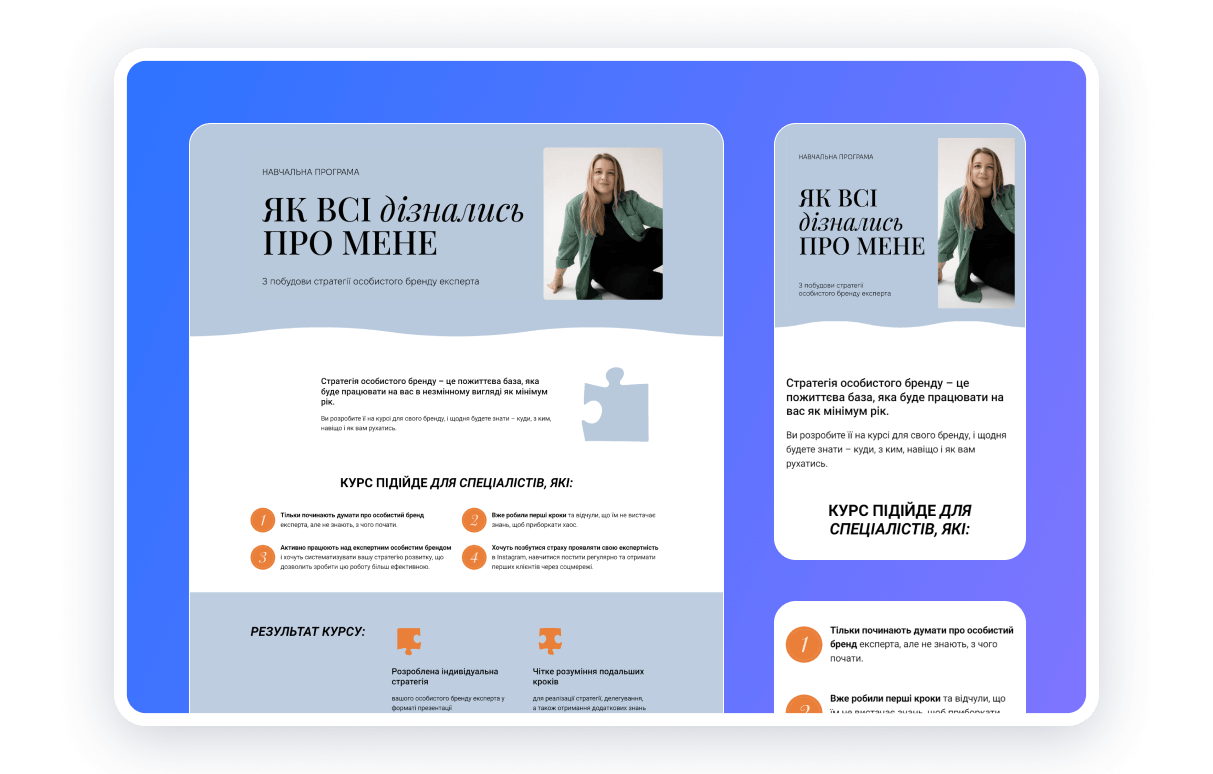
With the mobile version of the site, you will provide comfortable and convenient access to your enrollment in your course for the maximum number of users, regardless of what device they view the content on.
Recruit additional people
Especially if you have a small team. You may overlook some points on the site since you constantly see it 24/7. Therefore, when creating a website for your course, consider the possibility of involving additional specialists and participants in the development process.
Each person has their own unique experience and approach to problem-solving. Involving various experts and participants will allow for a broader range of ideas and perspectives, contributing to a more creative and understandable site. Teamwork can bring new ideas.
Or you can take someone from another field who is entirely out of context and can examine the site with a fresh perspective.
Conclusions
Creating a website for a course is a critical step in preparing and promoting your educational product. With these eight tips, you can make the most of this process.
With Weblium, you can easily create a website for your course using ready-made templates that will help you save time and resources. The site builder also allows you to easily configure your site for mobile devices to provide convenient access for users anywhere, anytime.
Don’t hesitate to start developing your website with Weblium today to achieve success tomorrow quickly!
