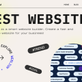
Key Factors To Improve Conversion Rates Using Psychology And Web Design
Ask any online business what they want to achieve with their website design and they will all say the same thing: an increased number of conversions. To achieve this, you have to make use of a discipline that specializes in people and what they want. Psychology has been getting a lot of attention nowadays for its ability to influence marketing strategy. It has proven itself as a useful tool in website design and everyone is trying to apply it in ways that make sense. Here are some examples.
Contents
1. It has to be familiar
Users look for familiarity when they go online. You might think people want to see something new when they look through your website, but that isn’t necessarily true. They want to see unique and innovative designs in the aesthetic of the website, but the user interface has to remain intuitive and easy to use.
No matter what kind of website you’re designing, certain elements have to be present.
Your website should include a navigation tab on the upper right portion of the screen or positioned all the way at the bottom. Here, you have to have icons and links that lead to your about page and contacts. These have to be present in a certain order. The tab should be on the left-most position, while contacts should be near the end of it. This is how most websites have it, which is why people find it easier to navigate this way.
2. Have a matching theme
The theme of your website is a crucial element that you can’t disregard. You want it to be appropriate for the type of business you provide. Think of all the colors and shapes that are associated with your line of work and try to incorporate them into the website in a practical and intuitive way.
If you’re running a business that specializes in construction materials, there’s no reason for your website to be as flashy as possible. The focus should be on materials and their application. Put yourself in the shoes of a contractor that visits your website. If they see too many flashy elements and colorful displays, they’re not going to take the website seriously because that’s just bad design. Your business is straight to the point, which is why the web design has to reflect it.
Clothing retail websites have a bit of leeway in this department. They can and should make use of contemporary styles to make their website seem eccentric and unique. They will obviously use more varied colors and shapes to show off their design. After all, there’s no better place to show off website design than a website that is dedicated to another form of design.
3. Influence with colors
In website design, colors are an absolutely unbeatable visual stimulus. There’s nothing you can’t do with the right color combination. You can express just about any emotion when you apply them correctly.
Brand recognition is mostly based off of the colors a brand uses. You could design the simplest possible two-dimensional drawing, but the right amount of red and yellow added to it will make you think of McDonald’s. If people can start to recognize patterns and colors as your brand, you’ve done your job correctly.
Applying this to websites requires a bit of ingenuity. You want to evoke certain emotions and also bolster your brand recognition. To do this, you need to figure out what each color represents and how you can apply it. Keep in mind that the inherent feeling colors evoke can change if you combine them in certain ways.
Calls to action are very often made of red colors because red gives you a sense of urgency. It’s like an alarm button that you have to press.
4. Use images to reinforce concepts
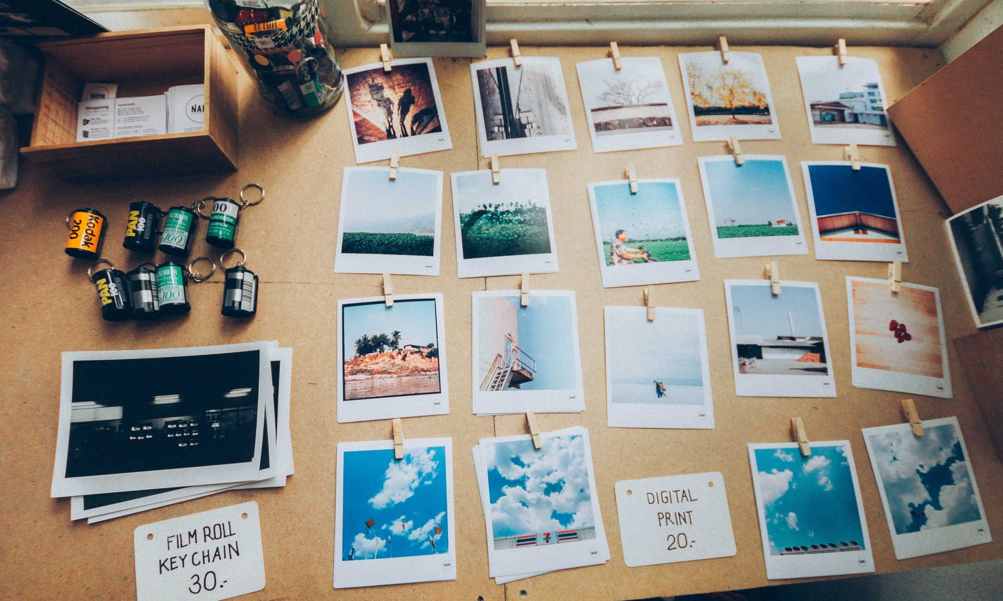
Images are a great way to capture someone’s attention. Users eventually lose focus while reading your page or blog, which is why you have to add something that will break the monotony and lead to more interest.
The images you place around your website should reflect part of the text or concept that is being mentioned. If it’s a relevant tie-in to the topic at hand, you can expect the views and engagements to rise. Users will be able to focus longer on your page, which will lead to more conversions down the line.
5. Increase readability
One of the key tenets of good design is making text easily legible. If every age group can read your text without issue or feeling like it’s in their face, you’ve done your job properly. The problem with websites is that there’s often a bunch of text in different places that need to be easy to read. How do you balance space with the ability to make everything legible?
The thing is, you don’t have to make absolutely everything into a comfortable read. People tend to skim most content after the first few lines, especially if it’s organized into a giant wall of text. To help with reading comprehension, you can divide your text into several paragraphs that make for easier reading. Even if the users skim a couple of lines, you can make use of images to sum up the point of a paragraph.
6. Attractive content is king
There’s no better way to convince people that your website is good than creating quality original content. Interesting content doesn’t just attract users to your website because they want more, it also helps make you into an authority in the business. If you’re able to present products and services in an interesting and palatable way, your business is probably top-notch quality.
The type of content you create depends on your budget and creative drive. Blogs have become an essential part of just about any Australian business website. They make products more attractive and they provide more than enough entertainment for users that want to see it.
Making content that appeals to a wider audience requires some expertise. Companies that specialize in SEO in Sydney often have to help up-and-coming businesses with their content creation. Making good content is both an art and a skill. You can always make use of help before you’re able to create it on your own.
7. Mobile optimization
Mobile phones have been consistently rising in popularity for some time now and online marketers have taken note of this. They are poised to replace desktops as the most popular way to browse the internet. Because of this, optimizing your website for viewing on mobile devices is probably your best move.
Most of the problems mobile users encounter on websites are related to videos and images. Desktop browsers and mobile browsers differ in how they present these pieces of media and mobile phones might not be able to adapt to certain formats. Try to check if the images you put on your website are mobile compatible. If users can smoothly navigate your website on their phone, they are more likely to convert.
Conclusion
The art of website design is pretty tricky. Designers are faced with a seemingly impossible task. Create something that is both attractive, intuitive, and unique, without sacrificing any of those things individually. Making progress is tough, but psychology allows designers and website owners to have an edge on the competition.
Author: Nick Brown