20 Modern and Performing Contractor Website Examples
Today, almost every customer starts their search online. If a contractor doesn’t have a website, it often raises doubts before the conversation even begins. According to this article, people usually want to see completed projects, read testimonials, and understand who they’re hiring before making a decision.
A website is a digital business card that works 24/7. It showcases your services, highlights real projects, and makes it easy to get in touch in just a few clicks. And most importantly, it can help you win the local competition.
But how to build a page that actually brings in leads? Let’s take a look at some of my favorite examples of contractor websites.
A strong website is a practical tool that helps attract new clients, demonstrate your expertise, and build trust before the first call even happens. The most effective contractor website examples I’ve seen combine clean, modern design with intuitive navigation and clear calls to action. They also integrate essential tools like quick quote forms and online booking.
Contents
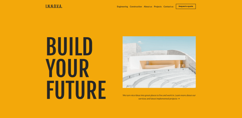
Construction engineering
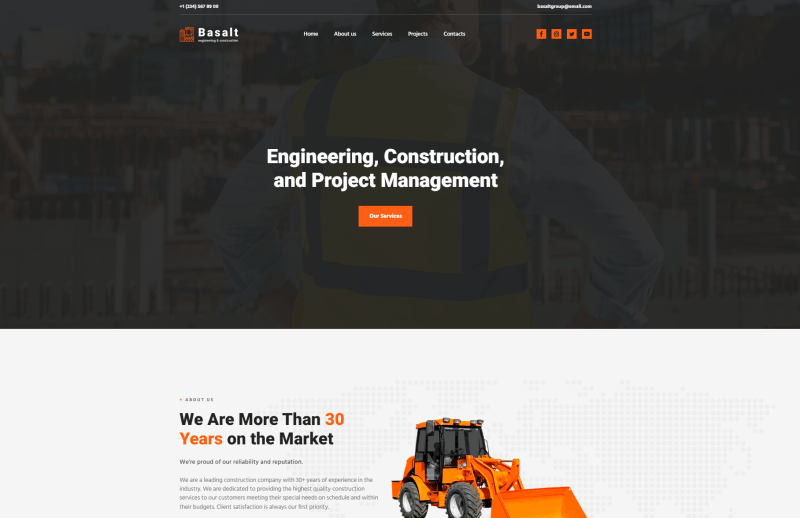
This template is designed for companies providing engineering services in the construction industry. I’d recommend it to teams that want to present themselves in a strict, confident, and highly professional way. The layout is clearly structured, with dedicated sections for services, case studies, and client reviews. Dark gray dominates the palette, while orange accents highlight key elements and reinforce a sense of reliability and technical expertise.
On the main page, you’ll find blocks for showcasing solutions, achievements, and contact details. There’s also a blog to build authority and share insights, plus a subscription form to keep your audience updated on news and special offers. Every component can be easily customized in the Weblium builder.
Summary: A bold color contrast and well-organized structure effectively communicate expertise and high-quality engineering solutions.
Cottage building
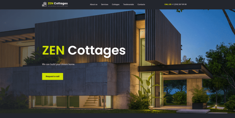
This template is a great fit for companies building cottages, private houses, and similar residential projects. I like how it immediately creates a feeling of coziness and trust while still highlighting modern architecture and attention to detail. Visually engaging galleries, detailed service descriptions, and a built-in consultation form make it both attractive and practical. Bright yellow buttons and large photos naturally guide visitors toward taking action. In my experience, this is exactly what a contractor website should do.
The testimonials section works through a smooth slider, so browsing reviews feels effortless. I’d also highlight the video player, it’s a strong addition if you want to show completed projects or explain your process in a more personal way. Once you choose this template, you can easily customize everything in the builder and adapt it to your brand, no coding needed.
Summary: Quick access to request a quote, call your team, or book a free consultation puts this template among the most powerful conversion-focused examples of contractor websites.
Construction Сompany
This is a versatile template for construction companies that offer a wide range of services. I see it as a solid foundation for presenting everything in one place (from your portfolio to key company details). The structure is clear, with an integrated map and quick contact forms that make it easy for visitors to reach out without extra steps. Orange backgrounds combined with restrained CTA buttons create a balance between boldness and professionalism.
I especially like the “About” section with real numbers and facts, it immediately strengthens credibility. The gallery is thoughtfully divided into three categories, helping potential clients quickly find projects similar to what they need. The “Follow Us” block in the footer adds a nice touch, allowing visitors to stay connected with your brand across social platforms.
Summary: Bold color choices and structured presentation make this one of the most confident and modern construction website examples.
Schmitt
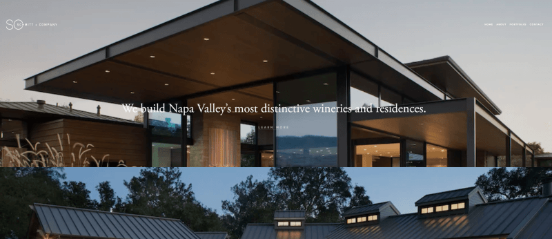
What immediately caught my attention here is the clean, minimalist visual style. It instantly communicates professionalism. The simple layout works perfectly with clear typography, creating a user-friendly interface that feels calm and confident. I like how the laconic sections focus only on key information, making it easy to scan and quickly find what matters.
Another strong point is the focus on visuals. Bright photos of completed projects build trust and demonstrate real results. Navigation feels intuitive, CTA buttons are placed exactly where you expect them, and the visible contacts with an interactive map make reaching out effortless.
Summary: A simple yet effective website that highlights reliability and quality through clarity and strong visual proof.
Yuras

This website feels warm and approachable, it immediately builds a sense of trust. The combination of warm tones and clearly structured sections creates an atmosphere of openness and care. Right from the first screen, visitors see reviews, key advantages, and information about the team, which I think is a smart move.
The visual proof is strong here. Photos of completed projects and certificate badges reinforce professionalism and experience. The structure makes essential details easy to find, and integrated contact forms simplify the process of requesting a consultation.
Summary: A friendly and trustworthy contractor website example that builds confidence through warmth, clarity, and strong visual validation.
Continental
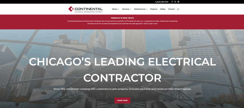
When I looked at this website, I immediately noticed its refined corporate style. It feels tailored for large-scale construction projects. The design highlights the scope and technical complexity of the work through high-quality visuals and subtle animations. Information is well-structured, clearly presenting services and capabilities without overwhelming the visitor.
Detailed case studies walk you through the process, not just the results, which builds credibility. The blog adds another layer by showcasing expertise and industry knowledge. Projects are thoughtfully categorized, making exploration easier and more engaging. Logical navigation and a built-in search bar further enhance usability.
Summary: One of the strongest examples of contractor websites that appeals to tech expertise and project scale.
Robert Carpentry
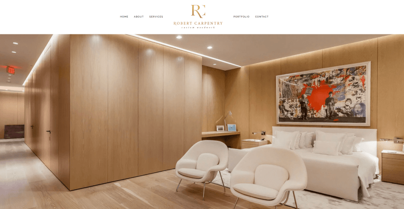
When I first landed on this website, I immediately noticed the balance between elegance and homeliness. The design highlights craftsmanship and the beauty of high-quality wooden products. There’s a strong visual focus: completed projects are placed front and center, reinforcing professionalism and attention to detail.
Navigation is simple and intuitive, which I always consider a big plus for contractor websites. Key services are presented in separate sections, so visitors can quickly understand the offerings and reach out without confusion. The portfolio plays a crucial role here, clearly demonstrating expertise in home improvement and custom carpentry.
Summary: A well-crafted website where strong visuals and a focus on manufacturing details build trust and showcase real skill.
Kevin Carpenter
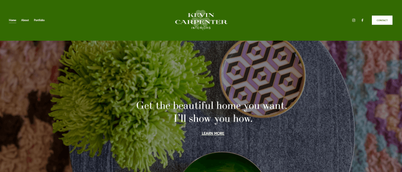
Another good website design that combines style and professionalism. The clean lines, soft green palette, and elegant visuals immediately communicate sophistication and attention to detail. The layout feels polished but still approachable, reflecting the quality of the interior solutions offered.
The portfolio gallery is clearly the star here. It lets visitors explore completed projects and instantly grasp the standard of work. I also like that About Me includes a prominent Contact button, making it easy for potential clients to reach out. Social media links further extend the reach and reinforce the personal brand.
Summary: A stylish and polished website that highlights aesthetics, portfolio quality, and a personal approach.
Tyler Mitchell
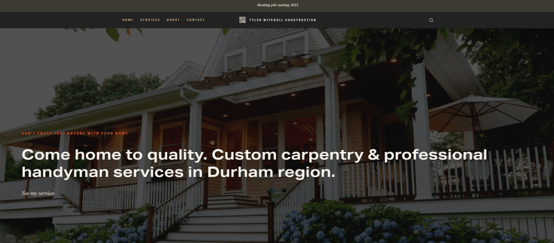
This site clearly balances functionality with accessibility. The homepage immediately communicates the benefits of working with the company, using large, easy-to-read text blocks paired with high-quality images that showcase different projects.
The structure feels intuitive, making it simple to navigate and quickly find the information you need about services and deals. A quote form placement here is a smart way to connect with potential clients directly. Overall, this website shows how a personal brand can be effectively presented online.
Summary: A modern contractor website that combines convenience, clarity, and informative content.
Midwest Glass and Glazing
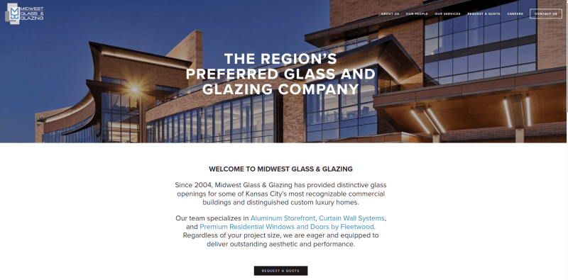
I find this website really conveys reliability and professionalism. The slider, contact information, and quote request form immediately give visitors a sense that this company is trustworthy and accessible. On the homepage, the top solutions are highlighted clearly, and the focus on technical capabilities and experience feels very convincing.
The photos of the manufacturing process and detailed case studies are especially effective. They add credibility and show the quality of work. The logical structure of the sections makes it easy to navigate and find information about different services or projects.
Summary: A general contractor website that effectively highlights technical expertise and builds trust.

BL Harbert
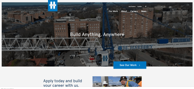
I like how this website balances a modern corporate look with an approachable feel. The visuals are clean yet dynamic, and the subtle animations make browsing more engaging. On the main page, the key benefits and company values are presented clearly, which immediately gives a sense of professionalism.
What stands out are the detailed case studies. They allow visitors to explore completed projects and build trust in the company’s capabilities. Navigation feels smooth, and the four main pages are easy to browse. The news section also reinforces expertise and helps attract potential clients.
Summary: A contractor website that effectively showcases both scale and client focus.
Square Footage
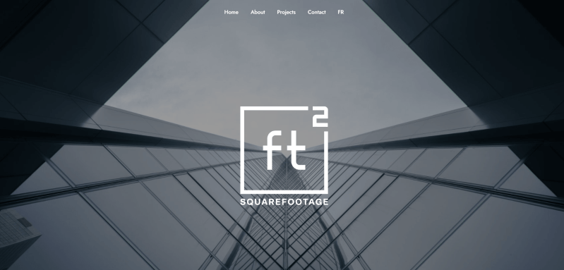
This website design is all about simplicity and modernity, which makes it perfect for showcasing commercial services. The clean lines and minimalist color palette immediately draw my attention to the portfolio and other key elements. Navigation feels intuitive, and I can access all the essential information easily from the top menu.
On the homepage, I like the interactive photos and compact blocks that clearly highlight the benefits of working with the company. The subtle animations add just enough movement without being distracting. There is also a big language switcher, which makes the site feel welcoming to a broader audience.
Summary: One of the most balanced examples of contractor websites that combines simplicity with functionality.
Straub
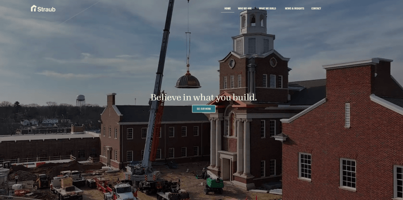
This website feels really inviting, and it immediately gives a sense of trust. The contrast palette feels modern yet reliable, and I like that the mission and values are clearly highlighted right on the homepage. It makes understanding the company easy.
The success stories, government and partners’ testimonials strategically showcase the results immediately. The What We Build with various categories provides functionality and ensures an additional level of interaction. The mobile version is optimized for quick browsing, making it accessible to different devices.
Summary: A contractor website that conveys warmth and a personal approach to clients.
CPB
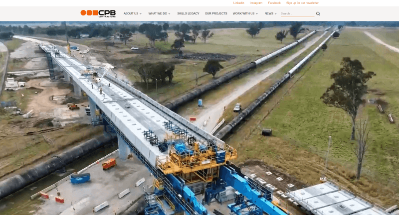
I immediately noticed how this website presents its key benefits at the first glance. The large, full-width images are impressive and really give me a sense of the scale of their accomplishments. The top menu makes it easy to navigate between topics, sign up for the newsletter, or search for info. Everything feels accessible.
The About Us section is presented in short, clear blocks; it’s easy to read and understand their story. The News section is regularly updated, which makes the site feel active. Subtle animation effects feel engaging without being overwhelming.
Summary: The general contractor website that effectively shows the brand’s scale and status.
RSA Contractors
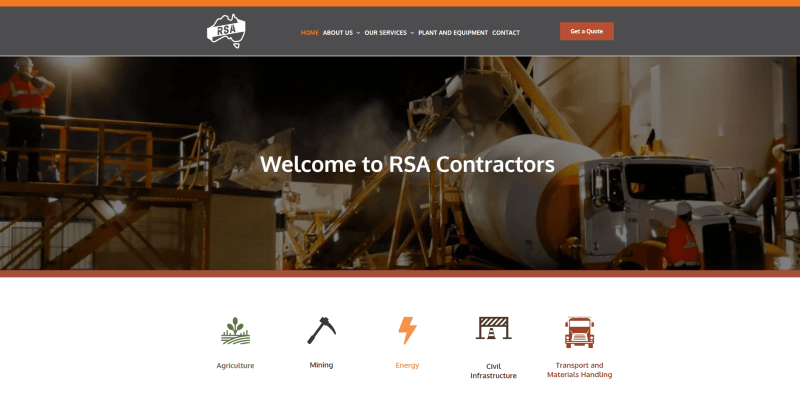
This website design gives a sense of modernity and precision. The geometric shapes and rich color palette convey reliability and stability, which makes me trust the brand right away. The homepage clearly presents key benefits and facts, so I can quickly grasp the scope of their activities.
I like interactive and well-structured portfolio sections. It’s easy to explore completed projects. Reviews and quality certificates further build credibility, while the Plant and Equipment section showcases their machinery, fleets, and technical capabilities.
Summary: A nice-looking contractor website that reflects technological expertise and a modern, professional approach.
Decor Builders
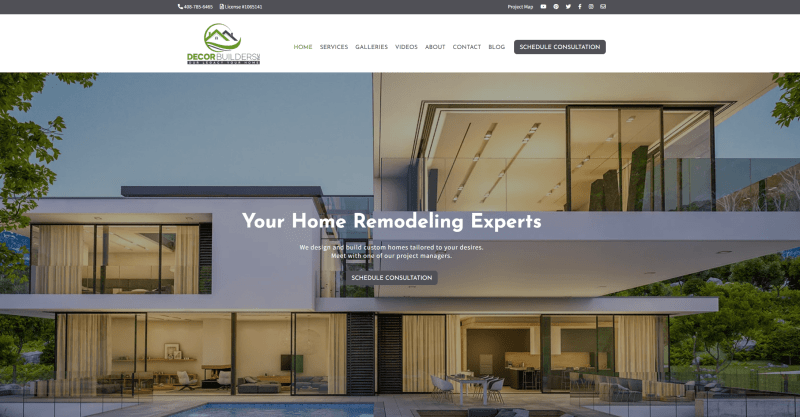
This design focuses on luxury and aesthetic appeal, making it one of the most fitting contractor website examples for interior decoration. The soft color palette and stylish visuals immediately give me a sense of comfort and sophistication.
The portfolio is the star here, showcasing projects with both quality and creativity. All information is presented in concise blocks, so I can quickly find what I’m looking for. The FAQs are easy to spot, which makes understanding the services quick & simple.
Summary: This home builder website perfectly balances creativity and elegance.
M&V
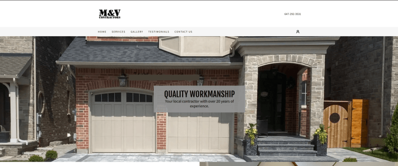
M&V emphasizes the durability and quality of its deals. The neutral colors and clean lines create a sense of reliability that I find very appealing.
The main page is practical, with clear information about services and real project photos. I like a well-structured layout and smooth navigation, which makes it easy to explore different sections. Mobile optimization ensures I can check everything on the go.
Summary: The focus on details and professional presentation makes this contractor website look and feel unique.
Greenworks
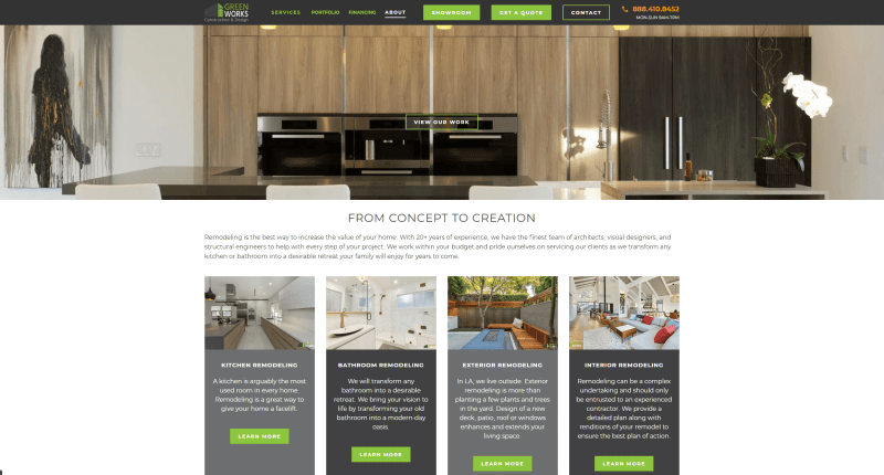
Greenworks immediately conveys its eco-friendly approach. The green accents on buttons and headings make the concept clear and memorable. The homepage tells you about their mission and environmental benefits right away, which, in my opinion, helps visitors connect with the brand.
The interactive portfolio blocks caught my attention because they highlight the quality and precision of each project. The blog looks useful for sharing insights and innovative tips.
Summary: The website effectively communicates the firm’s concept, expertise, and commitment to quality.
SOD
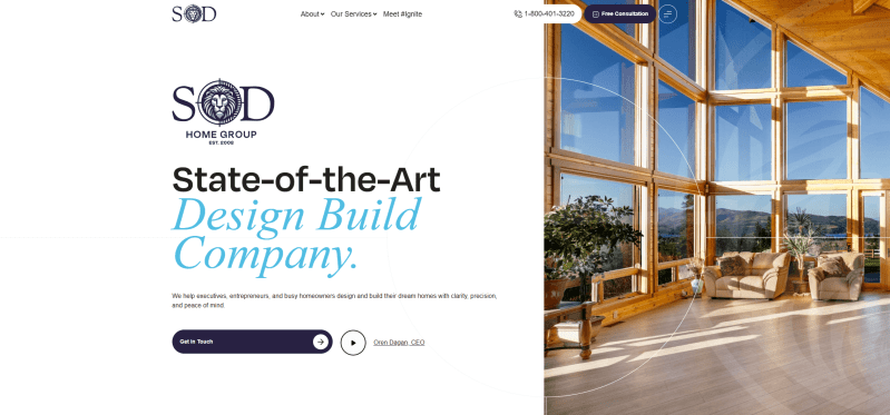
The Sod really stands out with its modern design and bright accent colors. It immediately catches the eye and gives a lively first impression. On the homepage, the interactive videos and clear messages made me feel engaged right away. Each block is visually unique with graphics, schemes, and icons.
What I found especially useful are the sections highlighting reviews and successful projects. They clearly communicate experience and reliability.
Summary: The vibrant and memorable style makes this design one of the most recognizable contractor website examples.
Weitz
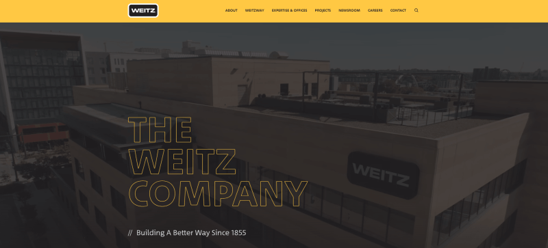
I found Weitz’s website to be a great example of elegant corporate design, it immediately conveys innovation and scale. The large text blocks combined with visuals clearly show the company’s achievements, making it easy for me to grasp their capabilities.
The portfolio gallery is interactive and allows users to familiarize themselves with the completed works in detail. The regularly updated news section adds a sense of activity and engagement.
Summary: The seamless mix of style and functionality reflects the brand’s professionalism and status.
Conclusion
With Weblium, you can quickly create a contractor website that looks professional and functions flawlessly – its basic features are specifically designed for beginners. You can choose from ready-made templates and blocks or start completely from scratch, adjusting every element to reflect your brand. You can add social media links and arrange everything exactly how you want it. You can also set up password-protected pages for private clients, and adjust every detail to suit your needs.
Start your free website now and make your business accessible.
FAQ about contractor websites
How to build a website for a contractor?
Choose a platform that offers ready-made templates for the industry. Then, place information about your services, photos, and a contact form for communication. Thanks to the intuitive interface, it will take only a few minutes or hours – it all depends on your needs.
What is the best website builder for a construction company?
Weblium is an ideal choice, as the platform provides stylish and professional templates, the ability to customize fully, and 24/7 user support. You can quickly add feedback forms, portfolios, and even secure pages.
How much does a website for a construction company cost?
The cost depends on the chosen tool. If you work on Weblium, a basic plan can cost as little as $8.25 per month. This includes access to a custom domain, SEO tools, and integrations.
What makes a great contractor website?
It should be easy to navigate, modern in design, and functional. It should clearly showcase your portfolio and contacts. Essential elements include testimonials, quick contact options, fast loading times, and mobile optimization.