Restaurant Website Design: Ready Templates and Top Ideas
If your restaurant doesn’t have a site yet, you can assume that no one really knows about you. When people want to dine somewhere, the first thing they do is opening Google or social media and looking for restaurant websites.
Don’t have a restaurant web page or does it look old-fashioned? Sorry, but a huge portion of your potential guests will pass by.
In this article, we will tell you what modern restaurant websites should look like, share some restaurants menu design ideas, and show examples of the best restaurant website designs.
Contents
Why Do You Need a Website for Restaurant?
Although we live in the 21st century, many restaurateurs don’t even think about creating a site. Yes, word of mouth, paid ads, and social media work too. But good restaurant websites are the first and main things that all restaurateurs should have.
Great restaurant websites can help you:
- Attract more customers. All people looking to dine at a new venue today open Google search first. And they may choose you if they come across your site.
- Introduce people to your venue and concept. Even if users have heard your name somewhere, they still don’t know what to expect from you. What kind of cuisine do you offer? What is your unique feature? Your site can tell them that.
- Build brand awareness. If users come across your restaurant websites from time to time, they will want to dine at your venues sooner or later.
- Launch marketing activities. PPC advertising, bloggers’ posts, press releases, and newsletters – all these activities have to lead somewhere. Interested customers who click on your ads expect to see great food websites with complete information.
What Makes Up Best Restaurant Website Design?
In fact, there are no strict rules here. The main thing is that your site should reflect the idea of your venue. Beautiful food photos are important, of course, but there are many examples of minimalist restaurant websites.
Your site can be a multi-page portal or a small one-pager. If you can fit everything you want to tell about yourself into several screens – why not. But there are some sections that must be present on all restaurant web sites.
You can always get some restaurant web design inspiration from looking at the top restaurant websites. The restaurants website inspiration ideas will help you create the structure of your own site and choose design features.
Most of the users opening resturant websites expect to see:
- General information about your venue. What kind of food do you serve? Who is the chef? Do your customers need to book tables in advance?
- Contact details. Opening hours, exact address, phone number for table reservations must be present on all websites for restaurants.
- Gallery with photos of the interior. It’s no secret that many people choose a venue for its interior. Show your potential guests what your venue looks like.
- Menu with prices. For each item on the menu, you can add a photo and a button for online ordering or booking a table. It’s also possible to create a one-page restaurant menu.
- Pre-order or booking form. Allow your clients to book tables online or place orders for takeaway. This will greatly simplify the work of your staff.
- News and promotions. If you have discounts and special offers, customers want to know about them before visiting your venue.
- Integration with social networks. Many visitors may be not ready to book a table right now but will happily subscribe to your Instagram or Facebook.
The Best Restaurant Website Examples
Before you start creating your restaurant web design, get some restaurant website inspiration from others. We’ve picked up some of the best restaurants websites.
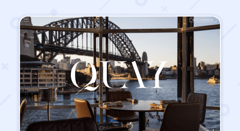
Quay Restaurant
This Australian venue focuses on stylish interiors and amazing dishes. It’s definitely one of the best restaurant sites. There is a beautiful photo of the interior on the cover. Then you can read about its chef and get acquainted with the menu. The footer contains all the contact information and a button for booking a table.
Drury Buildings
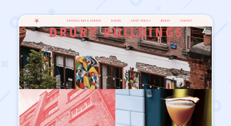
A smart combination of images with text blocks and muted red color are the hallmarks of Drury Buildings. As the owners themselves say about their venue, it is “a mixture of Berlin’s exterior and New York’s interior.” The character of this restaurant design website is highlighted by interesting accents and textures. A simple font keeps the food website design from getting fussy and pretentious.
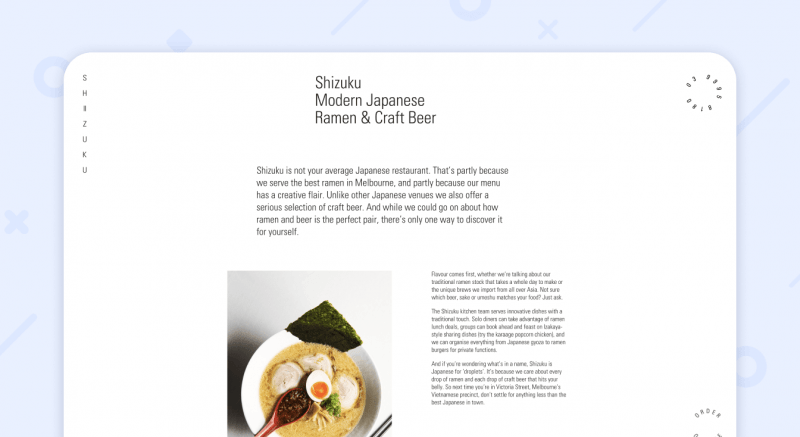
Shizuku
It is another Australian venue with an amazing concept. The site of the Japanese restaurant is very minimalistic. There is some information about the concept, a link to the menu, and a contact form for booking a table. This website design restaurant fully reflects the concept of the venue – innovative dishes with traditional taste.
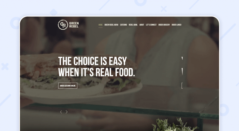
Green Rebel
This completely organic vegetarian website design will delight any meat eater. It starts with a video showing the interior, dishes, and satisfied customers. Animated lettuce leaves, carrot bunches, onion pieces look very naturalistic, as if they are already on your plate. A neat background similar to the texture of organic cork adds craftiness. We can confidently say that this is one of the best vegetarian restaurant website design ideas.
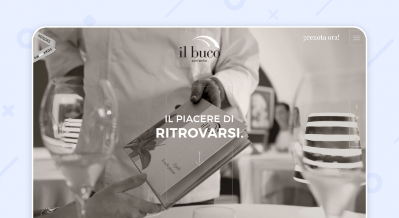
Il Buco
The color scheme of this site gives the impression of luxury and timeless style. The navigation is simple and straightforward, the menu is hidden in the upper right corner. On the main page, you can read about the chef, see the interior and menus. This site has received the Awwwards Honorable Mention. So you may consider it as one of the best restaurant website designs.
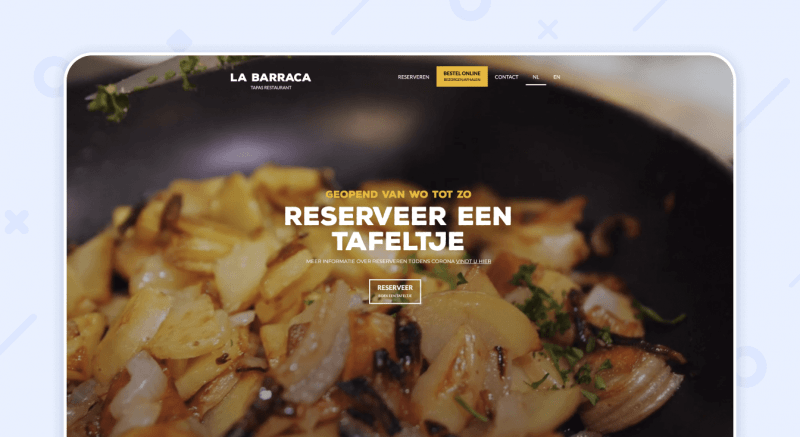
La Barraca
This Netherlands tapas restaurant relies on a cooking video. You can literally hear the chef’s knife slicing vegetables and frying pan sizzling. This is followed by a small gallery and featured reviews. And wherever you scroll to, a booking form follows you.
Bevri
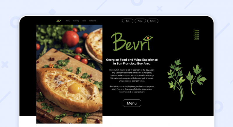
Bevri is the only Georgian food spot in San Francisco. This is a very simple restaurant website with an emphasis on juicy photos of Georgian dishes. On the restaurant home page, you can find out about the venue, see the menu, and subscribe to the newsletter.
How to Create the Best Restaurant Website?
You may think that creating beautiful restaurant websites is a long and expensive process. In fact, if you use a restaurant website builder, you can create well-designed restaurant websites yourself. It will take you no more than a few hours. And you won’t need a restaurant web designer!
For example, on Weblium, you can create a website from scratch using blocks. Or you can speed up the process even further by using ready-made templates with the best food websites design ideas.
Our designers are constantly creating beautiful templates for different niches. They are already filled with images and text. All you need is to slightly change the content – and your perfect website is ready!
Check out our restaurant website design templates below:
Restaurant Weblium Template
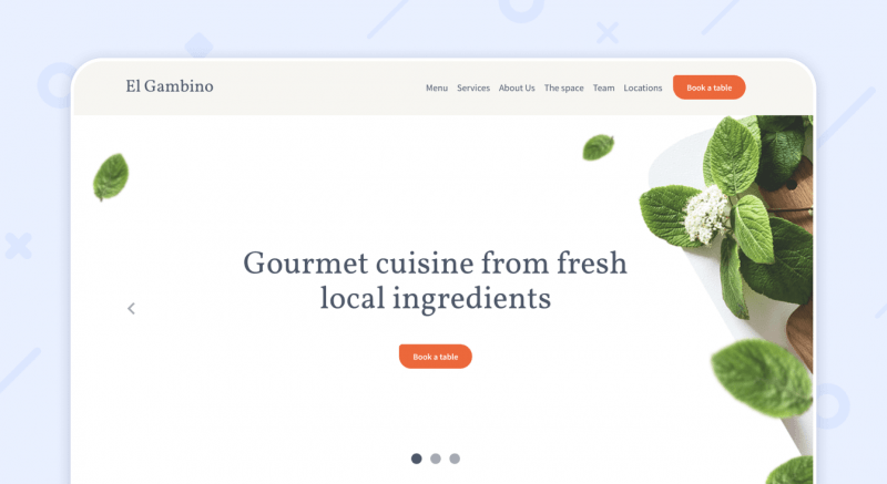
It’s one of the best websites for restaurants. You can immediately acquaint your potential guests with new dishes, menus, and special offers. Beautiful food photography and a mix of green and orange colors are appetizing!
Beer Pub Weblium Template
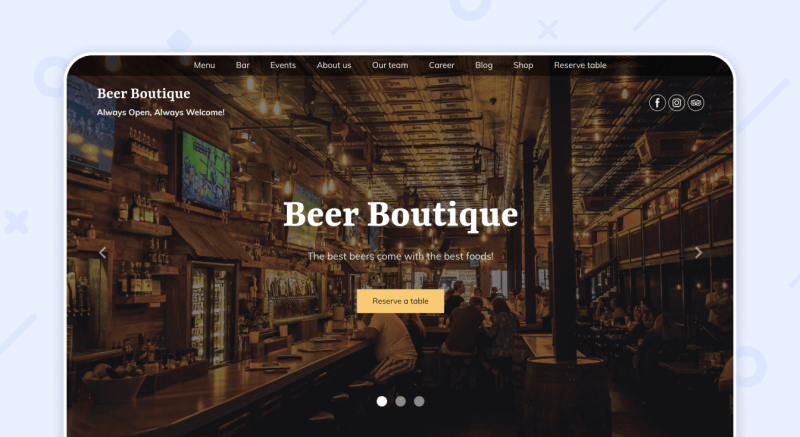
This is a great example of dark-colored restaurant websites design. This template works especially well for bars and pubs. Beautiful photos of the interior on the cover immerse you in the welcoming atmosphere of the venue.
Food Truck Weblium Template
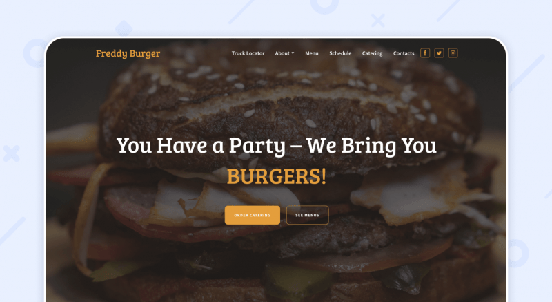
Can you smell that fresh and juicy burger? The large burger on the cover and yellow accents (they remind us of cheddar cheese) are beckoning to book a table. This template is also suitable for pubs, bars, street food spots.
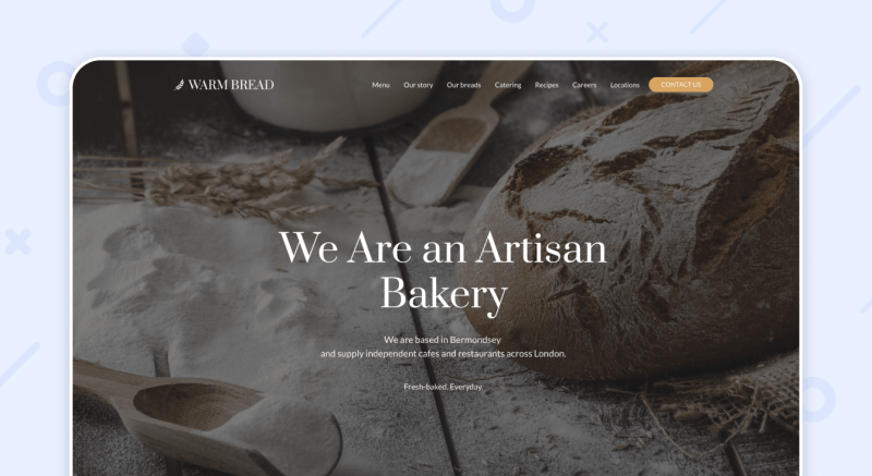
Bakery Weblium Template
This beautiful Weblium template is perfect for bakeries and coffee shops due to its color scheme. The cafe website design includes a menu, contact information, and a featured dishes section.
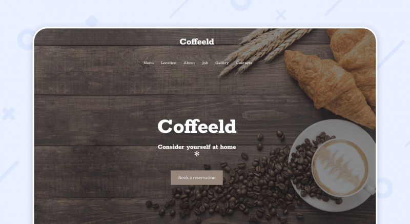
Cafe Weblium Template
It’s one of the best cafe websites templates in warm colors. There is a gallery with photos of the interior, and reviews of visitors on the home page. By clicking on the menu, a new page opens with detailed descriptions and prices.
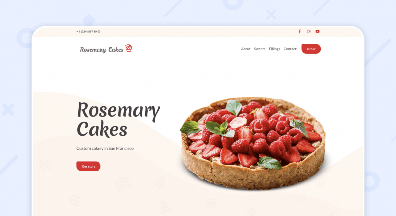
Cakery Weblium Template
This is one of our all-time favorite templates! Delicate colors and stunning photos of cakes and pastries cannot leave you indifferent. This template can be used for a cafe, pastry shop, bakery, candy store, etc.
Summary
Your restaurant web design can be whatever you wish. You can create one page restaurant websites or large sites with many sections. You can write a great restaurant blog or create simple restaurant menu websites.
But whatever website design restaurants you choose, make sure your site has a menu, information about opening hours and address, and a table reservation form.
All this can be done on Weblium in a few clicks without the need to hire a restaurant website designer. You can not only create a website but also run a restaurant design blog, integrate other services, set forms for booking tables.
We hope that our templates and featured ideas for restaurant website design inspiration will make it much easier for you to create your website.
And remember, not only famous venues need to go online. Your own site is a must for small coffee shops, bars, street food spots, etc.
We wish you good luck and a never-ending flow of guests at your venue!


