
How to Write "Thank You Page": Best Templates and Examples
Thank you page is a page or pop-up window that users see immediately after a conversion action — usually after purchase or sending a request.
Contents
What is a thank you page?
“Thank you for your order” page is a great opportunity to thank the client and engage him or her in the further use of your site. You can create such a page as you like – and the more original and sincere you are, the more effective such a page will be. At Weblium, we have thanked you pop-up windows which you can edit as you like. Today we will tell and show what design options there are.
Why do you need a thank you for your order page?
Many websites leave this page unattended, while it can greatly affect your customer loyalty. We all like it when they say thanks to us – and the more sincere and original this “thank you for your purchase” is, the more we are satisfied. Surely, when you serve the client offline, you thank him. Your website is no worse.
It might seem that when a user has already bought your product or signed up, you don’t need to do anything else. However, neglecting the thank you for your purchase note, you miss a valuable opportunity to build relationships with your new client (as well as further conversion increase).
As long as your competitors forget about this feature, you can use the following tactics to optimize the thank you page and create a wonderful experience for your users.
So, you need this page to:
- Show that you care.
- Make the user feel special.
- Increase customer happiness.
- Give additional important information (for example, when will the manager call back).
- Calculate the conversion by plugging analytics code to this page.
How to Write “Thank You Page”
The first thing you should know is that it’s not necessary to publish a separate page to thank your customers – a pop-up window is quite enough.
Now we will tell you how this can be done with an example of Weblium, step by step, so as not to make up a new page.
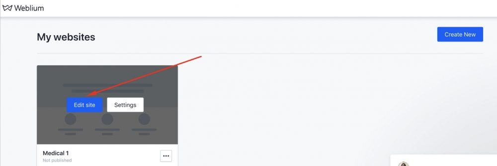
- Open your Weblium website in the editor.
If you don’t have yet, login and start editing your website
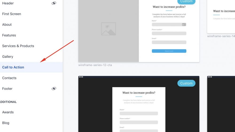
2. Create a Call to Action form.
The user leaves contact information or a request for the purchase in it.
3. Open the form settings.
When sending the form, your user can see the pop-up or be transferred to another page – a whole separate page with thanks for the order.
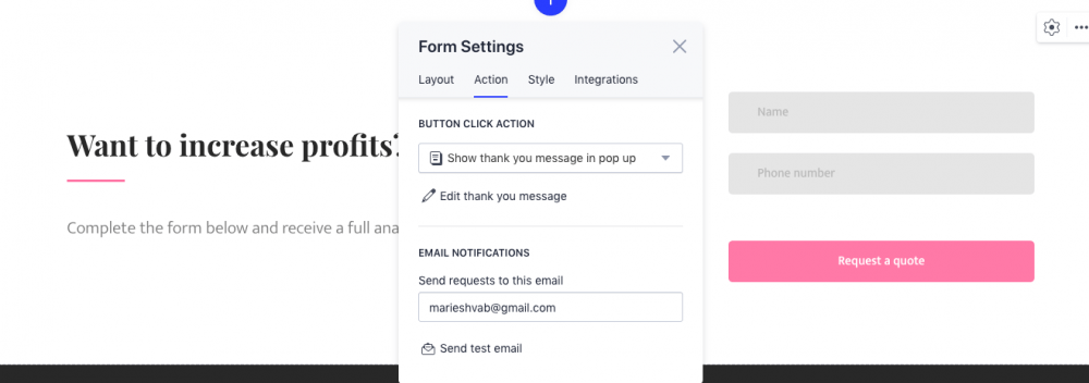
4. If you don’t want to create a separate page, select pop-up and click Edit – and you can change the entire text in this window.
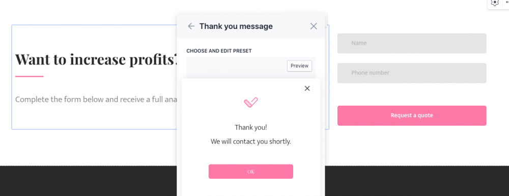
5. By default, a pop-up window with the phrase “Thank You! We will contact you shortly.” is included in each of our templates. Change each word freely so that the phrase looks as sincere and personalized as possible.
In general, there are only 3 rules for creating a thank you window or page:
“Thank you for your order” page rules
1. Confirmation message
Regardless of whether you receive an order for a product or simply collect contact details for further email distribution, you should confirm that you have received information from the user. The absence of any confirmation leads people to bewilderment – what if there has been any technical error?
2. Be concrete but personal
Specify in the message what you thank the user for – for the order, for filling out the contact form, for sending a request. Write this message in the same style as the whole site – if you’ve chosen a friendly tone, then continue in the same way. If you designed the site in a strict style and business tone, you should not be too familiar with the thank you message.
3. Give them more
Tell the user what to do next – wait for the operator’s call, message, get acquainted with promotions or social media. If you write that an operator will contact the user soon, then specify the time: for example, in the next 24 hours or from 9 AM to 9 PM on business days.
In fact, it all depends on your imagination. As for a separate thank you for ordering page, this can also be implemented on any website, however, this approach is gradually becoming outdated. The task of your site is to be simple and clear for the user, and a small neat pop-up window fits perfectly into this philosophy.
Thank you page examples
1. HubSpot
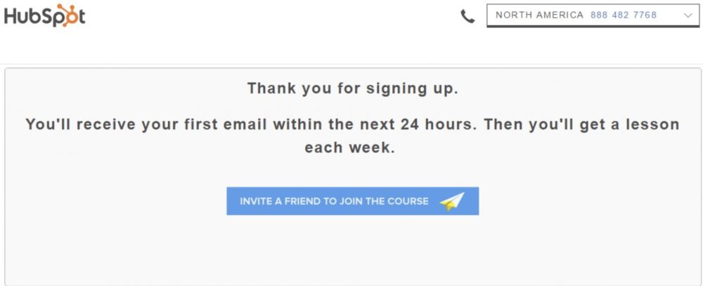
For HubSpot, an order is not the end, but the continuation of the user journey. First, the text on the pop-up window concretizes what they thank the user for – for signing up. Secondly, there is a more or less clear framework, when a person will receive the first email, and why it is great. And thirdly, by clicking on the button, the customer will not just close the site, but maybe invite a friend, and this action can be tracked by plugging the analytics code to the button.
2. Groove
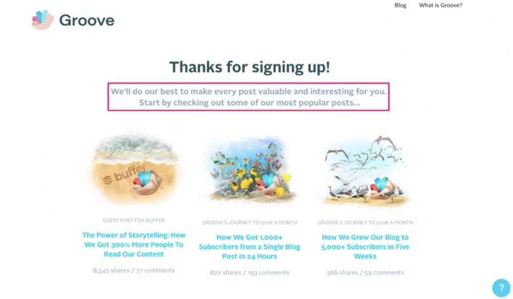
Groove also does not end the user journey at the moment of subscription. If the user is ready to leave his email address for distribution, it means that he is also ready to read some articles. Groove leaves the taglines of a few articles worth reading right now.
3. Sprout Social
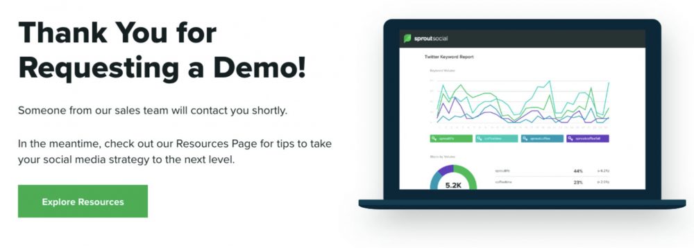
Another great example of how you can present all the necessary information with simple text. We especially like that they propose to visit another page with additional useful information. Also, they specify what you should wait for – for someone from the sales team to contact you.
Thank you page text templates
Here are some great templates that you can use to personalize your thank you page or pop-up window. Remember that you don’t need to copy these templates and use them as-they-are, on the contrary, you’d better change them and adjust to your website and current business needs to surprise and delight your customer.
#1
Thank you for your order! It is already on its way!
We’ve sent you a link to track the delivery status. While you’re waiting, we are glad to share a 10% discount on your next purchase. Activate it by clicking on the button below.
#2
Thank you for signing up!
We’ve got plenty of useful articles on our blog. Want to have a look now?
#3
Thank you for choosing us!
We are already working on your request. In the meantime, feel free to invite a friend to join the upcoming event.
Summary
As you can see in the templates above, there’s no need to write a huge thank you message. One or two sentences will be enough. Be concrete, personal, and polite, don’t try to squeeze even more money from the client with an upsell. Don’t forget about analytics codes for thank you pages, and be sure to control how users react to these windows. If you see a high failure rate, switch tactics. That is why we recommend using pop-up windows when creating a website on the Weblium platform, instead of separate pages, as they are easy to change at any time, without touching the layout.
Whatever site builder or CMS you use to create your thank you page, don’t forget to use the common rules from this article, and feel free to experiment with different options to find the best wording, message, and design.


