10+ Informational Website Examples For You To Follow Now
Informational websites are those sites that are created in order to provide a customized and branded resource for potential and active customers, members, investors, and so forth. These websites are usually content and design-driven. … A great informational website can act as an excellent sales tool for your company.
Usability comes first in this case. Mobile compatibility, well planned, web design, and easy-to-scan content architecture, fast loading, simple yet effective navigation, pleasant color scheme are the main features of a winning website today.
You will never get a second chance to make the first impression – that’s why you have to go through this informational website examples top to get a clear idea of what your own website should look like!
Make the task easier for yourself – use Weblium to create an outstanding, fast, and responsive website that matches the trends and effectively works for your business!
Create your own informational website for free
Contents
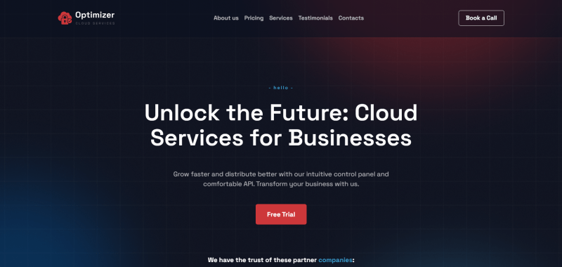
Optimizer Cloud Services
website: https://cloudproduct.weblium.site
Optimizer is an informational website template created for a company that provides cloud services for businesses. A great thing about this informative website is its design. The minimalist design in darker colors shows the professionalism of the company. The content is full and brief, so customers can learn everything they need without spending too much time. The site contains a great minimalist design, information about partners, and full information about the business.
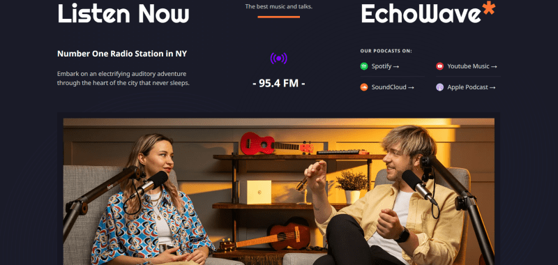
Echowave Radio
website: https://radio-podcasts.weblium.site
Echowave radio is a website of a radio station. This information website looks magnificent and provides great features for all interested in a niche. On the front page, you can find photos of hosts, basic information about the radio, and useful links, where people can listen to the radio. Moreover, there is music to listen to, so people can find the songs they like and listen to varying genres. The advantages include a great cozy design, high-quality photos, and a lot of interaction elements.
Logotypio

website: https://business-branding.weblium.site
Logotypio is an example of informational website of a digital agency focused on showcasing the services of a company. The company itself is focused on creating logotypes for different businesses, and the design solutions represent a high-level approach to logo creation. The site offers not only great photos and information about the company but also provides a great “Task/Solution” tab where people can see the cases.
FreshBooks Informational Website Design
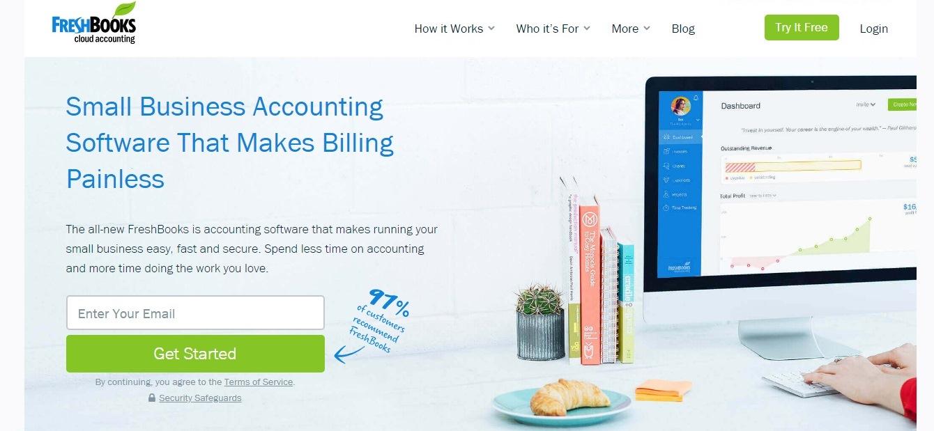
website: https://www.freshbooks.com
The website is very easy to consume: the entire site looks like an exciting story – you just scroll down and continue reading.There is also a great use of contrasting elements; while all the primary CTAs are distinctive and well-placed.
The testimonials showed on the website’s homepage tell you the real stories, explaining the reasons why you should buy the product. In addition, you will find a cool sub-headline that says: “Join over ten million business owners using FreshBooks”. This automatically gives a few plus points to the business’s credibility.
Book Landing: Information Website Template (free)
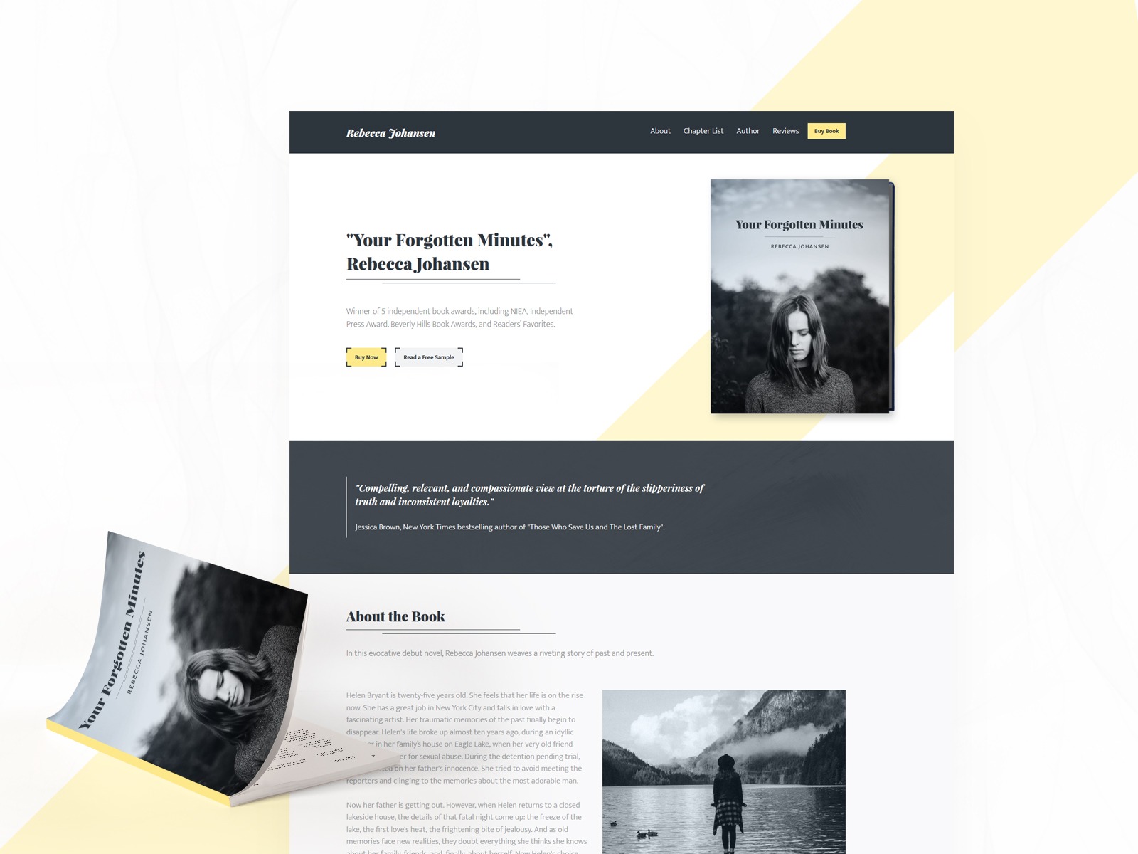
This template is one of the best information examples you’ve ever seen. On the site you can read the text of the book — that is, get some of the information from the book absolutely free.
This informative website is minimalistic and doesn’t contain any unnecessary information. The colors are most conducive to reading.
Airbnb Website Website Examples
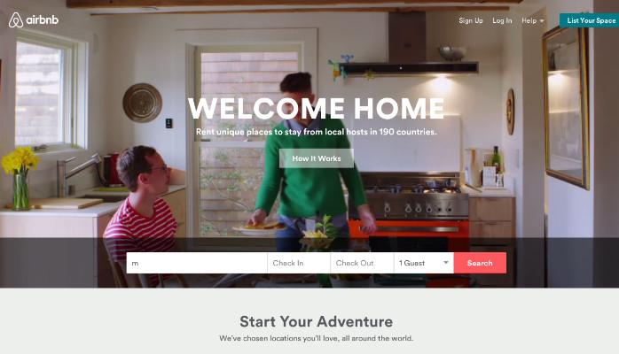
website: https://airbnb.com
This informative website example includes the date and destination in a smart search form, which is the first info that visitors will see.
The primary CTA (search) visually contrasts with the background; the second one is for hosts: it offers excursions that you can book on the same website. You can see which of these offers is the hottest.
William Mcdonough Informative Websites Examples

website: http://www.mcdonough.com
The sections of the website are customized. The hero slider functionality is rather complex, there is a unique tag cloud on the home page. The grid blocks on the home page look very neat and well-organized.
On the whole, the website is a good multifunctional solution that meets all the requirements of a quality personal informational website.
Mint – Informational Website Design Examples
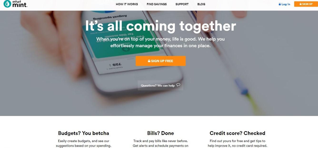
website: https://www.mint.com
The design if this website is ultra-simple, and it has a strong headline. The website’s homepage gives you secure and relaxing vibes, which is crucial for a financial firm.
It also contains a direct and simple CTA: “Sign up free.” The design of this call-to-action button is awesome — the secured lock icon enhances the concise copy.
Writer Website: Information Website Template (free)
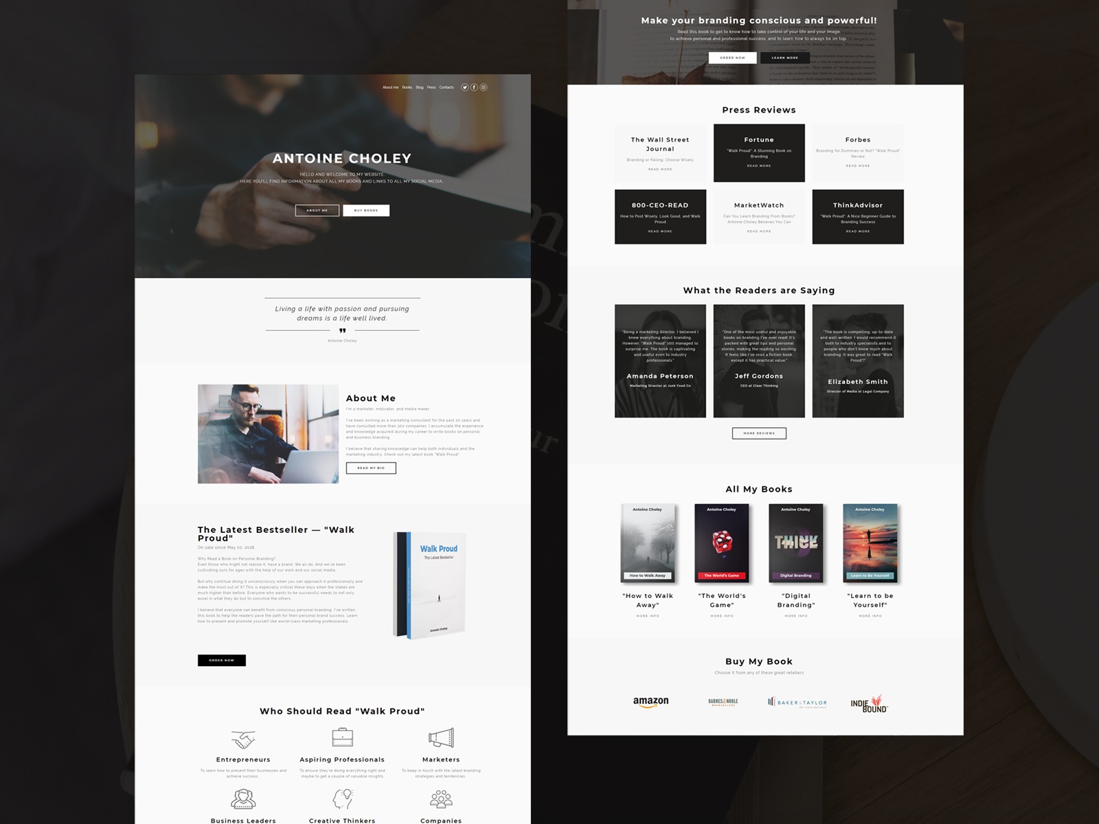
This informative website contains all new information about the writer. On the website you can find snippets of texts on the site.
The website is designed as minimalist as possible and is very pleasant to read.
Dropbox for Business Website
website: https://www.dropbox.com/business
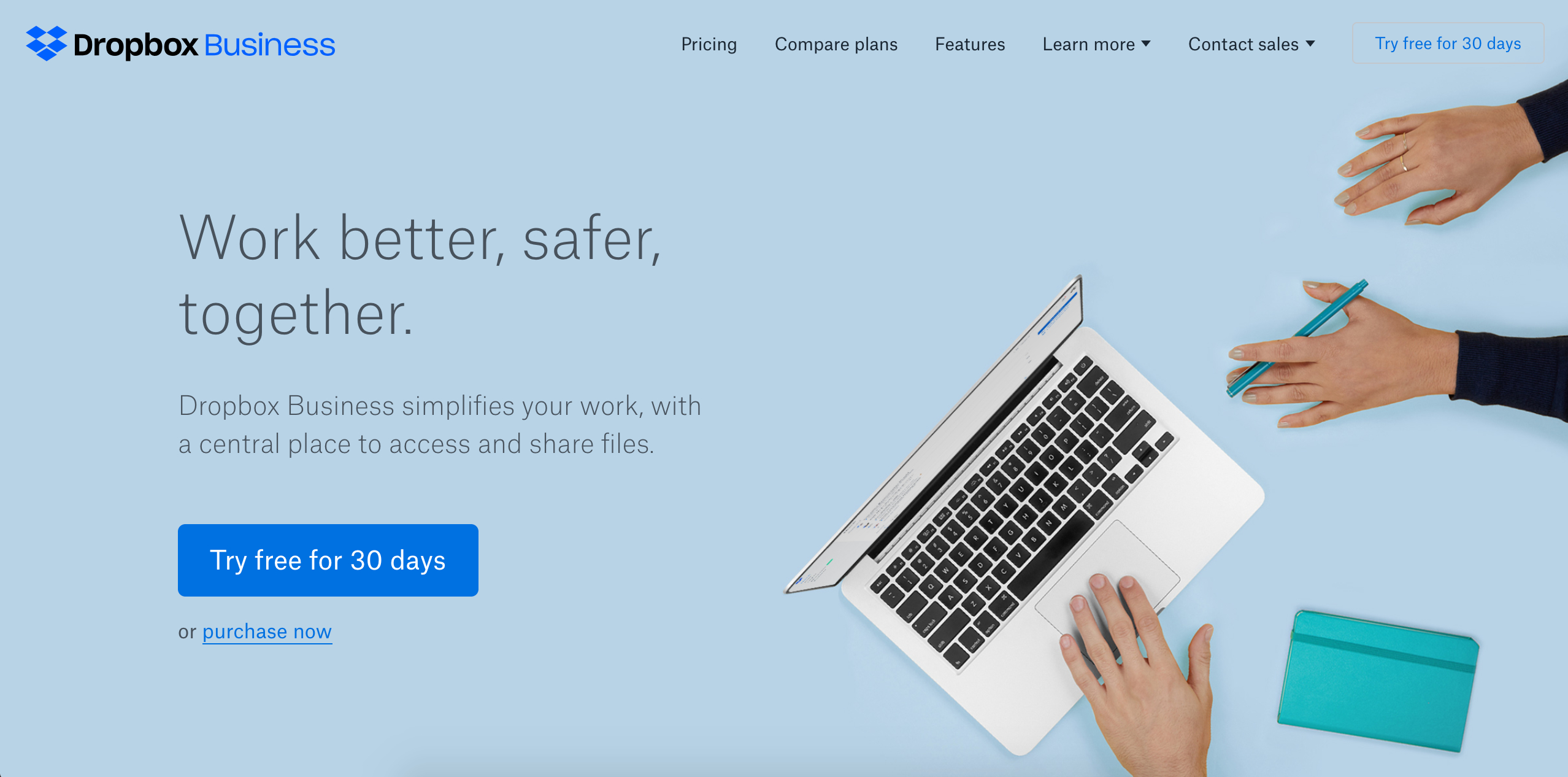
The design of the website is simple and user-friendly — you will see nothing but the important info you really need: a huge image with simple and compelling copy and a “Try free for 30 days” CTA.
The homepage is an excellent illustration of simplicity. It embraces whitespace while limiting the use of visuals and copy.
The sub-headline is also quite simple, but strong: “Dropbox Business simplifies your work, with a central place to access and share your files”.
Polygon Informational Website Examples

website: http://www.polygon.com
This video game review website had to get a place on this top for many reasons.
The first thing you see is the correct use of the whitespace – nothing distracts the visitor from the important info. The articles feature long-scrolling, unusual layouts; the text is accompanied by large and beautiful imagery.
In addition, you will find an impressive real-time search bar at the top of the browser window.
By the way, you can create a video website on Weblium for free.
The Verge
website: http://www.theverge.com
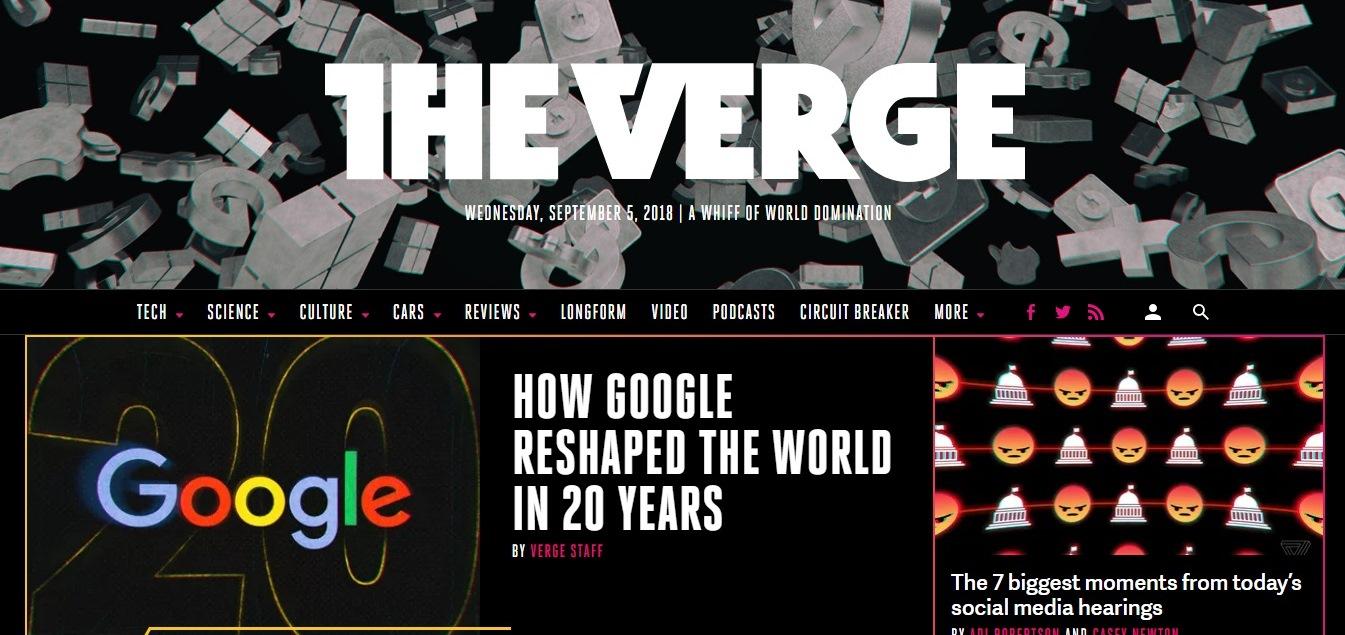
The website’s homepage meets you with a colorful and huge puzzle of hot stories’ headlines, showing a glimpse of the articles.
An image carousel, drilling the reader into a story, divides every webpage.
The top stories are given more space to draw the reader’s attention to the hottest news.
Conde Nast

website: http://www.condenast.com
The visual hierarchy is something you notice as soon as you enter the website.
The giant content slider in the header is really helpful in finding the Conde Nast’s beliefs.
The customizable filters are a great idea: you can choose what information you will see based on your interests.
Creating a decent website is not a problem – the problem is to find a way to do it in no time! Use Weblium to get a unique, fast, and responsive website for your business!

