Website Header Design: Best Practices to Make It Good (with Examples)
There are many components to crafting a great website and often the website header gets little attention in the overall building process. That is unfortunate as it is often the first and the best tool you need to keep someone on your website (other than amazing content).
So in this article, we are going to breakdown everything you need to know about website header design, from what should be in it to how you can build it. So, let’s start with the basics.
Contents
What Is a Website Header?
A website header is an area that sits at the top of your website and helps make your website congruent as well as it helps with navigating your visitor from place to place. This is a place where your visitor gets an idea of your brand and begins their journey through your well-built website.
Why your header is so very important? It is basically your greeting and handshake that starts your new relationship off. It is the first website part the people see and what makes them decide to stay or not.
Bad header navigation (desktop/mobile) makes people leave the website. The header has a significant impact on SEO as these are where the most important links and messages placed. A responsive header design increases website performance.
Website Header Size
Even with the ever-changing screen size across multiple devices, there is still one, most popular, website header size. Regarding the perfect size, most feel that 1024px width is fine, though there are header sizes that range from 1024px all the way to 1920px. These bigger widths are good for high-resolution screens.
How to Make a Website Header
There are a few key tips that you should use when building your website header (and there are more if you are going to script in HTML).
No matter what each business or niche of service you choose, it should have its own website and in turn, each should have its own unique header.
#1. Consider Navigation Beforehand
Think about what you want the website visitor to do the most. Then, make sure that the navigation and access to those items are forefronts. As an example, if you are a high-end boutique store that works with tailoring you may want to add a schedule button there to promote this aspect of your business.
#2. Choose a Good Font
The font does matter! Or fonts, we suggest using at least two for good topographic contrast and visual interest. You the font choices that are clear to read and work with the overall brand identity you are trying to craft.
#3. Use High-resolution Images
And not just high-quality. The images should also reflect the brand message, your concept, the products or services you intend to offer. For example, if it’s a portfolio website, a bright picture of you with a contrasting background could do the trick.
#4. Consider Using a Shrinking Header
There’s an option to make the header shrink when your visitor scrolls. This keeps all the pertinent information handy no matter what. Utilizing some tricks like color change on the scroll and leaving the navigation available anywhere on the page you may improve visitor retention.
#5. Express Your Brand Identity
Everything from the logo to the color pallet should express your brand identity, be bright and engaging. This means choosing the right layout that works with your logo as well.
#6. Use Effects to Engage the Visitors
You can utilize the rollover color and other effects to keep your visitors engaged and visually stimulated. it is also a good way to indicate your company’s overall image.
As for the technical part, there are a few key points that should be in every website header and they include:
- Logo & Brand Identity
- Navigation
- Page Title
- Search Bar
- Shopping Cart
- User Profile Link
- Login/Logout
- Notifications
- CTA
- Contacts
Tutorial: header settings
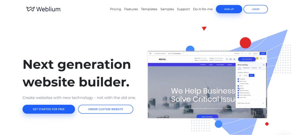
In this video, you’ll learn the main components of a good header. We’ll also show you how to add all the needed sections to your header — buttons, language menu, social icons. Moreover, you’ll find out how to move elements on your header, change its background color and style, and make it sticky. Follow the instructions below to set up a header settings on your site:
With this video, you will learn how you can design a header on the Weblium website.
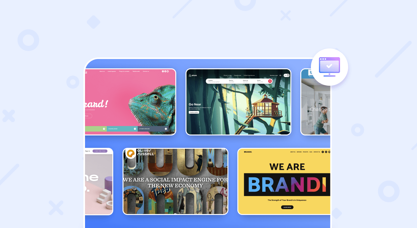
Website Header Examples
There are many sites that are created to help you make a website and they will have access to some great website header ideas. We’d like to show a few header examples made with Weblium.
Why are we showing our own examples? Quite simply, we have professional UX designers and product managers who research different niches to find which design elements work better from a marketing standpoint. We take this research into account when creating our templates.
Below we are going to look at just 3 of the different types of sites you could use to get inspired:
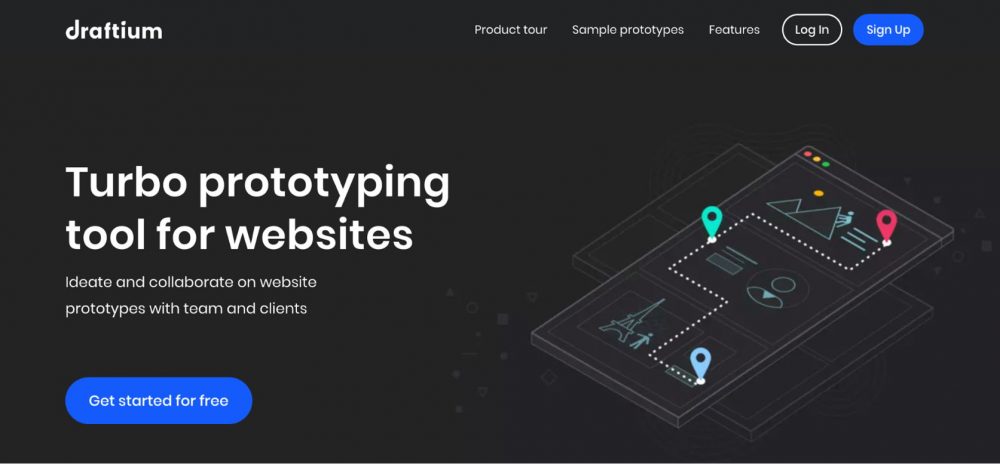
1. Prototyping Tool Website
Draftium is a prototyping tool, fitted with everything you need from great templates to ready-made blocks to create a mock-up of your vision and test it.
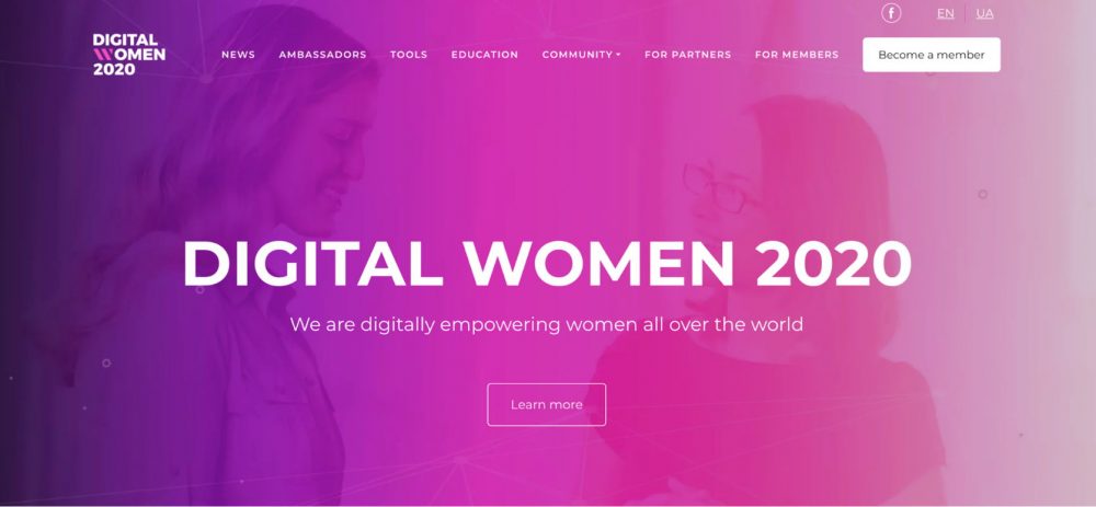
2. Nonprofit Community Website
Digital Women is a website for women empowerment in the entrepreneurship niche. They utilize their resources such as management tools, education, and a community to help raise women up and guide them into the competitive entrepreneurship world.
3. Portfolio Website Header Example
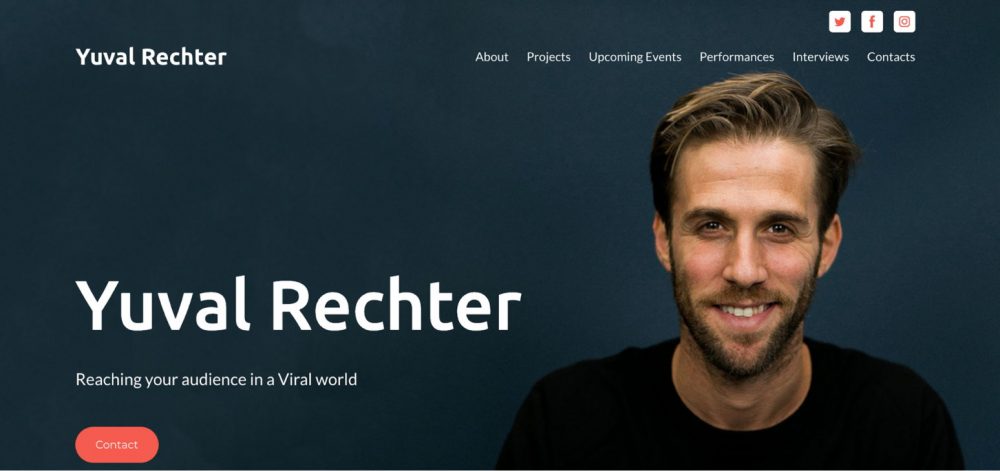
Now we are going to look at a portfolio site created on Weblium. Yucal Rechter is an online publisher that does work on magazines and site geared toward millennial women.
All three sites have several features in common, that improve engagement:
- High contrast color scheme.
- Easy navigation.
- Large, high-quality images.
- Clear Brand message in an easy to read font.
- Clickable elements (text, images, icons).
Wrap Up
With the information and ideas given above, it’s easy to see just how important your website header is to your overall brand identity. By adding bright pictures, giving a clear message and using the Weblium website builder, you can craft a clear and concise header that matches your brand and keeps your visitors engaged with the end mind of converting that visitor from a looker into a buyer.
