Best Homepages: 25 Examples That Set the Standard
In the world of web design, everything changes rapidly, and what was popular yesterday may seem outdated today. The design of the homepage continues to play a key role in the first impression of a brand, company, or product. The modern user demands not only aesthetic appeal but also functionality, loading speed, and an intuitive interface.
This year, special attention is paid to personalization, interactivity, and adaptability. Innovative technologies such as artificial intelligence, next-generation animation, and smooth user experience are becoming the basis for creating engaging visual and functional solutions.
In this article, we will consider the cool homepage examples that will help your website stay relevant, attract users, and stand out from the competition.
Contents
Cool homepage examples to learn from
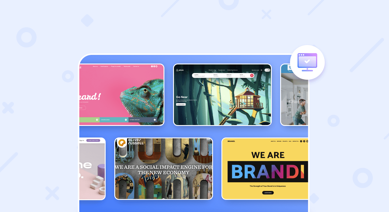
The selection of 25 best homepage sites cannot cover all practices worth attention. Nevertheless, we decided to share are our favorite examples of web pages with the best homepage designs. Let’s take a closer look at homepage layouts on the list and find out what’s so special about each.
Lizard Breeder: bright and stylish homepage
The design of this website’s home page is a bright, attractive screen created for websites dedicated to animals and pets. Its visual style favors exotic cold-blooded creatures such as chameleons, combining bright colors with playful, natural layouts. The design combines vivid images with clear, structured sections, making it ideal for pet stores, zoos, or reptile enthusiasts.
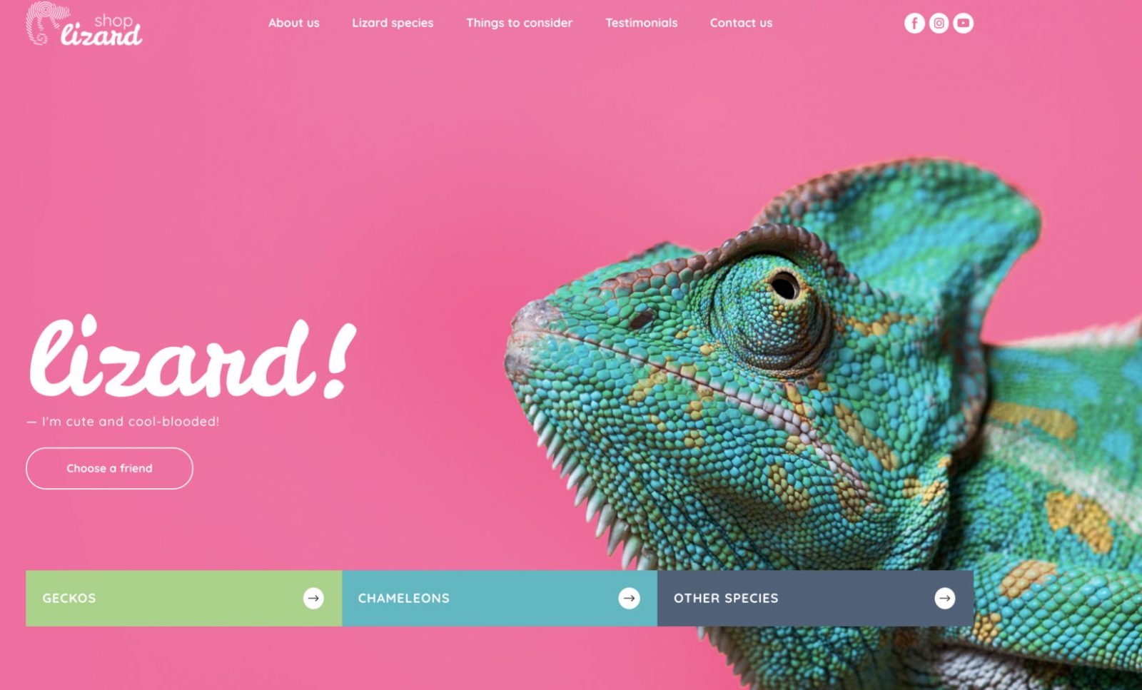
What makes it great:
- Bright, playful visual elements that instantly grab attention.
- Engaging jungle and habitat sections that tell a story.
- A clean, structured layout that balances images and content.
- A focus on unique, exotic pets that appeal to a niche audience.
- Product/adoption showcases designed for easy navigation and attention-grabbing.
- Colorful, dynamic blocks that make the home page lively and memorable.
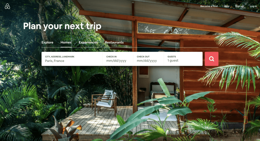
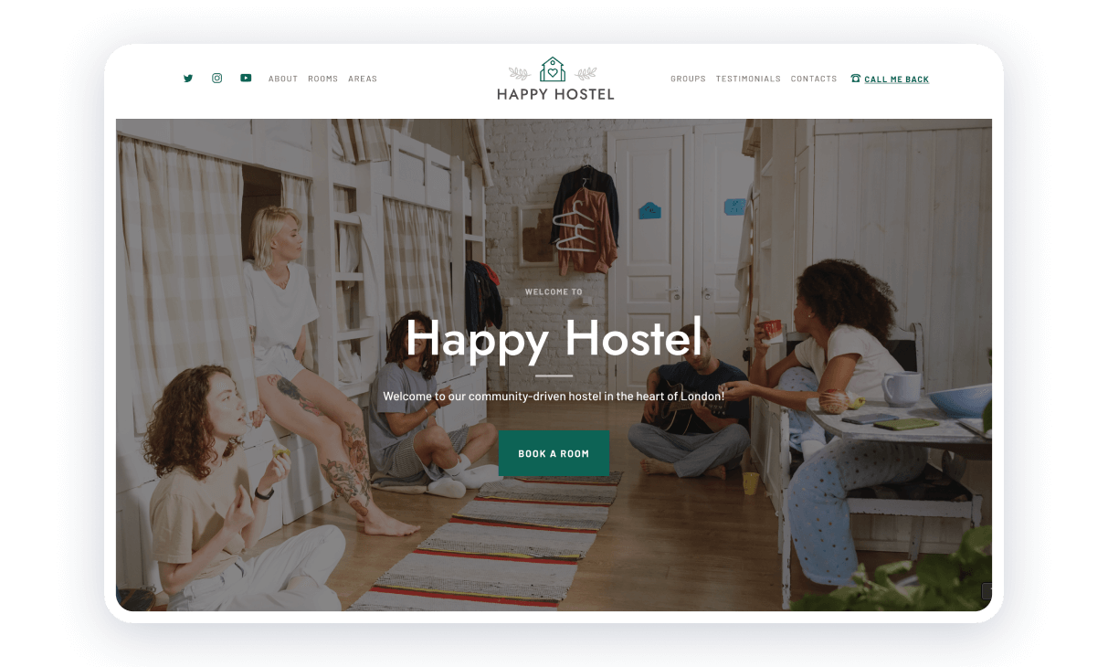
Airbnb – best website homepage
Besides the fair selection of homes and activities, the website aesthetics is a good bonus for travelers, who get inspired from the first seconds they open Airbnb. Realistic visualization of breathtaking places and thrilling experiences aren’t the only things to admire.
What makes it great:
- The search form with the main parameters (destination, dates, and number of guests) is located at the center of the page and guides a visitor to the next logical step.
- Users can switch between “Explore,” “Homes,” “Experiences,” and “Restaurants” tabs.
- The smart form displays recent searches and suggests options. The calendar opens automatically.
- A primary CTA element (“Search” button) is a highlighted element that contrasts with the background.
- The secondary CTA element is discreet: it is located in the upper left corner and sounds like a motto.
Dropbox best homepage example
Dropbox has different pages for individual users and the business sector, each a good example of simplicity in homepage design. You will not find impressive images or videos there, just a description of the basic functionality and a couple of CTA buttons, where they are relevant.
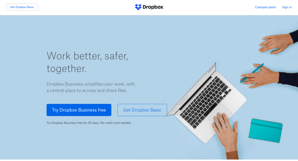
What makes it great:
- A good copy: a user starts the encounter with the service with a secondary CTA (“Work better, safer, together”), the solution to their problem, two subscription options, and a promise of financial safety (“No credit card needed”).
- Business users require more detailed information, as well as proof that this is a full-scale and secure solution for companies. They get the required information on the second scroll.
- A list of standard features is quite long. Instead of repeating the same things and add some more for the Advanced and Enterprise, Dropbox quotes “Everything in …” as the first point.
- Informative CTA “Try for free for 30 days” in the form of a blue button highlights the best offer. All other buttons are white and not highlighted.
- Main features are listed in a horizontal scroller with a “Learn more” link in order to avoid an overabundance of information.
Evernote – the great example the best homepage
Evernote has come a long way from an app for notes to the entire set of business tools. It is impossible to explain all the advantages briefly, but Evernote does a very good job of displaying the key benefits on the homepage.
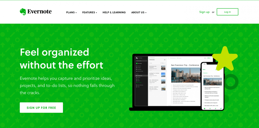
What makes it great:
- A menu is fixed at the top of the page and stays there as you scroll down. There is no need to go way back if you decide to sign up or log in. Besides, these two buttons are always in view.
- The combination of vivid green, dilute gray, and mustard is very effective. White and bright-green signs always stand out on the contrasting background.
- Instead of quoting terms and prices, the homepage offers solutions to users’ problems – “Remember everything important” and “Stay organized, wherever you are.” Choose your option and find out more about the corresponding subscription.
- Basic features and functionality are explained by using simple icons with short copies.
- A subscription form in the final block is placed on a green background similar to the first scroll. It creates a logical sequence and a feeling of completeness.
CloudPassage
CloudPassage is known for its innovations in cloud security systems. The company leapfrog over standard cloud associations, sticking just to a familiar color palette. The homepage features text content, which fully delivers the message regarding its functionality, and a banner in high-resolution.
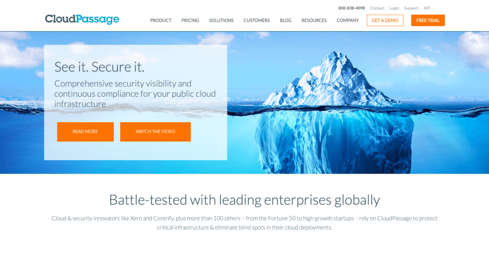
What makes it great:
- There is a video on the homepage, but it doesn’t start playing automatically.
- A user who wants to find out the details can choose between two options — “Read More” and “Watch the Video.”
- “Demo” and “Free Trial” buttons are highlighted, contrasting with the background and other colors on the page.
- The homepage has a clear logical structure. A user starts the encounter with a cover – image and the basic text that explains the customer value. Partners are listed and briefs are attached below.
- The image is metaphorical and helps to deliver a sense of safety, while the shades of blue cause a feeling of calmness.
Carbonmade
This is one of the brightest examples of a totally impressive homepage. This solution will not be suitable for all businesses and projects, but it shows how to combine the most important information on one scroll with ease. Nevertheless, the artwork is the highlight here.
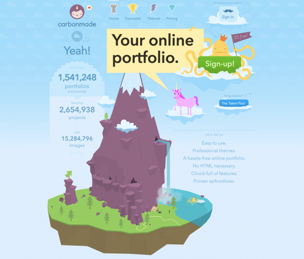
What makes it great:
- Extraordinary graphics reveal the creative potential of the Carbonmade team.
- Numbers together with a laconic fact list are demonstrative but not in a boring way.
- Successful integration of menu entries and corresponding icons is original and eye-catching.
- Gamification of the CTA buttons – “Sign in,” “Sign-up,” and “The Talent Pool” keeps the integrity.
- The key message is located at the center and written in contrasting letters.
Giftscoach — homepage example
This is a gift finder’s website, which is clear for anyone who enters this homepage. The UX design is extremely user friendly and quite trendy.
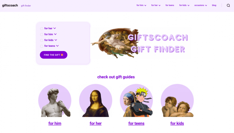
What makes it great:
- Easy navigation in the header highlighting the main categories — for him, for her, for teens, for kids, occasions, and blog.
- Clear and effective call to action.
- Minimalistic, yet very creative design — simple and catchy color palette, use of famous art pieces.
- Gift finding service is the main focus — it’s a very good approach to place the most important info right on the first screen.
Boxbe – homepage example
After you open this website, you won’t even look for another transportation carrier. All important information is provided on the homepage in a simple manner and with pleasant visual support. The website creates an impression that relocation is all about fun.
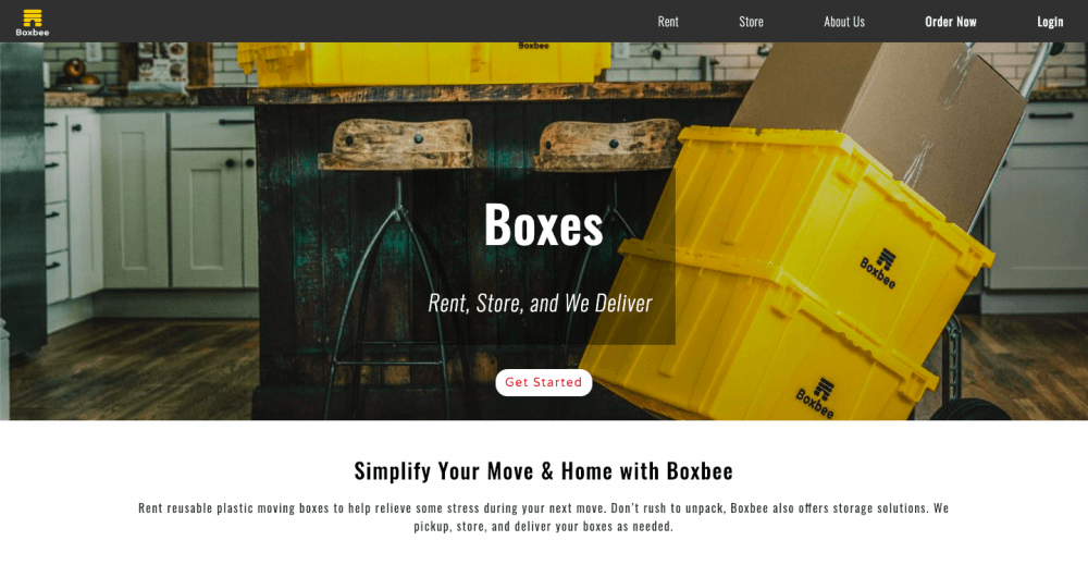
What makes it great:
- A headline is a call to action and a solution to a problem at the same time, which works perfectly for the target audience – active people, who want to have minimum hustle with the relocation.
- The design is simple and clear. Although there are five basic colors – white, black, yellow, red, and gray – they blend together perfectly without a feeling of excess.
- CTAs are highlighted with a contrasting yellow color. It is an interesting way to express the message through images that support the copy.
- A video suits the homepage concept perfectly. It is dynamic and sticks to the chosen color palette.
- Little things, like wordplay, are cherry on top. In this case, we’ve got some links to the blog posts in Blogbee.
Mint
When it comes to personal finance management, everyone wants to be certain they work with professionals and sleep well at night. Mint’s homepage gives a user that very feeling: you can trust these guys with your budget planning, it’ll be alright.
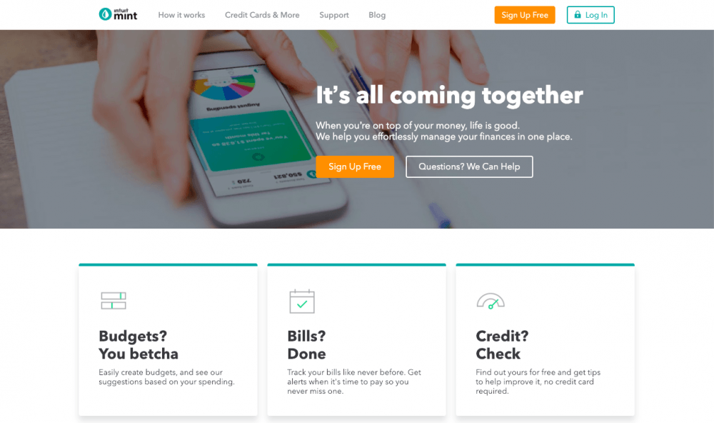
What makes it great:
- The design with block structure and the minimum of colors is simple and laconic.
- THE primary CTA button “Sign Up Free” is the only contrasting element on the page, although it still blends into the general design perfectly.
- A good copy: the strong headline and explanation are on the first scroll, key features explained in question/answer form.
- The homepage creates a calm and safe atmosphere, particularly by using white and green colors.
- Creative approach to the “Log In” button: a lock reminds about security once more.
Apidura
This website was pinned on over 10,000 boards. You’ll understand the reason as soon as you land on the homepage. The brand that specializes in bicycles and equipment sells it through storytelling with impressive imagery. Apidura invites to buy adventures, and bicycles are just an extra to pick up.
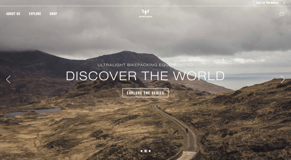
What makes it great:
- Impressive backgrounds are paired with the minimalistic semi-transparent menu and contour buttons.
- Banners are rotating slowly. A user can also switch between them with a click on an arrow or a bullet.
- Every CTA button continues a story and a topic of a headline above focusing on the experiences.
- The homepage features several blog articles, which attract attention to the topic in general.
- The page-width blocks intersperse with smaller blocks creating a feeling of balance.
Qed Group
This is an example of a homepage with jQuery effects. As a rule, SEO specialists advise to keep it simple. This is an exception to the rule, which demonstrates how to use the effects wisely. Although the homepage has some weak points, like gaps in translation, let’s focus on its design instead.
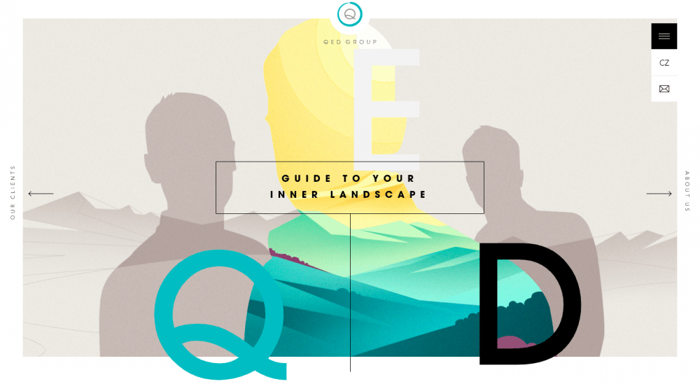
What makes it great:
- Vector graphics is the central theme that coordinates the homepage with the rest of the website pages. It is the identity rather than aesthetics, for a user feels more confident on the website with the strongly defined identity.
- A preloaded animated narrative disposes to further research and learning more about the company’s activity and services.
- Discreet micro-interactions of the interface elements, Ken Burns effect, and animations make the picture dynamic and engaging.
- The name of the company is always visible: when you scroll down, the letters follow the movement.
- Contour buttons with CTA and pop-up (or rather pop-left) contact form make it easy to contact the company and encourage them to do it in a friendly way.
Weblounge website homepage example
A small team passionate about design – this is a story of the team in a nutshell. No wonder that Weblounge’s homepage looks this impressive. Users discover the warm design with soft pastel colors that gradually turn into the sunny yellow, smooth and pleasant animations, and just perfection in its pure form.
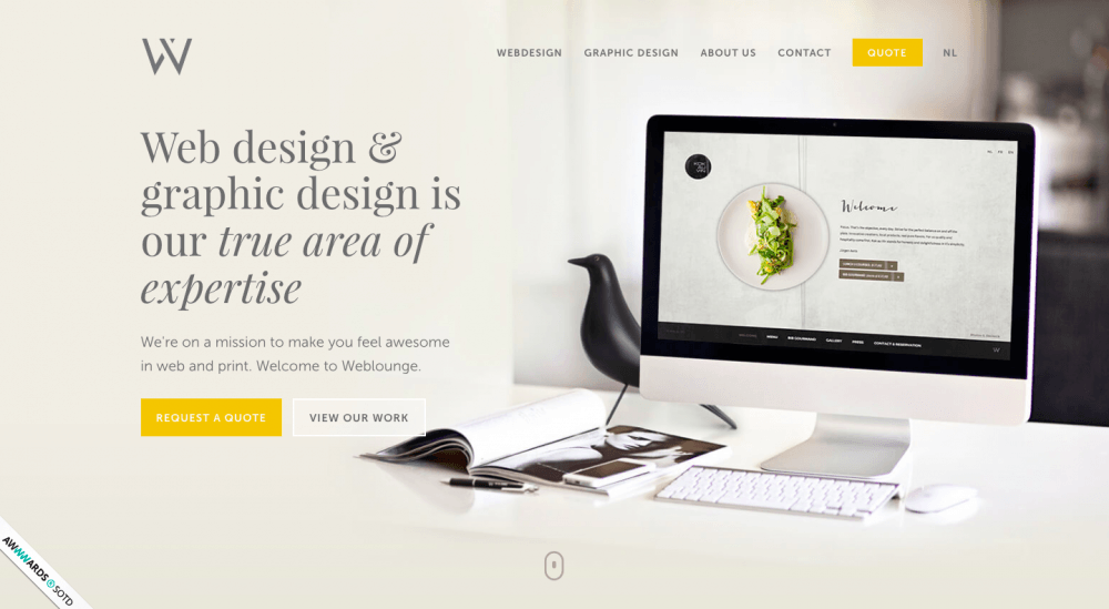
What makes it great:
- The structure is clear and logical. The first slide is a cover. The animation opens the rest of the content: cases, testimonials, basic facts, and contacts. Scroll animations and micro-interactions create a connection between the elements.
- Testimonials are displayed in the form of a slide carousel on a semi-transparent background.
- Different colors are used for different CTA buttons: informative ones (“View our back,” “Browse our portfolio,” “More about Weblounge”) are transparent on a gray or black background; the ones used for ordering (“Quote,” “Request a quote,” “Request a free quote”) are yellow with white wording.
- Information about the company is written on a yellow background, and the email is written in yellow letters. This color palette helps to create a positive attitude.
- A ribbon in the lower-left corner is a modest reminder about awards and appraisals (and actually the link to one of those).
Twenty-six digital website
A full-cycle digital marketing agency is the other kind of website owner, who knows onions when it comes to the great design, homepage design in particular. Here you will discover some unexpected solutions expressed by bold colors, engaging design, and some interesting projects.
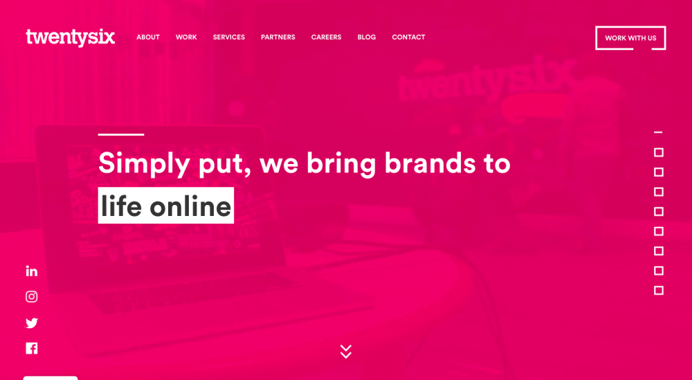
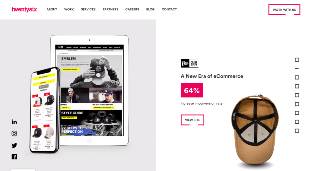
What makes it great:
- Extraordinary color choice attracts attention. The text is mainly black on white. However, the opening slide features the magenta background, and magenta elements appear throughout your journey down the page.
- Video on the background behind the semi-transparent magenta cover makes the cover very dynamic.
- A complete story of the interaction with brands unfolds as you scroll down. Markers on the right show the progress and let you switch between the scrolls.
- An abundance of animated elements somehow isn’t annoying. There are many counters, animated phone screens, moving letters, flying paper planes, and a dynamic logo with the key values.
- Effective CTA in the form of buttons blends well into the overall style.
Ted Todd Insurance
This is the homepage of an insurance company website. Although insurance is a sore point, Ted Todd Insurance made it less threatening. The company delivers the message about their services through familiar imagery and simple explanations, turning a homepage into an improvised landing page.
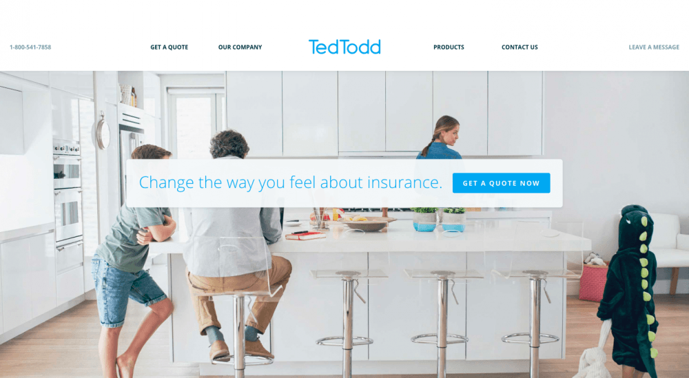
What makes it great:
- Light tones of the photos and minimalistic color palette create a soft and visually pleasant design that disposes to reconsidering the personal attitudes to the insurance system.
- Central block arranges all services according to the types. A carousel of blocks keeps them handy.
- The key message is the secondary call to action: “Change the way you feel about insurance.” Together with the key image, it strives to create a feeling of trust.
- Three buttons in minimalistic design let a user choose: “Get a quote,” “Call Us,” and “Leave Us a Message.”
- The website appeals to family values and responsibility, using images with children and parents.
Create your own website for free 🙂
Prezi
This presentation tool has become very popular in a short time. Of course, the secret lies in the functionality, but website design and usability have played a significant part as well. Prezi’s homepage will easily persuade a user that making presentations is as easy as 1,2,3.
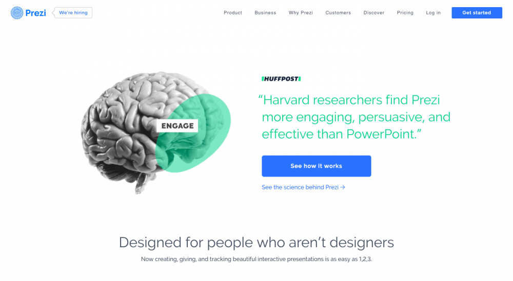
What makes it great:
- The homepage sets a clear data hierarchy and a logical sequence of events.
- It provides essential information about the functionality with the suggestion to find out more for the interested users.
- Strong copy, “Designed for people who aren’t designers,” features a wordplay and a solution to a problem.
- Imagery is also strong: a brain with highlighted centers that are (supposedly) responsible for the key functions a presentation should cover.
- Testimonials answer the main question: what makes this paid service better than the free PowerPoint?
Oliver Russell – homepage example
This company focuses on making brands stronger. It supports socially responsible and purpose-driven companies helping them to become highly competitive on the market. Oliver Russell must be a real pro judging from the possibility to use numerous impressive visual effects without distracting a user from the navigation and content.
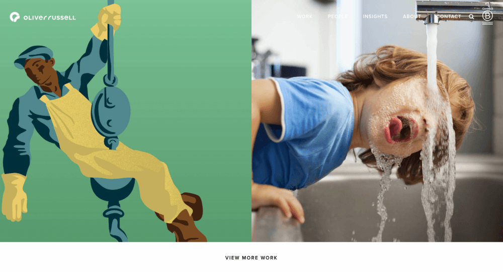
What makes it great:
- Versatile blocks help to tell the complete story, and it ends with contact details.
- A copy attracts attention: “We’re Lucky” instead of “What we do” pushes to read the following passage.
- Cases organized in a form of plates: you see the imagery, and descriptions hover above when you move the mouse.
- Simple language creates a friend-oriented approach: “We’re not like the other guys,” we talk in slang and prefer to treat everyone as equal.
- Links to the blog are followed by a subscription form.
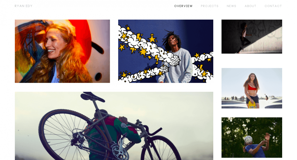
Ryan Edy – best homepage
When you open a photographer’s website, you expect to find out more about their works and projects. This homepage design fulfills this purpose completely. It displays the photographer’s works and nothing else. Sounds a bit challenging, doesn’t it?
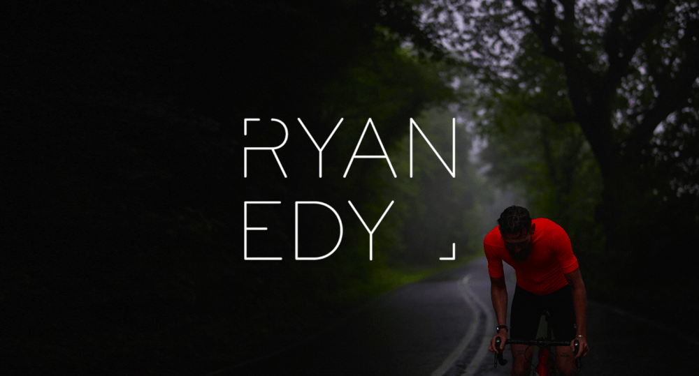
What makes it great:
- The opening slide is a cover that shows the photographer’s name only. After a user scrolls down, they discover the works. Interestingly, this cover image doesn’t appear again when you scroll up.
- The photos are organized in plates of different sizes.
- Static and animated media interchange, making the overall picture more dynamic.
- A pointer arrow hovering above an image puts it into action, revealing more photos. It has the opposite effect on dynamic images.
- The navigation is as simple as the interface.
Austeen Beerworks
The main purpose of a homepage on this website is to present the company and its product. Well, mission completed. Memorable imagery, pleasant fonts, video materials for those who are interested in brewing — everything is in its place.
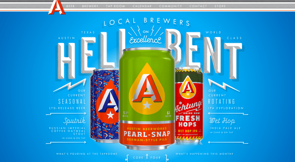
What makes it great:
- A user’s encounter with the alcohol-selling website starts with a question about their age.
- An opening scene features white letters and images of beer in high resolution on a clear baby-blue background. Such a solution highlights the key element: the beer.
- Clever use of fonts is impressive: different sizes, bold, italic, and dimensional letters somehow manage to work together harmonically.
- Links to videos for interested users are provided below the key image.
- Links to social networks and newsletter forms are located at the bottom of the page.
Magic Leap
At the very second, you land on Magic Leap homepage, you enter the Magicverse with its mind-blowing opportunities reaching far out. There is definitely no better way to present a unique headset than chosen by its creators. There is hardly a user who can’t resist THIS.
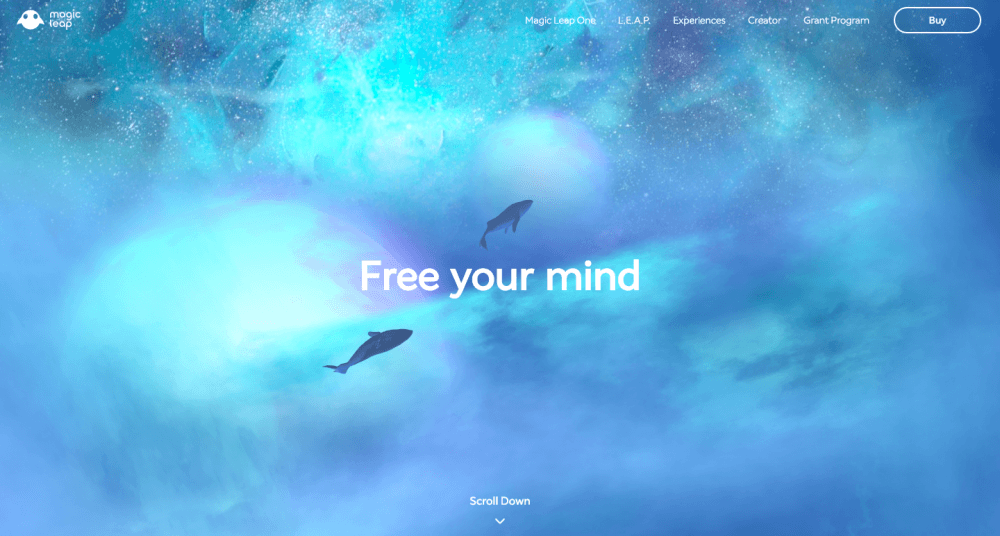
What makes it great:
- In spite of the seeming simplicity, the homepage catches attention by its bright imagery and well-thought-out typography.
- The abundance of animation and special effects is appropriate for presenting a virtual reality headset, and website developers use it to the fullest.
- Pastel colors get brighter but the main theme of the palette doesn’t change. The colors are light and glowing.
- There are only to CTAs, but very effective ones: “Scroll down” and “Explore Magic Leap One.” Actually, it is a good follow-up.
- A creative copy encourages us to join the adventure presented on the screen.
Uncrate – best homepage design
Welcome to the leading buying guide. This website is something in between a catalog, a collection of reviews, and a classifieds website. Uncrate covers the best products for men becoming a personal guide through the world of luxurious shopping – a very stylish guide, in fact.
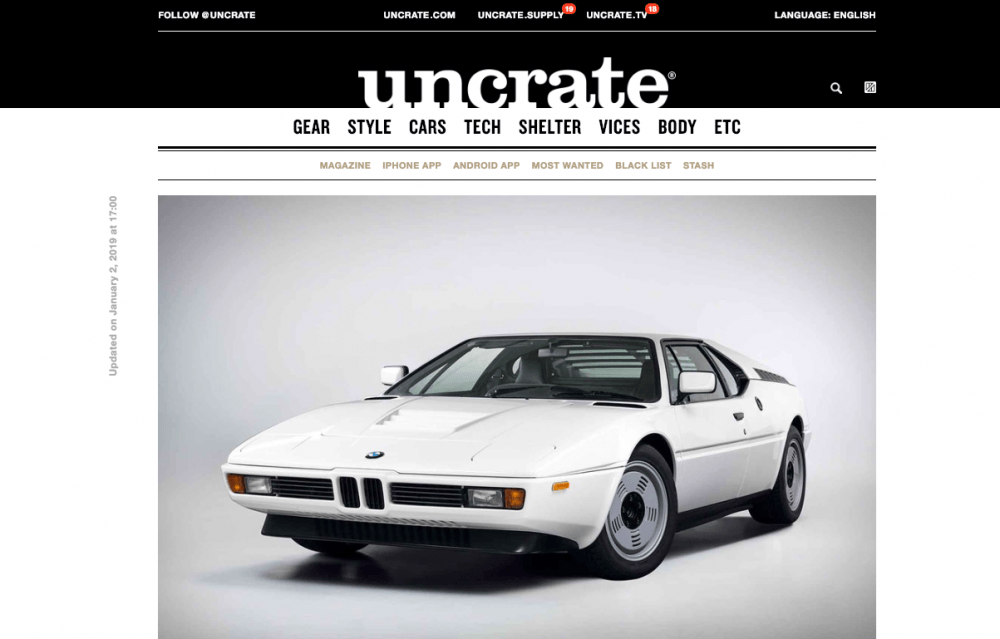
What makes it great:
- Despite multi-level navigation, homepage design is stylistically and visually integral.
- While using several ways of conversion, the homepage focuses on a key product.
- Popular items are conveniently displayed in plates with big images and text previews to fuel the interest.
- Several types of CTA buttons (”Stash for later” on every item, “Learn more from…” and “Buy from…”) appear depending on a provider and availability.
- Creative copy at the bottom of the page encourages to sign up for the newsletter.
This is the Brigade – homepage website example
Discover one more digital agency that is ready to impress a prospective client. You land on a homepage that seems a bit grim. Scroll just once, and it magically turns into a light-colored and inspiring, as if revealing secret powers of the team.
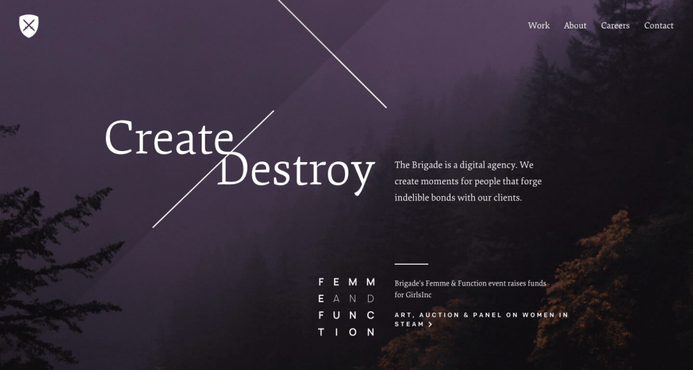
What makes it great:
- A dark foggy key image of the main banner together with a bit provocative slogan doesn’t let a user leave until they find out more.
- The essential information about the company’s specialization is followed by section segmentation and cases.
- Secondary CTAs are expressed by questions – “Want to make magic?”, “Want to join our team?”.
- Laconic descriptions with links to full versions provide a basic understanding of the company’s achievements and materials for closer investigation.
- The homepage geometry is created with the help of colors; lines are used just as additional elements.
Lyft – best homepage
The last on the list today, Lyft homepage is one of the best simple website design examples you will ever find. Unlike the majority of the websites described above, you will not find any guidelines or explanations. Pick an option first, and you’ll be granted access.
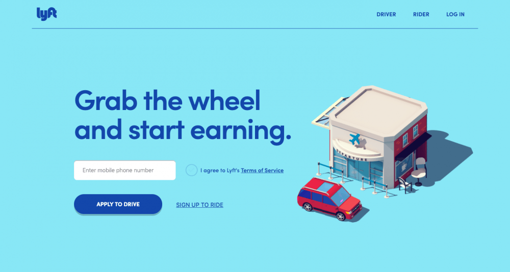
What makes it great:
- Clever custom illustration and wisely chosen basic colors catch users’ attention.
- CTA button is highly-contrasting. It becomes the focal point on the homepage.
- Details both for drivers and riders appear only after the registration is completed, so a homepage is just a road sign that shows a direction.
- The homepage occupies a single scroll becoming rather a poster or a flyer than a book cover.
- This is a perfect example of a laconic and minimalistic homepage design.
Weblium
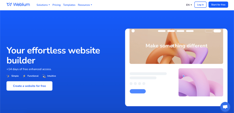
As a builder that allows users to create a website, the Weblium homepage needs to be easy to navigate, with a clear message and pixel-perfect element placement. It includes attractive elements such as animation and hover effects on buttons but keeps it simple and ensures everybody can do the same feature on their own websites.
What makes it great:
- User-friendly, clean header with only 4 main options to choose from, language switcher, and log-in buttons.
- Blue is an accent color that is used for the background, logo, and text.
- Microanimation attracts and presents the brand but does not distract and annoy users.
- The title represents the value, and some text blocks below it tell the mission.
- A great offer to test the platform for 14 free days and a call-to-action.
Lacoste
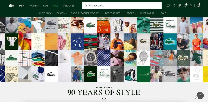
In the world of online shopping, it is important to stand out by adding a personal touch to the web design. Lacoste uses their custom color and is not afraid to add a colorful hero image. While the layout uses a minimalistic approach, the imagery attracts attention to the products.
What makes it great:
- Products are organized by categories: men, women, sales, etc.
- The search bar allows users to find what they are looking for effortlessly.
- Live chat provides an option to communicate with customers right through the website.
- The custom cart is quick to access.
MechWest
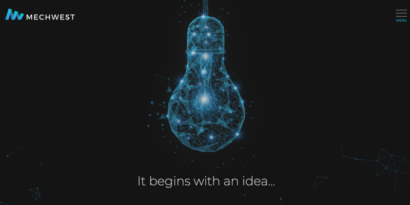
For companies that provide tech solutions and services, such as creating 3D models, it is really important to show their uniqueness right from the start. Users will be interested in your services if they like the work you do for your own brand.
What makes it great:
- Visitors can immediately understand what kind of services the company offers.
- Burger-menu is a great way not to distract customers from the page content.
- The only button under the hero section is the one for services; no ads or pushes.
- Even with a dark, plain background and few elements, it is visually appealing due to the main image.
How to create a cool homepage
To make your homepage stand out, focus on design, visual elements, and user experience. Highlight what makes your site unique, use interesting sections, and naturally guide visitors to your content. Here’s what to keep in mind:
- Concept
First, determine the function of your homepage: a welcome message to users, a showcase of key products or services, or a quick way to access the main sections of your site. Then, develop a basic structure for the page, identifying the main elements: menus, images, CTAs (calls to action), and text blocks.
- Design
- Color palette. Use colors that match your brand identity or create the right atmosphere. Pay attention to contrast for ease of perception.
- Typography. Choose fonts that are easy to read and use them consistently throughout the website.
- Layout. Choose a layout type that suits your purpose. You can use a classic, grid, or asymmetrical design.
- Mobile-friendliness. Make sure your design looks good on mobile devices. All Weblium websites automatically adapt to all screens.
- Content
- Define a main headline that grabs attention and clearly conveys the main idea of your site. Think about what content will be on the homepage. This could be brief information about you or your business, product/service features, or news.
- Use high-quality images and videos that highlight your style or showcase your services. They should be optimized for fast loading.
- Add clear buttons or links so that users can easily navigate to another part of the website or take the desired action.
- SEO
Choose the right keywords for your homepage that users are likely to search for. Don’t forget to fill in meta tags, such as the page title and description, to increase your visibility in search engines.
- Testing
Before publishing, check all links, buttons, and forms for correct operation. Test the website on different devices and browsers. Ask several people to test your page to get feedback on usability and effectiveness.
- Publishing and updating
When everything is ready, publish your homepage. Then, track visit statistics to see how users interact with the page and use this data to improve the page further.
10 rules for effective website homepage design
The perfect homepage design meets all the requirements listed below. If something is missing, send a project to rework until you can tick the box in front of every statement.
1. It is clear.
A homepage should provide an answer to the questions about who you are and what you offer. Visitors should identify this within seconds.
2. It resonates with the target audience.
You should speak one language with your customers. Use images, associations, and terminology that are familiar to them.
3. It solves a problem.
There should be a value proposition that persuades a user to discover more about your services, which provide something people have been looking for.
4. It is user-friendly.
By this time, you managed to capture the attention. Now, focus on usability: easy navigation, no screaming colors or fonts, smart use of flash banners and animations. The page has to be optimized for various devices and screen sizes.
5. It contains CTA.
Call to action elements guide a user through the website, providing directions for every next step and leading to the end of the conversion funnel.
6. It is well-planned.
All the elements perfectly blend together and work as an integral highly-functioning mechanism. CTAs are relevant. Texts are clear. A visual concept reflects business aesthetics. A homepage is built according to a simple-to-complex principle.
7. It is interactive.
It engages a user to interact with the website through extendable content, marketing forms, videos, links, smooth animation, and other elements.
8. It is focused on a user.
Colors should be contrasting. Fonts should be readable. Texts should be simple; leave SEO keys for other pages.
9. It is dynamic.
The market is rapidly developing. Customers don’t stay the same: they grow, learn new things, reconsider their values, change personal habits and attitudes. You should be ready to modify a homepage in order to reflect the needs of users.
10. It loads fast.
53% of people are going to abandon a page if it takes more than three seconds to load. No further comments needed.
Your perfect homepage by Weblium
When you are full of ideas and inspired by the top design examples, it seems that everything is possible and easy to translate into reality. To make sure your expectations won’t be dashed, choose an experienced team to work with and share your vision with them.
Weblium can offer even more homepage design templates. The team of web developers will customize any ready-made solution you find in the catalog according to your requirements. If you are not certain how a homepage of your website should look like, feel free to ask for assistance and rely on Weblium’s experience.