Notable Architecture Firm Website Examples
Imagine a website that instantly reflects the elegance and craftsmanship of your architecture firm, even before clients see your actual projects. For me, a stylish design, intuitive structure, and that “wow” factor are what define an effective web portal.
In this blog, I’ve gathered some of the most inspiring examples of architecture firm websites from around the world. Each one demonstrates creativity, innovation, and a perfect balance of visual appeal and functionality. Browsing them made me realize how powerful a website can be as a firm’s first impression.
Contents
Architecture firm
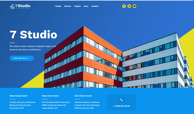
This site perfectly showcases a minimalist and modern design that immediately grabs attention. I really like how the hamburger menu keeps the interface clean, letting the stunning visuals take center stage. The homepage opens with a dynamic slideshow of impressive projects, inviting visitors to explore further.
Essential information is thoughtfully placed in the main section, while a single click reveals Projects, Services, and News. What I find especially practical is that anyone can customize this creative template for their own firm — and it looks especially fitting for a small business.
Architect CV
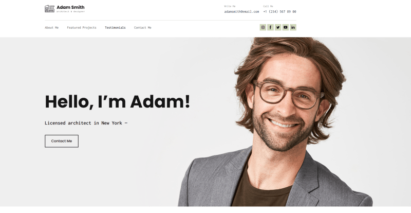
This digital CV is a great way to showcase yourself as a professional architect. It comes with all the essential sections (About Me, Works, Testimonials, and Contacts), everything I’d expect from a strong architect portfolio website. I especially like the engaging, user-friendly slider for displaying services and projects.
There’s also a handy option to download the CV, which is perfect for recruiters. Adding a link to a video presentation or your Instagram account is another smart touch. It’s one of my favorite architecture firm website examples to showcase different creative works.
Architect Bureau
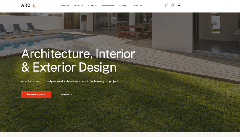
Minimalistic, stylish, and smart, this website design template is more than just an architect’s portfolio. Built with the Weblium website builder, it’s ready for customization, making it easy to create a professional online presence that reflects a modern architectural company.
I really like the soft pastel palette with red accents and clean sans-serif fonts. It makes browsing the site effortless and visually appealing. Highlighting top-completed projects helps clients imagine the final results, while approximate pricing and a convenient feedback form add transparency and usability. This layout is easy to personalize, letting you bring your ideas and brand to life quickly.
Makhno Studio
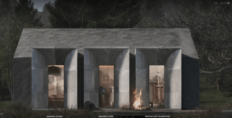
This is one of the most outstanding examples of architecture firm websites, mainly for its minimalism done right. The hamburger menu keeps the focus on the visuals, and the first slide features slowly transitioning, eye-catching images that immediately draw you in and make scrolling irresistible.
The smooth animations and subtle sound effects feel great. They add an interactive element that makes the experience feel alive. So, it’s no surprise that Awwwards recognized it as Site of the Day. All the essential information is clearly presented in the main section, keeping the design clean and functional.
Quintessentially Estates
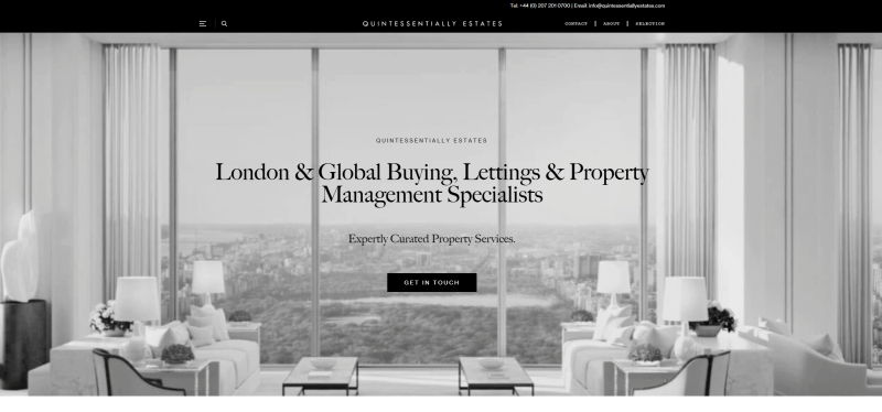
This site presents a clean, sleek design that perfectly suits a high-end real estate firm. I like the hidden menus. They keep just a minimalist header and a contact button, allowing visitors to focus entirely on the main content.
Scrolling down, visitors can find details about international services and inspiring quotes reflecting the company’s values. The interactive homepage, with its changing animations, paints an enticing picture of a perfect lifestyle – whether it’s the seaside, mountains, a bustling city, a restaurant, or a party with friends. The search and contact forms are conveniently placed within the first scroll, making it easy for users to take action immediately.
Europejski
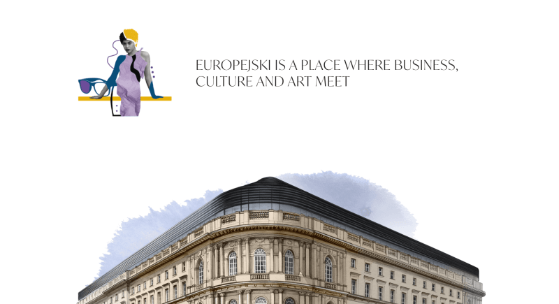
Europejski’s website immediately stands out with its bright watercolor animations and parallax effects, which guide navigation throughout the pages. I think this approach makes the site feel unique compared to other examples of architecture firm websites.
The site unfolds like a visual story the moment you enter. Visitors can enjoy the full introductory animation or skip it if they want. The interactive portfolio navigation is engaging, though it might feel a bit unusual at first. Personally, I found it easy to get accustomed to.
Foster+Partners
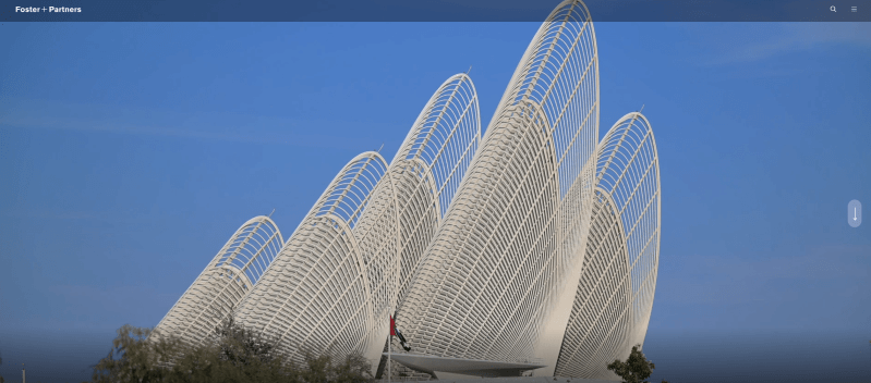
Foster+Partners’ website is all about user-friendliness, and I personally like this easy navigation. Unlike some of the flashier sites we’ve seen, this one avoids unnecessary effects and keeps the focus on what really matters – showcasing successful projects.
Photos take center stage, scrolling smoothly to reveal different facets of the company’s mission. The menu is discreetly integrated, only highlighting when hovered over, which keeps the interface clean while still being intuitive. For me, it’s a great example of elegance and functionality working hand in hand.

Effekt
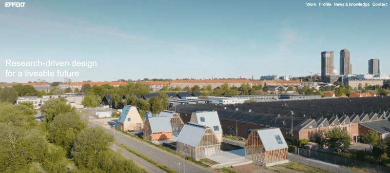
Effekt’s website reflects Danish design principles in every detail, from the layout to the company’s solutions themselves. I like their well-structured and easy navigation, mainly as a result of a clean grid layout.
The site focuses on just three main sections (News, Work, and Office). It’s simple but enough to give visitors a clear understanding of the company. The homepage also highlights key projects, immediately capturing attention and drawing users deeper into the portfolio.
BIG

BIG is one of the most creative architecture firm website examples I’ve come across recently. It feels bold and very memorable – even though it looks a bit experimental at first, it perfectly reflects the firm’s open-minded approach to style.
The site transforms into an abstract portfolio, incorporating pixel-inspired elements that make browsing feel like an artistic experience. Exploring BIG’s site shows how diverse architect websites can be, each one unique in its own way.
Nick Leith Smith
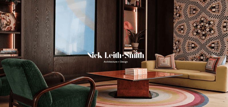
Nick Leith Smith’s website is a fantastic example of a clean, professional architect portfolio. The navigation has only four links, keeping the focus exactly where it should be – on their presentation. It feels polished enough to match international standards.
Visitors start with a gallery showcasing a wide range of projects, and the smooth transitions between them are surprisingly engaging. As you scroll further and open the business page, the portfolio becomes even more visually impressive, making it easy to see why this site stands out.
Dock
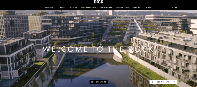
Dock’s website feels unique for its sophisticated parallax effects, applied to both text and visuals. The animations are impressive, though scrolling quickly can feel a bit dizzying at first.
All the essential information is available right on the homepage, while the hamburger menu neatly hides additional details like price lists and galleries. I found the placement of the menu button on the right unusual but visually harmonious. It adds a subtle touch of creativity to the overall design.
Shepley Bulfinch
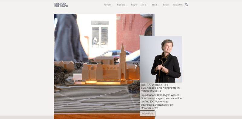
Shepley Bulfinch’s website creates an airy, inviting online space with a strong focus on its portfolio. Despite using parallax and mixed media, the site remains one of the cleanest examples of architecture firm websites with simple navigation and zero distractions. It’s really easy to find exactly what you’re looking for.
Visitors are immediately immersed in the unique Shepley Bulfinch universe, exploring the company’s buildings, standout projects, and even glimpses of a relaxed office atmosphere. The thoughtful mix of photos and videos keeps the site interactive and engaging, making it a great example of a modern architecture website.
How to design an architecture website?
1. Sign up. Start by registering on Weblium’s website builder using your email, Google, or Facebook account. The process is fast and takes just a few clicks, giving you immediate access to the website builder.
2. Choose a template. Choose from a variety of modern templates designed for architecture firms. Every template can be adapted to showcase residential, commercial, or mixed-use projects.
3. Personalize. Adjust colors, fonts, layouts, and sections to create a unique look that reflects your firm’s identity. Add your logo, brand messaging, and custom visuals to make the website truly yours.
4. Add features. Enhance usability and engagement with interactive elements: portfolio galleries to highlight projects, a blog to share insights, feedback forms for client inquiries, an integrated map for easy navigation, and social media links for broader outreach.
5. Publish. Preview your website across devices, make final tweaks, optimize for SEO, and publish it. Within minutes, your online presence will reflect your firm’s expertise and style.
Conclusion
Creating an architectural website on the Weblium builder is simple, fast, and efficient. You can start with ready-made templates that are easy to customize. And all this without any technical knowledge and under 30 minutes.
FAQ about architecture firm websites
What is an architecture site?
An architecture website showcases your projects, services, and design style. It works as an online portfolio where potential clients can explore your work, understand your unique approach, and easily get in touch.
Why do architects need a website?
A website is a powerful tool for attracting clients and promoting your brand. It allows you to present your projects professionally, build trust, and generate new opportunities. On top of that, a modern website makes communication simple and helps your firm stand out from the competition.
What colors and fonts work best for an architecture site?
Neutral, natural colors like white, gray, black, or earth tones work best. They highlight elegance and professionalism. For fonts, minimalistic options such as clean sans-serif styles are ideal, ensuring readability while giving your site a stylish, modern look.
Can you build an architecture firm portal without coding skills?
Absolutely. Platforms like Weblium let you create a professional architecture portal without any programming knowledge. Their intuitive interface allows you to customize templates, add content, and launch your site quickly. Everything is designed to be beginner-friendly and straightforward.