
Best Black Websites: 10 Black Website Design Examples
Conservative black color is coming back to web design!
It is rarely used in website design as the primary color, but if used correctly, it always looks visually appealing, extremely stylish and elegant, helping the user to focus on the artwork and content of the site.
We’ve got for you a selection of black websites: even if you’re a huge fan of white color, after reading this article, you’ll want to come to the dark side!
Contents
Why choose dark website design?
It’s simple. The black background:
- looks stylish, elegant and prestigious;
- creates a feeling of mystery;
- gives great possibilities for creating contrasts;
- creates a visual hierarchy;
- creates a deepness for presenting your content (especially the graphic content).
More than that, it’s easier to browse the dark background website for a longer time, as it doesn’t strain your eyes, especially in the evening or during the night. This is why popular websites like Twitter and YouTube now offer an option to switch to the dark browsing mode.
When it’s good to use the black website design?
- portfolio websites;
- design studio websites;
- exclusive product presentations;
- unconventional content.
Experts recommend using color black for the background in the following cases:
- if it is assumed that the visitors will work with the website interface in the evening or at night;
- if it is necessary to “hide” some interface elements so that they do not distract from viewing the main content or working with it;
- if it is necessary to make the scanning of content easier, to help to highlight the most important things at a glance.
When it’s bad to use the dark background website?
- you have too much text content;
- many elements on the page;
- too many bright taglines;
- if the dark background does not fit with the type of your site (kindergarten, charity fund site);
- you want to use the rich color scheme on your website.
Black websites examples
1. Jack Daniel’s: aesthetic black background
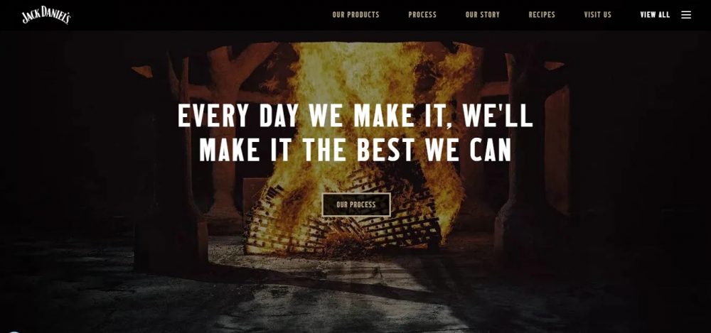
Website: https://www.jackdaniels.com/
The website owners made the background dark only on a few pages of the site, the others have white backgrounds.
It’s a very smart idea to choose muffled light colors for fonts and matching photos and video fragments: all this would not contrast too much with the dark background.
As a result, they’ve got a pretty cozy, stylish website design!
2. BlackBerry: black design website
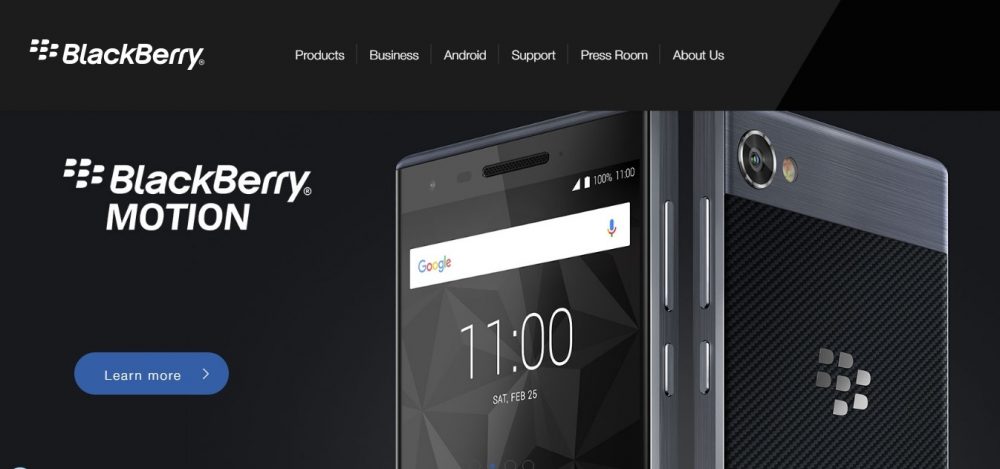
Website: https://blackberrymobile.com/emea/
BlackBerry chose a dark background for the site, which is diluted with gray accents for menus and pop-ups. Dark-colored smartphone images highlighted with light gray shine look even more stylish on a black background of the site!
White fonts and its darker shades add the necessary contrast to the picture.
3. Humaan: dark website
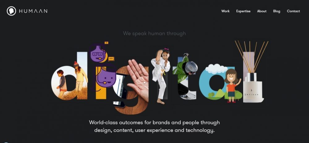
Website: https://humaan.com/
The website belongs to a team of creative designers and developers from Australia.
This is a pleasant, soft website style with a beautifully designed portfolio. Seamless transitions to the pages of projects are just beautiful. We think that this design really helps to sell upscale digital services to leading brands.
4. Fabiotoste: a great black background
Website: http://fabiotoste.com/
This is a personal HTML5 portfolio website of the Brazilian designer: it is a mix of effectively applied web techniques, descriptions of skills and examples of his work.
The designer chose the color of the sea wave, gray and white color for the inscriptions.
There’s one thing that makes this website one of the best among all these website designs: when scrolling, the picture explodes with animation of fragments of all colors of the rainbow, which brings a sense of celebration to the dark design of the site. Another interesting detail: portfolio items are made in the form of squares, which are animated when you hover the mouse over them.
5. Millemann Wines black and white website design
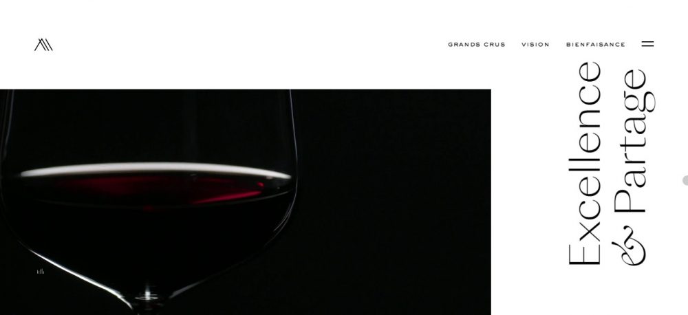
The “show” begins with a minimalistic greeting from the brand, decorated with white lettering on a completely black background. Then, the style of the site changes and becomes black and white in a proportion of about 60:40.
Dark-red shades of wine on animations and photographs look amazingly expensive and stylish on a black background!

6. Quest maze
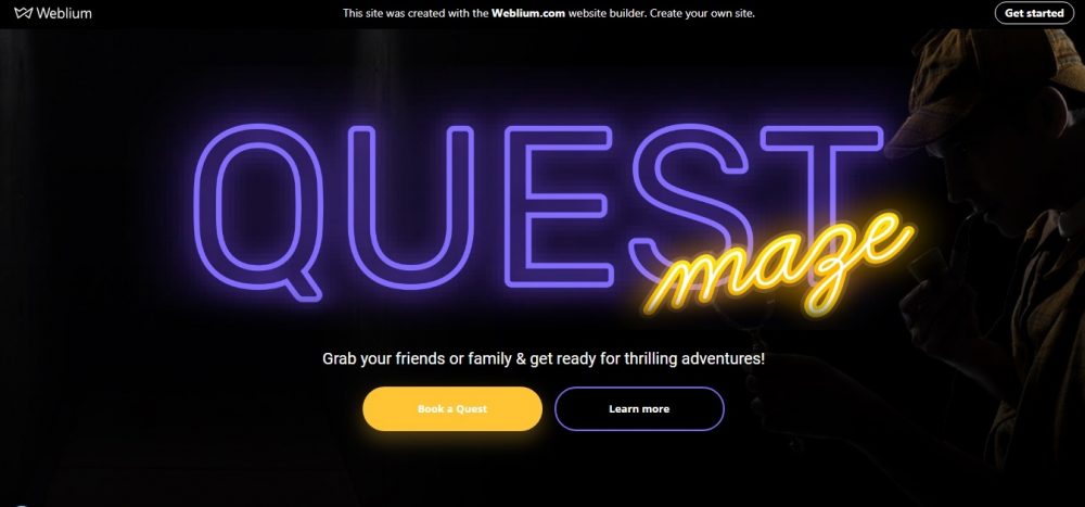
Website: https://quest-room.weblium.site/
The developers chose the most winning font colors for the black background of the site – yellow and white color, and neon… That’s a cool solution! Some CTAs are designed with a blue frame – it becomes a very stylish detail.
Blocks are highlighted with gray on a black background.
7. Weblium
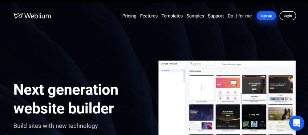
Website: https://weblium.com/
The website of the famous site builder of the 5th generation is created using the combined colors. The first page is dominated by a dark blue background with the white color inscriptions.
Then, it is complemented by blocks made in classic bright colors. This approach makes the design more interesting and prevents the reader’s eyes from getting tired quickly.
A lot of contrasting elements have been added to the site: blue CTAs, blue, gray and pink design elements, multi-colored blocks with special offers.
Black website templates for free
8. Leaf black website design

Website: https://coming-soon-landing.weblium.site/
The design of this site is an enduring classic of the “dark genre”: a dark gray background with darkened quality photographs, white and light gray lettering, dark gray and blue CTAs that cannot be missed… This simple design looks surprisingly stylish!
9. Colora podcast
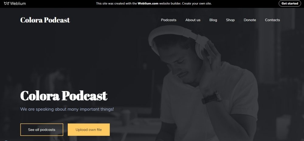
Website: https://podcast.weblium.site
Another site with a classic dark gray background, but with the addition of yellow in the design of website elements.
The winning colors were chosen for the inscriptions: white, light gray and yellow, which are perfectly readable against a dark background.
Also, to attract the attention of the visitor, yellow blocks and pretty red social media buttons were added to the design.
10. Crazy FM black website
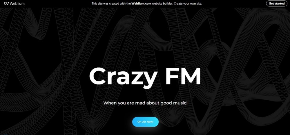
Website: https://radio-station.weblium.site/
The first page of the site has a black background, but there is also a gray graphics, which makes the background look richer.
The rest is a classic of the genre: white and gray taglines, blue CTAs, bright pictures that look advantageously against a dark background, individual white and blue blocks – the design looks quite attractive!
Summary
Use the dark background to:
- Reduce eye strain;
- Support visual hierarchy;
- Make solution feel more mysterious;
- Create an impression of luxury;
- Improve readability in the nighttime hours;
- Ensure the context of use (entertainment apps used in late hours).
Avoid dark background if:
- The solution is used during the day outside;
- There is a lot of text to read.
Use a light background when:
- When there’s a lot of text to read, focus on lighter themes for visual clarity;
- When you want to show a professional theme to prospective clients;
- When you want a modern, simple, and classic feel to an app.
Don’t use light background:
- When users need to spend many hours reading and scrolling on the app. Light themes might cause visual strains to the eyes. Always conduct a usability test to confirm this.
If you like black design, or you prefer white background, or you are ready to combine them in search of the best solution, but you’re not sure about that, try creating your own design using Weblium templates!
In these templates, you can change the fill colors, background, blocks, and turn on all your imagination to find the ideal solution! And if you’re in doubt, the built-in AI will always suggest you the right solution!
Login and create your own black website