10 Mega and Drop Down Menus Examples
At Weblium, we constantly monitor the newest web design trends, and we just couldn’t put aside website menus – such a simple and ingenious solution for website navigation!
According to Clutch research, 94% of consumers consider simple website navigation as a very important factor.
Contents
What is website navigation?
Website navigation is an important design element that helps the visitor to quickly access the sections of the site that he needs. The site’s navigation menu, which is present on all pages, allows visitors to see all the potentially interesting website sections and, as a result, it significantly improves the user experience.
There are many types of site menus. Today, we will talk about drop-down menus and mega menus – some of the most popular types. We will highlight such important questions as:
- What are the drop-down menus and mega menus?
- Why mega-menus are so popular?
- What websites & niches benefit the most using mega-menus?
- How to create a good drop-down or mega-menu for your website easily?
Also, we’ll show you the 10 best drop down and mega menu examples that will blow your mind and inspire you!
What is the drop-down menu?
The drop-down menu is an element of the website interface, that shows previously hidden information when you hover/click on it.
What is a mega menu?
A mega drop-down menu is the same drop-down menu but with a wide selection of options, represented with the help of a two-dimensional drop-down structure. This is an excellent solution:
- helps you to host a large number of product categories;
- allows you to save usable space on the site;
- allows you to show the user a greater amount of useful content than navigational elements do.
Now you know what these two types of menus are, and, of course, you want to ask “what menu should I choose for my site?”.
Different types of menus are used for different types of websites. For example, drop-down menus are more suitable for small sites, and a mega menu is ideal for large eCommerce sites with a huge number of categories and sections.
Mega menus allow the user to see all the options at once, without keeping everything in mind, and the icons help to make the navigation more intuitive.
In general, drop down menu is the most popular type of multi-level menus, allowing you to give more direct links to site pages than the standard navigation bar does. It is best to use drop-down menus if your site has more than 5 but less than 10 menu options.
But the mega menus, if they are made correctly and when they are really necessary, have a number of advantages – let’s see what they are.
Now, let’s take a look at the top 10 examples of cool drop-down menus and amazing mega menus.
10 good menu examples (drop-down and mega dropdown)
#1. Upalti drop down menu

Visit the website: https://euunw.weblium.site/
The site offers a convenient and concise menu with several drop-down submenus in the “Services” and “About us” sections (where this is really necessary). The drop-down menu design looks simple and uncluttered.
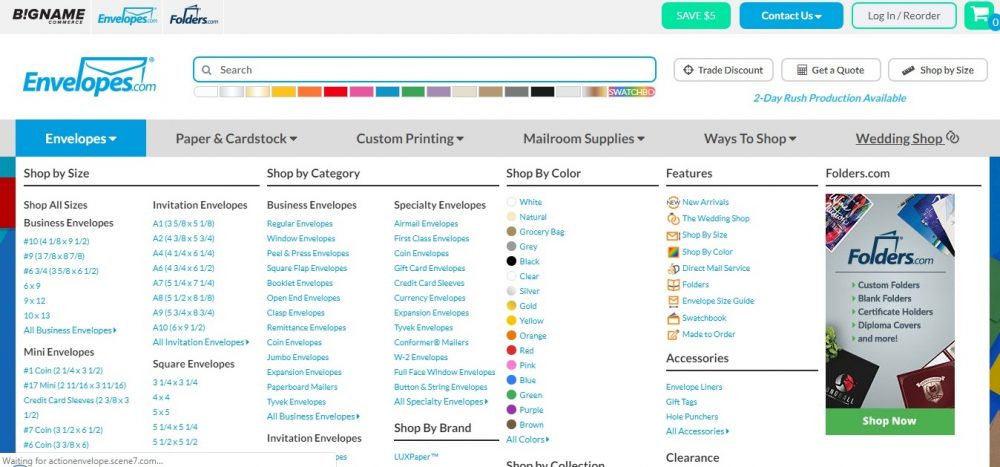
#2. Envelopes.com responsive mega menu
Visit the website: https://www.envelopes.com/
The mega menu is organized just great: the products are sorted by color, size, style, and texture of the paper. Submenus are also competently divided into sections to make it easier to find exactly what you need.
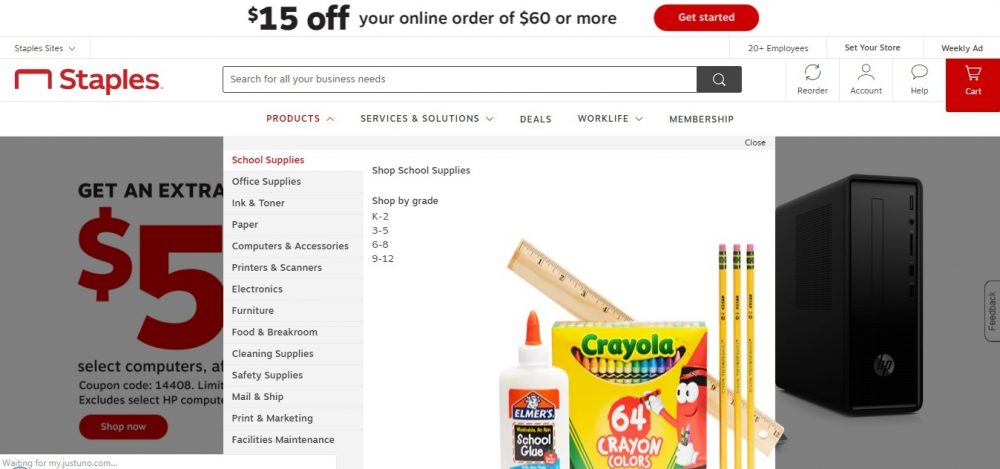
#3. Staples mega menu
Visit the website: https://www.staples.com/
This is one of the best examples of mega drop-down menus for e-commerce sites on our list. Each category has a short description and shortcuts for the most important services.
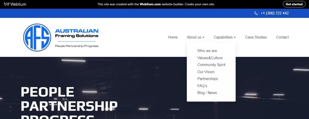
#4. AFS drop down menu
Visit the website: https://k9s6g.weblium.site/
This is one of the coolest and simplest responsive drop-down menu examples in the list.
This design & engineering company website provides a horizontal drop-down menu consisting of only 5 sections. The decision to create drop-down menus in the “About us” and “Capabilities” sections allowed the developers to reduce the main menu up to 14 sections!
#5. Walmart mega menu
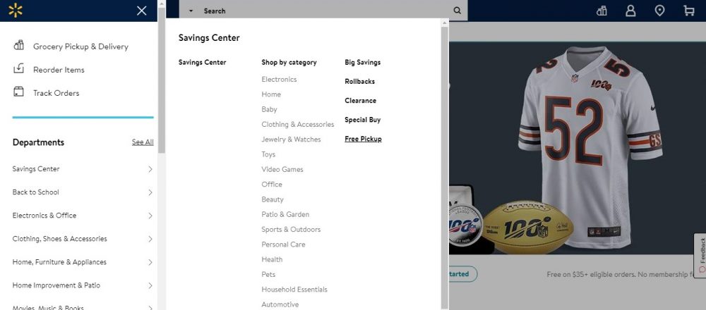
Visit the website: https://www.walmart.com/
Wal-Mart offers thousands of products, so it just needs the perfect mega-menu! By the way, their menu navigation is very clear and smooth.
#6. Build.com responsive mega menu
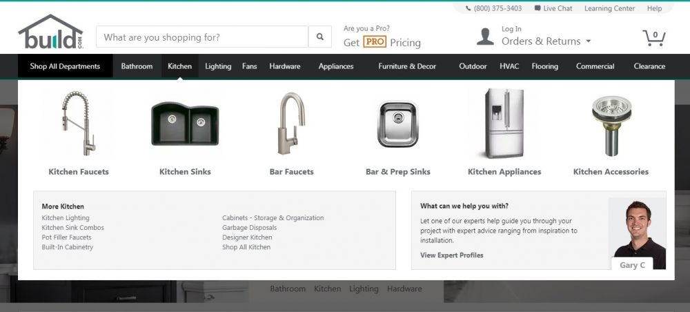
Visit the website: https://www.build.com/
Build.com shows that even a mega-menu can be concise and takes only part of the screen. The developers made a smart move and used icons instead of text, and the details are shown when you hover the mouse over an object.
#7. Estee Lauder mega menu
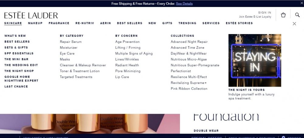
Visit the website: https://www.esteelauder.com/
This website’s mega-menu with black text and white background with a section’s image fits perfectly into website design. Different fonts emphasize the hierarchy of menu elements.
#8. Australian Bill Cutters drop-down menu
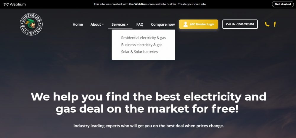
Visit the website: https://p9cii.weblium.site/
This site has a concise menu of 5 sections with drop-down menus in “About” and “Services”. It looks pretty simple yet informative.
#9. The Sak mega menu
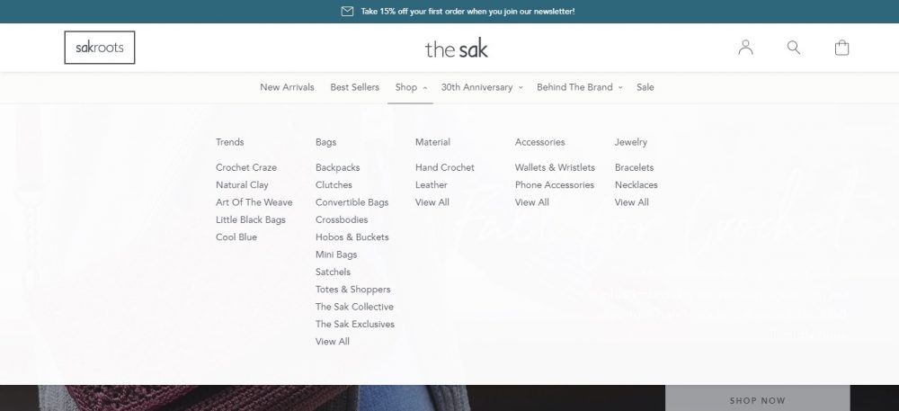
Visit the website: https://www.thesak.com/
This is, maybe, the most attractive mega drop-down menu design we have seen lately.
The site’s mega menu uses dynamic effects: when you hover your mouse over an object, it is underlined. The interaction effect is executed very smoothly!
#10. Piano mega drop-down menu
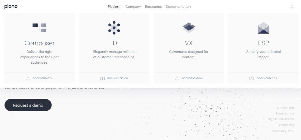
Visit the website: https://piano.io/
The perfect laconic mega menu UI design of this website has only two levels and uses the simplest hidden interactive effects.
Why mega-menus are so popular?
In short, the mega-menu is an excellent solution both for the web developer (it’s easier to design navigation for a large site) and for users (it’s easier to navigate the menus of online stores and web portals).
Benefits of the mega menu option:
- it’s easy to use: a mega-menu opens only when you perform a specific action (click, hover, tap), you immediately see everything, you don’t need to scroll;
- it looks stylish;
- it saves page space: a website’s front page can be devoted to more important concerns – strikingly delivering your message or drawing attention to something new and special, for example;
- it complies with the screen size;
- it makes all menu items visible at once: as opposed to the standard drop down menu, the user does not need to keep anything in mind;
- it excellently structures the information: the visitor will immediately understand what category each item belongs to, and that helps to make the visitor stay on a website longer;
- it uses graphic elements (pictures, icons) to draw a user’s attention to areas of your most important information. Also, it helps to emphasize the relationship between the menu items.
What websites mostly benefit from using mega-menus?
- Big e-commerce websites: one of the best examples is Best Buy. If there were no mega-menu guiding the visitor to the desired category on the website, people would get lost.
- Fashion & clothing stores: you can find amazing categorized menus on most of these sites – check out the Nike website, for example.
- Blogs and magazines: on such sites, the mega menu also helps to showcase multiple topics and categories. For example, for the Huffington Post with its dozens of categories and topics, a properly created mega menu is the best option to make it easier to find news and browse archives.
- Corporate websites & startups: the advanced mega-menu of Ford’s main site is quite creative. They use pictures of cars they have in store with the price tags, which significantly saves your time when choosing a car.
- Hotel & restaurant websites: on such sites, a user-friendly mega menu helps show potential customers different types of rooms, leisure activities, and meal plans. Check out SOL Beachclub website’s creative mega-menu: vibrant images help to showcase all available events and utilities at once!
How to create a mega menu or drop-down menu?
Even though drop down and mega-menus are insanely popular and really help the site achieve its goals, there is no specific guide for creating the perfect one, just some tips on how to design mega menus for easy navigation of your website (the processes of creating a mega menu and a drop-down menu are very similar). Keep in mind that the drop-down or mega menu design varies from site to site.
So, you have several options to choose from:
- doing the research yourself, studying the multiple website examples and then trying to find a suitable option for yourself (time & effort consuming + the perfect result is not guaranteed);
- hiring a web-developer (can be quite costly);
- using WordPress plugins – for example, Max Mega Menu or Uber menu (keep in mind that although using WP plugins is much easier and faster than creating different types of drop-down menus in HTML, the plugins may have many drawbacks like errors, unstable updates, negative influence on page load speed, еtс.);
- or use one of the popular site builders, that will automatically create a suitable menu for your site, depending on its type and features.
Summary
The mega-menu trend is definitely here to stay in the digital marketing arena!
Designing a good drop-down or mega menu undoubtedly improves your website’s navigation. When a visitor sees more options, this helps the site achieve its business goals: sell more products, motivate the visitor to get in touch with you, grow followers, get more subscribers, etc.
But keep in mind that mega menus are a not a good idea for any website: for example, you won’t need it if the site does not have a large number of links, or when there is nothing but multiple links displayed on your home page, or when the main purpose of your site is to funnel visitors to a specific webpage.
Also, you should always check out if your mega menu looks good on mobile devices and make sure that it has a clear and uncluttered design.


