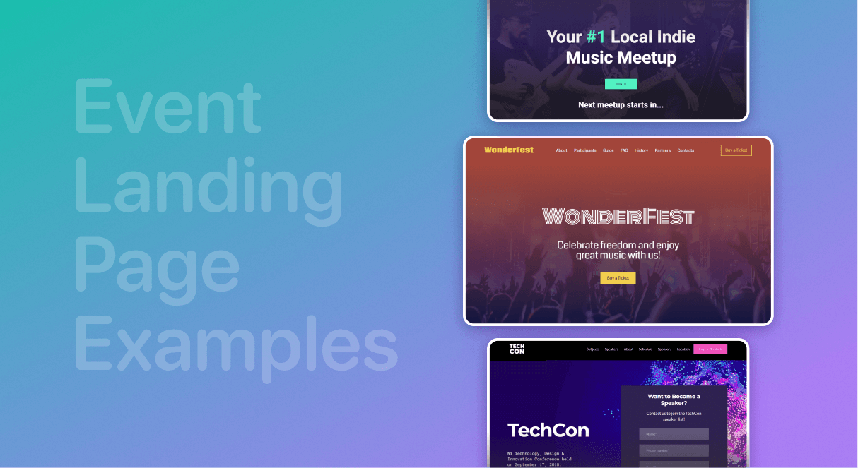
10 Event Landing Page Examples
The Weblium team, the creators of the stunning modern website templates, is following the latest news of the digital world, and that’s why we are able to create today’s best online solutions for business!
The event landing page is a relatively inexpensive way to promote your upcoming event on the Web. But despite the fact that it is so easy to create, you need to make sure all the attendees are aware of all the details.
Ask yourself: «What makes a great event website?», – and find your event landing page inspiration below!
Let’s get it started!
Contents
1. Kikk festival event landing page
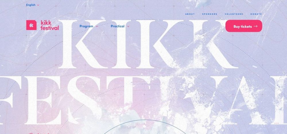
visit this event landing: https://www.kikk.be/2019/en/home
Key features: design, color scheme, typography, usability, sound, CTA
The background of the website of a famous international festival of digital and creative cultures is mesmerizing: you see the “Archipelagos of fragility” from the high up in the sky. It is designed as a kind of a map, where you can find the information about the speaker, visitors, parties, market strands, etc.
The pacifying combination of white and gray as well as pink and blue shades does not distract from the content.
The short menu in the header includes the most basic items, in addition to which two more are offered: “Program” and “Practical” with the drop-down submenus. Also, here you will find the bright “Buy Tickets” CTA.
2. Fat Fat Fat festival event landing page example
Key features: design, usability, typography
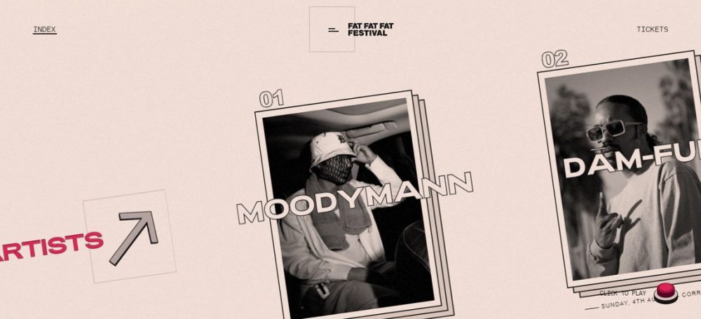
This is a website of the well-known festival of music and creativity. Its design is quite simple, but at the same time, it is unique and doesn’t look like any other. The most impressive thing is that it is not the design itself, or the graphics or the color scheme that makes it stand out, but the navigation.
The main part of the main page is occupied by a list of artists with horizontal scrolling. The profile of each artist has a photo, brief information about the performance and about the artist himself.
*winner in Awwwards’ «Site of the day» nomination
3. Prior Holing – Event Landing Page Example
visit this page: https://prior.co.jp/
Key features: color scheme, navigation, imagery, typography
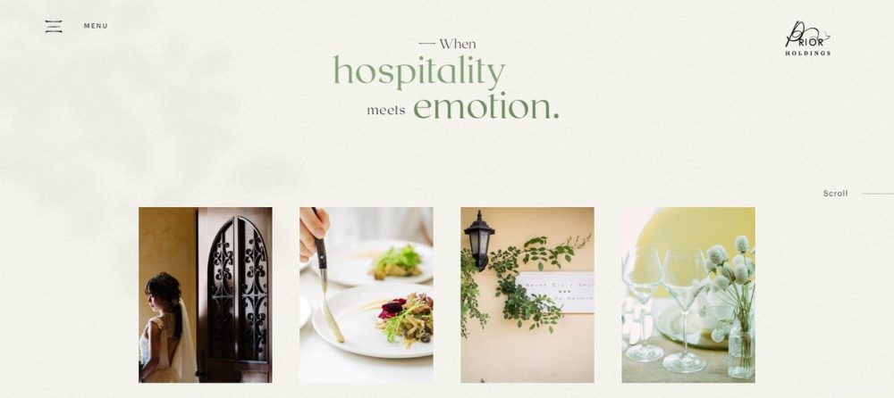
This snow-white, minimalist website takes the first place in our list of event planning websites.
The company focuses on organizing weddings, however, their list of services offers any events under the sonorous motto “When hospitality meets emotion”.
Horizontal scrolling fits perfectly into the general concept of the site, and you can easily find all the most important sections, or you can click on the neat hamburger menu and select the section of interest from the list.
*winner in Awwwards’ «Site of the day» nomination
4. Fresh Agency website
visit this page:https://whereamazingthingshappen.co.uk/
Key features: design, creativity, navigation, fullscreen
If you are looking for amazing event landing page examples, search no more!
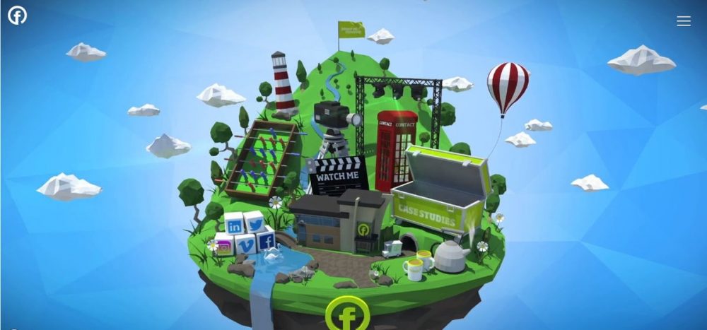
It all starts with a cool animated intro. A fabulous island in the sky is the main page of the site! Just hover your mouse over the clickable elements and go to any section of the site you want. The same things you can do using the hamburger menu.
* The Drum Recommends Awards 2019, RAR Awards 2018
5. EventiX event landing page template
visit the website:https://eventsagency.weblium.site
Key features: color scheme, navigation, CTA
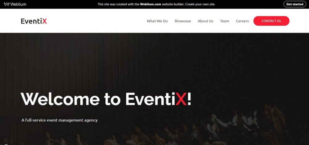
If you want to get the calls from your customers today, then the contact us button is the most important thing your website should have! On the EventiX event landing page, it is located just where it has to be: to the right of the main website menu, under each block of services, in a separate block on the main page.
At the bottom, just before the footer, they focus your attention on the contact form one more time.
6. TechCon event template page
visit this template:https://event.weblium.site
Key features: design, usability, informativity
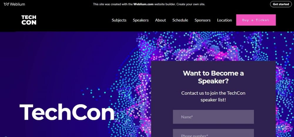
Here we got a very informative New York conference landing page: the event is dedicated to business, design, and innovation. This is one of the latest Weblium’s event website templates.
On the first page, you are immediately offered to buy a ticket and fill out a form to participate as a speaker. There’s also a countdown timer a bit lower.
This event landing page offers a detailed calendar of events, a compelling “Why You Should Visit TechCon” section, under which there is a huge prominent “Subscribe” button.
7. Creative Cruise event website example
visit the website:https://www.creativecruise.nl/
Key features: design, color scheme, creativity, graphics, usability
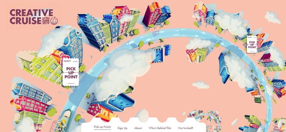
This is one of the greatest event landing page ideas we have seen!
The main page of the festival website, which “brings together the captains of the creative industry of Amsterdam”, shows a bright drawn “golden spiral” of the city of Amsterdam with the points you can pick up to check out the event.
The menu of the site is made in the style of a tear-off notepad (yes, it is located not at the top, but at the bottom of the page). By the way, if you feel dizzy from the city’s spinning landscape, you can always pick up a point in the site menu.
8. Crimons Event Decoration Agency Website example
visit this event decoration template:https://event-decoration.weblium.site
Key features: design, fullscreen, navigation, typography
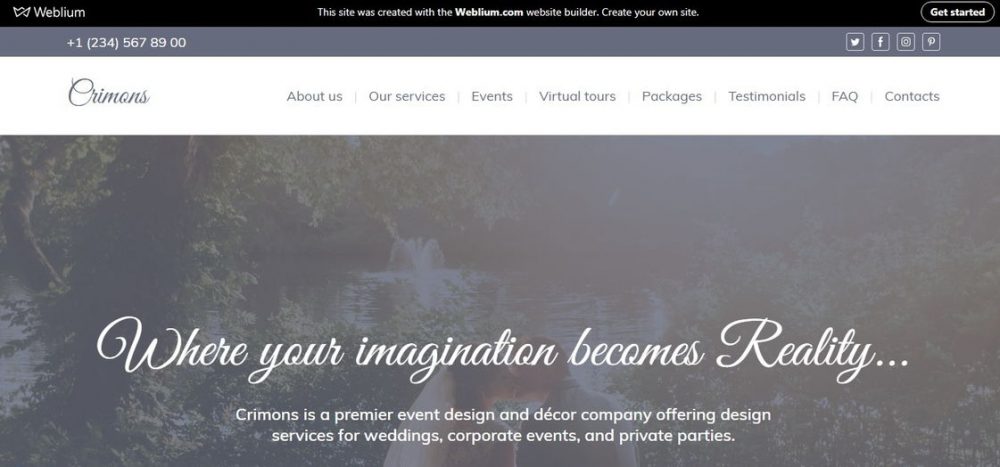
This is an excellent event landing page template designed in a classic style! It offers the set of all necessary functions, wrapped in a beautiful, pleasant design. In the header, you will see a fullscreen photo with two CTAs, allowing you to immediately get advice and get acquainted with the best works from the portfolio.
The most important “About Us” section is available first in the list by scrolling. The convenient “Our packages” table gives you a clear picture of prices.
At the bottom of the event landing page, there is a convenient form for getting a quote, the map, and a very informative footer.
9. Hoss Event Agency
visit the website:https://hossagency.com/
Key features: design, usability, video, fullscreen
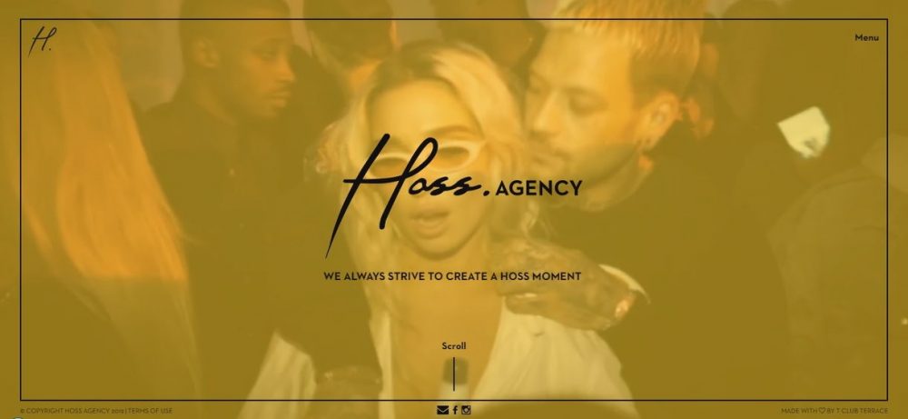
The design of the Hoss agency website is concise and draws your attention with its neat simplicity. The banner shows a beautifully animated hand inscription of the name of the agency, after which a demo video highlights the best moments from the latest events. On the left of the header, there is the agency logo, and there is the menu button on the right.
The site is designed in a very simple and beautiful style!
10. IndieUp Event Landing Page Template
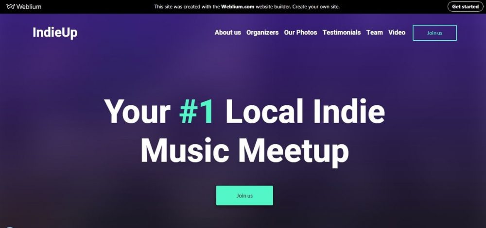
visit the website:https://meetup.weblium.site
Here is a detailed thought-out event landing page of the indie music fan community, which will keep you aware of the most important and interesting events in the life of indie musicians.
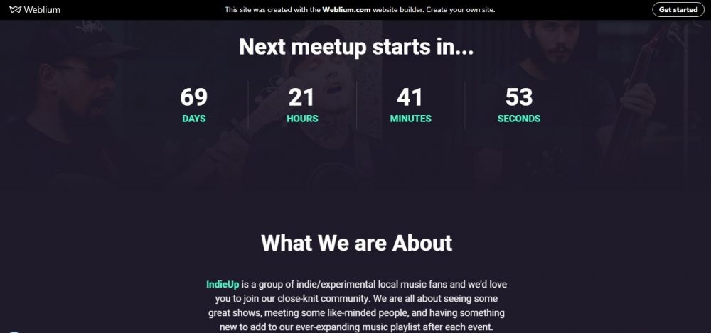
Right in the header, you can see the countdown timer of the upcoming event. Each section has a noticeable “Learn more” CTA button and social media buttons.
In the “Team” section you will find the information about team members: photo, position, brief information, and social network buttons.
How to create an event landing: 10 tips
#1. Create an effective branding
Branding helps the consumer to recognize your brand at a subconscious level. Branding should permeate the entire site, adding an extra touch of unity to it.
Let your brand live in the visitor’s memory even after he leaves your site: everything from the color scheme of the site and to the shape of your logo can help your offer to acquire a unique voice.
#2. Use strong visuals
What is an event website without the bright images?
Cool graphics can tell more than a thousand words. Professional photographs allow the visitor to feel involved in the event (even being thousands of kilometers away from it), to feel its atmosphere, to understand that, behind the site, there are people who really care!
It is possible to post photos of beautiful locations of events (interiors and exteriors) on the site, but it is even better to post photos of happy guests, speakers during a speech, faces of spectators, etc. After all, you are selling emotions!
Use only the real, brightest and highest quality photos. If it’s difficult to choose the best photos – create a photo mix!
#3. Showcase your major selling points
The first thing you should think of is the competitive advantages of your event/company. Does the agency provide services that competitors do not have? If yes, be sure to highlight this fact.
You can mention or even publish an interview with an important guest of the event on your site. If the event takes place in a picturesque landscape or interior, use colorful photographs to show the beauty of the location.
Add this unique information (or add a link) to your main page.
#4. Using videos is a must
The latest Wyzowl reports claim that 87% of marketing pros are using videos as an effective marketing tool. Can you imagine – a one-minute clip can replace 1.8 million words!
You can use the background loop video, or you can show highlights from your latest events, or you can even publish video testimonials, interviews with the speakers and guests.
#5. Don’t forget about your social proof
Perhaps, you have already heard that 70% of people need social proof before they make a decision to buy something?
This is how we usually act: it is more likely that we do something if we see that someone else does it.
Therefore, make sure that your event site has reviews of influential people or real attendees – add credibility to your brand!
#6. Add the clear “what, where, when, who” information
Such important information as the date, time and place of the event (as well as the brief information about its organizers) should be published in a prominent place on the main page of the site. Adding a reverse time counter will make the information even more clear and motivate the interested visitor to further study the information.
#7. Use Strong Calls To Action
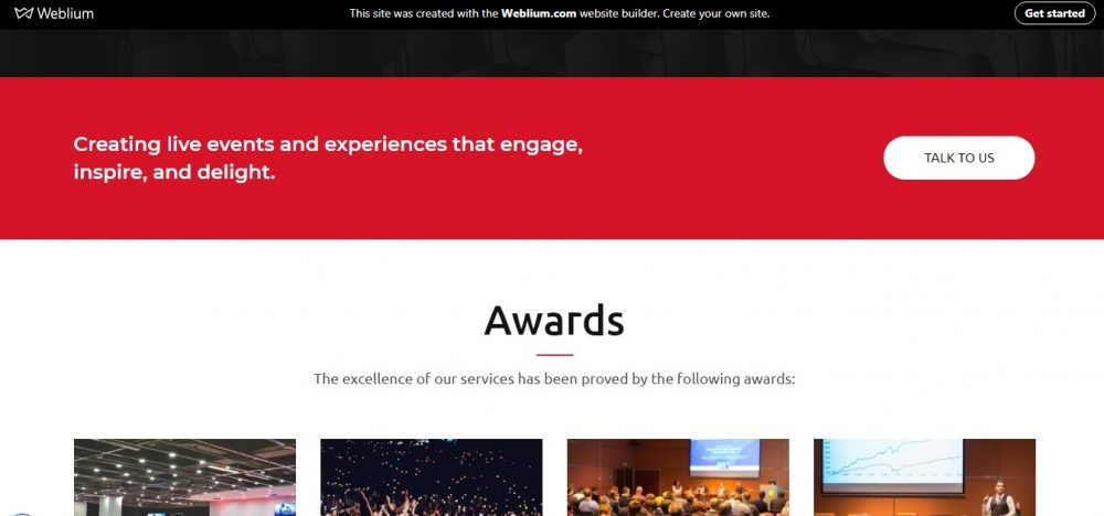
An event website with no strong CTAs is nothing but interesting information. To get your visitors motivated, use buttons, forms, links that draw attention and drive people to buy tickets or register
The best practice is to have CTAs located at different places throughout the website. For example, it is better to place the registration form directly in the header of the site, as in the picture below.
#8. Add social media buttons
To get the best results, your SM page should work in a tandem with your event site. Social networks are just perfect for the promotion of festivals and conferences.
Consider making a unique SMM #hashtag and feature it on your site.
#9. Don’t forget about the contacts
You need to give your visitors the opportunity to reach you! That’s why it is a good idea to add all popular ways to contact you to the site.
Also, providing a map is more than just common decency – it’s a great way to get everyone there.
Summary
Your event landing page is a powerful marketing tool that can either attract people or push them away. Therefore, it is important to create a perfect first impression – and people will rush to buy tickets for the upcoming event.
If you have even the slightest doubt of how to create the perfect event landing page, it is available today. Using a ready-made website template will save you time and money.

