10 Massage Website Examples: Relax, Enjoy & Get Inspiration!
The design of your massage website should reflect its “soul” and position it correctly. Therefore, if you decide to create a website or redesign the one you already have, the only thing you need is an inspiration!
That’s why we have prepared for you this list with the best massage website design examples on the Web!
Of course, you already know that you can easily create a full-fledged modern website with Weblium for absolutely free?! So, before you dive into reading this post, take a look at this massage studio website created using Weblium!
Contents
Massage Websites
Massage website created on weblium.com
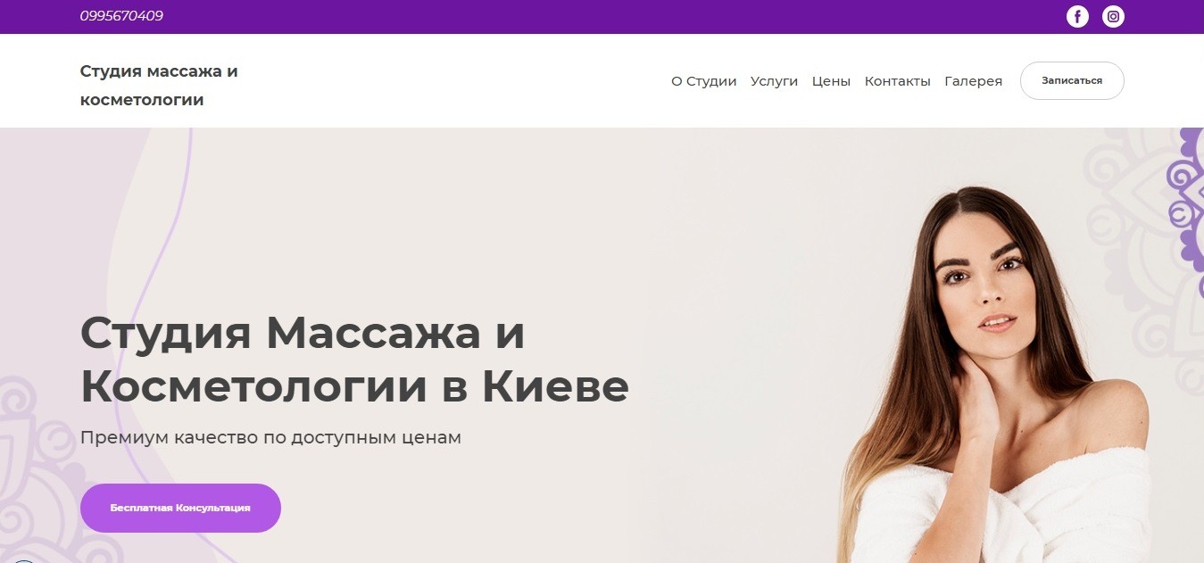
website: https://massageinkiev.com.ua/
Massage Naples website
website: https://massagenaplesfl.com/
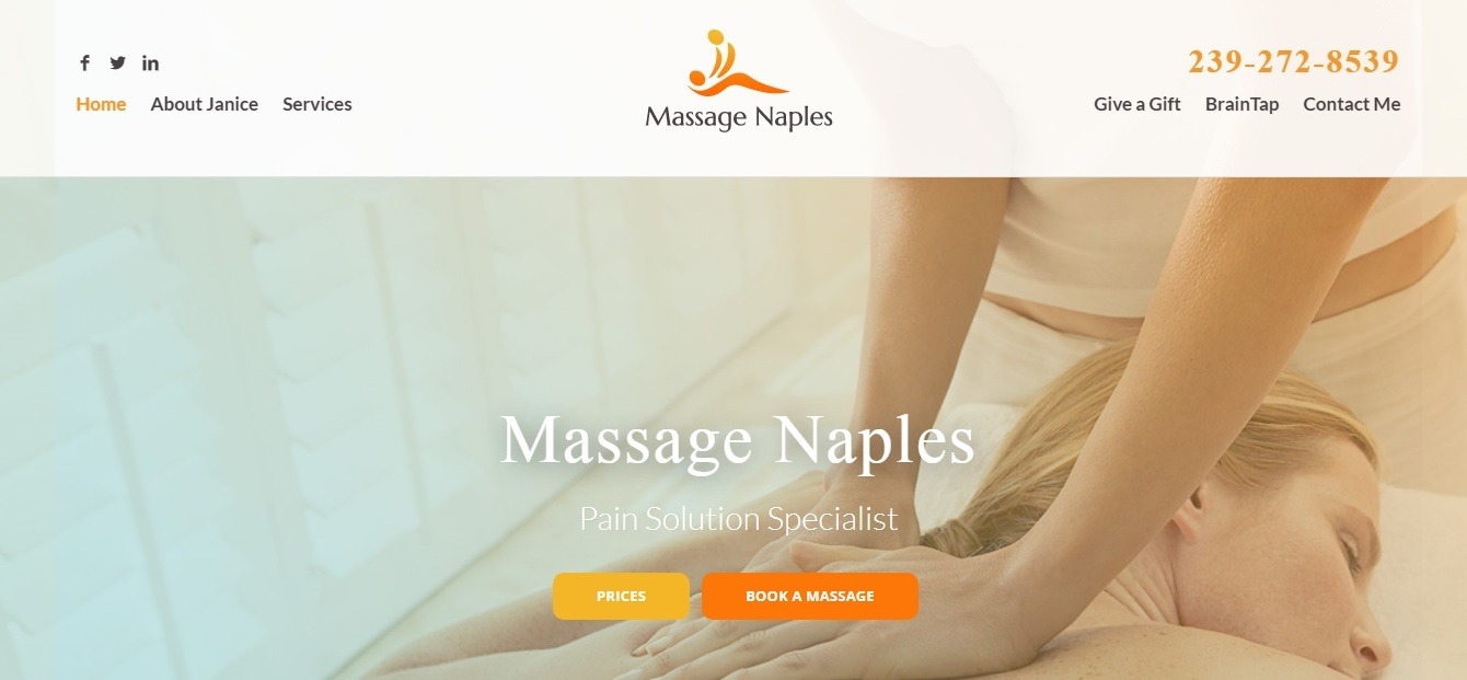
What we liked the most: correct website structure and logically personated content
This massage therapist design captivates with its clarity – the information is presented in the order in which the visitor needs it.
The header of the site is as informative as possible – the short and logical menu is the first thing you see, after which you are immediately provided with the prices and the opportunity to order a service.
Just below the quality photo in the header, you will find comprehensive contact information located in a bright, separate block – it is simply impossible to miss it!
The Massage Elite
website: http://themassageelite.com/
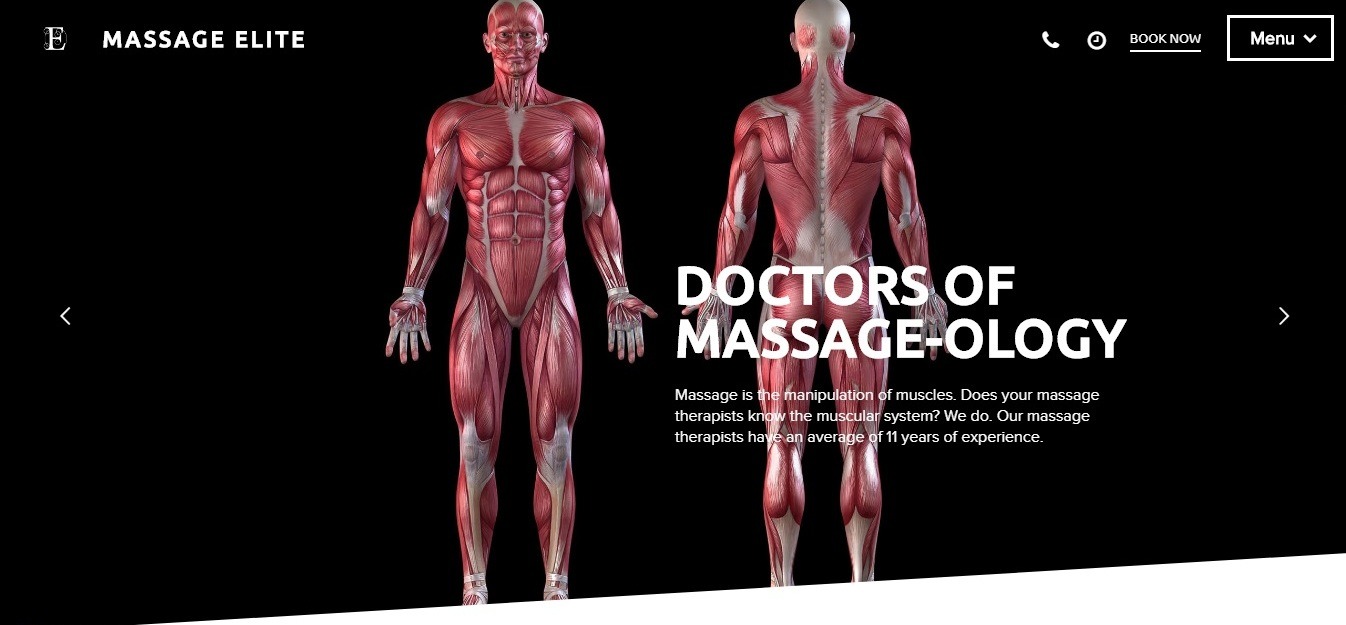
What we liked the most: creative design, strong copy.
The Massage Elite website has several key advantages that make it great.
Firstly, there is a creative design of the main page with full-size switchable images, accompanied by cool taglines.
Secondly, in order to create the most convenient navigation, the developers opted for a sticky menu. A detailed list of services is designed in the form of huge blocks with graphic icons.
Finally, intriguing descriptive CTAs, that are scattered throughout the site, motivate the visitor to interact with the website.
White Stone Healing Center website
website: https://whitestonehealingcentre.com.au/
What we liked the most: simplicity of design and website structure.
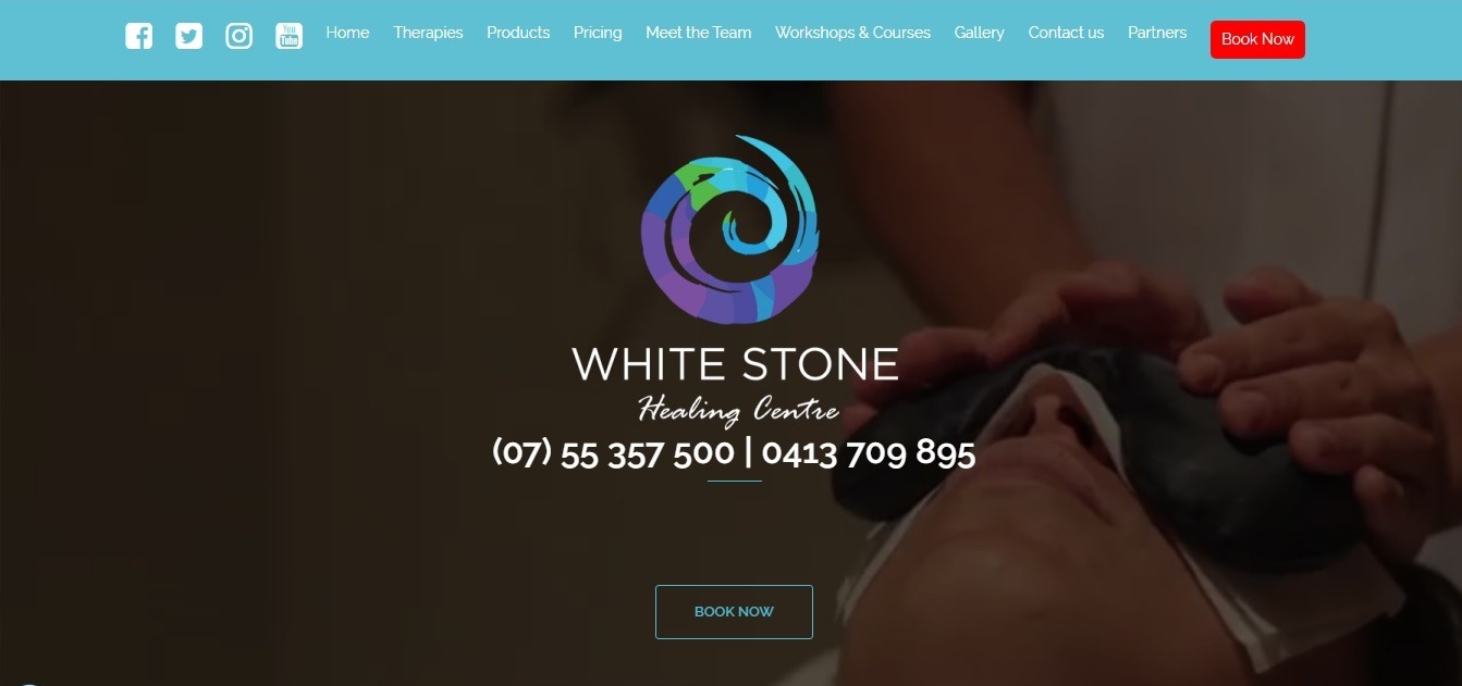
This massage center website is very simple, but it is very well made!
The first thing you see is a short video introduction to the brand. On top of it you will see you will immediately see the clickable phone numbers (if you want to get more details) and the “Book Now” button (if you are ready to pay a visit).
In the main menu, you can quickly and easily find all the details you need in the drop-down submenus.
It is a good idea to create two various blocks with CTA buttons that offer the visitor to choose his next actions! Well, and a stylish, concise footer with geolocation is a perfect way to end it up!
Remedy Massage
website: https://www.remedymassage.com/
What we liked the most: modern seamless design and minimalistic hover effects
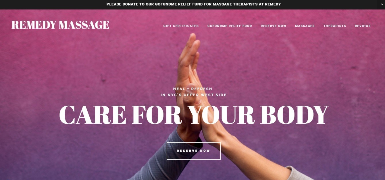
The site draws attention thanks to its cool hover effects (for example, interestingly highlighted main menu items) and a clear presentation of information (immediately after the header, you see structured information about modalities with prices).
The website’s seamless, minimalistic design looks even better with full-size photos, alternating with light-color spaces and split-screen blocks.
Vitality: massage website design
What we liked the most: high-quality images and CTAs.
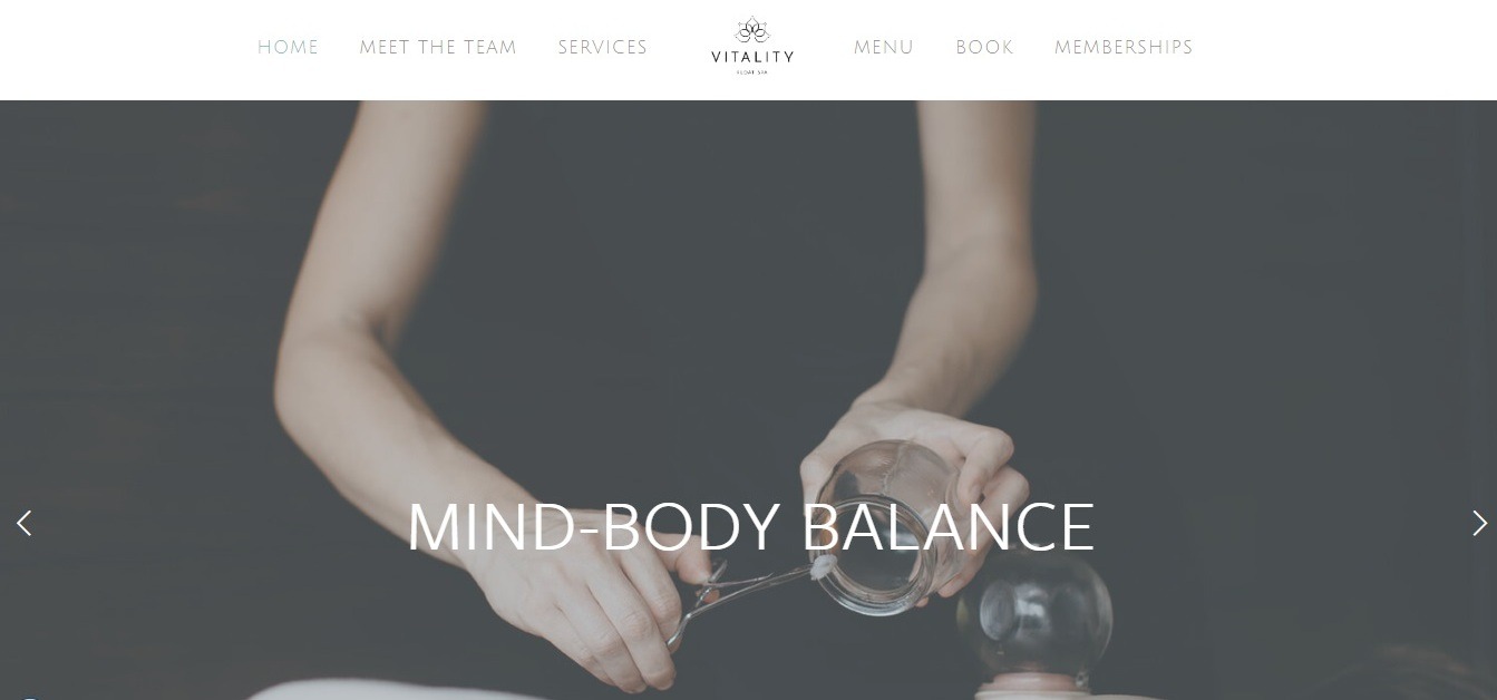
If you want to get a real visual pleasure – visit the Vitality website!
Impeccable images colorfully tell about the services, creating the effect of realism and literally visualizing the sensations you can experience in the salon.
We also really liked the site menu with a logo located in the middle between six blocks. This is a great way to effortlessly bring unique features to the header of your site!
Patrick Mansell Sports Massage Therapist
website: http://patrickmansell.com/
What we liked the most: the right combination of colors, the correct website structure
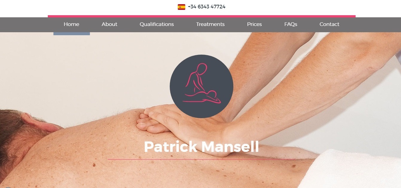
First of all, this site attracts attention with its convenient structure and thoughtful presentation of information.
The header clearly highlights Patrick’s specialization. Right below the site header, you see his briefing and qualifications. The block with services on a split-screen is very clear; also there is a FAQ section nearby.
The gray background in combination with pink and blue elements looks just great!
 Massage Quantum Healing
website: https://massagequantumhealing.com/
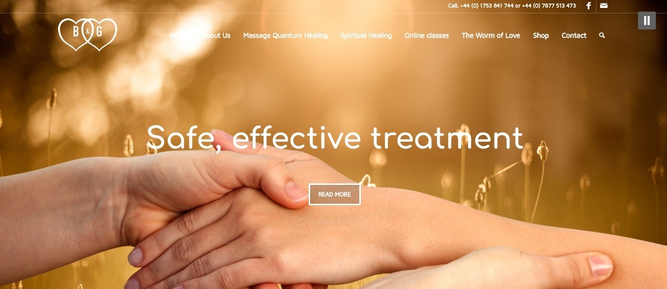
What we liked the most: attractive graphics and the right combination of colors
The Massage Quantum Healing website is designed just fine!
The main advantage of the site is its excellent high-quality graphics, thanks to which it is simply pleasant to look at this design. The accompanying music makes you feel relaxed and safe.
The colors of the block backgrounds perfectly match the website’s design concept, the CTAs are quite noticeable, but do not get out of the overall design and do not look intrusive, the fonts perfectly complement the design, and even the small icons in the services section are designed to create a sense of harmony and naturalness.
City Touch NYC
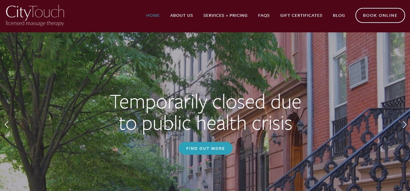
What we liked the most: illustrative presentation of information, convenient site structure
In addition to focusing on an interesting servant (massage for couples), City Touch NYC website correctly prioritizes the information: immediately under the header, you’ll find the list of main advantages of the salon that is clearly designed with the help of icons and short descriptions.
These guys won’t make you read the long and boring texts – you can watch a video overview of the salon services.
Zeel
website: https://www.zeel.com/
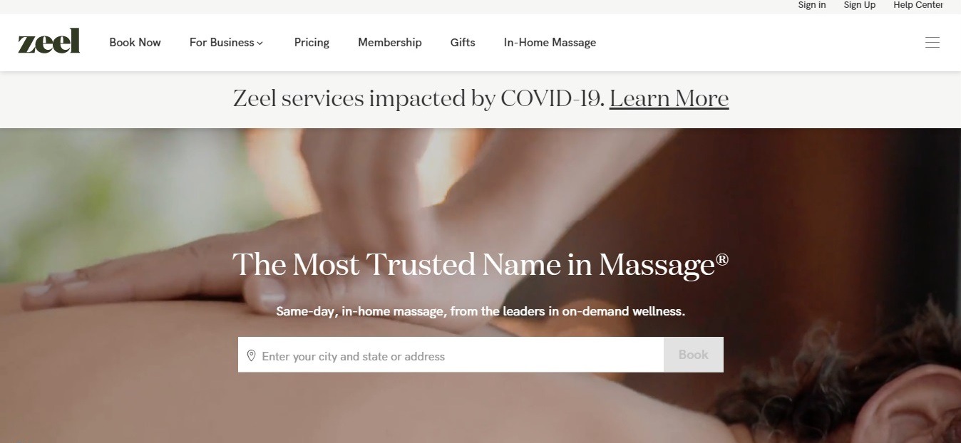
What we liked the most: the perfect combination of astounding images and strong copy
This is what happens when someone succeeds in revealing his identity by creating a convenient massage therapist website design!
On top of the classic video background, you see the form for entering your current location and the “Book” button with the strong tagline: “The Most Trusted Name in Massage”.
It is a good idea to place a bright block with customer reviews directly under the header.
The rest is done with the help of a split-screen layout, an impeccable combination of images and capacious copyright, which perfectly helps to convey a message to a visitor.
Another interesting element – clickable icons with different massage techniques – a clever move, convincing in the high professionalism of services.
The Massage and Body Lab
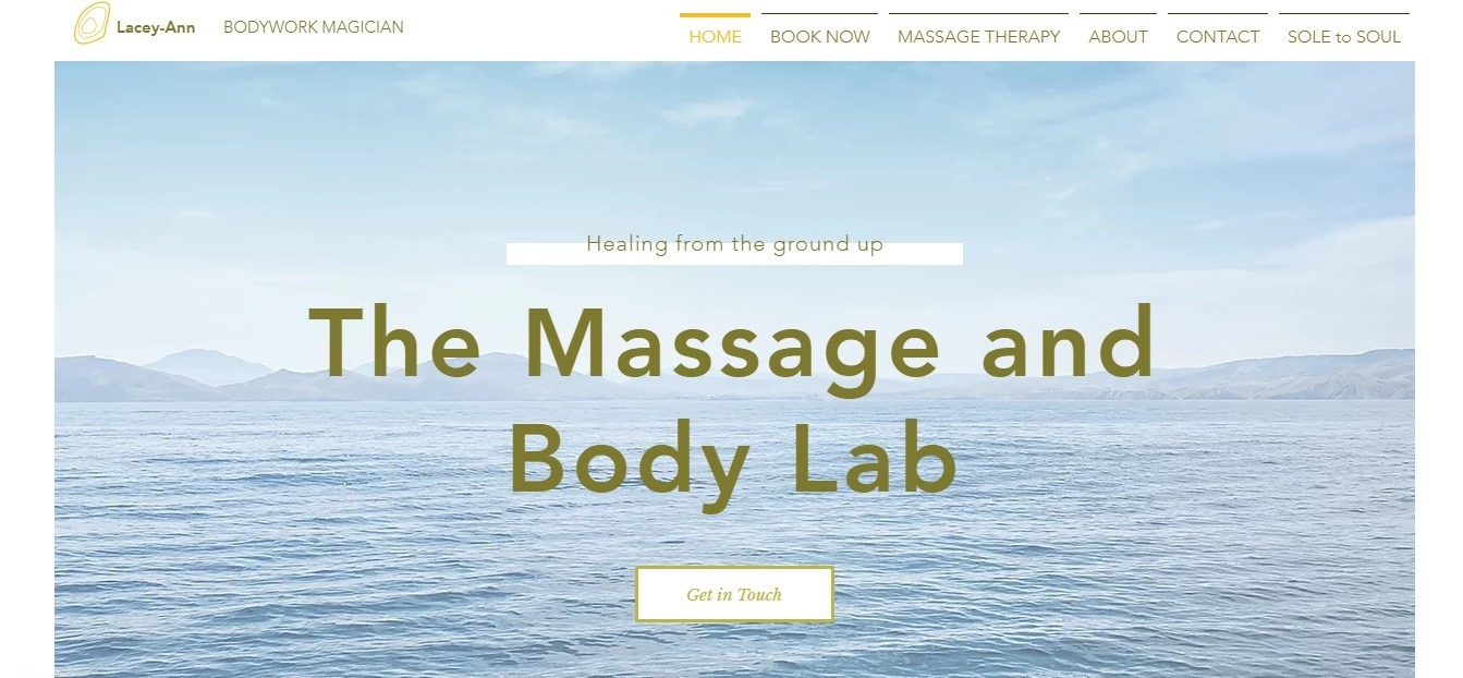
What we liked the most: clarity of presentation of information and perfect imagery
The design of this website is a vivid example of a successful combination of different peaceful images related to nature.
Right in the header, a big and bold title represents the name of the studio; it is accompanied by a bright CTA, exposing the parallax effect when scrolling.
Each service and procedure offered by the studio are described in detail and correctly presented to the visitor with the help of neatly arranged blocks and texts with clear fonts.
The best way to experience the possibilities of modern templates is to test them!
You won’t even have to waste your time registering on the website – just log in with your Facebook account, and you will get the full access to the editing options. And yes – it’s completely free!
Massage website templates
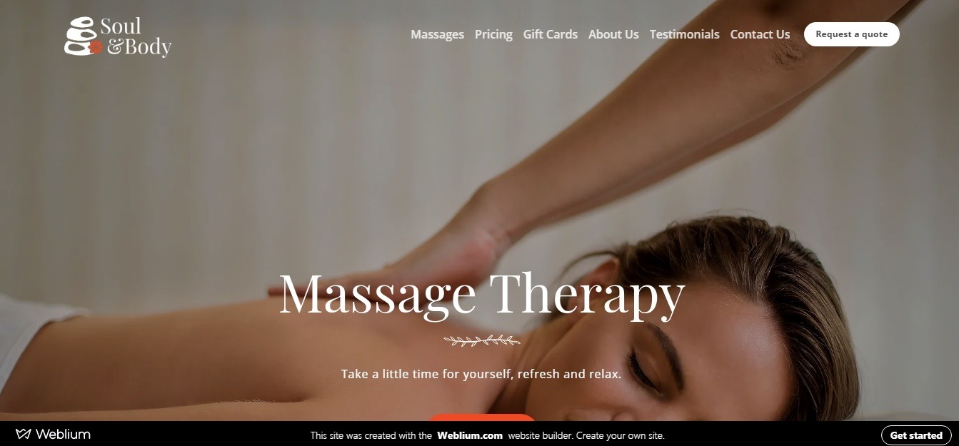
Take a look at this modern massage therapy website template: it was created by professionals from Weblium taking into account the most relevant trends in web design and digital marketing.
Now, you can use this design for building your unique website! Make any changes to the design and types of blocks and individual elements, add your content and launch your website to make it immediately start attracting new customers!

