The Best 404 Page Ever: 22 Creative Ways to Handle “Page Not Found”
Everyone knows how sad it can be to find 404 pages instead of the page you were looking for. Many website owners give useful information on their 404 error page or at least try to amuse the user that got lost, sometimes even surprising him with their creative solutions. And sometimes, 404 page becomes the most interesting page on the website and gets into the top 404 creative pages lists.
Make yourself some coffee: we have prepared a selection of 20 best 404 pages for you.
Contents
What is a 404 error?
Sometimes the website visitors see the 404 error page because the web page simply does not exist (it was deleted or renamed), and sometimes the broken link is the reason for the error. Sometimes the users type in the incorrect website address. In any case, no one will like the faceless design of the page or just a standard 404 message.
Remember: creative 404 design can create a strong impression on the visitor, make him smile, cheer him, make him remember your website for a long time and even make the visitor share the link with friends!
1. Klaus: best computer geek 404 Error Page
Visit the page: https://klaus.dk/404/
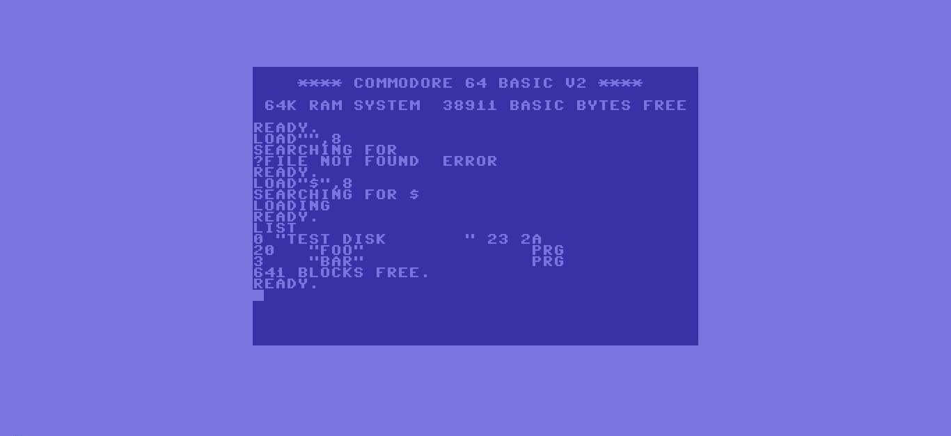
Here’s a custom 404, which will please the computer geeks first, but all the other users will also find it unusual and attractive.
You are looking at the interface of Commodore 64, the home computer with 64 KB of RAM, released on August 1982 at a price of$ 595! You probably don’t remember it, but your dad probably had it.
And it is not just a picture, but an animation: the cursor blinks at the end of the line, and a new text is periodically added as if someone is editing it. It looks very cool and fresh!
2. Hakim 404 Error Page
Visit the page: https://hakim.se/404
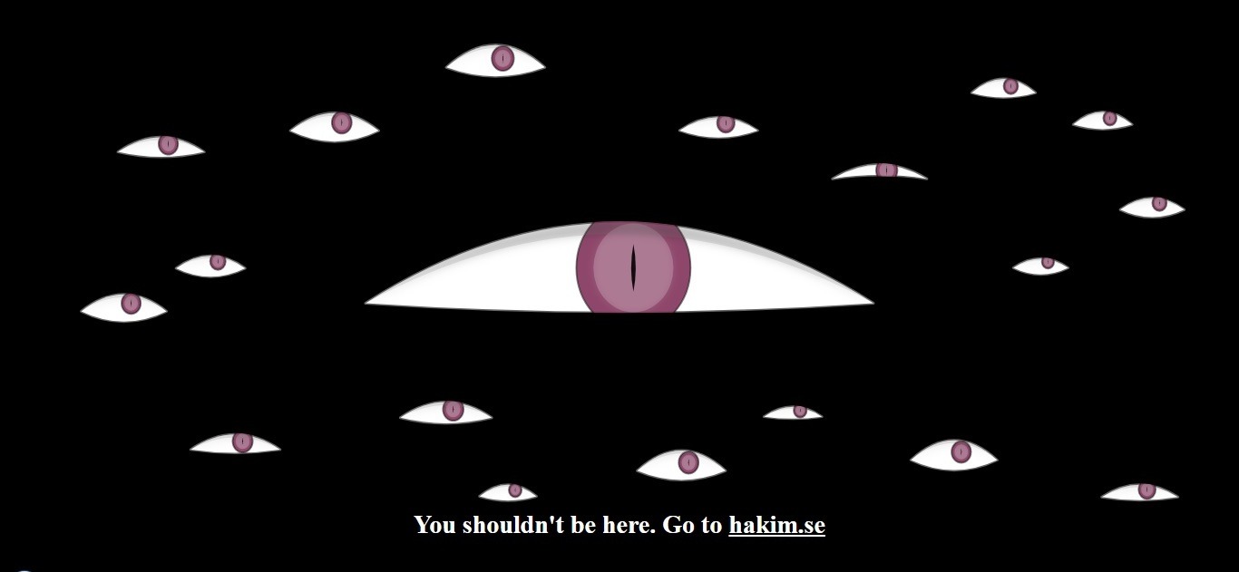
When we have opened this page our first thought was «You came to the wrong neighborhood, m******r!».
As this Swedish front end developer and interface designer say on his «about me» page: «I love to experiment with graphics and interactivity». Well done, Hakim El Hattab!
3. HotDot studio: best hypnotizing 404 page ever

Visit the page: http://hotdot.pro/en/404/
Interactive fascinating numbers won’t give you a break, hypnotizing you and forcing you to stay on this page forever :). It looks very cool, we can even say – beautiful!
4. Becherovka: best creative 404 page ever
Visit the page: https://becherovka.com/en/error/404
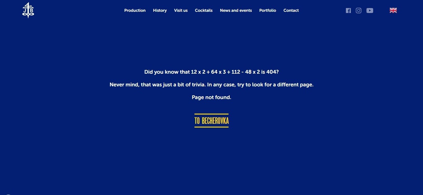
The 404 page of the site of famous elite alcohol drink, instead of showing the common error message focuses your attention on a curious fact: if you sum up all the numbers you see on the screen, you will get 404! Just in front of you, there is a full menu of the site and a link to the main page. Just an original solution in the best traditions of marketing!
5. Toggl 404 Error Page
Visit the page: https://toggl.com/404
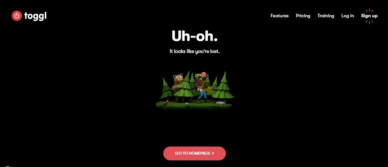
Here we’ve got 404 pages featuring a beautifully animated 3D fairy tale with a 404 error page plot. It looks very realistic and fascinating.
6. Weemss: best touching 404-page example
Visit the page: https://weemss.com/page-not-found/
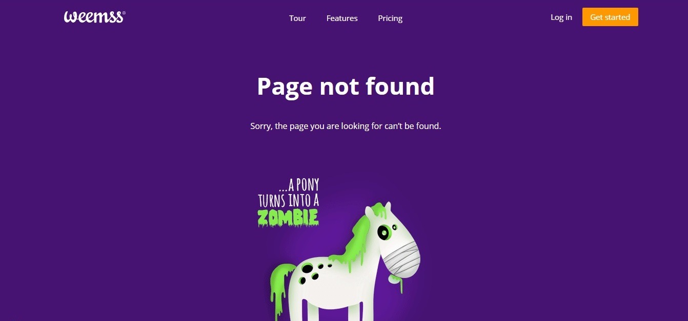
This is just one of the most amazing 404-page ideas! The page says: “every time someone visits this page, a pony turns to zombie”, after which you are offered to register or log in to the Weemss website!
This marketing is still so touching, and you won’t believe it, but it still works!
7. Slack: best animated 404 page
Visit the page: https://slack.com/404
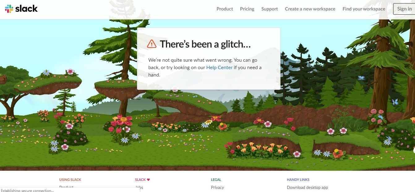
The guys from Slack did their best to create a beautifully animated page. Their creative 404 page resembles a fairy tale with tiny interactive elements (you can «touch» chickens and pigs).
The page offers you to visit any website page using the menu or use some help. By the way, while you move your mouse over the animated picture, it is displayed in color, but as soon as you stop interacting with this 404 page, the picture fades and turns black and white.
8. Love Beets: best social marketing-oriented 404 page
Visit the page: http://www.lovebeets.com/404
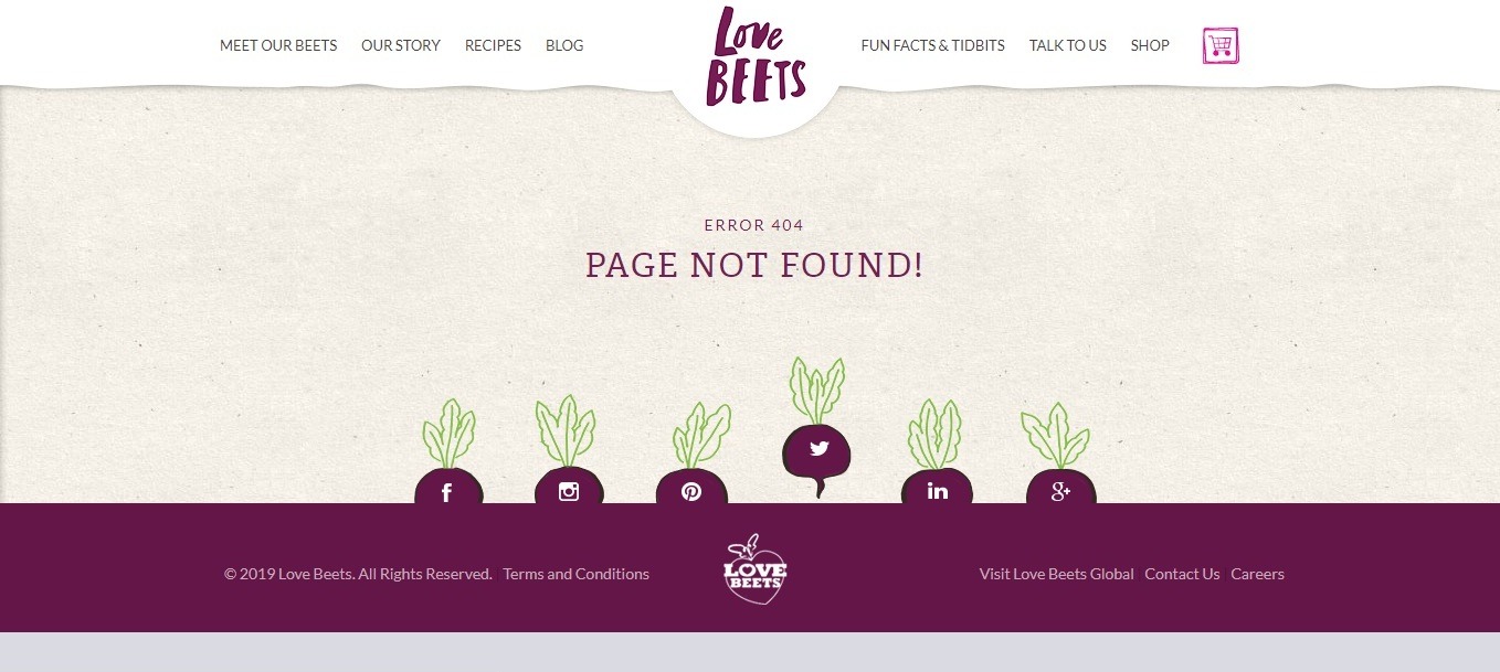
This website belongs to an English farm that grows organic vegetables for your salads. The page is simple, but still has an intrigue: take a look at these social sharing buttons disguised as beets in the garden (yes, they are animated) – quite an interesting marketing solution!
9. CSS Tricks: the best simple idea of 404 page
Visit the page: https://css-tricks.com/thispagedoesntexist
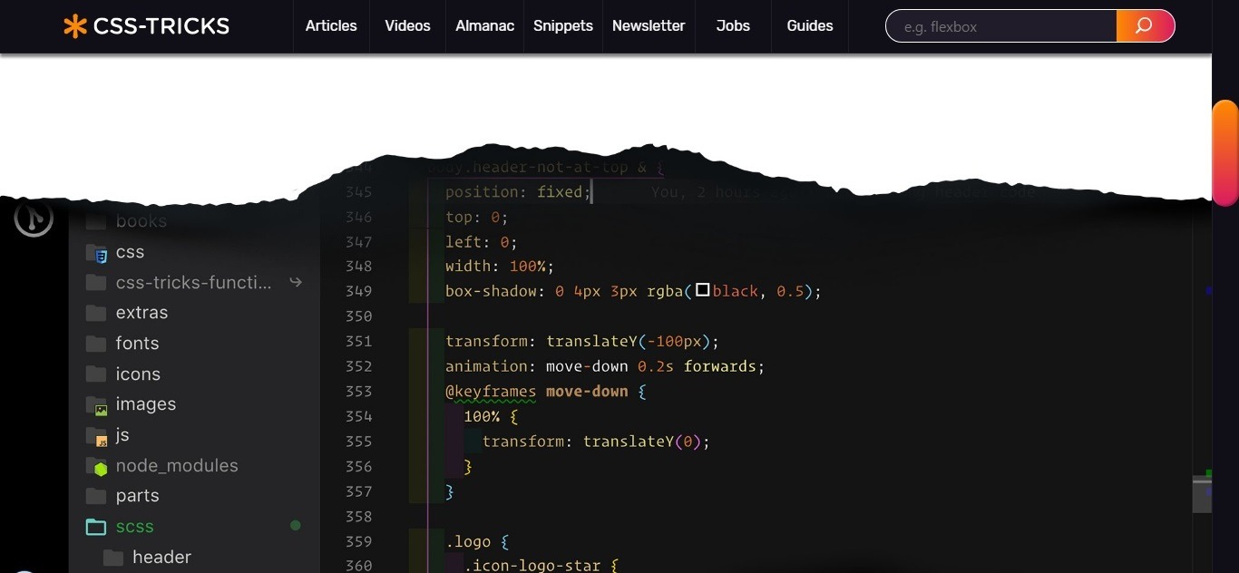
On the CSS-tricks website, the 404 error message is designed in a minimalistic, thematic style. When you get to this page, you see a white background, and a gap, in which you can see the code of the web page.
It looks like as if you have clicked on a broken link, something in the WWW universe has gone wrong, and you saw the inside out of it! The only drawback of this idea is the lack of a button to return to the main page. It’s good that you can go anywhere on the website from here – or you can subscribe using the form below the picture.
10. Limpfish 404 Error Page
Visit the page: http://www.limpfish.com/404
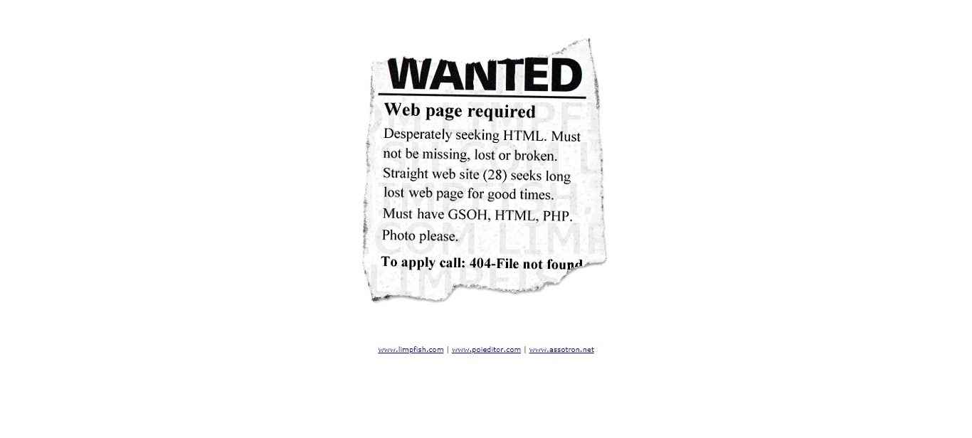
In our opinion, this is one of the most simple yet funny 404 pages. «The webpage is desperately seeking HTML of her life. Preferably without mistakes and bad habits»! Brilliant and creative!
11. Orange Coat: best creative/guiding 404 page
Visit the page: https://www.orangecoat.com/dear-happy-internet-traveler
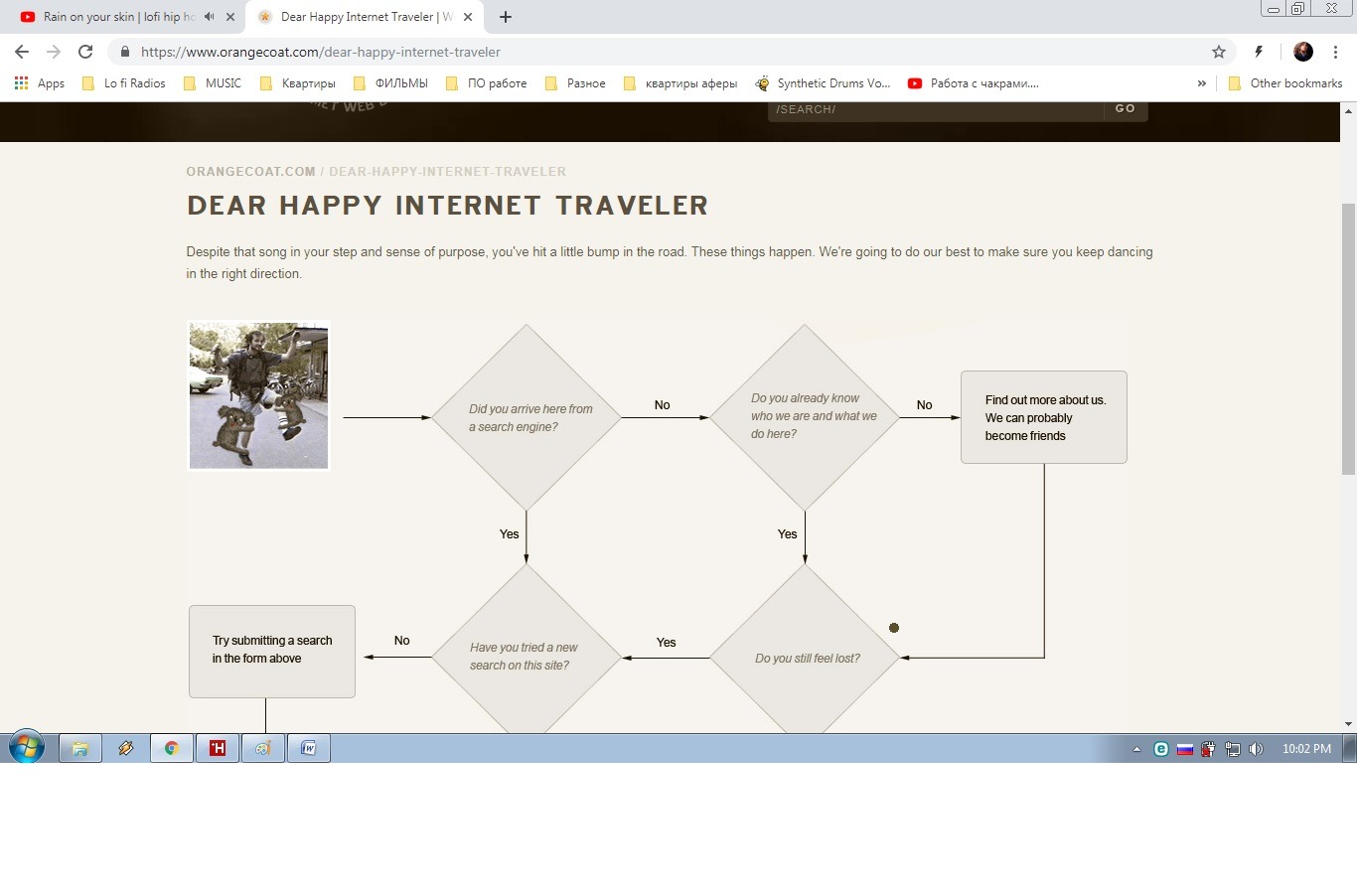
This website has 404 pages of best practice. Here you are offered a whole block diagram of actions in order not to get lost and find what you were looking for!
12. Hatched: best interactive 404 page
Visit the page: https://hatchedlondon.com/tproger
This page is one of the top 404 page ideas, before which we take off our hat.
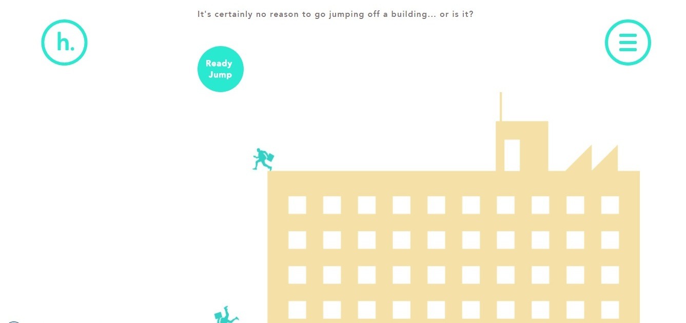
HatchedLondon decided to make a 404 page veeeeeery long, but you can reach the end in just one second by pressing «Ready Jump» button – or you can have a bit longer falling down. The most interesting part is at the bottom of the page, offering you useful menus and CTA and links.
At the same time, the page fits well into the design and looks interesting and great!
13. Deep Time 404 Error Page
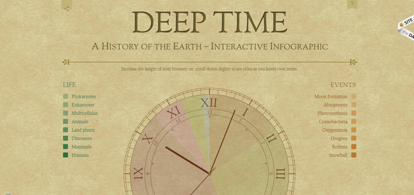
Visit the page: http://deeptime.info/
Lost in time, the vintage 404 page of the project of interactive infographics offers you an interesting way to explore the history of the Earth.
14. Kualo: best interactive retro game 404 page
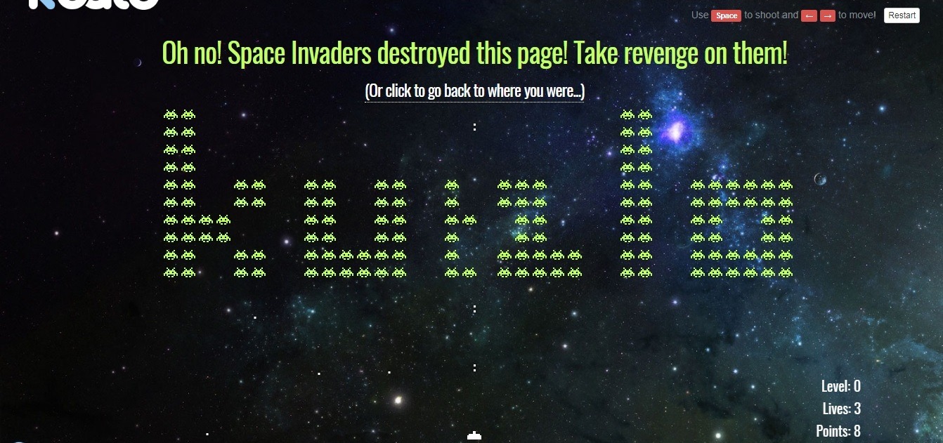
Visit the page: https://www.kualo.co.uk/404
Web hosting meets all its 404 error page guests with a fascinating game. “Space invaders” is just a sweet flashback from childhood. Use arrows to control your ship and space to shoot. This custom 404 page is a perfect way to lose your day with great pleasure!
15. Imgur: best creative 404 page
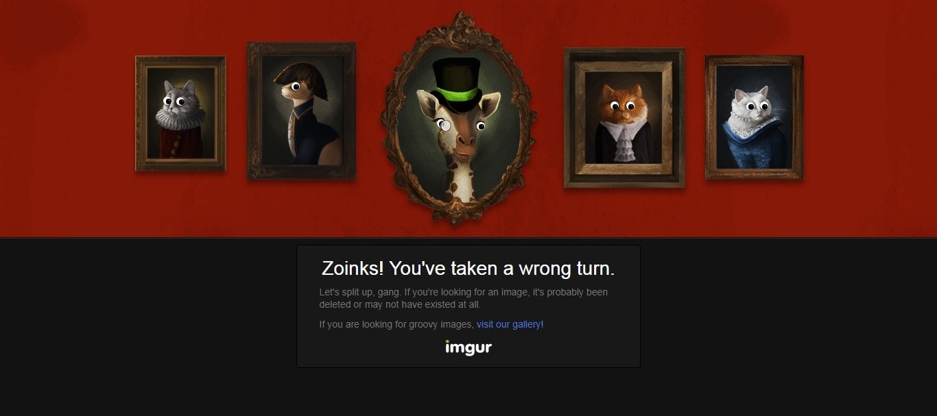
Visit the page: https://imgur.com/tproger
The website of the popular Imgur picture-sharing service has made a 404 page in the form of a gallery wall with the portraits of animals. While you move the mouse, these eyes of the animals follow the cursor, that gives you a strange, but funny feelings It’s a pity that only a giraffe is ready to talk to you.
16. Figma: 404 page
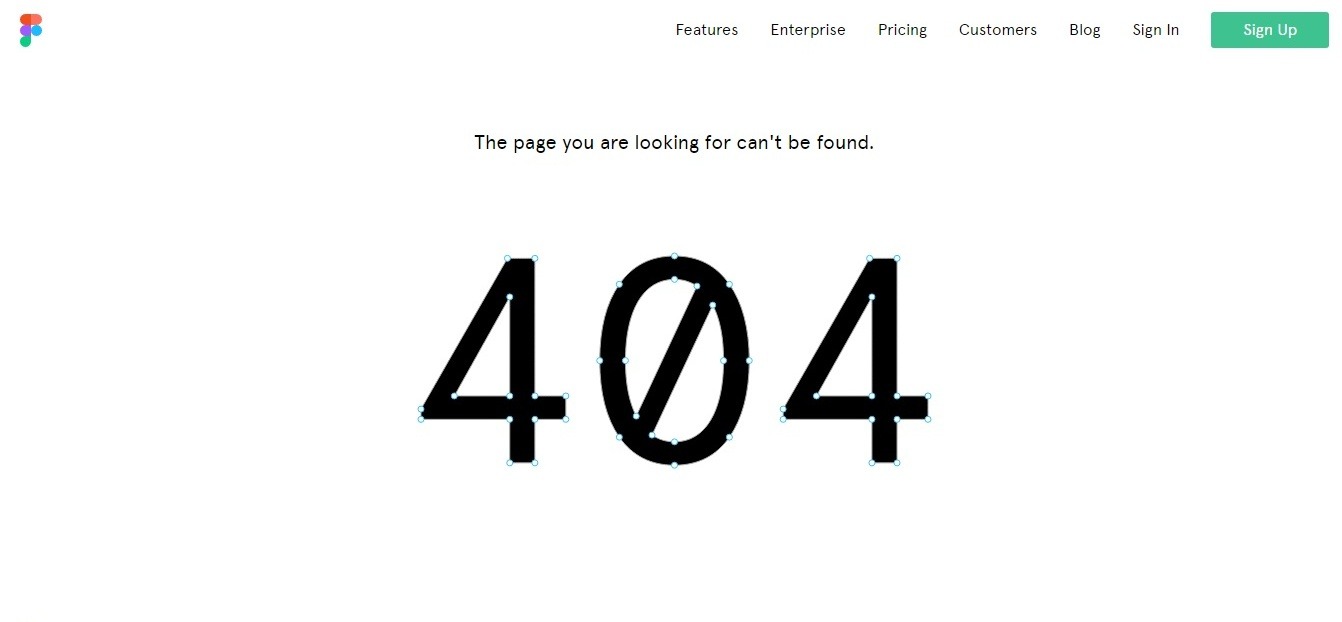
Visit the page: https://www.figma.com/404/
The interface design tool owners did a great job by creating a perfect design for themselves! You can play with the nodes of the letters on the 404-page error message. It’s better to try it than to tell about it!
17. Hugoware: the best interactive graphics 404 page
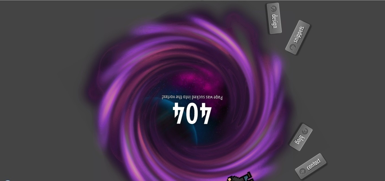
Visit the page: http://hugoware.net/tproger
The creator has put a heart into creating a beautiful and animated 404 error page, that is almost entirely written in CSS (the pictures, of course, are pigs). He even shared the source code! As you enter the page, the menu collapses and spins in a black hole, remaining clickable.
18. Lyft: best simple/animated 404 page
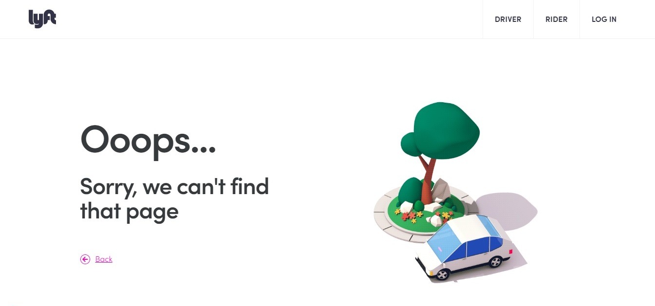
Visit the page: https://www.lyft.com/404
This American taxi service has definitely got one of the 404-page ideas! It’s simple yet fascinating: you see a cool animation of a car circling around a tree, but at any moment you can click on any link in the menu and stop this madness!
19. Epic: best staff 404 page

Here’s one beautiful 404 error page, made as a creative version of the “About Us” page.
20. Wadav website
Visit the website: https://www.wadav.com/404.html
21. Weblium: best simple idea 404 page
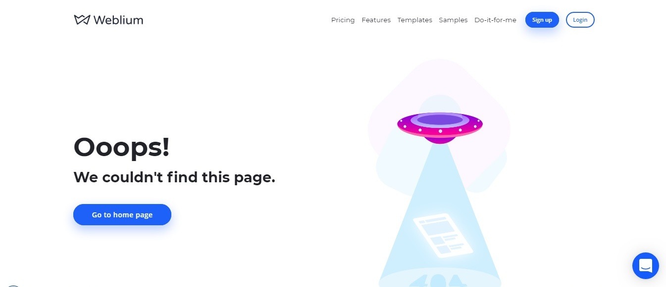
Visit the page: https://weblium.com/klf
Weblium has got a simple yet attractive 404 error page, showing that a UFO steals your page!
Google Maps had a similar concept. It’s the classic story – you are offered to go back to the main page or select the appropriate section from the menu in the page footer.
22. Chargebacks911: funny and friendly 404-page error
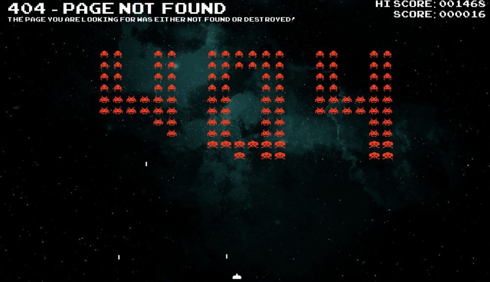
Visit the page: https://chargebacks911.com/play-404/
Oh, this 404 page is really amazing! This page is like an online game. No one can resist a 5-minute shooter game. Respect, guys from chargebacks911!
What Makes a Great 404 Error Page?
You should understand that the 404 error page is not (and shouldn’t be!) useless for your visitor: many website owners think that almost nobody would see it so why creating it or making it interesting? But they are wrong, and the design of the 404th page is often underestimated.
There are two directions of the creation of the design of 404 pages you can choose from:
- Since the page opens when the error occurs, you can guide your visitors and show him where to go: you can give him links to other pages of relevant content.
- Or you get creative and use your 404 error page as a creative space where people will want to come back again and even share it: place an eye-catching picture, create a cool cartoon, an exciting animation – even the most poking fun content that people will want to share with their friends will do!
In order to make the 404 errorless frightening and more engaging you can do the following:
- explain what happened;
- indicate the causes of the incident;
- tell your visitor what to do next.
This is the standard. But you can use any other creative messages to keep your visitor engaged with your site.
People like the 404 pages with touch humor and unpredictability. The main thing is to determine the expectations of your visitors and to achieve your marketing goals. Funny 404 pages should have more than a thoughtful beautiful design, but also a solution to the problem that the visitors had encountered.
5 essential elements of a successful 404 error page
- Links to important sections of the site and motivating call to action. Add the “Back to homepage” button and place some links to the most popular site pages.
- Add a search bar so the visitor will be able to quickly go to the section he was looking for before the error occurred.
- Adhere to corporate identity and design. Navigation, logo, color scheme and other web design elements must be identical. Too much difference with the brand design is alarming and makes your visitor think that he had accidentally moved to another resource.
- Be clear and friendly. If you think that every user knows what a “404 error” is, you are wrong. Therefore, try to explain what the problem is and tell people what to do next in a friendly manner.
- Bring in some creative flow and humor in the making of your custom 404 pages! Creative illustrations draw the attention, arouse interest and the desire to learn more, to explore the website.
- It’s great if your 404 page includes an interactive animation that can be set in motion with the mouse cursor – this may keep your visitors engaged with your website for a long time.
Summary
When a visitor opens the standard 404 error page, it is likely that he will immediately leave the website and never come back. And a completely different, custom, attractive and useful 404 pages can easily make the visitor stay on your website and motivate him to continue exploring it. In fact, it increases the loyalty of your audience and improves the website’s SEO.
In other words, creating a custom 404-page design is a way to talk humanely with your visitors in a human way and keep them engaged with your website.
With Weblium AI Website Builder you can create the website you have dreamt about without anyone’s help in no time. And in addition to all the benefits like a free domain and hosting, a site with basic SEO settings for promotion and the highest load speed, you can request the coolest 404 error page template! Keep in mind that all 404 pages for the templates are of the highest quality, and created according to the latest trends!

