Automotive Website Design: 10 Best Examples
“Nobody will ever buy a car online!” This is what a common perception among the business sector was years ago. Today, every 3 minutes, another vehicle sells on eBay, and the leadership in the automotive retail sector belongs to Amazon.
You’ve decided to launch your own automobile website and now wonder whether there are some industry-specific dos and don’ts of website design? Or maybe just looking for inspiration?
Then you’re in the right place! In this article, you will find good practice tips for automotive websites. We also picked some of the best automobile website design examples that drive creativity.
Contents
Automotive design examples
Getting an automobile website design that drives traffic doesn’t have to cost you an arm and a leg. The one fail-proof way in case if you don’t have any experience in web design is to start from a ready-made template.
First, it’s built by professional designers, so the layout, the colors, the fonts, and the decorative elements are perfectly matched.
Besides, today’s site builders make assembling a bespoke website as easy as pie. You can choose from countless themes, content blocks, features, and customize them in a few clicks!
Some of the car website designs below are created with Weblium – a smart site constructor with a free version available.
Denver Automotive: free website template
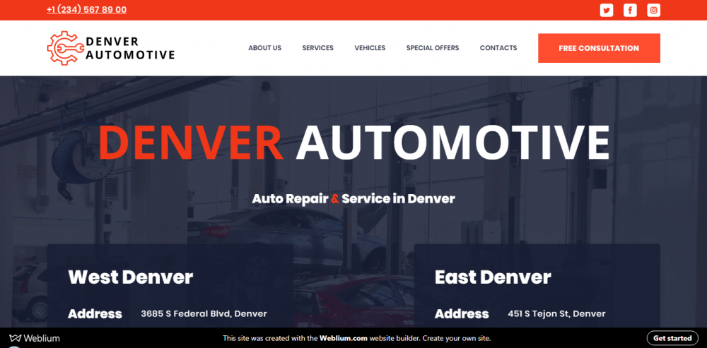
An auto repair and maintenance company from Denver opted for a minimalistic design featuring clean-cut rectangular shapes and flat UI elements. By choosing a slightly dimmed scarlet, a deep navy, and a warm white for the website color scheme, they achieved an elegant, modern, and yet very professional look that would compliment any business website.
LA Customs – great automotive design
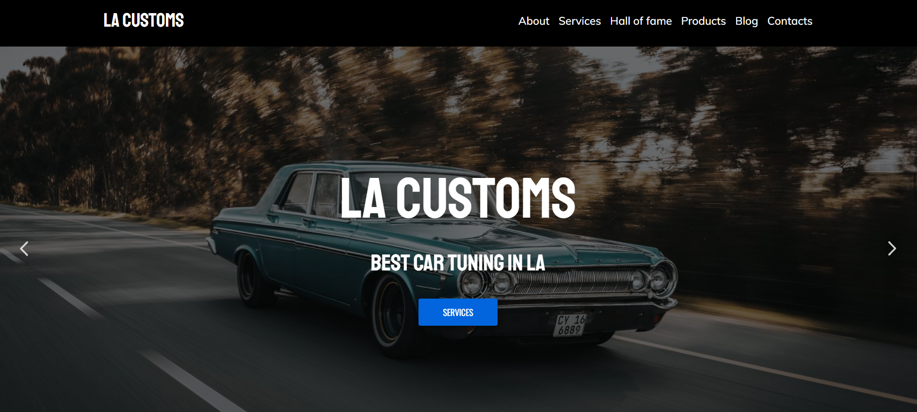
This LA-based car tuning company specializes in retro car restoration, and their web design is a clever reference to their domain expertise. While using modern fonts and layout, the landing page brings a classy old-fashion vibe. All the images are toned down to give them that washed-out, retro photo look. You can almost smell a vintage car leather and hear some 70ths radio station tunes when scrolling through the page.
Billy’s Auto Services: free template
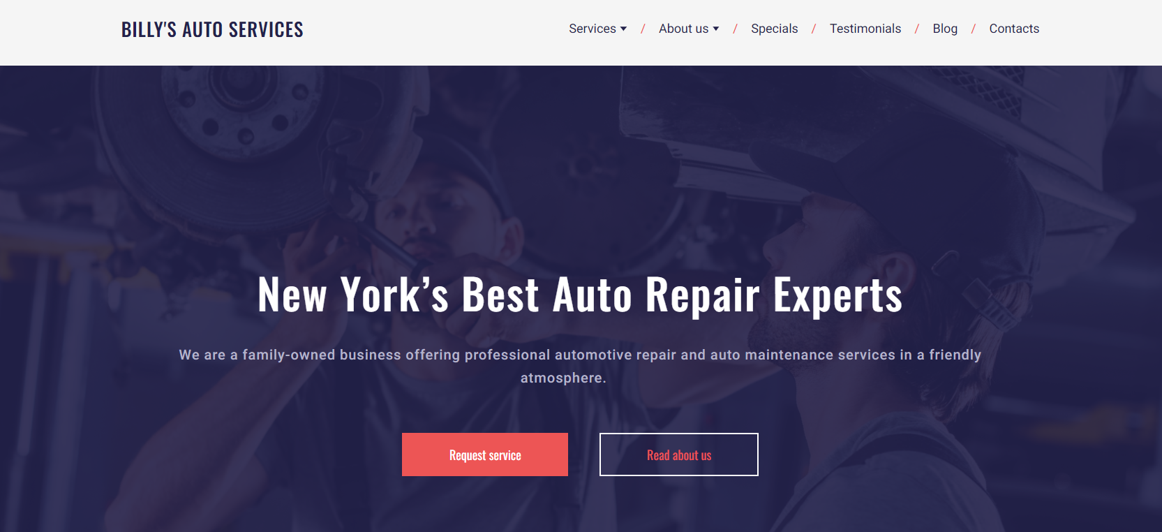
In the case of this auto repair company website design, a magic trick is to discover and combine two bold shades that you wouldn’t think will work together. A rich lilac has made a perfect couple with a bright rose-red accent color.
Notice how simple and minimalistic the decorative elements and icons are – a great visual solution to counter-balance this flashy color duo.
ProntoWash – automobile website template
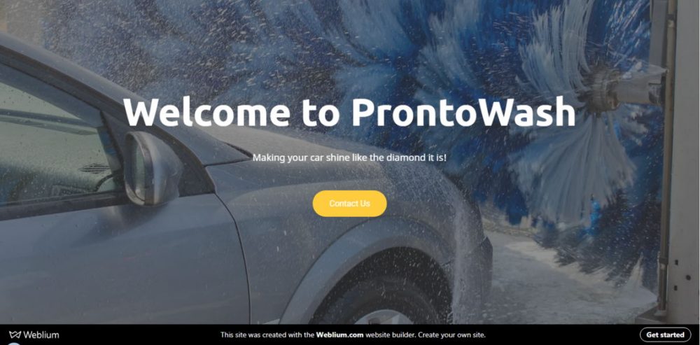
The landing page welcomes a visitor with a full-screen hero image illustrating the type of services right away. This is quite a smart design solution for an express car wash – you can simply hit a single button and get what you need without being forced to scroll through the company values, special offers, and testimonials first.
The layout is built with simplicity and clarity in mind, making the impression that the services there are as fast, and your car will become as clean as their website is.
Rimac Automobili – automobile website design
source: https://www.rimac-automobili.com/
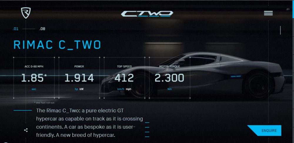
This electric automobile website design is a fascinating example of applying digital storytelling techniques to the product website design.
The web page sews together animations, video, and navigation controls to create an interactive story. As you scroll, you get introduced to the vehicle and the technology under its hood in an immersive and engaging way.
Ferox Vehicles Corporation
source: https://www.feroxcorp.com/
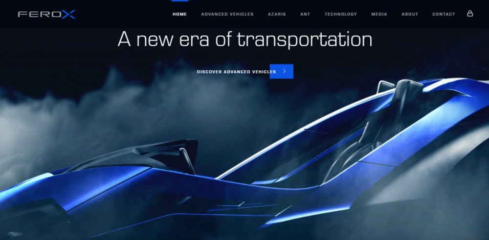
One more automobile website design that reminds us that the future is now, and it’s marvelous. The company develops next-generation vehicles, and the website reflects their philosophy to a T!
The website features incredible 3D illustrations worth a Hollywood sci-fi movie. Dark textured backgrounds make all the fine details pop.
Hammond Auto Repair Website
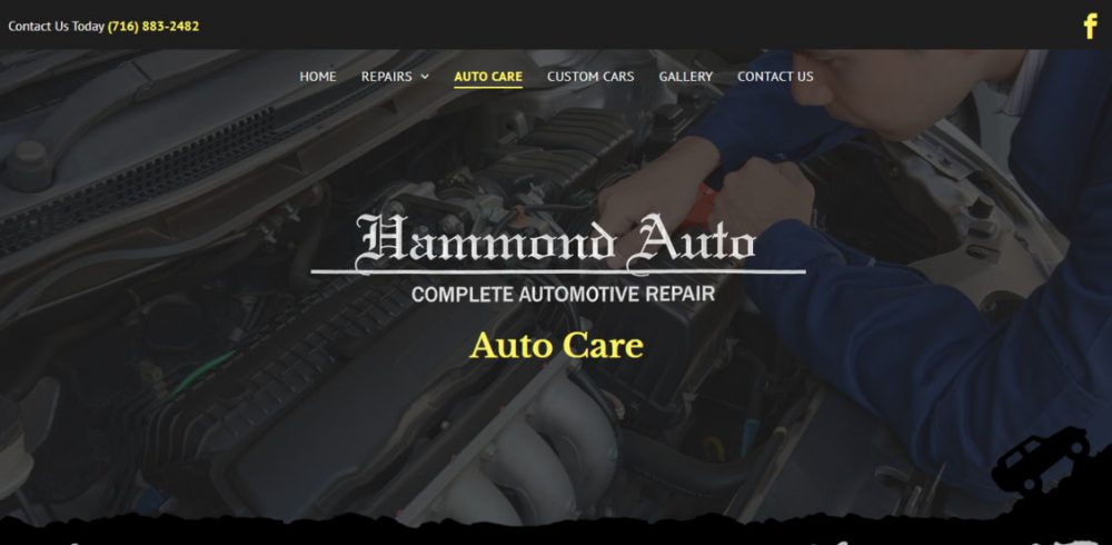
source: https://www.hammondautorepair.com/
You can tell that this automotive repair website was made with love. It does not boast trendy eye-popping colors, sophisticated grids, or complex animations.
What it does have, however, is a personality. A very simple layout that is essentially a sequence of full-width blocks, with all the necessary information upfront. For the backgrounds, they use high-quality photos of the crew members doing their job.
The Mechanic Spot: automobile website design
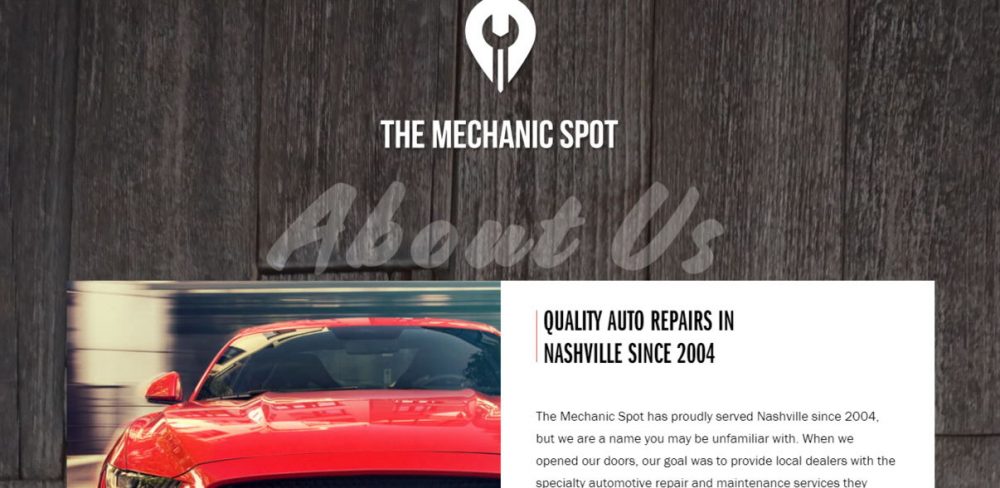
source: https://themechanicspot.com/
A family-owned auto repair firm turned the website into a virtual expansion of an actual office by matching website design to its interior. The front page has a lot going on – different typefaces, grids, block types. Although, this rather creates a warm, non-corporate impression. And thanks to clear and well-thought site structure, it’s easy to navigate.
Lackiererei Cankaya
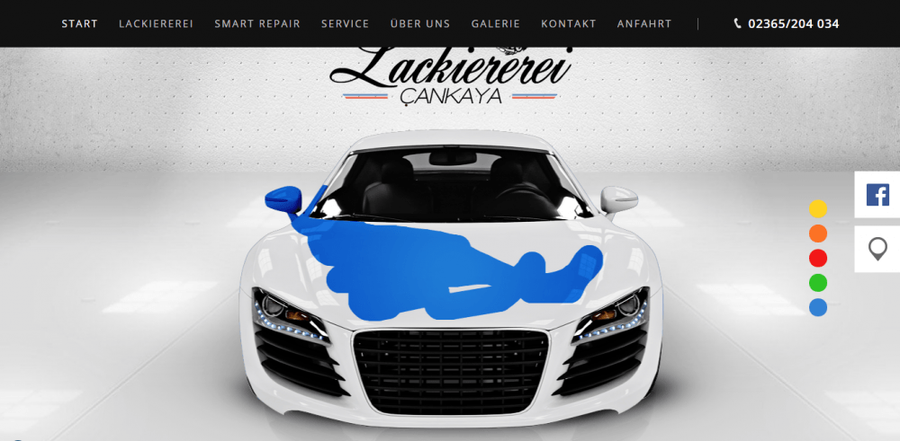
source: https://www.lackiererei-cankaya.de/
This German auto repair website could be called just an example of solid quality design, if not for one little thing that makes it amusing. The front page header image is actually interactive – you can spray paint a white car in one of five colors.
Autoklinika: automotive website design
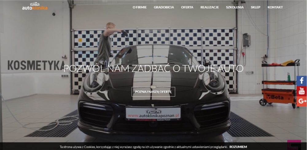
source: https://autoklinikapoznan.pl/
A Polish auto repair and maintenance website awes the visitor with a stunning video sequence right out of the gate. The crisp, vivid images serve as the backgrounds for the content blocks. A smooth parallax effect only adds to a pleasant user experience.
Automotive website design tips
- Shorten the path from the front page to the product. The fewer steps it takes for a visitor to see the car models available with all the detailed specs, the better. Putting a product upfront is always a good idea when it comes to website design.
- Consider using trendy mega dropdown menus. Note how the Lexus lists their car models (each with a photo included!) right in the main navigation menu. You will have to make literally a single click to check a model of your interest. Isn’t this neat?
- Don’t be shy to use visual content generously. The Lamborghini website front page is so visually rich that it resembles Google image search results. Vibrant imagery and videos work great for displaying one of the most expensive car models in each gorgeous detail.
- Keep a website structure clear and simple. A user simply leaves a website if its navigation is a maze they have to solve. Take a peek at the automotive websites of such automobile industry giants as Mercedes Benz, Mitsubishi, or Chrysler to see how well-structured they are!
- If you operate on a bigger scale, consider creating several microsites or local websites instead of a single global ponderous website. This approach is used by Volkswagen, Hyundai, and Volvo, among others.
Wrap Up
These were just a few tricks and ideas from the vast arsenal that you can use to achieve a website that will drive your automotive business to the next level.
If you’re looking for a professionally looking website that you could maintain without hassle, Weblium website builder may be just the right choice for you.


