20 Best Author Websites: Inspiring Examples of 2026
Creating an author website and building a strong online presence can play a key role for anyone who wants to present themselves as an author, find their audience, communicate with readers, and build a recognizable personal brand.
In this article, I’ve put together a selection of some of the best author website examples — focusing on ideas, design, execution, and content quality. I recommend reading it from beginning to end, as I go beyond a simple showcase. I share my perspective on what works, what doesn’t, and why, based on patterns I’ve noticed across different author websites.
Contents
Veronica Roth
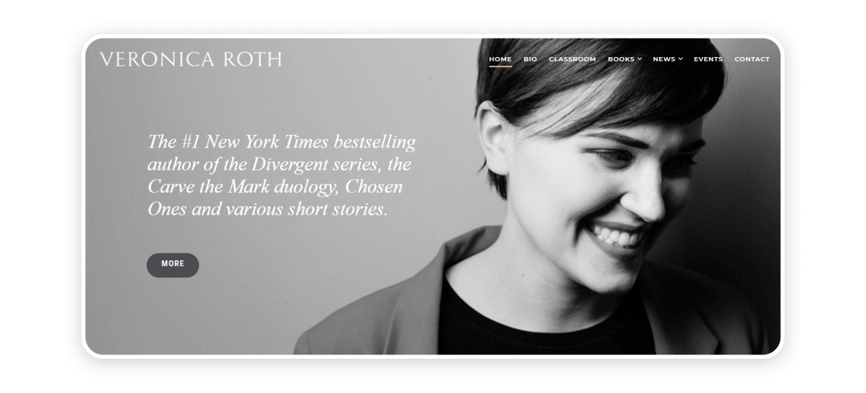
When I explore Veronica Roth’s website, I see how thoughtfully it’s organized to showcase her work. She gained prominence with the film adaptations of her Divergent series, and her homepage immediately guides visitors through the site’s sections. From there, I can experience her creative style, follow her career, receive updates, and reach out directly.
What I find especially effective is the site’s balance of dynamic and static visual content. It keeps things interesting without being overwhelming, and the clean, simple design lets the information stand out. At the same time, it subtly acknowledges the role of the movie adaptations in her success, adding context and depth to her story.
J. K. Rowling
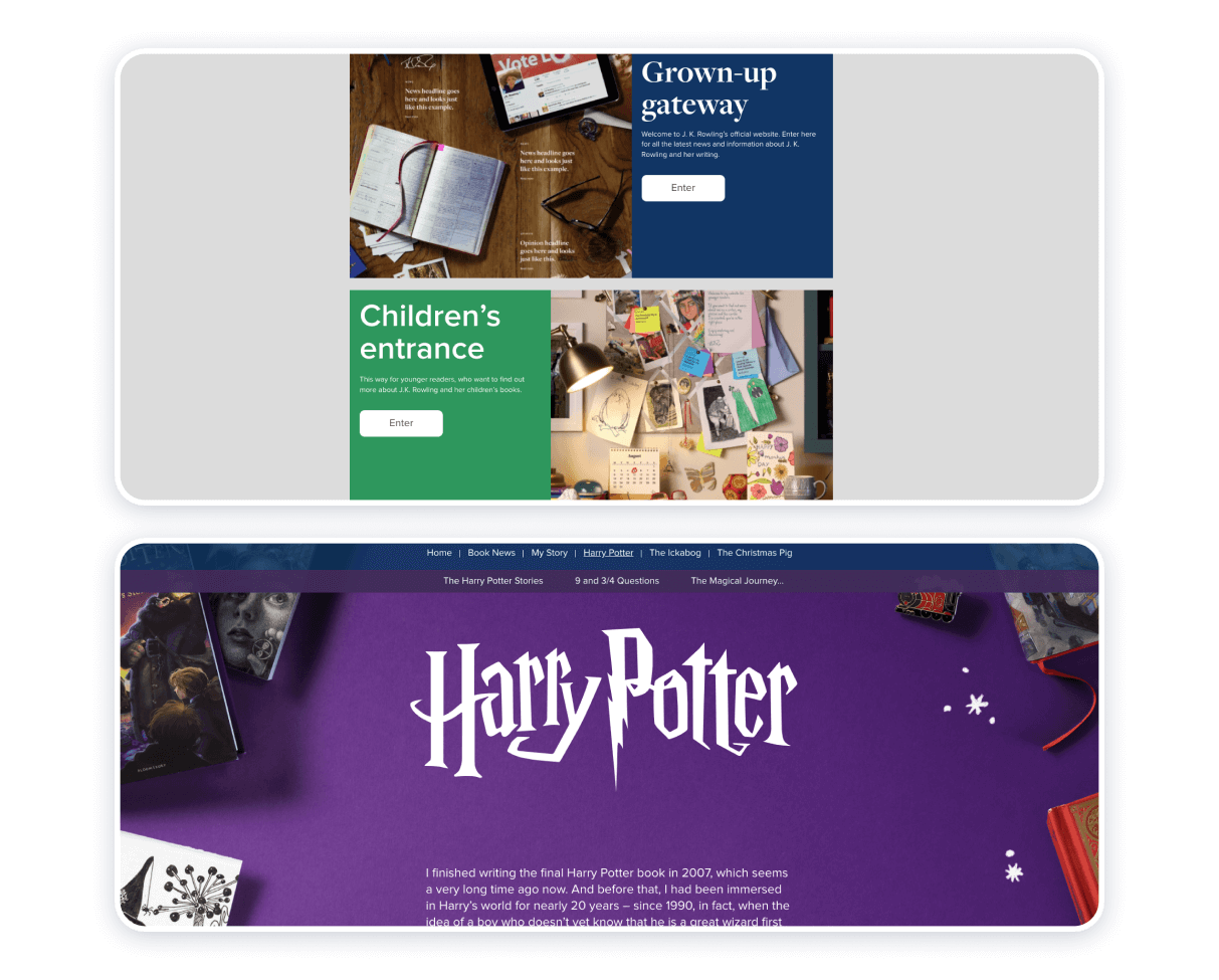
When I explore J.K. Rowling’s website, I notice how thoughtfully it’s designed for different audiences. Today’s younger generations might owe their love of reading and fantasy in part to her work, yet the site doesn’t assume everyone needs an introduction. Rowling uses discretion effectively, positioning herself for both children and adult readers without overwhelming readers with details about her career or publishing journey. As one of the most successful authors of our time, she keeps the focus on her books, nothing more, nothing less.
I really appreciate how the site separates the experience for adults and children. The adult section highlights her writings for adult readers, while the children’s section opens a world of magic, mystery, celebration, and hope—the kind of comfort and light we all seek. Both sections are rich in detail, offering a glimpse into what her workspace might look like and creating a sense of connection with her as a person. The children’s version is brighter and more colorful, while the adult version is more restrained; both are intuitive to navigate.
What I find most impressive is how the design, content, and structure work together to give me a clear sense of Rowling’s personality, style, and approach to writing.
Stephen King
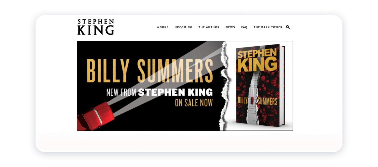
Contrary to Stephen King’s reputation as a master of fright, a founder and proponent of the horror genre, the writer’s website is an epitome of homogeneousness, neatness, and informativity. There are two major focal points on the author’s homepage: Billy Summers and Firestarter, the latest of the horror king’s compositions. The website honors Mr. King’s magnum opus written thus far, The Dark Tower series. White, black, crimson, yellow, and brick colors work well together, providing insight into the author’s genre of choice, working methodology, and artistic tastes. The website is up-to-date and provides two-way and effective communication between the author and his audience.
David Sedaris
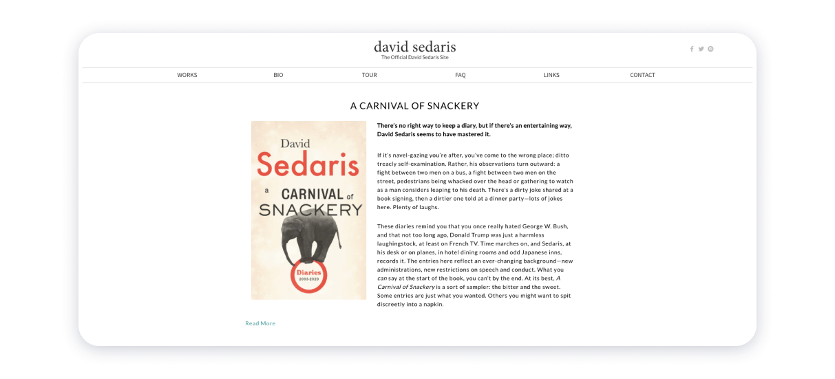
Design-wise, black readable font against a white background is nearly always a winning combination. David Sedaris’s website illustrates the appeal and effectiveness of that particular approach to design. By making his writings a centerpiece of the source, the author allows his work to speak for itself. The interface of the website is understandable. Therefore, the website itself is easy to navigate. The landing page’s header contains icons that will lead you directly to the writer’s social media accounts. The sections of the website, laid out horizontally and strategically placed, invite a visitor to explore the resource and look for the information they may require to immerse themselves in the creative mind and works of David Sedaris.
The landing page is, basically, dedicated to the author’s latest composition, A Carnival of Snackery. Books are definitely the website’s focal point, emphasizing the website owner’s expertise. On the right-hand side of the home page is a list of events for the writer’s followers to make an informed decision and as quickly as possible about whether or not they should go and meet the writer himself in person. At the footer of the home page, there is a contact form that allows you to subscribe to newsletters from the author and instantly receive updates on his tour dates, writing, and, essentially, everything pertinent to his life’s work.
Emma Cline
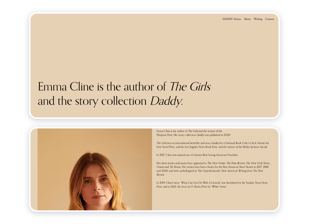
This book author’s website is intended to send an explicit message about who she is in a straightforward yet candid manner. The beige color symbolizes minimalism, rigidness, and femininity. The color palette is a unifying element, bringing all the elements of the sources together. The website is totally compatible with the “nothing in excess” maxim. Still, it provides sufficient detail to introduce the author, her disposition, and her style.
The resourse is a new author website. It is also up-to-date, based on the information in the news section. Still, the only noticeable flaw in this particular author website example is that you may not be able to evaluate the resource’s credibility adequately.
Antoine Choley
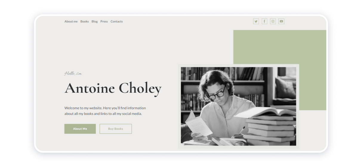
Built on the Weblium platform, the source is the epitome of elegance, expression, temperance, and convenience. The webpage for Antoine Choley is carefully planned and thorough. By appealing directly to the audience, the author seeks a more meaningful connection to his audience. By specifying his area of expertise, the writer establishes and maintains his reputation as a professional. By sticking with a monochromatic color palette, the author managed to keep the visitor’s attention on the message he communicates through words. Consequently, the website appears versatile and clean at the same time.
If you’re aiming for a similar look and structure, Weblium’s ready-made author and personal website templates make it much easier to recreate this kind of experience. They already follow the same principles of balance, clarity, and focus — so you can adapt the layout, refine the content, and build a polished author website without starting from scratch.
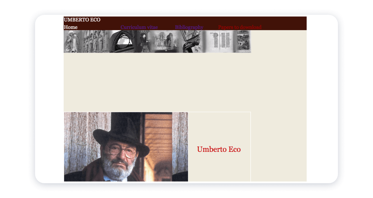
The website is dedicated to Umberto Eco, his writings, career, and life paths. On the plus side, the website is formidable in terms of the fluency of presentation of information. The author’s website is unprecedentedly easy to navigate, so much so that it is possible to describe it at some point as overly simplistic for a writer of Eco’s level of sophistication and intellect. This website for an author is an example of a tribute to a creator who is now passed on and an attempt to preserve his legacy. Overall, the author website is a go-to resource primarily to those interested in a thorough study of Umberto Eco’s biography and bibliography.
Neil Gaiman
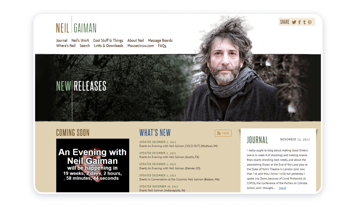
This author’s website is another example of how fiction writers’ websites help create a brand and mirror the artistic identities and personalities of authors themselves. Neil Gaiman’s works imbue with action, arcane knowledge, Gothic aesthetics, and subdued humor. The author website at hand encapsulates all that.
The source harmoniously incorporates the author’s journal to make it easier for his followers to keep track of his artistic pursuits, plans, intentions, and deeds. The source is convenient and easy to navigate. The harmonious combination of colors, soft textures, and readable font is the basis of the source’s appeal. Dark colors mimic a Gothic vibe of Neil Gaiman’s background, whereas the white background offsets that effect, introducing even more harmony and coherence to the author’s website.
Paula Hawkins
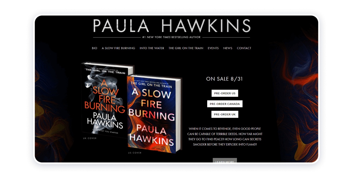
This is another author website example that entices visitors to keep their attention on the author’s works. The abstract background is inspired by the design of the books’ covers, which again epitomizes the strategy of letting the writer’s work speak for itself. The author’s home page is easy to navigate, offering a foothold into different kinds of information the author’s supporters might need to keep track of her work. The panel with the headings leading a visitor to the different sections of the website guaranteeing the visitor themselves a seamless and exhilarating experience exploring the author’s website.
John Grisham

The first time you enter John Grisham’s website, a pop-up window opens, offering you a free newsletter subscription so that you can stay in touch with the author and receive updates from him. The bold statement reads Mr. Grisham is “America’s favorite storyteller.” The books, bio, and event & updates section is an opportunity for getting a birds-eye view of the author’s career, work, and creative approach.
The writer positions himself as socially responsible by making the interface adaptable to the needs of users with disabilities. The resource places emphasis on the books and, at the same time, offers the readers planet of ways to connect with the author.
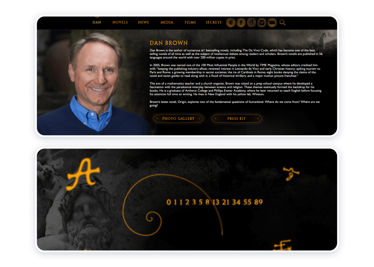
This author’s page is, essentially, dedicated to his books. The header advertises the film adaptation of Mr. Brown’s composition, The Lost Symbol. The website advertises the author’s account on social networking platforms. The resource is imbued with the author’s fascination with the occult. The images of Mr. Brown’s book covers look really regal against the dark background.
The author website is a go-to place for the people seeking an insight into the workings of Mr. Brown’s creative mind. The design decisions appear smart and exhibit the website builder’s competence in color psychology. The source concerned tantalizes the visitors, compelling them to continue browsing through it.
E. L. James
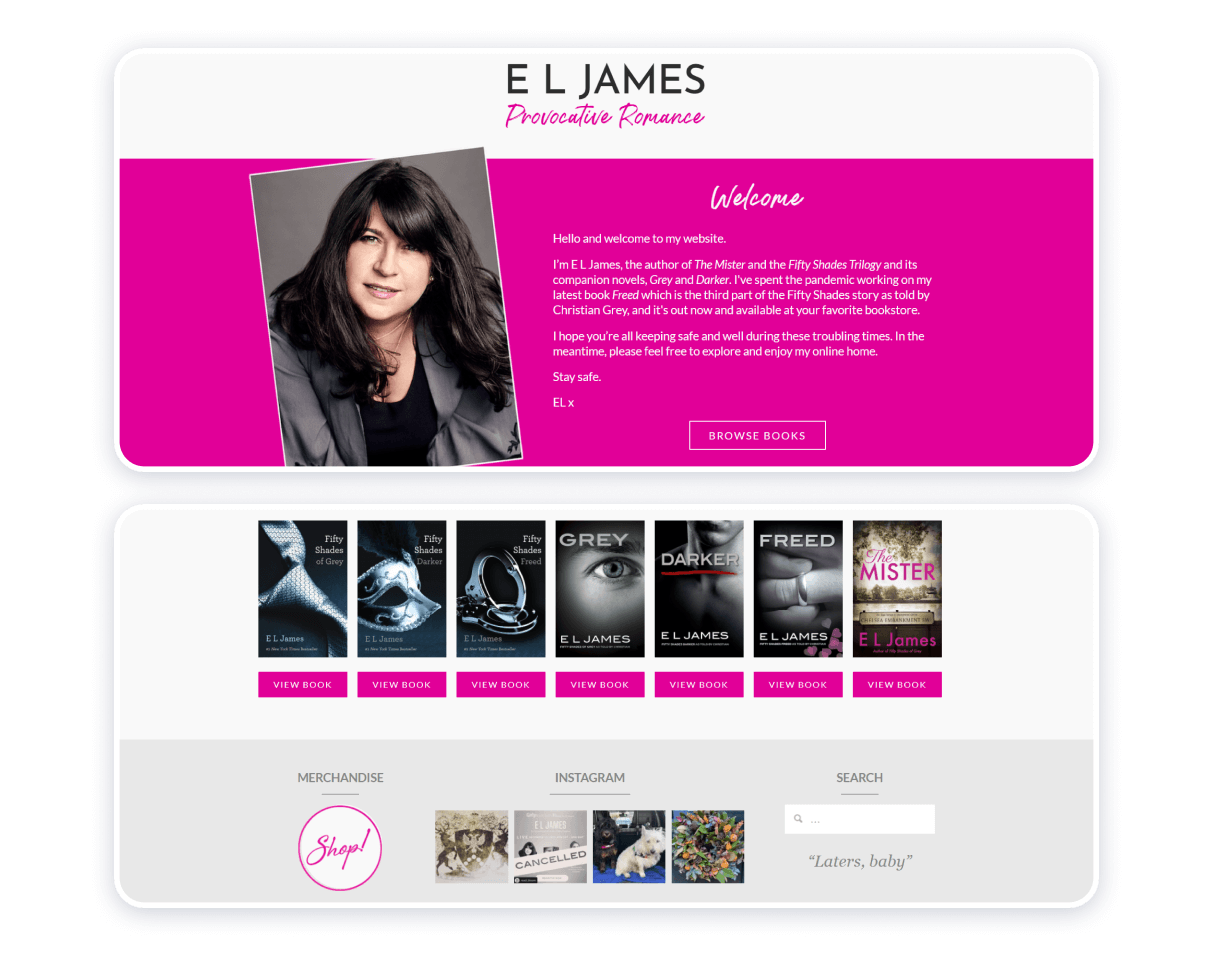
The statement on the official website for E. L. James claims she is the author of the provocative novels. Madam James is the one to produce the Fifty Shades series. White and pink colors appear to typify femininity. There is plenty of velocity in the photo portrait integrated into the author’s homepage. As much as the resource as a whole, the portrait itself is an epitome of feminine energy.
The footer of the page is:
a) an icon that will forward you to an online store to purchase branded items;
b) a layout of four latest images from the author’s Instagram page;
c) a search icon.
Even though the author homepage makes the whole website easy to navigate, pink, blue, and grey tones, while the white background offsets them nicely, appear still too emotionally charged.
Amy Krouse Rosenthal
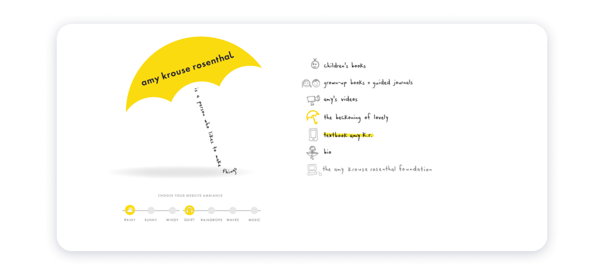
A website for author Amy Rosenthal encompasses a creative approach in terms of design solutions. The website’s calligram-inspired appearance resembles a page in the copy of a collection of French Symbolist poetry. Sketchy icons seem overly simplistic but exceptionally endearing at the same time. Yellow, grey, and black colors work well against the white background, serving as a personification of optimism, resilience, and vital energy.
The option of picking a musical accompaniment offers a visitor a more personalized user experience and, hence, an opportunity to connect with the author herself on a deeper and more meaningful level. A respectful attitude toward privacy characterizes the author as virtuous. The author’s online presence builds itself on the notions of creative expression and temperance.
Lewis Carroll
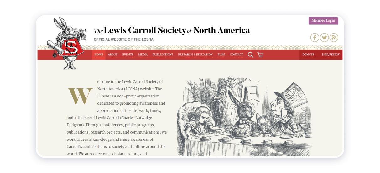
The website under consideration is Lewis Carroll Society of North America’s official source to rediscover the author it is designed to celebrate. The harmonious integration of John Tenniel’s illustrations adds a bit of a vintage vibe and a painterly look to the author’s page. Pastel background makes the monochromatic and sepia images coalesce. The home page introduces Lewis Carroll Society of North America, the author himself, Charles Ludwig Dodgson, also known as Lewis Carroll, and fundamental details about his life’s works, Alice’s Adventures in Wonderland and Alice. Through the Looking-Glass. Despite an intelligible and effortless navigation mechanism, the resource is an exceedingly sophisticated and extensive source.
Brené Brown
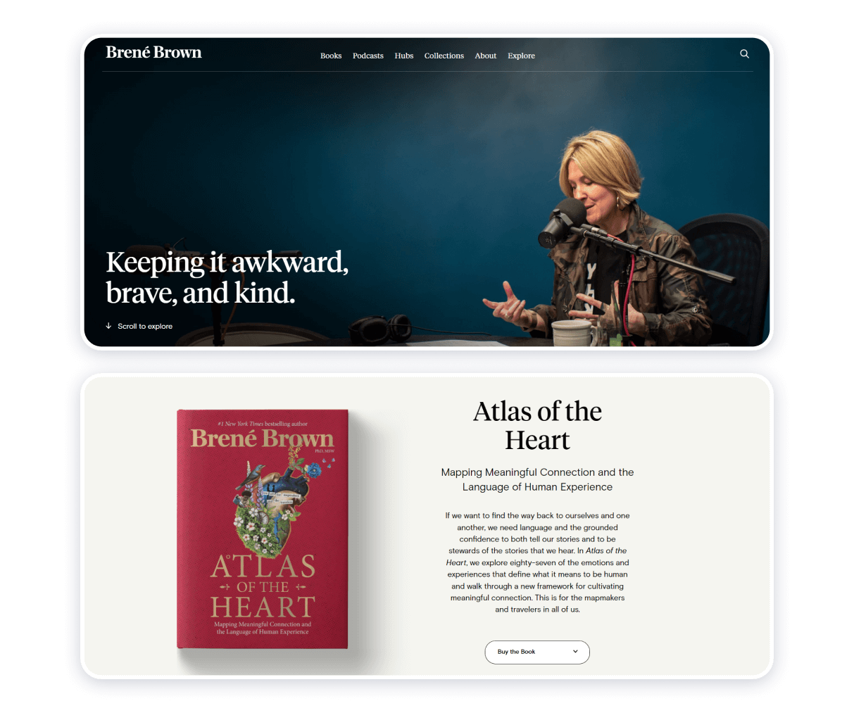
As you will be exploring Madam Brown’s website, you will most certainly notice the horizontal panel with the titles of the author website’s sections: ‘Books,’ ‘Podcasts,’ ‘Hubs,’ ‘Collections,’ ‘About,’ and ‘Explore.’ As your cursor will be hovering over each of the words arranged in a horizontal line, a drop-down menu will appear, offering you a detailed map and an insight into the significant aspects of the Madam Brown’s personality and work as a non-fiction author, psychology and philosophy expert.
Deep and vibrant colors of the background image at the header of the home page that portrays the author herself contrast with the white background of the rest of the page. The fluent shift between dark- and light-colored fonts enhance the source’s readability. The symmetry of shapes, textures, and, most importantly, colors shape the basis of the resource’s appeal. All in all, the author’s page is credible, up-to-date, and easy to navigate.
Jo Nesbo
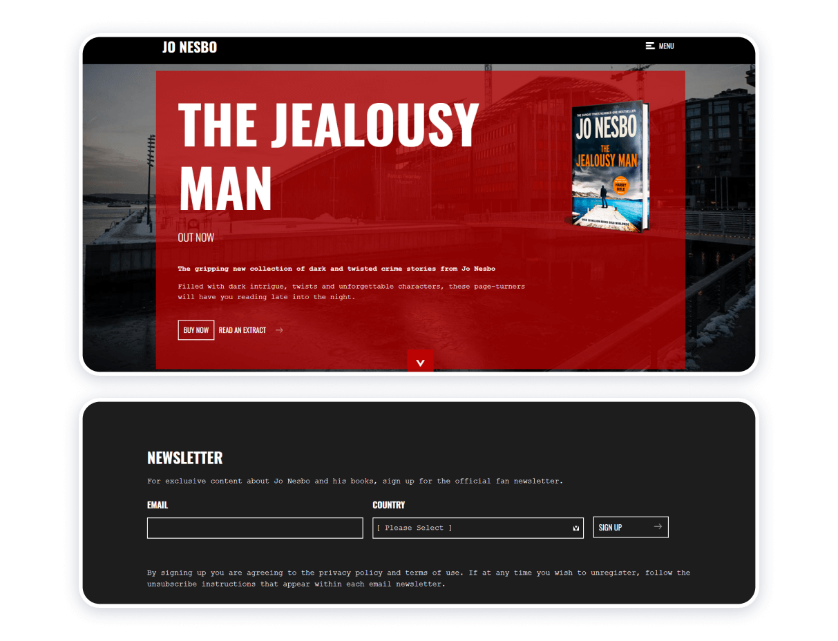
Design-wise, this resource is a tribute to a genre that has helped Jo Nesbo on his way to praise, fame, and recognition. Nesbo is a highly-regarded detective stories writer. A dark-themed website is interspersed with saturated images picturing either the books or the author himself. The centerpiece of the author’s home page is his recent composition, The Jealousy Man. The photograph of a book is placed against a field of translucent crimson cover, which, in turn, overlays another photograph depicting a construction site in a high-contrast scene.
The contrast between light and dark colors, hues, and shades builds the suspense effect. Thus, the author’s online presence establishes his creative identity. The harmonious integration of the newsletter subscription form, news and updates section, and the author’s most recent posts on Facebook facilitates communication between the author and his audience.
Stephenie Meyer
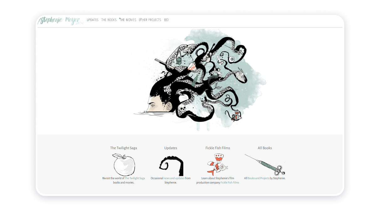
A website for Stephenie Meyer is minimalistic, ingenious, and convenient. Distinct fonts and artwork add an authentic look to the source and make it stand out from other websites and web pages in its category. Light-green color represents seafoam and harmoniously complements red, grey, white, and black. The artwork at the header of the homepage works as an attention-grabber. The resource will help you keep track of the author’s professional pursuits and assist you in the business of exploring the world of creations. Seamless navigation makes the experience of browsing through the author’s webpage even more captivating.
Jojo Moyes
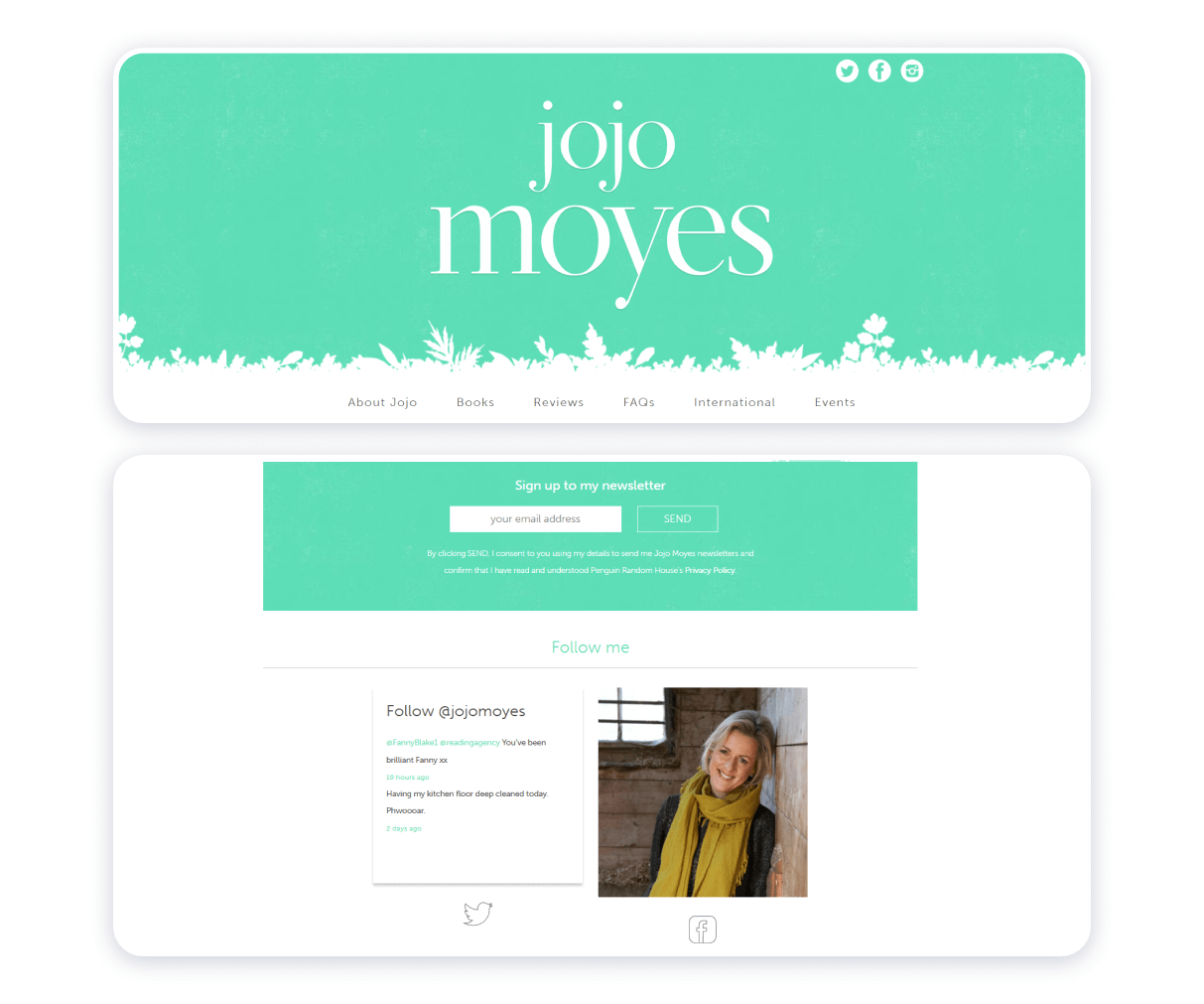
Building only on a quick glance at Jojo Moyes’s webpage, the two features of the resource stand out. The author effectively integrates the links to her social media accounts and, in doing so, adopts a more systemic approach to establishing a solid online presence. The use of personal pronouns creates the effect of appealing directly to Moyes’s website visitors. Mint color makes the source visually appealing. Non-aggressive call to action is strategically placed and invites the visitors to sign up for newsletters and follow the author’s official accounts on Twitter and Facebook. The website is credible and up-to-date.
Emily Martin
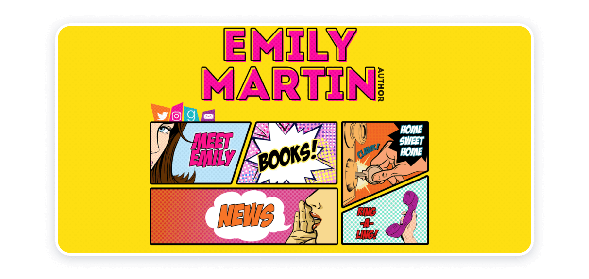
This particular resource is a great author website example in terms of form and content. On the one hand, it is explicit, colorful, bright, and memorable. On the other hand, it offers insight into the author’s artistic self. Apparently, the artist is fond of pop art, which speaks volumes. Another distinctive quality of the resource is that it integrates the link to the account for Emily Martin on Goodreads. Although the website is static, drawing inspiration from comic books when making design-pertinent solutions endows the website itself with inexplicable vibrancy and velocity.
Matt Kindt
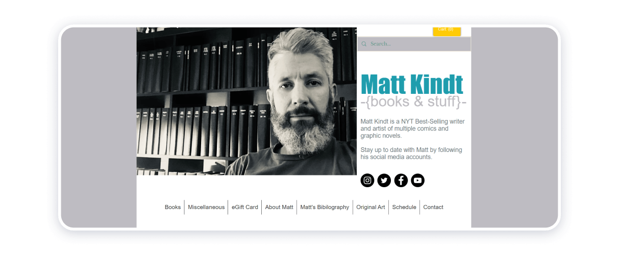
Online store templates can work for author websites and Matt Kindt’s website. The design is plain and comprehensible, inviting the visitor to keep fixating on the artist’s purpose (what he is trying to accomplish) and the message he wishes to communicate to the world through his work. On the downside, the link to explore Kindt’s artworks seems not working properly. Other than that, the author’s page is brief and to the point.
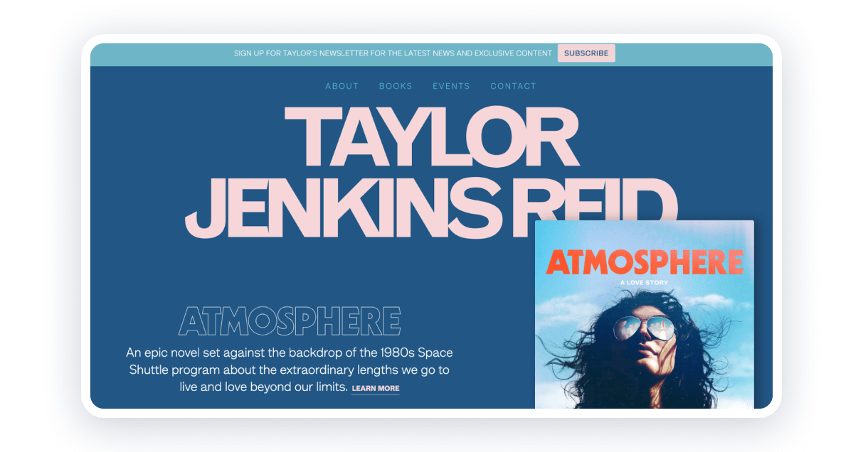
The web design uses bright and contrasting colors, but all elements together reflect the writer’s style and personal brand. There are pages like About, Books, and Events that allow users to know the author and his books better. The contact page includes a sign-up form for a subscription to receive news, updates, and exclusive content.
Each book has its own page with a description, video trailer, and reviews. Visitors can easily find the information and choose the work they are interested in. It is also convenient to buy the books. All links to the online stores are placed in the main section on the Homepage.
What should an author website include?
When I look at authors’ websites, I see how differently authors approach their online presence. There’s no single formula for building an effective author website, as what works perfectly for one writer may not work at all for another.
From my perspective, the strongest author websites communicate the author’s intent and mission clearly yet subtly. They stay clean and uncluttered, inviting visitors to explore the site step by step rather than overwhelming them. A professional, authentic design combined with high-quality content is what truly helps attract attention, generate interest, and make an author’s brand easier to discover.
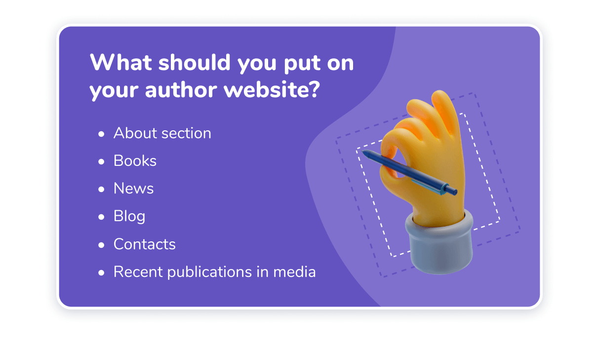
Once properly organized and carefully planned, these blocks would offer your followers (the visitors of your website) a substantial amount of information about you as an author. Just be honest, be inventive, give yourself time to evolve, and let your supporters see the work you have done on yourself.
Conclusion
Writing is challenging. However, it does not mean that you cannot enjoy the process. So is building a website. Should you decide to build yourself an author’s website, chances are you may feel overwhelmed at some point. Do not let it discourage you because nowadays, there are so many ways for you to create a website by yourself, even if you have no experience in programming.
Weblium can become your devoted companion should you decide to get through with a plan to go online. Weblium can take care of all technical aspects that come with the task of putting up a website, allowing you to invest the efforts necessary to express your creative self.
