20 Inspiring Conference Website Examples in 2026
Planning to host a memorable conference? It all begins with effective engagement — presenting your program, sharing essential details, and enabling seamless communication with your audience. A well-designed website is the perfect solution to achieve these goals.
Here’s some inspiration for your event! Discover the most interesting conference website examples that blend sleek design with powerful functionality to captivate attendees and simplify their participation. With the builder Weblium, you can make a modern website for your conference with beautiful layouts and registration forms in under an hour!
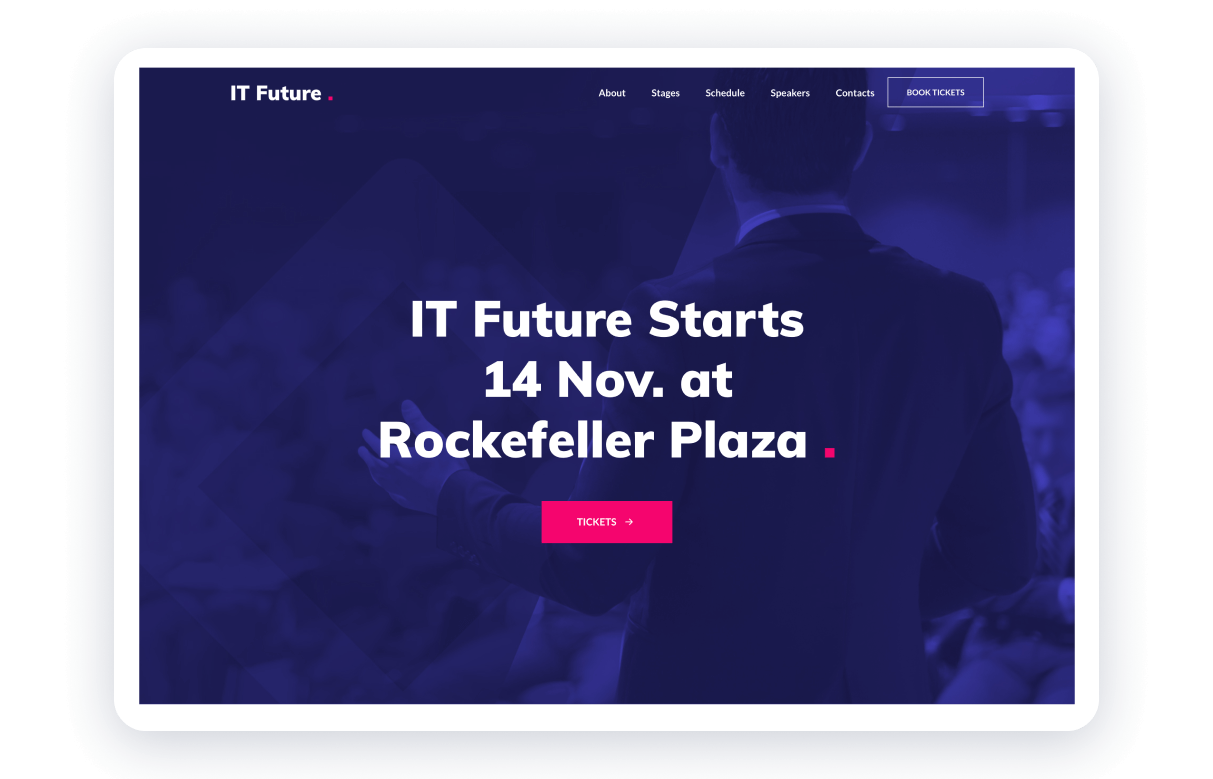
This template is a total win with its easy-to-use navigation, gorgeous color scheme, and layout that makes the website easier to browse. That’s the most incredible way to guide and gently encourage visitors to book tickets without being pushy.
Everything’s laid out perfectly — whether you’re checking out the conference’s purpose, agenda, or speakers, it’s all right there, easy to find, and stress-free. Even though it’s packed with info like programs, speaker details, and testimonials, it doesn’t feel overwhelming. Thanks to a smart layout, lists, titles, and icons, everything stays clear and organized.
The design is minimal, sticking to just a few main colors that really pop and highlight the important stuff. Plus, those action buttons? They’re placed so strategically that you can’t help but feel ready to grab your tickets the second inspiration strikes!
Customizing it is a piece of cake — just pick this template from the right category (or just click the button below), add your content, and you’re good to go. It’s perfect for putting together a professional conference website in no time.
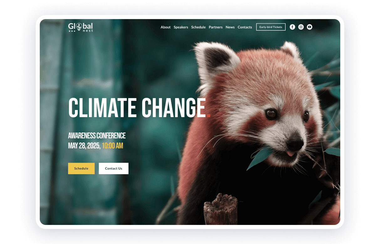
This template is perfect for scientific conferences, packing all the key details into an engaging layout. It nails the demonstration of the event’s focus, hot topics, and star speakers while keeping things interesting for everyone — specialists, students, or just curious attendees.
Each topic is served up with short but info-packed descriptions, jazzed up with numbers and visuals to make everything super easy to digest. Want to know more about the speakers? On Weblium, you can easily add social media links, giving the whole thing a personal vibe and hyping up their sessions.
The gallery section shows audience moments and event highlights to build that sense of community and get everyone excited. For ongoing communication, the template supports email subscriptions, enabling organizers to share updates about upcoming events or activities.
This user-friendly template is an excellent starting point for creating a scientific conference website — get started for free and customize it to your needs.
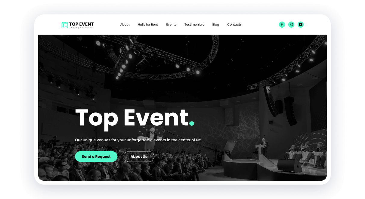
Let’s take a look at this template to promote your event venue! The design should do more than inform — it should evoke the atmosphere and make visitors feel the vibe. This template lets you align the design with your brand’s personality using matching colors, fonts, and slogans.
Here is a quick to-do list that we can learn from this design. Display key benefits with impactful messaging. Use high-quality images in galleries or sliders with zoom options to showcase your venue’s features in detail. Preempt client inquiries with a well-organized FAQ section addressing common questions.
To build trust, the template includes dedicated sections for partners, contact information, and a map, encouraging visitors to reach out confidently.
Launching your website is as simple as swapping out content and colors — perfect for creating a stunning online presence for your venue.
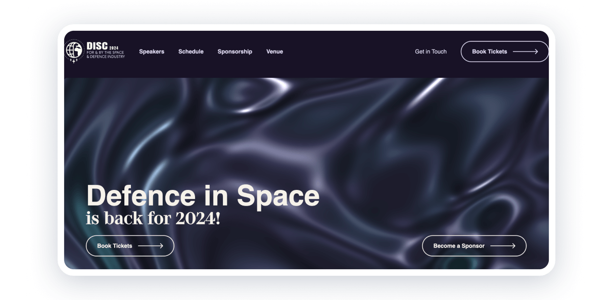
The Defence in Space Conference website nails a futuristic design that matches its focus on advanced technology and space defense. Right from the homepage, you’ll find key topics, expert speakers, and important sponsors, making it clear how significant this event is.
With an easy-to-navigate agenda and interactive registration tools, everything is simple to access. High-quality visuals, infographics, and colors make the website cohesive and ultra-modern.
The header includes only main sections to go, so visitors can quickly book tickets or find the venue of the event. All conference websites need to have a well-made header and footer with pages, sections, and main buttons.
UITP Summit
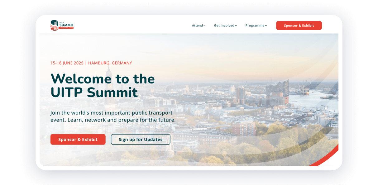
The UITP Summit website blends modern design with in-depth content to showcase sustainable urban mobility solutions. Its clean layout and interactive features make it simple for users to check out the program and how to attend.
Dynamic visuals of Hamburg, the host city, set an inviting tone, while the easy-to-use navigation lets attendees quickly find registration and accommodation info.
Bet you find the accent color here and understand how to use it for your marketing purposes! Here’s a great example of using orange buttons to attract potential attendees.
RSA Conference
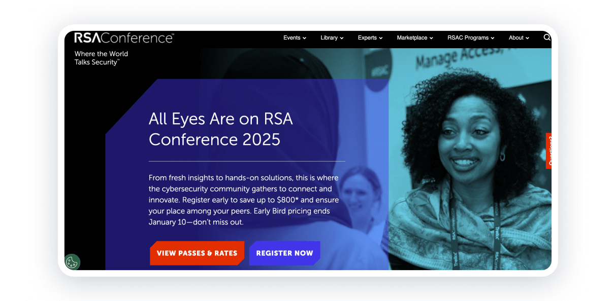
The RSA website gives innovative vibes with a black background and two opposite colors for buttons. The conference website design is easy to navigate, with all the key info — session topics, keynote speakers, and exhibitor details — right at your fingertips.
Interactive tools like agenda customization and on-demand resources keep users engaged, while smartly placed CTAs make the registration process smooth and hassle-free.
It is one of the conference website examples with the search feature, which is a good choice for large websites if there are a lot of various details.
i-Con
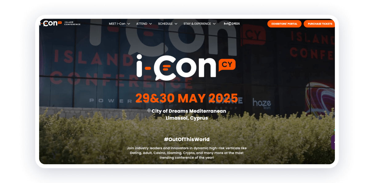
This website presents the event called The Island Conference (i-Con). It takes place on the island, so the design offers relaxing vibes while keeping in mind professional networking. The vibrant colors and visuals also reflect the location. Engaging CTAs and bright buttons invite attendees to explore schedules, speakers, and staying details easily.
The simple booking system makes planning much clearer. There are two kinds of tickets, both with three various options: first wave, early birds, and normal price. It is the key to making attendees book them as soon as possible!
Health 2.0 Conference
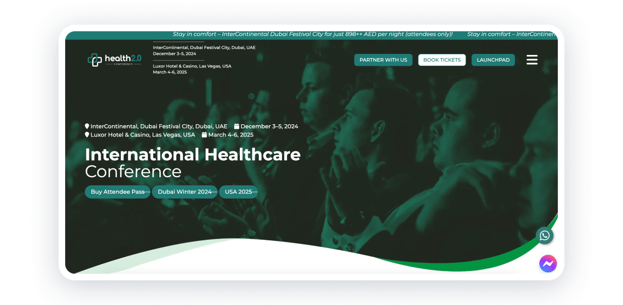
The Health 2.0 Conference website is tailored for healthcare professionals and innovators, with a clean and professional design that prioritizes functionality. If you have many points to share, like past events, agenda, themes, format, reviews, news, and even blog — you need to organize all of these into categories.
Interactive elements, registration forms, and live session previews encourage user engagement, while the overall aesthetic reflects a commitment to modern healthcare advancements.
User-friendly experience is based on the burger menu even on large screen devices, an option to connect via WhatsApp and Messenger, and a perfect green palette. The most professional conference websites should have a live chat or link to messengers, and you can easily connect it with website builder Weblium.
C2 Montréal
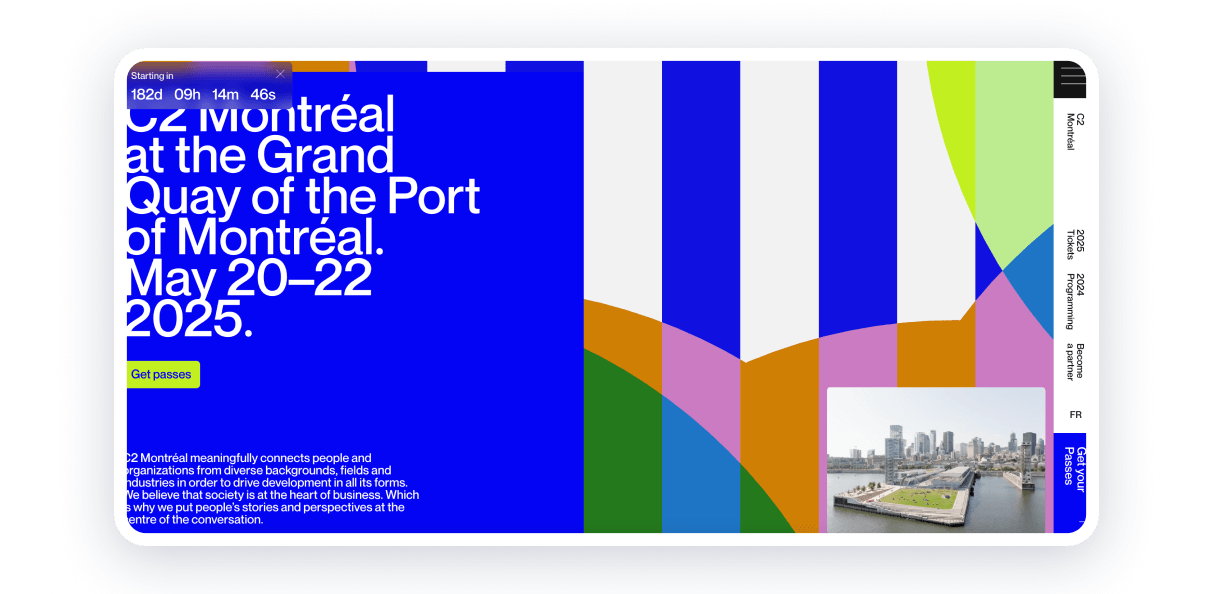
C2 Montréal’s website is pure creativity in action. With artistic layouts and eye-catching visuals, it’s as bold and innovative as the event itself. The combination of different colors and elements can be a mess sometimes, but not in this case.
Every detail — dynamic design, interactive tools — feels made to spark curiosity and keep you engaged. It’s a perfect match for an event that’s all about rethinking traditional business conferences.
This example shows how great conference website design can go beyond looking good — it can capture the spirit of an event and make the whole experience more interactive and fun.
Aspen Ideas Festival
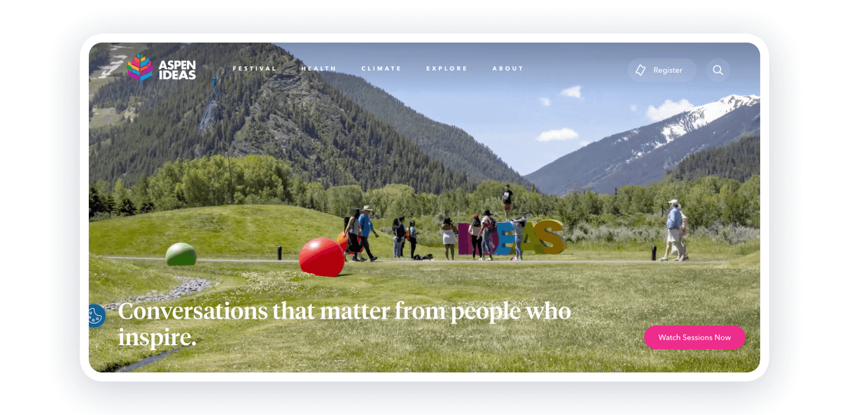
The Aspen Ideas Festival website brings the spirit of exploration to life with bold visuals and a focus on standout speakers. Choosing a white background when placing photos and colorful elements is a perfect solution not to be extra.
Everything’s laid out in a way that makes sense — whether you’re browsing sessions, signing up for events, or diving into the festival’s thought-provoking content, it’s all easy to navigate.
This website is a great example of how a clean, engaging design can draw in a wide audience and leave them feeling inspired.
Europe Fashion Summit
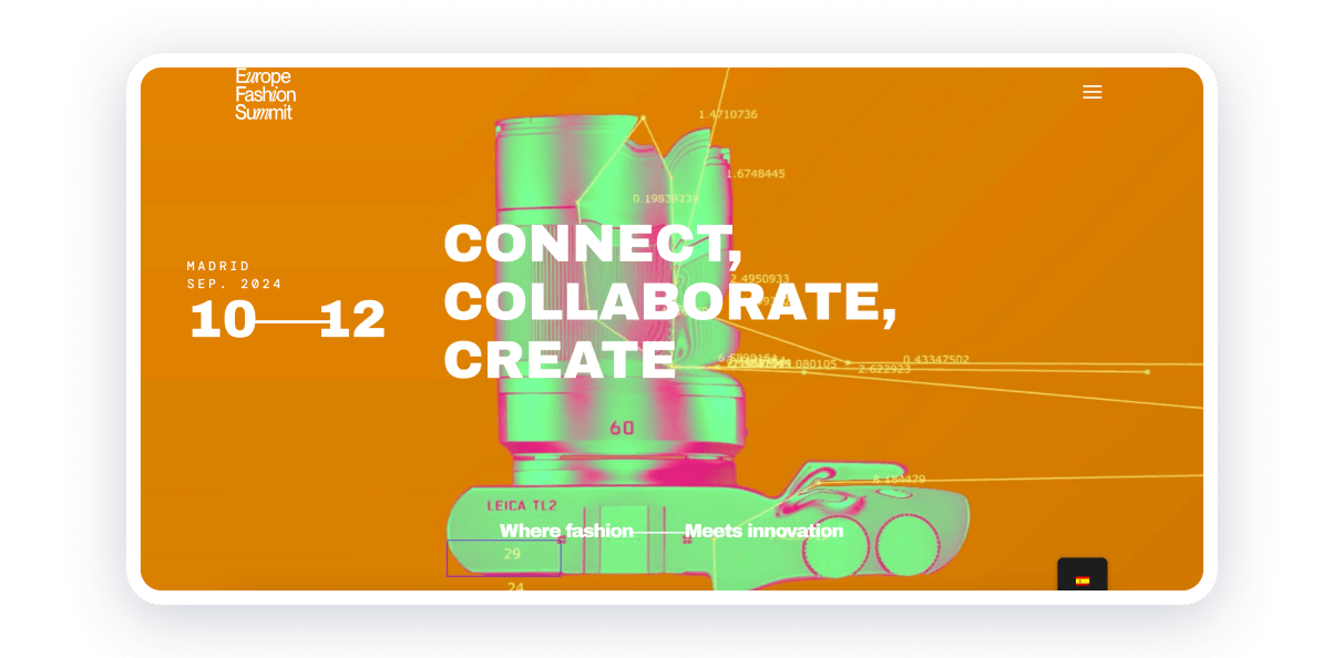
The Europe Fashion Summit website stands out with its colorful design, font match, and minimalistic navigation. Here is the recipe for how to catch visitor attention for each section: pick a specific background color (here are pink, purple, green, and orange), arrange them in a checkerboard pattern, and make text colors different too.
That’s cool they display all speakers’ photos in the same style and using grid markup. It gives the feeling of consistency and style. That’s what fashion website users need!
Visitors also have an opportunity to switch between languages, so if you need to present your event worldwide, you can do it, too. By the way, it’s possible in Weblium, which makes it a perfect solution for making the best conference website.
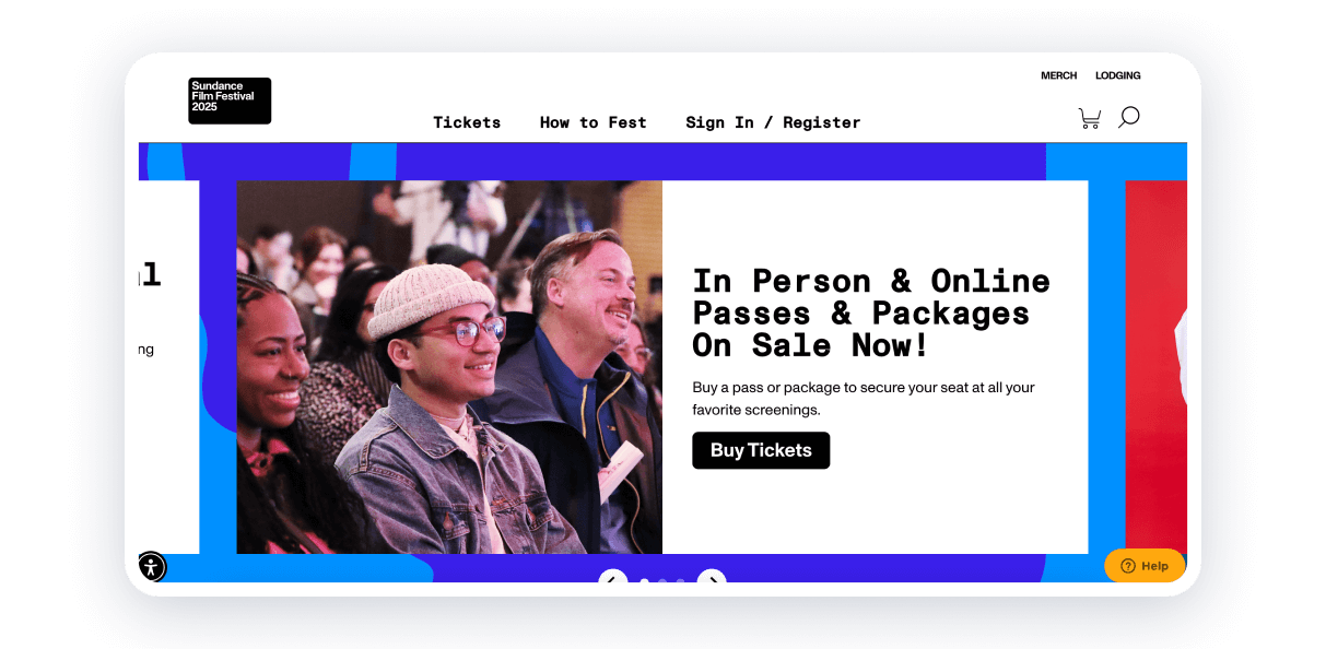
The Sundance website embraces a clean, modern design with bold typography, high-quality visuals, and a cohesive color palette. Your conference website can adopt a similar approach by choosing a visually striking yet harmonious template that reflects the essence of your event.
Use large, eye-catching banners or hero images that highlight key speakers, sessions, or themes, drawing users in as soon as they land on the conference page.
Sundance excels in storytelling, showcasing its films, creators, and events with passion. Your website can replicate this by dedicating sections to highlight the story behind your conference, its mission, and what attendees can expect. Use videos, testimonials, or quotes from past events to create a personal connection.
American Psychological Association Annual Convention
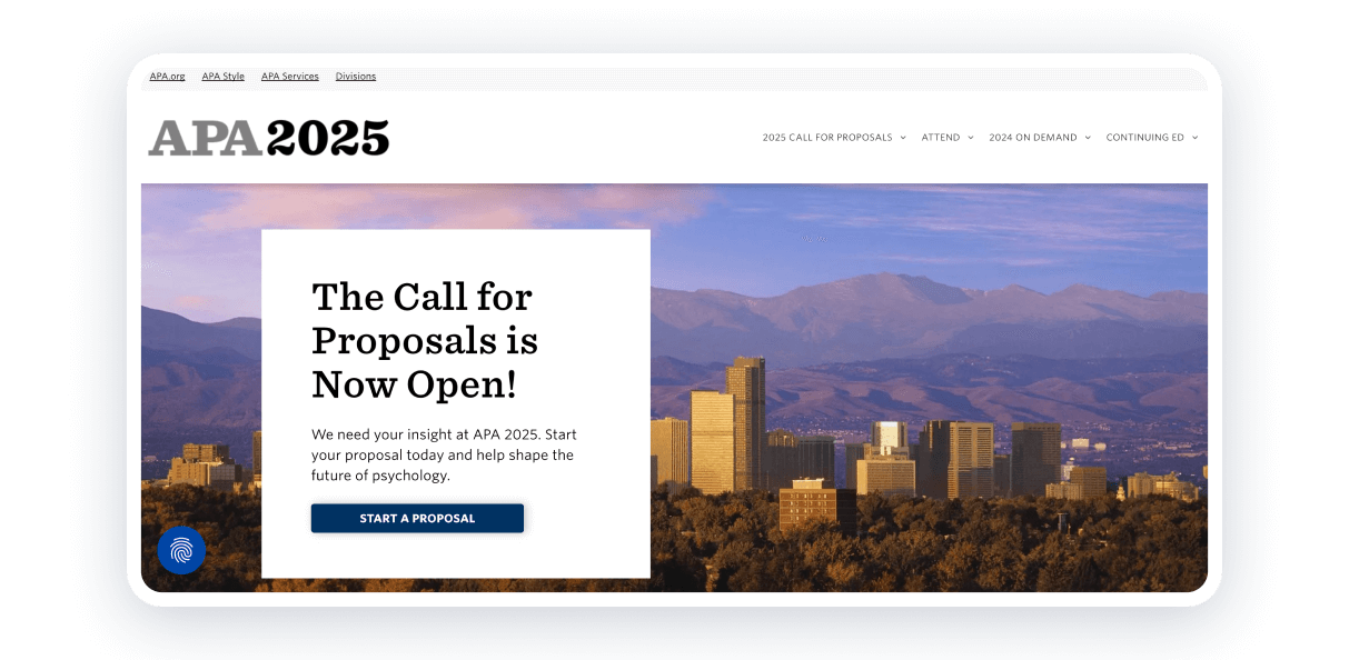
The APA convention website keeps it simple and professional, just right for its academic audience. The layout is all about delivering the important stuff — session details, poster presentations, and networking events — clearly and without fuss.
With a clean, easy-to-follow structure, you can quickly find everything from registration to speaker info without getting sidetracked.
This no-nonsense design really highlights the convention’s focus on knowledge-sharing and professional growth. The huge amount of information about the previous convention gives visitors trust and confidence, too.
World Architecture Festival
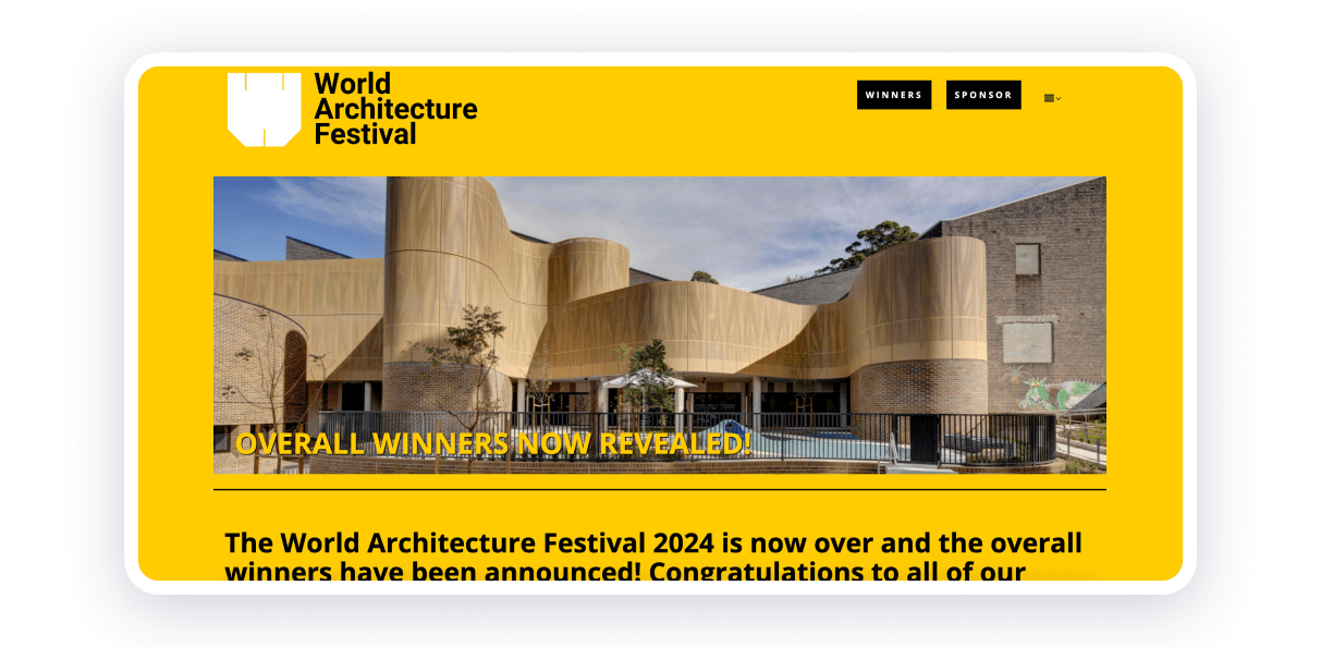
The WAF website showcases a minimalist yet powerful design. Your virtual conference website can reflect this approach by using a modern, structured layout with a consistent color scheme and font choice that mirrors the theme or industry of your event. High-resolution images or videos of past conferences, key moments, or appealing visuals can set the tone.
It’s cool that visitors can browse the winners of the last festival and their projects. The website encourages everyone to take part and register.
The design of this one of the conference website examples discloses that you can just choose the styles and content that will present your event goals and vibes.
European Food Summit
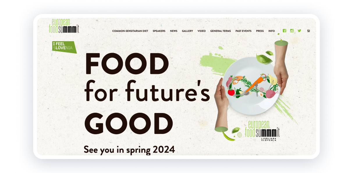
The European Food Summit website places a spotlight on culinary pioneers and their contributions. Similarly, your website can celebrate thought leaders, innovative ideas, or projects related to your conference theme.
Whether it’s showcasing culinary delights, moments from previous events, or your conference’s location, ensure that the visuals evoke the event’s atmosphere. Warm, earthy tones or vibrant, appetizing colors can complement the theme.
You can include a gallery or a feature section that highlights speakers, exhibitors, or awards. Last but not least, offer teaser content, like video interviews or articles, to build anticipation.
LAUNCH Music Conference
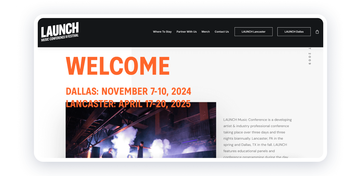
The LAUNCH Music Conference website captures the energy and creativity of the music industry with bold visuals and a vibrant design. Key features include detailed conference schedules, artist lineups, and ticketing options, all presented in an intuitive layout.
For musicians and industry professionals, the website offers clear information on the area, dinner, and even where to buy merch. The seamless navigation and call-to-action buttons make it easy for attendees to plan their experience.
This website strikes the perfect chord between visual appeal and practical usability, reflecting the dynamic spirit of the conference.
AI Health Summit
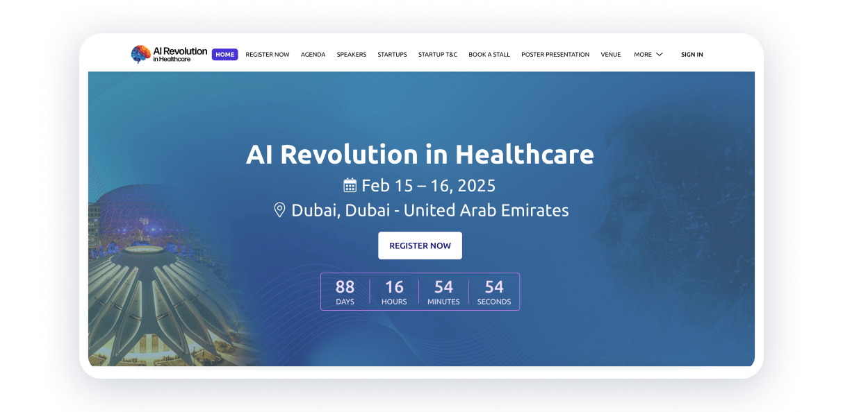
The AI Health Summit website showcases a modern, dynamic design that emphasizes the cutting-edge nature of the event. The website follows a minimalist approach, using plenty of white space, which helps highlight key information like event dates, speaker details, and registration links without overwhelming the user.
With high-quality images and videos related to AI and healthcare, the website immerses visitors in the futuristic nature of the summit. The conference website needs to ensure a seamless user experience, which can be made by placing registration, ticket purchase options, and a map strategically throughout the layout.
HRX
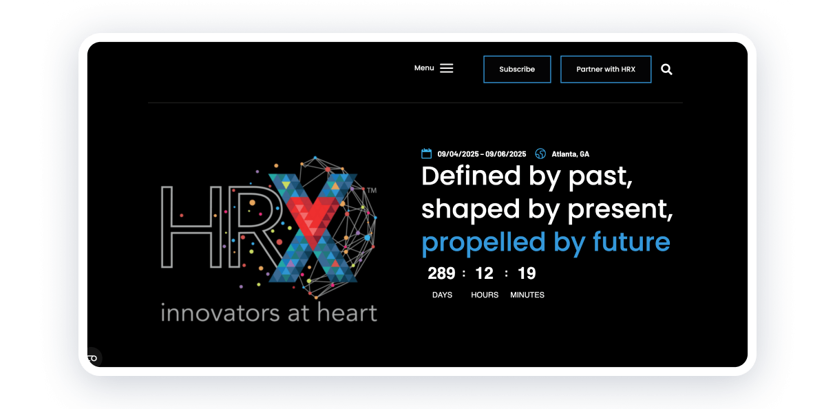
The HRX website features a clean and dynamic design with a strong focus on innovation and collaboration in healthcare. It emphasizes user engagement through interactive features, such as session suggestions, media recaps, and sponsorship opportunities.
The website also highlights key event details, such as seminar topics, meeting dates, and venues. This platform skillfully blends educational content with marketing opportunities, offering both professionals and sponsors a space to connect and share ideas.
A countdown right on the homepage creates excitement and urgency, letting users know how much time is left before an event, launch, or promotion. It’s a great way to encourage engagement and action, such as ticket purchases or registrations.
Creative Cruise
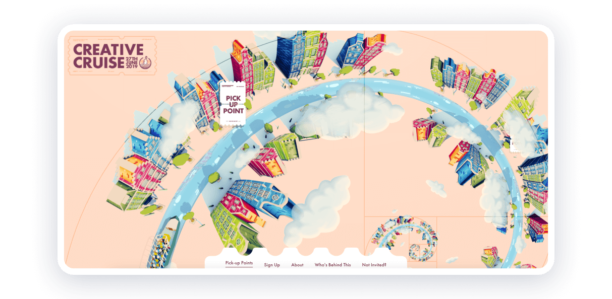
This artist networking event uses a modern design with a rotating cityscape that ties into the theme of the event. It employs the Fibonacci spiral to guide the layout, offering a unique interactive experience. The website’s simple yet effective menu and CTA buttons contribute to its success.
The layout typically uses a clean, open space with effective use of typography, often pairing elegant fonts with bold, contrasting colors that help direct attention to important information or calls to action.
The website employs interactive elements such as sliders and hover effects that enhance the users’ experience without overwhelming them.
International Publishers Congress
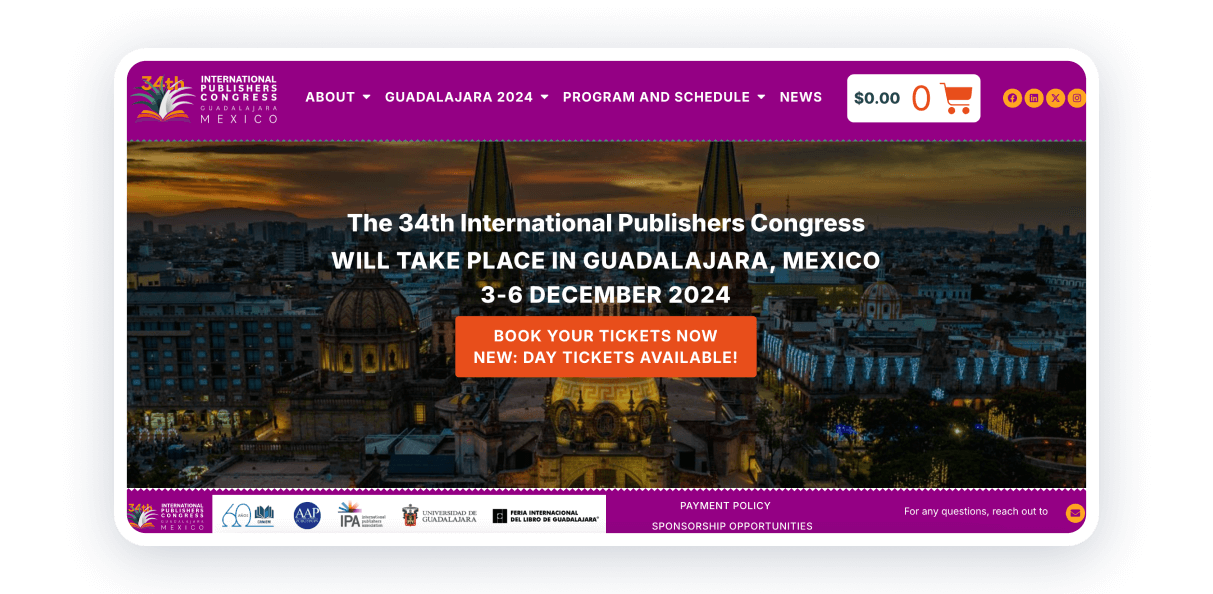
The website for the 34th International Publishers Congress effectively combines functionality and web design. A cart, social media icons, and news — all placed in the header for convenience.
The website features a straightforward layout with a top navigation menu, categorizing essential information such as the about, conference program, schedule, etc. This ensures ease of use for attendees seeking specific details.
The visitors can find information about transportation, accommodation, and regular fees. It helps them to plan every step and encourages them to register.
Summary
Hope you find some inspiration from these conference website examples! Creating a professional and engaging website is easy with Weblium. Whether you prefer starting with a customizable template or building from scratch, the website builder provides all the tools you need to bring your vision to life.
Take advantage of features like contact forms and a built-in CRM system to manage attendees seamlessly. The intuitive editor ensures you can have your website ready in no time — just a few clicks to personalize a template, and you’re set to go.
If you ever have questions, live chat support is available 24/7 to assist you every step of the way. Don’t wait — start creating your own conference website with Weblium today and make your event a success!
FAQ About Conference Websites
What is a conference website?
A conference website is an online platform designed to provide essential information about a conference or event. It typically includes details about the event’s agenda, speakers, location, ticketing, and registration. A good conference website serves as a hub for attendees, offering updates, resources, and tools to ensure a seamless experience before, during, and after the event.
How to make a website for a conference?
Creating a conference website can be simple with the right tools. First, choose a website builder like Weblium with templates specifically designed for conferences. Decide on sections and customize the design. Include contact forms, ticketing options, and social media links. Publish your website and share it via email, social media, and other channels to reach your target audience.
What makes a good conference website design?
A good conference website design focuses on user-friendly navigation, a professional layout with cohesive colors and high-quality visuals, clear call-to-actions (CTAs), and responsive design. It is important to highlight key details about the event, such as speaker profiles, session descriptions, and testimonials.
