11 Best Plumbing Website Designs of 2025
The word «plumbing» doesn’t connote with beautiful web design or high-end web-technologies. The reason is that too many plumbing companies run awfully designed sites that look like they were made in the 90s.
Well, times have changed. The competition is so high that even a plumbing website should look like a gem and work perfectly to get the customer’s attention.
We’ve made the list of 10 top plumbing websites design examples to show you the important «do’s» so you can create your own perfect website!
Choose a free plumbing website
Contents
Plumbing Websites in 2025
#1. My Plumber – Best Plumbing Websites Example
website: https://myplumberca.com
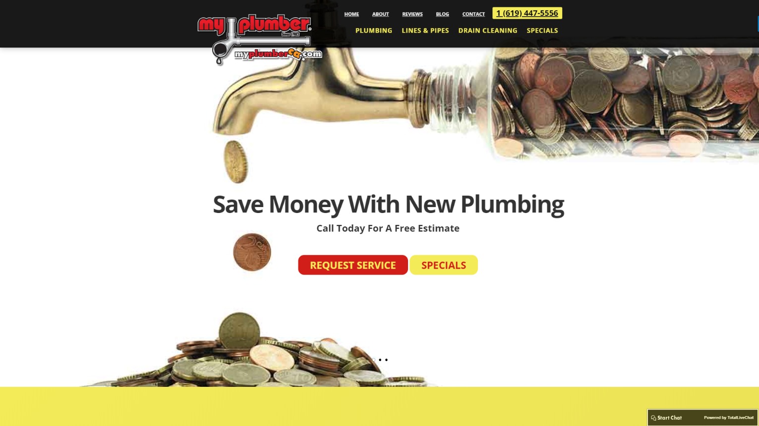
Main advantages of this plumbing website design
- The first thing you see when you enter the website is an easy-to-find company logo that grabs your attention.
- The quality main photo and content around it provide you with the main information about the business.
- The company’s phone number is easy to find: you see it at the top and bottom of every page you visit.
2. New York Plumbing Website
website: http://www.nyplumbing.com
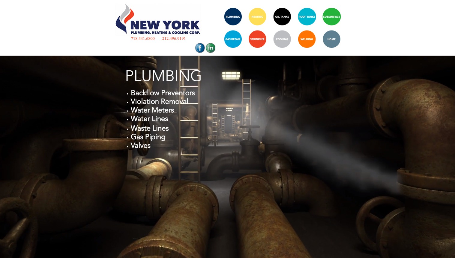
Main advantages of this website for plumbing services
- The website is simple and clean, so the visitor doesn’t get intimidated right off the bat.
- The website’s design is attractive while the site is easy-to-use.
- Attractive high-quality pictures grab your attention, whereas bright trust factors like client logos and imagery make it clear that these guys are professionals.
3. Len The Plumber
website: https://lentheplumber.com
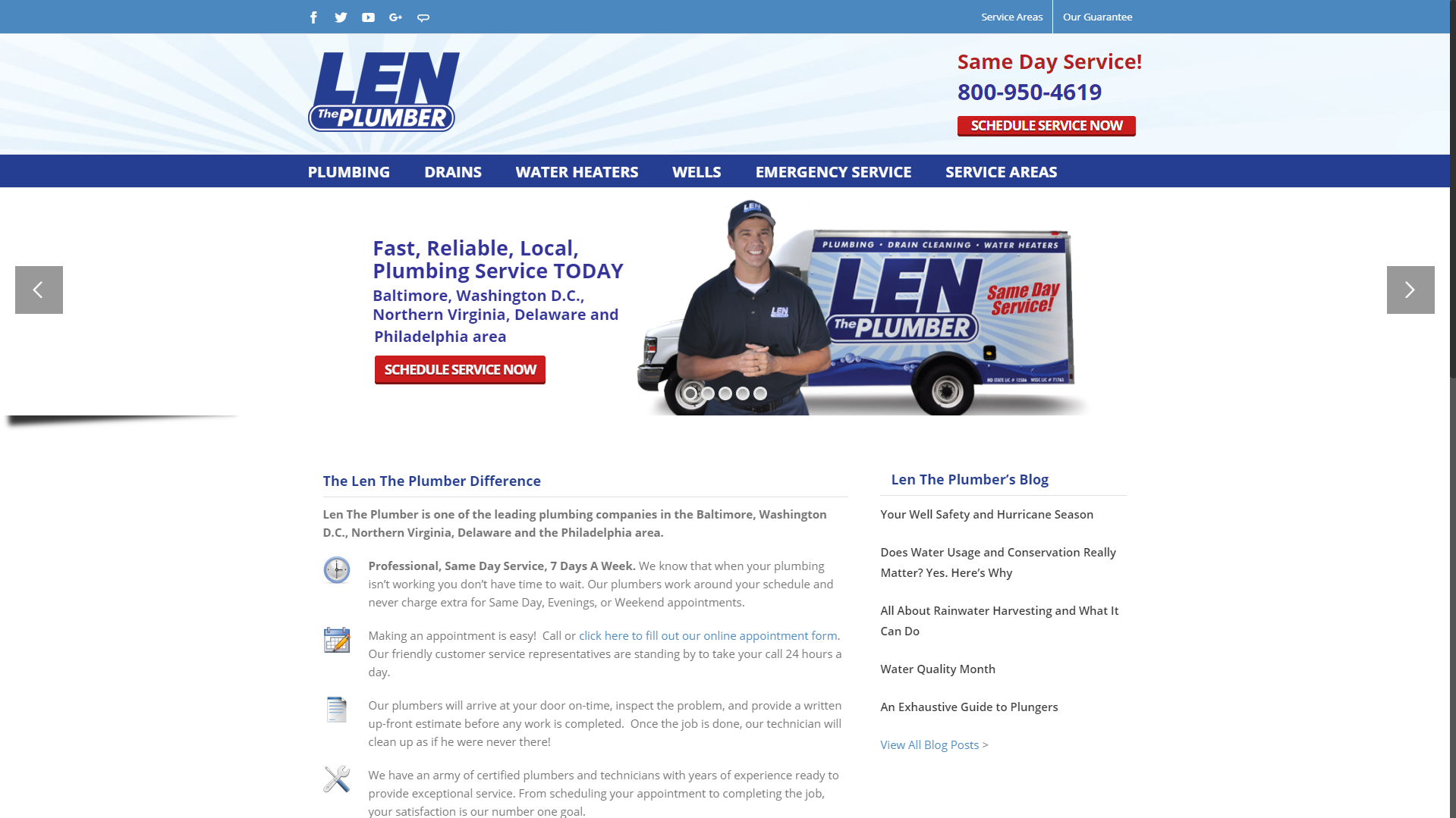
Main advantages of this plumbing company website
- These guys have put a clear CTA in the website’s header, thereby increasing the chances to get calls.
- The “Same Day Service” copy emphasizes that the company is ready to help you right away.
- Moreover, the company provides 2 different ways to contact them: using the phone or an online form.
4. Ruso Bros Plumbing
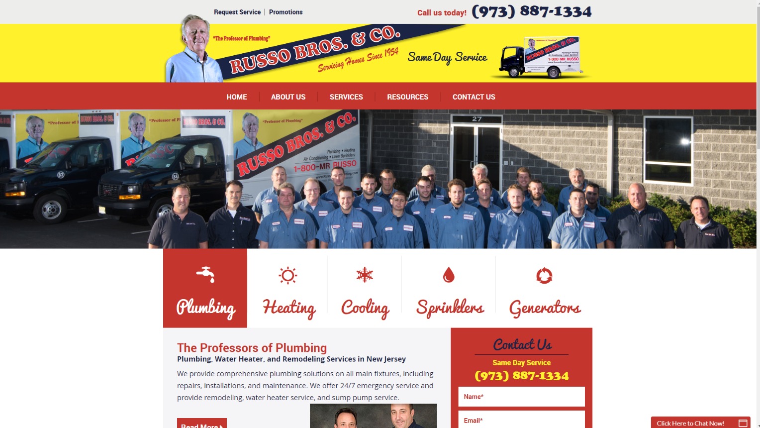
website: https://www.russobrosplumbing.com
Main advantages of this plumbing company website
- If you want Google to love your website, give your visitors a clear list of services that you offer (like the boxes and icons these guys used). As a result, visitors will find the exact info they were looking for just when they land on your webpage.
- A sticky header (a statiс one that is always at hand) is also crucial for a plumbing website these days.
5. Pohlman Plumbing
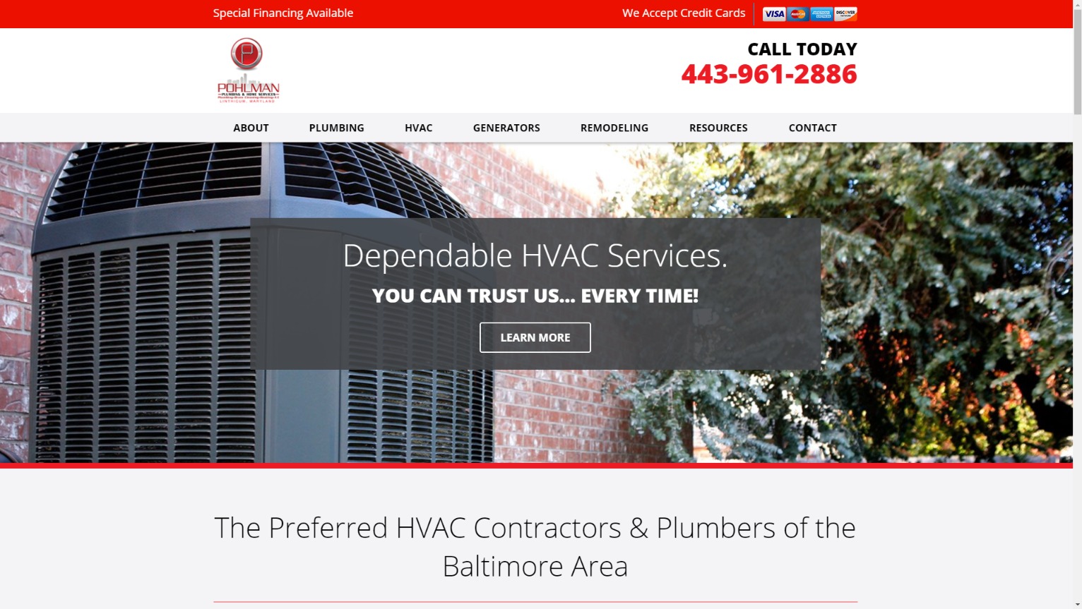
website: https://www.pohlmanplumbing.com/
It is a very good idea to keep a CTA present and visible throughout the website – especially if you use the mobile website version. It gives you a wonderful opportunity to convert mobile users into leads in one click.
6. Kimberling City Plumbing
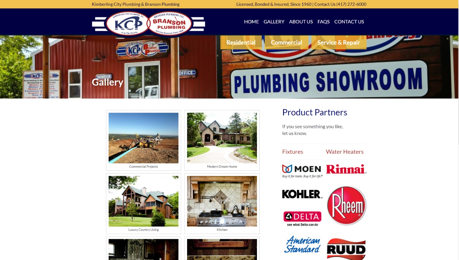
website: https://kcp-plumbing.com
Main advantages of this plumbing company website
- The icons are visually appealing and go with the imagery of friendly staff members.
- The icons under the main photo look stylish, adding a nice touch to the overall simplicity of the website design.
- The website also has a subtle animation to attract visitor’s attention to web pages. The imagery is crisp and bright.
7. Fred Smith Plumbing and Heating Company
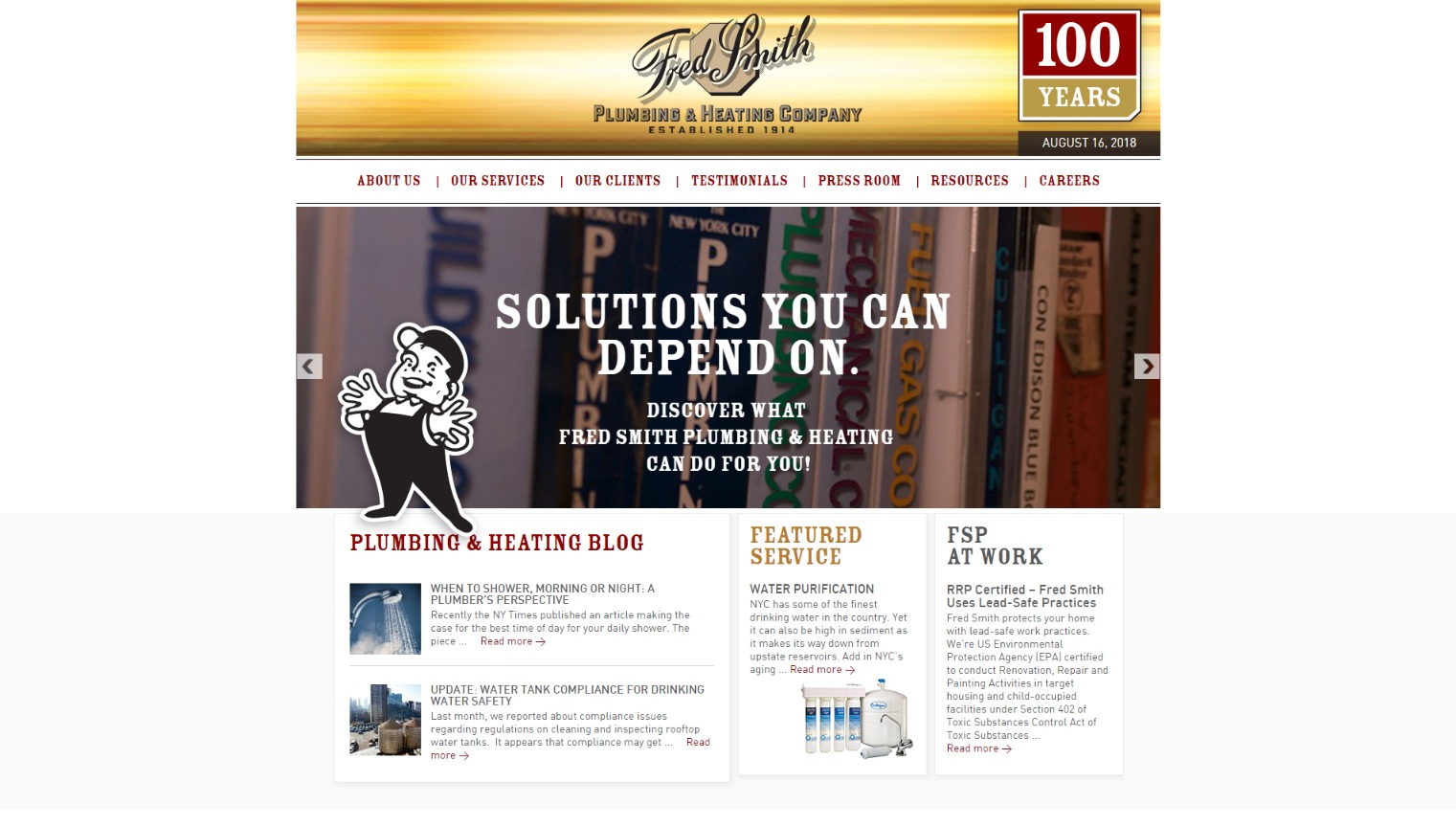
website: https://www.fredsmithplumbing.com
Main advantages of this plumbing company website
- The website uses plenty of colorful industry-related images – the first thing you notice when you try to find out what these guys do better than the others.
- The attractive heading and company’s logo build up trust with visitors.
8. Service Pros Plumbing
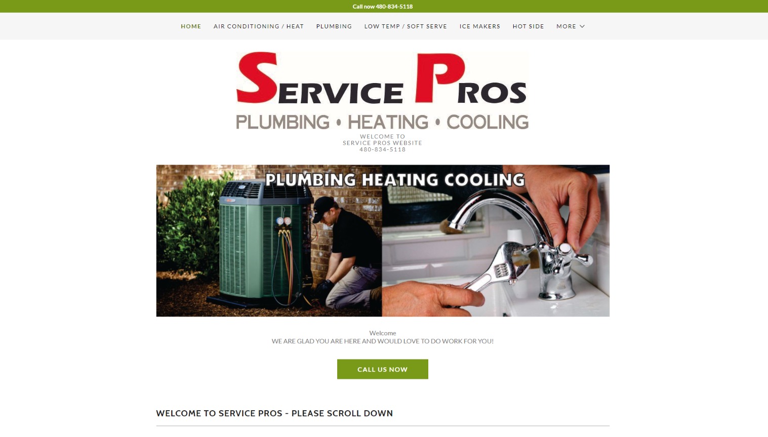
website: http://serviceprosaz.com
Main advantages of this plumbing and heating company
- This company treats the clients and their homes with the respect they deserve. The website emphasizes this attitude.
- Using the contact form in the header and a detailed list of services is a great marketing practice. The name and contact details overlap even the picture behind it.
- One more plus is that the navigation adjusts on scroll: it is larger at the top and shorter near the body of the webpage content. So you can easily move to another webpage with no need to scroll to the top.
9. Century Plumbing
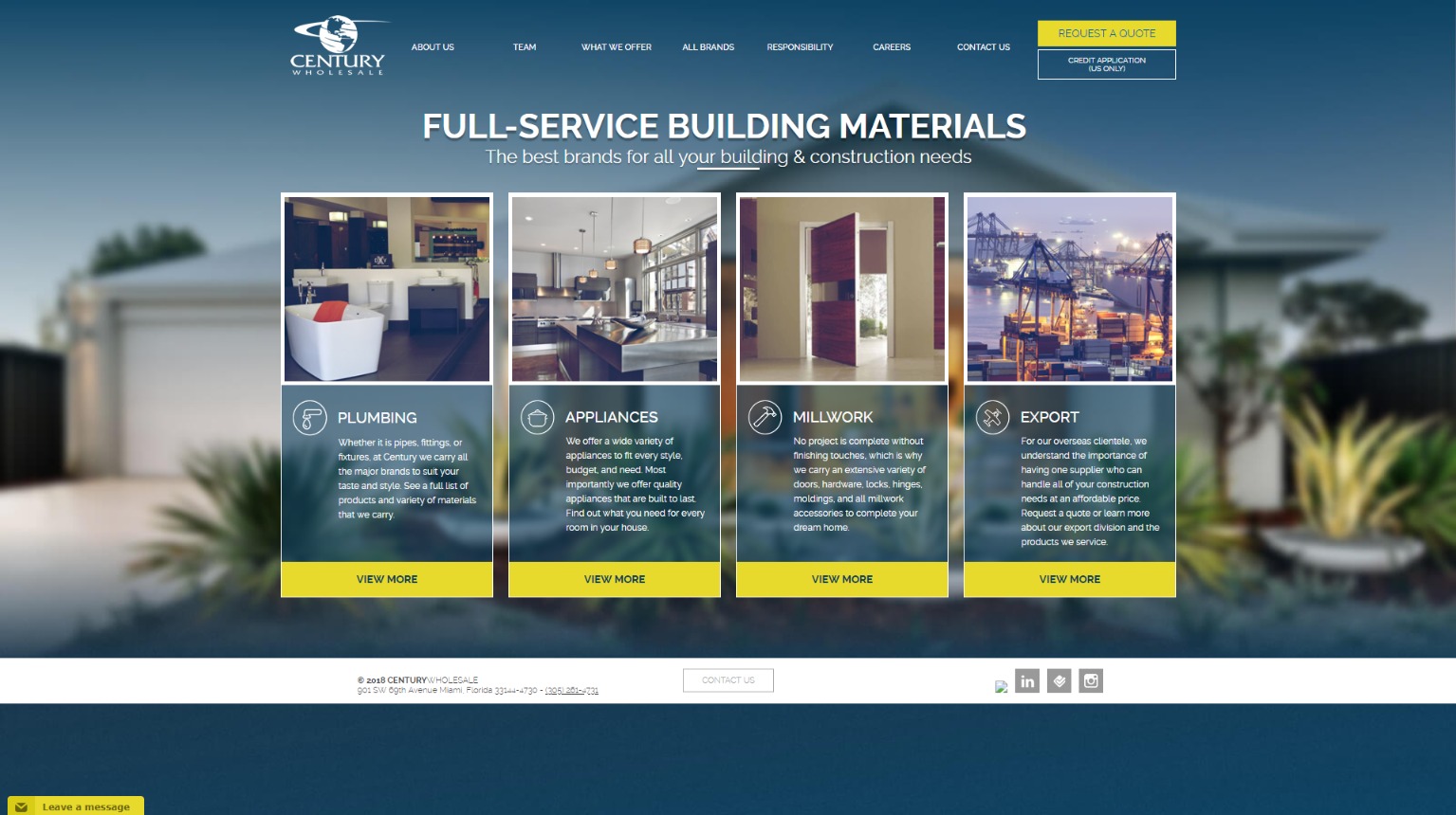
website: http://www.centurywholesale.us
Main advantages of this plumbing and construction company website
- The website is interactive and has lots of animated imagery and sounds. The photos aim to show all the benefits of the products & services that the company offers.
- You also find bright large images throughout the website: this is the thing to keep in mind when creating your own website!
10. Tony La Martina Plumbing
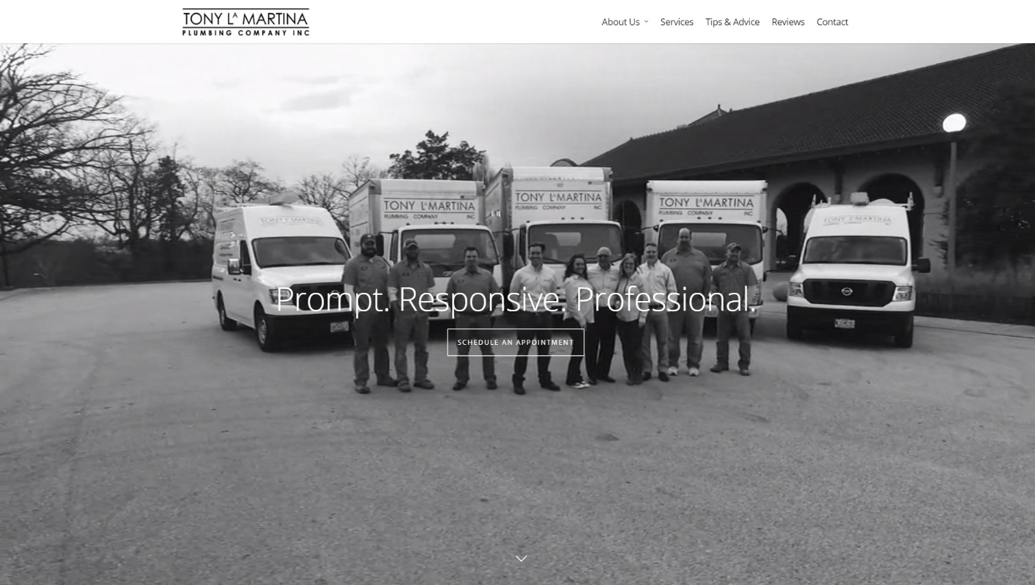
website: https://tonylamartinaplumbing.com
11. Cypress Street Plumbing
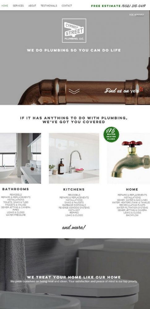
website: https://www.cypressstreetplumbing.com/
Main advantages of this plumbing company website
- The first thing that grabs your attention is the simple grey and blue color scheme and the introduction video that displays the way these guys do their job.
- The homepage of the website uses a panning effect in the video with the photos of the staff. The other web pages have a static background.
- Subtle animation is seen throughout the website drawing the visitors’ attention to the specific page section. The service section is a great example.

