19 Best Podcast Websites Examples for Your Inspiration
You’ve already stepped onto the thorny path of launching your podcast. You have chosen a topic that you care about and resonates with your audience, created a content plan, found the necessary technical equipment and people to help you create a quality product. Well done, you have already taken a lot of important steps. There are many more interesting ones ahead.
Contents
Why do you need a podcast website?
Creating a podcast website is another critical step in promoting your content. This is a platform where you can accomplish many goals:
- develop your personal brand and community,
- offer additional content,
- attract more audience with paid ads and organic SEO promotion,
- monetize your product: sell your merch or other information products.
A podcast website is not just a page on the Internet. It’s a place where your voice and stories can sound louder and reach more people.
Once you’ve figured out why you need a podcast website, it’s time to analyze your niche. We’ve compiled a selection of some of the best podcast websites that can give you some interesting insights.
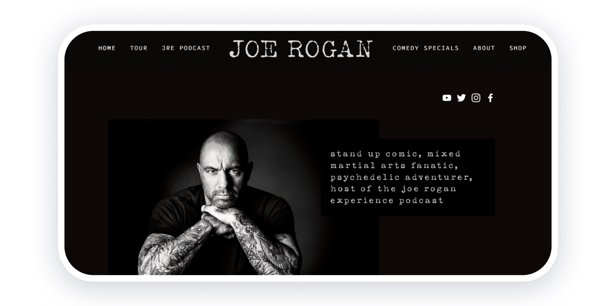
The Joe Rogan Experience podcast features 2-3 hour-long conversations hosted by comedian Joe Rogan with guests, including actors, comedians, musicians, MMA fighters, writers, artists, etc.
The one-page website is designed in minimalist black and white colors. The page contains information about the comedian, his tour, specials, links to social networks, and his store.
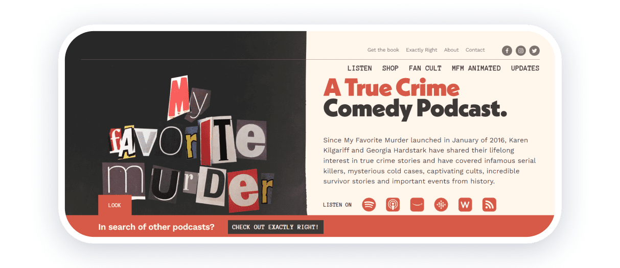
My Favorite Murder is a popular true crime comedy podcast hosted by Karen Kilgariff and Georgia Hardstark.
The site is full of different types of content. The main page provides a brief description of the podcast and links to all the streaming services where it is available. For those looking for other similar podcasts, there is a link to a platform created by the authors of My Favorite Murder.
The site has a built-in player so that users can listen to episodes right away. There is also a shop with merchandise, animations created by a fan of the podcast, news, a fan cult, and a subscription to exclusive content.
Easy navigation on the podcast site simplifies the perception of information and provides a positive user experience.
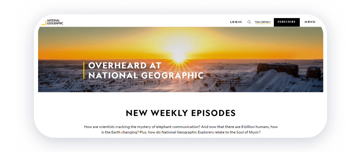
Overheard at National Geographic is a science podcast hosted by Peter Gwin and Amy Briggs. The podcast does not have its own website. There is a page on the National Geographic website that is packed with handy information.
At the beginning of the page, there is a brief description of the podcast and links to the platforms. Next, there is a block with the latest episode and all episodes for 2019-2023. Each episode has a dedicated page with a photo, an embedded player, and a transcript of the conversation. The pages also include relevant links to other episodes.
Simple design and bright photos make for a high-quality overall impression and a positive experience on the podcast page.
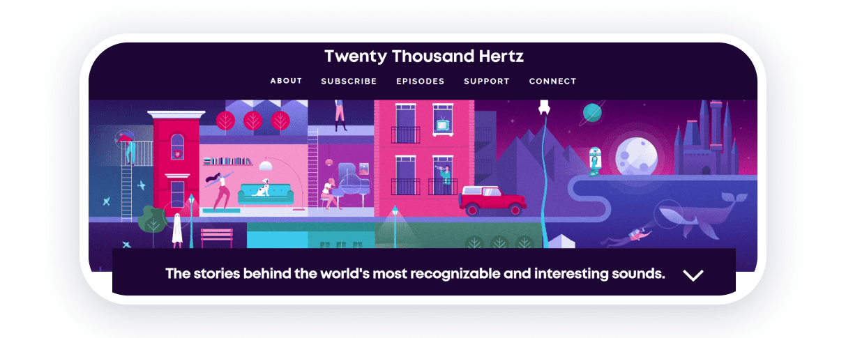
Twenty Thousand Hertz is a podcast hosted by Dallas Taylor that features stories of the world’s most memorable and exciting sounds. The site has a simple structure with bright graphics and animation. The dominant color scheme is blue. Intuitive navigation makes it easy to browse and listen to episodes. Each podcast episode has an intriguing description and links to streaming platforms.
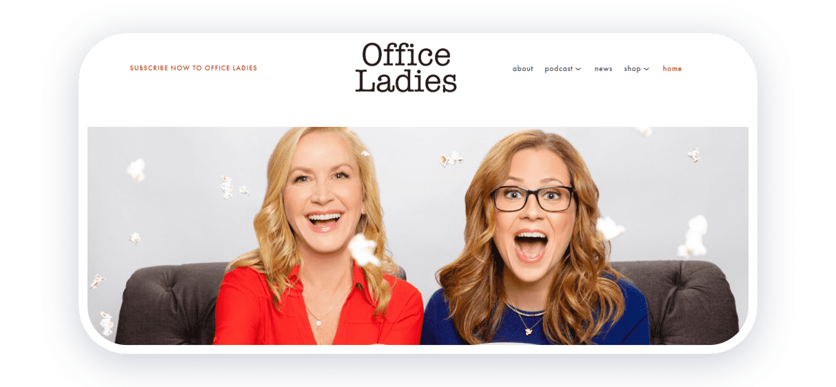
The Office Ladies is the perfect podcast for fans of The Office. The podcast is hosted by co-stars and best friends Jenna Fischer (Pam) and Angela Kinsey (Angela). The girls discuss each episode of the show, share backstage stories, and answer questions from fans.
The site features a vivid photo of the actresses that conveys the podcast’s vibe, a short description, news, and a merchandise shop. Each episode has a separate page with a player, description, and helpful links.
Well-written copies and clear CTAs are the key features of this podcast website.
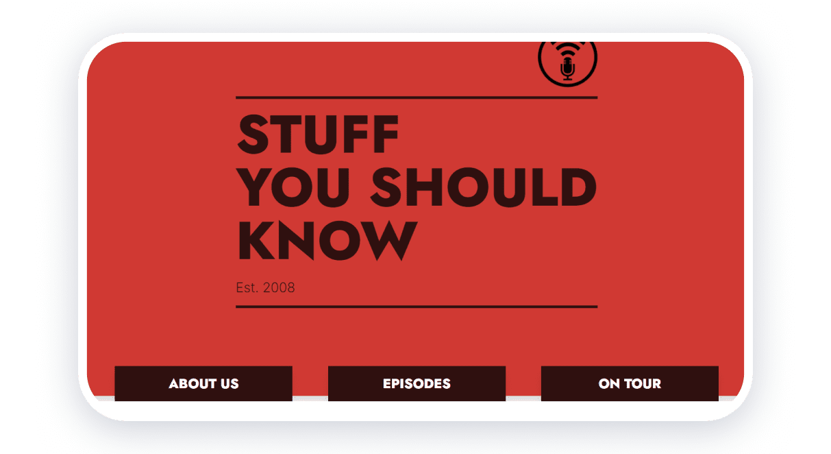
Stuff You Should Know is a podcast by Josh Clark and Chuck Bryant, who discuss topics ranging from satanism to chaos theory.
The podcast’s website is clean and concise, with brand colors of red, black, and white. The site has three pages: “About Us,” with information about the podcast and the hosts; “Episodes”, an archive of all 1500+ episodes with listening available on the site; and “Tour”, a schedule of the podcasters’ upcoming performances.
There are also links to social media and streaming services where you can listen to episodes.
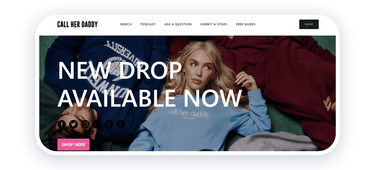
Call Her Daddy is the most popular podcast on Spotify among women, hosted by Alexandra Cooper. The host invites celebrities and addresses social issues, relationships, and other sensitive topics.
On the homepage, a banner with the latest merchandise and links to social networks is available. Another element on the home page is a player with the latest episode. There is also a form on the site to submit a question or tell your story for the next episode.
A page with the intriguing title “Free Nuds” provides vital information for girls who need help with abortion. At first glance, the comedy podcast fulfills an important social role: it promotes feminism and equality and criticizes misogyny.
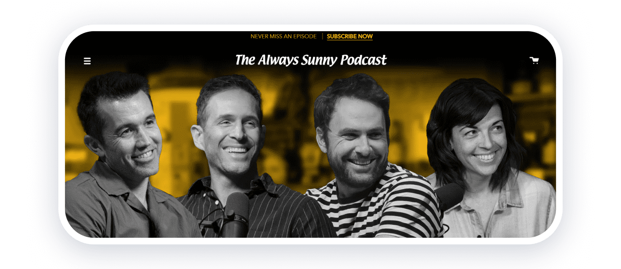
The Always Sunny Podcast is a review of the sixteen seasons of the sitcom “It’s Always Sunny in Philadelphia”. It is hosted by Charlie Day, Glenn Howerton, and Rob McElhenney.
The podcast airs in video format on YouTube, so a CTA with a subscribe button is at the top of the page. Orange, black, and white colors dominate the design, and the podcast website features many animations and video excerpts. Links to the video episodes on YouTube are also attached. The audio version is available on the website or streaming platforms. On each episode’s page, a transcript of the conversation is included.
The site offers information about tickets and the podcast hosts’ tour, as well as the shop to purchase merch.
The footer also contains a subscription form for the podcast’s email newsletter and links to social media.
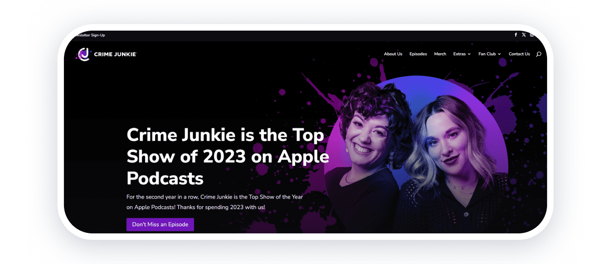
Crime Junkie is a true crime podcast hosted by Ashley Flowers. This site is a superb example of how to develop a community. The copies on the site focus on the fans of the project: “Can’t Get Enough True Crime? Congratulations! You’ve found your people.”
The website is designed in a blend of black, purple, and white colors. The main page contains information about the podcast, its achievements, links to streaming platforms, and the latest episodes that are available on the site. The authors of the podcast are engaged in charity work, and the page lists the organizations they cooperate with.
The site has a merchandise store and a fan club, which also contribute to the development of the community.
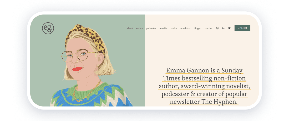
Emma Gannon is a writer and podcaster from the UK. On her podcast, Ctrl Alt Delete, she invites guests and discusses her work and personal experiences. The site has user-friendly navigation, including pages with information about all of Emma’s activities: about, author, podcaster, novelist, books, newsletter, blogger, and teacher.
There are many reviews and quotes posted on the site, which increases credibility and has a positive impact on brand development. The minimalist design of the site in pastel colors is in line with the overall strategy.
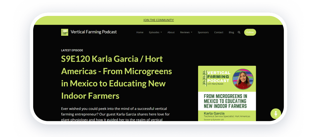
Vertical Farming is Harry Durand’s podcast about agriculture. The centerpiece of the website is the podcast episodes. The latest episode is directly accessible on the home page. There is also a list of previous episodes, streaming platforms, and related blog posts.
After opening the page, a pop-up appears with a call to subscribe to the email newsletter. A pleasant light green color prevails on the website, emphasizing the theme of the podcast and creating clear, coherent branding.
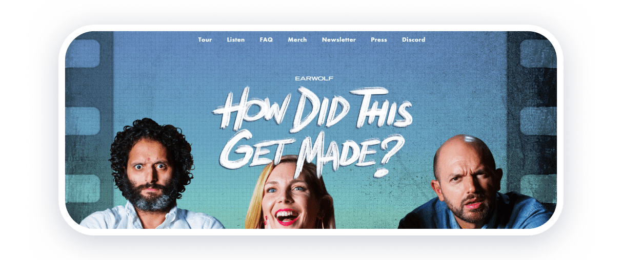
How Did This Get Made? is a podcast hosted by Paul Scheer, June Diane Raphael, and Jason Mantzoukas, with occasional guest appearances. In each episode, the hosts comically discuss bad movies.
The homepage features a banner with emotional photos of the show’s hosts. There is also info about the tour and an option to buy tickets. The site has a FAQ section, a built-in media player for listening to episodes, and CTAs with appeals to buy merch and subscribe to the email newsletter.
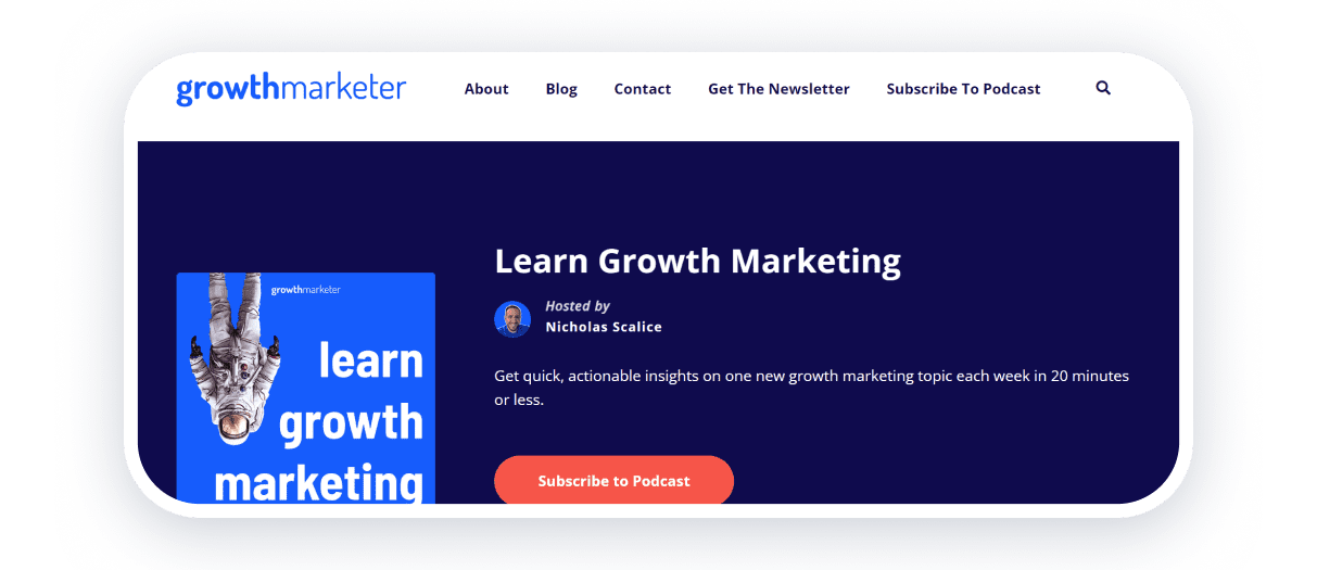
Nicholas Scalice, host of the Growth Marketer podcast, records 10-15-minute episodes on marketing topics. The website design is simple and clear. Episodes are available for listening on the home page. The site has a blog that provides a deeper dive into Growth Marketing. Clear navigation, CTAs with appeals to subscribe to the podcast and email newsletter make the site simple and effective.
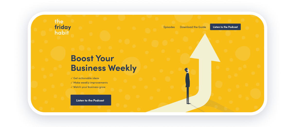
The hosts of the Friday Habit podcast, Mark Labriola II and Benjamin Manley, help business owners make their enterprises more efficient. To do this, they suggest setting aside time on Fridays.
The website design combines yellow and navy blue colors. The home page addresses the pain points of the target audience and describes how the podcast will resolve their problems. Clear navigation, CTAs, an audio player for listening to episodes, and links to streaming platforms provide an effective user experience.
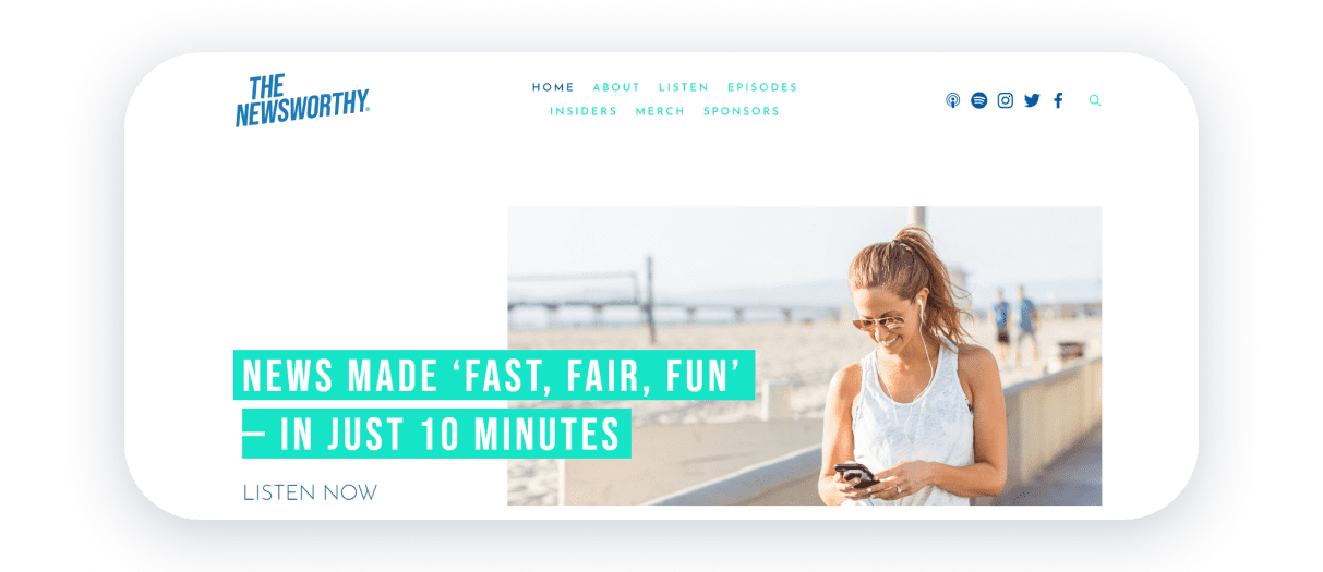
News podcast host Erica Mandy releases 10-minute podcasts about the latest events. Her witty and individual style is reflected on the website. The website design is minimalistic and blends white and turquoise colors. Vivid photos of the host and listeners’ reviews increase credibility. A convenient audio player, links to social media, merch, and newsletter subscription make site navigation intuitive.
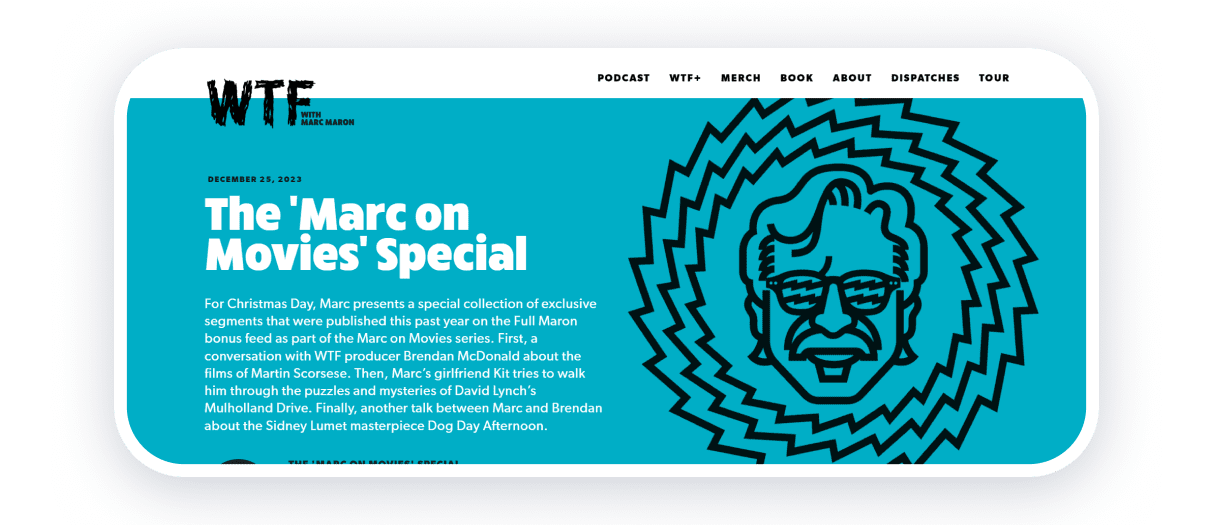
In his WTF podcast, Mark Meron conducts in-depth conversations with comedians, musicians, actors, etc. The main page focuses on the latest episode of the podcast, which is available for listening on the website. The site has an archive of previous episodes, branded merchandise, tour information, a paid subscription to exclusive content, and catchy posts.
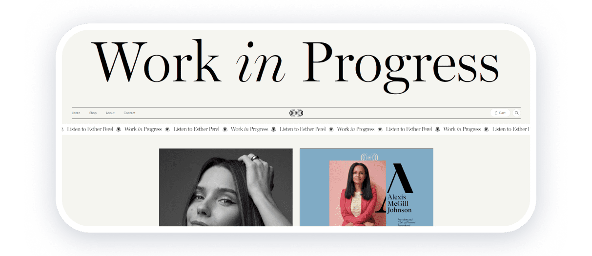
The podcast’s host, Sofia Bush, has frank conversations with guests on professional and personal topics. The key message of the podcast is that each person can be a work in progress but still a masterpiece.
The website is designed in a minimalist style with beige and pastel colors. Fonts, animations, and columns create accents on the page. You can also buy merchandise, and subscribe to the newsletter and social networks.

Bendrew Scott breaks down the latest news from YouTube, social media, and streaming services to assist content creators in figuring out how this news affects their careers and projects.
The site has a very clean design: the main page offers episodes, links to streaming services, and social media. Conciseness and simplicity make audio a key element of the site.
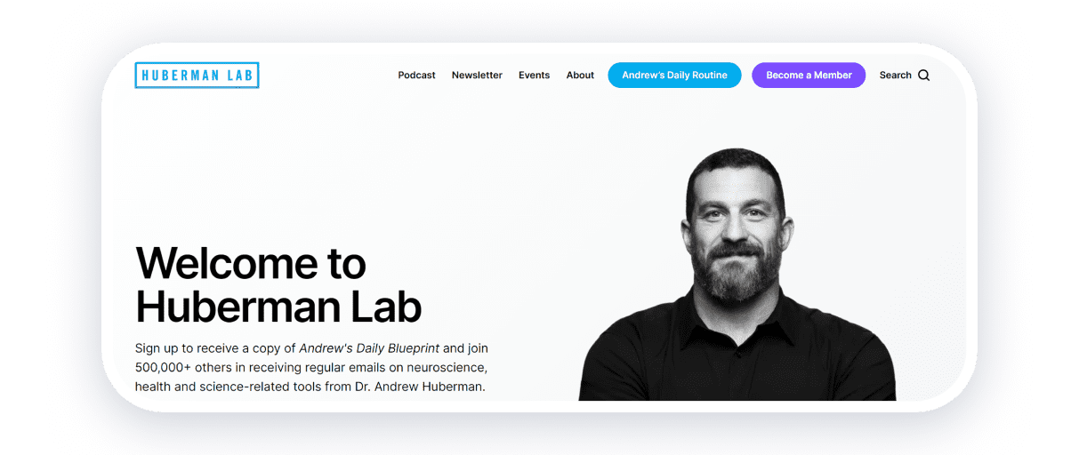
The Huberman Lab is a science podcast by Andrew Huberman, PhD, a neuroscientist and neurobiologist. The main page features a professional photo of Andrew and a CTA inviting people to subscribe to the email newsletter.
All episodes are accessible in video format. User-friendly navigation by topic and category lets you choose the subject you’re curious about and find the episode you need. Each episode includes links to relevant articles.
Information about the doctor’s professional growth and testimonials increase credibility. Intuitive navigation and a restrained, no-frills design ensure a positive user experience.
How to create a podcast website?
The most efficient way to create a podcast website is to use website builders. You can pick a ready-made website template and customize individual website blocks, content, fonts, colors, etc. No web design or programming skills are required. The platform offers you a ready-to-use layout that you can adapt to your needs.
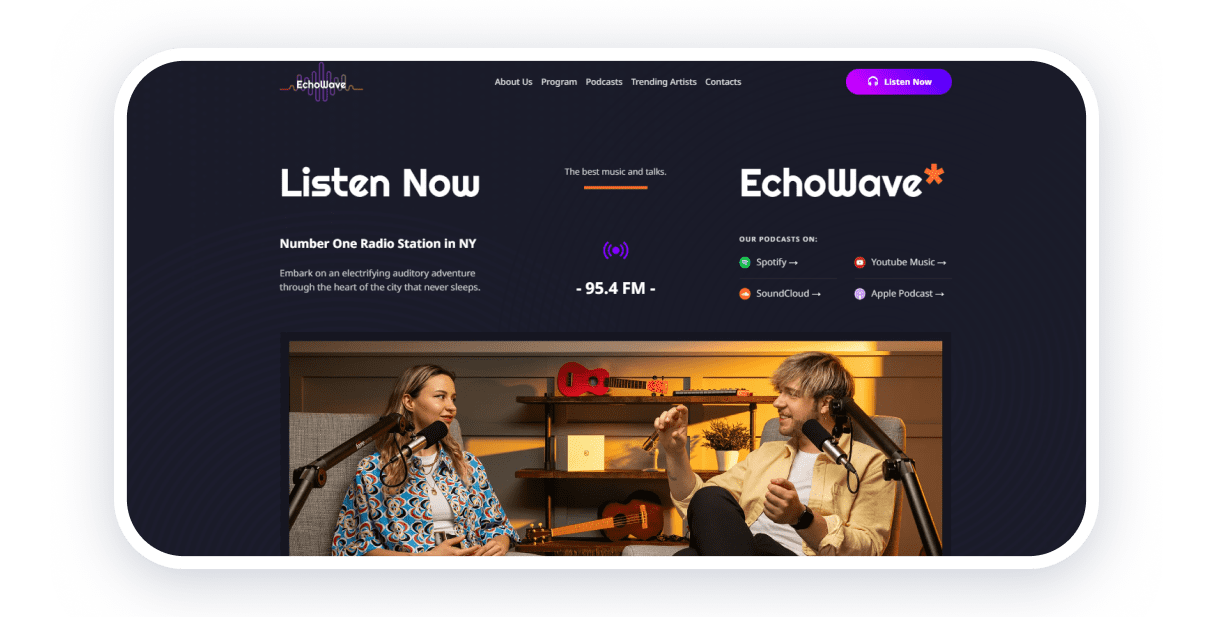
Weblium website builder includes templates for podcast sites. Having signed up for a paid subscription, you get access to many useful features: a free domain for 1 year, an unlimited number of pages on the site, multilingualism, the ability to add third-party code, etc. AI for content creation, and integration with various services, analytics, and marketing tools will also significantly facilitate the creation of a website for your podcast.
We hope our podcast website examples helped find ideas and inspiration. Let us know in the comments which site you liked the most.
