30+ Beauty & Hair Salon Website Examples
No sphere of human activity stands still, and the beauty industry is no exception. People always need beauty salons because they give them a sense of confidence, remind them that life does not stop, and that there are still many pleasant moments ahead. Life goes on, and it is up to each of us to decide how to live it and what to create while we still have time.
Today, I want to talk about beauty salon websites. This term is not limited to hairdressing websites — it refers to any beauty industry establishments that want to promote themselves online. The following selection of websites is my attempt to show how even a small project can have a big impact. In the world of beauty and self-care, ideas for a salon website provide an opportunity to learn from the experience of others and be inspired by the beautiful examples in the industry.
Elegantly designed beauty salon websites have that special style that sells both your salon and your hairdressing ideas. The list below has 35 examples that will stir your imagination and taste! Find ideas for your own hair salon website!
Contents
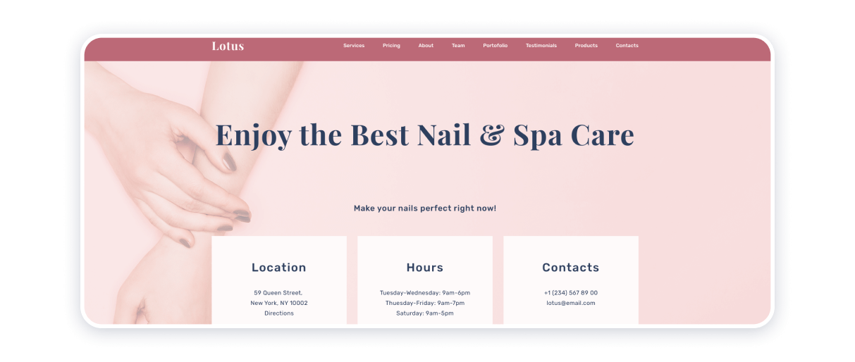
Lotus Nail Salon
Built on the Weblium platform, the Lotus have “Services”, “Pricing”, “About”, “Team”, “Portfolio”, “Testimonials”, “Products”, and “Contacts” sections. If invite the visitor to jump right into the specifics, the particulars of doing business with an acclaimed agent in the beauty and personal care industry. Parallax scrolling, pastel color scheme accentuating the shades of powder pink and soft-hued beige match the softness of shapes and textures of the images that feature of the website. .
In terms of the venture’s marketing approach, it may be worthy of note that the salon’s Instagram feed becomes harmoniously incorporated into the structure of the nail and spa salon website. More of a down-to-earth approach to operating within the beauty and personal care industry aligns with ingenuity and memorable aesthetics, which most certainly would satisfy the demands of those who value accuracy and professionalism above out-of-the-box thinking.
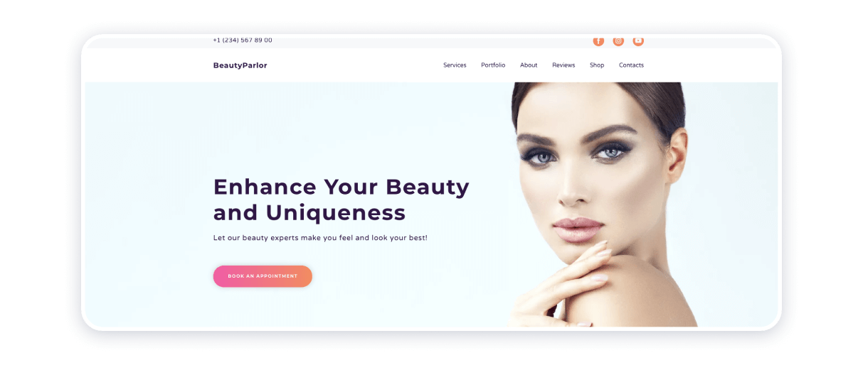
The premise of any beauty salon is that each of them is a place to decompress. Taking care of oneself is essential for proper interaction with other people, and the staff of Beauty Parlor proves itself to be aware of that maxim. This website template is made with Weblium with creamy contrasting colors at a slightly painterly look to the website, which make this online environment even more delightful.
The visual information present on the website is the pure expression of delicacy and grace. The header of the homepage contains Facebook, Instagram, and YouTube buttons as well as the phone number of the facility, thus, providing all the information needed for efficient communication. “Services”, “Portfolio”, “About”, “Reviews”, “Shop”, and “Contacts” sections convey the essence of the venture and give the visitors the gist of its philosophy.
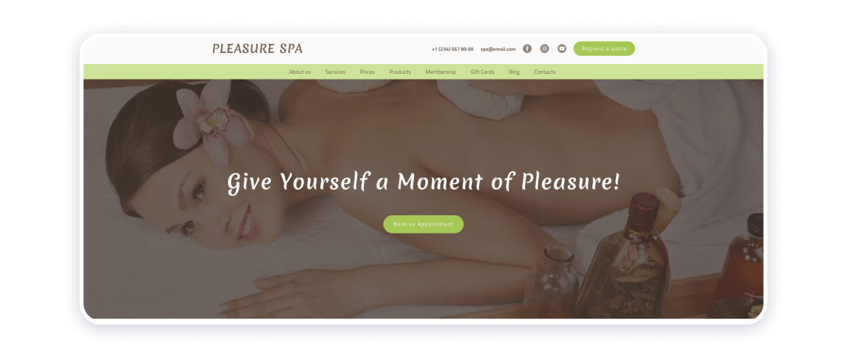
Spa procedures require a tailored approach. Beauty, wellness, repose, and meditation — a spa salon should personify all of those things. This Weblium website templates is made with light brown and green colors in this particular case of spa website design allude to the environmentally conscious approach to understanding and developing a sustainable service delivery model. Non-aggressive calls to action, disambiguation of the beauty and personal care services the facility provides, as well as its special offers and packages currently available for ordering.
Scrolling through the website is one exhilarating yet calming experience because, from icon designs, color palette, font of choice, to shapes and textures — everything in it imbues with serenity, peace, wisdom, contemplation, and aspiration to beauty.
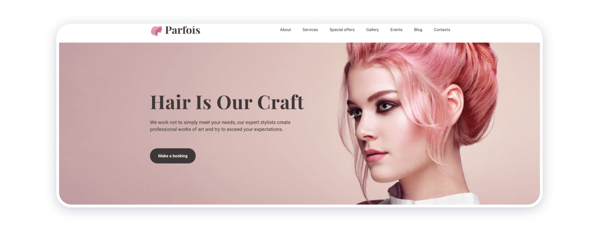
Order, structure, and cleanliness of the design are the key features of the Parfois hair salon website made on Weblium website builder. Rose and powdery accents in the website’s color scheme become a unifying motif, an instrument that makes the website itself evolve into a coherent whole. Call-back form and quick links to access the website’s main blocks boost the accessibility of the source.
The blog section helps reiterate the probity and professionalism of the beauty parlor’s employees. All in all, the source concerned encapsulates simplicity and sophistication, efficacy and charm, exceptionality and appeal to emotion.
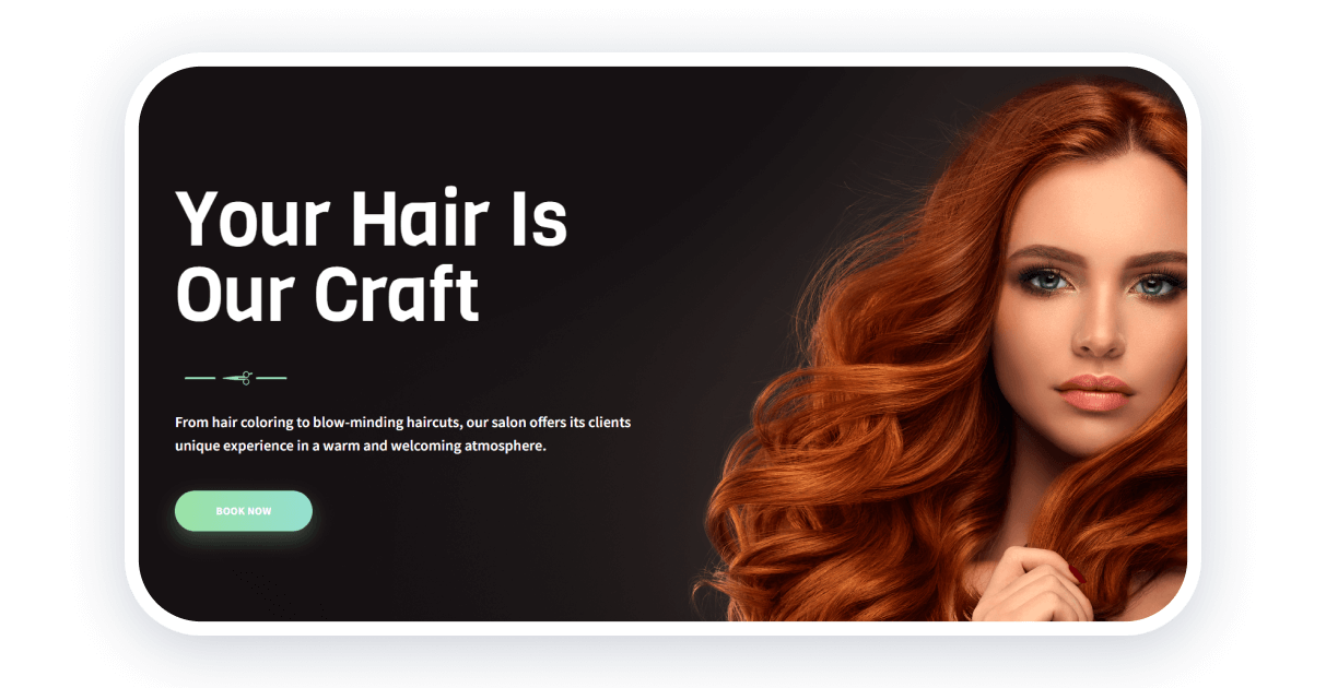
What makes this beauty parlor website the best is the hero image, which emphasizes the website’s main specificity: hairstyles and haircuts. This website template was created on Weblium, so you can easily customize it.
This website focuses primarily on high-quality images, showing their best examples of artwork. The color palette is gray, but it doesn’t make it boring, thanks to the bright accents on the buttons and images. Do you already want to have an excellent beauty salon website?
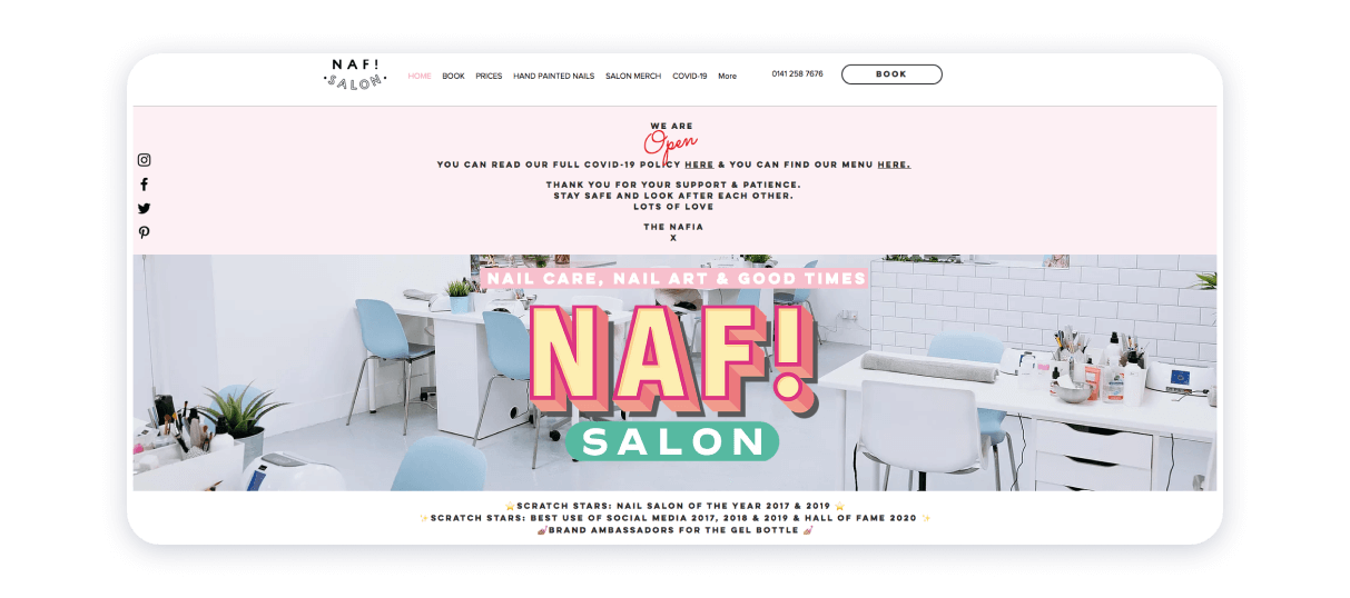
Vogue has shone a spotlight on NAF! Salon by including it on its list of best beauty care facilities based in Great Britain. The source is an exemplar in that its visual aesthetics is meritorious. Pastel color scheme contrasts with blunt font and daring font to round off the valiant tone of voice.
A logo is the centerpiece of the nail salon website. Admittedly, it also contains stunning pictures of the parlor’s nail artists at work. Thus, the party concerned attests to the significance of careful and intelligent elaboration of the aesthetic.
Treatwell
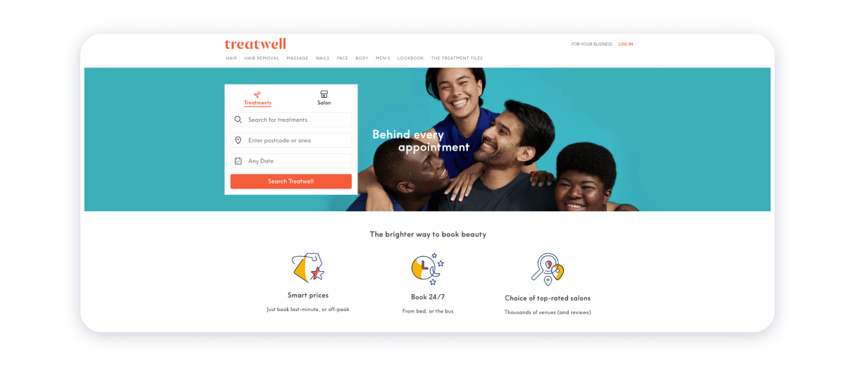
Treatwell’s mission is to show the significance of establishing and sustaining connections between the parties delivering beauty and personal care services and their customers. The structure of this particular beauty salon is extremely ramified and diverse. In Treatwell, they focus on the simplicity and clairvoyance of navigation through their website. The clean and neat design of the beauty parlor’s website occurs due to the flexible yet carefully thought-out arrangement of blogs and menus.
The interface of the source is convenient because of the presence of an extendable menu. Hence, the website visitors will be able to find painlessly the information they may need to use the beauty parlor’s services efficiently.
Heyday
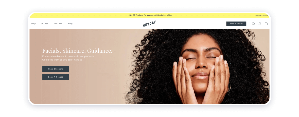
This beauty salon stands out because the party that owns it is aware of its target audience. Heyday’s website would be of particular interest to skincare enthusiasts. The source coalesces laconic design, which is, evidently, one of the perks of calling in a website builder’s services. The guiding principles of this electronic resource revolve around exploiting only the best-quality pinch-sharp images against a relatively simple and non-aggressive background. Polished appearance aligns with a strategically positioned and carefully elaborated call to action. The design of this website’s interface combines smart and comprehensible ideas, smooth and classy flair.
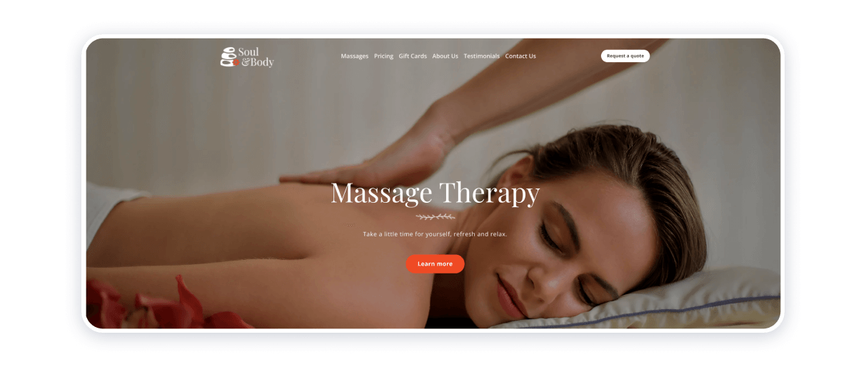
This massage salon website is a starting point, and there may be several reasons for that. First, the pastel color palette adds to the website’s almost painterly look. The textures and smooth and blend beautifully with the fonts and icons.
The owners of the website provide a substantial amount of information a potential user may require. The stakeholder specifies the niche and offers a glimpse into the interior design of their facility. Strategically placed testimonials section reaffirms the expertise and integrity of the people behind the enterprise.
NineZeroOne Salon
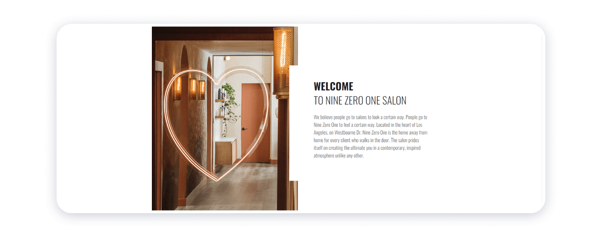
NineZeroOne beauty parlor website fuses staggering visual data and quotes epitomizing the ethical principles and working ethics of the venture. The stakeholder’s philosophy is the intention to turn a visit to them into a rewarding and memorable experience. Hence, this particular example of a top salon website stands out because it explains how the beauty care industry can shape actual people’s lives.
The source is coherent primarily because of the color palette, quality, and texture of the images, and fonts complement each other harmoniously, turning the source itself into an elegant whole.
Sensa Salon
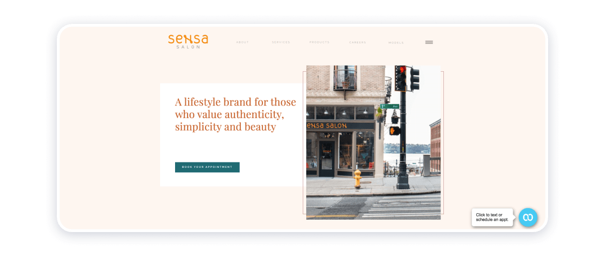
This site is a good example of a well-organized structure. This salon offers many featured services, masterclasses, news, galleries, and freshly renewed pictures.
One page contains everything that a customer is looking for, including links to social networks, blogs, and contacts. The site is a good example of elegance and responsiveness.
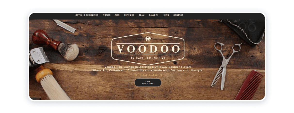
This site with an excellent design has all features necessary for clients to stay on the page. One home page combines all information and besides casual services offers free model trials for using new hairstyle techniques on those who are interested to experiment.
Brown wood color on the background with old-fashioned pictures adds mystery and professionalism at the same time.
Relle Organic Salon
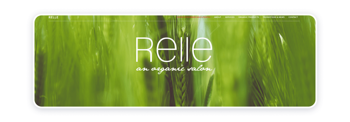
The color of the site reflects the mission of the salon which is to put health back into the beauty industry. Their products contain no chemicals, are not tested on animals, and are eco-friendly. The design of the site is calm and laconic, and also includes a bio glossary, vegan page, and online shop.
Salon True
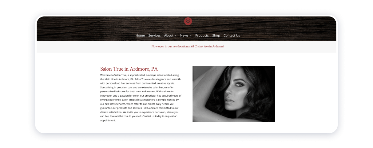
Design-wise, Salon True website places emphasis on texture. The website’s header contains the name of the beauty parlor, its logo, and motto, the latter being explained and deciphered further at the footer of the home page. “Services”, “About”, “News”, “Products”, “Shop”, and “Contact Us” blocks extend the homepage.
Sheer sophistication with which the enterprise handles the business of its online presence is, by all means, commendable in the sense that it exemplifies how a proper strategy for arranging information can benefit the usability of the source. Minimum of embellishment, both visual and textual, seem in no way to hamper the intention of the experts behind the enterprise to showcase their work. Just the opposite: lack of deliberately fancy elements does not divert the attention from the subject matter, which is beauty and personal care delivery.
Ama the Salon
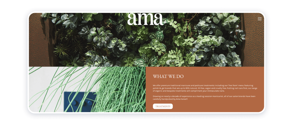
The enterprise is exemplary in that it demonstrates fine development of brand identity and its implementation in both online and offline environments. Roaming about this particular website feels like walking down the halls of an art museum. High-definition pictures demonstrating the interior designs of physical spaces help to exert a strong participation effect. Ambiance, elegance, vibrant and juicy colors, user-friendly interface, legible fonts bolster the eloquence and depth of the source.
Eight Zero Five Salon
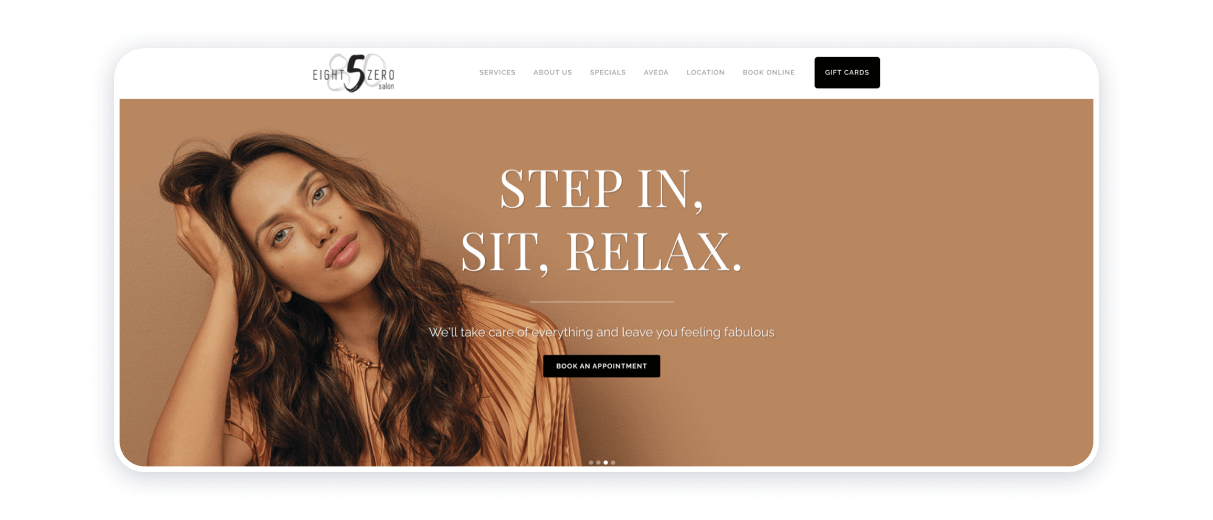
This parlor’s website exploits only top-quality images to render ambient atmosphere and symbolize sustainability, softness, and vivacity as the brand’s most definitive qualities. Refined culture of beauty and personal care as well as adherence to the mission to help to protect the environment appear to represent the brand’s mission and philosophy. Eight Zero Five is conclusive proof that sustainability and commitment to society’s greater good are essential for a beauty salon business from its outset.
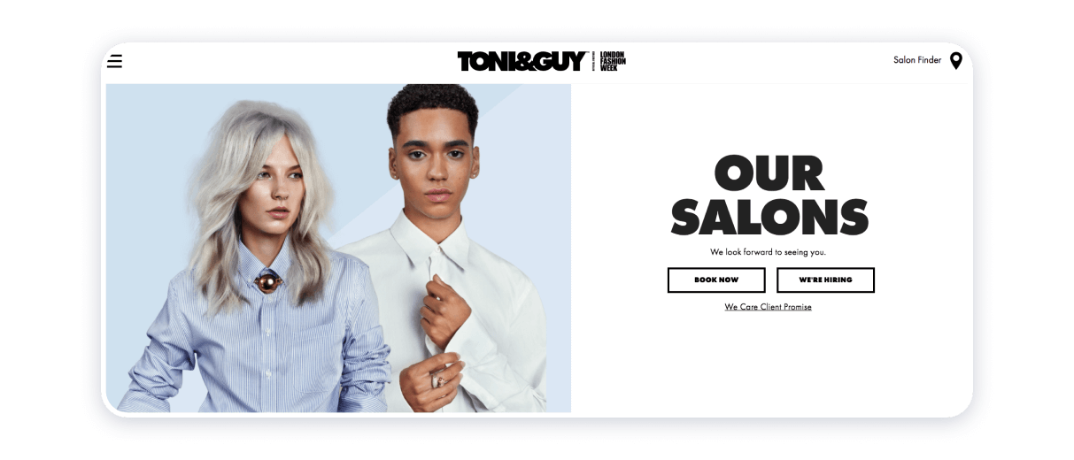
The source concerned demonstrates how one can turn the footage into a proper tool to attract customers. Video content is the focal point of the salon website and it helps to shape the expectations of those who visit it. Thanks to a tasteful video, the business owners behind the website manage to create a stylish, net, and clean media product.
Gradient minimalist logo looks regal, and it also chimes in with the readable black and white fonts. White background and pastel colors put finishing touches on the website, contributing to its tidy and graceful appearance.
Willow Med Spa & Salon
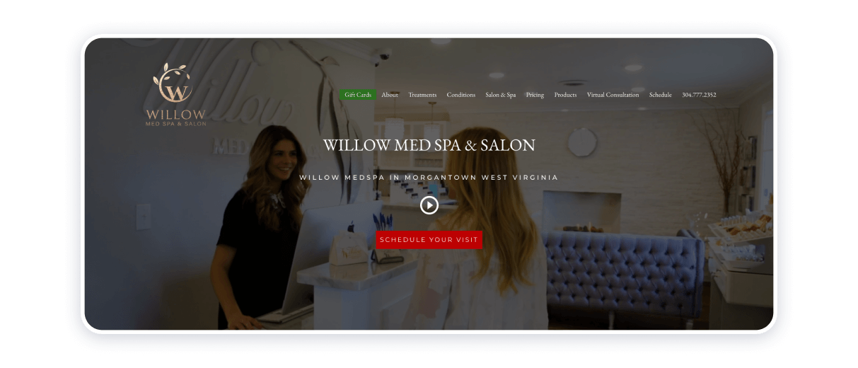
The source concerned demonstrates how one can turn the footage into a proper tool to attract customers. Video content is the focal point of the salon website and it helps to shape the expectations of those who visit it. Thanks to a tasteful video, the business owners behind the website manage to create a stylish, net, and clean media product.
Gradient minimalist logo looks regal, and it also chimes in with the readable black and white fonts. White background and pastel colors put finishing touches on the website, contributing to its tidy and graceful appearance.
Mario Tricoci
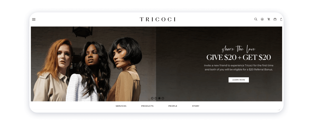
This salon offers a variety of gifts, certificates, and packages, online registration, shopping for original beauty products, and many others. Once you start to navigate the site, it devours you more and more.
Fringe Salon NY
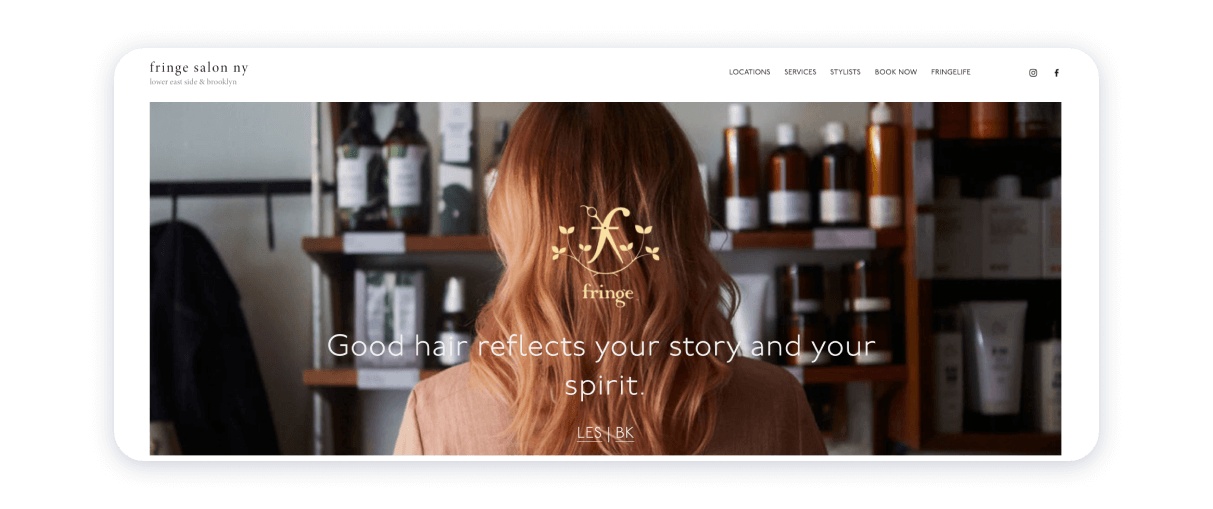
Effortless navigation is, probably, one most definitive and distinguishing qualities of Fringe Salon’s website, which occurs because of the intelligent and instinctual design of the home page. A casual tone of voice prevents drawing up a radical sales agenda. Exquisite images are crucial because they help to pique the visitors’ interest. The logo of a brand is in gold color, thanks to which it appears majestic.
The website is a highly structured electronic environment mainly because all the important information is easy to find, and all blocks are easy to detect. The website owners build customer confidence by strategically placing a mention of their salon in a Jetsetter Magazine.
Loyalty Barbershop
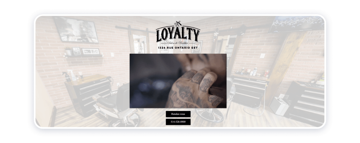
Although the interface of this grooming salon is in French, those with a limited command of this language or those who do not know it at all will be able to appreciate dark themes, clarity, tidiness, and good arrangement of the website’s blocks. The owners of the website have chosen to attach a hyperlink to their phone number. Hence, a potential client is able to select their preferred option and contact the facility using the tools that are most convenient for them. The demo (a one-minute video) is truly fascinating and it shows the hair salon to its best ability.
Haven Spa
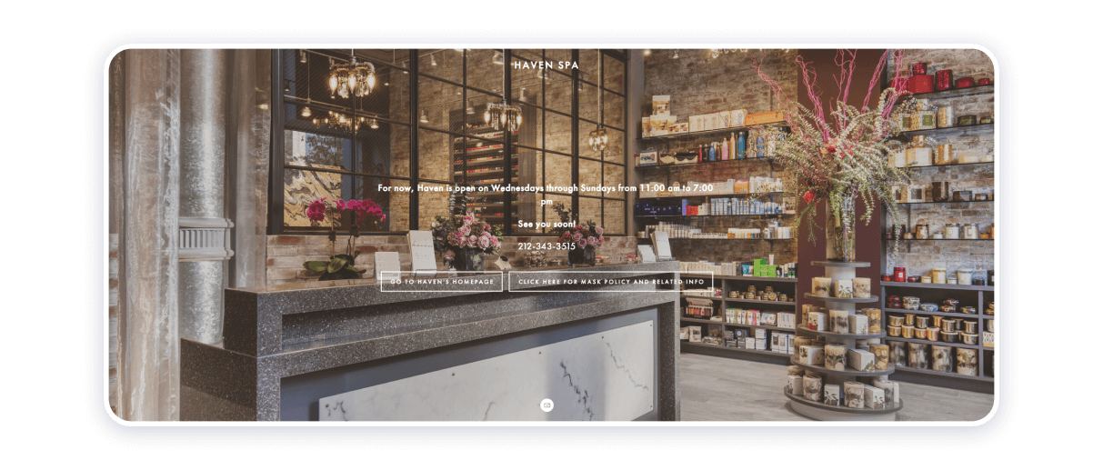
The Haven Spa website owners have made a strategically sound decision to place navigation on the left-hand side. In doing so, the proprietors of this beauty and personal care business enable a reading view of the background image, which is a wide-angle shot of the interior design of their physical salon and a glimpse into the aesthetics of the facility.
In all fairness be said, once you enter a homepage, you will be able to see an accessibility menu icon that slightly interferes with a list that contains about 24 items to access the corresponding blocks on the website, including but not limited to accessibility, online booking, photo gallery, accolades (mentions in press), gifts, and the services the facility delivers. The accessibility menu cannot be underestimated, from the perspective of improving the experience of using the website for people with disabilities no less. Haven Spa is a socially responsible venture, meaning that may be contemplating the inclusion of disabled persons. The ambiance and assuage characterize the website’s atmosphere at its best.
Jo Hansford
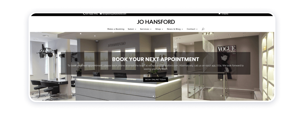
The electronic source at hand is the epitome of straightforwardness, neatness, and austerity. The website is a quintessence of modern perception of cultured and gleaming beauty. The beauty salon website emanates expertise and finesse.
The website invites the clientele by greeting them with a pop-up notification that offers to sign up for a newsletter and get a reward in the form of the 20% off product purchases. Harper’s Bazaar, London Evening Standard, Tatler, Grazia, and Glamour all praise the Jo Hansford beauty salon for its overall elegance and professionalism of the staff.
Muse Salon and Spa
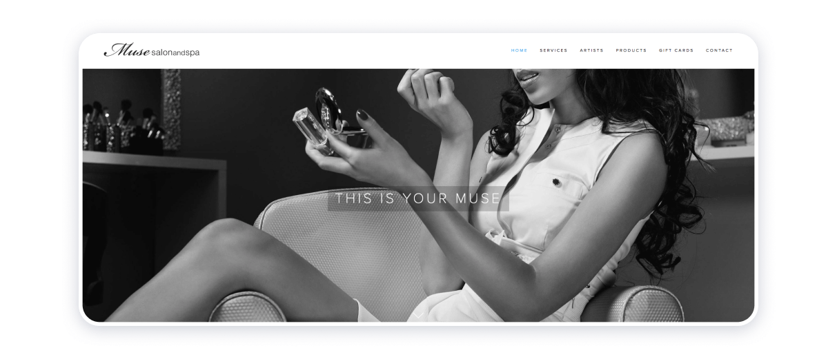
Parallax scrolling and integration of high-definition images are some of the most definitive features of the Muse Salon and Spa website. The picture gallery demonstrates the best sides of the salon’s physical space and the services they offer. The resource mirrors the salon’s individualized approach and aligns it with placid yet resolute calls to action. The structure and design of the website are captivating and moderately cheesy, for the sake of a truthful rendition of the atmosphere of the beauty and personal care delivery industry.
Cuts & Bruises Barbershop
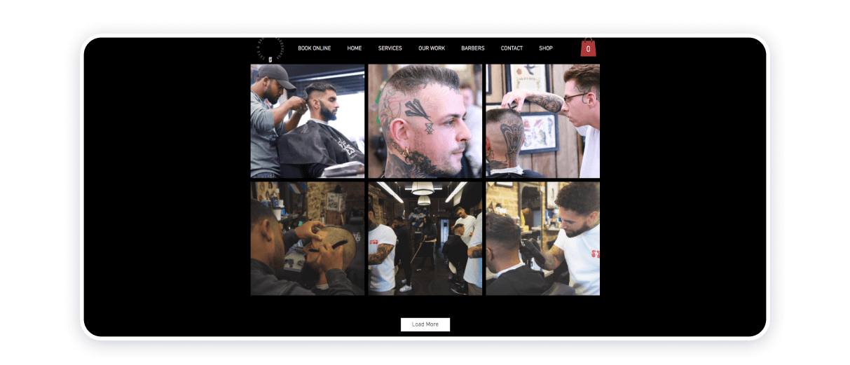
The beauty parlor concerned succeeds at coalescing its online and offline environments. Its online presence is intelligent, comprehensible, and manageable. To help the website’s visitors resolve their hesitations, the holders of the website keep it neat. Integration of demo videos into the structure of the homepage helps to build up the visitors’ and potential customers’ expectations.
The website also features links to the salons’ accounts on social networking platforms. Hence, the arrivals to the grooming salon’s website can form a clearer view of the aesthetics and atmosphere of the physical space.
Fawn and Fox Salon
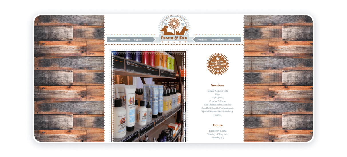
This website is an amazing resource of the latest news in the hair industry and the achievements of the salon. You have access to the archives of news since April 2012.
Right from the homepage, you can book the services for men’s and women’s cuts, creative coloring, hair pre-treatments, special occasion style and make-up, services for eyelashes and brows.
Salon 29
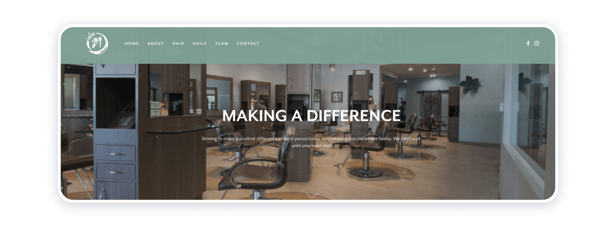
Salon 29 operates effectively because it brims with delicate refinement. The website features the brand’s logo, clear and sharp images, and numerous endorsements provided by happy clients. Embedded links to the beauty salon’s Facebook and Instagram pages enhance the discoverability and accessibility of the beauty parlor.
All in all, Salon 29 is a great example of how neatness and minimalism can translate into an effective online presence. The most plausible explanation of the website’s innate coherence may consist in the harmony between the interior design of the actual space and gradient watercress color.
Altitude Salon
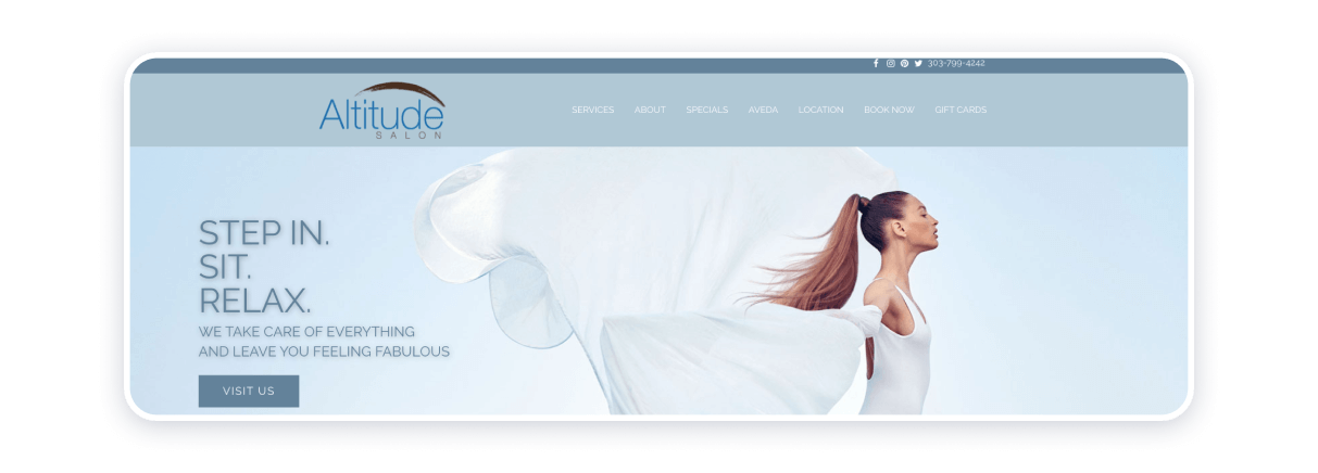
Some of the most crucial and hard choices a party deciding to build a website can ever make are pertinent to picking a color palette for a mediascape that is entirely their own. The expert mind behind the Altitude Salon website is very much aware of the maxim stated above, as a meticulous combination of colors and hues is what makes the website itself special. In this particular case, the color scheme of choice serves to bolster brand awareness and keeping the focus on effortless navigation, functionality, clearness, and charm. The qualities indicated above serve the purpose of empowering the beauty salon’s customers and the visitors of their website by inspiring them to recapture beauty and strength within themselves.
Hairazors Salon
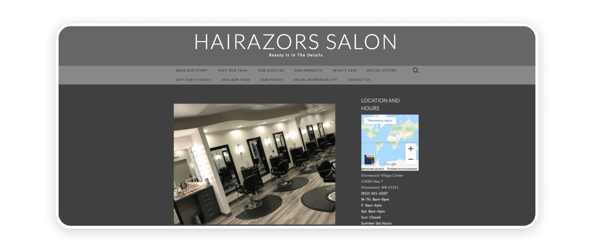
This salon serves males and females of all ages. Besides usual services, their site is designed to offer their own products, the link will lead you to the online shop, and the booth rentals offers invite new talents to join them!
The home page also has links to social networks and full information about the salon’s background.
Lisa Dinh Hair Studio
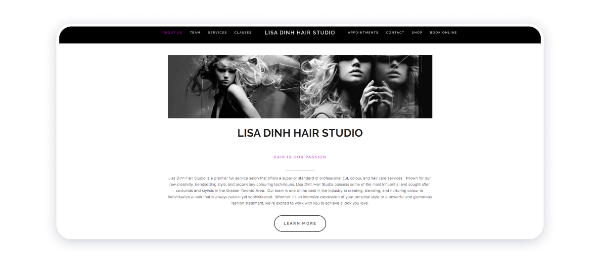
Lisa Dinh Hair Studio places emphasis on the experts behind the brand. The group portrait of the crew is shrouded with loyalty and warmth of human companionship, which also helps the prospective clientele to feel even more positive about the integrity of this beauty salon. The white color of the background as if creates additional breathing space, hence leaving the room for the visitors’ eyes to rest.
The demonstration video conveys the message of unity of the inner world, the appearance, and the external environment, which is totally unprecedented in and of itself. The enterprise sends a message of the importance of contemplating the brand’s mission and vision of bringing about subtle tangible, and continuous changes for the sake of a healthier, happier, and more environmentally conscious civilization.
Code Salon
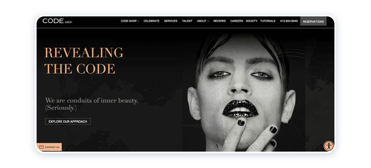
Their philosophy is determined by freedom of spirit. They believe all humans are unique and can be anything, not only what society wants them to be. The design totally reflects that philosophy.
The website is intriguing, neat and simple and makes clients want to know what’s more to it, enjoy their experience at Code and celebrate being human!
DBK Salon
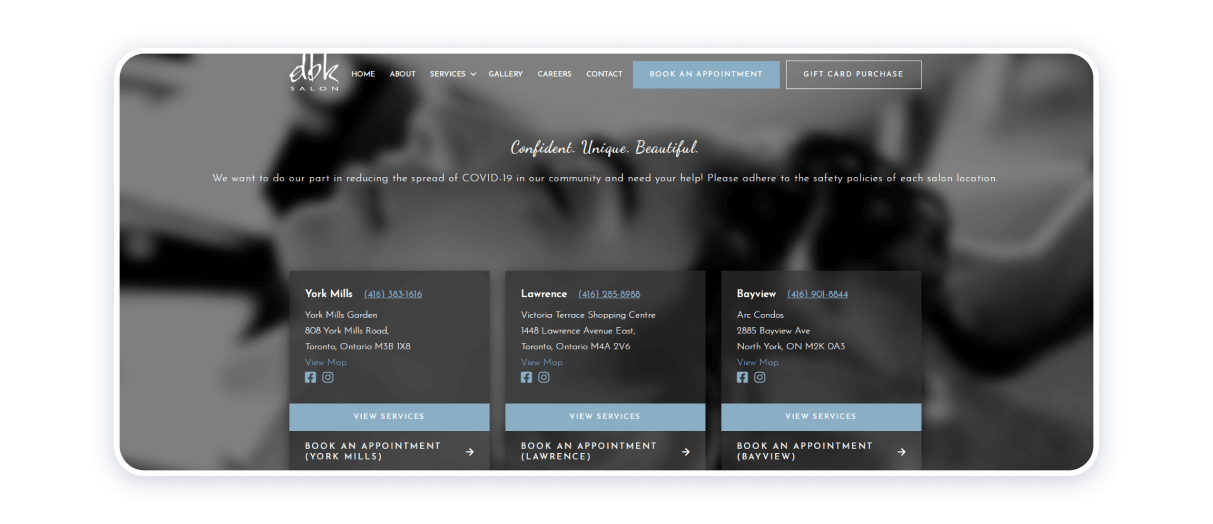
This beauty salon website exploits a monochromatic theme in grey tones. For the convenience of the website visitors, all necessary buttons have been placed on the header of the home page. The motto reads: “Confident. Unique. Beautiful” and it encapsulates the brand’s perception of recreation, beauty, and care. The presence of customer reviews bolsters the credibility of the resource. A total of three state-of-the-art, multi-service locations in the Canadian Ontario province, and the website does honor all of them by offering accordingly insights into the signature designs of the said venues.
Mop Hair Salon
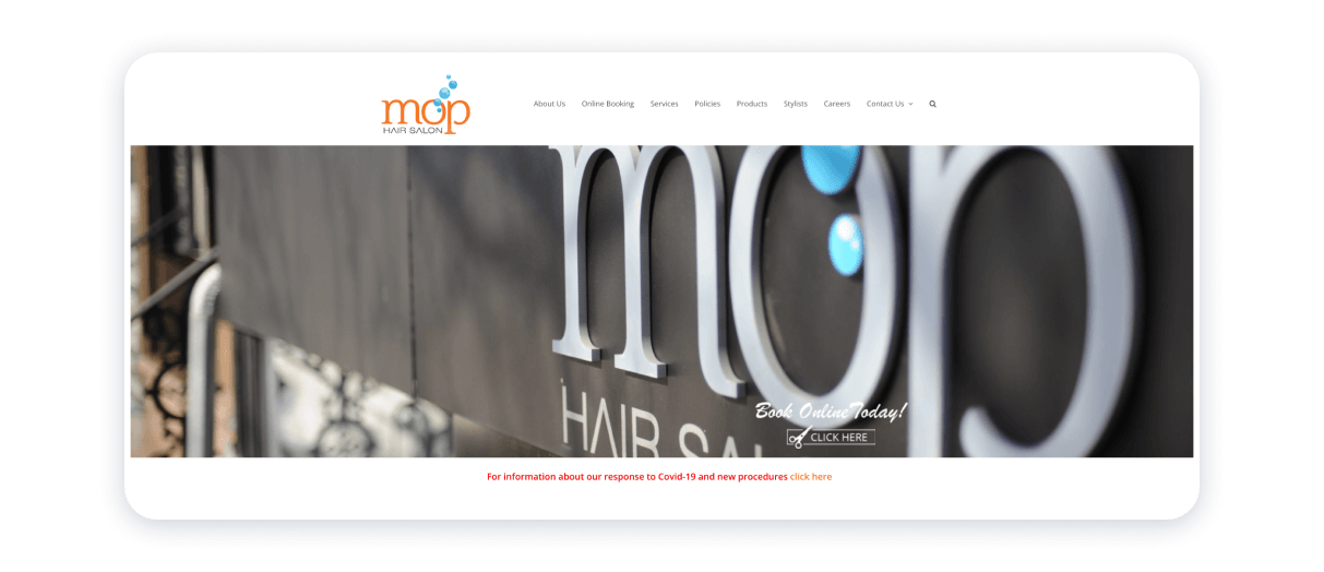
It was opened in 2013 by a team of talented stylists whose main goal was to work with a client until they achieve the look best suited for them. When you read about the salon, you can find a lot of reviews from clients listed in a neat row.
The design is colorful and bright. Alongside some eye-catching pictures, you find an intuitive menu that navigates you throughout the site. There is a big orange button which says book appointment and attracts attention. The more you look at the site, the more you want to visit the place.
Encore Salon & Day Spa
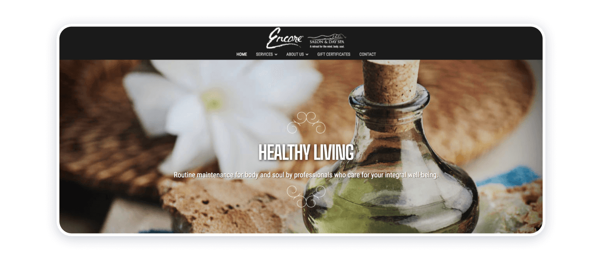
The building was originally a private residence, then home and hospital of Dr. Fishman, then Cheryl, who was the third owner of this building, completely renovated it, maintaining its elegance and old charm, and transformed it into a spa salon.
Design mirrors the history of the building. It is neat and classy. There is a short menu in the header giving clients all the necessary information in brief. Meanwhile, the footer has a blog and map. Images on top keep changing as you navigate the menu giving you an aesthetic delight.
Sine Qua Non
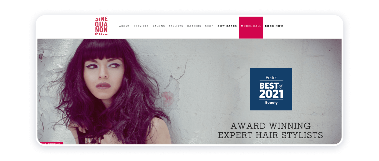
Started in 1993, salons have become the most successful in Chicago. The manager was a musician and songwriter, so Sine Qua Non became famous on the local arts scene.
This site features all salons of the Sine Qua Non brand, showcasing versatile and artistic hairstyles they made. Their mission is to make a client ecstatic about their hair. Everything on the site from pictures to content emphasizes an innovative approach to creating hairstyles.
Parlour Hair Salon
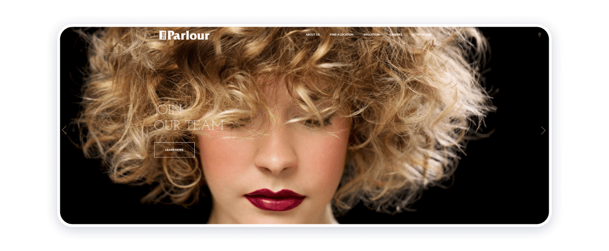
Parlour is a chain of hair salons with their own philosophy of personal responsibility, respecting others, looking for a good in others, and tidying up its weaknesses.
This site has an elegant dark design with a big opening menu offering among many services educational course, career offers, team portfolio, and a separate wedding hairstyle site.
Tips on Making a Salon Website
Salon website ideas presented above provide certain persuasive arguments for the numerous possibilities of coming at the business of starting a website for your beauty and personal care enterprise from many different angles. It is possible to briefly outline the points to ponder and things to remember like so:
- Forge your brain identity, sustain it, and evolve with it.
- Consider simplicity as your faithful friend.
- Formulate key messages and let them guide you.
- Do not be afraid of using bright colors.
- Organize efficiently.
- Authenticate your aesthetics.
- Be consistent with the content and form of the instruments that will help you deliver your message to the world.
- Exploit different marketing channels, and leverage SMS marketing platforms or email marketing tools to connect directly with clients.
Weblium can become your trusted and loyal companion in the procedure of creating a website for your beauty and personal care venture. The website builder is easy to use and it offers a plentiful of tailor-made templates to satisfy your demands. Weblium will help your dreams soar to the greatest heights and offer you the means necessary to see them fulfilled.
Now that you have seen all these ideas of beauty and hairdressing websites it’s time to create your own.
FAQ on hair salon websites
How to create a hair salon website?
Creating a hair salon website starts with choosing a reliable website builder, such as Weblium. Begin by selecting a salon-specific template that reflects your brand. Add essential pages like a homepage with your services, an “About Us” page, a pricing list, a gallery showcasing your work, and forms. Include contact details and testimonials.
How to choose the color for a salon website?
Opt for colors that resonate with your brand identity and target audience. Soft pastels like pink, lavender, and mint convey a calm and luxurious vibe, while bold colors like black and gold suggest sophistication. Avoid overwhelming combinations — stick to two or three complementary colors.
What are some recommended free website builders for a beauty salon?
Weblium is ideal for creating a professional beauty salon website. The builder offers user-friendly, beautiful templates, easy customization, contact forms, and the most affordable pricing.
