Construction Company Website Design: 9 Best Examples
Have you ever thought of construction companies? It is a highly competitive business that allows specialists to constantly work on improvements, learn new techniques, and discover materials.
On the other hand, when looking for construction services, people usually let one company or master do all the work for them. This makes long-term deals work out and bring satisfy and profit to both sides of a contract.
Now think of the best examples of a website for a construction company. Impressing style, enumeration of the best works, and experience in the field.
When the company is quite big, it may decide that a website is a necessary step in their career. Create a website on Weblium from scratch and introduce yourself to the world.
Construction Company Website Templates
Let’s go!
Contents
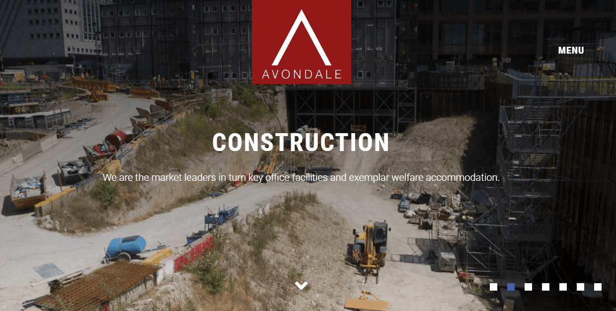
Avondale – construction company
Website: https://www.avondale-construction.co.uk/
“Wellcome to Avondale construction!” This is the welcome phrase on the home page of this construction company website.
Features:
- a brief description of a company
- real photos of a working process
- the grand company demonstrates its grand projects
- eco-friendly materials and waste management are among the key points
- testimonials section
- news Blog
- Instagram follow preview
Balfour Beatty commercial construction company
Website: https://www.balfourbeatty.com/
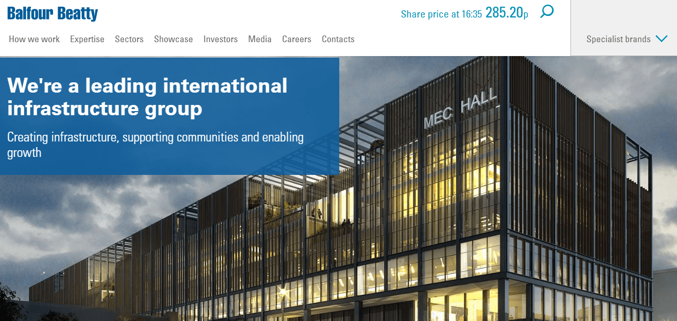
One more large construction company website on the list.
Balfour Beatty is slightly different from the previous example. Founded in 1872, by George Balfour the company works for different kinds of customers around Britain.
The outstanding characteristic of the website is its likeness to a blog website. It contains sections of news, video share, list, and opportunities for cooperation and partnership. They claim to be leaders and trendsetters on the whole construction and infrastructure sector as a whole.
Virtus
Website: http://www.virtus-contracts.co.uk/
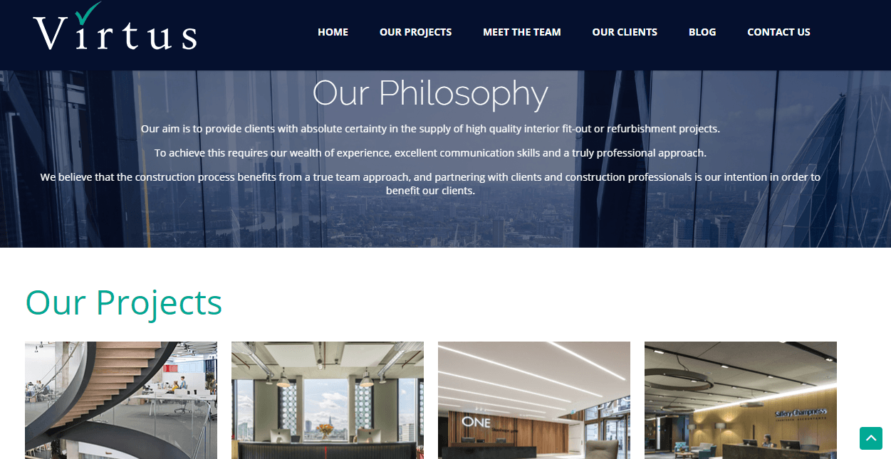
I want to admit a very useful website decision applied here. It is a fixed header panel with the company name and main pages of the website. This wraps complex interaction with customers because they always can move to more interesting pages, and they don’t forget the name of your company:) This is crucial for smaller companies, competing with the others.
The philosophy of the company is also a romantic hook that is likely to influence inner feelings.
The section “Our projects” is common among construction company websites, a must-have. Show off your previous works, designs, and quality of spacing on a website for a construction company.
This company has switched Instagram preview to a Twitter account. Possibly, they have oriented on business Twitter users, who might enjoy reading short construction posts along with photos follows.
Meet the team page is also lovely. It contains photos of the same style for workers of the company. This is a perfect way to establish a little closer contact with customers and show how many devoted colleagues work there. with this introduction, you make the first step to engaging in productive communication.
MacKenzie Construction – website designs for the commercial construction company
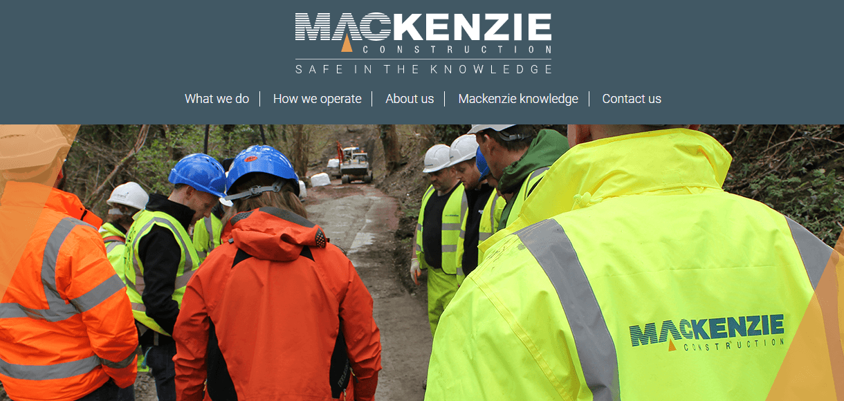
Website: http://www.mackenzieconstruction.com/
Meet the team of MacKenzie Construction company from Glasgow.
Their website looks like a number of motivating slogans and descriptions. But it definitely looks good.
They are a company that makes a value of health and safety, quality of services and resources, puts efforts into innovation and introduce new technologies in the field. They are proud of what they do. Because they love their clients and orders.
A blog is called here MacKenzie knowledge and is reflexing on issues of construction.
Graham
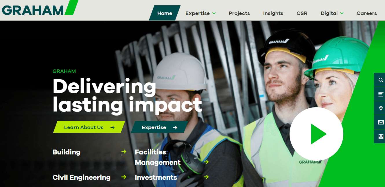
Website: https://www.graham.co.uk/
Graham is another construction company and here is their website.
The website is bright green, symbolizing new ideas and decisions on the sphere, provided by the company.
They claim to be experts in civil engineering, facilities management, interior design, investment projects. Their philosophy is not listed anywhere separately but is feels everywhere throughout the pages on this website. The company is devoted to working for people’s satisfaction, want to make an impact for a brighter future.
Harvest construction – great design example
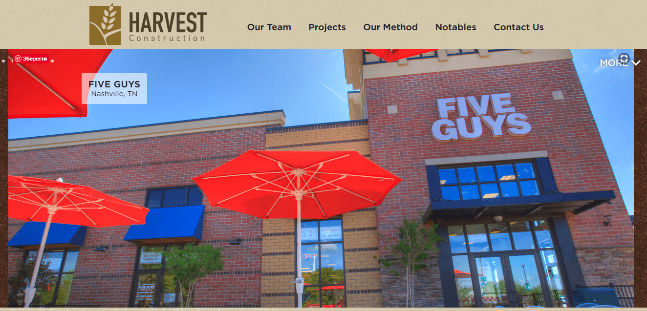
Website: http://www.harvestconstructionllc.com/
Harvest construction stands out from the list of usual designs for the website of a company in this sphere. They used brown colors for the background and logo, and this distinguishes them from among others. Then, bright colors on the photos create a modern appearance.
The page “Our method” replaces a more common “philosophy” section. But it transfers the same – ideas and requirements. At Harvest, they value efficient standards, constant communication with clients is likely to establish long-term partnerships.
Hawaiian dredging construction company, Inc.
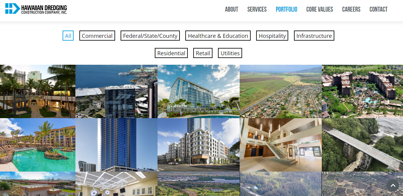
Website: http://www.hdcc.com/
Hawaiian dredging construction company made a bet on the brand of luxury buildings. Just take a look at there photos and you see that their services are expensive and valuable. But you are sure, they make it with taste and inspiration. Their portfolio is very large, they aren’t shy and show all their works – collected into different sections. They build constructions of different complexity, e.g. bridges, roads, commercial and industrial projects.
Nan Inc
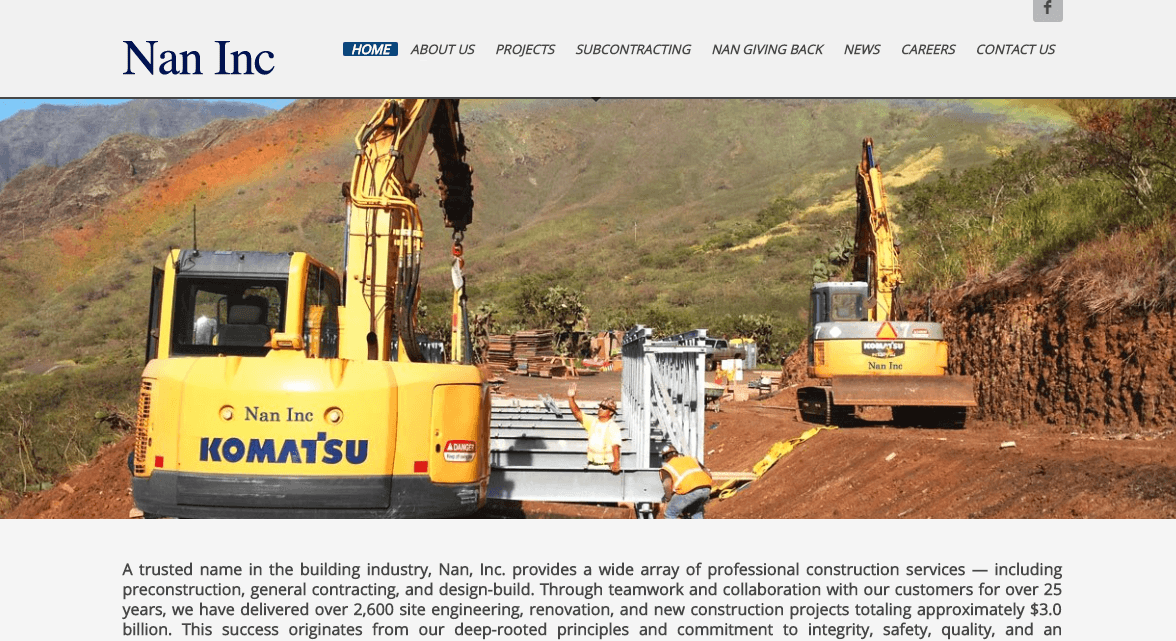
Website: http://www.nanhawaii.com/
Nan Inc was founded in 1999 and is still working for its old and new clients.
Their website includes a description of the company on the home page, moreover, it is arranged in a separate article for interested users.
Next, they placed on a home page a photo gallery and featured projects. These all insures, that a visitor will find all the necessary info without redirection to other pages.
The footer is minimalistic, even more than it should. But still, it provides contact info and address. We at Weblim have already inspected the best footer examples in our blog, follow the link to read: footer website examples.
Vaughn
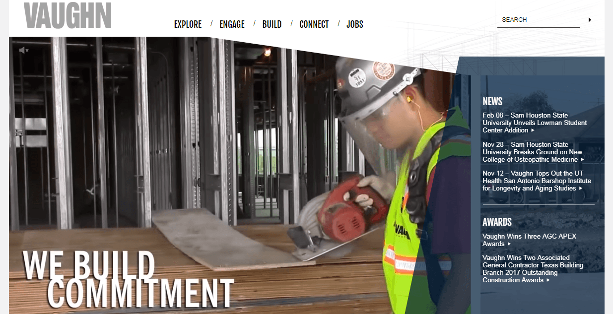
Website: http://www.vaughnconstruction.com/
This website page can be described as “short”. You can’t scroll down and inspect information like in a one-pager. Here you can watch videos of the construction process, read slogans:
- we build trust
- we build commitment
- we build teams
- we build certainty
- we build quality
And after this, you may become interested in other sections – read a firm profile, check the parameters on which this team is different, explore the news.
And then – your last destination is the “connect” button. Click it to join the team, contact managers, to make other inquiries.


