How to Build Your Perfect Personal Branding Website
Congrats on the decision to build a personal website — you’re on the right track!
You’ve obviously understood the importance of having a strong personal brand, and a website will definitely help you grow this brand more strategically.
For this blog, we’ll lay down all the tips and tricks to help you create a solid website (read: a website you’d like to keep in the longer run).
Alongside that, we’re also going to share how to build a website (small hint: it’s through the help of Welbium).
Alternatively, if you’re already good at the tips and tricks and want to begin building your personal branding website, get started on Weblium for free.
Contents
1. Decide on a goal
Alright, so before you even decide on how, when, and where to build your website, first drill down on the “why”.
Analyze your purpose for this website. Is it to improve the credibility of your brand? Do you want to increase sales? Do you want to publish your thoughts and ideas on this site and gain an audience?
Deciding on the goal is extremely important as it’ll also impact the other decisions you make with the site (e.g., your CTAs will get impacted based on your goals).
2. Images are crucial
For most folks, the biggest component of building a personal branding website is the added credibility and trust that might come their way.
So, to ensure your audience can trust you, always add images of yourself and your work.
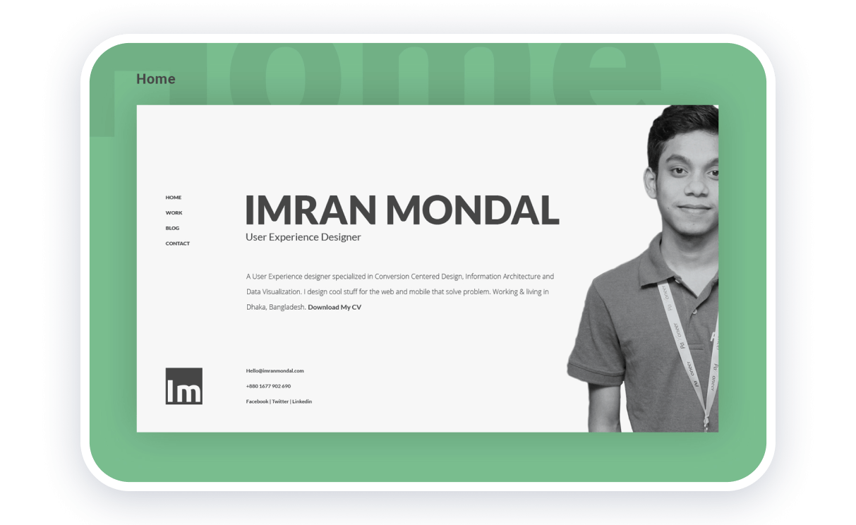
Also, please avoid using stock images as they’re known to build a feeling of un-authenticity and can make you lose your USP (unique selling point) by making your product indistinguishable.
3. Showcase your expertise
Showcasing your expertise with the help of awards you’ve gotten, results you’ve achieved, or work you’ve done helps your readers trust you (and most of your clients want to see your expertise, too).
Just to back up this claim, we got the insights of Joe Kevens, founder of B2B SaaS Reviews and Director at PartnerStack:
“As a business owner who hires freelance writers, when I’m considering whether to hire one, I like to see who the writer has written for and read some of their sample work.
A personally branded website is an effective way for writers to showcase their work and demonstrate their expertise. The same goes for marketers and other freelancers.”
4. Weave in testimonials
Weaving in testimonials and reviews is another great way to authentically build trust for your brand.
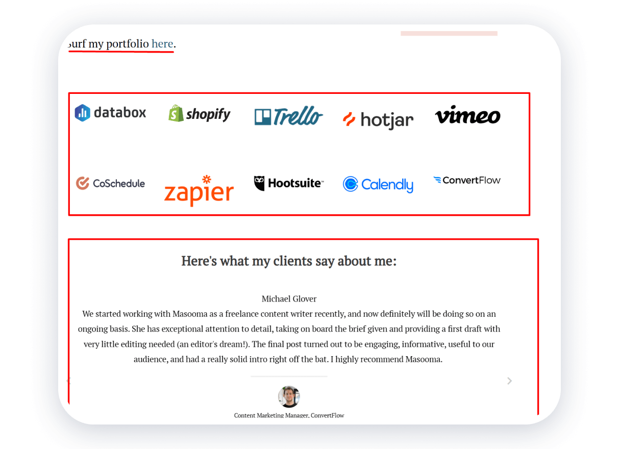
For example, consider the website of Masooma Memon, a freelance writer.
Not only does she weave in the testimonials she’s received from her clients about her blog posts, but she also drops the names of the companies she’s worked with and shares the link to her portfolio (all of which do an excellent job of building her expertise).
5. Define your value and USP
Your website should also define what you do differently from other competitors in the market, so sharing your value and USP are some of the great ways to do that.
For example, some things you can consider highlighting are:
- The clients you have worked with
- The years of experience you have
- The courses you’ve taken
- The recognition you’ve received
- The prices you offer
- The level/type of work you can do
- The guarantee you offer
- The results you’ve gotten
Also, try to be as specific as you can. For example, instead of saying, “I help brands improve conversion rate,” try saying, “I help brands improve conversion rate by X%.”
6. Optimize for SEO
Plug your website into the search console of search engines and begin looking for the best SEO practices to follow. For example, you can:
- Integrate relevant and high-volume keywords
- Use images that are adaptable to all devices
- Post relevant content that brings value
- Add internal and external links
- Reduce the number of error redirects
- Improve readability by structuring your content
7. Be strategic with CTAs
As we mentioned before, your CTAs are dependent on the goal you have for your website. So, consider the goal and the intent of the reader and develop CTAs accordingly.
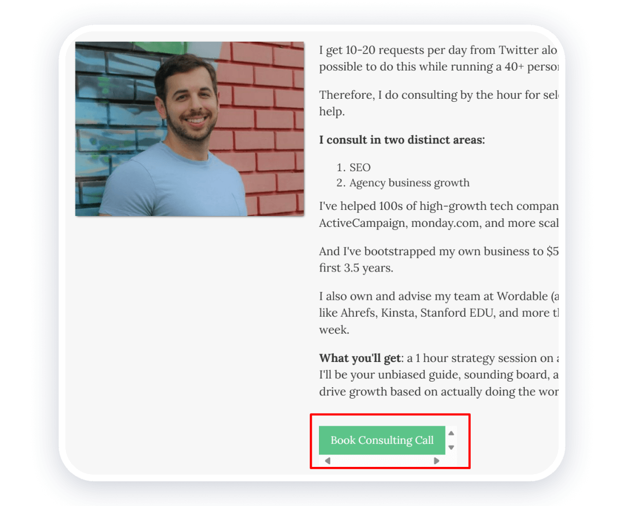
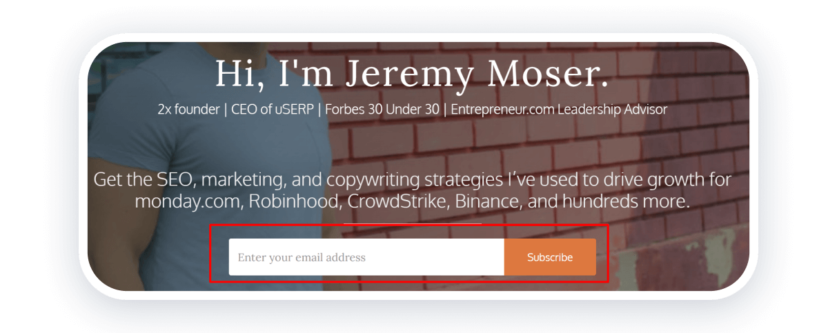
Even if you have multiple audiences, you can make CTAs relevant for each persona. For example, consider the personal website of Jeremy Moser. He has different CTAs on different pages for different audiences.
In this example, he’s targeting agency owners looking for growth advice.
Meanwhile, on this page, he’s targeting SEO and marketing professionals looking for SEO tips and tricks via a newsletter.
A study by HubSpot also found that personalized CTAs showed an improvement in conversion rates by 202%.
Oh, and it doesn’t hurt to add links to your social media accounts. It’s a simple way to encourage conversations with your target audience and build a following.
8. Have a chat with the experts
Before your website gets buffed and polished, you might also benefit from having one-on-one conversations with experts in different fields (e.g., SEO, design, UX, web development, etc.) to get their input.
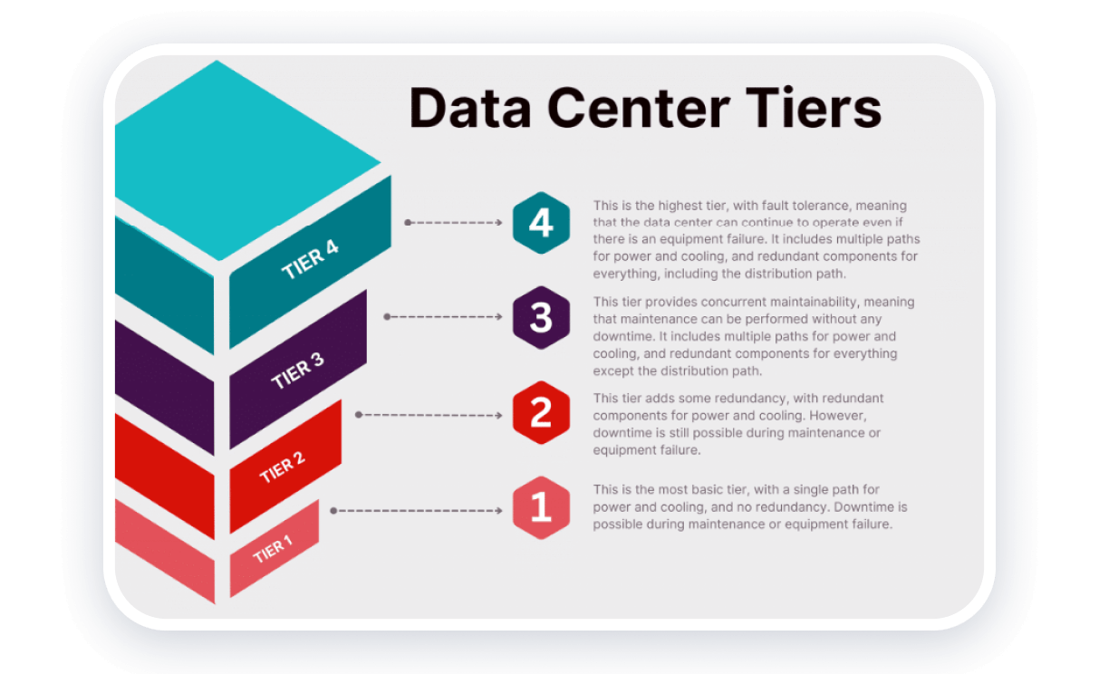
For example, if you estimate to have many users visiting your site and engaging with it, or if you offer high-ticket items where users expect a seamless experience, you can ask your web developer if a colocation data center might be the right path for you.
These centers can help provide each user with a seamless experience by improving website load times, minimizing downtimes, and providing better security.
In addition to considering the benefits of a colocation data center for enhancing user experience, it is also important to prioritize data center sustainability. As the need for digital infrastructure continues to grow, it becomes crucial to opt for environmentally friendly solutions.
Look for data centers that prioritize energy efficiency, renewable energy sources, and sustainable practices. By choosing a colocation data center that emphasizes eco-friendly practices and sustainable infrastructure, you can attract environmentally conscious consumers who value businesses that align with their values.
9. Keep it legally compliant
If you offer products or services (e.g., consultation calls, bookings, templates, etc.) on your website, then it’s vital to ensure you and the reader are both protected.
So, it’s more important than ever to focus on the fine print and mention all the necessary details on your terms and conditions page. In this scenario, we’d recommend opting for a free terms and conditions generator like the one offered by Termly. This tool can help you draft comprehensive terms and conditions that align with your needs.
But that’s not all. As a business, you need to make sure that your website is accessible to everyone. By using the best text-to-speech software, adding browser extensions like ARIA, and asking experts to audit if your website adheres to the W3C accessibility standards — you can guarantee that your website checks all the accessibility boxes.
Only then, once the legality is sorted (and you’re sure both parties are equally protected), you can create the website of your dreams!
10. Consider design and UX
The design and user experience (UX) you present to the audience can make a huge impact on the way your website is perceived and the conversion/bounce rates you have.
So, here are some design tips you can leverage:
- Keep things simple (don’t make a super-cluttered website)
- Ensure your CTAs have a big contrast in colors
- Keep the red and blue colors for errors and links, respectively
- Don’t forget to add a search bar (especially if you host a blog)
- Use universally understood icons
- Understand the user flow of your website
11. Be consistent with style
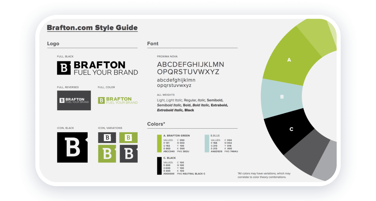
Your content and design must look consistent throughout your website. You can’t use red and green on one page and yellow and white on others. Similarly, you can use a funny tone on one landing page and a strict tone on your home page.
Some experts even recommend having style guides that you can quickly refer to when creating new content. For example, your design style guide can look like this:
That said, authenticity is key — so don’t be afraid to keep conversations genuine and switch things up a tad bit every once in a while!
In addition, your personal branding website should echo the same style and tone as other professional platforms. If you are active on LinkedIn, for example, make sure that the content, images and tone you use are in line with your website. Tools that allow you to schedule LinkedIn posts can be invaluable in ensuring that your brand image and message are consistent.
12. Optimize website load speed
Finally, the final “tip” up our sleeve is to ask you to optimize your website to improve your load speed.
Most people agree that traditional websites should load within three seconds, or you risk increasing the bounce rates on your site.
So, here’s what you can do to optimize your website’s load speed:
- Try to compress your images to show high-definition content without taking up too much space.
- Reduce the number of error pages and redirects on your website.
- Reduce your HTML and JavaScript codes with the help of plugins like Autoptimize.
- Double-check if your fonts and designs take a long time to render!
- Try to use cache prefetching techniques.
[Side Note: You might also benefit from asking your web developer how to improve load speed during your one-on-one call.]
Use Weblium to build the perfect personal branding website
Now that all’s said and done about the best practices to keep in mind when developing your personal website, let’s get to the fun part about how to create this website. So, here are the steps:
Step 1: Go to Weblium.
Step 2: Click on “Start for Free” if you want to create your own website, or click on “Order a website” if you want a professional to make your website.
Step 3: If you’ve chosen the latter option, leave the experts to do a job well-done. If you’ve chosen the former option, begin browsing templates on Weblium and creating the website you need.
Step 4: Connect your website with your domain name. And that’s it — you’re done!
If you need help along the way, check out the templates and solutions that we offer at Weblium to improve your public image today!
