8 Inspiring Museum Website Examples
Museums are true treasure troves of culture and history. Their websites should reflect that same depth. Today, when most people discover exhibitions and events online first, a strong digital presence becomes a powerful way to engage visitors, present collections, and build a lasting connection with the audience.
In this article, I’ll share some good examples of museum websites that truly stand out for their style, usability, and creativity. Let’s explore what makes them work.
Contents
Museum
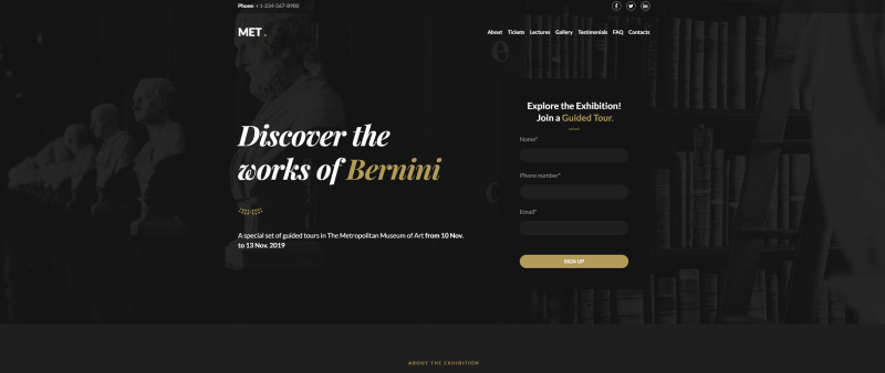
This one-page museum website template immediately catches the eye with stylish typography and a deep, dark background that creates an atmosphere. The guided tour sign-up form is placed right in the hero section, so interested visitors can register instantly without extra steps.
To avoid overwhelming users with long descriptions, the content is organized using an accordion. Everything is structured and easy to explore. A gallery with high-quality photos highlights the exhibition rooms, while carefully selected icons support the overall aesthetic. It’s one of my favorite museum website examples you can use to create a modern and engaging online hub for a museum.
Art gallery
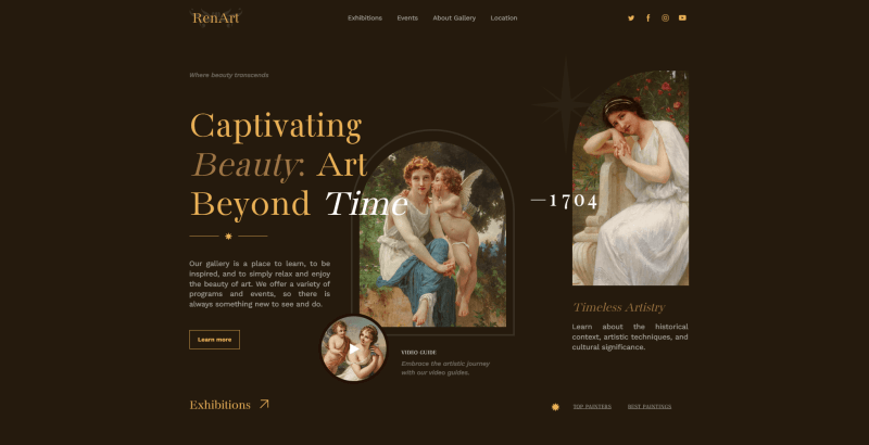
This refined design is created to deliver an immersive user experience while presenting art in its full depth. The thoughtful blend of typography, color palette, and layout creates a sense of transition. Here, the masterpieces don’t just appear on the screen. They truly stand out and command attention.
One of the standout features is the free, layered arrangement of elements that elegantly overlap each other. You can recreate the same effect by experimenting with composition and visual hierarchy. Testimonials, imagery, and links are positioned in an unconventional yet harmonious way, adding character and originality. This template can also be good for a gallery website or bold creative portfolio. Everything is fully customizable.
Design
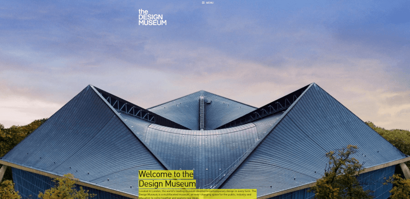
Another great example of museum websites, a Webby Awards winner. The whole web portal feels bright, bold, and very on-trend. The first thing that caught my attention was the header photo of the exterior. It looks like a piece of art on its own. And right above it, there’s a super compact menu that feels clean and satisfying to use.
As I scroll down, I immediately see announcements of key events presented as large photos, it’s a smart move. Then come the practical details: the schedule, clear “Book tickets”, “Plan your visit”, “Sign up for updates”, and “Become a member” buttons, plus a calendar of events. Everything feels well-arranged and easy to navigate.
Mucem
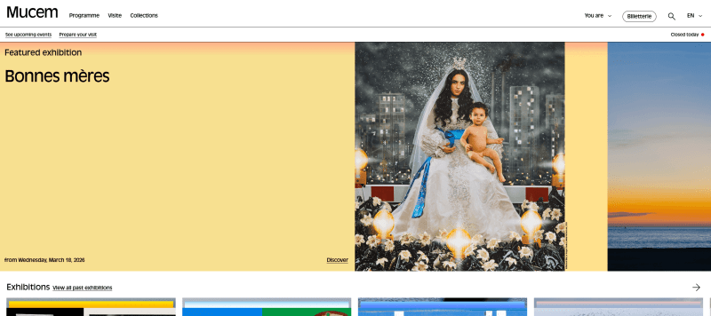
This is one of the most interesting art museum websites: visually attractive, flat in style, and clearly structured. The developers focused on simplicity, yet the portal still stands out thanks to its distinctive identity. As you start scrolling, the large header inscription gradually shrinks, creating a subtle dynamic effect. Bright, multi-colored blocks highlight announcements of the most important events.
Closer to the footer, just below the news section, there are dedicated options for different visitor categories. You’ll also find links to social media, press reviews, government contracts, work and training opportunities, “Friends of Mucem,” and other useful sections, all well-organized and easy to access.
Frans Hals
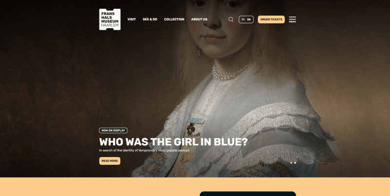
Check out this Awwwards winner, and you’ll immediately see what makes it stand out. The homepage opens with a bold “Welcome” message, paired with a concise top menu and a clearly visible “Buy Tickets” button right below. On the left, a clean, minimal menu invites visitors to explore the calendar, use search, view locations, check the schedule, or purchase tickets.
The navigation is thoughtfully designed, allowing users to access everything they need even before they begin scrolling. The footer adds a subtle retro touch that complements the overall style.
Tate
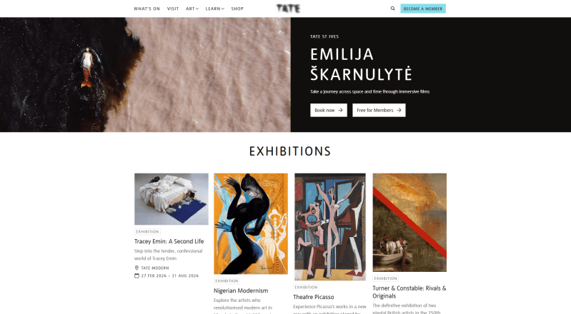
The header features a video clip from the latest exhibition, which is a good way to set the tone and immerse visitors right away. As you scroll, you can explore galleries, upcoming events, and collectible art objects. Each is presented with detailed information. Further down, there’s a dedicated block inviting visitors to become a member, subscribe to the newsletter, or purchase selected products.
The design relies on generous white space, which I think makes the website feel clean, modern, and easy to navigate. Blue buttons neatly complement the overall color scheme and guide attention without overwhelming the page. It’s no surprise that the famous Tate inspires others through its professionally designed web portal.
Metropolitan
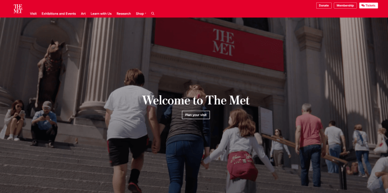
This is among the most beautiful and well-organized museum website examples. The first thing that draws attention is the banner featuring a video alongside a clear “Plan your visit” button. In the best tradition of effective design, CTAs appear in every main page block, which I find especially smart for a modern art site.
Scrolling down, there’s a “What’s on” section, a block with locations, a primer, links to artists, interviews, and a calendar of events. Visitors can also explore additional opportunities like the audio guide, “Kids and families”, “Educators”, and more. Everything is laid out to make discovery easy and engaging.
Whitney
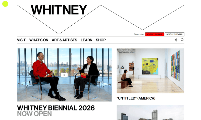
One of the standout features of this site is its large, readable fonts paired with subtle animated elements, which make browsing feel effortless. The portal keeps things straightforward. Scrolling through ticket purchases, membership options, news, and subscription forms gives access to all essential functions and CTAs without clutter.
The search bar is particularly smart, considering the site includes so many artworks and artists. It’s by far one of the easiest examples of museum websites with intuitive navigation and user experience. With these thoughtful features, Whitney clearly stands out as one of the best exhibition website examples.
How to make a website for a museum?
1. Register. Start by creating an account on Weblium. Once registered, you gain access to an intuitive editor that simplifies the website-building process, even if you have no coding experience.
2. Choose a template. Browse through a variety of pre-designed layouts and select the one that best fits your museum’s style. Each template is fully adaptable, allowing you to create a unique online presence.
3. Customize. Use the editor to tailor colors, fonts, layouts, and other design elements to match your branding. Weblium’s basic features are easy and intuitive, and can be used by beginners without any design experience.
4. Add content. Upload professional photos of exhibits, events, and museum spaces. Consider creating separate galleries for different collections or exhibitions to make navigation easier for visitors.
5. Go live. Set up SEO for better search visibility, connect your social media profiles, and double-check all links and content. With Weblium, publishing your website is as simple as clicking a button, making your museum accessible to audiences worldwide.
Conclusion
Building an online portal for your museum is fast and simple with Weblium’s website builder. Whether you use ready-made templates or design your site from scratch, it’s possible to launch a polished, professional website in as little as 30 minutes.
Bring your exhibitions and collections to a global audience, making your museum accessible anytime, anywhere. Sign up for Weblium and create a modern and professional museum website with ease.
FAQ about museum websites
Why does a museum need a site?
A website is a powerful way to attract visitors and promote events. It quickly provides information about opening hours, ticket prices, and the latest news. Additionally, it enables online booking and helps reach a wider audience, including young people and international visitors.
What should be on a museum website?
Essential pages should include the museum’s history, collections, and current exhibitions. It’s also important to provide contact information, addresses, and an interactive map to make visiting easier.
What makes a good museum website?
A good museum website is visually appealing, easy to navigate, and fully optimized for mobile devices. Fast loading, clear structure, and high-quality content (such as professional photos of exhibits, detailed descriptions, and timely updates) are key to keeping visitors engaged and well-informed.