10 Great Coaching Website Examples That Build Trust & Clients
There is a common belief that the life coaching business is destined to fail. Some say that life coaches are not experienced enough to advise people on important matters, and that the audience cannot always apply the solutions offered to their situations. Nevertheless, there will always be skeptics. Meanwhile, focus on developing an excellent website rather than trying to prove them wrong. Here are 10 awesome examples for inspiration.
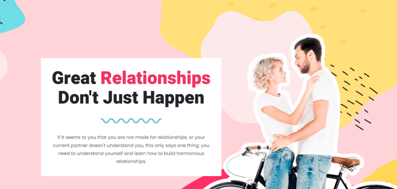
First, we would like to present our free coaching website template. You can start your coaching website for free with this template. Just log in and try out our website builder 🙂
Try coaching website template for free 🙂
So, let’s go to see the most beautiful website examples 🙂
Contents
Onyxon
This business coach website is focused more on the business part of personal growth. This is a larger agency that provides a variety of services for the ones who would like to improve not only mentally but also career-wise.
Strong points: magnificent modern design, a wider range of services, and professional photos of the employees.
Try coaching website template for free 💼
Margot Wilmore
This is one of the most inspiring coaching website examples to inspect. The bright palette of the website is refreshing and gives enough energy to browse it through. The site contains information about the services and the pricing, which is also convenient for potential clients.
Strong points: convenient navigation, bright design, and full information about the services and the pricing.
Try coaching website template for free 👫
Insight Coaching – beautiful life coaching website
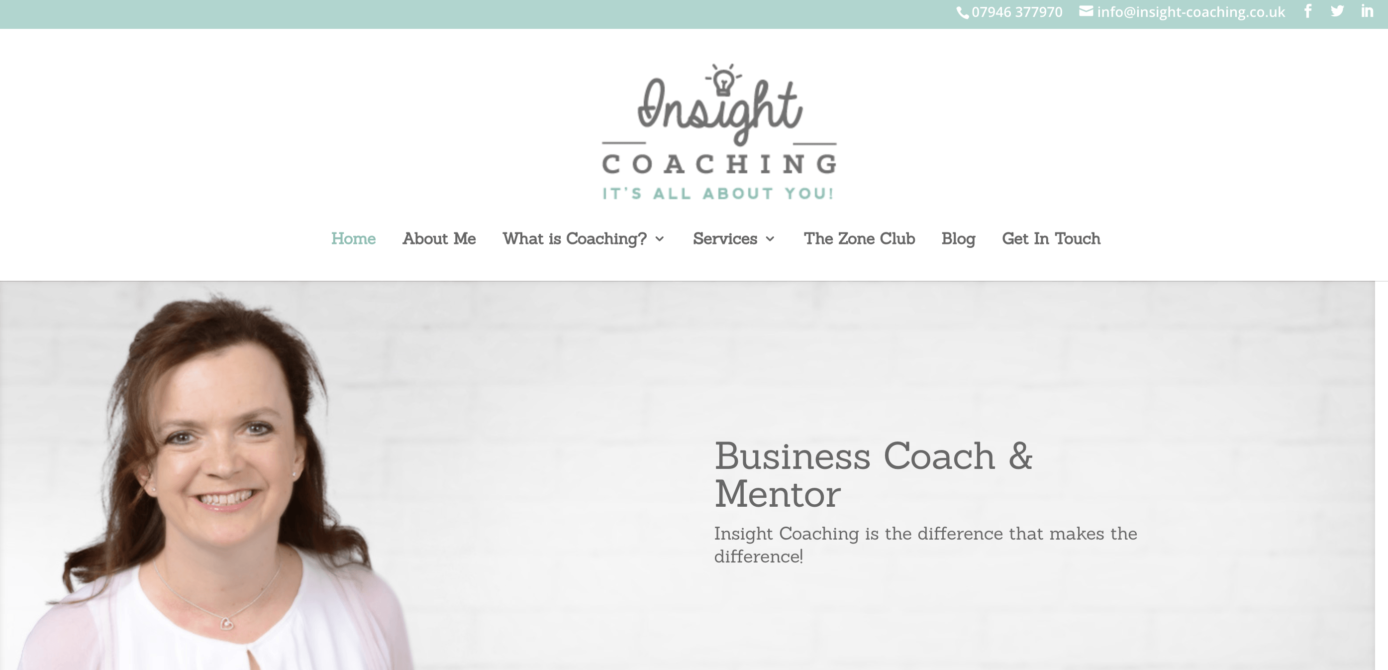
One of the best things about this website is that it starts with the explanation: what coaching is and how it can be helpful for you.
Even in case a user lands here accidentally, they see a short explanation and “Click for more details” link, discreetly placed below. A call to action is not aggressive, just like all the other CATs on the site. The homepage is very informative. Texts are written in a friendly manner, and the color palette looks very relaxing.
A bad factor of this website: Not Secure.
View website: http://www.insight-coaching.co.uk/
Cortney McDermott – the example of the life coaching website
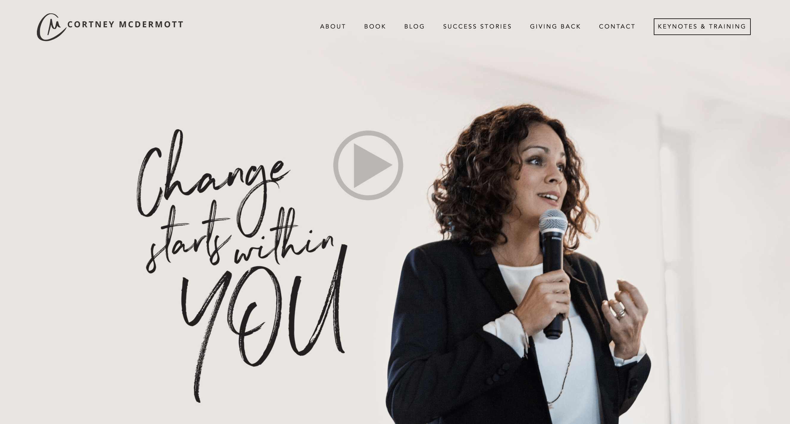
Your meeting with Cortney McDermott starts from the moment you open her site. There is a high-res image of the coach and a handwritten slogan — “Change starts with you.”
A Play button opens the video by Fox 32, where you can see the coach in action. The list of partners that appears with the next scroll proves her credibility and encourages her to subscribe to a free weekly digest. The navigation and website blocks are well structured. Beige and white together with black wording make the design elegant.
View website: https://www.cortneymcdermott.com/
Wild Sacred – life coaching website
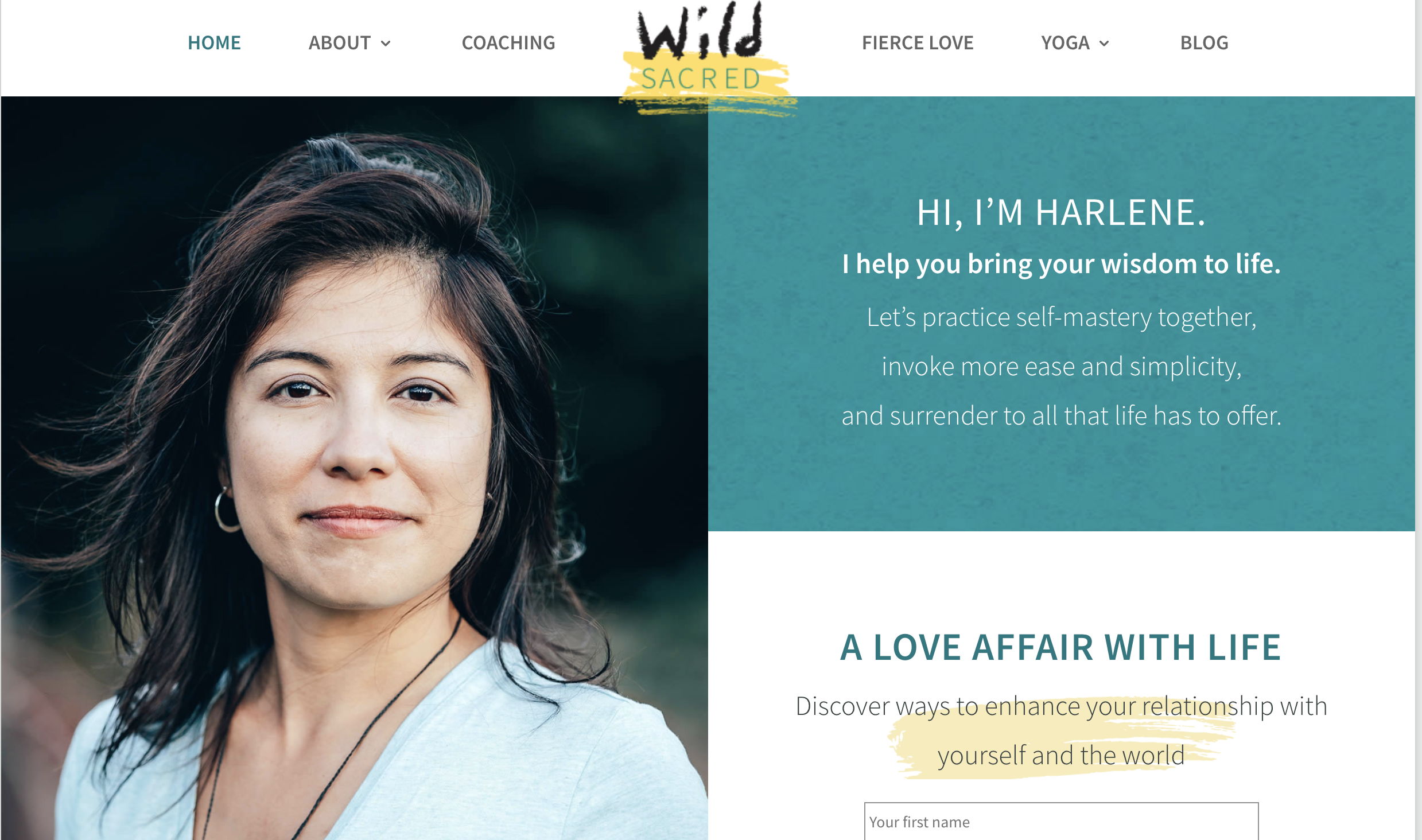
This website has a simple block structure and praises simplicity in general.
Users meet Harlene, smiling, and promising to invoke more ease and simplicity. Bright contrasting colors make the site lively and energetic. Personal photos, also bright and crisp, show a person who can be a good example to follow. This might sound like a very subjective estimation, but the subjective factor is exactly what makes a person choose a coach. Wisely placed CAT buttons with smart copy encourage to interact.
A bad factor of this website: Not Secure.
View website: http://wildsacred.com/
Create your own website for free 🚀
Amber Chalus – coaching website design
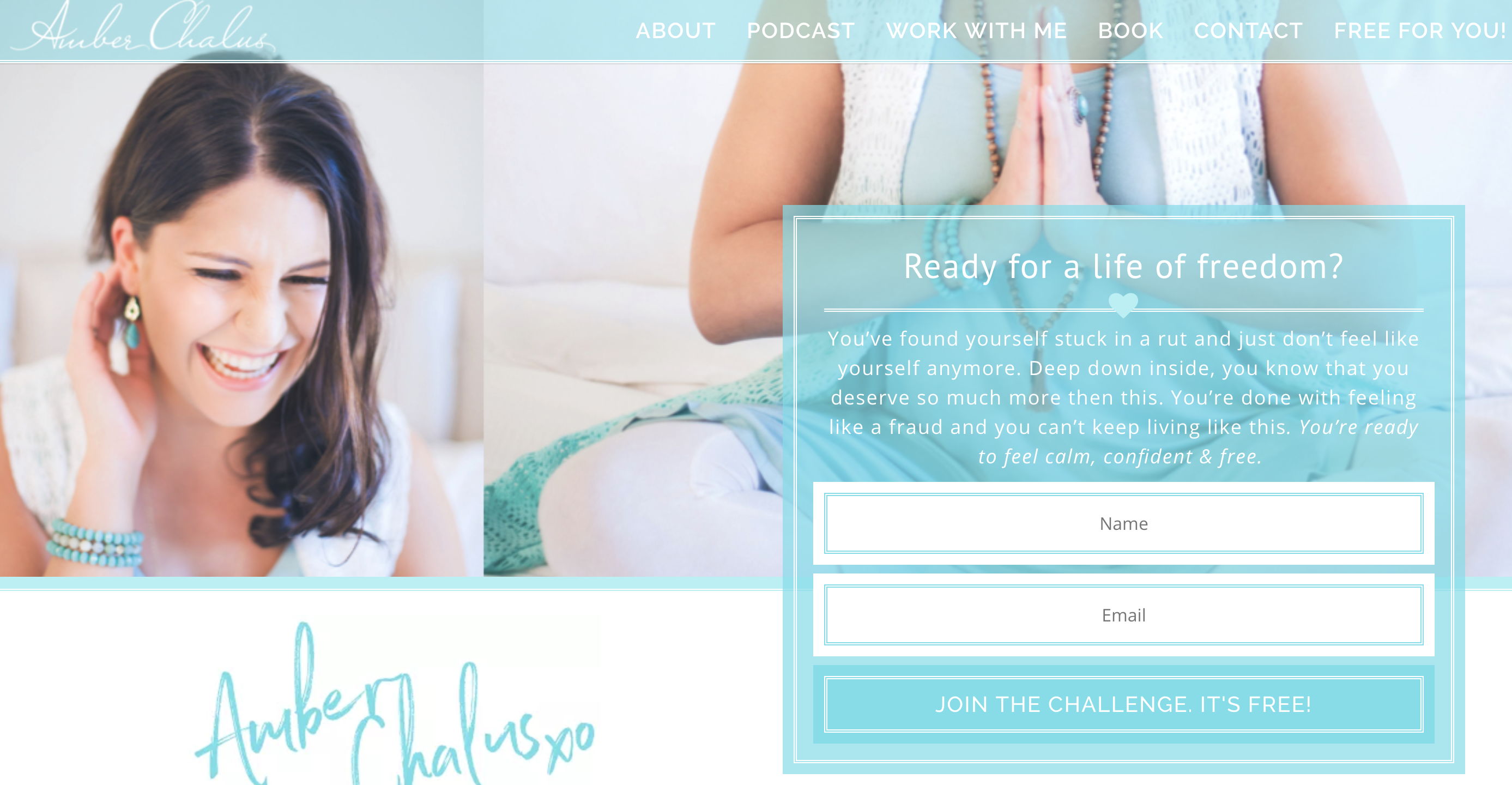
Pleasant white and turquoise colors, nice wording, a smiling coach — it all looks like you are in a good place. Pay attention to the copy: Amber Chalus explains her services through hypothetical situations, emphasizing that things you can achieve are bigger than you might think. Users can subscribe to a free newsletter on the first scroll on the homepage — a good move to connect with potential clients.
View website: https://www.amberchalus.com/
Elizabeth Rider – coaching website example
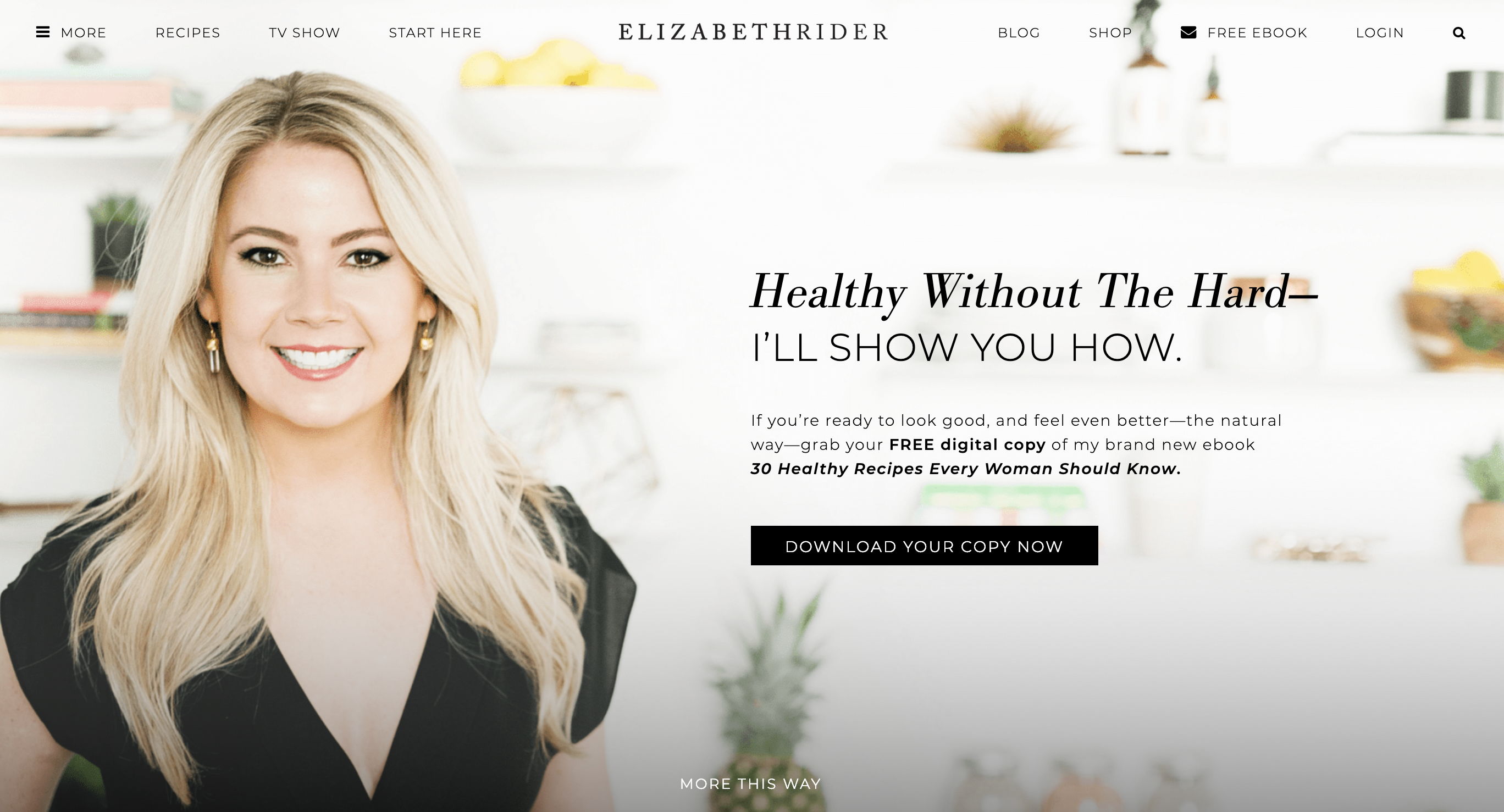
Elizabeth Rider is very straightforward. She meets a user with a solution to their problem: she can show how to start a healthy life without suffering, how to leave junk food behind and don’t feel like you are in The Hunger Games. The navigation is smartly organized. Links to the main sections are located at the top. A click on More opens the side menu so everything is accessible from the first scroll on the homepage. The host also offers a bonus — a free copy with 30 healthy recipes.
View website: https://www.elizabethrider.com/
The Courage Practice – coaching website example
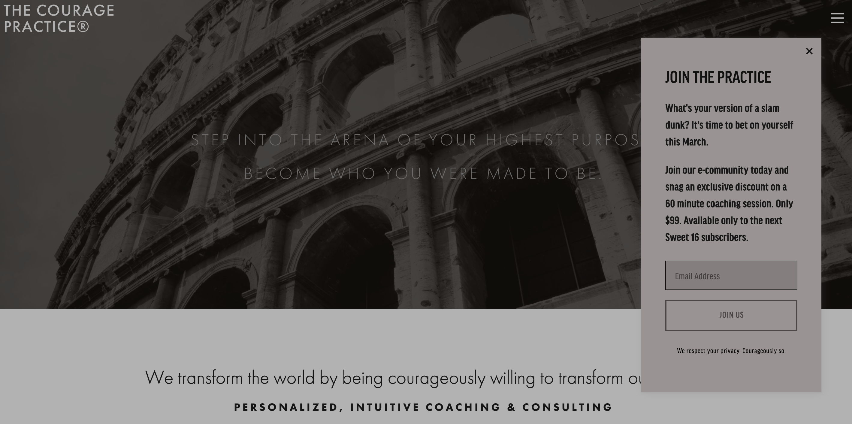
While the examples mentioned above are focused on the personal development and confidence, The Courage Practice strives to create an image of the highly professional service that can deal with issues of any scale, sphere, and complexity. Below the copy on the main page, users discover what assistance they can get. Abstract images in warm colors contrast with the first slide as if illustrating the positive changes that wait for you.
View website: https://thecouragepractice.org/
Skybound Coaching & Consulting – website example

This is an excellent example of a business-oriented approach. The hypnotizing animation, challenging slogan “Dare to fly higher” written in red letters, highlighted menu points — someone wants you to decide that it is the right time for personal development and ensures to help with.
The minimalistic design and convenient navigation help to focus the attention on the opportunities and CATs.
View website: https://goskybound.com/
Kimberly Buchanan – great life coaching website design example
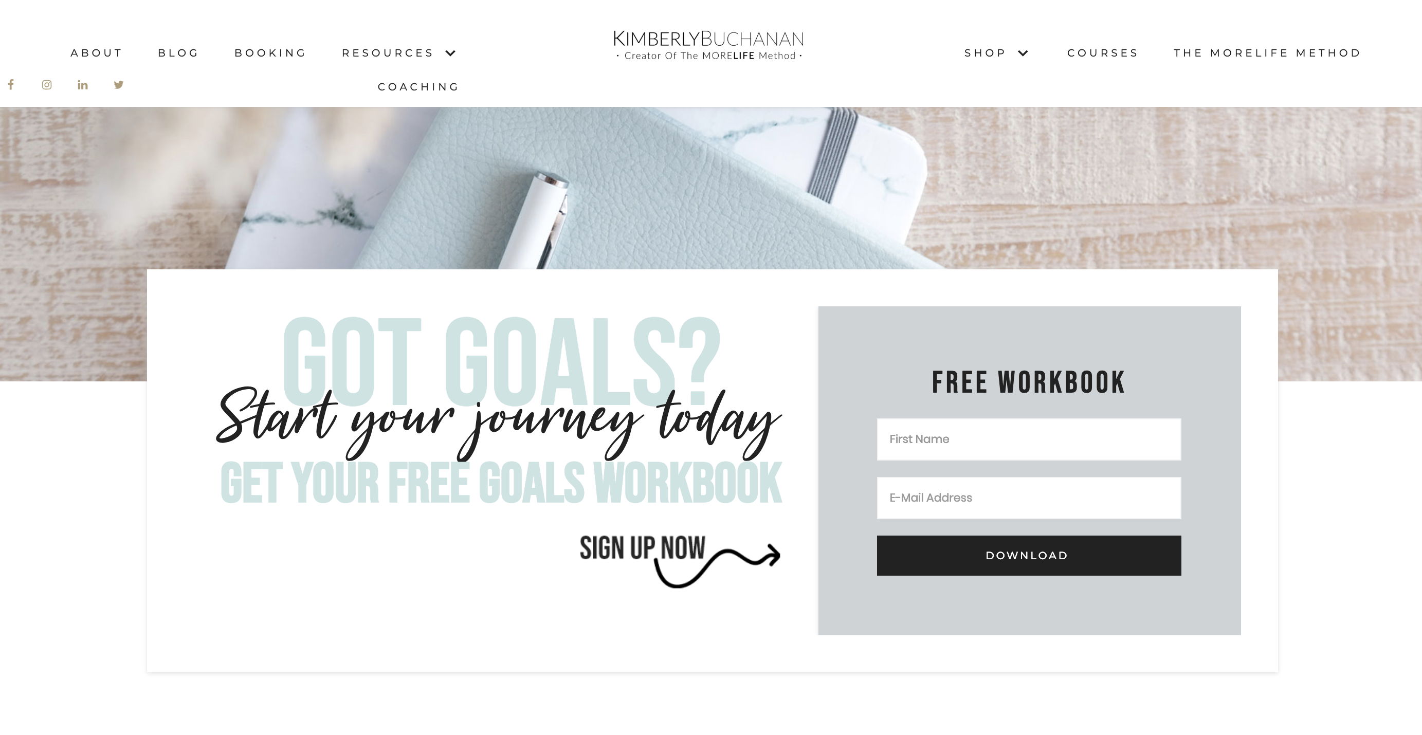
This is an example of a really great design. Wooden textures and slightly different pastel tones of turquoise, lavender plants, and cozy blankets, nice lettering, some golden accents — it all calms you down and helps to focus on life planning. Kimberly Buchanan introduces herself as the creator of The MORELIFE method and includes several logos of companies she has cooperated with. The good website navigation makes it easy to figure out the rest.
A bad factor of this website: Not Secure.
View website: http://kimberlybuchanan.com/
Melissa Ambrosini – personal coaching website
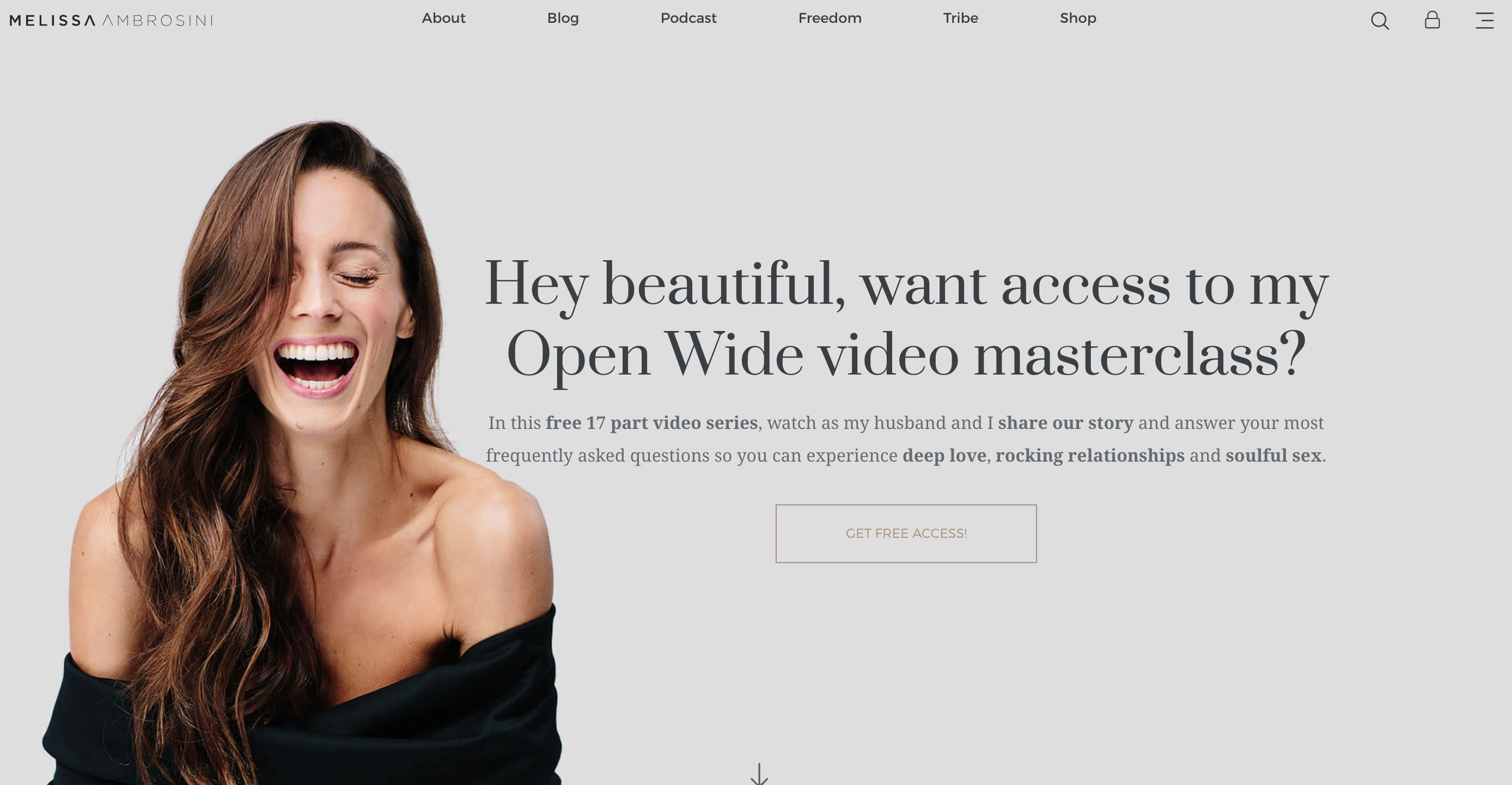
Melissa Ambrosini knows how to attract users’ attention. The greeting “Hey beautiful” and free video series, just like the image of the happy coach, help to gain users’ trust. Altogether, they make believe that this person can teach how to be happy. Smooth animation, an arrow for scrolling the slides, and smiling faces guarantee positive user experience. Short videos and testimonials add to the coach’s credibility.
View website: https://melissaambrosini.com/
10. Heidi Rose – life coaching website

We left this one for a dessert. When users open this website, they are puzzled for a couple of seconds: it looks more like a photo from a resort than a life coaching website. The next scroll reveals it all — it is an invitation to “create your online sanctuary.” Actually, Heidi Rose is a lifestyle coach who turned into a website designer, but she still can help you to discover the meditation techniques.
View website: https://heidirose.com.au/
How to set up a coaching website?
Start with a clear goal. Decide what you want visitors to do — sign up for a session, leave a request, or buy a program. Next, choose a simple website builder, such as Weblium, so you don’t waste time on technical details. Here is a list of steps you need to take to create a coaching business website:
- Choose a template for coaches or experts.
- Formulate a clear value proposition: who you help and the problem you solve.
- Add pages: About, Services, Testimonials, Contact.
- Set up a registration form; you can add a calculator here to receive applications.
- Optimize your website for mobile and search engines (SEO). These settings are very easy to configure and can drive significant traffic to your website.
FAQ about coaching websites
What are the common elements of successful coaching sites?
Successful coaching sites almost always include a clear headline with client benefits, a photo or video of the coach (people buy from people), and a description of services and work formats. A bonus and a nice advantage for a coach’s website would be to add reviews or case studies, for example, in video format, as well as a call to action (e.g., Book a call / Get started).
What should a life coach website look like?
A life coach’s website should be calm and visually clean, with a focus on emotions and trust. It should definitely include a personal story or approach and maximum meaning. The main thing is for the visitor to immediately understand that you are the specialist who can help.
Do I need a website as a life coach?
Yes. A website is your point of trust. Even if clients come from Instagram or recommendations, they still want to see who you are, understand your work process, read reviews, and contact you easily. Keep in mind that without a website, you lose potential clients.
What makes a good coaching website?
A good coaching website speaks the client’s language, focuses on the problem and the result, has a clear CTA, and is easy to update without developers. For example, if it is created on a website builder such as Weblium, it has all the necessary features for business development.

