
White Texture Background Websites
Hosting Tribunal claims that the user’s first impressions are 94% related to design. The background also plays an important role – this is the first thing that catches the eye of the website visitor.
A white background website is a win-win classic option that will always be in trend. It is universal, easy to perceive a solution that builds trust, and helps the user to focus on important elements of the site design. What else could you ask for?! Only some cooler ideas with white texture background that looks even more fascinating!
Today we want to show you how cool a white background website can be using the examples of first-rate resources and modern site prototypes offered by the progressive Weblium website builder (this will give you some inspiration for creating your own, unique white background website using Weblium).
Contents
“Sabcomeed” coffee shop white background website
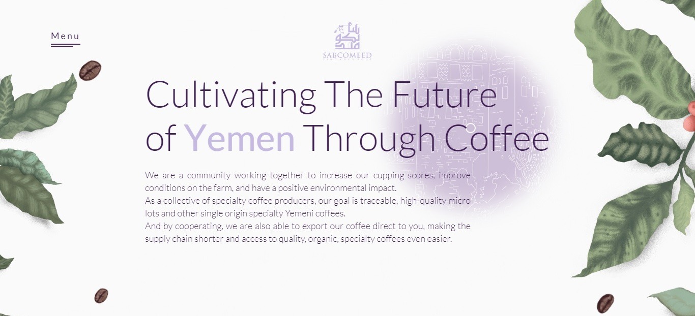
website: https://sabcomeed.com/
(“Awwwards” nominee in the “Website Of The Day” category)
This website’s snow-white background looks very attractive decorated with coffee beans moving on the screen and coffee leaves framing the edges of the screen.
The developers embodied an interesting idea in the design of the Sabcomeed site: the mouse cursor snaps out (as if with a flashlight) a fascinating pattern that seems to lie under the major website backdrop.
“Uniel” branding & design studio white texture background website

(“CSS Design Awards” nominee in the “Website Of The Day” category)
The white background of this website with an almost imperceptible, but very elegant texture blends perfectly with black typography and abstract geometric shapes, bright photos, and black website sections.
This is another great example of how you can dilute a simple white texture background to make the website’s design more interesting.
“Fast Car” car rental white background website

(Weblium professional template)
A clean white background, tasty images of car models, yellow social icons, blue buttons, and black letters – this is the secret of the astounding white background website, which really attracts attention!
“RunnerZ” running club white texture background template

(Weblium professional template)
In order to make it simpler (if you absolutely have no time for looking for genius ideas), you can spice up the usual website’s white backdrop with light gray geometric ornaments, as done on the “RunnerZ” website.
As a result, the design still has all the advantages of a white background, but it does not look boring and faded!
“Tender Flowers” floral studio white background website
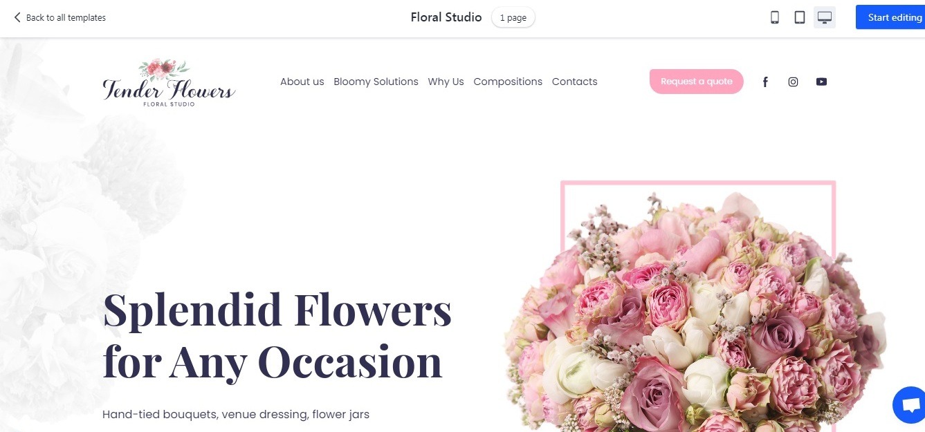
Sometimes creating the design for a wedding florist studio website is as easy as pie: you can use beautiful photos of wedding bouquets with pink accents, pink monograms and icons, and translucent silhouettes of petals and bouquets on a clean white background. And the best part? You can easily create a florist website like this on Weblium, using ready-made blocks and intuitive design tools.
(Weblium professional template)
“Skydive Birds“ skydiving club white texture background website

(Weblium professional template)
Creating the design of this site, the developers have put an interesting idea to life: the frames of the site blocks are blurred and look like an alternation of blue sky and white clouds. The perfect design for a skydiving club, isn’t it?
Fascinating typography, bright labels, and buttons, and, of course, breathtaking photos are used to complement the picture!
“Logotypio“ brand design studio white background website

(Weblium professional template)
In the design of this studio website, the developers limited themselves to only small translucent details on a white background; however, the design looks intriguing with its colorful pink-black typography and alternating pink and blue blocks!
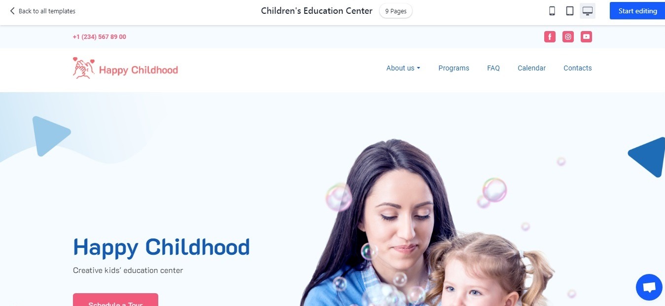
Children’s education center white texture background website
(Weblium professional template)
How can you use geometric shapes on the white background website of the children’s education center, but not to scare away visitors with a high-contrasting picture? To do this, it’s enough to use a few shapes of light colors.
That’s exactly what they did on the “Happy Childhood“ center website – and, as you can see, the design looks pretty cool!
“ITStudy” IT-school white background website

Unlike the previous website design, “ITStudy” website developers allowed themselves to use brighter colors together with geometric shapes and abstract separators of the website design blocks, adding large icons for defining logical blocks and partially, background patterns.
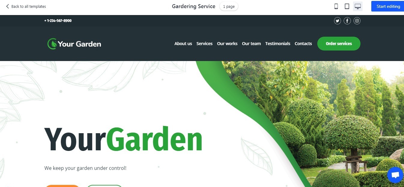
“Your Garden” gardening services white texture background website
(Weblium professional template)
Meet the natural “green” design from “Your Garden” studio!
This white background website uses photographs of green plant sprouts, images of foliage, petals, and garden tools. White blocks alternate with green blocks, buttons, monograms under headings, and inscriptions.
You can notice the translucent photos of fields and forest stands on the background – every element fits the overall website style and looks just stunning!

