
Yellow Background: 10 Website Examples
The yellow background is something, that drives attention from the first sight. Someone may not appreciate this bright color, but definitely, can’t pass by it. Yellow grabs attention – and then, the task is to smartly use it.
It is easy to create a yellow background on almost any site. It is even easier when you use website builders like Weblium. Just upload the desired yellow background or picture with yellow elements, and the job is done.
The yellow background is widely used for websites in restaurant niche, for tourism and traveling websites, for everything, connected to happiness, and probably, the sun 🙂 At the same time, the background of yellow color is used by the law firms, sports clubs, event agencies, web design agencies, and many more others.
Thus, if you think, that yellow background images are right for you – then do it. Choose the desired tint and shadow: yellow is not always bright, it can play its role as a peaceful, yet noticeable color.
Create your own yellow website for free 🙂
Contents
Yellow background website examples
We have seen tons of websites with various backgrounds. And here we made a list of the best websites with yellow backgrounds. We cared to pick websites from different niches, to ensure that yellow is suitable for each one.
So, continue reading – beautiful websites await!
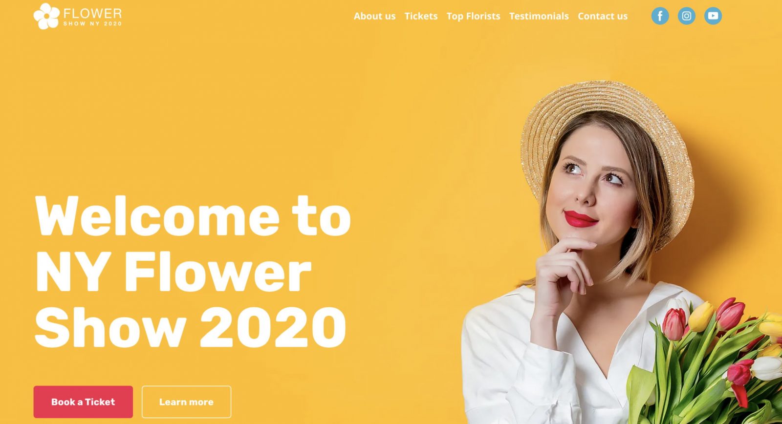
Flower Show – yellow website template
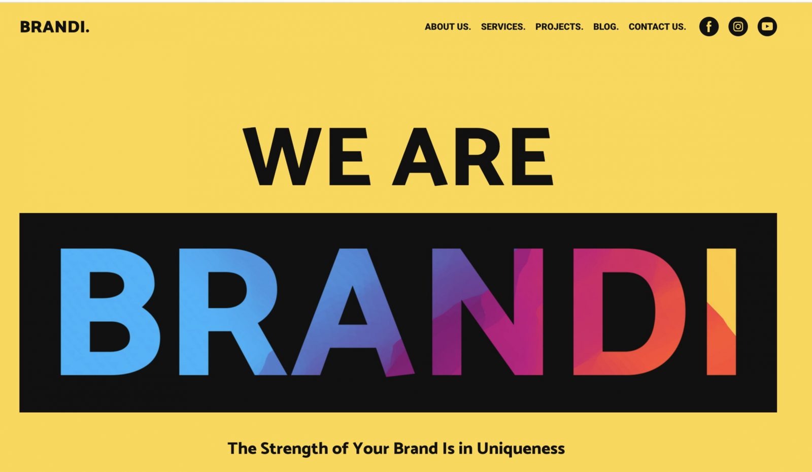
Creative Agency: yellow background template
Toy Fight Creative agency
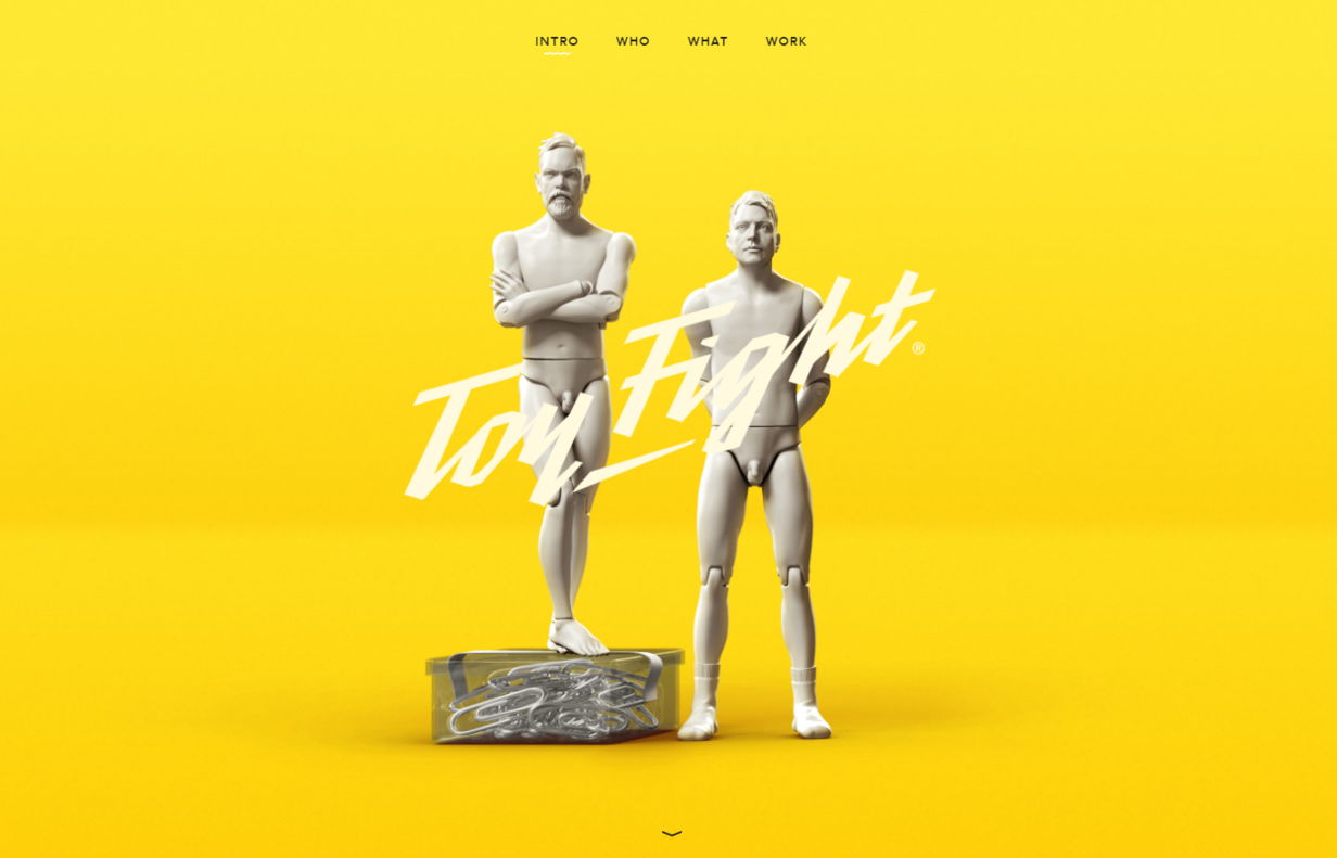
website: https://toyfight.co/
Toy Fight is a creative agency is from Manchester, United Kingdom.
Their website is a canonical usage of yellow in design. The yellow color here is bright, it is the central element of the website, it grabs attention. The other elements are in calm white and gray colors. Otherwise, this website would be a complete bright disaster.
Design tip from this website: Choose wisely colors-companions. Not every color can interact with yellow in the same way, so count on it.
Asylum marketing company
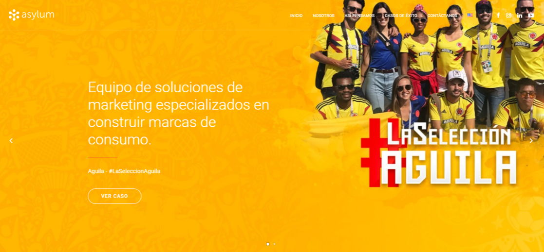
website: http://asylummarketing.com/
Check this cool yellow background of a global agency specialized in brand experience. This company has used a combination of yellow background images with the photos of their team, all in yellow uniform. This, of course, accents on the color and makes it look even more bright. Yellow vectors are not the only one decision, as you see here – the yellow color looks pleasing with the images and patterns on it.
Choose the background of this type of corporate style suits.
Frans Hals Museum
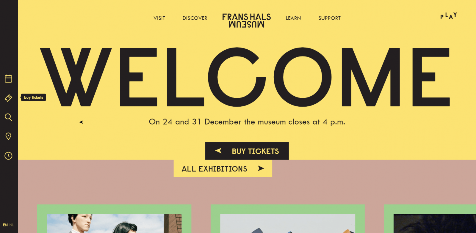
website: https://www.franshalsmuseum.nl/en/
Frans Hals is a museum from the Netherlands.
For this website, the yellow background is used only for the home page and navigation icons. Check this website live, and you will see, that here are combined many bright colors, but only within logical rules of color mixing.
Yellow here is used with black lettering. This is the highly contrasted combination, that makes a website look serious and professional. And pleasantly welcoming at the same time.
See how this website interacts with the user’s attention by switching colors of the tabs. Remember this site and get some inspiration for colors combining.
By the way, Weblium has AI Supervisor, that helps in color selection.
Jazz FM Romania
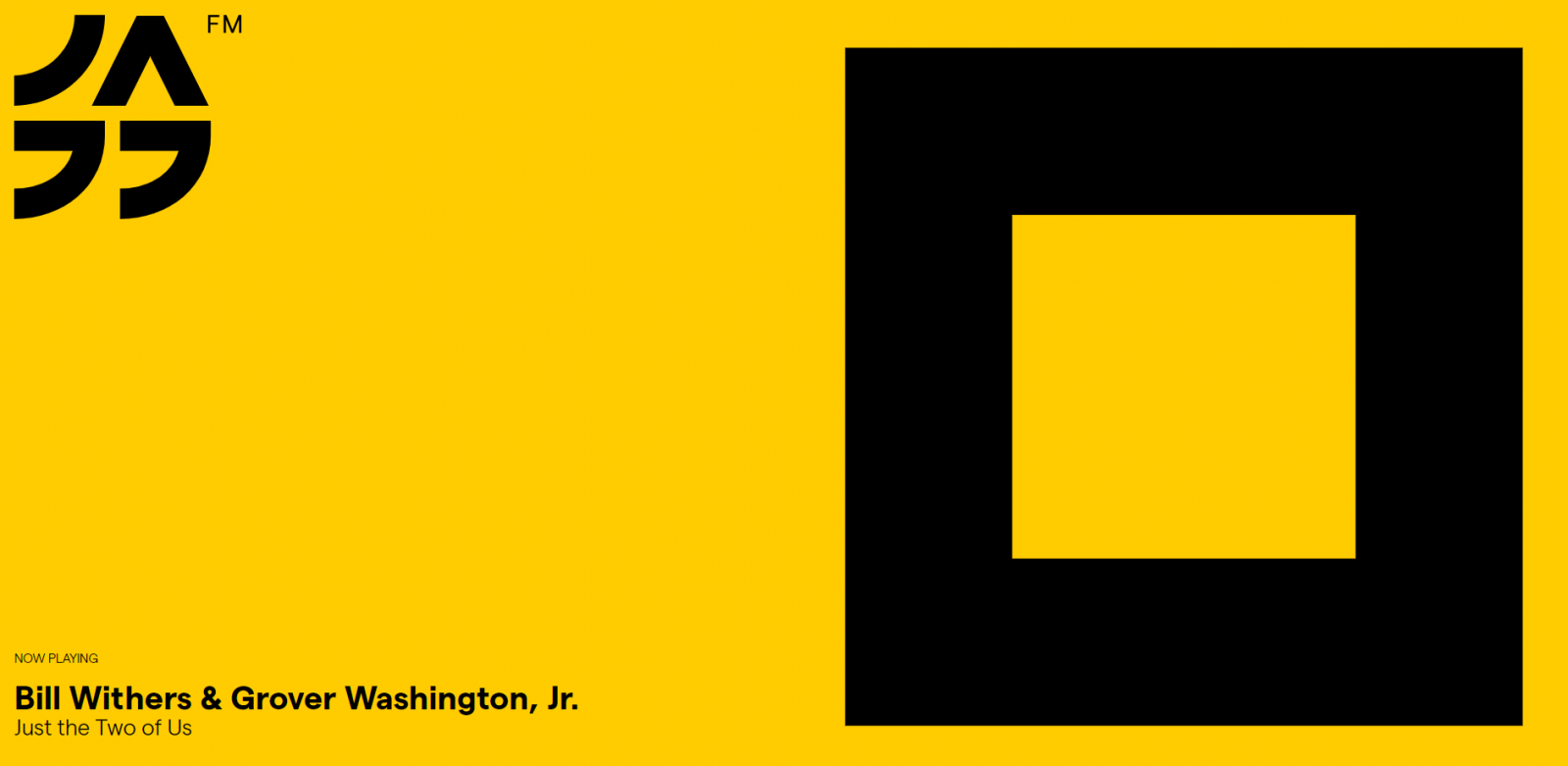
website: https://jazzfm.ro/
Just take a look at this website!
The developers and owners of this Radio Romania have a great taste. They have chosen a plain yellow background for the website devoted to jazz music. We are happy to find this website for at least two reasons: a great example of using yellow on the website, and for the great music:)
Coming back to web design, the website is mostly yellow, with interesting decisions to place text and logo in the corners on the left. This big black square stands for the stop music button. Yes, we were listening to this radio, while writing this paragraph.
So, no more words about this website – do and investigate it yourself. Of just use yellow background image for your website and experiment with the filling.
Design tip: Here, the background is almost everything that is on the website. And it looks clear and applicable. But, be sure that it is something, that suits your business.
Aspire music website – blue and yellow background

website: https://www.aspiremusic.com.hk/
Aspire Music is a modern, contemporary music school based in Hong Kong.
This website is divided into two parts – yellow and blue. They look very natural together, playing on the contrast.
This website overall is made like a blog, and on the home page, it contains a stable background.
We can notice, that these colors don’t conflict with the photos of any kind. The lettering color is white, the same as in our first example. Yellow is bright enough to make white color visible and attractive.
Branding agency website template from Weblium
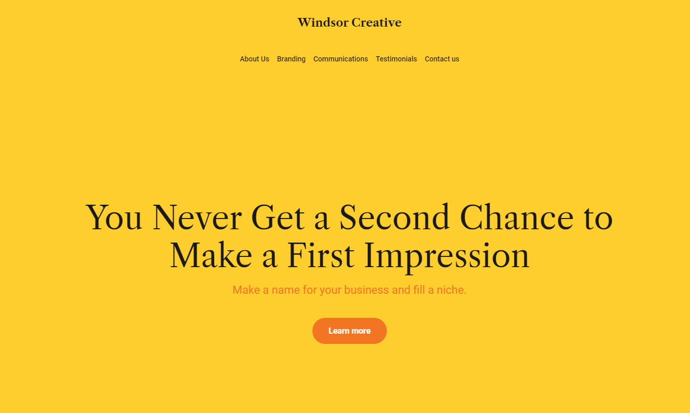
Weblium also has yellow styled website templates.
This one is designed for Branding agencies. Just like some examples above, this template has a plain yellow background without using other colors.
However, text colors here differ: they are black and orange, two colors that are way darker than yellow, and create an attractive page in contrast.
Recruitment agency website template

The dark yellow background is used for a recruitment agency website template from Weblium. In this example. The yellow color is far from the most important element. At the same time, it complements the image of the page and makes it enjoyable for the viewer. The photo looks great on a yellow and white background, as it is in contrast.
Check the full version of a template after registering on Weblium. You will see how the used blocks interact with the user (you) and you will be able to pick this website template for your own project.
Copywriting Agency: yellow and white website

Bottom Line
Now you know the features of using yellow backgrounds by different companies. Feel free to experiment with this type of background for your business or personal website.
Creating a Website in Weblium is even easier – you can pick any template you like, and turn it to yellow – in some ways
- Adding a yellow background from your local computer. Just upload the background and that is it
- Choose a yellow picture from Unsplash, luckily, it is integrated with Weblium, so that you even don’t have to download an image – it is already inside our system.
- Pick a template and chose colors palette to yellow with AI Supervisor. It will automatically adjust supportive color yo your main choice.
Create a website with Weblium now – you will get a lot of pleasure in the process, and a cool modern website in the end!


