Breaking Bad: 11 bad website examples in 2026 (and the mistakes behind them)
Some websites make you wonder whether the designer had a plan, a deadline, or a working mouse. Others look like someone emptied an entire GIF folder onto the screen and called it a day.
But bad web design is more than an aesthetic problem. When visitors can’t read your content, find your products, or figure out what to click, they have little reason to stick around.
You have just 3-5 seconds to make a first impression. In that time, visitors start deciding whether to stay on or leave. The recent research on the 5-second rule highlights how quickly people form an impression of a website.
Looking at bad website examples is a useful way to understand what works and what doesn’t. From confusing navigation to cluttered layouts, bad website design examples show how small decisions can create a frustrating experience. This collection of worst websites 2026 highlights the problems worth learning from — and how to avoid repeating them on your own site.
Contents
TL;DR
- Make it easy to know where to click. If visitors have to guess what to do next, they may leave before finding what they need.
- Don’t make people wait. A page that takes 8 seconds to load can lose visitors before they even see what you offer.
- Check how your site looks on a phone / tablet. A layout that works perfectly on desktop can quickly fall apart on a smaller screen.
- Make your site easy for everyone to use. Good color contrast and helpful image descriptions make a real difference for visitors with different needs.
- Start with a ready-made template. A professional starting point can save you time and help you avoid common website mistakes.
What makes a website bad?
A bad website makes visitors work too hard — and most won’t bother. Research by Lingaard et al. (2006) found that people can judge a webpage’s visual appeal in just 50 milliseconds. A cluttered first screen can turn them off before they read a word. Other common problems are messy clashing colors, inconsistent fonts, and broken mobile designs. Without clear calls to action (CTAs), visitors may not know what to do next. Poor color contrast and missing image descriptions can also make a site harder to use and rank. Google page insights recommends loading the main content within 2.5 seconds. Accessibility can have legal implications, too, for businesses covered by the European Accessibility Act (June 28, 2025).
Comparing good vs. bad web design
Good web design isn’t about following every trend or making a page look like every other site on the internet. It’s about helping visitors understand your offer, navigate your content, and take the next step.
If you need a reminder of what good design looks like, explore these beautiful websites for inspiration and see how strong visuals, clear structure, and thoughtful navigation work together.
| Good | Bad | Why it matters |
| Clear visual hierarchy | Everything competes for attention | Visitors struggle to identify important information. |
| Intuitive navigation | Confusing menus and broken links | People have trouble finding pages or products. |
| Consistent color palette | Clashing colors and poor contrast | Text becomes difficult to read. |
| Readable typography | Tiny, inconsistent, or decorative fonts | Visitors have to work harder to consume content. |
| Responsive design | Horizontal scrolling and broken layouts | The site becomes frustrating on phones and tablets. |
| Fast loading and responsive interactions | Slow pages and laggy buttons | Visitors may abandon tasks before completing them. |
| Accessible content | Missing alt text and inaccessible controls | Some visitors cannot use essential content or features. |
| Clear CTAs | No obvious next step | Visitors don’t know how to contact you, buy, or sign up. |
| Purposeful content | Walls of text and unrelated elements | The main message gets lost. |
| Consistent layout and spacing | Randomly placed elements | The site feels disorganized and harder to scan. |
The difference often comes down to usability, not personal taste. Examples of bad web design are all about recurring website design mistakes, such as unclear priorities, unreadable text, and navigation that makes visitors confused. These commong patterns can help you spot bad web design and fix it with ease.
Want to see even more principles in action? Browse these best website designs for inspiration to see how professional websites balance visual hierarchy, readable typography, and intuitive navigation.
Bad website examples
Let’s meet the websites that illustrate what can go wrong. These terrible websites highlight different bad website layout choices, usability issues, and visual problems. Each example includes a chaos rating, a specific design issue, and a practical lesson you can apply to your own website.
These ugly websites show that appearance is only part of the problem: poorly designed websites can also make everyday tasks harder, damage trust, and leave visitors unsure where to go next. Recognizing bad website characteristics early makes it easier to fix them before they affect the user experience.
Blinkee — when everything flashes at once
Chaos rating: 🔥🔥🔥🔥🔥 (5/5)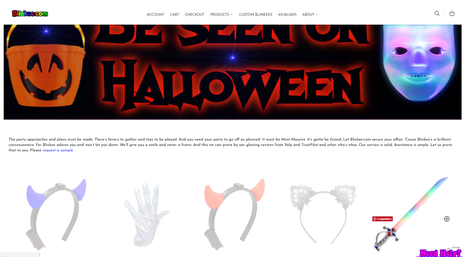
Screenshot taken October 2026.
Visit the website: https://blinkee.com
Blinkee sells glowing and blinking products, so a colorful visual identity makes sense. The problem begins when the website competes with the products for attention. Flashing visuals, a dark background, small product images, and inconsistent browsing experiences can make it harder to compare items and find useful information.
Animation should demonstrate a product or communicate something meaningful. When multiple elements move simultaneously, they can distract visitors from product details and purchasing controls. Depending on the effect, flashing content can also pose accessibility and safety concerns for some people.
A better product page would use larger images, clear categories, consistent product cards, and a prominent CTA. Motion should be limited, purposeful, and controllable.
Lesson: Use animation to support the shopping experience, not to turn product discovery into a visual endurance test.
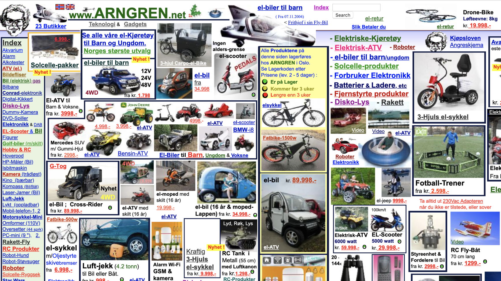
Arngren — information overload
Chaos rating: 🔥🔥🔥🔥🔥 (5/5)
Screenshot taken October 2026.
Visit the website: http://arngren.net
Imagine opening a classified-ad newspaper from the 1990s, shaking it vigorously, and letting every listing land wherever it pleases. That’s the impression created by Arngren’s densely packed assortment of products and listings.
The central problem is information overload. Numerous images, inconsistent spacing, tiny text, and competing elements make it difficult to scan the page or understand where one category ends and another begins. The weak visual hierarchy forces visitors to work out what deserves their attention instead of guiding them through the content.
A better approach would group listings into clear categories, standardize image sizes, use readable typography, and make search and filtering prominent. Visitors should be able to narrow down their choices instead of inspecting the entire internet one thumbnail at a time.
Lesson: Organize content into clear groups and establish a visual hierarchy before adding more elements to a page.
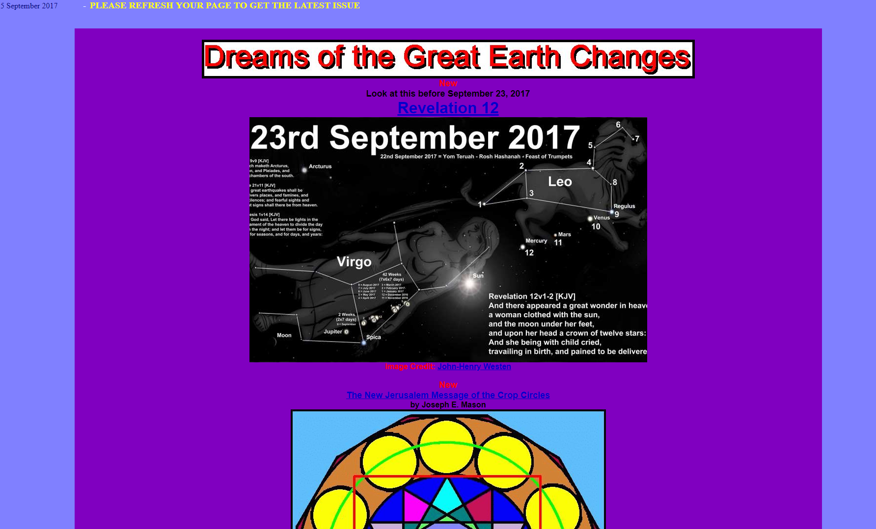
Great Dreams — a readability nightmare
Chaos rating: 🔥🔥🔥🔥 (4/5)
Screenshot taken October 2026.
Visit the website: http://www.greatdreams.com
Great Dreams illustrates what happens when a website keeps accumulating content without a consistent design system. In the supplied example, changing colors, tiny text, a lengthy homepage, and shifting page widths make reading feel like an endurance sport.
The main mistake is treating content volume as a substitute for structure. Even valuable information becomes difficult to use when headings, spacing, typography, and navigation don’t help visitors understand how the pieces fit together.
Break long pages into meaningful sections, use descriptive headings, and establish consistent text sizes and spacing. If a page contains several unrelated topics, consider giving them separate pages with clear navigation.
Lesson: Make content easy to scan with consistent typography, logical sections, and a clear purpose for every page.
Pacific Northwest X-Ray — unclear messaging and weak calls to action
Chaos rating: 🔥🔥🔥🔥 (4/5)
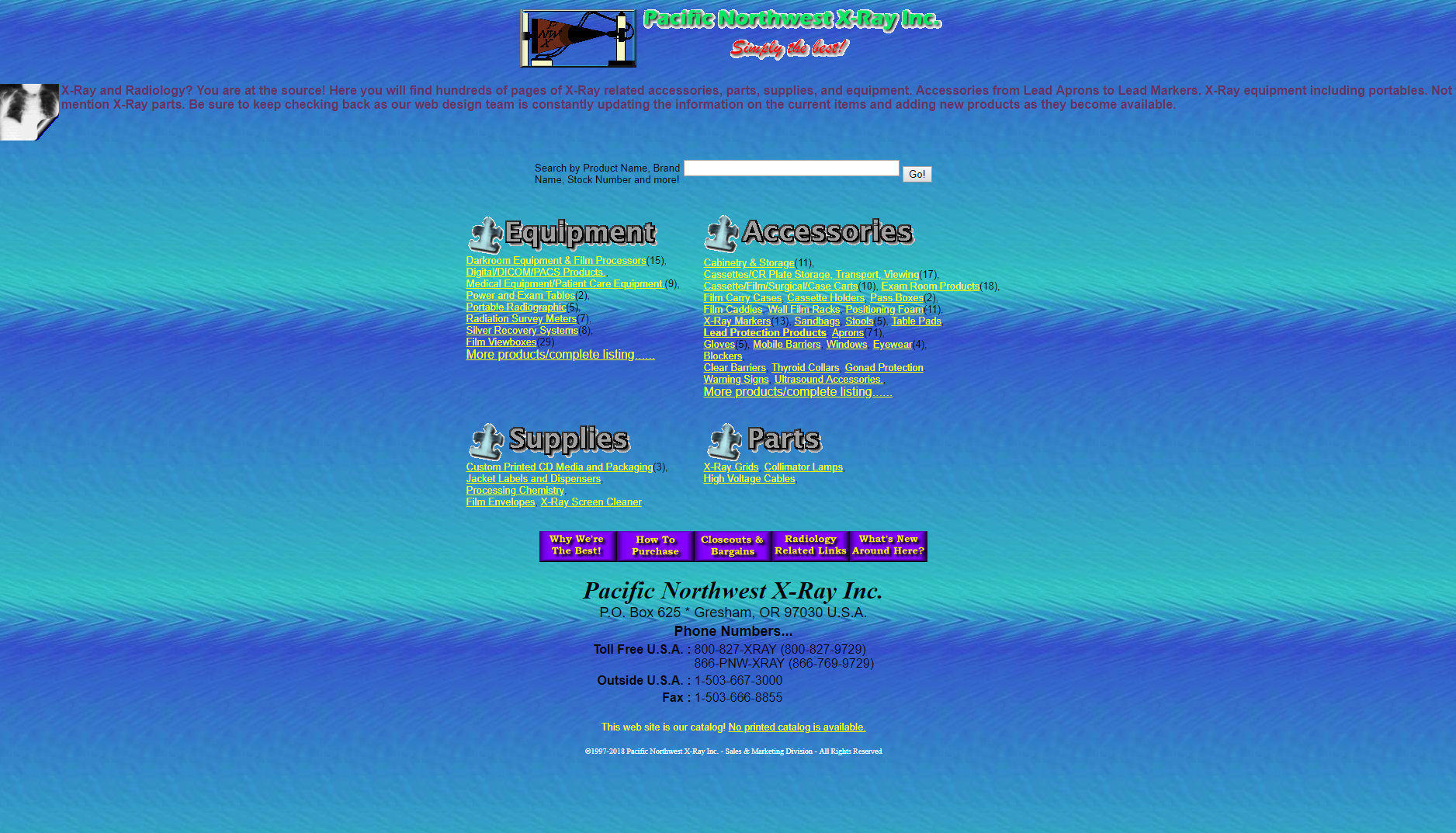
Screenshot taken October 2026.
Visit the website: http://www2.pnwx.com
A business website should explain what the company does before visitors need to investigate. The supplied Pacific Northwest X-Ray example struggles with that first impression, combining dense text, conflicting colors, limited whitespace, and weakly positioned calls to action.
For a specialist supplier, customers need to understand the product range, identify relevant categories, and know how to request information or place an order. If the primary action is difficult to locate, the site adds friction to an already specific buying process.
A stronger layout would open with a concise description of the business, provide clear product categories, and place contact or ordering options where visitors expect them. Readable typography and consistent spacing would make the information easier to navigate.
Lesson: Explain what you offer, who it’s for, and what visitors should do next before filling the page with details.
Suzanne Collins’ books website — a missed opportunity to guide readers
Chaos rating: 🔥🔥🔥🔥 (4/5)
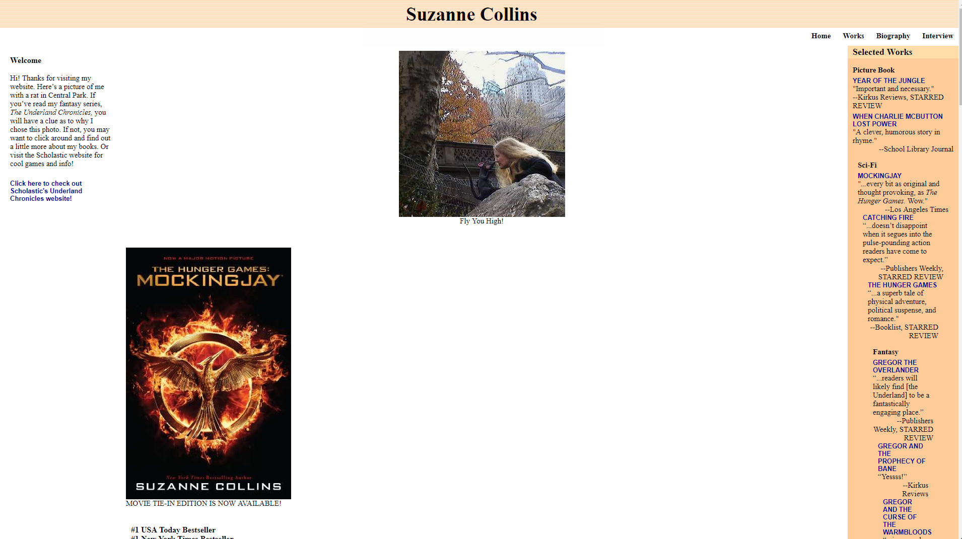
Screenshot taken October 2026.
Visit the website: http://www.suzannecollinsbooks.com
Fans of The Hunger Games shouldn’t need a treasure map to explore an author’s books. In the supplied example, the experience is undermined by difficult-to-read content, limited book information, and purchase links that send readers to retailers’ homepages rather than the relevant book listings.
The core issue is a mismatch between visitor intent and the path the website provides. Someone looking for a particular novel wants its description, format, and purchasing options — not another round of searching.
A better author website would give each book a dedicated section or page with a cover, synopsis, publication details, and clearly labeled retailer links. Text should remain readable at normal zoom, and links should lead directly to relevant destinations whenever possible.
Lesson: Match every important link to the visitor’s next likely question or action.
Bella De Soto — the never-ending homepage
Chaos rating: 🔥🔥🔥🔥🔥 (5/5)
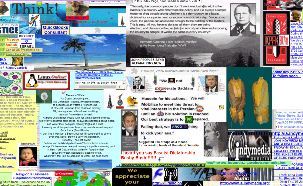
Screenshot taken October 2026.
Visit the website: http://www.bellads.info
Some homepages tell a story. Others seem determined to include every story ever told. The Bella De Soto example is characterized by an oversized page, numerous low-quality images, and content spread across an awkwardly large layout.
The main problem is a lack of prioritization. When visitors must scroll both horizontally and vertically to find information, the layout becomes an obstacle instead of a guide. Excessive image sizes can also make pages harder to navigate and may contribute to slower loading, depending on how the assets are delivered.
Use a responsive grid, consistent image dimensions, and clear content sections. Keep related information together and move secondary details to dedicated pages. Compress images and provide appropriate image dimensions to reduce unnecessary loading work.
Lesson: Give every element a clear place in the layout, and make sure visitors can navigate the page without horizontal scrolling.
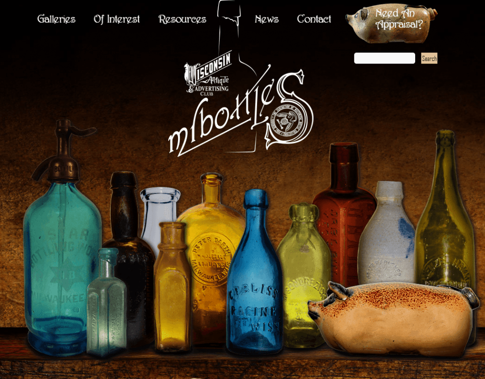
Antique Bottle Collectors Resource — a collection without a system
Chaos rating: 🔥🔥🔥🔥 (4/5)
Screenshot taken October 2026.
Visit the website: http://www.mrbottles.com
A website about collecting antique bottles has a natural opportunity to showcase fascinating objects, historical details, and specialist knowledge. But when text colors change unpredictably, images appear without a consistent arrangement, and long blocks of content compete for attention, the collection becomes harder to explore.
This is a content-organization problem as much as a visual one. Collectors may want to browse by bottle type, manufacturer, period, or other identifying details. Without meaningful categories and predictable navigation, even useful information becomes difficult to find.
A more effective design would organize entries into searchable categories, use consistent image cards, and provide descriptive headings. Long articles should include internal links and clear section breaks.
Lesson: Build a consistent content structure that helps visitors discover information instead of making them search through an unorganized collection.
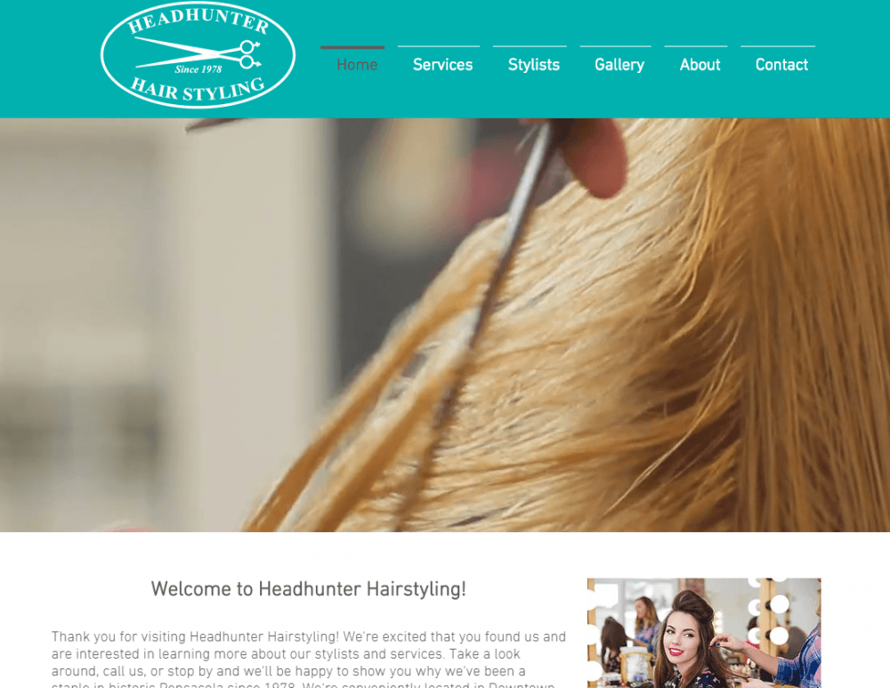
Headhunter Hair Styling — performance is part of the experience
Chaos rating: 🔥🔥🔥 (3/5)
Screenshot taken October 2026.
Visit the website: https://www.headhunterhairstyling.com
A salon website doesn’t need elaborate animations or dozens of visual effects. It needs to help potential customers find the services, prices, location, opening hours, and booking information they need. The supplied example raises concerns about a basic presentation and slow loading.
Performance is not just a technical detail hidden behind the design. A slow page delays access to the information people came for. Google recommends an LCP of 2.5 seconds or less, an INP of 200 milliseconds or less, and a CLS score of 0.1 or less for a good experience at the 75th percentile of page visits.
Check the site with Google PageSpeed Insights and use web.dev’s Core Web Vitals guidance to identify potential improvements. Optimize large images, remove unnecessary scripts, and avoid heavy effects that don’t serve a clear purpose.
Lesson: Measure page speed and interaction performance rather than assuming a visually simple website is automatically fast.
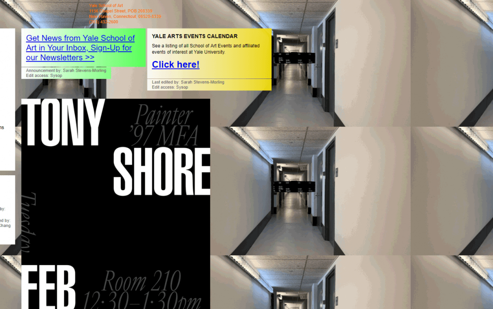
Yale School of Art — experimental design needs usable navigation
Chaos rating: 🔥🔥🔥 (3/5)
Screenshot taken October 2026.
Visit the website: http://art.yale.edu
The Yale School of Art has a long history of experimenting with how a school’s online presence can reflect its creative community. Its previous wiki-based website became known for its unconventional, collaborative, visually unpredictable presentation.
But unusual design isn’t automatically bad design. The important question is whether students, applicants, and visitors can find essential information, understand navigation, and complete their tasks. An experimental interface may work well for an art community while presenting challenges to someone who simply wants to find application requirements or event details.
There is also an important freshness issue here: Yale announced a new website in September 2026, describing a redesigned experience with an emphasis on accessibility and clarity. The old site’s appearance should therefore not be presented as a current screenshot of the live website. See the official Yale School of Art announcement.
Lesson: Creative expression can be part of a website’s identity, but essential information and navigation should remain accessible and understandable.
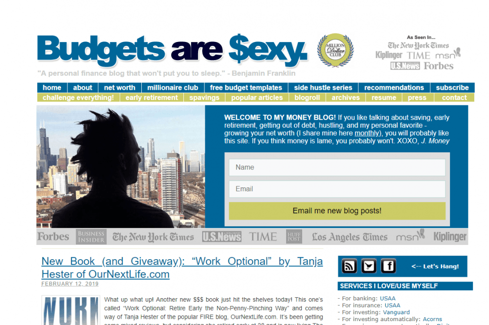
Budgets Are Sexy — inconsistent visual hierarchy
Chaos rating: 🔥🔥 (2/5)
Screenshot taken October 2026.
Visit the website: http://www.budgetsaresexy.com
Not every bad website looks like a digital explosion. Some have a recognizable structure but miss the details that make a design feel polished and easy to use. The supplied Budgets Are Sexy example falls into this category, with a monotonous color scheme, button styling that doesn’t clearly connect to the surrounding design, and navigation that may be less intuitive for new visitors.
The lesson here is subtle: a website can be readable and functional while still making important elements harder to distinguish. Visual hierarchy helps visitors identify the main headline, primary CTA, supporting content, and secondary links.
Choose a limited palette, maintain consistent button styles, and use contrast and spacing to establish priorities. Navigation labels should describe their destinations clearly rather than relying on visitors to guess.
Lesson: Use consistent visual cues to distinguish primary actions from secondary content, and test whether first-time visitors can navigate the site without help.
Historian of the Future — visual noise without a clear message
Chaos rating: 🔥🔥🔥🔥🔥 (5/5)
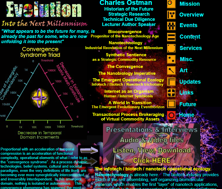
Screenshot taken October 2026.
Visit the website: http://www.historianofthefuture.com
Acid colors, GIFs, mismatched images, inconsistent typography, and unrelated lists can make a website memorable for all the wrong reasons. The supplied Historian of the Future example illustrates what happens when visual elements compete instead of working together.
The biggest issue is that visitors may struggle to understand what the website is about or what they should do next. A strong first screen should establish the site’s purpose, while the rest of the page should support that message with relevant content and clear navigation.
Choose a cohesive color palette, limit decorative animation, and use headings to create a logical information hierarchy. Every major section should contribute to the site’s purpose. If a visual doesn’t help explain, persuade, or guide, consider removing it.
Lesson: Make the purpose of the website obvious above the fold, then use consistent visuals and a clear CTA to guide visitors forward.
The first screen doesn’t have to look like a psychedelic poster to get noticed. A strong homepage makes the business’s purpose clear, establishes a visual hierarchy, and gives visitors an obvious next step. See these homepage design examples for ideas you can apply to your own site.
The most common website design mistakes in 2026
Many common website mistakes are easy to overlook when you’re focused on how a page looks on your own screen. But web design mistakes to avoid aren’t limited to colors and fonts: they also include slow performance, inaccessible controls, and confusing user journeys. Some of the most damaging issues are bad UX examples in practice — visitors can’t find information or complete a task even when the website looks polished.
1. Weak visual hierarchy and confusing navigation
Visitors shouldn’t have to inspect every element to understand where they are or what to do. Use descriptive headings, meaningful section order, consistent navigation labels, and a clear primary CTA.
Keep the most important information above the fold where practical, but don’t try to squeeze every detail into the first screen. The goal is to establish the purpose of the page and make the next step obvious.
Modern web design isn’t just about adding animations, gradients, or the latest visual trend. The best designs make information easy to scan and navigation predictable. Explore these modern website design examples to see how contemporary layouts can stay both visually engaging and practical.
2. Slow page speed and poor Core Web Vitals
In 2026, performance remains a key part of a good user experience. Google’s three Core Web Vitals measure different aspects of how a page behaves:
- LCP (Largest Contentful Paint): how quickly the main content appears. Aim for 2.5 seconds or less.
- INP (Interaction to Next Paint): how quickly a page responds to user interactions. Aim for 200 milliseconds or less.
- CLS (Cumulative Layout Shift): how much unexpected movement affects the page. Aim for a score of 0.1 or less.
These thresholds are evaluated at the 75th percentile of page visits. A single lab test doesn’t tell the whole story, so use PageSpeed Insights to review available field data and diagnostic results.
Large images, unnecessary scripts, and poorly managed embeds can contribute to performance problems. Optimize assets and prioritize fixes that improve the experience for real visitors.
3. Poor mobile and responsive design
A desktop layout doesn’t automatically translate well to a phone. Text may become too small, buttons too difficult to tap, and columns too wide for the screen. Horizontal scrolling is particularly frustrating when visitors are trying to compare products or complete a form.
Responsive design adapts the layout to different screen sizes. Test your navigation, forms, buttons, images, and checkout flow on actual mobile devices or realistic mobile previews. Make sure essential content remains available without awkward zooming or scrolling in multiple directions.
4. Accessibility problems: color contrast, alt text, and keyboard access
Accessibility is not an optional finishing touch. It helps people with different visual, auditory, motor, and cognitive abilities use your website.
The W3C Web Content Accessibility Guidelines (WCAG) 2.2 provide a recognized framework for accessible content. Under WCAG 2.2 Level AA, normal text generally needs a contrast ratio of at least 4.5:1, while large text generally needs at least 3:1.
Also check that:
- Informative images have meaningful alt text
- Decorative images can be ignored by assistive technology
- Navigation and forms work with a keyboard
- Focus indicators are visible
- Form fields have clear labels and understandable error messages.
The European Accessibility Act has applied since June 28, 2025, and covers specified products and services, including certain e-commerce services. Its scope and exemptions matter: for example, microenterprises providing services are exempt under the directive. Businesses should check the requirements that apply to their particular services and jurisdiction rather than assuming the law covers every website in the same way. Start with the official EU overview.
5. Generic AI-generated websites without a clear purpose
AI can help generate page layouts, images, and copy quickly. But speed doesn’t guarantee a good result. A generic AI-generated website may have vague headlines, repetitive sections, stock imagery that doesn’t match the business, or a CTA that doesn’t reflect the visitor’s needs.
Use AI as a starting point, not a substitute for judgment. Check every headline for specificity, replace generic visuals with relevant imagery, verify factual claims, and make sure each page serves a clear purpose. A small business website should reflect the actual business, its customers, and its offer.
Not sure how to give an AI-generated design a more original feel? Collect references before you start editing. These places to find website design inspiration can help you discover visual directions, layouts, and ideas that fit your brand instead of settling for a generic result.
Is your website breaking bad? A 10-question checklist
Ask yourself these 10 questions:
- Can a new visitor understand what I offer within a few seconds? Check the main headline and supporting copy above the fold.
- Is the primary CTA easy to identify? Make the next step clear and use consistent button styling.
- Can visitors find important pages quickly? Review the navigation labels, page structure, and internal links.
- Is the content easy to scan? Look for short sections, descriptive headings, readable fonts, and sufficient whitespace.
- Does the site work on mobile? Test menus, images, forms, buttons, and checkout flows on a phone.
- Does the page load and respond quickly? Review LCP, INP, and CLS in Google PageSpeed Insights.
- Is the text readable against its background? Check color contrast against WCAG 2.2 guidance.
- Can people use the site without a mouse? Test keyboard navigation, visible focus, and form accessibility.
- Do images and links help visitors? Add useful alt text to informative images and make sure links lead to the right destinations.
- Does every page have a purpose? Remove redundant content and make sure each page supports a visitor need or business goal.
Use this checklist to identify bad website design before it frustrates your visitors. If several answers raise concerns, you’ve likely found some website design mistakes worth fixing. Prioritize the issues that prevent people from understanding your offer, navigating the site, or completing important tasks.
If you answer “no” to several questions, prioritize the problems that block essential tasks first. Fix confusing navigation, inaccessible controls, broken forms, and performance issues before spending time on decorative changes.
How to create a good website (while avoiding the worst)
Understanding what makes a website bad gives you a practical starting point: instead of chasing every design trend, focus on the issues that make a site difficult to use and learn how to avoid bad web design from the beginning.
Start with the visitor’s goal
Decide what each page should help someone do. A service business might want visitors to request a quote, while an online store needs to help customers compare products and check out. Build the page around that goal instead of adding sections simply because they look impressive.
Still deciding what your website should include or what kind of site to build? Check out these website ideas for different goals and industries to find a direction before planning your pages and content.
Use a clear visual hierarchy
Give each page one main message, supporting information, and an obvious next step. Use headings, spacing, typography, and consistent buttons to help visitors understand the relationship between sections. Don’t make every element equally prominent.
Choose a responsive, well-structured template
A quality template gives you a starting point for layout, typography, navigation, and spacing. It can help you avoid common website design mistakes before you even start customizing the content.
For example, Weblium offers ready-made website templates, a visual editor, responsive layouts, and 24/7 support. You can customize the design and content for your business instead of building every section from scratch.
Templates aren’t a guarantee of a perfect website, though. Replace generic copy, use relevant images, check contrast, and test the final result on mobile.
Start with a design that gets the basics right! Choose a professionally structured, responsive template and customize it to fit your business. Spend less time building from scratch and more time making your website useful to customers.
Explore business website templates
Measure, test, and improve
Use Google PageSpeed Insights to investigate performance, and check out web.dev for practical optimization guidance. Review accessibility against the W3C WCAG 2.2 guidelines, and ask real users to complete the tasks that matter most.
You can also monitor analytics to understand where visitors leave the site. A high bounce rate isn’t automatically proof of bad design: someone may find the answer they need on a single page. Interpret the metric in context and investigate whether visitors are completing the intended task.
The goal isn’t to make your website perfect on launch day. It’s to remove friction, make information easier to find, and improve the experience as you learn more about your visitors.
Key takeaways
1. If visitors have to think about where to click, they won’t: uncertainty and chaos are the #1 website killers.
2. Speed is design too: a page that loads in 8 seconds is already bad, no matter how pretty.
3. Always check your site on a phone: that’s where most layouts quietly break.
4. Low contrast and missing alt text don’t just look sloppy: they shut real people out.
5. Start from a professional template: You can easily avoid the lion’s share of mistakes on this list .
FAQ
What makes a website bad?
A website can frustrate visitors when it’s cluttered, hard to navigate, slow to load, or difficult to use on a phone. If people can’t quickly find what they need or figure out what to do next, they’re more likely to leave.
What is the worst website in the world?
There’s no official winner, but these 11 bad websites are often mentioned as examples of overwhelming website design.
How do I know if my website design is bad?
Start by checking your site’s speed with Google PageSpeed Insights and opening it on your phone. Then ask five people to find your contact details within 10 seconds. If they struggle, your navigation or layout may need work.
Can a bad website design hurt SEO?
Yes. Slow loading and poor page experience can affect how people interact with your site, while Google uses Core Web Vitals as part of its page experience assessment. If visitors can’t find what they need, they may leave without taking action.
How can I fix a bad website quickly?
Start with the biggest problems: give your homepage one clear focus, compress large images, fix layouts that don’t work on mobile, and make sure your text is easy to read. A few targeted changes can make your site much easier to use. If the current design needs too much work, you can also start from scratch with a professionally designed template and customize it to fit your project.