12 Beautiful Backgrounds for Your Website
The background is the very first thing users actually perceive once they’re on your website. Before they read the first line of text, they read the overall emotional vibe it translates. With this first impression, they decide whether to continue getting to know your brand.
If you’re looking to power-up your brand identity with modern and unique website background design, learning from the best, and keeping up with the trends is one way to succeed.
These are some of the eye-catching background design tendencies for 2021:
- animations, micro-animations, and micro-interactions;
- using primary colors and flat colors for website backgrounds and graphics;
- experimenting with pastels, neons, and saturated colors;
- duotone and gradient backgrounds;
- simplicity and minimalism.
Anyway, one picture is worth a thousand words. And we’ve got not one but ten hottest background ideas that are also easy to recreate without any web design skills.
By the way, some of these stunning examples of beautiful backgrounds were created with Weblium. It’s an easy-to-use site builder where you can experiment with multiple background types, templates, and more – completely for free!
Create your beautiful website for free
Contents
Beautiful Background Examples and Ideas
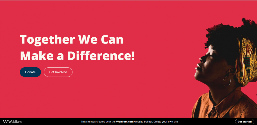
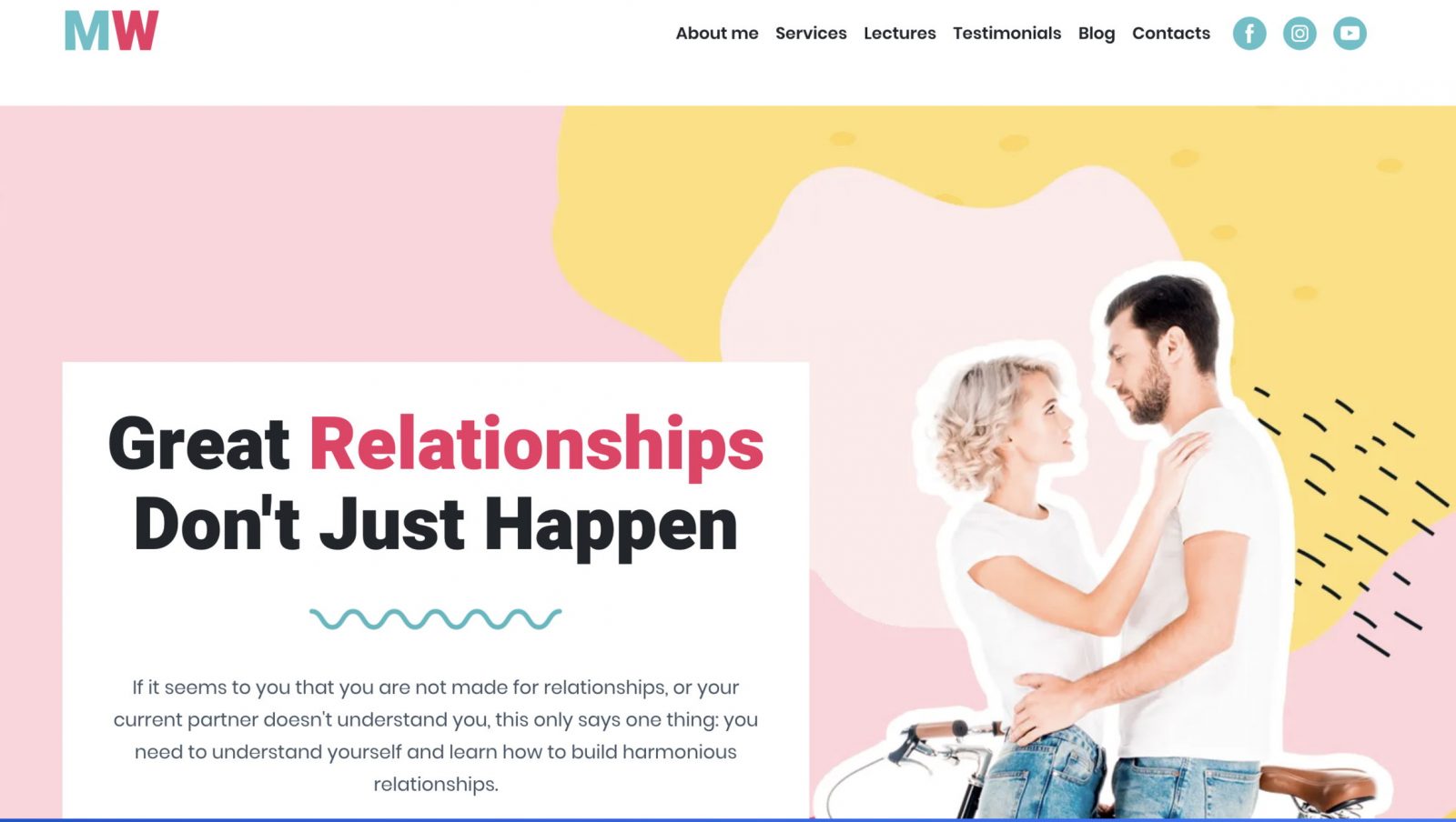
Relationship coach: free beautiful template
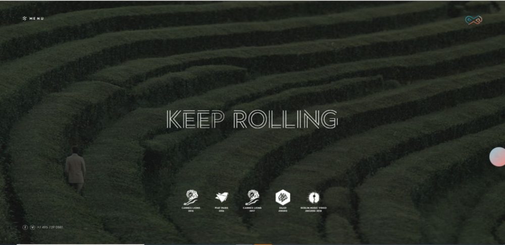
Profilm: modern video beautiful background idea
website: https://profilm.ru/
Video backgrounds have been around for a while, and today it takes a website designer something more than simply putting a video clip on a loop to impress anybody. This video production studio succeeded — they’ve put together a hypnotic sequence of rich visuals, then toned it down with a subtle grainy film effect, achieving a perfect balance between playfulness and finesse.
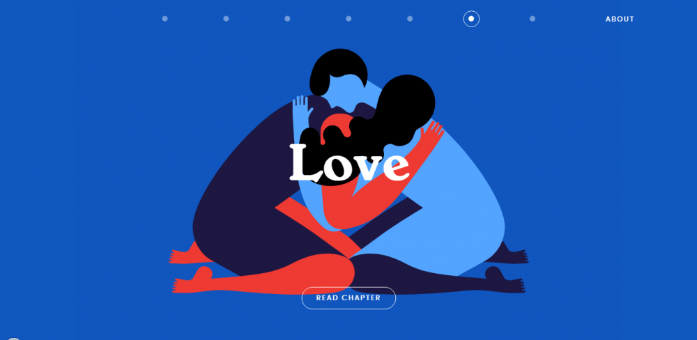
Inside the Head: beautiful image background
website: https://insidethehead.co
What’s great about a simple image or photo background is that it provides you with absolute freedom for experiments. You can try on various high-quality images, trendy colors, patterns, photos, or video backgrounds in one click. Not only such a simple solution allows you to refresh the website look every time, but it also helps you find the design that reflects your brand the best and drives the most conversion.
For the digital story “Inside the Head”, gorgeous full-screen images serve as visual support for each chapter. A sprinkle of animation adds another dimension to the static illustrations. You can adapt the idea and add beautiful backgrounds made in the same style to each section of your website to maintain a consistent feel and mood.
Dignity, Deconstruction & Protection: beautiful colorful background
Bright, juicy colors continue to gain popularity in web design. On the Dignity, Deconstruction & Protection website, vivid colors are incorporated masterfully and with a sense of proportion. An alternation of content blocks painted with neutral and accent colors creates visual rhythm and draws the attention on what’s important. A rich raspberry shade used for the cover image makes the photo truly pop.
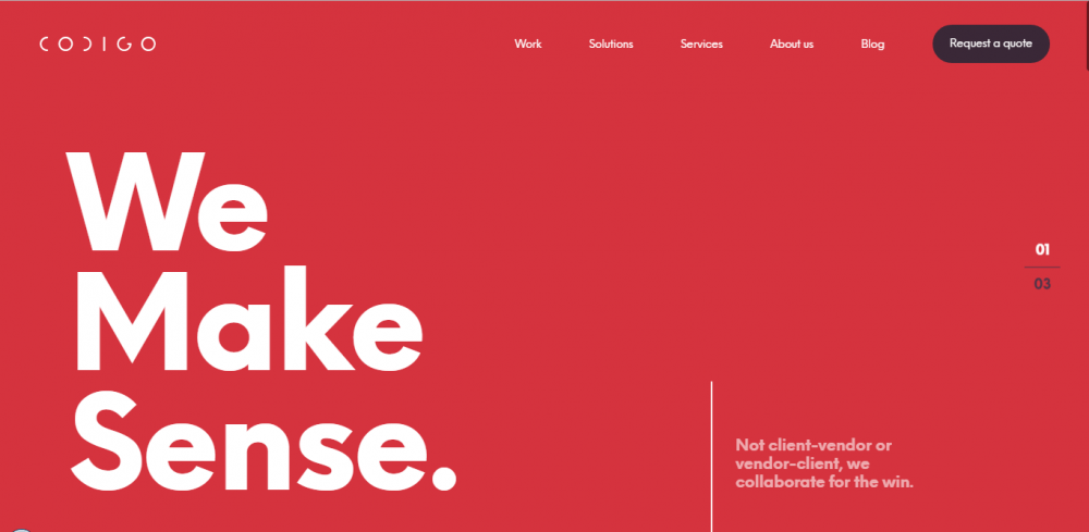
Codigo: simple background idea
website: https://www.codigo.co/
Here’s another noticeable trend – simplicity. No textures. No patterns. No overlays. What could be more simple than a single color fill background?
It’s like if web designers got together and decided: “Yep, we’ve tried every Illustrator tool. From now on, it’s going to be the paint bucket.”
Because no one can argue that the colors are beautiful. And sometimes they don’t need any enhancements to send a powerful message. Codigo digital agency proves the argument by using solid red and white backgrounds all through the website. And look, these plain colors work wonders for them!
One Theory: light texture background template
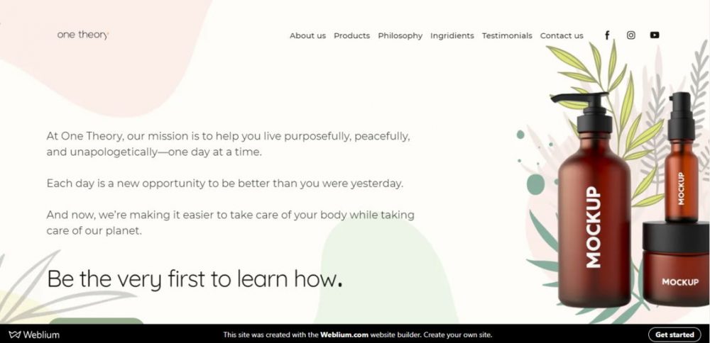
Muted background with subtle texture/pattern is a smart choice for when you aim to put a spotlight on the content. Pastel nice backgrounds complement what your brand has to display, say, or offer, instead of stealing the show.
The organic care products company sets an aura of purity, peace, and softness that the customers expect from their products by choosing the flattering backdrop. They went for a calm, delicate shade of pink and dropped some floral decorative elements here and there.
Panache: minimalist background
website: https://panache.fr/
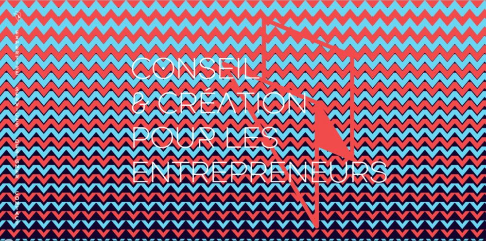
Minimalism to web design is what a little black dress to fashion – it never goes out of style. And you know why you don’t see that many minimalistic design websites around? Because in the case of the “less is more” approach to the visual content, everything else besides the backgrounds has to be flawless – layout, typography, color scheme, etc.
The landing page of a graphic agency utilizes the full arsenal of design tricks, from custom fonts and experiments with layouts to striking color pairing and scroll-driven animations. Minimalistic geometric shapes and patterns bring all these daring and somewhat contradicting design findings together as an integrated whole.
If you’re fond of geometric shapes in website design, we’ve got even more amazing backgrounds with an original take on this trend for you!
Likely Story: bold pink&blue background
website: https://likely-story.co.uk
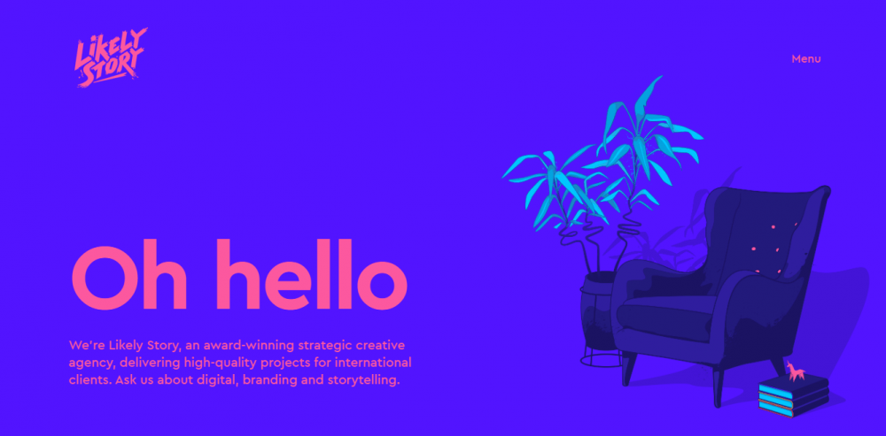
From Barbie pink to dusty rose, there’s something about the color pink that makes it great for website designs. This branding agency website goes for the foolproof approach inspired by flat design. For their backgrounds, they combine catchy, bold shades of pink and blue that speak disruptive creativity.
The Snow Queen: riding the gradient design wave
website: https://designers.snowqueen.ru/
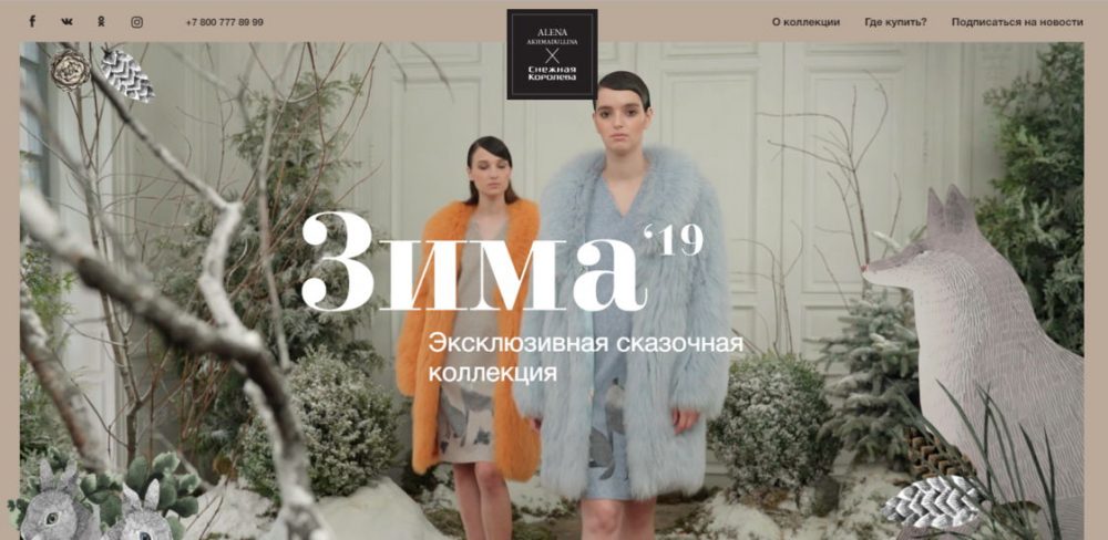
Gradients and color transitions have become a hot web design technique lately, thanks to Spotify and Instagram that started the trend. And pastel shades are the easiest to mix into the perfect blend. This website goes a bit further than simply mixing several colors — it uses a nifty optical trick with the background color changing smoothly from one to another as you scroll.
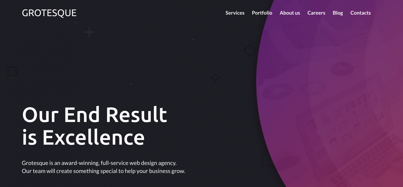
Web-design agency: beautiful background template
Webarts: animated beautiful background
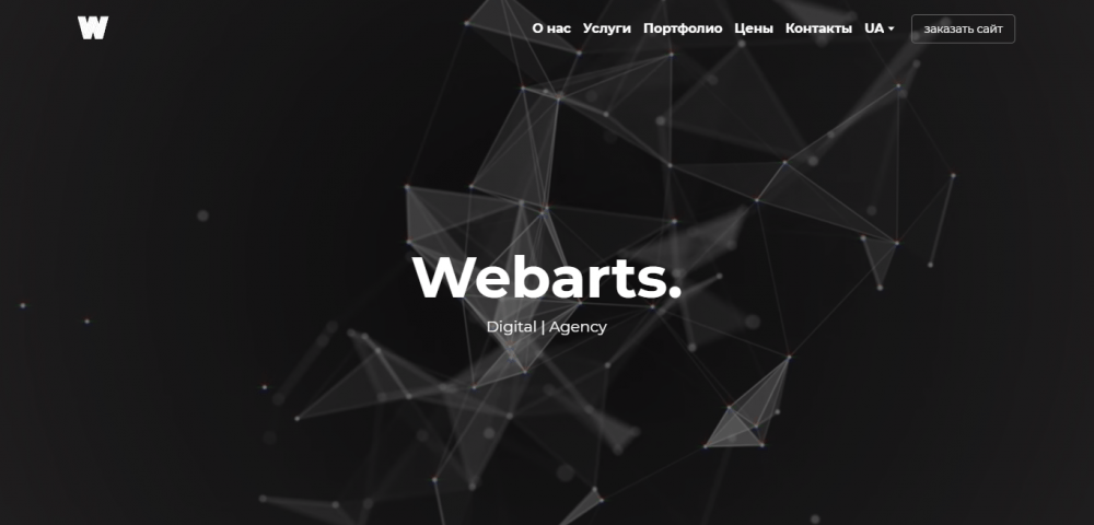
website: https://webarts.com.ua/
As with any autoplay video, animated background design can become either a centerpiece of your website or an annoying eyesore. This digital agency portfolio nailed it by creating a mesmerizing hero banner with abstract animation on a neutral dark background. The design translates innovation but also brings back warm and nostalgic memories of good old screensavers.
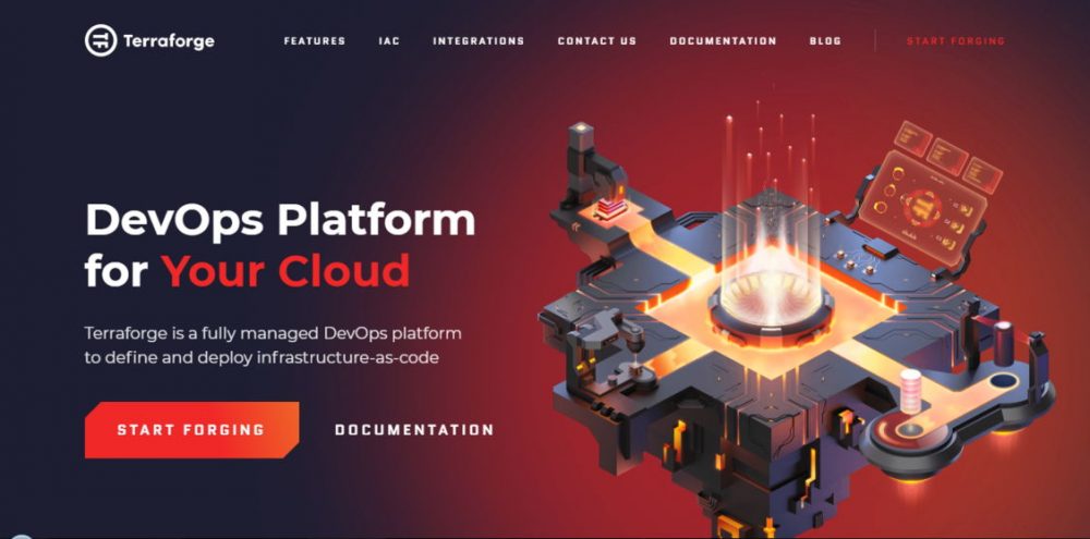
Terraforge: isometric backgrounds
website: https://terraforge.io/?ref=lapaninja
The isometric web design graphic is having a moment now. This unique style creates a WOW effect by adding the third dimension to flat design.
The development company uses the asymmetric deep-colored backdrop for an intricate isometric illustration on their landing page. Combined with animated flat illustrations, this design sends a message – complex visuals for complex technology.
Wrap Up
Hopefully, our beautiful backgrounds overview boosted your inspiration levels and brought some fresh ideas on how to level-up your website design. If you’re ready to start bringing your insights into reality, why not check out a free Weblium website builder? It provides you with great flexibility to play around with various backgrounds and see which of the ideas works the best.
