15 Best Dental Websites for Your Inspiration
A dentist’s website is not just an online business card, but a real tool that helps attract new patients and increase the number of appointments. A well-designed website can work 24/7, even when the dentist is busy in the office, and allows people to find you, learn about your services, and book an appointment online.
To understand which approach would be most effective for my project, I reviewed various dental websites. I paid attention to how they present information about their services, design contact forms, showcase their team, and display patient reviews. For me, it is important that the website is not only beautiful, but also practical, intuitive, and reliable — that it works for me and helps develop my dental practice. So take a look at these great examples and think about how to use best practices for your website.
Contents
Pearl Dental by Weblium
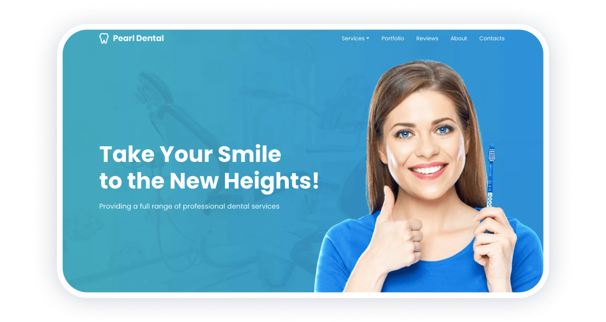
This website for a dental clinic offers you all the necessary information from the start: their address, working hours, and contacts. As you scroll down the main page, you can read about their services and prices. Pearl Dental also provides before-after photos and patient reviews.
Finally, you can request a free consultation by leaving your contacts in the answer form. This website was made using Weblium.
Strong points
- Fresh design in corporate colors
- The ‘Reviews’ section
- A feedback form that you can use to receive a callback
Sullivan Heights Dents by Weblium
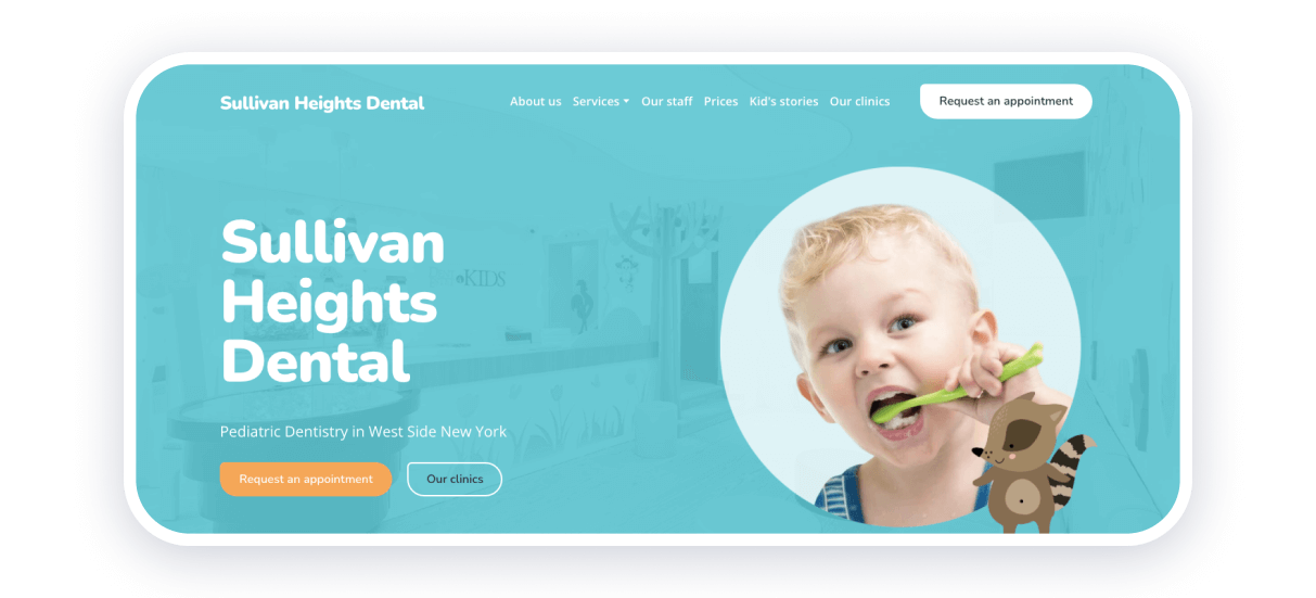
Providing testimonials is a great approach to gaining customer trust. Thus, many businesses apply this trick. What about a dentist website? Sullivan Heights, a kid’s dentistry, decided to share the stories of their little clients as well! This allows other clients to make sure they will have a pleasant experience visiting the clinic before they book an appointment. By the way, you can do this in one click.
The website has an intuitive interface and pleasant design. This is obvious since it was made using Weblium dentist template! You get to know about all of the services offered by Sullivan Heights, the methods they use, and their staff straight on the main page.
Strong points
- You can request an appointment with one click
- All the services and their prices are on the main page
- A separate blog section with kid’s stories
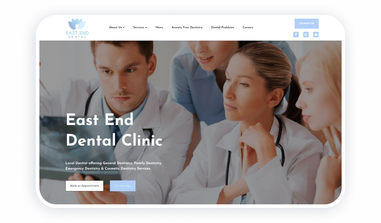
The essence of this clinic’s approach lies in anxiety-free dentistry. If you are scared of doctors, you will be glad to hear that modern dental offices carry out pain-free treatment. The website visitors can read the blog about dental problems, apply to work in East End Dental, or book an appointment.
In general, the website is clear and quite useful. It is one of those cool dental websites that inspire confidence and look fresh.
Strong points
- The ‘Book an Appointment‘ button on the main page
- A convenient blog
- Cute illustrations and clear design
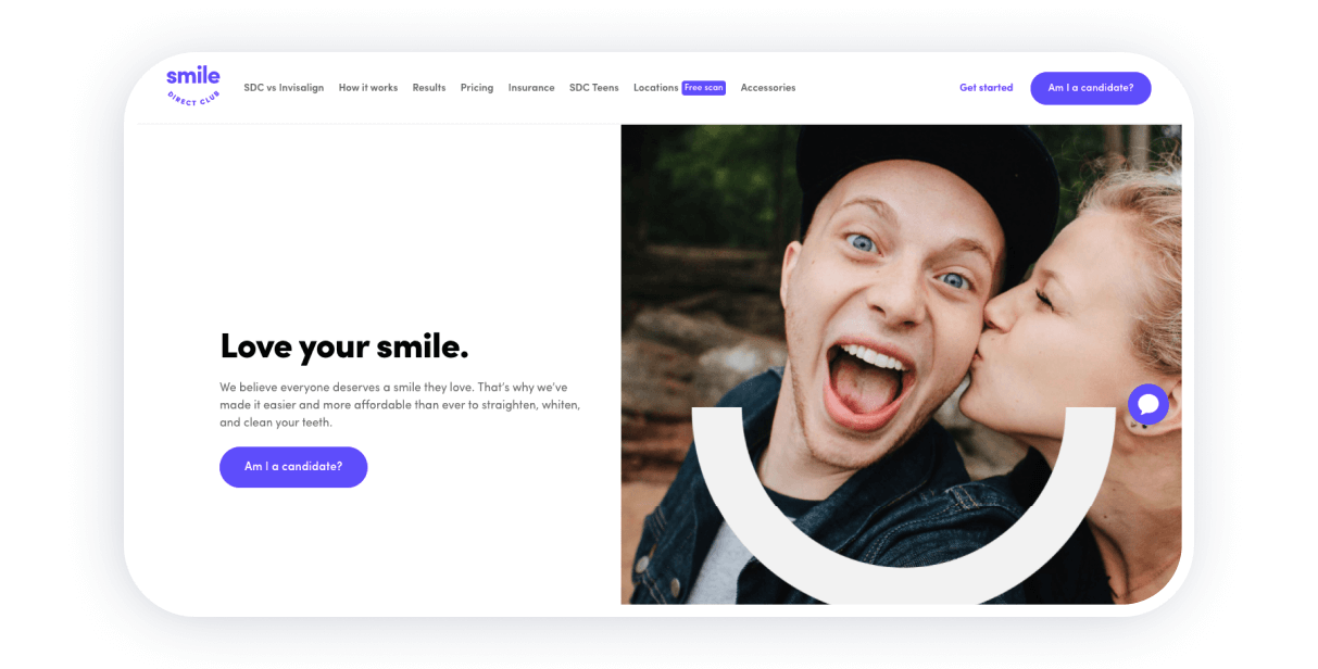
This website belongs to a company producing teeth whitening and straightening kits. As you first open the page, the bright design and fun photos attract your attention. You get to know the products they offer as well as prices.
Smile Direct provides you with real-life reviews and offers everything needed for a website promoting teeth whitening products. You can read testimonials, order a kit, or leave a request and receive a callback.
Strong points
- Many interactive buttons that allow you to leave a request or receive a ready answer
- Sections of the website explaining how it works
- The prices and product photos are on the main page
Winning Smile
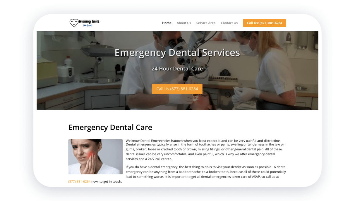
We got a brief website with laconic design and a minimum of information. Such websites for dentists work too! Many people rely on brevity when they choose a medical institution. Thus, if you receive all the needed information on the main page, the rest is unimportant.
Strong points
- A ‘Call Us’ button
- Informative website sections explaining the working hours, who the company is, and what are their contact details
- Laconic design
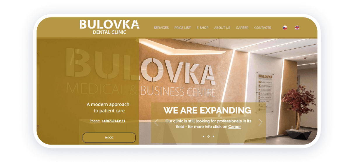
As you open the website, you immediately see a pop-up window where you can leave your request and receive the answer on Messenger. The design may be too overwhelming for some but it is definitely catchy and works well. The Bulovka website is available in two languages.
Strong points
- Bright design
- A pop-up window where you can leave a request
- They have their e-shop where you can purchase a voucher for a teeth whitening procedure
Penn Dental Medicine
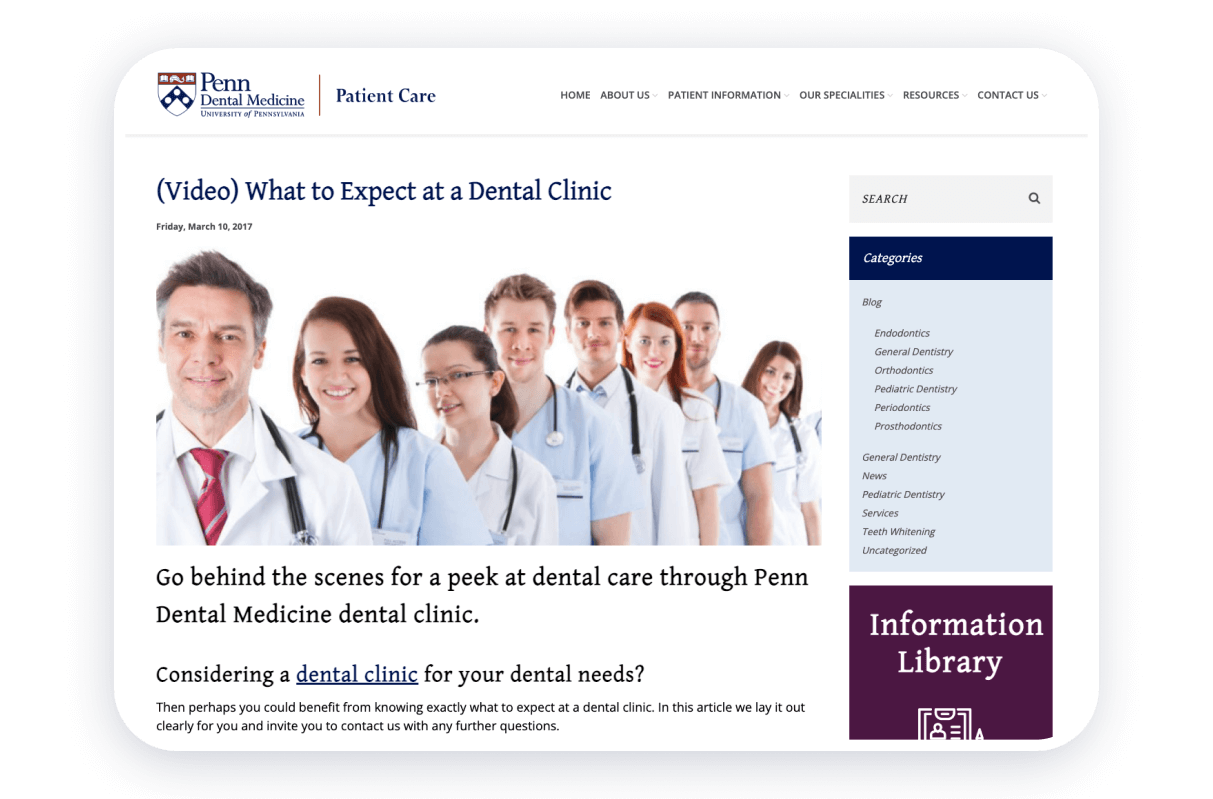
This university dental clinic website is straightforward and clear. You get a somewhat formal design as the clinic works for the student only within the limits of the University of Pennsylvania. In general, this web page offers you everything needed to quickly book an appointment, provides info about their specialists, and gives tips for the clients.
Strong points
- A pop-up window offering a $25 coupon for new clients
- The Blog section
- Video content and lots of useful info
- Social media links
Smile Delhi
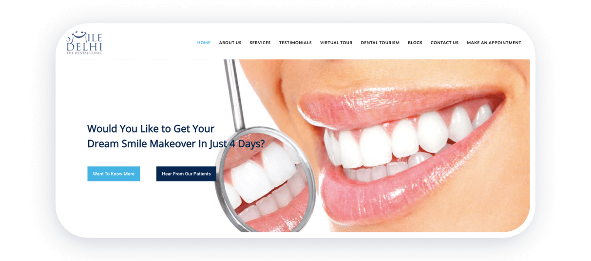
Using high-quality photos of smiling people is one of the most effective tricks for the best dentist websites design. Smile Delhi shows you not only stock photos, but real-life before and after photos of their clients, shares testimonials, and explains how to book a visit.
Strong points
- You can request an appointment in a few clicks
- A virtual tour feature is a very cool feature — you get to see the inside of the clinic before you even visit it
- The website offers all the vital info in the page header
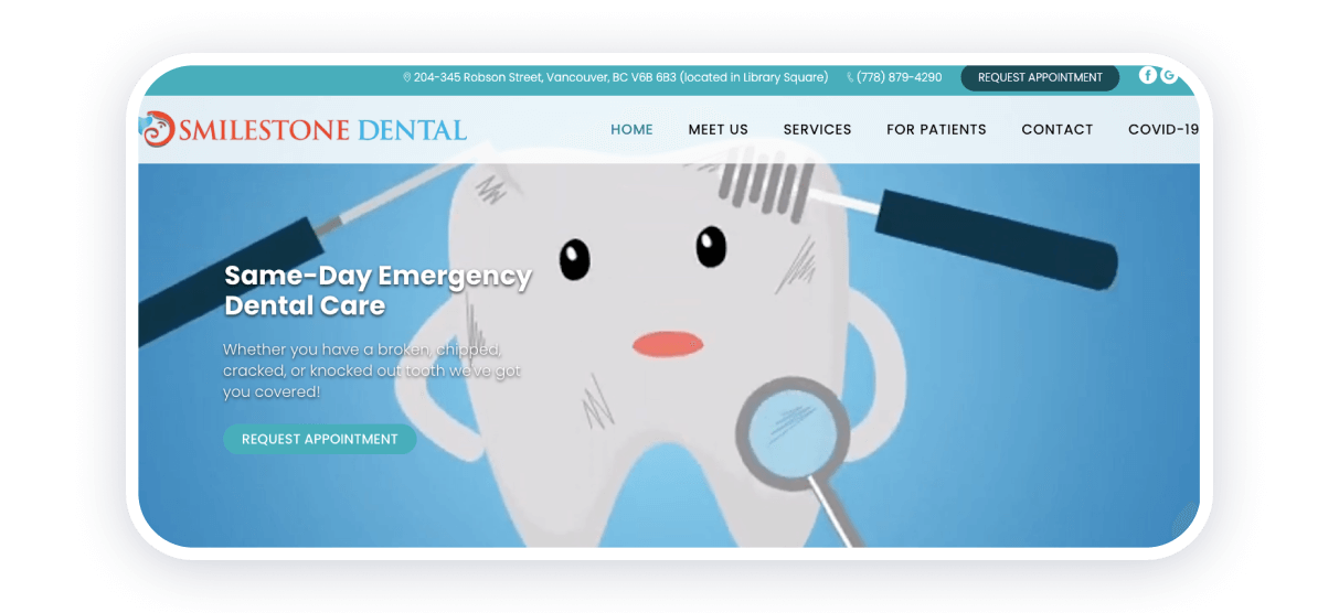
Animations are always a good idea! Smilestone decided to use them to catch your attention straight from the start and encourage you to book an appointment.
The website transitions are smooth and exciting — the whole page looks like a video page. What is more, you have all the necessary information at your service. This is an example of one of the most interactive websites for dentists we have seen.
Strong points
- An interactive design
- ‘Request the appointment’ button is present
- Links to social media
Doha Dental Center
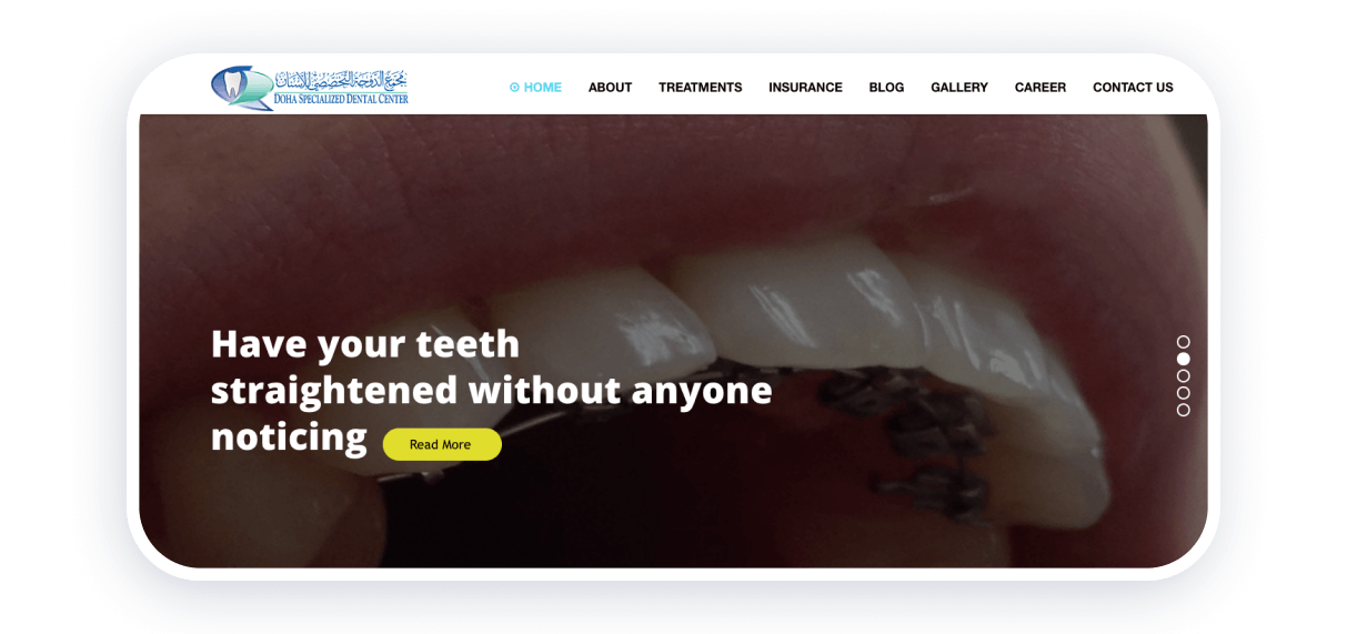
This clinic even has an app that you can download to make an appointment or follow your treatment history. However, the website itself has everything needed to benefit from dental services. You can read about the clinic, reviews, career prospects, request an appointment, check the working hours, and view the gallery of before-after photos.
You can also check an interactive table with statistics that are updated in real-time. It includes the number of cases, years of experience, and happy client reviews. Top dentist websites integrate this page section since it is very interactive.
Strong points
- ‘Request the appointment’ button is present
- Many useful features allow you to study all the info before the visit
- Statistics that are constantly updated
AmeriDent Lab
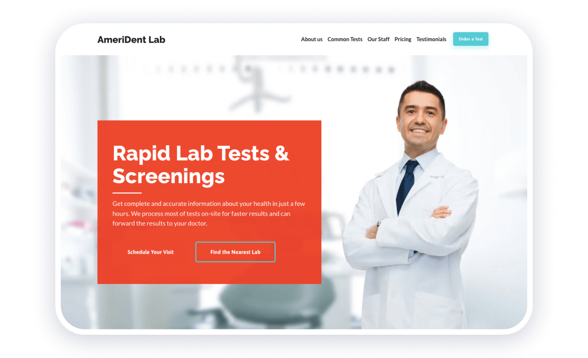
Red is not a color particularly associated with medicine, but it works quite well in the case of AmeriDent. A bright call to action on a red background immediately explains what the clinic is up to. This is an example of a great dentist website with quality photos and smooth operation.
Besides, you have a separate menu with prices that you can open to the table with all the services.
Strong points
- Bright colors
- Smooth transitions
- High-resolution photos
Tend Dental Clinic
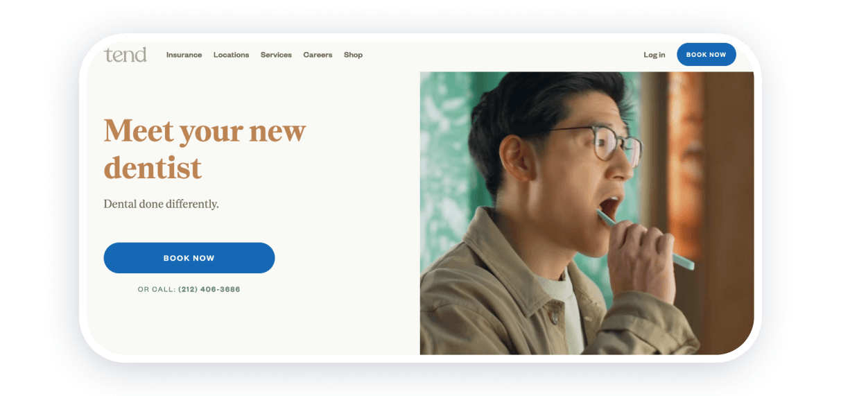
Tent Dental Clinic boasts of a minimalistic design that will attract the attention of visitors who rely on the aesthetic part of the dental clinic. Medical institutions that follow modern design trends inspire confidence since they know how to approach a young audience.
Strong points
- All the necessary info is present
- Cool modern design
- Smooth transitions and pleasant navigation
LA Dental
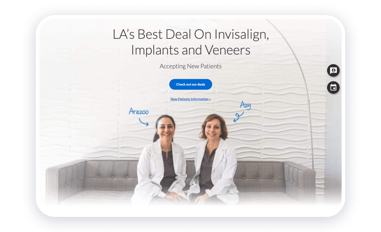
This dental website is laconic and interactive. Similar to many other dental clinic websites, LA Dental chose blue as their central color. You can read about the prices, treatment methods, and all the contact details straight on the main page.
Strong points
- Pop-up form
- ‘Book Your Appointment’ button
- The section of the website presenting the team is present
Luka Dental Care
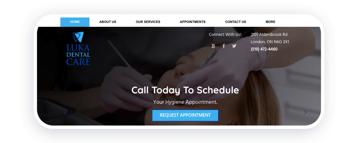
Luka Dental Care is another example of an effective dental website. The main page consists of details concerning the work of the clinic and many interactive buttons. Nevertheless, a laconic website layout doesn’t mean you cannot access all the needed information. Here you have the contact details and ‘About Us’ section.
Strong points
- Convenient menu
- Links to social media are present
Manhattan Periodontics
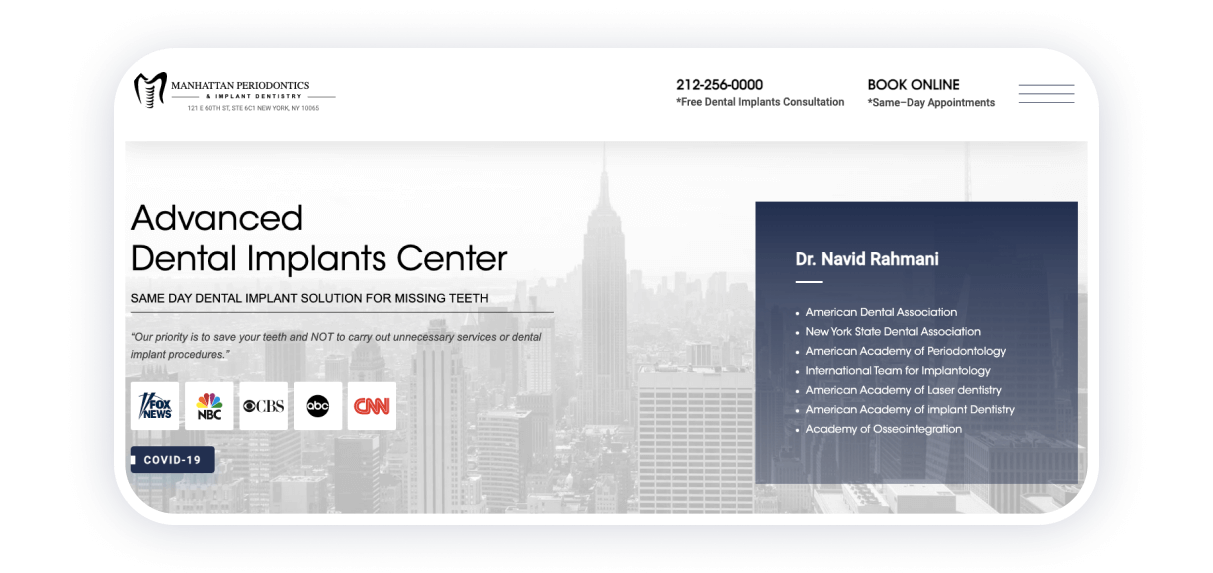
This clinic looks luxurious and offers you top-notch services. You can predict the quality you will get judging from little details. Pay attention to design choices, the brevity of the information offered, and all the certificates that the clinic can boast of. You get the look and feel of luxury, which was definitely the purpose of this NYC clinic. Thus, Manhattan Periodontics has one of the best dental websites in terms of design.
Strong points
- Elegant design
- Interactive buttons to receive a callback or make an appointment
- You get an explanation of the technologies offered at the clinic
- Real stats specifying the experience, number of successful cases, and reviews
Conclusion
After reviewing examples of 15 successful dental websites, I noticed that the best ones have common features. They usually include:
- Answers to patients’ most frequently asked questions.
- A forum or blog with articles about dental practice.
- A “Questions and Answers” section where clinic specialists personally respond to patient inquiries.
- Cool photos of real people before and after treatment.
For me, it is important that everything looks professional and honest. It is better to never use stock photos of doctors — only real photos of the clinic and the team at work. I would also avoid copying medical articles from other resources and would suggest creating original and competent texts that really help people.
I would pay special attention to the mobile version of the site, as the category of users who only visit from mobile devices is constantly growing, and many people do not use desktops at all to search for dentists. Therefore, the site should be convenient and fast on any gadget.
I would choose the Weblium platform to create a dental clinic website. It offers themed templates with a ready-made structure, as well as all the necessary blocks, widgets, and applications that help organize the clinic’s online presence. This allows you to significantly save on website development and direct resources to high-quality content that really works to build your reputation and attract patients.
So now it’s time for your website to create your website on Weblium and show patients that your clinic is all about professionalism, care, and comfort in every element of your online presentation.
