20+ Modern Website Examples to Inspire You
The rapid development of technology, changes in the world economic sphere, cyclic recurrence of fashion imposes its mark on the web design industry. Something that was modern yesterday is completely out of date today. Thus, when looking for contemporary website design, be sure to inspect the trends in web design. New types of modern website examples are appearing every day, and we could share them with you every day. Let us name the modern website examples of the week for you.
In this article, we have prepared a number of up-to-date websites. They present contemporary high standards of beauty, functionality, and quality. So, let’s get some inspiration today.
Contents
Modern Website Design Examples
Explore a curated selection of cutting-edge website designs that showcase the latest trends and innovations in web design. Perfect for sparking creativity and guiding your next online project.
Modern actor portfolio example
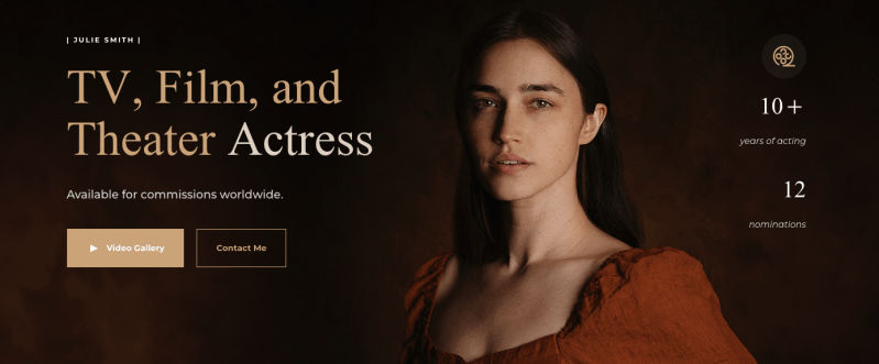
It’s not just a website, it’s a ready-made website template on the Weblium website builder. You can use this template to create a modern, high-quality and incredibly elegant website. This incredibly modern website contains many details that attract attention and make this particular website stand out from the rest. The homepage presents all the information about the actress, and the following screens will detail the portfolio. Want to use this template as well?
Nike – a great example of the modern website
Visit the website: https://www.nike.com/
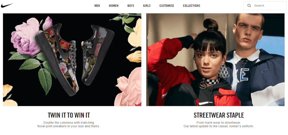
The first on our stage is a Nike website. Nike is a worldwide famous company, it passed a long time of developing itself. For now, they are trendsetters not only in sportswear. Smaller companies trying to learn and adopt Nike’s business strategies and style in the desire to build something similar. Yes, following the dinosaurs is a great way to learn and develop. Nike website is a modern website combination of conciseness, conviction, and fashion.
Сisco: modern website design
Visit the website: https://www.cisco.com/
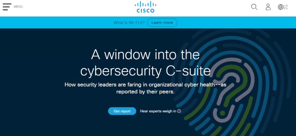
American transnational company Cisco also deserves appearing in our top list. It is an experienced giant in the world of business. The website of this company represents an appeal for future development and interest in strong technologies. The home page of a website contains moving blocks with news from the blog, menu button which simplifies navigation and is overall pleasant for an eye. Cisco represents a great combination of products and informational resources.
#3. Adidas Yung Series – modern website example
Visit the website: https://www.adidas.com/com/apps/yungUS18/
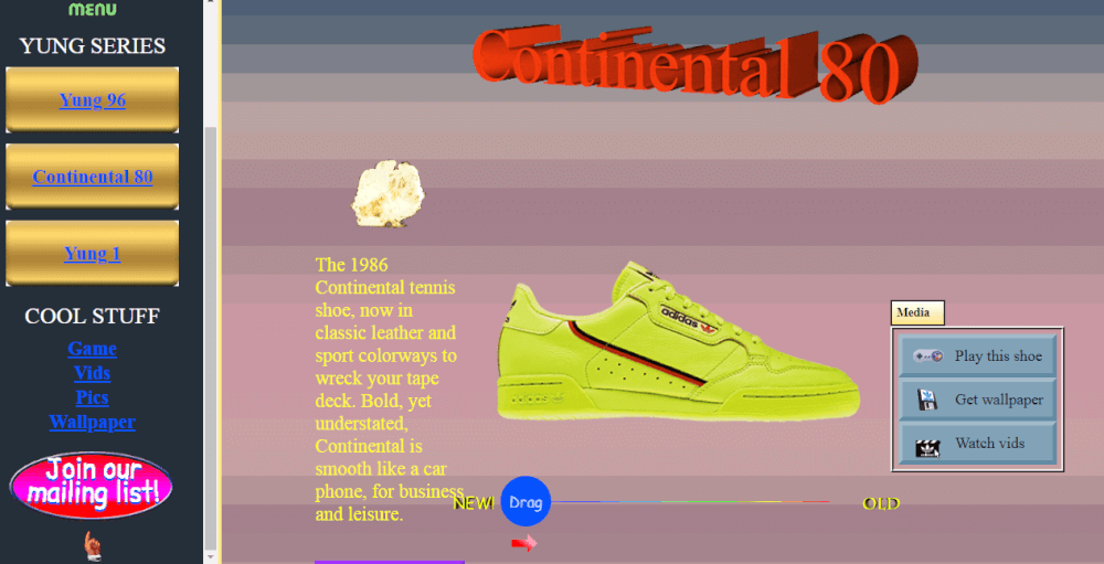
Adidas Yung Series website stands aside from the main trends. It used an ugly design, inspired by fashion at the dawn of website development. This example website can be taken only by two opposite views: you love it or you hate it. This aggressive style tends to extract your emotions and exaggerate your feelings apart from the sneakers themselves. Thus, it all works out. Because if you feel something about the advertisement, you probably notice and remember the product. That is how modern marketing works.
Tell ‘em Steve-Dave
 Visit the website: https://www.tellemstevedave.com/
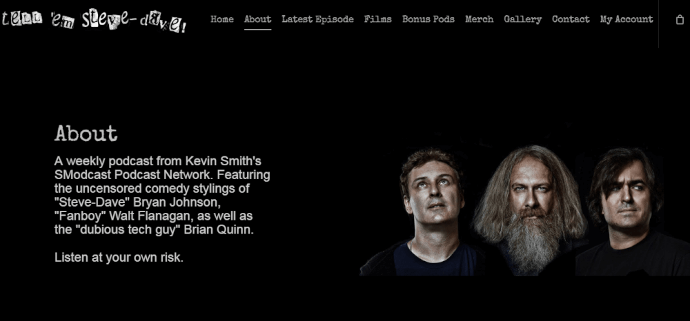
A site devoted to audio podcasts of Kevin Smith. We believe the style reflects perfectly with the atmosphere inside the audio stories. It combines dark color palette with bright cartoon images, animated page icon, attracts attention to faces of the authors on About page. The feature of this website is in construction. The webmaster decided to create sections of the website at subdomains. It redirects you to a сoresponding domain if you click on a particular button. Check whether this decision is suitable for your own business. Also, notice the Soundcloud integration on the website, which is very useful for modern websites for musicians, record label studios, portfolios.
Alfa Laval – modern minimalist website
Visit the website: https://www.alfalaval.com/
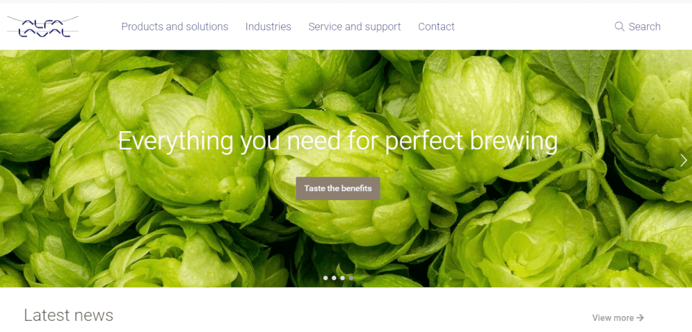
Alfa Laval was founded in 1883 in Sweden. For now, they are a developed and well-known corporation working in technology areas of heat transfer, separation, and fluid handling. We are completely in love with their website. The company mostly works in the B2B segment, but the website is a perfect business card for their service and products. It attracts by brevity and simplicity along with open communication with a client. Quick navigation panels help to find the necessary information on the website in a single click. And bright illustrations make the user experience highly pleasurable.
Modern website for a nutritionist

This website is a symbol of modern websites: well-displayed information, stylish design, and a clear offer with high-quality images. It’s not just a website, it’s a Weblium website template. What makes this site unusual is its bright palette: the light orange color attracts all customers and encourages them to lead a good lifestyle.
Crunch Base – modern website design example
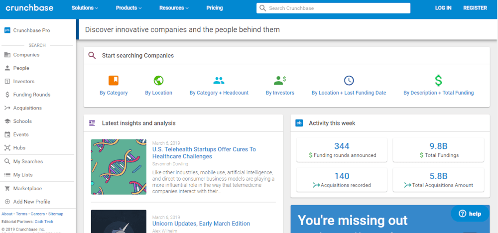
Visit the website: https://www.crunchbase.com/
Crunch Base as a website designed for networking. Here businesspersons are allowed to list their companies, looking for investors, partners, colleagues. It is easy to find the required sections, using wide amounts of search options. Search in one click by using the general search panel in the header. Modern networking website design is characterized by intuitive navigation options, different possibilities for registering an account (personal, company account). It contains a modest basic design with pastel calm colors.
Dropps
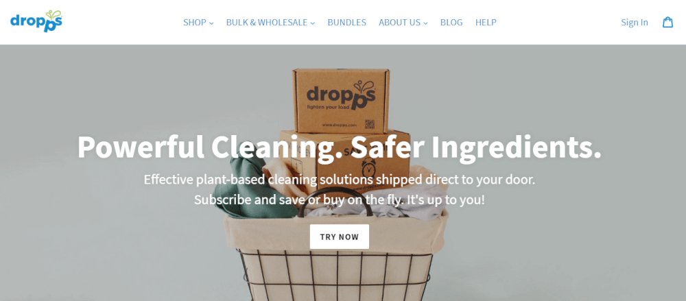
Visit the website: https://www.dropps.com/
Dropp’s company website presents new ways to wash and clean the house. They have chosen a friendly nice design, according to their business positioning. The aim is to reduce the harmful impacts of ordinary cleaning products. They propose using plant-based technologies for home and outdoor usage. This is an e-commerce website, it allows online orders and payments. Speaking of design, we agree that this is the best solution for an environmentally friendly company. Scrolling to the bottom, you feel a more and more pleasant atmosphere and become imbued with respect to Earth. Thus, the decision to purchase there safe domestic products seems to be a lifetime choice.
Example of a modern stylist website
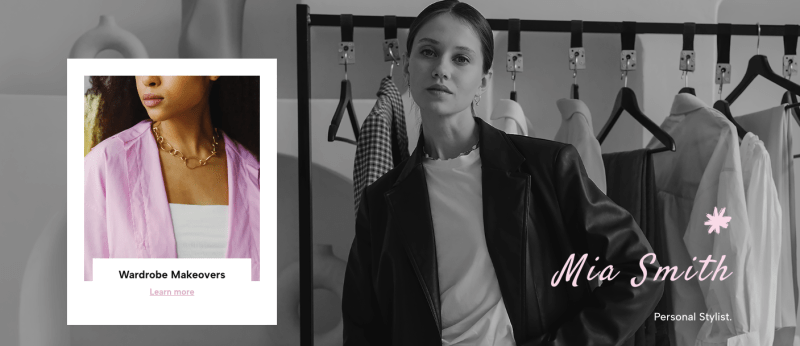
This minimalistic, modern, and inspiring fashion niche websites. The site uses a stylish and bright frame that contrasts with the gray background, making it look organic and incredibly modern. What makes this website modern? Of course, its minimalism, which has been a trend for years. If you want to create a modern website, you should definitely use this template as a basis for your website.
Jen Sincero – modern website design
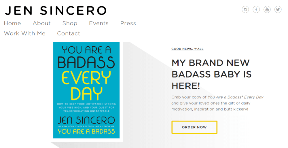
Visit the website: https://jensincero.com/
Now it is time to investigate the contemporary portfolio website. Jen Sincero has developed her own style for introducing herself. She uses the white-blue-yellow color palette, call-to-action buttons, special word combinations (“badass baby”) which together line up a holistic image. We bet Jen developed this style for a long time, making slight changes in perfection. And now this worked out for her successful career as a life coach.
Discogs
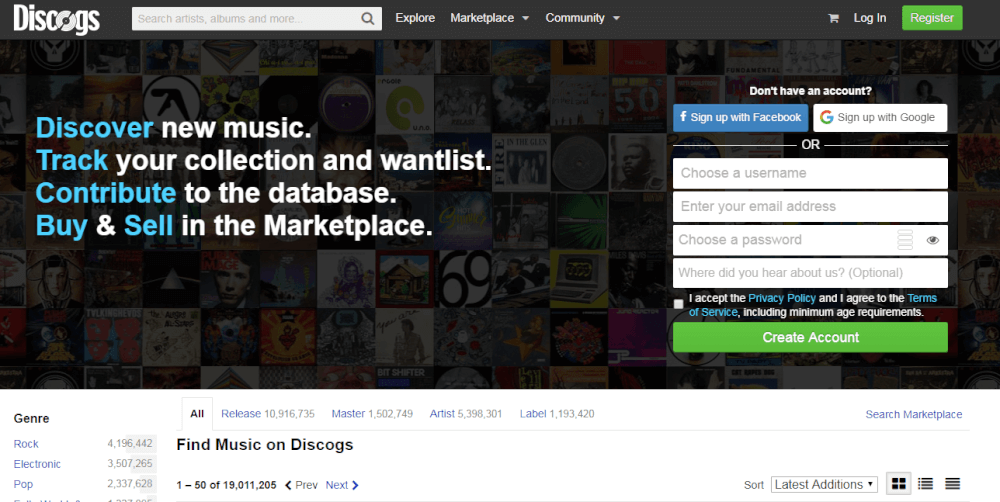
Visit the website: https://www.discogs.com/
Discogs – a music website. This is a marketplace and exhibition of music albums. New releases and old vinyl records. The website is modern in the way of navigation works. There are comfortable filters that help you to sort out the whole amount of available music. Overall look if the website doesn’t distract the user’s attention from the main topic – satisfaction from favorite music. The footer contains many useful links for those who are interested. Social media following is a contemporary must-have for socializing your product within targeting groups. The help center and blog aim to interact with customers for educational purposes.
Related article: 15+ Website Footer Design Examples For Your Inspiration
Jen Fariello
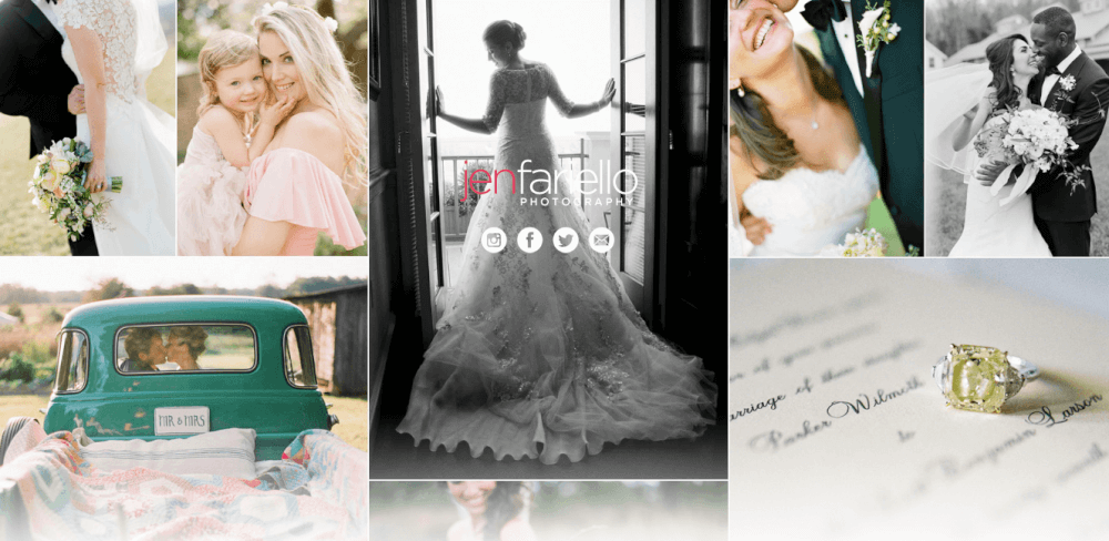
Visit the website: http://jenfariello.com/
Meet one more minimalistic one-pager in this list – website by Jen Fariello. This is a modern web template of an attractive portfolio of a photographer, in addition to Facebook and Instagram pages. Actually, social media follows are the central and main parts of the page, except the photos on the background. All the photos are of a similar style, which creates an atmosphere of professionalism. We give five stars to this design. What is your suggestion?
Humaan
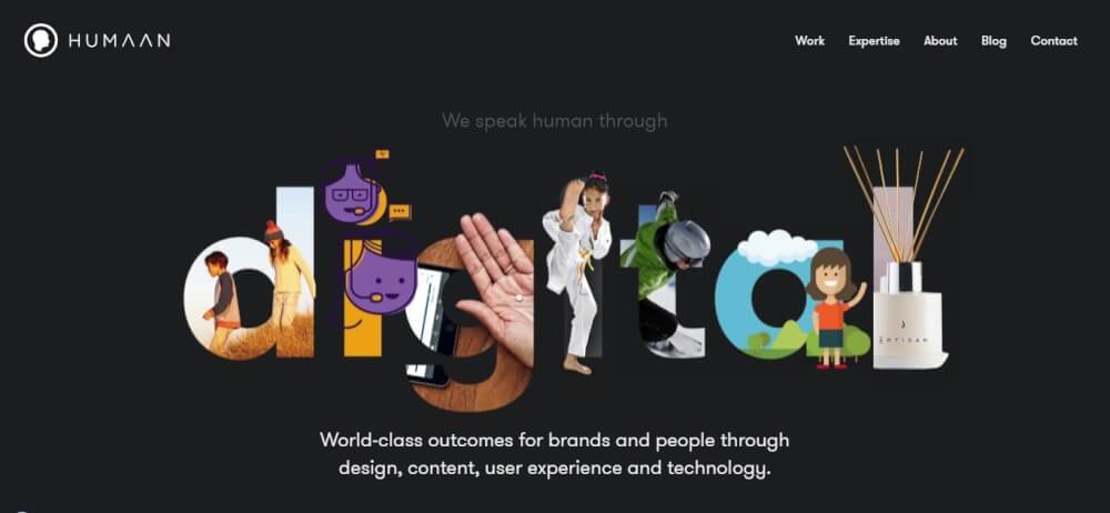
Visit the website: https://humaan.com
This is the website of the team of Australian creative designers and developers. It fascinates you with its nice, soft design with a beautifully designed portfolio. Pay special attention to seamless transitions to the pages of projects. This is the perfect design for selling high-end digital services for leading brands!
Framenoir modern website
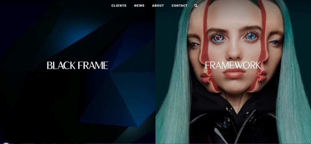
Visit the website: http://www.framenoir.com
This is the website of the company engaged in advertising and branding. The main page allows you to closely get acquainted with the company, to identify its features and benefits. The website has just a few pages – the main categories, that a good online business card! As is custom with this type of site, there is a minimum of content and functionality. The dynamic design creates pleasant impressions and smoothes minimalism.
Oribe
Visit the website: https://www.oribe.com
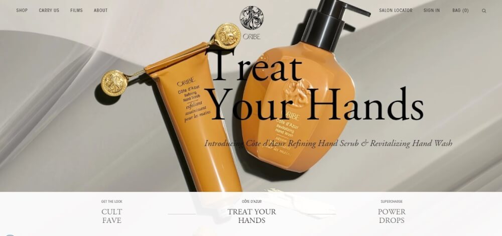
The site of the American cosmetics brand is an example of excellent eCommerce design, created in a sophisticated black and white style. The main page with the landing page structure and a spectacular video on the first screen is aimed at a VIP client. Next, when you hover the cursor, the arrow animation with the zoom effect will immediately attract your attention. You have to make just two clicks to get to the product card!
Content agency’s modern website

This business template can be used not only for marketing, but for any niche. In any case, your website will turn out to be incredibly modern and creative. You will have great opportunities to present your services and products. Do you want to have a modern and stylish business?
Cedric Pereira

Visit the website: https://www.cedricpereira.com
This is one simple, but well-structured and entertaining design portfolio! This is a website of former Deezer and Ultranoir trainee, French interactive designer that is now graduating from HETIC. The creativity here starts literally «on the spot»: the spot is the main fascinating and quite creative interactive element on the main page, and this is the first thing you see while the website is loading. Decisions like this immediately make the designer portfolio sticky!
Wibicom
Visit the website: http://www.wibicom.be
This website is minimalistic, concise, but stylish – it is an excellent example of an online business card that allows you to delve into the company’s activities, studying its services and numerous opportunities it offers you in detail. Pay attention to how thoughtful website structure and concept is, how a small catalog with a description of services, and an active feedback button help to form the flow of customers!
Codetasty
Visit the website: https://codetasty.com
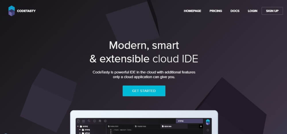
This is a modern website that has applied some of the freshest trends: a full-screen menu, a spectacular fill of translucent buttons, large refined icons, and backgrounds with a linear gradient. This is just an excellent UX-design with clear navigation and the ability to scroll the content!
Malika Favre modern website design
Visit the website: http://malikafavre.com
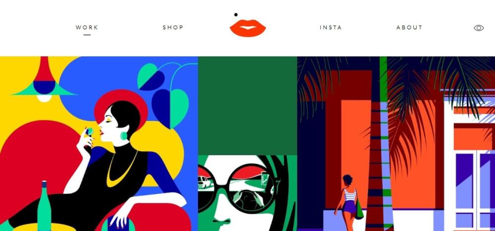
Take a look at this selling portfolio website of a British illustrator, created in the flat design style. The great graphic design of his projects is coherently presented in a flat-tiled design. Malika impresses with the ability to use positive and negative space. The animated vector graphics look quite elegant. Spectacular illustrations on the main page create a true emotional message.
Folk strategies
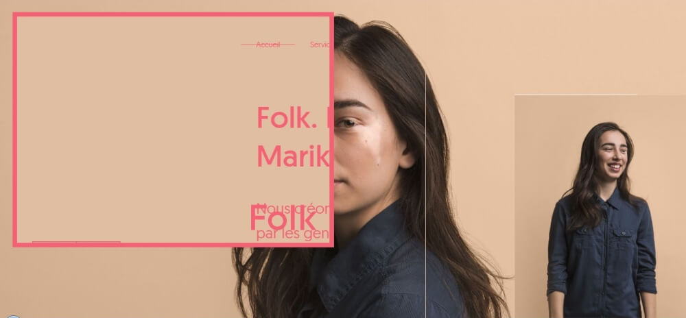
Visit the website: http://www.folkstrategies.com
This online business card is, maybe, the ideal solution for public relations services advertising. The website is quite unusual, creates an ambiguous impression, and, thus, once again focuses on creativity. The basis of the site is its dynamism and minimalism of the info content. On the whole, the website creates cool emotions and an impression of the company.
Soulight App
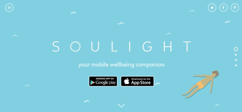
Visit the website: http://soulightapp.com
Take a look at this spectacular, but very calm design of the mobile application website, that was created to reduce stress and improve the emotional state of a person. This is one of the modern website design examples that suits the app’s mission!
Copper&Brave modern website design
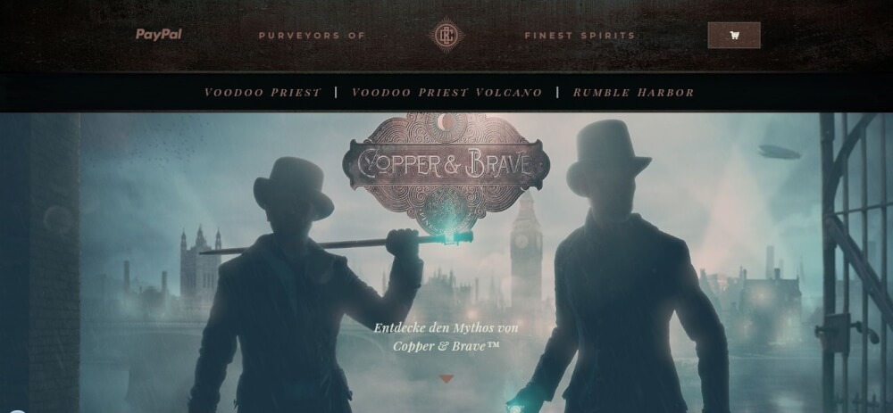
Visit the website: http://www.copper-and-brave.de
A luxurious example of an Awwwards website winner, that has become one of the best projects of simple websites. The online business card presents the elite varieties of rum. The cool thing about this site is that it takes you a few centuries back in the time when rum was the most popular alcoholic beverage. The design of the site, its colors, the music literally immerse the visitor in the atmosphere of history and cause a genuine desire to buy a drink. By the way, if you wish to purchase a bottle of elite alcohol, the site will easily help with this with its modest online sales feature. At the same time, the functionality itself is not similar to that inherent in online shopping at all! It contains only one button. There is no product card, no product description, or other classic stuff inherent in online shopping. However, this is a perfect selling online business card, which gives huge benefits to the company!
How to make a modern-looking website
Step 1. Sign up and select the template
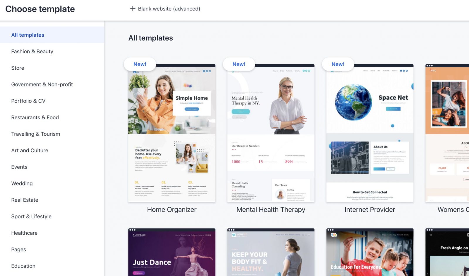
First, sign up with the platform. Enter your details or use your Google or Facebook account. To start, you need to click “Create a new site” button and on the left, you will see a gallery with dozens of really beautiful and modern templates with different themes and styles, categorized for convenient search.
Step 2. Add content and edit your template
After you have chosen your template, you should take the time to fill it with unique texts and images. You can add or delete blocks, change the color and style of text on the page, rearrange buttons, edit menus. Simply put, customize the template according to your taste and make it unique. Don’t be afraid to experiment! 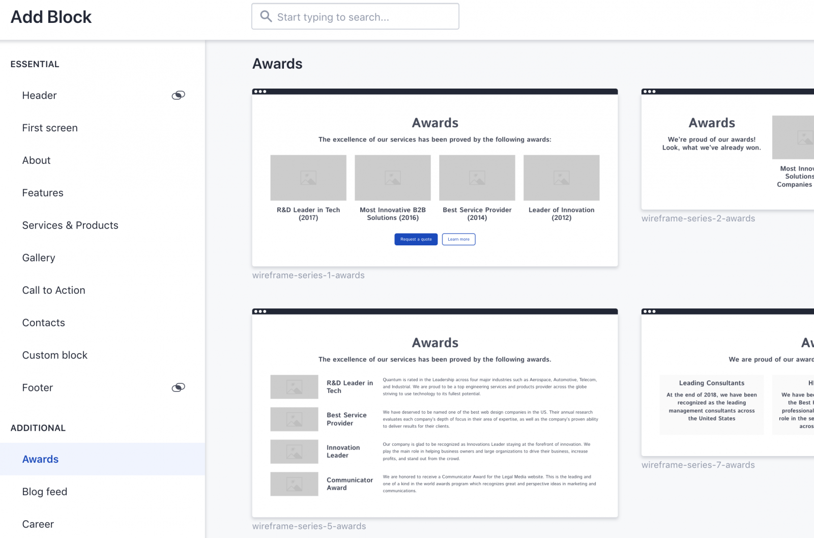
Step 3. Create new pages
Step 4. Configure SEO Settings
Step 5. Add CTA and contact forms
CTA (call to action) – is a navigational element that pushes the visitor to take action. These can be “hot” buttons, contact forms, or just a text with a link to other pages.
Step 6. Connect analytics metrics
Here you can customize integration with other tools and services such as Google Analytics, Google Tag Manager, Hotjar, etc. 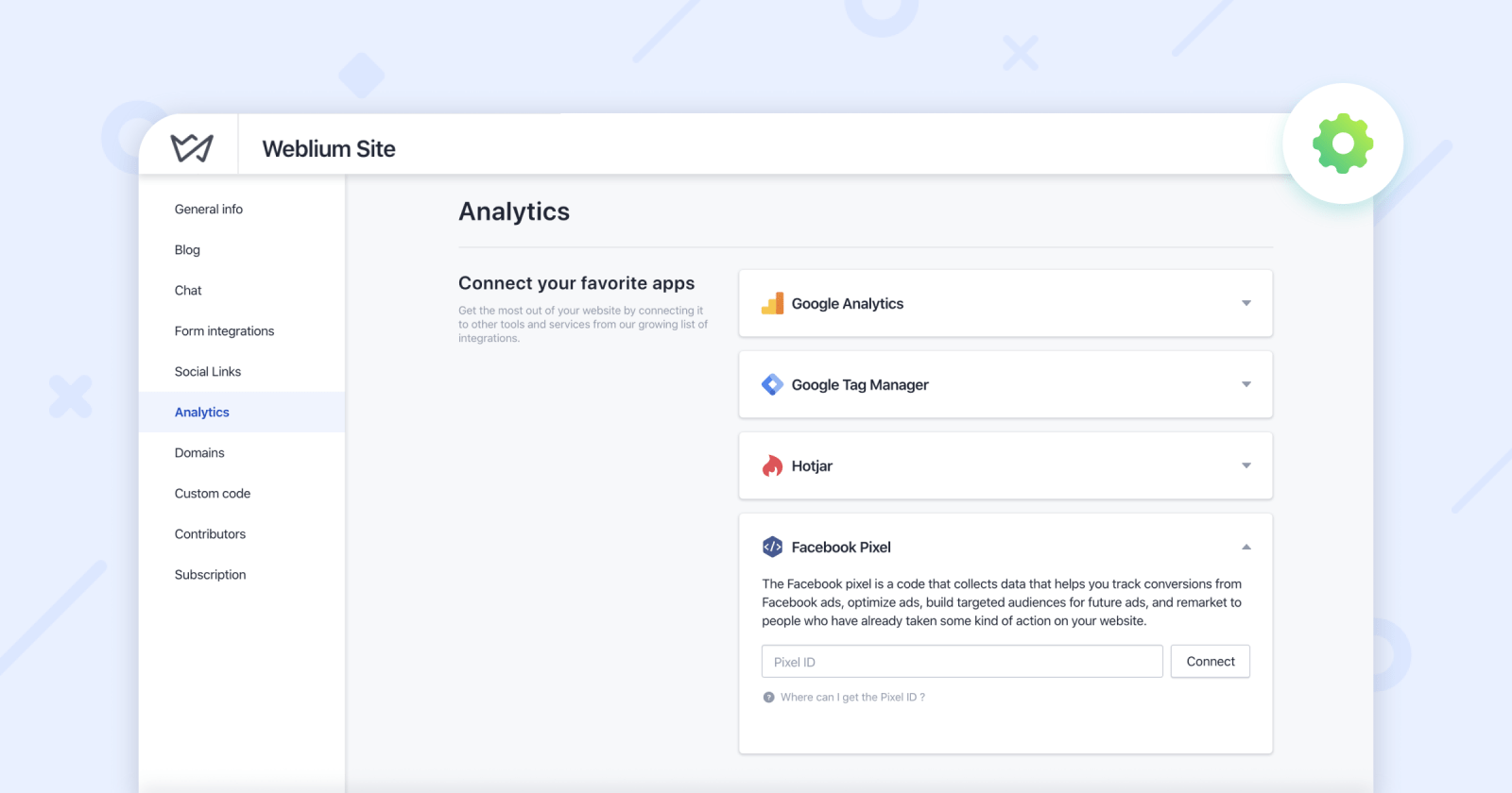
Step 7. Check your website
Step 8. Create a blog
Step 9. Show your website to the world
Modern Website Design Examples FAQ
What makes modern website design great and effective?
Modern web design is effective when it combines a clear layout, fast loading speed, intuitive navigation, and a strong visual hierarchy. A good website is user-centric, mobile-friendly, and uses typography, colors, and visual elements to grab attention. Interactive elements and clear calls to action also make modern websites more engaging and conversion-friendly.
What are the coolest designed websites on the internet?
Some of the coolest websites combine unique visual elements, animation, and storytelling. Examples include portfolios of creative agencies, tech startups, photographers, and designers who use bold typography, dynamic layouts, and micro-interactions.
How can I find inspiration for my own website design?
Browse galleries of modern websites, template libraries, and award-winning design sites. Look at popular layouts, color palettes, and interactive features. Inspiration can also come from offline sources such as magazines, art, and nature—anything that sparks visual ideas for your site

