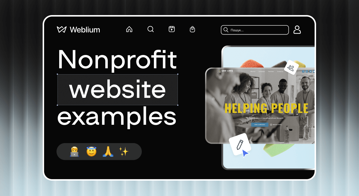
10+ Best Nonprofit Websites to Look to for Inspiration in 2025
In today’s digital world, a powerful online presence is essential for non-commercial organizations. But how do you create a space that not only informs but also inspires action? Imagine it becoming a hub for donations, volunteers, and supporters who are eager to join your cause. Sounds like something you benefit from? Keep reading to discover how the best nonprofit websites connect, engage, and drive impact.
What makes online resources truly effective? More than just a pretty design. It captures the essence of your mission, making it easy to get involved. Curious about what key elements? Let’s explore some standout examples!

This template has the best website design for nonprofits and charities. Change the content according to your needs. The main contacts are placed in the header, and a donation button is right in the main section for quick access.
Other elements demonstrate the purpose, projects, and results. They identify how the company helps and offers to become a volunteer. It also builds trust by giving an opportunity to view detailed reports from different years. Seeing the numbers and experience, people will trust you and join in.
There is a blog feature to share advice and news. A great idea is to place a subscription option for a newsletter. It’s up to you what to change in this nonprofit website design. You can easily do it in the editor!

This nonprofit website design includes a few bright colors to highlight its mission and calls to action. It offers to show the campaigns, watch videos, send money, and take part. Every issue is placed in a separate section, so it is convenient to explore your work and projects.
A slider displays all campaigns, giving everyone the option to learn more about each in detail. The About Us includes specific data, such as numbers and goals. There is a partner area and testimonials from people who got their help.
This template is a perfect example of responsiveness. Users will have an excellent experience from different devices. You don’t need to waste your time. Just add your information to the foundation website template!

This is one of the best nonprofit websites with correct homepage. The choice and assignment of images are excellent. For example, three vivacious pictures divide it into several sections. The bright color scheme welcomes visitors. Brilliant navigation includes the three blocks to find out more immediately.
What catches the eye is the placement of the CTA. For example, the not-so-large button with the straightforward word «Give» and a drop of water in the top-right corner is very easy to notice. When you scroll down, you will see photos with short texts and other CTAs. Thoughtful headings and a well-organized footer are must-haves to draw attention.
The Royal Conservatory

This nonprofit web design is both simplistic and elegant. It features strong and convincing images, clear, pleasant fonts, CTAs, and well-thought-out menus, which improve user experience.
There is a block for donation with all the possible options. If you also have various ways, you may place them with a short description and link. Thus, visitors decide which one is the best for them and contribute.
There is also a search bar, allowing everybody to find quickly what they need. The section dedicated to sharing information about the company features award-winning accordions. This is a great way to write as many details as you need, but keep it clear and easy to navigate.
The Future Project

Thanks to the hefty typography, all the titles really stand out, and the statistical facts are very easy to read. Calls to action are highlighted with the light blue color matching the logo, gently focusing the attention.
With the contact forms, it is super easy to take action. This is one of the best nonprofit websites with mobile-friendliness and a great user experience with a seamless transition from desktop to mobile.
You may set general styles for your web hub with a few clicks in the Weblium’s editor that are suitable for your brand visuals.


The user-friendly header consists of a few main links and ways for donations. It is sticky and always stays at hand as visitors scroll. Every single page looks elegant and modern. The color scheme is consistent. It is an excellent idea to choose an accent color (here, it perfectly matches the name and logo) and use it for active elements, links, and icons.
The banner image immediately shows an example of the Red Cross’s work and, paired with the CTA, encourages people to donate. This is one of the best charity websites that works perfectly on mobile devices. The look, the feel, and the convenience of usage stay the same across the various screen sizes.
World Wildlife Fund

World Wildlife Fund is really appealing! A clear and comprehensive navigation bar gives visitors everything they need to be a donor. The buttons for adoption are always here, at the top right-hand corner, and it takes them to the section with many different options with all the info they need. They place a form with all the details and explanations. If you promote through other channels like social media and want to raise money quickly, you can try this approach.
This is one of the best nonprofit websites due to its aim to educate the audience. It looks great on mobile screens. Despite a lot of elements about different approaches to the work, it is convenient due to the space between them and the well-thought-out structure.
Galapagos Conservancy

Strong images are displayed right on the main page. Creative and simplistic block-shaped elements guide users to different areas. The menus are creative but still have a clear hierarchy.
It not only gives the option to donate or join the NGO but also tells about its mission, achievements, and impact. There are 4 ways to help: donate, become a guardian, adopt an animal, and subscribe. It increases the possibility of engagement.
All the micro animation, such as hovering and lifting-ups, helps the audience to explore. There are only three main colors, maintaining the minimalistic approach. It is one of the best charity websites with a dark background, which is gaining popularity.
Thirst Relief

Let’s get some inspiration from this example. Less is more, and it reminds us of that. There are multiple sections, but thoughtful links make it very easy to navigate. The high-quality images and expressive icons immediately give a clue as to what you need to do next.
The influential newsletter CTA perfectly explains the reasons to sign up. The blog feature providese the consistency and experience of the firm. This charity’s website design is responsive and mobile-friendly.
Habitat For Humanity

This association website design is elegant and simplistic. Monochromatic grids with bright images perfectly present the information. The top bar, with a neat search box, a «Donate» button, and social media profiles, is in the right place.
There are descriptions for volunteers divided into various categories: school, corporate, individual, etc. Each has its own description and photos.
It looks great on mobile devices and provides a perfect user experience, just like the desktop version. This is the best nonprofit website, with easy navigation and a convenient structure.
Humane Rescue Alliance

This is one of the best nonprofit websites that uses the cuteness factor to its fullest: the introduction video makes you smile, and the adorable icons make you want to explore. «How you can help» is divided into categories like adopt, volunteer, and give. It consists of various blocks with information about different ways to help and learn more.
It is a perfect idea to let the audience find out about their impact right away. The donate and the menu buttons in the top right corner look great and are easy to find.
How to create a nonprofit website?
- Define goals
Before development, it’s essential to define its goals clearly. These could include raising awareness, attracting volunteers, collecting payments, or providing resources and information about your cause. Understanding your objectives guides the structure, ensuring it aligns with your mission and effectively communicates your message to your audience.
- Choose a template
Once your goals are defined, choose a template that fits the vision and purpose, or build yours from scratch. Weblium is a website builder that offers ready templates tailored for non-commercials, making it easier to start quickly. It is user-friendly, visually appealing, and represents the brand and message. If you’re starting from scratch, focus on creating a simple and intuitive layout.
- Prepare content
Gather and organize the content. This includes writing compelling copy that explains your mission, goals, and impact and showcasing success stories, testimonials, and key statistics. High-quality images and videos of your work help bring your cause to life, while a clear call to action encourages the audience to explore more.
- Add essential features
Donation buttons should be easy to find and function seamlessly, enabling supporters to contribute online. Contact forms allow users to connect with you for more information or to get involved. Other features, like volunteer sign-up fields, also enhance functionality and engagement.
- Publish and promote
Once your NGO websites are ready, publish them and ensure it’s mobile-friendly and optimized for search engines (SEO). To promote websites for nonprofits, share them on social media, send email newsletters, and collaborate with influencers or media outlets that align with your cause. Ongoing promotion and engagement are key to maintaining visibility, growing your community, and driving action toward your goals.
Non-profit website design best practices
- Donation page
If a person has a huge desire to donate, he finds out how. But not everyone is that patient! Of course, it is an excellent idea, and you should have one, but you’d better place it on a unique block!
Nothing should distract people from making a decision — no irrelevant animations, unnecessary images, or extra links. The text should be humane, convincing, concise, and clear. The high-quality images feel nice and noble.
- Links to social media
You can place links in the sidebar or the footer and add them to your newsletter. Blog content is the best way to build trust with potential donors, so when creating it, ensure that you place social media links to texts to demonstrate the importance of your work and improve your SEO ranking.
- Staff pages
People should know their heroes! Therefore, add a personal space for each employee describing his life, values, career history, and position. The best way to humanize your brand — and believe us, all the top nonprofits have it! Let people see how passionate and hardworking your team members are.
- Financial transparency
This is a must-have for all the great websites for nonprofits! Donators always want to know what their money is spent on. Provide clear financial results to build trust with your supporters. Place the clickable and downloadable annual reports, form 990 and 501.
- Gift tool
A gift is the easiest way to thank someone… and significantly boost donations. Many visitors simply do not know that they have an opportunity to give the appropriate present.
By adding this tool to your site, you guarantee that donors are aware of this option and provide them with the resources they can follow upon submitting.
- Donor data
Having an effective non-profit website, you receive plenty of donor data through your registration forms. It is a good idea to have CRM on your site, saving lots of time and effort and avoiding making confusing mistakes.
Using CRM, all your data will be automatically filtered within each donor profile, and you will simplify your work!
- Use other communication channels
If you follow modern online presence trends, you may use several methods of online presence in addition to your charitable website.
Bet on various digital tools, such as email marketing and SMM, to develop a consistent and integrated communications strategy. Different people get engaged in different ways, so it is a win-win solution anyway.
Conclusion
Creating a quality website is essential for nonprofit organizations to connect with supporters, raise awareness, and drive impact. The examples we discussed highlight the importance of clear goals, a user-friendly layout, compelling content, and essential features like donation buttons and contact forms. These elements not only engage the audience but also drive action.
Now is the perfect time to build an online space for your non-commercial company, and Weblium is here to help. With a wide range of customizable templates, an intuitive editor, email marketing, and top-notch security features, Weblium makes building and managing your nonprofit website more effortless than ever. Start today and bring your mission to the world with Weblium!
FAQ about nonprofit websites
What type of website is best for nonprofit organizations?
It is easy to navigate, mobile-friendly, and optimized for user engagement and donations. It should also have a straightforward, compelling design that effectively communicates its mission and encourages visitors to take action, whether donating, volunteering, or learning more about the cause. Ideally, it should feature a mix of informational blocks, donation links, and resources for supporters while ensuring an easy user experience.
Should a charity have a website?
Yes! In today’s digital age, it serves as a central hub for information, donation collection, and volunteer sign-ups. It builds credibility, offers transparency about how funds are used, and provides a platform to engage with supporters. Without a website, a charity may struggle to reach a wider audience and miss opportunities to connect with potential donors and volunteers.
What should a nonprofit website include?
It should include several key elements: mission statement, donation form, volunteer sign-up, success stories or testimonials, events or campaigns, contact information, and social media links.
Does my nonprofit need a website?
Absolutely! It is a critical tool for increasing visibility, establishing credibility, and providing a platform for donations and engagement. It allows your nonprofit to reach a global audience, inform potential supporters, and make it easy for them to get involved.