Top 10 Web Design Trends for 2024
Web design trends constantly change. The desire to provide users with more unique solutions, alongside the development of AI tools, leads to new trends. It is essential to know about these trends, especially if you will use them on your site.
But it is not a mandatory requirement to always adapt your website to new trends. On the one hand, they can complement the concept of your business and make your website look fresh and up-to-date. On the other hand, they give novice users a base to understand what is trending and what you should try first.
In this article, we will show you web design trends for 2024 so you can find inspiration for your future sites. Our designer, Anastasia, who creates Weblium templates, gave her forecast and explained why these trends will be relevant in 2024.
Contents
Implementation of the AI
Artificial intelligence is still at its peak. People are interested in different ways to generate images and texts from scratch, and your website will benefit from using AI. This is why current trends in web design heavily implement content created by artificial intelligence.
AI can now do different tasks. For example, you can generate images and text for your landing. On the other hand, you can go further and add AI-generated videos or generate pages for your site using AI website builders.
The main best feature of AI is that it still makes users curious, might bring more attention to your website, and significantly reduces the time required for website creation. Moreover, AI-generated content can complement web trends that we will describe further in the article.
The development of mobile design
A lot of users access websites via mobile devices. They can find your website during working hours, in the car, or on the street. For this reason, you should ensure that your website will be well adapted.
Now, the logic of website creation may change, and you will first create a mobile version of your website and then adapt the desktop version. Mobile sites should be brief so that users will conveniently absorb all the information. Images and videos should be optimized so that even people with poor connections will see your content.
One of the advantages of mobile websites is that you can conveniently promote them via social media, such as Instagram. People who scroll posts or view stories can easily access your website and, for example, purchase something they are interested in.
Retro Style
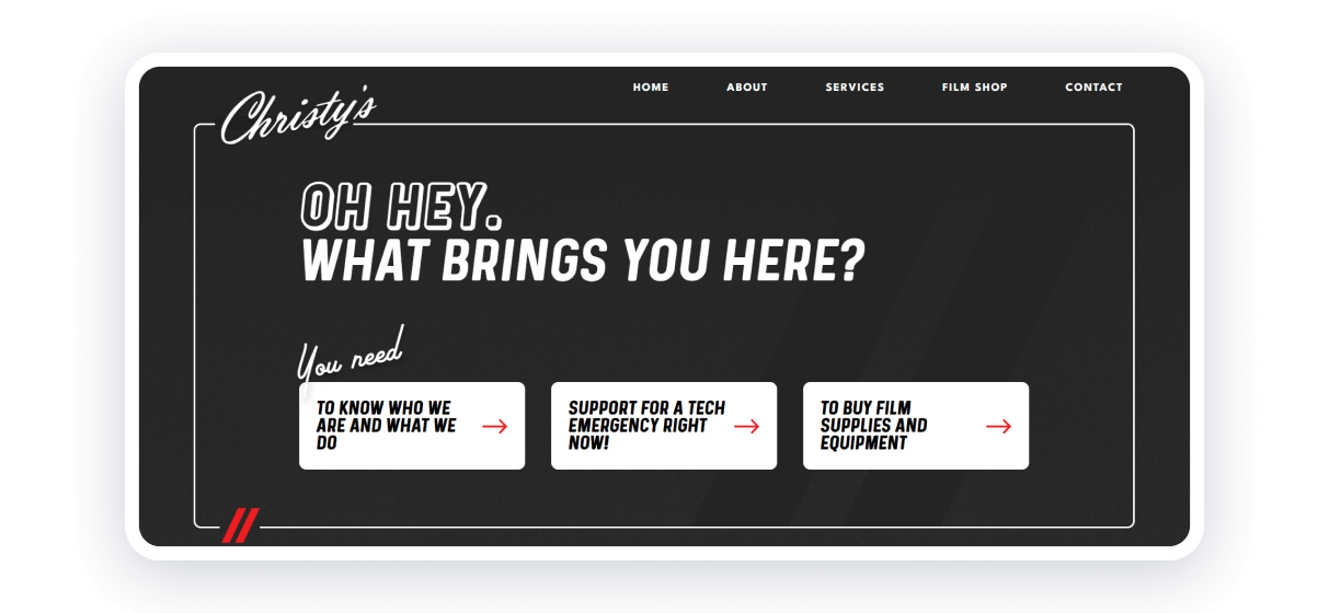
A constant look back to the origins is necessary because it allows you to find something new in a nearly-forgotten old. Retro gives extraordinary vibes to websites.
Retro includes using pastel colors, black-and-white photos, and illustrations, elements like ribbons, post stamps, and hand-written and typewriter fonts.
There are many ways to implement this style, but some companies will benefit even more. Such sites include the following:
- Historical websites;
- Restaurants;
- Clothing stores;
- Websites about cars.
In some cases, retro can be used as a seasonal theme for your website, where you will turn your modern and recognizable elements into their retro version.
Kitsch
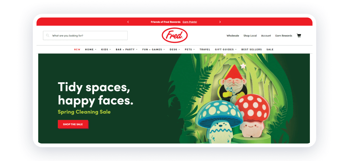
Source: https://www.genuinefred.com.
Kitsch comes from design solutions focused on giving the image of high-quality art by using low-cost materials with low-effort methods. In web design, it follows the same rule but with different implementations.
Web Kitsch is mainly focused on going back to the roots — the early age of the Internet with bright colors, chaotic yet convenient structure, and default fonts. The very first look at it might even be unpleasant; users might think that this is just a low-effort website with no creativity in it. But further examination of it will show that all this chaotic structure is heavily systemized; every single element is in the right place, and each color is picked perfectly. Kitsch is not one of the website design trends that will require no effort in creation.
This solution will be perfect for blogs, personal websites, or portfolios. It will give you space to present yourself to your audience.
Brutalism
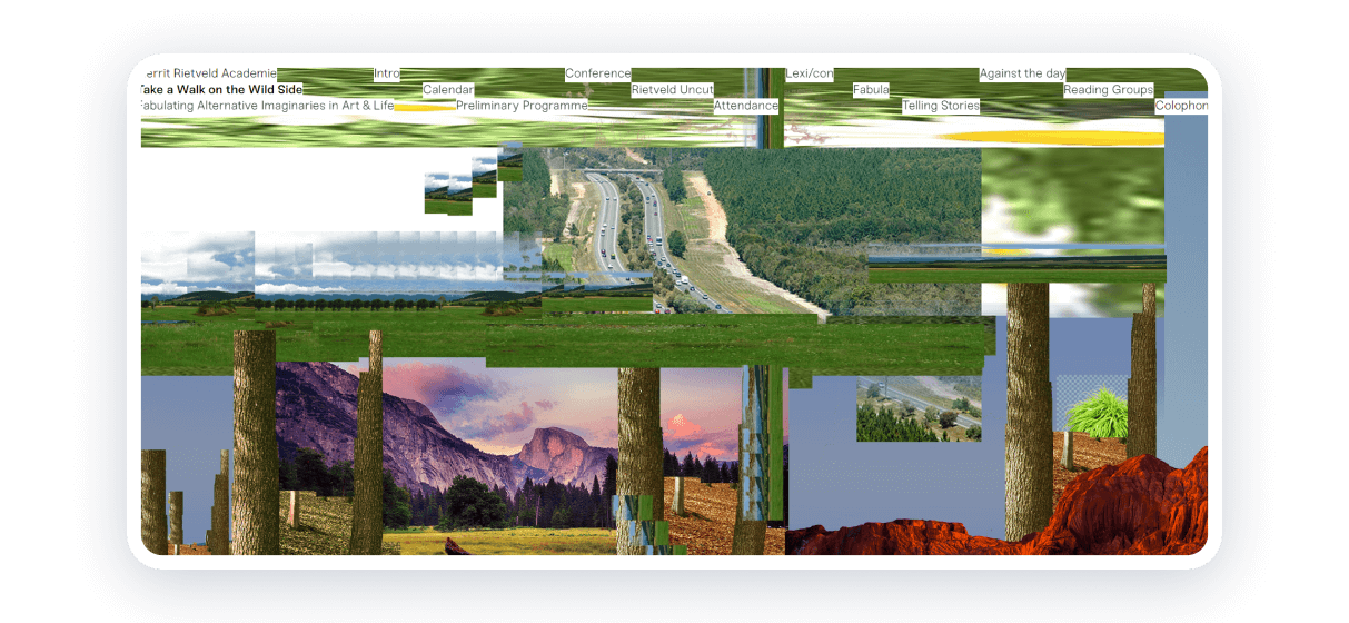
Web brutalism can be seen as some form of Kitsch. However, it is an absolutely different style with many variations. In some cases, brutalism will be minimalistic, including brief messages, color fills, pixelated illustrations, and 1 button. On the other hand, they can contain a considerable number of elements, odd handwritten fonts, a lot of photos, and glitches.
Brutalism in web design can also implement either modern or archaic design solutions by adding 3D animations, different overlays, or default fonts. It allows designers to show they are different and are ready to ignore specific design rules.
Overall, this is one of the most interesting website design trends you should try. However, make sure it will complement the concept of your website.
Experiments with typography
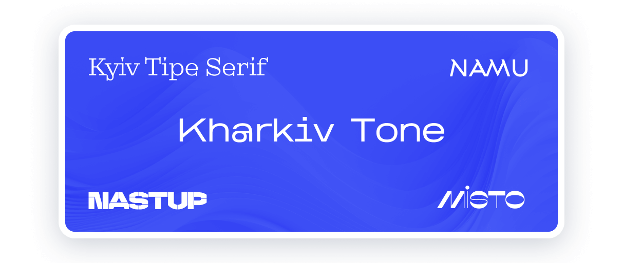
Typography is the top priority of any website, and you should pay attention to the varying styles of it. Website design trends in 2024 might require the following:
- Huge titles. Modern design trends will require you to highlight your thoughts and make titles recognizable among those unique solutions you use on your website.
- Noise. Adding noise effect to your text will be an attractive solution, which, however, should be used wisely. In some cases, it might create discomfort for users.
- Animated texts. Animated texts might sound outdated, but their wise usage will complement your website. For example, you can make a title that will move a bit or add some glitch effect.
- Text as a background element. Some websites might use text as a background element to create a unique design. For example, you can imitate “Blue Screen of Death” or a VHS tape or add headers with some description. Those background texts might include some Easter Eggs for cautious users. But ensure that customers will not get lost in it. It should be just a background element that will not ruin the perception.
Using default and handwritten fonts might also be a good solution. Just make sure your site’s main text will be recognizable and understandable.
Poster design
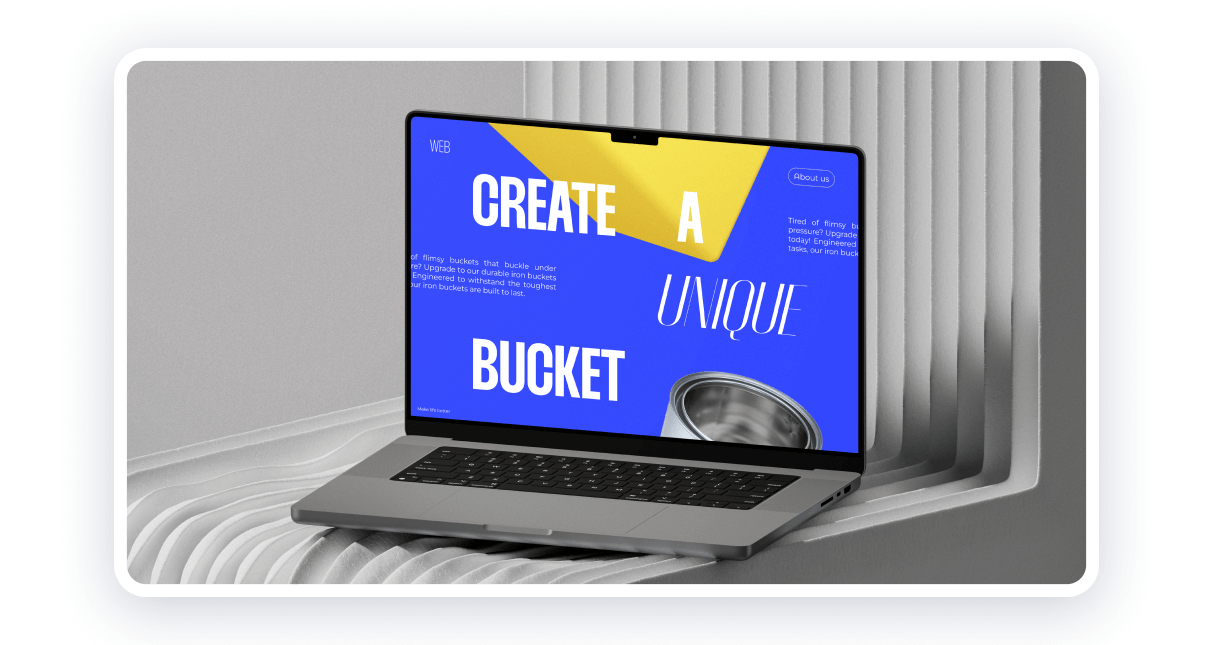
Posters provide us with captivating images and catching texts. This is why it is now one of the main web design trends. Poster methods are actively used not only on landing pages, where you need to sell and do it fast. You can also enhance your CV, express your thoughts, or give information about your company.
The varying elements of posters will give you options to highlight everything you need. You can add large illustrations to switch visitors to the proper mood and conveniently fill people with information.
3D elements
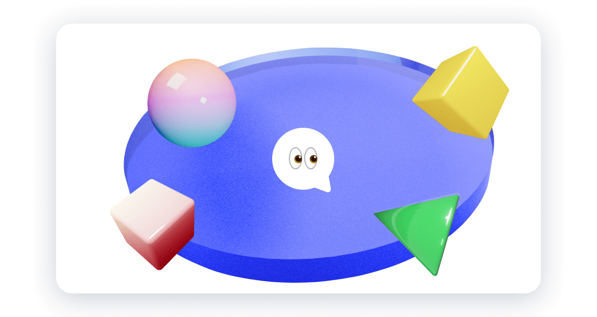
Implementation of simple 3D models is now trending. It doesn’t mean you need to make your website fully 3D, but adding some elements will benefit your conception. Modern trends in web design do implement 3D parts in many cases.
You can start with simple models and illustrations to give your site more stylish vibes. Sometimes, you can make 3D interactive elements, such as buttons. Add simple and complex shapes, make them move, or add interactions to them, and give your website more life.
3D elements, like any other part of your website, should be used wisely. Don’t overload your site with a variety of 3D elements. Keep your visitors focused.
Animations
It might seem that animations have become less popular now. However, including the web design trends we described, animations will significantly improve such designs. Kitsch and brutalist websites use animations to highlight different aspects of the website.
Including the directions of modern design, animations, combined with 3D elements, can give you a variety of solutions to make your site recognizable and unique.
The conclusion
The latest web design styles are extremely interesting and varying. You can see a switch to more chaotic and artistic directions. 3D elements, animations, kitsch, and brutalism are web design trends that will not complement any website but will definitely give unique vibes. Moreover, going to more poster solutions will be a great way to present your ideas to your customers and highlight the most important aspects of your website.
However, it is not mandatory to follow these trends. Not any website will match with them. You just need to ensure your site will be fully functional and understandable to your target audience.
Add varying integrations, choose the preferable style for your website, and promote it to attract more customers.
Create your functional and trendy website with Weblium!


